


 本文深入探讨了Android中ShapeDrawable、StateListDrawable和LevelListDrawable的使用方法。通过具体实例,展示了如何利用这些Drawable资源创建按钮背景、实现状态依赖的图形显示以及电池电量指示器的动态变化。同时,文章还介绍了如何通过样式统一应用界面元素的设计。
ShapeDrawable
<shape
    xmlns:android="http://schemas.android.com/apk/res/android"
    android:shape="oval">
        <stroke
            android:width="2dp"
            android:color="@color/colorPrimary"/>
</shape>
Apply ShapeDrawable as a background:
android:background="@drawable/button_background"
StateListDrawable
StateListDrawable which allows for a different graphic to be used depending on the state of the object.
<selector xmlns:android="http://schemas.android.com/apk/res/android">

    <item android:state_pressed="true">
        <shape xmlns:android="http://schemas.android.com/apk/res/android"
               android:shape="oval">
            <stroke
                    android:width="2dp"
                    android:color="@color/colorPrimaryDark"/>
        </shape>
    </item>

    <item android:state_pressed="false">
        <shape xmlns:android="http://schemas.android.com/apk/res/android"
               android:shape="oval">
            <stroke
                    android:width="2dp"
                    android:color="@color/colorPrimary"/>
        </shape>
    </item>

</selector>
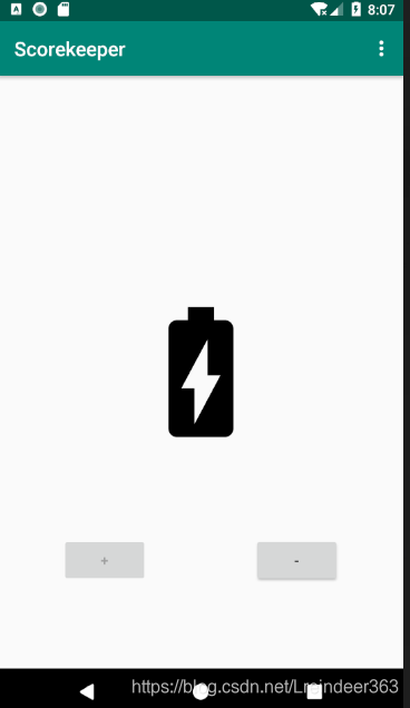
LevelListDrawable
This is introduce in homework. Here is my solution:
- Create a XML in drawable dir named battery:
<level-list xmlns:android="http://schemas.android.com/apk/res/android">
   <item android:maxLevel="0" android:drawable="@drawable/ic_battery_charging_20_black_24dp"/>
   <item android:maxLevel="1" android:drawable="@drawable/ic_battery_charging_30_black_24dp"/>
   <item android:maxLevel="2" android:drawable="@drawable/ic_battery_charging_50_black_24dp"/>
   <item android:maxLevel="3" android:drawable="@drawable/ic_battery_charging_60_black_24dp"/>
   <item android:maxLevel="4" android:drawable="@drawable/ic_battery_charging_80_black_24dp"/>
   <item android:maxLevel="5" android:drawable="@drawable/ic_battery_charging_90_black_24dp"/>
   <item android:maxLevel="6" android:drawable="@drawable/ic_battery_charging_full_black_24dp"/>
</level-list>
-
Use as a
srcforImageViewapp:srcCompat="@drawable/battary" -
Call
setImageLevelcompanion object { var batteryLevel = 0; const val MAX_BATTERY_LEVEL = 6 const val MIN_BATTERY_LEVEL = 0 } fun increaseBattery(view: View) { if (batteryLevel < MAX_BATTERY_LEVEL) { batteryView.setImageLevel(++batteryLevel) decButton.isEnabled = true if (batteryLevel == MAX_BATTERY_LEVEL) { incButton.isEnabled = false } } } fun decreaseBattery(view: View) { if (batteryLevel > MIN_BATTERY_LEVEL) { batteryView.setImageLevel(--batteryLevel) incButton.isEnabled = true if (batteryLevel == MIN_BATTERY_LEVEL) { decButton.isEnabled = false } } }
Style
- Any style attributes defined by the parent style are automatically included in the child style.
- A style attribute defined in both the parent and child style uses the child style’s definition (the child overrides the parent).
- A child style can include additional attributes that the parent does not define.
- In between the
<resources>tags, add a new style with the following attributes to create a common style for all buttons:
<style name="ScoreButtons" parent="Widget.AppCompat.Button">
    <item name="android:background">@drawable/button_background</item>
</style>
The above snippet sets the parent style to Widget.AppCompat.Button to retain the default attributes of a Button. It also adds an attribute that changes the background of the Drawable to the one you created in the previous task.
- Create the style for the plus buttons by extending the
ScoreButtonsstyle:
<style name="PlusButtons" parent="ScoreButtons">
    <item name="android:src">@drawable/ic_plus</item>
    <item name=
        "android:contentDescription">@string/plus_button_description</item>
</style>
The contentDescription attribute is for visually impaired users. It acts as a label that certain accessibility devices use to read out loud to provide some context about the meaning of the UI element.
- Create the style for the minus buttons:
<style name="MinusButtons" parent="ScoreButtons">
    <item name="android:src">@drawable/ic_minus</item>
    <item name=
        "android:contentDescription">@string/minus_button_description</item>
</style>
- use style:
style="@style/PlusButton"
DayNight Theme
-
Change AppTheme’s parent to
Theme.AppCompat.DayNight.DarkActionBar -
Change Night Mode between Day Mode
    override fun onOptionsItemSelected(item: MenuItem): Boolean {
        if (item.itemId == R.id.menu_night_mode) {
            // Get the night mode state of the app.
            val nightMode = AppCompatDelegate.getDefaultNightMode();
            //Set the theme mode for the restarted activity
            if (nightMode == AppCompatDelegate.MODE_NIGHT_YES) {
                AppCompatDelegate.setDefaultNightMode(AppCompatDelegate.MODE_NIGHT_NO);
            } else {
                AppCompatDelegate.setDefaultNightMode(AppCompatDelegate.MODE_NIGHT_YES);
            }
// Recreate the activity for the theme change to take effect.
            recreate();
        }
        return true
    }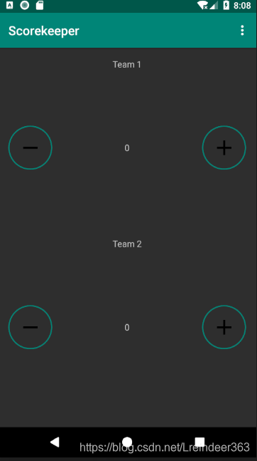


 扫一扫
扫一扫


 6110
6110

 被折叠的 条评论
为什么被折叠?
被折叠的 条评论
为什么被折叠?
 到【灌水乐园】发言


