


 本文详细介绍了Flex布局中的容器属性,包括主轴方向flex-direction、换行方式flex-wrap、简化写法flex-flow、主轴对齐justify-content及交叉轴对齐align-items,并通过实例展示了不同属性值的效果。
flex布局
display: flex 容器有六种属性
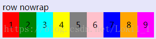
一、flex-direction 主轴方向 row水平左 row-reverse水平右 column垂直上 columen-reverse垂直下(4个属性值)
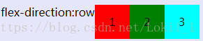
- flex-direction: row 默认主轴水平方向,左侧为起点
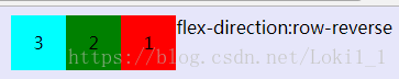
- flex-direction:row-reverse 默认主轴水平方向,右侧为起点
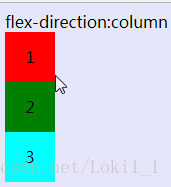
- flex-direction:column 主轴为垂直方向,起点在上
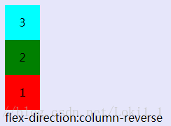
- flex-direction:column-reverse 主轴为垂直方向,起点在下
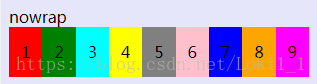
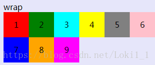
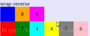
二、flex-wrap 一条轴线挤不开,如何换行 nowrap默认不换,wrap正换, wrap-reverse倒换 3个属性
<span>wrap</span>
<div class="box">
<div class="item red">1</div>
<div class="item green">2</div>
<div class="item aqua">3</div>
<div class="item yellow">4</div>
<div class="item gray">5</div>
<div class="item pink">6</div>
<div class="item blue">7</div>
<div class="item orange">8</div>
<div class="item Fuchsia">9</div>
</div>
<style>------------------css样色,其他颜色自定义
body {
background-color: #E6E6FA;
}
.box {
width: 300px;
display: flex;
flex-wrap: {{wrap}};
}
.item {
width: 50px;
height: 50px;
line-height: 50px;
text-align: center;
}
</style>
- flex-wrap: nowrap 默认 不换行 里面的盒子自适应
- flex-wrap:wrap 换行,按正序排列
- flex-wrap:wrap-reverse 换行,倒序排列
三、flex-flow 是flex-direction 和 flex-wrap的简写形式。 默认是row nowrap 解释为 主轴为水平方向,左侧为起点,不换行。
四、justify-content 主轴上的对齐方式 (5个属性)
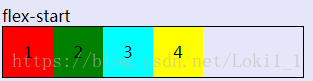
- justify-content: flex-start 左对齐
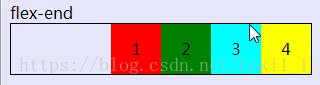
- justify-content: flex-end 右对齐
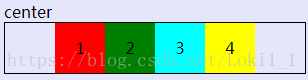
- justify-content: center; 居中
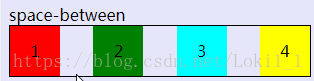
- justify-content: space-between 两端对齐中间等距
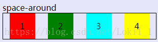
- justify-content: space-around 两侧距离是每项间距的一半
五:align-item 交叉轴上的对齐 5个属性 假设交叉轴从上到下
flex-start | flex-end | center | baseline | stretch
.box {
width: 300px;
border:1px solid black;
display: flex;
flex-direction: column;
align-items:flex-start;
}
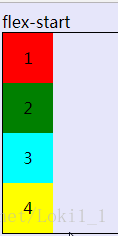
- align-item: flex-start 交叉轴的起点
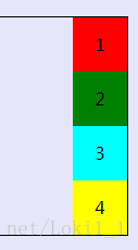
- align-item:flex-end 交叉轴的终点对齐
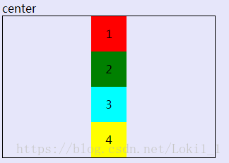
- align-item: center 居中


 扫一扫
扫一扫


 582
582

 被折叠的 条评论
为什么被折叠?
被折叠的 条评论
为什么被折叠?
 到【灌水乐园】发言


