


The assumption behind this chapter is that the reader is familiar with basic chart types such as bar, line graph, treemap, pie, and area. The focus will be on the middle ground, with the intent of relating how to improve visualization types you may already use on a regular basis, as well as introducing chart types with which you may be unfamiliar, but that are, nonetheless, widely useful. And, finally, I will introduce you to Tableau extensions, which offer some more exotic奇异的 chart types.
Perhaps the most useful part of this chapter is actually not contained in the book at all, but rather in the workbook associated with the chapter. Be sure to download that workbook (the link is provided in the following section) to check out a wider range of visualization types.
This chapter will explore the following visualization types and topics:
- • Improving popular visualizations
- • Custom background images
- • Tableau extensions
Keep in mind that the content of your dashboard is the most important thing, but if you can have the same content with a nicer design, go for the nicer design. Marketing sells and will make your users happy; I hope the next sections will help you find your path and eventually make you a better dashboard designer.
Improving popular visualizations
Most popular visualizations are popular for good reason. Basic bar charts and line graphs are familiar, intuitive, and flexible and are thus widely used in data visualization. Other, less basic visualizations such as bullet graphs and Pareto charts may not be something you use every day but are nonetheless useful additions to a data analyst's toolbox. In this section, we will explore ideas for how to tweak, extend, and even overhaul a few popular chart types.
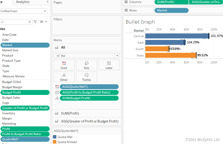
Bullet graphs
The following steps are meant to teach you the basics of a bullet graph:
- 1. Navigate to https://public.tableau.com/app/profile/marleen.meier to locate and download the workbook associated with this chapter.
- 2. Navigate to the worksheet entitled Bullet Graph and select the CoffeeChain data source.
- 3. Place these fields on their respective shelves: Profit on Columns, Market on Rows, and BudgetProfit on Detail in the Marks card.
- 4. Right-click on the x axis(Profit axis) and select Add Reference Line.
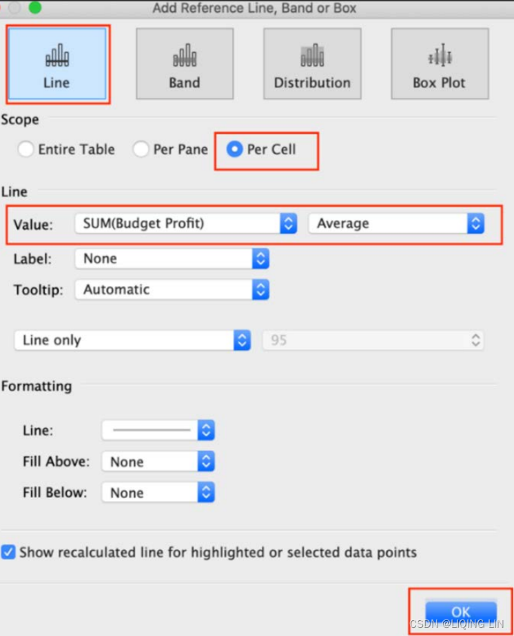
- 5. From the upper left-hand corner of the Edit Reference Line, Band or Box dialog box, select Line. Also, set Scope to Per Cell, Value to SUM(Budget Profit) as Average, and Label to None. Click OK:
- 6. Let's add another reference line. This time, as an alternative method, click on the Analytics pane and drag Reference Line onto your canvas. (You could obviously repeat the method in Step 4 instead.)

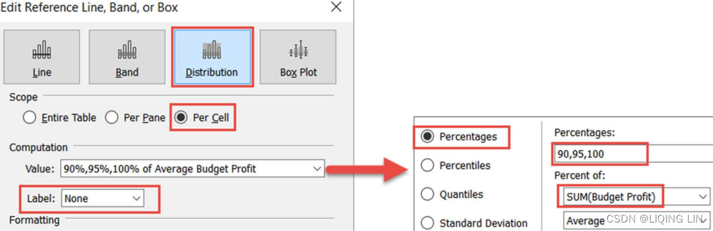
- 7. Within the dialog box, select Distribution and set Scope to Per Cell. Under Computation, set Value to Percentages with 90,95,100 and Percent of to SUM(Budget Profit). Set Label to None. Click OK:
- 8. Create a calculated field called Profit to Budget Profit Ratio with the following code:
SUM([Profit])/SUM([Budget Profit])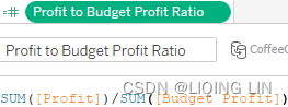
- 9. Create another calculated field called Quota Met? with the following code:
SUM([Profit])>=SUM([Budget Profit])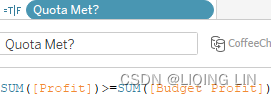
- 10. Right-click on Profit to Budget Profit Ratio and select Default Properties | Number Format... | Percentage.
- 11. Place Profit to Budget Profit Ratio on the Label shelf in the Marks card and Quota Met? on the Color shelf in the Marks card:
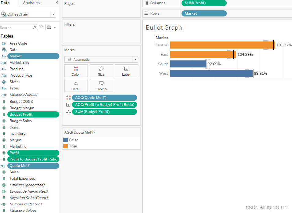
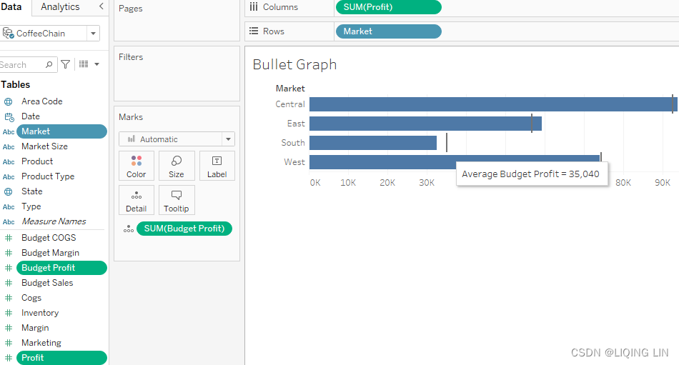
As you survey our results thus far, you will notice that there are some important aspects to this visualization. For example, the reference lines and the colored bars clearly delineate[dɪˈlɪnieɪt]标明,标示 when a quota was met and missed. Furthermore, the percentages communicate how close the actual profit was to the budgeted profit for each market. However, there are also some problems to address:
- 1• The percentage associated with the South market is partially obscured.
- 2• The background colors represented by the reference distribution are obscured.
- 3• The colors of the bars are not intuitive. Orange is set to True, which signifies象征, in this case, the markets that made the quota. However, psychologically speaking, orange is a warning color used to communicate problems and therefore would be more intuitively associated with those markets that failed to make the quota. Furthermore, these colors are not easily distinguishable when presented in grayscale.
- 4• The words False and True in the legend are not immediately intuitive.
In the upcoming steps, we will address those issues and show you possible solutions.
Bullet graphs – beyond the basics
To address the problems with the graph in the previous section, take the following steps:
- 1. Continuing from the previous exercise, access the Data pane on the left-hand portion of the screen, right-click on Quota Met?, and adjust the calculation as follows:
IF SUM([Profit]) >= SUM([Budget Profit])
    THEN 'Quota Met'
ELSE
    'Quota Missed'
END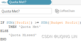
- 2. This calculation will create
- the string Quota Met if the profit is >= the budgeted profit
- or the string Quota Missed if the profit isn't higher than(<) the budgeted profit.
- These two strings can be used as a legend and are more intuitive than the previous True and False.
(problem 4 solved: the words False and True in the legend have been replaced with the more descriptive terms Quota Met and Quota Missed.)
- 3. Create a calculated field named Greater of Profit or Budget Profit with the following code:
IF SUM([Profit]) > SUM([Budget Profit])
    THEN SUM([Profit])
ELSE
    SUM([Budget Profit])
END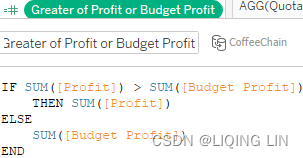
This calculation will show- the profit amount if it is more than the budgeted amount,
- or the budgeted amount if the profit is smaller.
- This will help us to always show the bigger amount of the two.
- 4. Place Greater of Profit or Budget Profit on the Columns shelf after Profit.
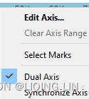
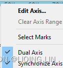
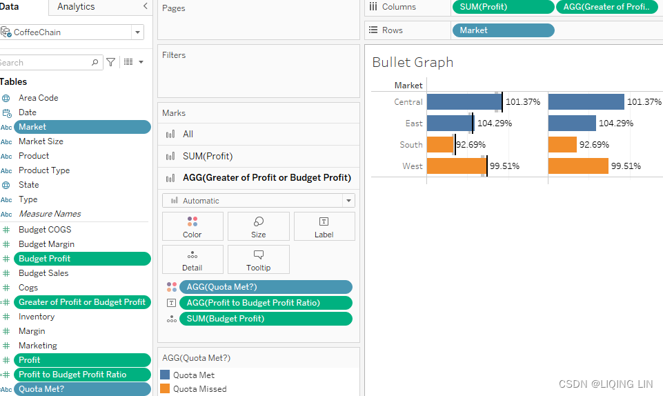 Also, right-click on the pill and select Dual Axis.
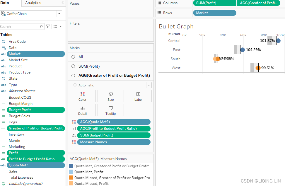
- 5. Right-click on the axis for Greater of Profit or Budget Profit and select Synchronize Axis.
 ==>
==>
- 6. Within the Marks card, select the pane labeled All:
- 7. Set the mark type to Bar.
- 8. Remove Measure Names from the Color shelf.
- 7. Set the mark type to Bar.
- 9. Within the Marks card, select the pane labeled AGG(Greater of Profit or Budget Profit).
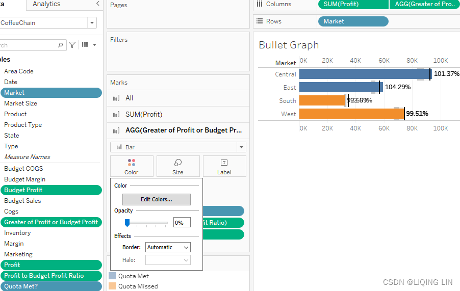
- 10. Click on the Color shelf and set Opacity to 0%.
- 11. Within the Marks card, select the pane labeled SUM(Profit).
- 12. Remove AGG(Profit to Budget Profit Ratio) from the Marks card and note that the percentage labels are no longer obscured.
(problem 1 solved: The percentage numbers are no longer obscured.)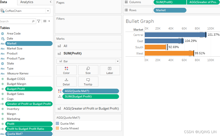
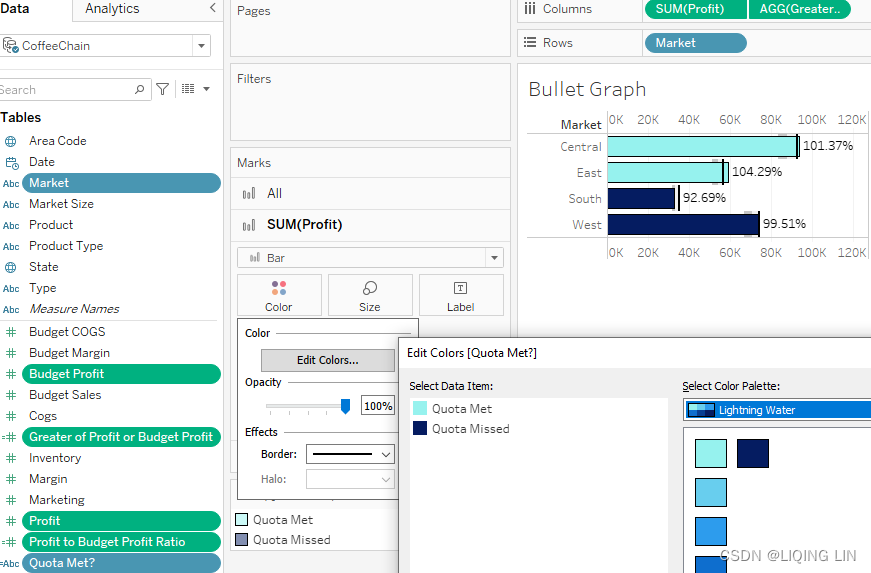
- 13. Click on the Color shelf and select Edit Colors. Within the resulting dialog
box, complete the following steps:- 1. Double-click on Quota Met and set the color to Light Teal
- 2. Double-click on Quota Missed and set the color to Dark Blue
-
14. After you have clicked OK for each dialog box and returned to the main screen, once again click on the Color shelf and select black for Border.
-
15. Click on the Size shelf to narrow the width of the bars by dragging the slider to the left.(The background colors are easier to distinguish due to having narrowed the
bars.)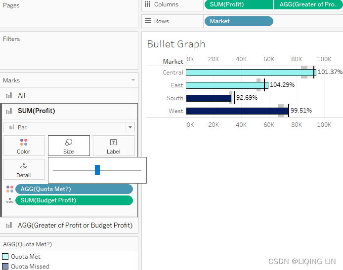
- 12. Remove AGG(Profit to Budget Profit Ratio) from the Marks card and note that the percentage labels are no longer obscured.
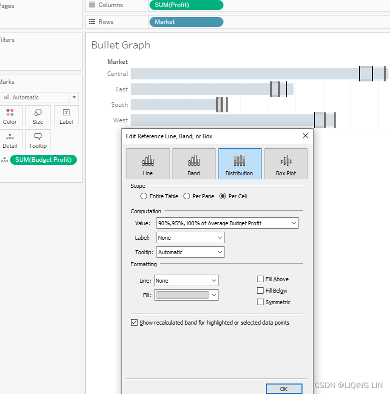
- 16. Right-click on the Profit axis(bottom) and select Edit Reference Line. Then set Value to 90%,95%,100% of Average Budget Profit:
17. Moving down to the Formatting section, set the fill color to Grey. Click the Fill Below checkbox and the Reverse checkbox. Note that the background colors are now more easily distinguishable(Problem 2):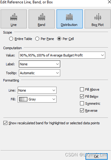

18. Right-click on the axis(Top) labeled Greater of Profit or Budget Profit and deselect Show Header. You may wish to make some additional tweaks.
Note that each of the aforementioned problems has now been addressed:
- • The percentage numbers are no longer obscured.(Use 2 columns)
- • The background colors are easier to distinguish due to having narrowed the bars(size, bar border, reference line distribution : fill below, reverse).
- • The color of the bars is more intuitive. Furthermore, using black(or dark color), white(light color), and gray has circumvented any readability problems arising from color blindness or grayscale print.
- • The words False and True in the legend have been replaced with the more descriptive terms Quota Met and Quota Missed.
By completing this section, you will have learned how small or bigger tweaks can improve your visualization and the type of graph you chose. You can do this whenever the current choices you have made do not tell the full story yet. In addition to that, it is also a selling point. Your users like a nice design and clear dashboards. By improving your visualization with more advanced techniques, you will be able to improve your storytelling and marketing.
In the next section, we will continue to add complexity to known visualizations. This time we will create pie and donut charts and eventually combine the two.
Pies and donuts
Pie charts are normally frowned upon in data visualization circles. They simply have too many drawbacks. For instance, pie charts don't utilize space well on a rectangular screen. Treemaps fit much better. Also, the number of slices that are reasonable on a pie chart is fairly limited, perhaps six to eight at best. Once again, treemaps are superior because they can be sliced at a finer level of granularity while remaining useful. Lastly, when using pie charts it can be difficult to discern which of two similarly sized slices is largest. Treemaps are no better in this regard; however, if the viewer understands that treemap sorting is from top left to bottom right, that knowledge can be used to distinguish size differences. Of course, bar charts circumvent[ˌsɜːrkəmˈvent]规避,回避 that particular problem entirely, since the eye can easily distinguish widths and heights but struggles with angles (pie charts) and volume (treemaps).
Despite these drawbacks, because of their popularity, pie charts will likely continue to be widely used in data visualization for years to come. For the pessimistic Tableau author, the best course of action is to grin and bear it. But for one willing to explore and push frontier boundaries, good uses for pie charts can be discovered. The following exercise is one contribution to that exploration.
Pies and donuts on maps
Occasionally, there is a need (or perceived need) to construct pie charts atop[əˈtɑːp]在……上面 a map. The process is not difficult (as you will see in the following exercise), but there are some shortcomings that cannot be easily overcome. We will discuss those shortcomings after the exercise.
The following are the steps:
- 1. Within the workbook associated with this chapter, navigate to the worksheet entitled Pie Map and select the Superstore data source.
- 2. In the Data pane, double-click on State to create a map of the United States.
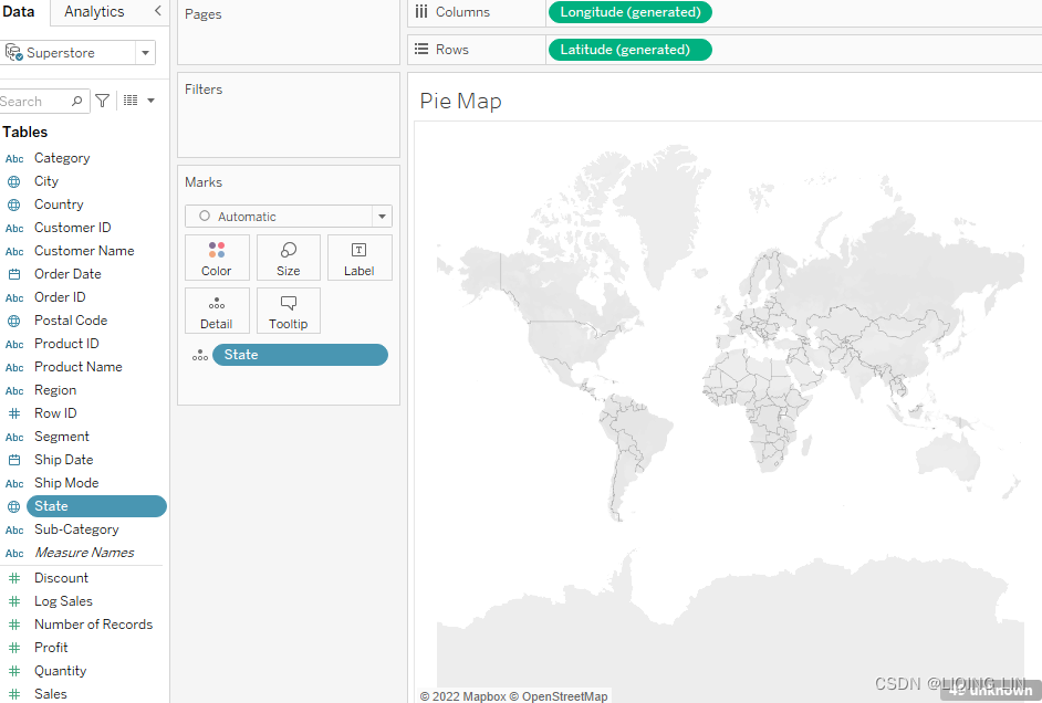
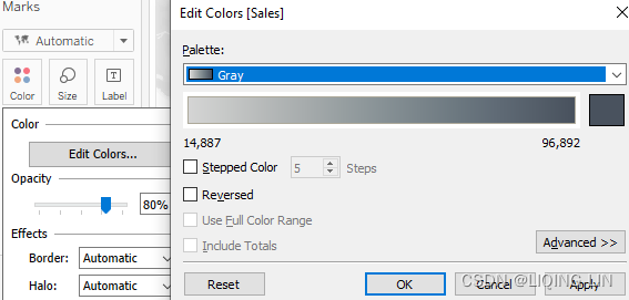
- 3. Place Sales on the Color shelf. Click on the Color shelf and change the palette to Grey(Gray):
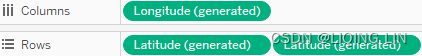
- 4. Drag an additional copy of Latitude (generated) on the Rows shelf by holding Ctrl for Windows and Command for Mac and simultaneously dragging the pile to create two rows, each of which displays a map:
- 5. In the Marks card, you will notice that there are now three panes: All, Latitude (generated), and Latitude (generated) (2).
Click on Latitude (generated) (2) and set the mark type to Pie: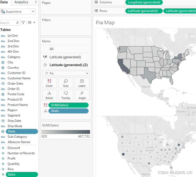
- 6. Place Category on the Color shelf and Sales on the Size shelf.
- 7. Right-click on the 2nd instance of Latitude (generated) in the Rows shelf
and select Dual Axis:
Can you see issues in the visualization? Two should be immediately apparent:
- • First, the smaller pies are difficult to see. Clicking on the drop-down menu for the Size legend and selecting Edit Sizes could partially address this problem, but pies on smaller states such as Rhode Island will continue to be problematic.
- • Second, many states have the same light-gray background despite widely varying sales amounts.
The following approach will address these issues while adding additional functionality.
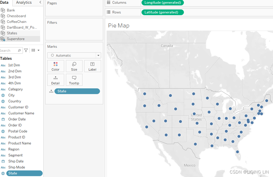
Pies and donuts – beyond the basics
The following are the steps required to create a pie and donut chart on top of a map. By combining the different methods, we will be able to show more information at once without overloading the view:
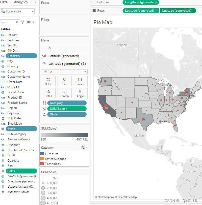
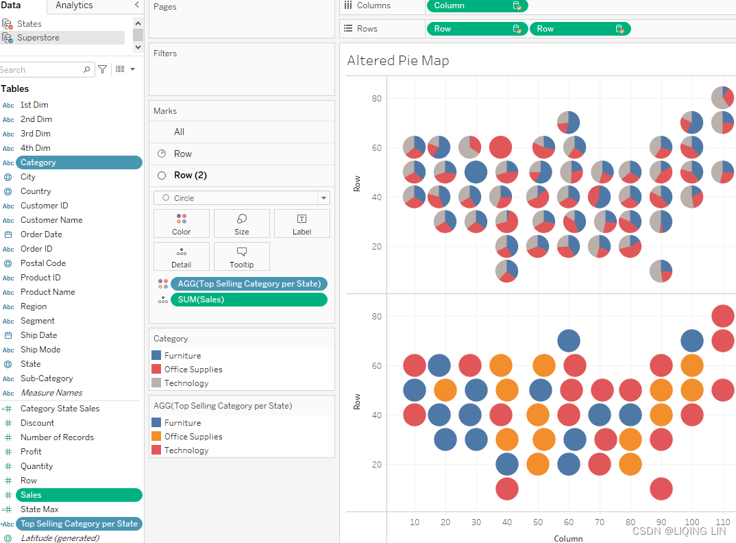
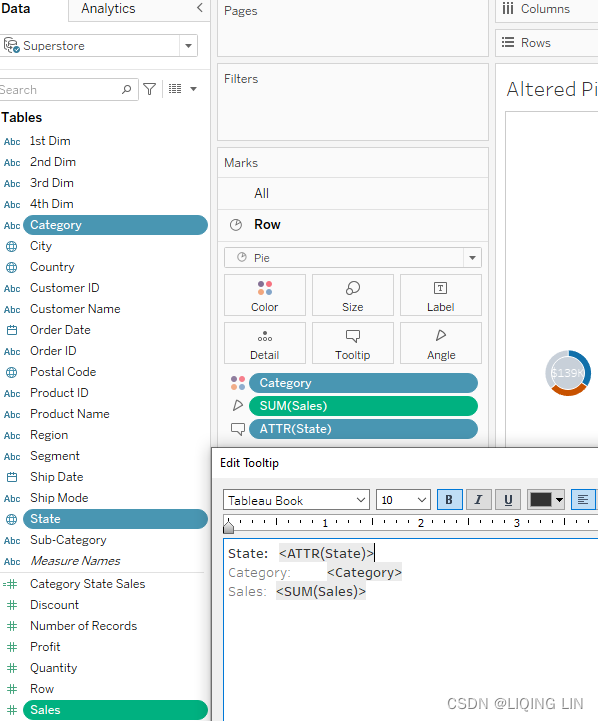
- 1. Within the workbook associated with this chapter, navigate to the worksheet entitled Altered Pie Map and select the Superstore data source.
- 2. Create the following calculated fields:
- Category State Sales
{ FIXED State, Category: SUM(Sales) }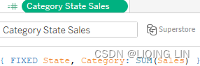 the sales per category in each state
 - State Max
{ FIXED State : MAX([Category State Sales]) }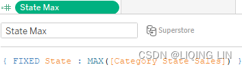
- Top Selling Category per State
MAX(
    If [State Max] = [Category State Sales]
        then Category
    END
)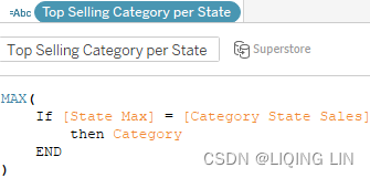
- Category State Sales
- 3. We need those first two Level of Detail (LOD) calculations and the last calculation in order to show the sales per category, while also showing the best-selling category per state.
- 4. Within the Marks card, set the mark type to Pie.
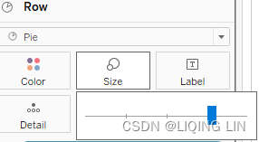
- 5. From the Superstore data source, place Category on the Color shelf and Sales on the Angle shelf.
 ==>
==>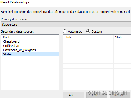
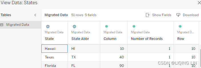
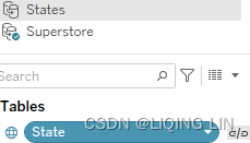
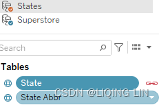
- 6. Within the Data pane, select the States data source.
- 7. Click the chain link next to State in the Data pane in order to use State as a blended field:
 ==>
==>
- 8. Drag Column (Dimension
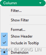 ) to the Columns shelf and Row (Dimension) to the Rows shelf.
 - 9. Click on the Size shelf and adjust the size as desired.
- 7. Click the chain link next to State in the Data pane in order to use State as a blended field:
- 10. At this point, you should see a rough map of the United States made up of pie charts. Next, we will further enhance the graphic by changing the pies into donuts:
- 11. Return to the States data source and place another instance of Row (dimension) on the Rows shelf.
- 12. In the Marks card, select Row (2) and change the view type to Circle.
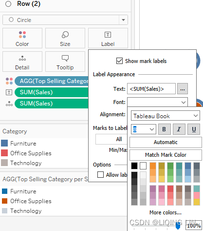
- 13. From the Superstore dataset, place Top Selling Category per State on the Color shelf:
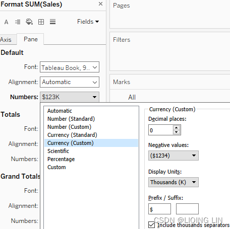
- 14. Place Sales on the Label shelf. Right-click on the instance of Sales you just placed on the Label shelf and select Format. Make the following adjustments in the Format window:
- 1. Set the Numbers formatting to Currency (Custom) with 0 decimal places and Display Units set to Thousands (K):
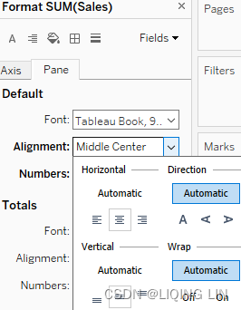
- 2. Set Alignment to Middle Center (Vertical Horizontal) as shown in the following screenshot, so that the numbers are centered over the circles:
- 1. Set the Numbers formatting to Currency (Custom) with 0 decimal places and Display Units set to Thousands (K):
-
15. In the Rows shelf, right-click on the 2nd instance of Row and select Dual Axis.
-
16. Right-click on an instance of the Row axis and select Synchronize Axis.
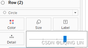
- 17. Within the Row (2) instance on the Marks card, make sure that Size exceeds the Size of the Row instance in the Marks card in order to show the pie chart as an outer ring.
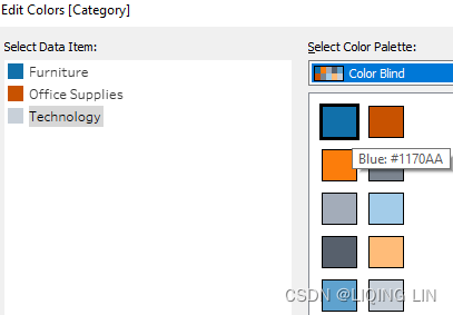
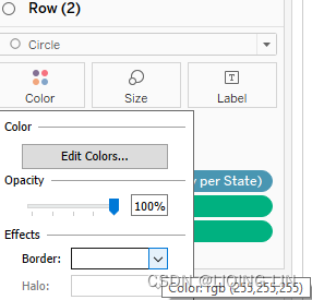
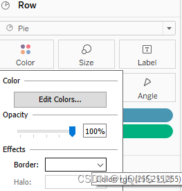
- 18. Within the Row (2) and Row instances of the Marks card, click on the Color shelf and select Edit Colors. Adjust the color settings as desired so that the color of the overlaying circle (the hole of the donut) can be distinguished from the underlying colors and yet continues to recognize which Category sold best. I selected the following:
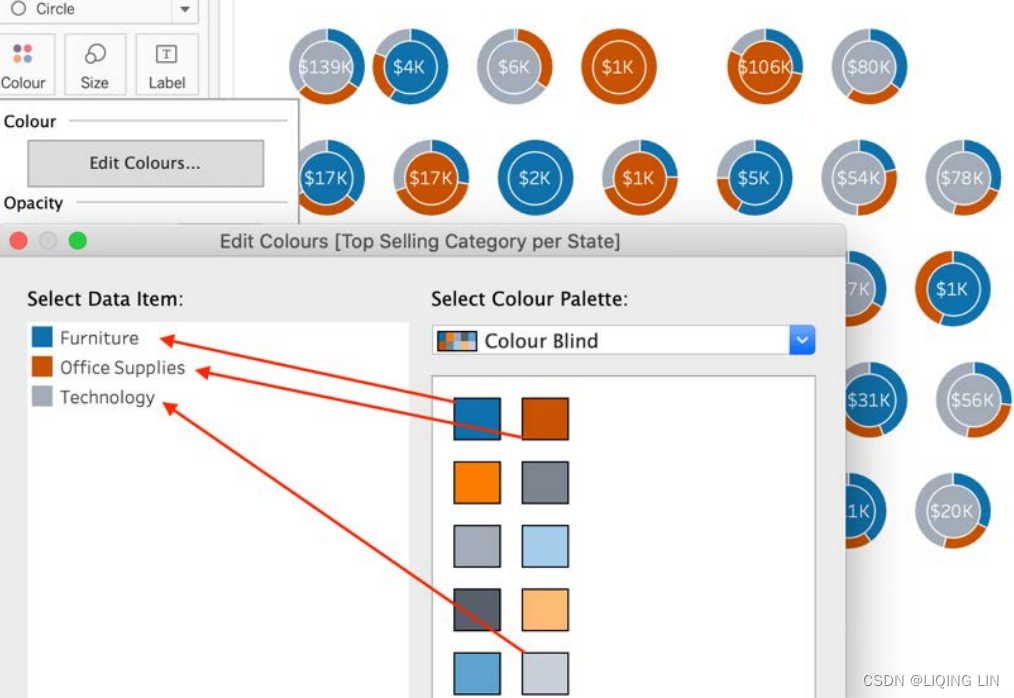
- 19. Also within the Color shelf, set Border to the desired color. I used white. I also used white as the color for Label.
- 20. select Row panel on the Marks Card, drag the State to the Tooltip and then Edit Tooltip
 select Row(2) panel on the Marks Card, drag the State to the Tooltip and then Edit Tooltip
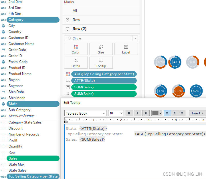
- 21. Right-click on each axis and deselect Show Header. Select Format menu | Lines and set Grid Lines to None. Make other formatting changes as desired:
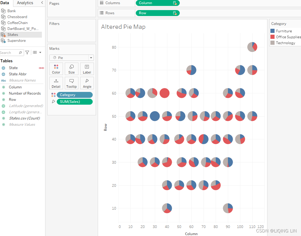
 At first glance, the visualization may look peculiar. It's called a tile grid map and although it's fairly new to the data visualization scene, it has begun to see usage at media outlets such as NPR. In the right setting, a tile grid map can be advantageous. Let's consider a couple of advantages the preceding exercise gives us.
First, the grid layout in combination with the Log Sales calculated field creates a map immediately evident as of the United States, while ensuring that the sizing of the various pie charts changes only moderately from greatest to least. Thus, each slice of each pie is reasonably visible; for example, the district of Columbia sales are as easily visible as California sales.
Second, the end user can clearly see the top-selling category for each state via the color of the inner circle (that is, the hole of the donut). This was accomplished with the LOD calculations. Thanks to the LOD, we were able to differentiate the best-selling category from the other two. Since all three categories live in the same column, you need to use an LOD calculation. You can refer to https://blog.youkuaiyun.com/Linli522362242/article/details/124730062, Level of Detail Calculations, for more details on LOD calculations. The end result is an information-dense visualization that uses pie charts in a practical, intuitive manner.
This section demonstrated some more creative approaches to show data from different angles in the same visualization. Next, we will continue to discuss another advanced visualization, Pareto charts.
Pareto charts帕累托图
Using Pareto charts
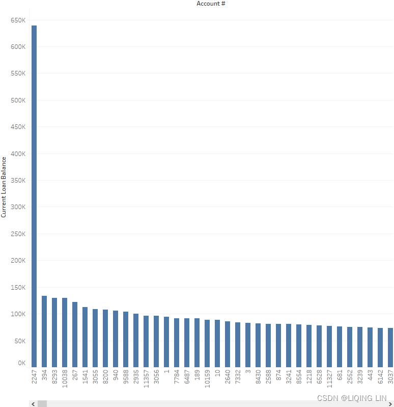
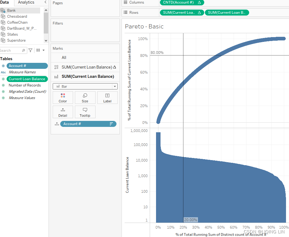
Of course, not every dataset is going to adhere to the 80/20 rule. Accordingly, the following exercise considers loan data from a community bank where 80% of the loan balance is not held by 20% of the bank's customers. Nonetheless, a Pareto chart can still be a very helpful analytical tool.
Take the following steps:
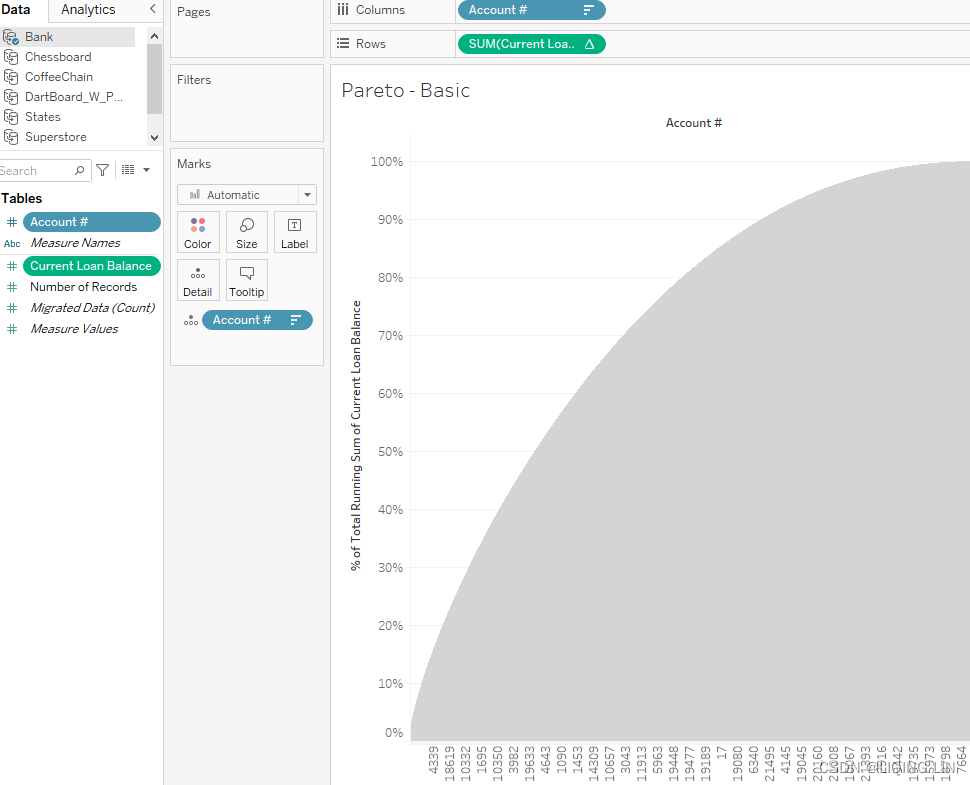
- 1. Within the workbook associated with this chapter, navigate to the worksheet entitled Pareto - Basic and select the Bank data source.
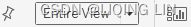
- 2. In the Data pane, change Account # to Dimension. Place Account # on the Columns shelf and Current Loan Balance on the Rows shelf.
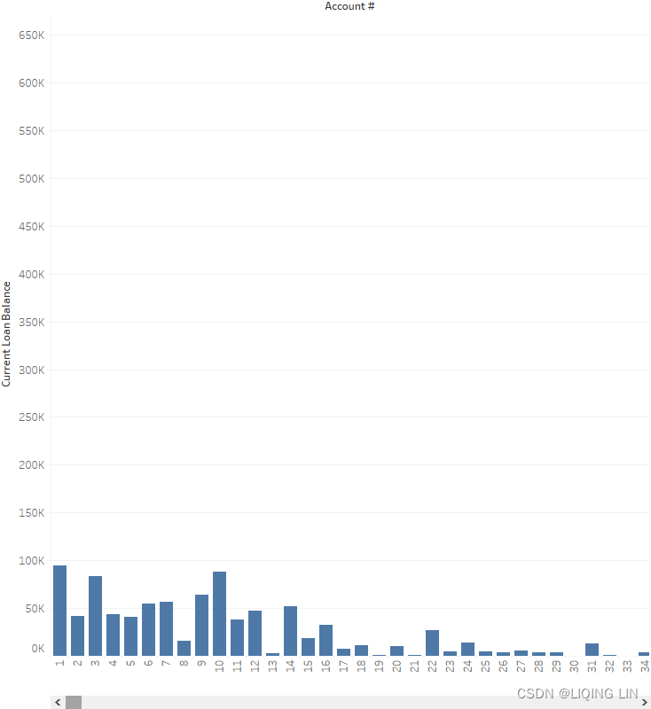
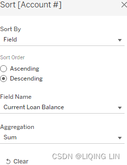
- 3. Right-click on the Account # pill and select Sort. Set Sort By to Field, Sort Order to Descending, Field Name to Current Loan Balance, and Aggregation to Sum:
-
4. Click on the Fit drop-down menu and choose Entire View.
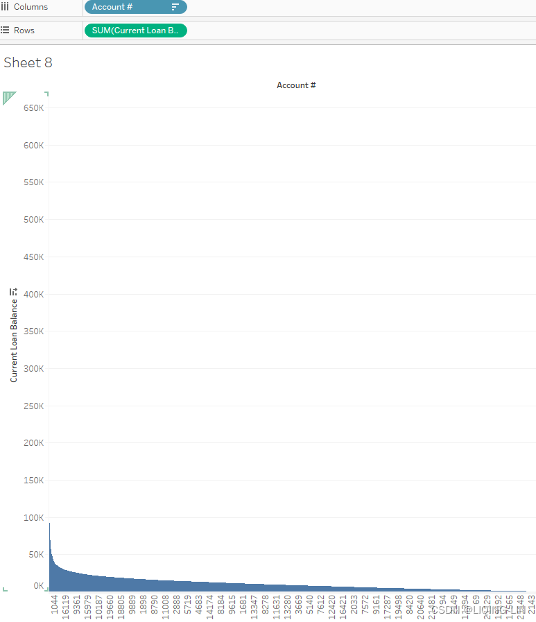
- 5. Right-click on SUM(Current Loan Balance) located on the Rows shelf and select Add Table Calculation. Choose the settings as shown in the following screenshot:
% of Total Running Sum of Current Loan Balance
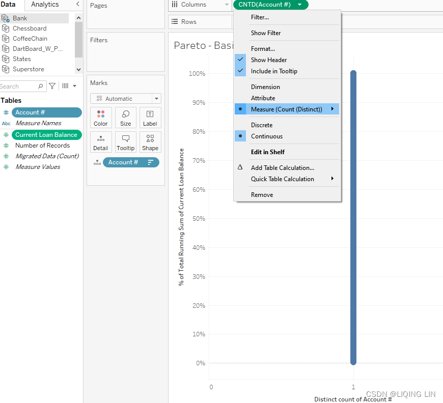
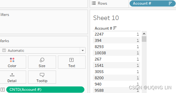
- 6. Drag an instance of Account # to the Detail shelf.
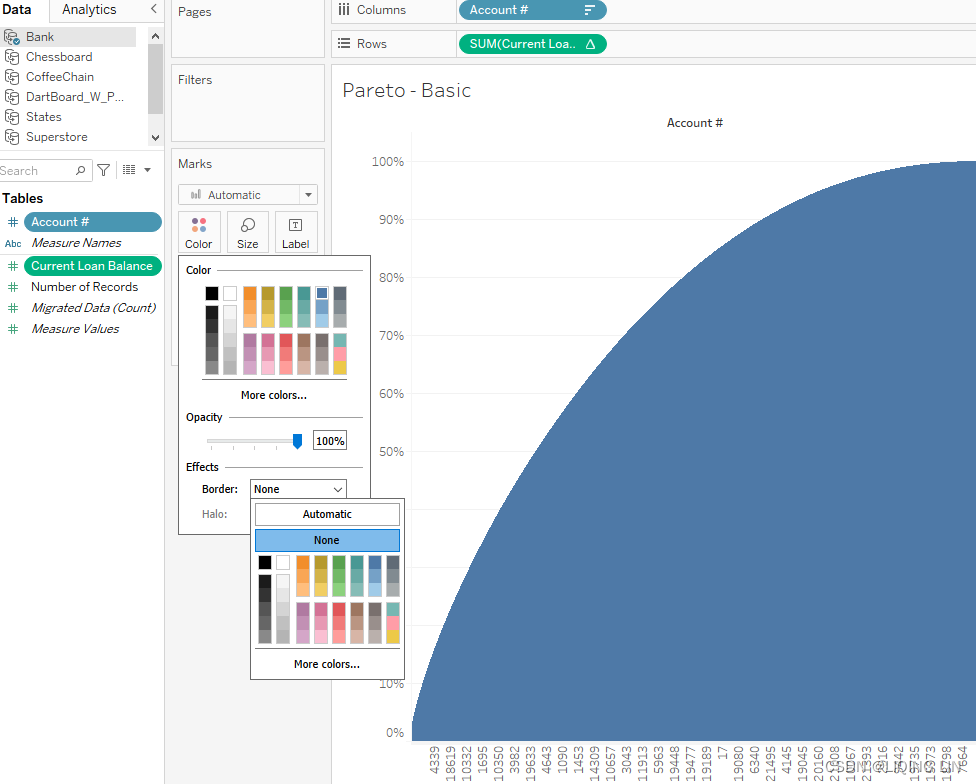
- 7. Click on the Color shelf and set Border to None.
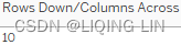
 Previously, addressing along a unique Account#, then we can accumulate the current number of accounts along horizontal axis
 - 8. Right-click on the instance of Account # that is on the Columns shelf and select Measure | Count (Distinct). Note that a single vertical line displays:
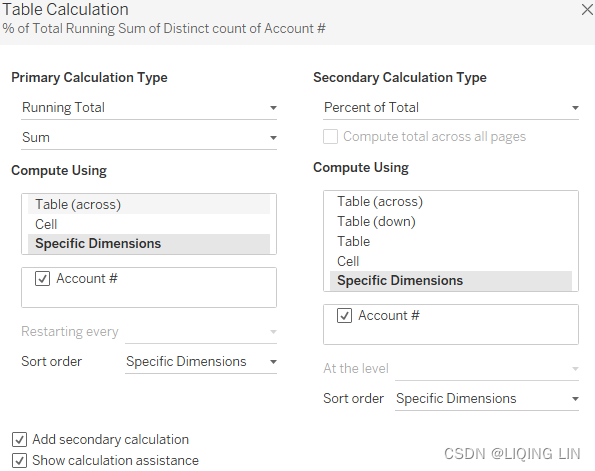
- 9. Once again, right-click on the instance of CNTD(Account #) on the Columns shelf and select Add Table Calculation. Configure the settings as shown in the following screenshot:
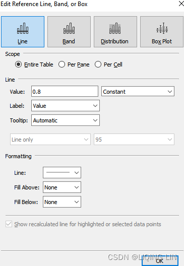
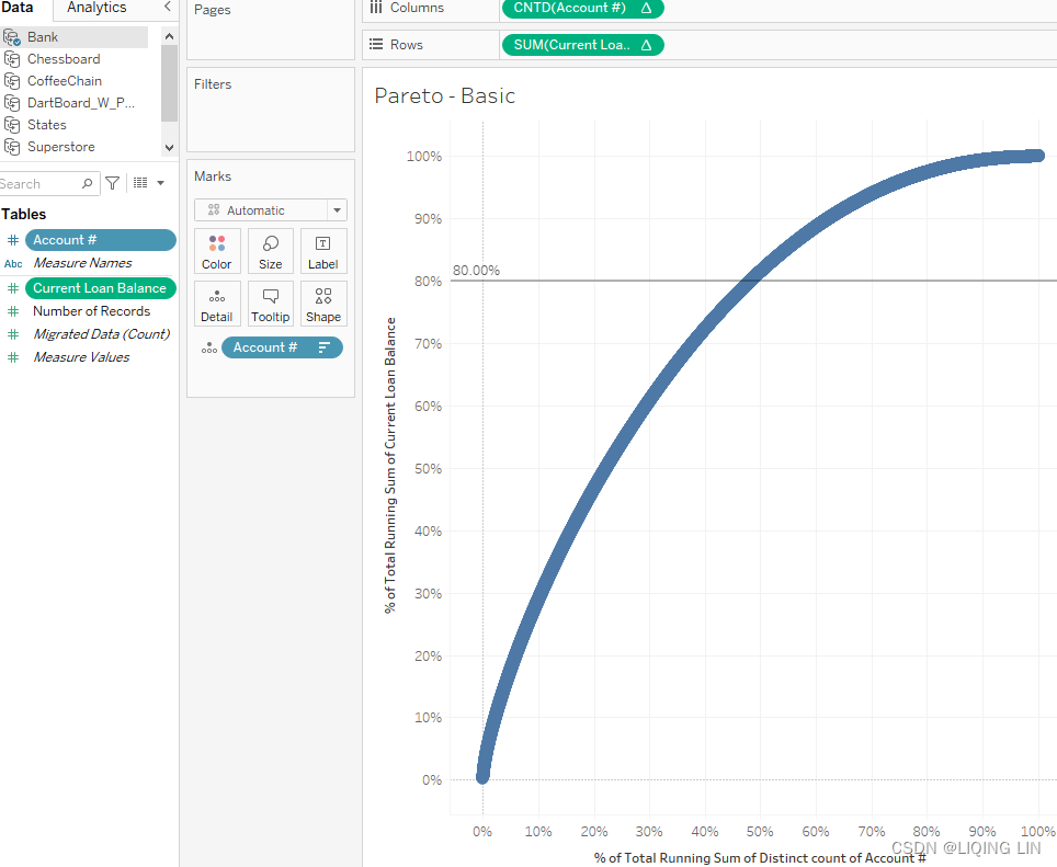
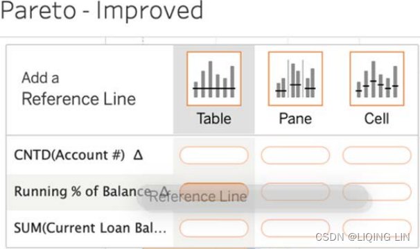
- 10. Click the Analytics tab in the upper left-hand corner of the screen and perform the following two steps:
- 1. Drag Constant Line to Table | SUM(Current Loan Balance)

right click the horizontal line(0.29%) then select Edit... - 2. In the resulting dialog box, select Constant and set Value to 0.8 as shown in the following screenshot:
- 1. Drag Constant Line to Table | SUM(Current Loan Balance)
- 11. Repeat the previous step with the following differences:
- 1. Drag Constant Line to Table | CNTD(Account #)

right click the vertical line(0.00%) then select Edit... - 2. In the resulting dialog box, select Constant and set Value to 0.2
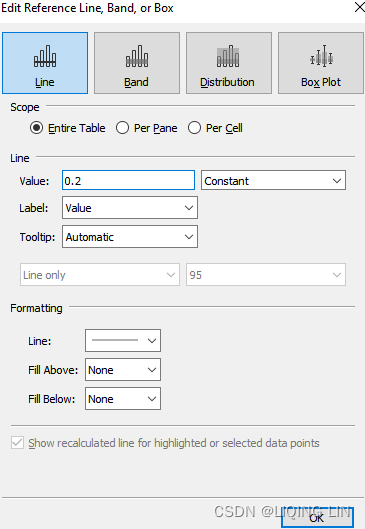
- 1. Drag Constant Line to Table | CNTD(Account #)
- 12. Drag Current Loan Balance to the Rows shelf. Place it to the right of the SUM(Current Loan Balance) Δ that is currently on the Rows shelf. Note that the axis is affected by a single loan with a much larger balance than the other loans:
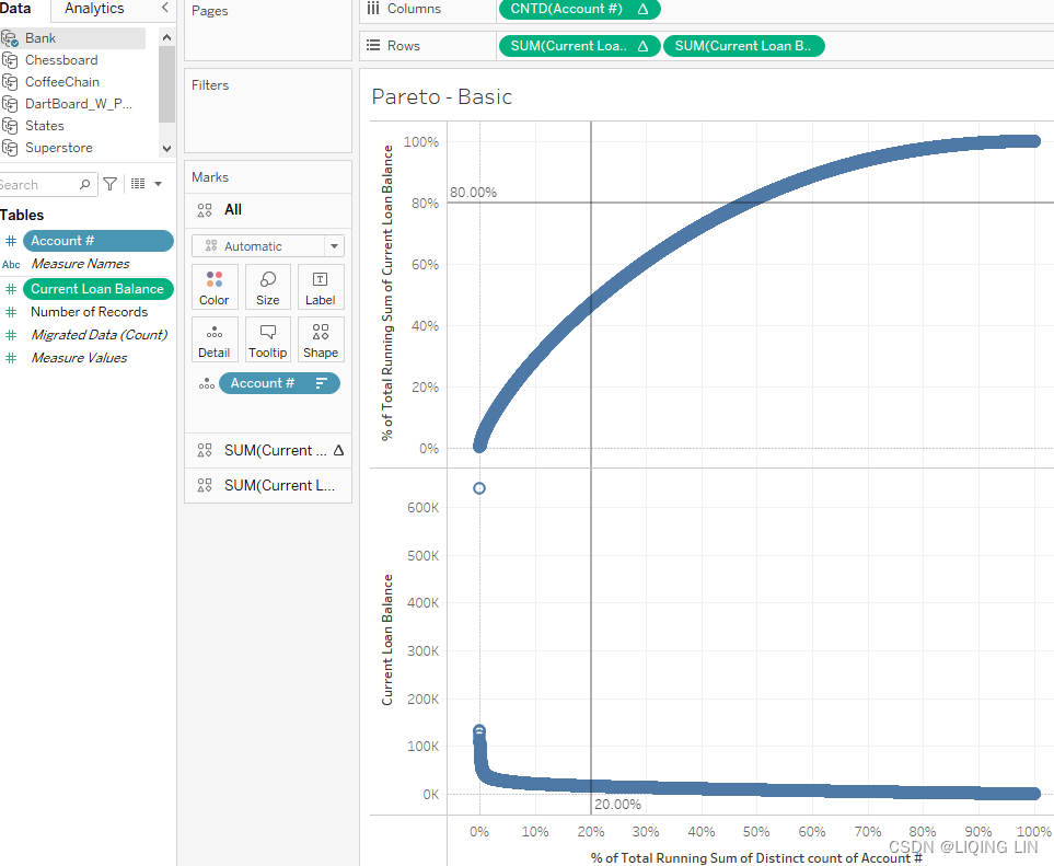
- 13. Right-click on the Current Loan Balance axis and select Edit Axis. In the resulting dialog box, set Scale to Logarithmic and close the window.
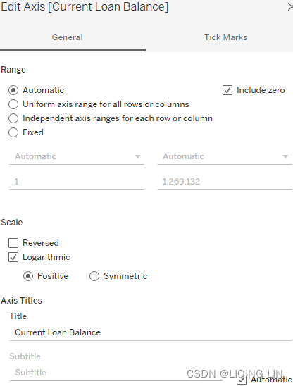
This addresses the problem of the single large loan affecting the axis and thus obscuring the view of the other loans.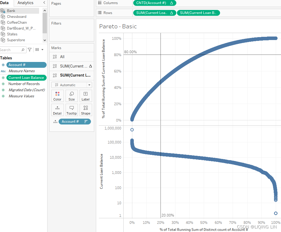
- 14. Within the Marks card, select the 2nd instance of SUM(Current Loan Balance) and set the mark type to Bar:
- 15. Right-click on SUM(Current Loan Balance) on the Rows shelf and select Dual Axis.
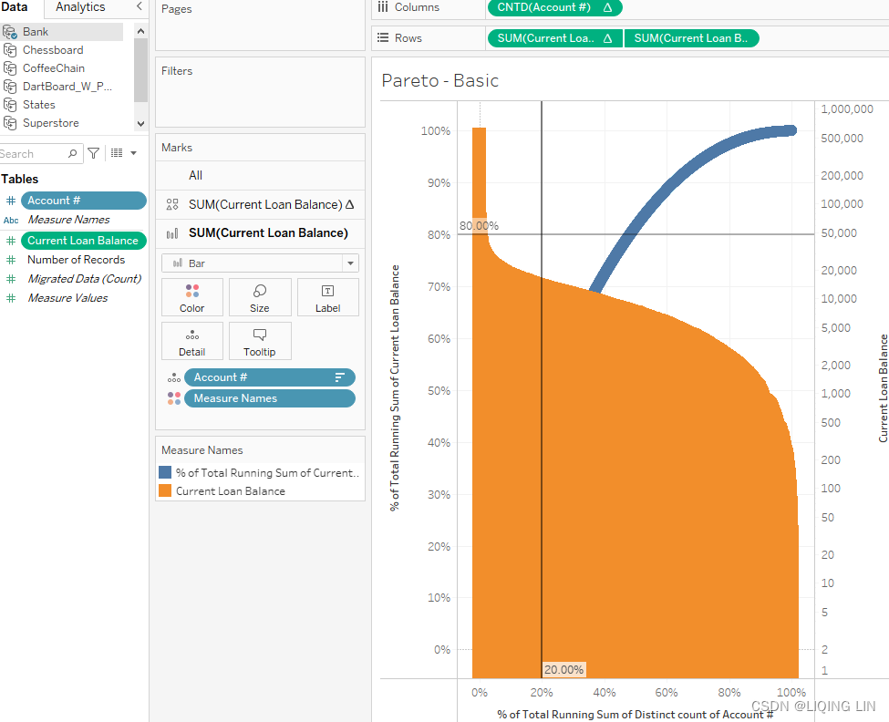
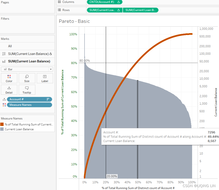
- 16. Right-click on the % of Total Running Sum of Current Loan Balance axis and select Move Marks Card to Front. Change the colors, tooltips, and formatting as desired:
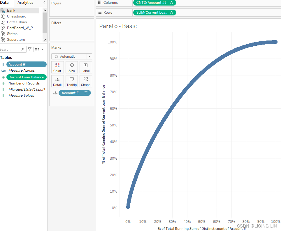
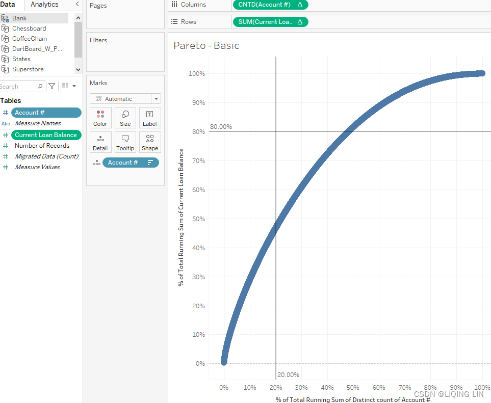
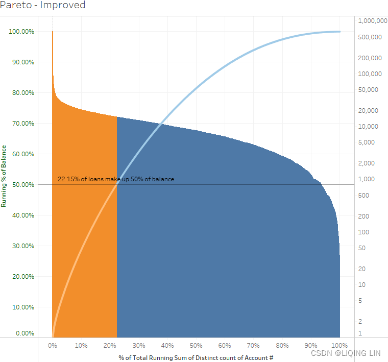
There are positive aspects of this visualization to consider. First, the end user can quickly gain an initial understanding simply by observing both portions of the graph in conjunction with the values on the axes.
- The y axis on the left, for example, shows the percentage of each current loan in regard to the total amount of current loans, presented in a running sum(accumulation) such that we end up at 100%.
- The y axis on the right side shows the amount of those same loans(from right to left : from the largest to the smallest).
- The x axis simply presents us with the unique account IDs or numbers. We can see that in this example, 20% of the accounts hold almost 45% of the loans and around 50% of the accounts hold 80% of the loans. Those are the two cross points of the red line and the two reference lines.
- Furthermore, the end user can hover the cursor over any part of the curve and see the resulting tooltip.
However, there are a number of ways this visualization could be improved. For example, adding parameters to the two reference lines and rewording the axis labels to be less verbose would be quick ways to add additional value. Therefore, in the next exercise, we'll see if we can go a little beyond the current visualization.
Pareto charts – beyond the basics
In the previous exercise, we had to take a closer look in order to figure out what percentage of accounts account for how many of the loans. The following steps will show us how to create a parameter in order to make it easier for us to spot the intersection:
- 1. Duplicate the sheet from the previous exercise and name the duplicate Pareto - Improved.
- 2. Remove both reference lines by selecting them and dragging them out of the dashboard.
- 3. Drag SUM(Current Loan Balance) Δ (the table calculation) from the Rows shelf to the Data pane. When prompted, name the field Running % of Balance.
RUNNING_SUM( SUM([Current Loan Balance]) ) / TOTAL( SUM([Current Loan Balance]) )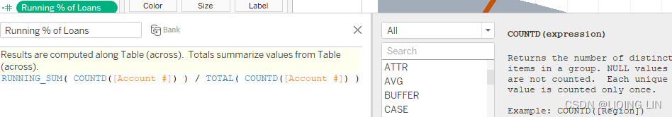
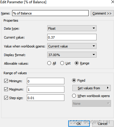
- 4. Create and display a parameter with the following settings. This parameter % of Balance will allow us to set any given value between 0 and 100% and we will be able to see that area on the Pareto viz in color:
- 5. Right-click on the newly created parameter and select Show Parameter.
- 6. Create the following calculated fields:
- Running % of Loans : Accumulated Account Number / Total Account Number
//         (                                                    )
RUNNING_SUM( COUNTD([Account #]) / TOTAL( COUNTD([Account #]) ) )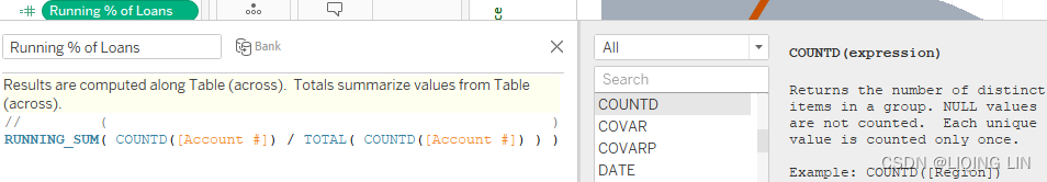
- Pareto Split
IF [Running % of Balance] < [% of Balance]
    THEN "Makes up X% of Balance"
ELSE
    "Makes up rest of Balance"
END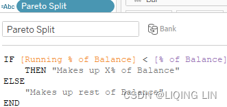
- Pareto Split (label):Note (start position=1, length=5)
//Running % of Loans : Accumulated Account Number / Total Account Number
IF LOOKUP([Pareto Split], -1) != LOOKUP([Pareto Split], 0)
    THEN MID( STR([Running % of Loans] * 100), 1, 5 )
         + "% of loans make up "
         + MID( STR([% of Balance] * 100), 1, 5 )
         + "% of balance"
END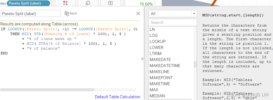

- Running % of Loans : Accumulated Account Number / Total Account Number
- 7. The configuration that will result in the coloring of a selected area on the Pareto chart needs some extra attention, therefore we created 3 calculations. With the help of those, we can change the color of parts of the viz and add some explanatory text as well as labels.
- 8. Select the All portion of the Marks card.
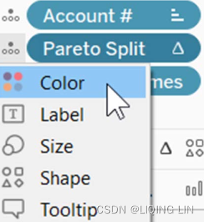
- 9. Drag Pareto Split to the Detail shelf. Click on the drop-down menu to the left of the Pareto Split pill on the Marks card and select Color:
- 10. Select the Running % of Balance Δ panel of the Marks card. Set the mark type to Line.
- 11. Drag Pareto Split (label) to the Label shelf. Note that the expected label does not display:
- 12. To address this, first click on the Label shelf and select Allow labels to overlap other marks.
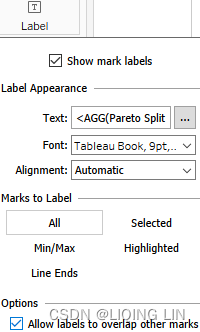
- 13. Then, right-click Pareto Split (label) on the Marks card and select Compute Using | Account #. Now you will see the label:

- 11. Drag Pareto Split (label) to the Label shelf. Note that the expected label does not display:
- 14. Click the Analytics tab in the upper left-hand corner of the screen and perform the following two steps:
- 1. Drag Reference Line to Table | Δ Running % of Balance:
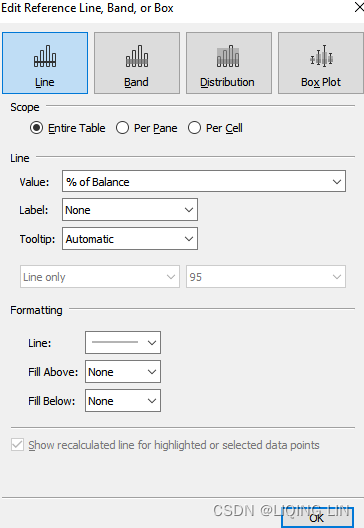
- 2. In the resulting dialog box, select % of Balance from the Value drop-down menu and set Label to None.
- 1. Drag Reference Line to Table | Δ Running % of Balance:
- 15. Change the colors, tooltips, and formatting as desired:
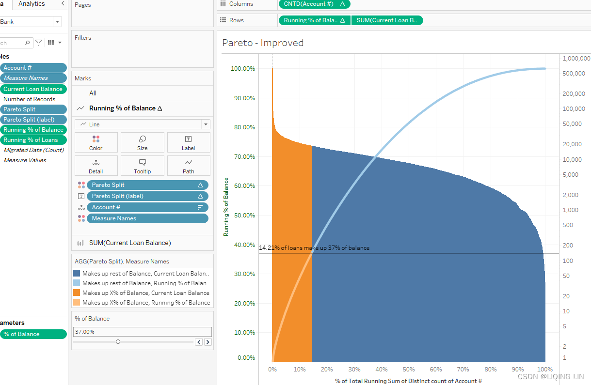
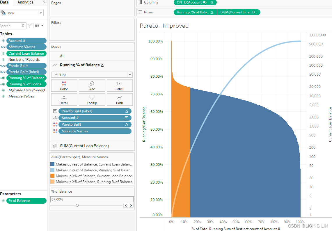
 As you will see in the screenshot, the end user now has a single parameter to slide (top-right corner) that moves the horizontal reference line(% of Balance) on the chart. As the end user moves the reference line, the text updates to display the loan and balance percentages. The colors also update as the end user adjusts the parameter to vertically communicate the percentage of loans under consideration. We were able to achieve this by creating the calculated fields Pareto Split and Pareto Split (Label) , which perform calculations on the data in the view in combination with the parameter.
The next section discusses a very powerful and still rarely used feature that will bring your dashboards to the next level! Imagine a street view with houses in Tableau, where by hovering over each house you will be able to see the rent/buy price, the size, and maybe other characteristics. You can't imagine how to achieve this in Tableau? Well, continue reading! We will discuss diverse examples of maps, images, and even games like chess and darts in the next section
Custom background images
Custom background images in Tableau open a world of potential. Imagine the ability to visualize any space. Possibilities encompass sports, health care, engineering, architecture, interior design, and much, much more. Despite this wealth of potential, background images in Tableau seem to me to be underutilized. Why? Part of the reason is because of the difficulty of generating datasets that can be used with background images.
Like the tile grid map discussed before, background images require a grid layout to pinpoint[ˈpɪnpɔɪnt]精准确定(位置或时间) x and y coordinates. In the following section, we will address how to use Tableau to create a grid that can be superimposed[ˌsʊpərɪmˈpoz]叠加的 on an image to instantly identify locations associated with x and y coordinates and relatively quickly produce datasets that can be accessed by Tableau for visualization purposes.
Creating custom polygons
Geographic areas for which Tableau natively provides polygons include country, state/province, county, and postcode/ZIP code. This means, for example, that a filled map can easily be created for the countries of the world. Simply copy a list of countries and paste that list into Tableau. Next, set the view type in Tableau to Filled Map and place the country list on the Detail shelf. Tableau will automatically draw polygons for each of those countries.
Furthermore, special mapping needs may arise that require polygons to be drawn for areas that are not typically included on maps. For example, an organization may define sales regions that don't follow usual map boundaries. Lastly, mapping needs may arise for custom images. A Tableau author may import an image of a basketball court or football pitch[pɪtʃ]球场 into Tableau and draw polygons to represent particular parts of the playing area. To create a filled map for each of these examples for which Tableau does not natively provide polygons, custom polygons must be created.
In this section, we will start with the basics by drawing a simple square around the mythical[ˈmɪθɪkl]虚构的 Null Island, which is located at the intersection of the prime meridian[məˈrɪdiən]子午线的 and the equator[ɪˈkweɪtər]赤道.
Drawing a square around Null Island
We will progress to a more robust example that requires drawing polygons for every city in Texas. There is an option in Tableau that allows an author to Show Data at Default Position for unknown locations. Selecting this option will cause Tableau to set latitude and longitude coordinates of 0 (zero) for all unknown locations, thus creating a symbol on the world map 1,600 kilometers off the western coast of Africa. Tableau developers affectionately refer to this area as Null Island.
Null Island even has its own YouTube video: https://www.youtube.com/watch?v=bjvIpI-1w84.
In this exercise, we will draw a square around Null Island:
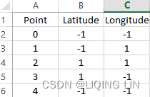
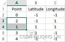
- 1. Recreate the following dataset in Excel:
- 2. Copy and paste the dataset into Tableau empty area in the data panel. By doing so, a new data source called Clipboard_... will appear:
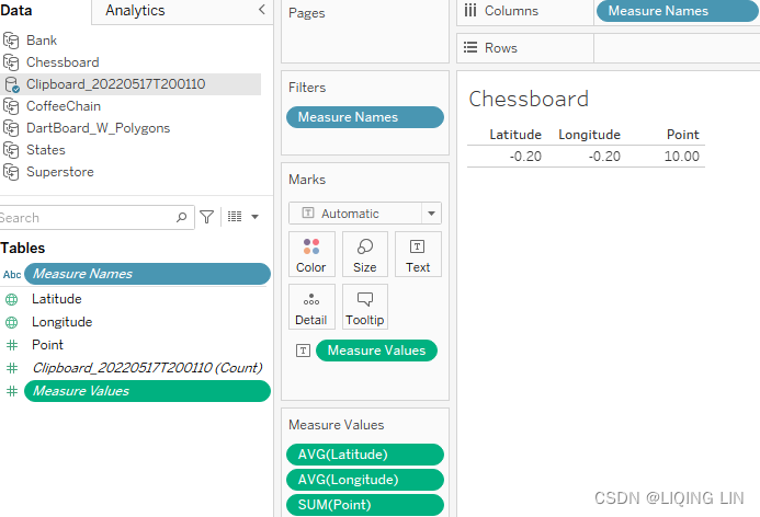
- 3. Remove all fields from the worksheet.
 Sheet
Sheet - 4. Convert Point to a dimension. This can be accomplished by either right-clicking on Point and selecting Convert to Dimension, or by dragging it to the dimensions portion of the Data pane.
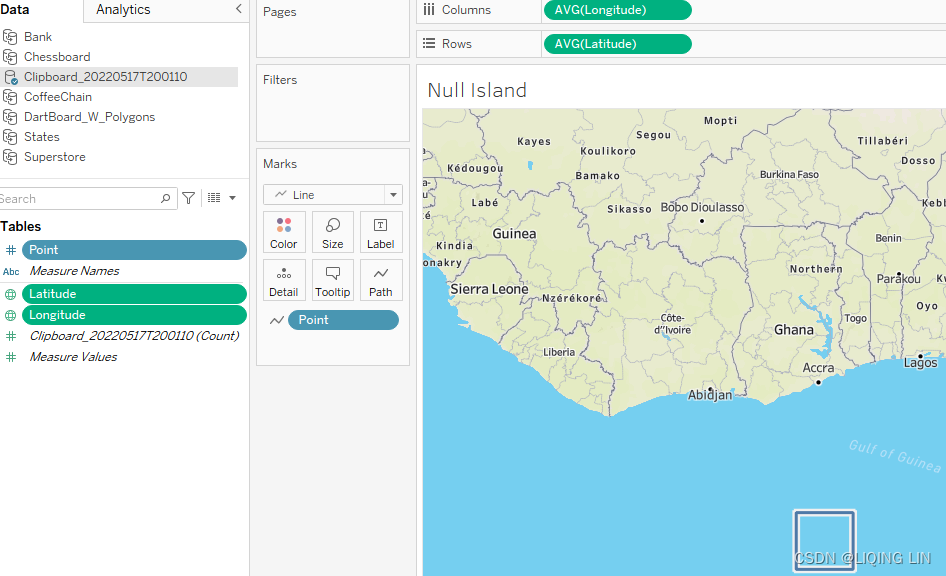
- 5. Double-click on Latitude and Longitude. It doesn't matter in which order, Tableau will automatically place Longitude on the Columns shelf and Latitude on the Rows shelf.
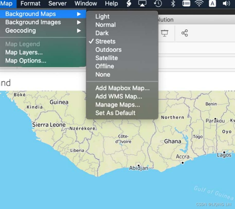
- 6. Select Map | Background Maps | Streets. You might have to zoom out a bit to see the land line:
- 7. Change the view type to Line, and drop Point on the Path shelf. You should see the following results:
- 8. Go back to your Excel file, switch the rows containing data for points 1 and 2, and copy the data again into Tableau.
- 9. Follow Steps 2–7 and observe the resulting image:
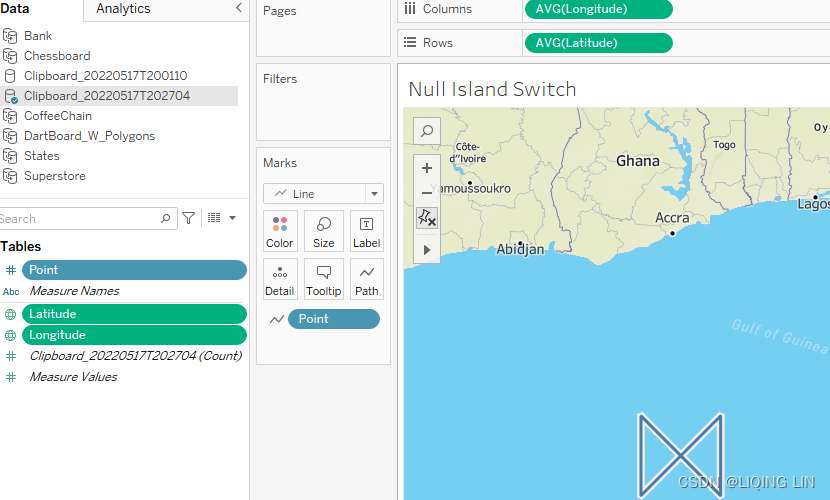 Incorrectly delineating Null Island
This interesting but incorrect image occurred because of incorrect point ordering. As a rule of thumb, when determining point order, select an order that would make sense if you were physically drawing the polygon. If you cannot draw the desired polygon on a sheet of paper using a given point order, neither can Tableau.
It is likely that you found completing this exercise in Tableau relatively easy. The challenge is in getting the data right, particularly the polygon points. A useful (and free) tool for generating polygon data can be found at https://cbistudio.interworks.com/. This is one of many tools created by InterWorks that are helpful for addressing common Tableau challenges.
We will use it next to show which books in our library are available and which aren't.
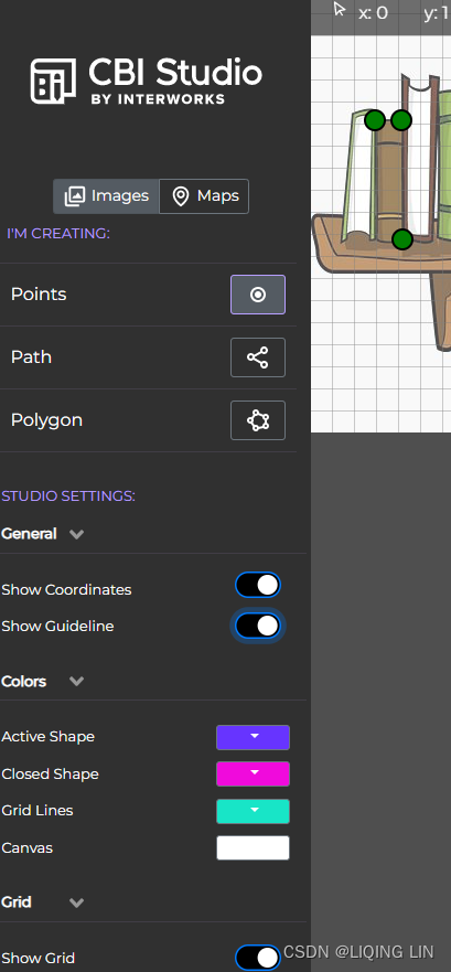
Creating an interactive bookshelf using polygons
I am not very good at drawing myself, but I always loved the fancy polygon backgrounds I saw on Tableau Public, having shapes of all kinds and being able to have Tableau interact with them, color them depending on a measure, or link an action to a specific area. Did you know, for example, that the continents can be reshaped to build the shape of a chicken? Well, Niccolo Cirone made a Tableau dashboard out of it, using polygons: https://www.theinformationlab.co.uk/2016/06/01/polygons-people-polygon-ize-image-tableau// 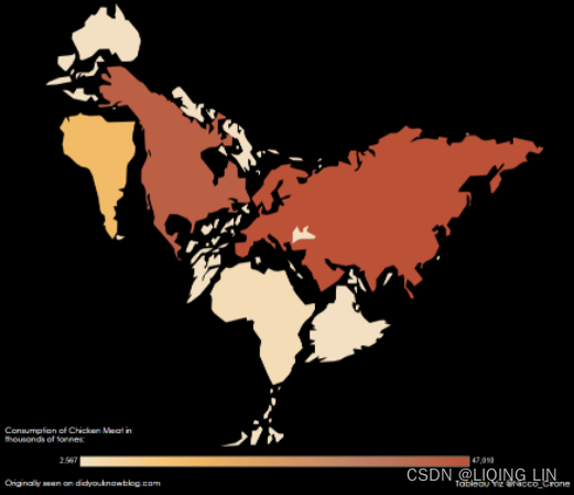
Do you want to build fancy dashboards too but your drawing skills are mediocre just like mine? Don't worry! This section will give you the tools to achieve it anyway. InterWorks has developed a tool similar to paint by numbers, the perfect application to build polygons without drawing too much yourself. You can find it here: https://cbistudio.interworks.com/. All you need to do is find an image, upload it to the tool, and start drawing along the lines.
For this exercise, I searched for an image of a bookshelf on the internet. You can do the same and find an image for this exercise or download the image I used, which can be downloaded here: https://github.com/PacktPublishing/Mastering-Tableau-2021 .
- 1. Open the free drawing tool from InterWorks (https://cbistudio.interworks.com/) and upload your image.

- 2. Now start at the edge of one book and click. A red dot will appear. Now go to the next edge of the same book and click again. A line will be drawn along that edge of the book and the coordinates automatically appear in the list at the top right:
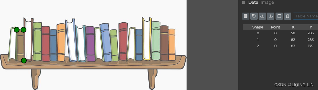
- 3. The last dot of a book should be on top of the first dot, which will finish the first polygon. The next dot you set somewhere else will get a different shape number and hence can be distinguished as a different shape by Tableau later on. And remember, move along the outside of a book to avoid crossing lines.
- 4. When you are done outlining the books, copy the Point Data values (shown in the bottom left of the preceding screenshot) to Tableau, just like we did with Null Island, by clicking Ctrl + C and Ctrl + V (use Command for Mac).
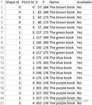
- 5. If you have lots of data points, you can also copy the data to Excel first and save the file to be used as a data source in Tableau. I did so and in addition, I added the Name and Available columns. You can also see that each book has a unique shape ID, the point ID is the order in which you clicked on the screen, and x and y represent the location on the screen:
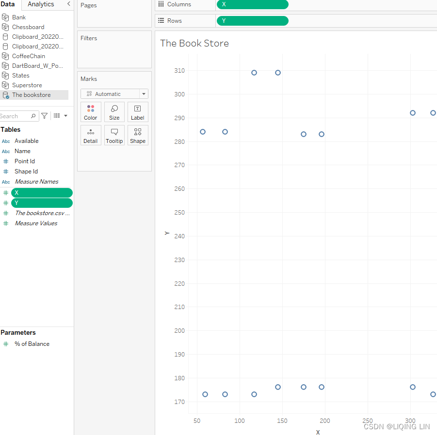
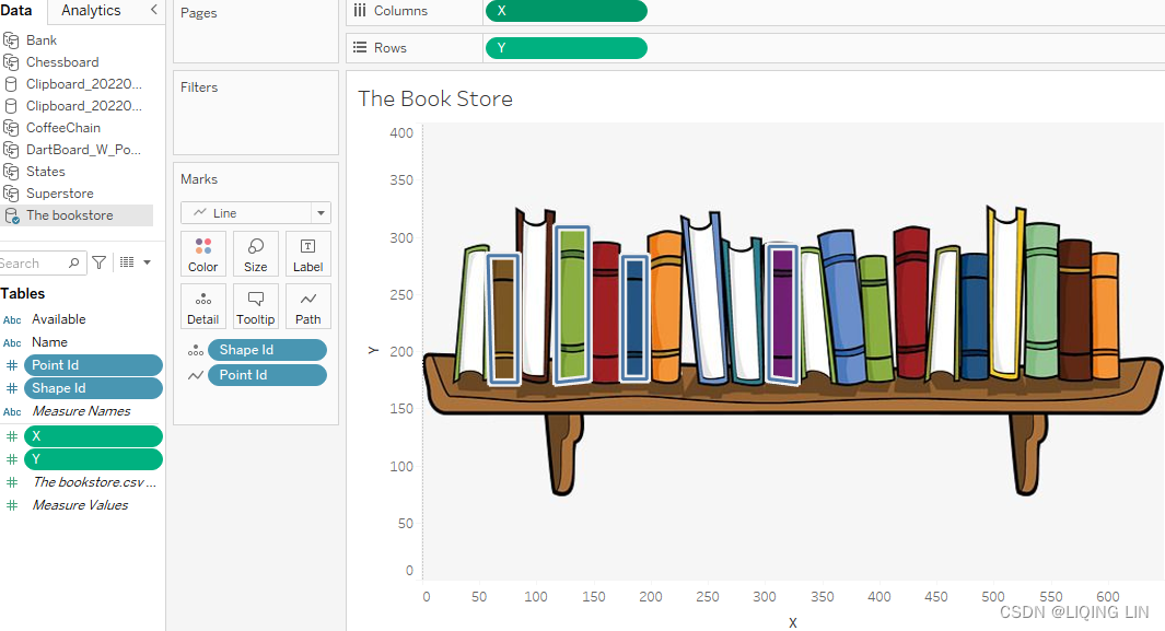
- 6. Next, load the data in Tableau and place X(Dimension) on Columns and Y(Dimension) on Rows. Can you recognize the bookshelf yet? I only used four books for this exercise:
- 7. Before we can add the image to Tableau, we need the coordinates of the outermost points for the Tableau settings. Simply go back to the drawing tool and hover over the edges. Note down记下 the x and y coordinates for the four edges. Either x or y should be 0 in each of the corners:
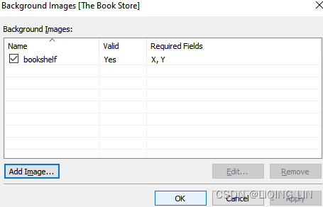
- 8. Back in Tableau, click on Map | Background Image and select a random one.
 In the following popup, define a name and upload the image you used in the drawing tool. Also fill in the coordinates for the X and Y fields to represent the edges of the image:
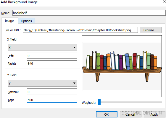
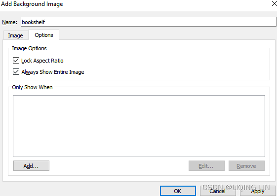
- 9. Click on Options and select Always Show Entire Image. Then close this window:
- 10. Your image should appear on your worksheet now, with matching dots surrounding the books:
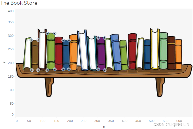
- 11. To create a surrounding line instead of dots, change the mark type to Line and place Shape Id on Detail and Point Id on Path:
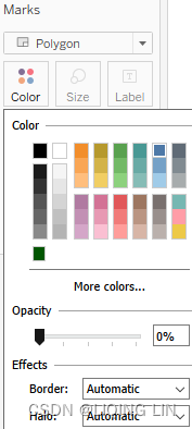
- 12. To create a polygon, change the mark type to Polygon and set Opacity in the Color shelf to 0%.
- 13. In addition, you can add a tooltip with the book Name and Available after placing both fields on the Detail shelf:
- 14. If you now hover over the books, you can see the name as well as the availability:
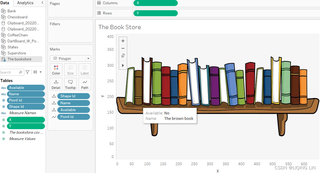
 The best part about polygons is that they fill the whole area. In this example, no matter where you hover or click, the complete back of the book is covered because we drew an area rather than a point or a certain default shape. And this comes with endless options; imagine a big library where every book is a polygon, and you can connect live data to the polygon dataset with the up-to-date availability of any book. Aside from books, you can draw anything. What I have seen most in Tableau are floor plans, supermarket shelves, office layouts, shapes split into parts… polygons really allow you to get creative with your visualizations.
But, if you don't have an image at hand and you want to draw something very specific to your dashboard, you can use paid or free software like Adobe Illustrator Draw, Sketch, Sketsa SVG Editor, Boxy SVG, Gravit Designer, Vecteezy Editor, Vectr, Method Draw, Inkpad, iDesign, Affinity Designer, macSVG, Chartist.js, Plain Pattern, Inkscape, and many others.
https://blog.youkuaiyun.com/Linli522362242/article/details/123970001


Analyzing a game of chess in Tableau
In this exercise, we will use Inkscape. But instead of drawing something in one of the tools, transforming it into polygons, and loading it in Tableau, we will create the code for an SVG file(Scalable Vector Graphics) in Tableau, load it in Inkscape to see if it worked, and then transform it into polygons and load the converted version with x and y coordinates back into Tableau to analyze a game of chess. By creating an SVG file yourself, you will be able to recognize which are the x and y coordinates Tableau needs and thus you will always be able to transform SVGs.
Creating an SVG file in Tableau
In this section, we will use Tableau to generate the XML required to construct an SVG file that can be opened with the vector graphic tool Inkscape, which is open source and is thus available free of charge. Visit inkscape.org to download the latest version. We will also need the Chessboard.png image available on the Packt GitHub page: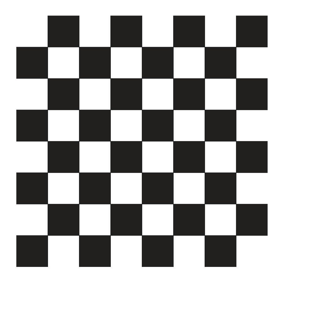 https://github.com/PacktPublishing/Mastering-Tableau-2021. Please download that one as well.
Usually, polygons show their power even more when used in non-linear drawings. Our chessboard, however, is a good example in this case, because we will create the locations used by Tableau ourselves—creating a square is easier than a more complex shape because we can work with increments. Note that a grid with 10 rows and 10 columns is used in the following examples, which of course generates a grid of 100 cells. This will perform satisfactorily in Inkscape. However, if a large cell count is required, a professional graphics tool such as Adobe Illustrator may be required. I tested grids with up to 10,000 cells and found the performance in Inkscape unacceptable—however, the same grids performed adequately in Illustrator.
Creating a grid
The following exercise serves multiple purposes. The first purpose is to demonstrate how to use Tableau to create a grid. This chapter provides another opportunity to use data scaffolding, which was discussed in https://blog.youkuaiyun.com/Linli522362242/article/details/124335986, All About Data – Joins, Blends, and Data Structures. The difference is that in https://blog.youkuaiyun.com/Linli522362242/article/details/124335986, dates were used for scaffolding purposes(The actual data scaffolding occurred upon selecting Show Missing Values from the Date field dropdown after it was placed on the Rows shelf. This allowed every year between Start Date and End Date to display even when there were no matching years in the underlying data.) whereas in the following section, bins are utilized. Additionally, this exercise requires many table calculations that will help reinforce the lessons learned in https://blog.youkuaiyun.com/Linli522362242/article/details/124550022, Table Calculations. Lastly, this exercise makes use of data densification, which was discussed in https://blog.youkuaiyun.com/Linli522362242/article/details/124642806, All About Data – Data Densification, Cubes, and Big Data.
To get started, take the following steps:
- 1. Open a new Tableau workbook and name the first sheet Header.
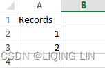
- 2. Using Excel or a text editor, create a Records dataset. The following two-row table represents the Records dataset in its entirety:
- 3. Connect Tableau to the Records dataset:
- • For convenience, consider copying the dataset using Ctrl + C and pasting it directly in Tableau using Ctrl + V.
- • Tableau will likely consider Records a measure. Drag Records to the Dimensions portion of the Data pane.
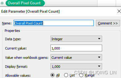
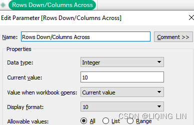
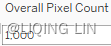
- 4. Create 2 parameters. Entitle one Overall Pixel Count and the other Rows Down/Columns Across. The settings for both are as follows:
- • Data type: Integer
- • Allowable values: All
-
5. Show both parameters. Set RowsDown/Columns Across to 10 and Overall Pixel Count to 1,000.
-
6. Create a calculated field named Concatenate Header with the following code:
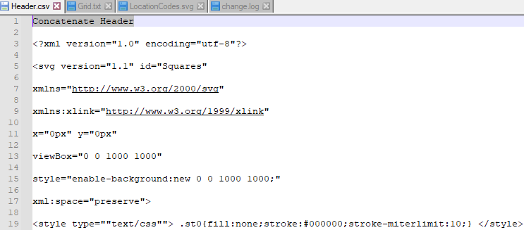
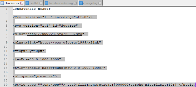
'
<?xml version="1.0" encoding="utf-8"?>
<svg version="1.1" id="Squares"
xmlns="http://www.w3.org/2000/svg"
xmlns:xlink="http://www.w3.org/1999/xlink"
x="0px" y="0px"
viewBox="0 0 ' + STR( [Overall Pixel Count] ) + " " + STR([Overall Pixel Count])+ '"
style="enable-background:new 0 0 '+ STR([Overall Pixel Count]) + ' ' + STR([Overall Pixel Count]) + ';"
xml:space="preserve">
<style type="text/css"> .st0{fill:none;stroke:#000000;stroke-miterlimit:10;} </style>
'
//This is the code used to generate the SVG header.  Note the use of [Overall Pixel Count] to determine the overall size of the grid.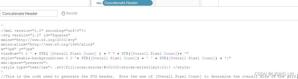
-
7. Now we have created a skeleton[ˈskelɪtn]框架,骨架 or template that will help us create multiple locations in order to draw a grid in Tableau.
- 8. Place the newly created calculated field on the Text shelf.
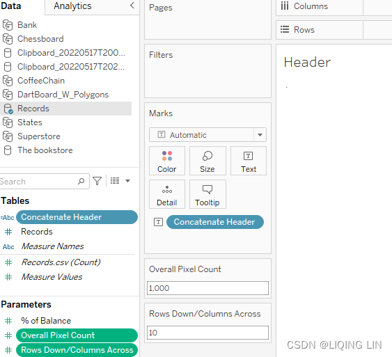
- 9. In the toolbar, choose to fit to Entire View to view the results; you can see that the parameters fill in STR([Overall Pixel Count]) from Concatenate Header:
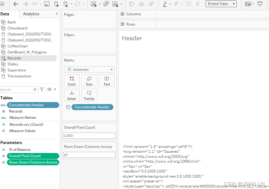
the Generated SVG Code is the header information which will be used in the SVG file. - 10. Create a new worksheet named Location Codes.
- 11. Create the following calculated fields:
- Rows Down/Columns Across: number of rows == number of columns
[Parameters].[Rows Down/Columns Across] //This calculated field simply refernces the parameter of the same name. //It is used in several other calculated fields.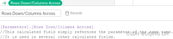 <=
<=
- Which Column?: LAST() returns the index==0, so we add 1 to make start_index=1
LAST()+1 //This calculated field is used in conjunction with [Which Row?] //to determine X coordinates for each location code.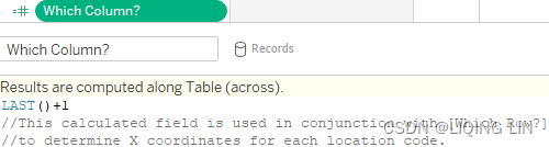 ==>
==>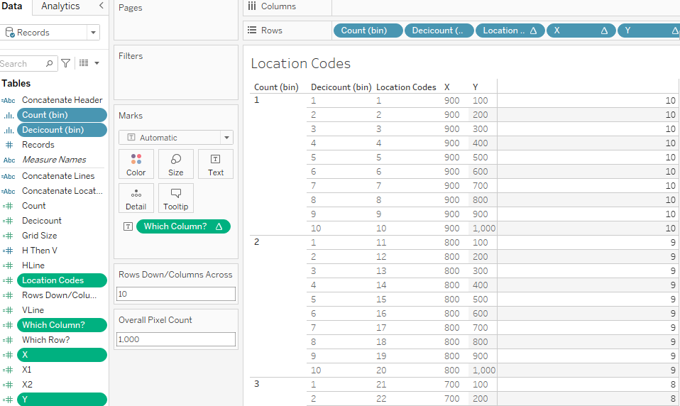
- Which Row?
INDEX()
//This code is used to determine the placement of the X coordinate
// for each Row.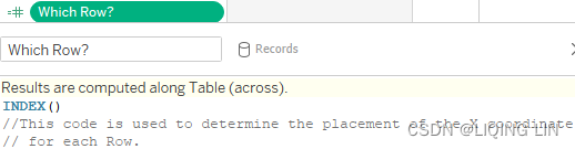
- Grid Size : (100)
[Overall Pixel Count]/LOOKUP([Which Column?],FIRST())
//This field essentially produces
// [Overall Pixel Count]/[Rows Down/Columns Across].
// It is necessary
//Because simply using
// [Overall Pixel Count]/[Rows Down/Columns Across]
// will not generate the grid size
//for every row in the view.
<==
<==
LOOKUP([Which Column?],FIRST() ) return 10 series
1000/10 = 100 just a one value, so 1000 / 10series = 100series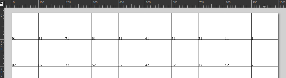
- X
[Overall Pixel Count] - ( [Grid Size] * ([Which Row?]) ) //The x coordinate for each location code changes for each column. //A new column is designated each time [Rows Down/Columns Across] //has run through a complete cycle.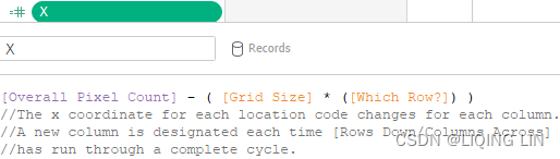 <==
<==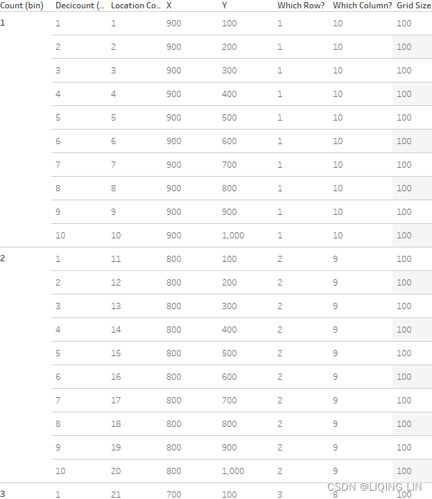
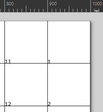
each cell size = grid size=100 pixels, 10 columns per row, total 10 rows
X, Y = (900,100),(900,200),(900,300),...,(900,900),(1000 - 100*1 = 900,1000),
(800,100),(800,200),(800,300),...,(800,900),(1000 - 100*2 = 800,1000),
... ...
(100,100),(100,200),(100,300),...,(100,900),(1000 - 100*9 = 100,1000),
( 0,100),( 0,200),( 0,300),...,( 0,900),(1000 - 100*10 = 0,1000), - Y
[Overall Pixel Count] - ( [Grid Size] * ([Which Column?]-1) )
//The Y coordinate for each location code changes for each row.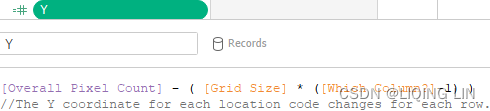
- Count:will generate [Rows Down/Columns Across]==10 bins or bars
If [Records] = 1 THEN 1 ELSE [Rows Down/Columns Across] END //This calculated field is used to generate two numbers. //It is then used to generate the bin [Count (bin)]. //'Show missing values' can be selected on the bin to force //Tableau to display all the intervening numbers.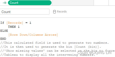 <==
<==
- Decicount: cut each bar down to [Rows Down/Columns Across]=10 blocks
If [Records] = 1
    THEN 1
ELSE
    [Rows Down/Columns Across]
END
//This calculated field is used to generate two numbers.
//It is then used to generate the bin [Decicount (bin)].
//'Show missing values' can be selected on the bin to force
//Tableau to display all the intervening numbers.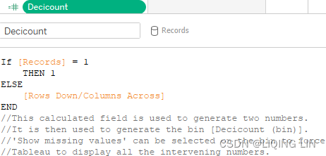
- Location Codes : to label each cell
INDEX()
//This is simply a count where each cell
//in the final grid has a unique location code.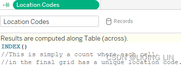
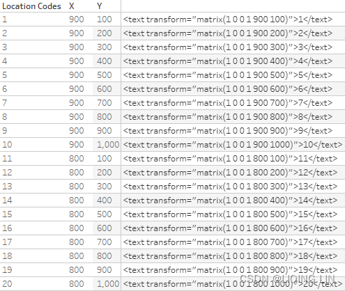
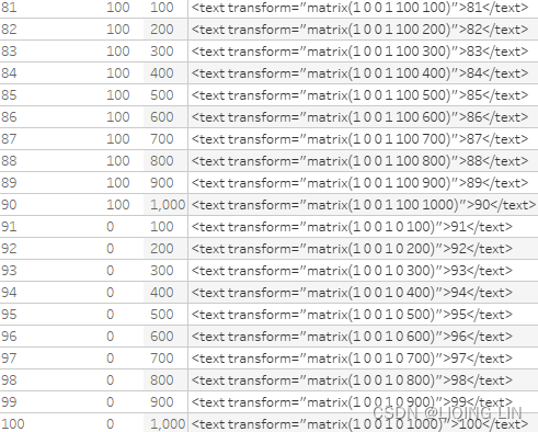
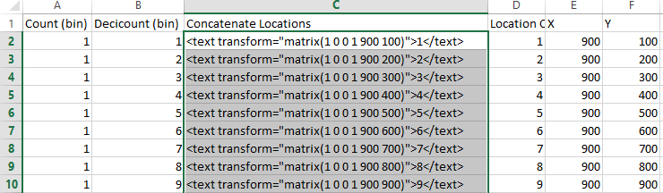
- Concatenate Locations
'<text transform="matrix(1 0 0 1 '
+ STR([X]) + " " + STR([Y])
+')">'
+ STR( [Location Codes] ) + '</text>'
//This calculated field generates the SVG code necessary to
//map coordinates for each location code.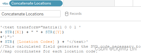
......
all text code contain all location code(called cell label) and postions(
 )
)
- Rows Down/Columns Across: number of rows == number of columns
-
12. The created calculated fields will be used in the next steps to create a table of values, similar to the table of values that we generated in the drawing tool. Only now, we will do it ourselves and use SVG code instead of longitude and latitude values.
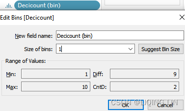
- 13. Right-click on Count and select Create | Bins.... In the resulting dialog box, set Size of bins to 1:
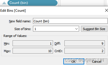
- 14. Right-click on Decicount and select Create | Bins.... In the resulting dialog box, set Size of bins to 1:
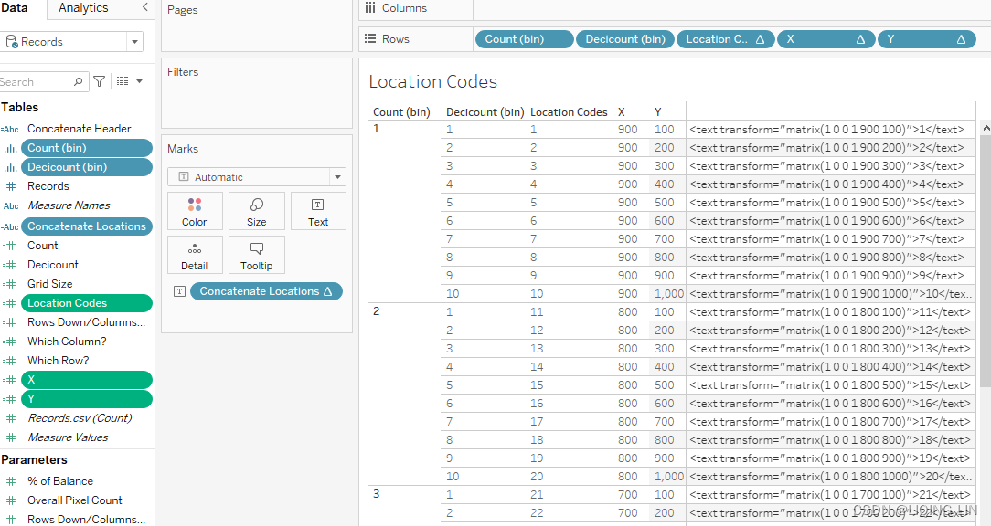
- 15. Place Count (bin), Decicount (bin), Location Codes, X, and Y on the Rows shelf. Be sure to place those fields in the order listed:
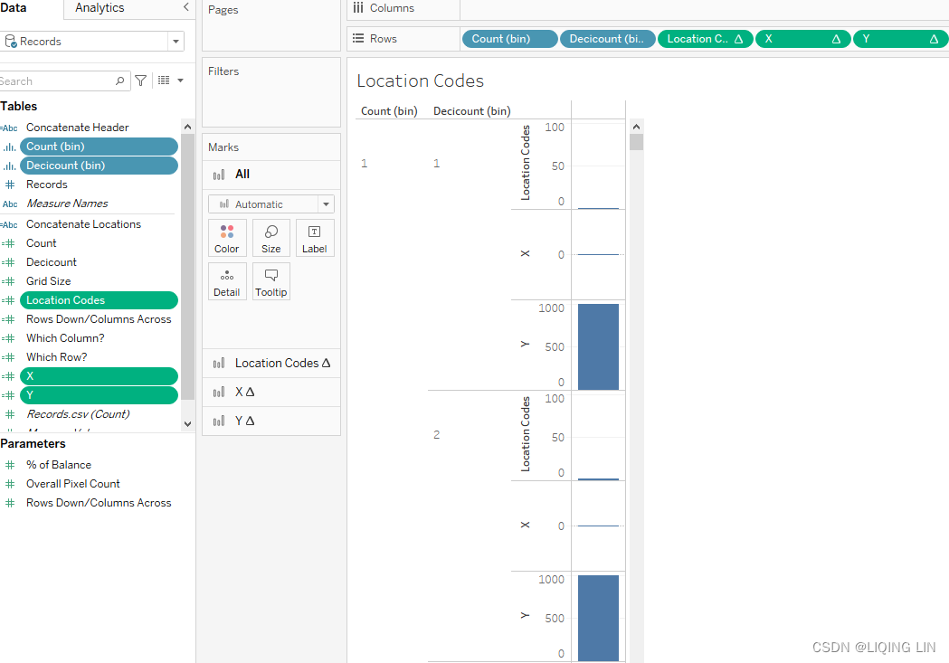
- 16. If your fields are green (meaning continuous), right-click on each field on the Rows shelf and set it to Discrete. Then:
- 1. Right-click on Count (bin) and Decicount (bin) and ensure that Show Missing Values is selected
- 2. Right-click on Location Codes, select Discrete, and then select Compute Using | Table (Down)
- 3. Right-click on X, select Discrete, and then select Compute Using | Count (bin)
- 4. Right-click on Y, select Discrete, and then select Compute Using | Decicount (bin)
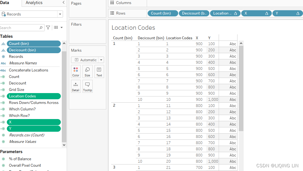
- 17. Place Concatenate Locations on the Text shelf
- 18. Right-click on the instance of Concatenate Locations you just placed on the Text shelf and select Edit Table Calculations.
- 19. At the top of the resulting dialog box, note that there are four options under Nested Calculations: Grid Size, Which Column?, Which Row?, and Location Codes. Set the Compute Using (addressing) definition for each as follows:
the calculated fields (Grid Size, Which Column?, Which Row?, and Location Codes) are used in the Concatenate Locations, you need to tell Tableau…and here is the trick…how these calculated fields to be calculated inside the nested calculation.https://blog.youkuaiyun.com/Linli522362242/article/details/124550022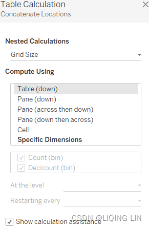 100(pixels) X 100(amount, table down)
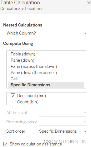 Count (bin) is partitioned(partition_label==Column index), Decicount(bin) is addressed(direction, calculation along Decicount(bin) dimension), and each partition will restart a calculation
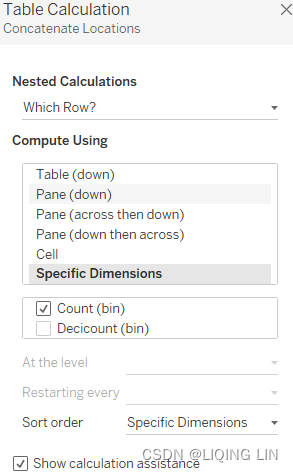 Decicount(bin) is partitioned(partition_label==row index), Count (bin) is addressed(direction, calculation along Count (bin) dimension), and each partition will restart a calculation
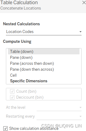
-
20. In the toolbar, choose to fit to Fit Width to view the results; you can already see that multiple rows have been created. Those rows will later be used to draw a grid:
... ...
the Generated SVG Code contains the information (which is including all LocationCodes which are used to label each grid cell and all label postions) will be used in the SVG file.
-
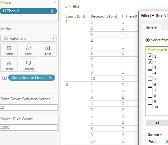
21. Now, create a new worksheet named Lines.
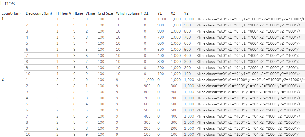
- 22. Create the following calculated fields:
- H Then V: if [H Then V] ==1 : Horizontal line, if [H Then V] ==2 :Vertical line
Index()
//This calculated field is referenced to first generate
//the horizontal grid lines and then the vertical grid lines.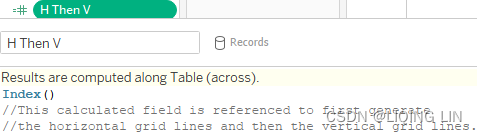
- HLine
LAST()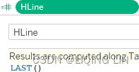
- VLine
INDEX()-1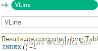
- X1
IF [H Then V] = 1
    THEN 0
ELSE
    [Overall Pixel Count] - ( [Grid Size]*([VLine]) )
END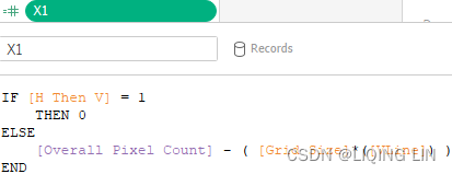

- Y1
IF [H Then V] = 2
    THEN 0
ELSE
    [Overall Pixel Count] - ( [Grid Size]*([VLine]) )
END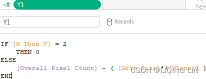
- X2
IF [H Then V] = 1
    THEN [Overall Pixel Count]
ELSE
    [Overall Pixel Count] - ( [Grid Size] * ([VLine]) )
END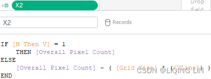
- Y2
IF [H Then V] = 2
    THEN [Overall Pixel Count]
ELSE
    [Overall Pixel Count] - ( [Grid Size] * ([VLine]) )
END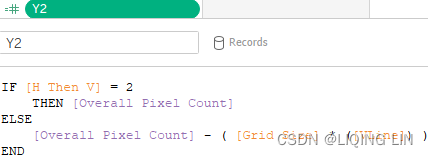
- H Then V: if [H Then V] ==1 : Horizontal line, if [H Then V] ==2 :Vertical line
-
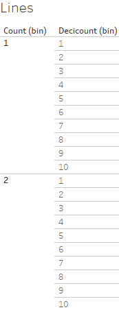
23. Next, place the following fields on the Rows shelf in the following order: Count (bin), Decicount (bin), H Then V, HLine, VLine, Grid Size, X1, Y1, X2, and Y2. Note that each should be cast as discrete.
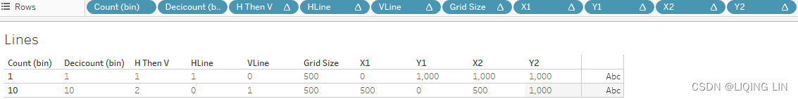
-
24. Right-click on Count(bin) and Decicount(bin) and set each to Show Missing Values.
- 25. Right-click on each of the remaining fields on the Rows shelf and select Edit Table Calculations. Set the Compute Using (set the dimension for addressing, the remaining dimensions are partitioned) definition of each field as shown in the following table:
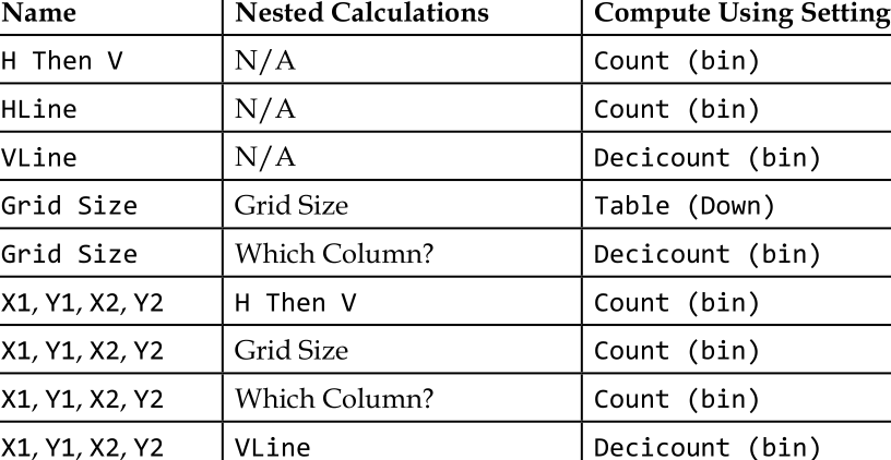
Note that some of the fields include nested table calculations. In such cases, the Table Calculation dialog box will include an extra option at the top entitled Nested Calculations: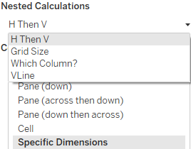
X1, X2, Y1, and Y2 need to be configured for 4 nested calculations. Start by opening the X1 table calculation and then selecting H Then V from the Nested Calculations dropdown, and set Compute Using to Count (bin). Then, in the same window, select Grid Size from the dropdown and enter the corresponding Compute Using setting. After all 4 dropdowns have been set, continue with X2 and do the same.
Name Nested Calculations Compute Using (addressing, direction)
H Then V N/A Count (bin)
HLine N/A Count (bin)
VLine{Index()-1} N/A Decicount (bin), thus Count (bin) is partitioned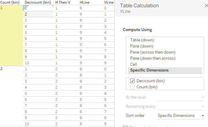 Name Nested Calculations Compute Using (addressing, direction)
Grid Size Grid Size Table (Down)
Grid Size Which Column? Decicount (bin), thus Count (bin) is partitioned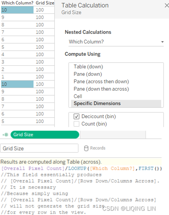 partition: calculation scope
Name Nested Calculations Compute Using (addressing, direction)
X1, Y1, X2, Y2 H Then V{Index()} Count (bin), index is calculated along Count (bin)
X1, Y1, X2, Y2 VLine Decicount (bin), thus Count (bin) is partitioned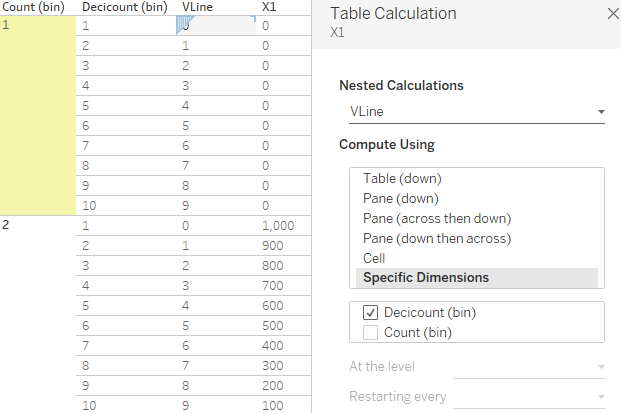
Name Nested Calculations Compute Using (addressing, direction)
X1, Y1, X2, Y2 Grid Size Count (bin)
X1, Y1, X2, Y2 Which Column? Count (bin) background color : yellow(partition)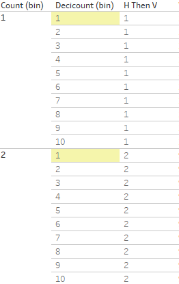
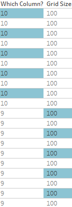 since FIRST()
Grid Size : [Overall Pixel Count]/LOOKUP( [Which Column?],FIRST() ) =1000/10=100
Which Column? : Last()+1 ==> (10,9,...) for each partition, (10,9,...) for each partition,... - 26. Filter H Then V to display only 1 and 2:
- 27. Create a calculated field called Concatenate Lines with the following code:
'<line class="st0" x1="' + STR([X1]) + '" y1="' + STR([Y1])
+ '" x2="' + STR( [X2] ) + '" y2="' + STR([Y2]) + '"/>'
//This calculated field will generate the SVG code that
//draws the lines for the grid.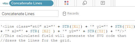
- 28. This calculation will create a new string by including the fields X1, X2 and Y1, Y2. By doing so we multiply one row of code by as many rows as we want, each with a specific combination of X1, X2, Y1, and Y2.
- 29. Place Concatenate Lines on the Text shelf. Your worksheet should look as follows:
- 30. Export the code from the three worksheets just created.
Exporting the code from the three worksheets can be tricky since Tableau may try to input additional quotes for string values. I found the following approach works best:
• Select the Header worksheet.
• Press Ctrl + A to select all the contents of the worksheet.
• Hover the cursor over the selected text in the view and pause until the tooltip command buttons appear.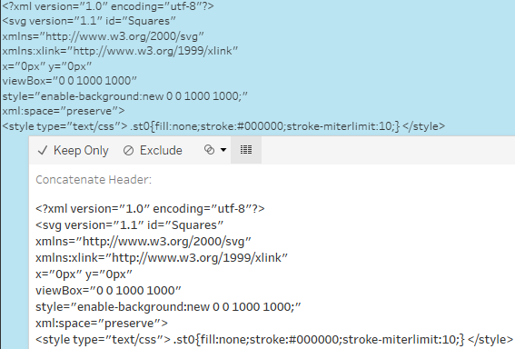
• Select the View Data icon at the right-hand side of the tooltip.
• In the resulting View Data dialog box, select Download.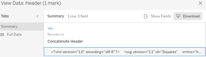
• Save the CSV file using the same name as each worksheet; for instance, the data exported from the Header worksheet will be named Header.csv.(you need remove the quote)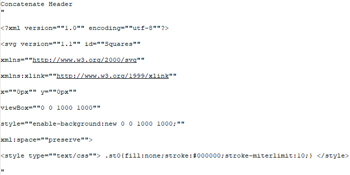 ==>
==>
• Repeat the steps for the remaining worksheets.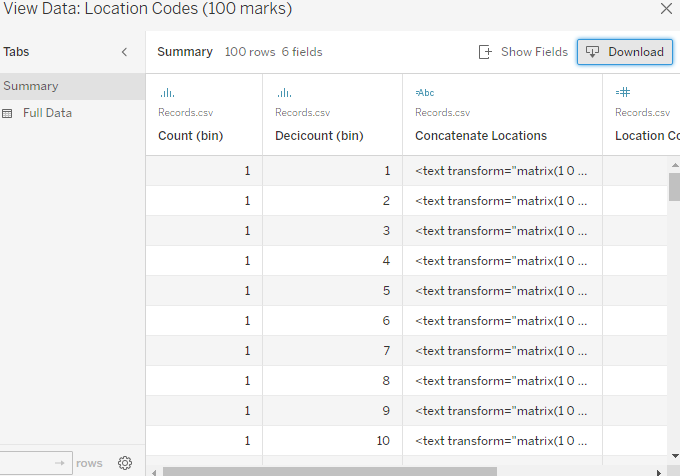
- 31. Open an instance of your favorite text editor and save it as Grid and LocationCodes.svg
- 32. Using text editor, copy the data from Header.csv and paste it into Grid and LocationCodes.svg. Be sure not to include the header information; include only the XML code. For example, in the next screenshot, don't copy row 1, only copy row 2:
- 33. Using Excel, copy the required data from Location.csv and paste it into Grid and LocationCodes.svg. The required data only includes the column labeled Concatenate Locations. Do not include the other columns or the header. Include only the XML code. For example, in the following screenshot, we only copy column C:
- 34. Using Excel, copy the required data from Lines.csv and paste it into Grid and LocationCodes.svg. Again, the required data only includes the column labeled Concatenate Lines . Do not include the other columns or the header, only the XML code.
- 35. Lastly, complete the SVG file by entering the </svg> closing tag. The full code has been added for your convenience on the Generated SVG Code tab:
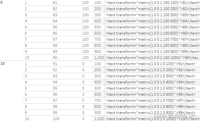
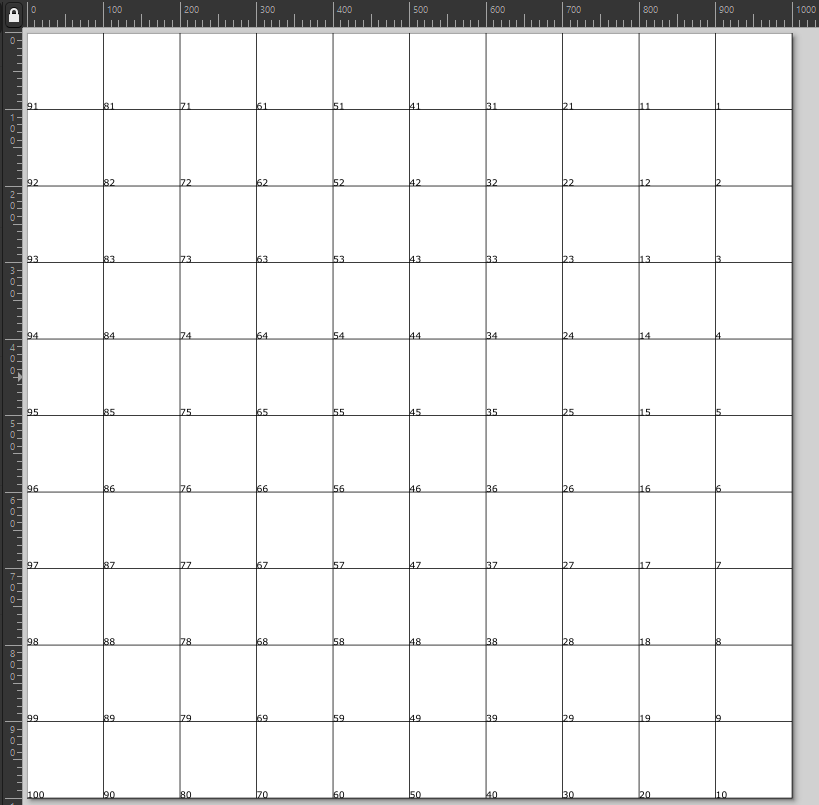
<?xml version="1.0" encoding="utf-8"?> <svg version="1.1" id="Squares" xmlns="http://www.w3.org/2000/svg" xmlns:xlink="http://www.w3.org/1999/xlink" x="0px" y="0px" viewBox="0 0 1000 1000" style="enable-background:new 0 0 1000 1000;" xml:space="preserve"> <style type="text/css"> .st0{fill:none;stroke:#000000;stroke-miterlimit:10;} </style> <text transform="matrix(1 0 0 1 900 100)">1</text> <text transform="matrix(1 0 0 1 900 200)">2</text> <text transform="matrix(1 0 0 1 900 300)">3</text> <text transform="matrix(1 0 0 1 900 400)">4</text> <text transform="matrix(1 0 0 1 900 500)">5</text> <text transform="matrix(1 0 0 1 900 600)">6</text> <text transform="matrix(1 0 0 1 900 700)">7</text> <text transform="matrix(1 0 0 1 900 800)">8</text> <text transform="matrix(1 0 0 1 900 900)">9</text> <text transform="matrix(1 0 0 1 900 1000)">10</text> <text transform="matrix(1 0 0 1 800 100)">11</text> <text transform="matrix(1 0 0 1 800 200)">12</text> <text transform="matrix(1 0 0 1 800 300)">13</text> <text transform="matrix(1 0 0 1 800 400)">14</text> <text transform="matrix(1 0 0 1 800 500)">15</text> <text transform="matrix(1 0 0 1 800 600)">16</text> <text transform="matrix(1 0 0 1 800 700)">17</text> <text transform="matrix(1 0 0 1 800 800)">18</text> <text transform="matrix(1 0 0 1 800 900)">19</text> <text transform="matrix(1 0 0 1 800 1000)">20</text> <text transform="matrix(1 0 0 1 700 100)">21</text> <text transform="matrix(1 0 0 1 700 200)">22</text> <text transform="matrix(1 0 0 1 700 300)">23</text> <text transform="matrix(1 0 0 1 700 400)">24</text> <text transform="matrix(1 0 0 1 700 500)">25</text> <text transform="matrix(1 0 0 1 700 600)">26</text> <text transform="matrix(1 0 0 1 700 700)">27</text> <text transform="matrix(1 0 0 1 700 800)">28</text> <text transform="matrix(1 0 0 1 700 900)">29</text> <text transform="matrix(1 0 0 1 700 1000)">30</text> <text transform="matrix(1 0 0 1 600 100)">31</text> <text transform="matrix(1 0 0 1 600 200)">32</text> <text transform="matrix(1 0 0 1 600 300)">33</text> <text transform="matrix(1 0 0 1 600 400)">34</text> <text transform="matrix(1 0 0 1 600 500)">35</text> <text transform="matrix(1 0 0 1 600 600)">36</text> <text transform="matrix(1 0 0 1 600 700)">37</text> <text transform="matrix(1 0 0 1 600 800)">38</text> <text transform="matrix(1 0 0 1 600 900)">39</text> <text transform="matrix(1 0 0 1 600 1000)">40</text> <text transform="matrix(1 0 0 1 500 100)">41</text> <text transform="matrix(1 0 0 1 500 200)">42</text> <text transform="matrix(1 0 0 1 500 300)">43</text> <text transform="matrix(1 0 0 1 500 400)">44</text> <text transform="matrix(1 0 0 1 500 500)">45</text> <text transform="matrix(1 0 0 1 500 600)">46</text> <text transform="matrix(1 0 0 1 500 700)">47</text> <text transform="matrix(1 0 0 1 500 800)">48</text> <text transform="matrix(1 0 0 1 500 900)">49</text> <text transform="matrix(1 0 0 1 500 1000)">50</text> <text transform="matrix(1 0 0 1 400 100)">51</text> <text transform="matrix(1 0 0 1 400 200)">52</text> <text transform="matrix(1 0 0 1 400 300)">53</text> <text transform="matrix(1 0 0 1 400 400)">54</text> <text transform="matrix(1 0 0 1 400 500)">55</text> <text transform="matrix(1 0 0 1 400 600)">56</text> <text transform="matrix(1 0 0 1 400 700)">57</text> <text transform="matrix(1 0 0 1 400 800)">58</text> <text transform="matrix(1 0 0 1 400 900)">59</text> <text transform="matrix(1 0 0 1 400 1000)">60</text> <text transform="matrix(1 0 0 1 300 100)">61</text> <text transform="matrix(1 0 0 1 300 200)">62</text> <text transform="matrix(1 0 0 1 300 300)">63</text> <text transform="matrix(1 0 0 1 300 400)">64</text> <text transform="matrix(1 0 0 1 300 500)">65</text> <text transform="matrix(1 0 0 1 300 600)">66</text> <text transform="matrix(1 0 0 1 300 700)">67</text> <text transform="matrix(1 0 0 1 300 800)">68</text> <text transform="matrix(1 0 0 1 300 900)">69</text> <text transform="matrix(1 0 0 1 300 1000)">70</text> <text transform="matrix(1 0 0 1 200 100)">71</text> <text transform="matrix(1 0 0 1 200 200)">72</text> <text transform="matrix(1 0 0 1 200 300)">73</text> <text transform="matrix(1 0 0 1 200 400)">74</text> <text transform="matrix(1 0 0 1 200 500)">75</text> <text transform="matrix(1 0 0 1 200 600)">76</text> <text transform="matrix(1 0 0 1 200 700)">77</text> <text transform="matrix(1 0 0 1 200 800)">78</text> <text transform="matrix(1 0 0 1 200 900)">79</text> <text transform="matrix(1 0 0 1 200 1000)">80</text> <text transform="matrix(1 0 0 1 100 100)">81</text> <text transform="matrix(1 0 0 1 100 200)">82</text> <text transform="matrix(1 0 0 1 100 300)">83</text> <text transform="matrix(1 0 0 1 100 400)">84</text> <text transform="matrix(1 0 0 1 100 500)">85</text> <text transform="matrix(1 0 0 1 100 600)">86</text> <text transform="matrix(1 0 0 1 100 700)">87</text> <text transform="matrix(1 0 0 1 100 800)">88</text> <text transform="matrix(1 0 0 1 100 900)">89</text> <text transform="matrix(1 0 0 1 100 1000)">90</text> <text transform="matrix(1 0 0 1 0 100)">91</text> <text transform="matrix(1 0 0 1 0 200)">92</text> <text transform="matrix(1 0 0 1 0 300)">93</text> <text transform="matrix(1 0 0 1 0 400)">94</text> <text transform="matrix(1 0 0 1 0 500)">95</text> <text transform="matrix(1 0 0 1 0 600)">96</text> <text transform="matrix(1 0 0 1 0 700)">97</text> <text transform="matrix(1 0 0 1 0 800)">98</text> <text transform="matrix(1 0 0 1 0 900)">99</text> <text transform="matrix(1 0 0 1 0 1000)">100</text> <line class="st0" x1="0" y1="1000" x2="1000" y2="1000"/> <line class="st0" x1="0" y1="900" x2="1000" y2="900"/> <line class="st0" x1="0" y1="800" x2="1000" y2="800"/> <line class="st0" x1="0" y1="700" x2="1000" y2="700"/> <line class="st0" x1="0" y1="600" x2="1000" y2="600"/> <line class="st0" x1="0" y1="500" x2="1000" y2="500"/> <line class="st0" x1="0" y1="400" x2="1000" y2="400"/> <line class="st0" x1="0" y1="300" x2="1000" y2="300"/> <line class="st0" x1="0" y1="200" x2="1000" y2="200"/> <line class="st0" x1="0" y1="100" x2="1000" y2="100"/> <line class="st0" x1="1000" y1="0" x2="1000" y2="1000"/> <line class="st0" x1="900" y1="0" x2="900" y2="1000"/> <line class="st0" x1="800" y1="0" x2="800" y2="1000"/> <line class="st0" x1="700" y1="0" x2="700" y2="1000"/> <line class="st0" x1="600" y1="0" x2="600" y2="1000"/> <line class="st0" x1="500" y1="0" x2="500" y2="1000"/> <line class="st0" x1="400" y1="0" x2="400" y2="1000"/> <line class="st0" x1="300" y1="0" x2="300" y2="1000"/> <line class="st0" x1="200" y1="0" x2="200" y2="1000"/> <line class="st0" x1="100" y1="0" x2="100" y2="1000"/> </svg> - 36. Now, open the SVG file in Inkscape ( https://inkscape.org/ ) and observe the grid:
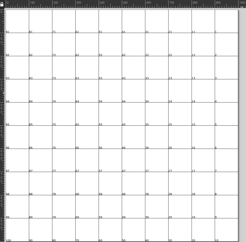
We will cover an example of how to use the grid for a polygon data source in Tableau in the next exercise.
Using a grid to generate a dataset
Skilled chess players will complete a game in about 40 moves. In chess tournaments[ˈtʊənəmənt]锦标赛,联赛, data is routinely captured for each game, which provides opportunities for data visualization. In this exercise, we will use data from a chess game to visualize how often each square of a chessboard is occupied:
- 1. Within the workbook associated with this chapter, navigate to the worksheet entitled Chessboard.
- 2. Download the Chessboard.png pictures from this book's GitHub repository if you haven't done so yet. Open the SVG file(LocationCodes.svg) created in the previous exercise in Inkscape.
- 3. Within Inkscape, press Ctrl + A to select all. Group the selection using Ctrl + G.
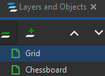
- 4. From the Inkscape menu, select Layer | Layers and Objects. The keyboard shortcut is Shift + Ctrl + L.
- 5. Within the Layers palette that displays on the right-hand side of the screen, press the +
 icon to create a layer. Name the layer Chessboard.
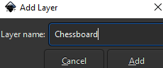 Then, create another layer named Grid
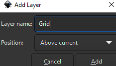 :
:
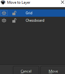
- 6. Click on any line or number in the view. Right-click on that same line or number and select Move to layer. Choose the Grid layer.
- 7. Select File | Import and choose the Chessboard.png image.
 Then right click image to select Move to Layer
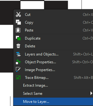 ==>
==>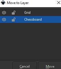
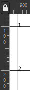
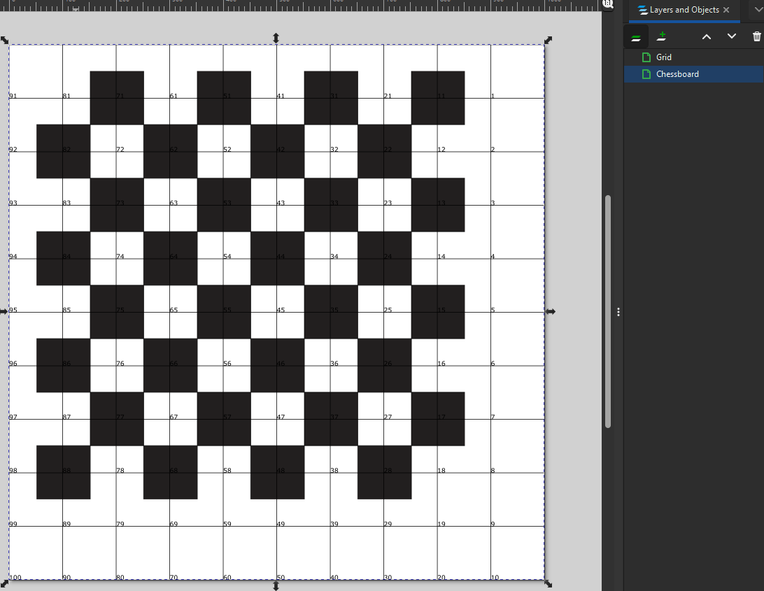
- 8. Make sure that the image is placed on the Chessboard layer so that the location code numbers are not obscured. Position the chessboard image such that location code 81 is centered over the top left-hand square of the chessboard. Since the chessboard is only composed of 64 squares, it will not encompass all 100 squares the grid provides.
At this point, you need to manually generate a dataset based on how often each location is occupied.
For example, you might note that for one game, position 81 was occupied for 40 moves,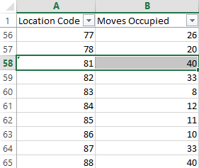 in which case the player may simply have never moved that rook. However, in another game the position may be occupied for only 10 moves, perhaps indicating the player performed a castle early in the game.
Visualizing a chess game
In this exercise, we will take a look at a dataset generated from a chess game and discover how to visualize the results based on the work done in the previous exercises. The following are the steps:
In this exercise, we will take a look at a dataset generated from a chess game and discover how to visualize the results based on the work done in the previous exercises. The following are the steps
- 1. Within the workbook associated with this chapter, navigate to the worksheet entitled Chessboard and select the Chessboard data source.
- 2. Right-click on the Chessboard data source and select Edit Data Source in order to examine the dataset.
- 3. In the dialog box asking Where is the data file? steer to the Chessboard.xlsx file provided with the assets associated with this chapter.
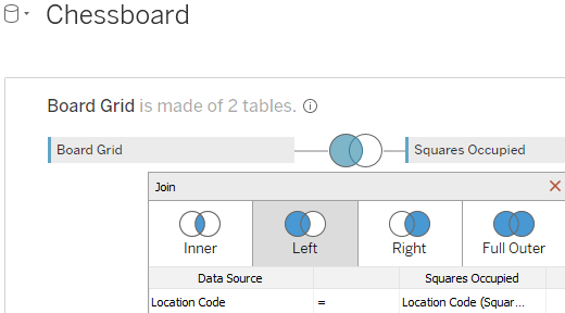
- 4. The table named Board Grid contains each location code and the X and Y coordinates associated with each location code. This dataset was taken from the LocationCodes.csv created earlier in this chapter. The table named Squares Occupied contains the fields Location Code and Moves Occupied. Board Grid and Squares Occupied are connected using a left join on Location Code:
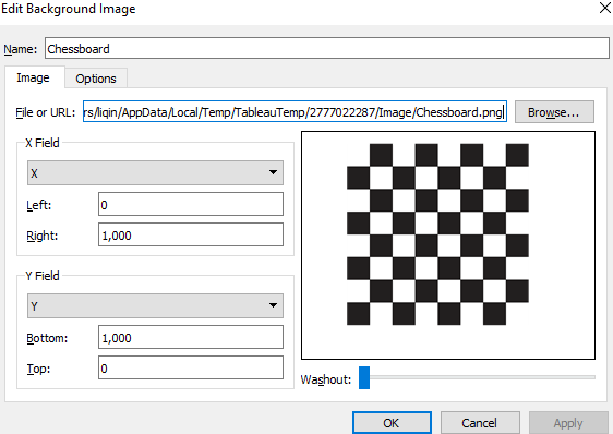
- 5. On the Chessboard worksheet, select Map | Background Images | Chessboard.
- 6. In the resulting dialog box, click Add Image to add a background image.
- 7. Fill out the Add Background Image dialog box as shown:
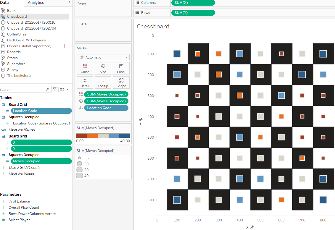
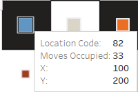
- 8. Place the fields X, Y, and Location Code on the Columns, Rows, and Detail shelves respectively, and the Moves Occupied field on Color and Size:
- 9. Right-click on the X and Y axes and set both to Fixed with a Fixed start value of 0 and a Fixed end value of 875
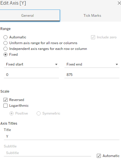
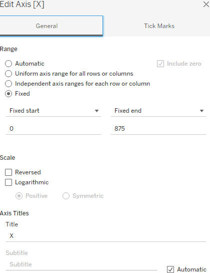
- 10. Edit the Y axis and set it to Reversed. Do not reverse the x axis.
- This last step was performed because the data has been structured to mirror the X and Y coordinate setup that is the default in most graphic tools. In these, the upper left-hand corner is where X and Y both equal 0.
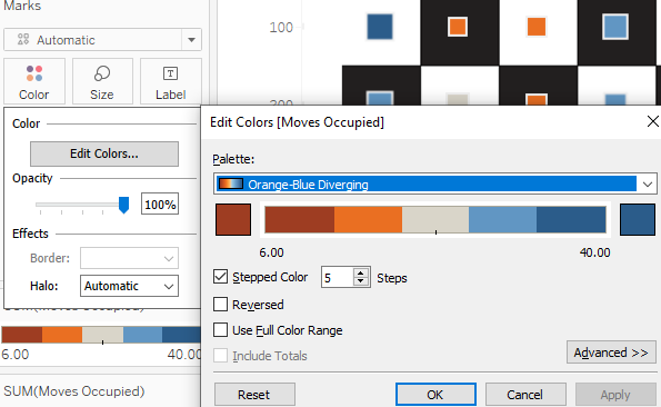
- 11. Adjust Color, Size, Shape, and so on as desired:
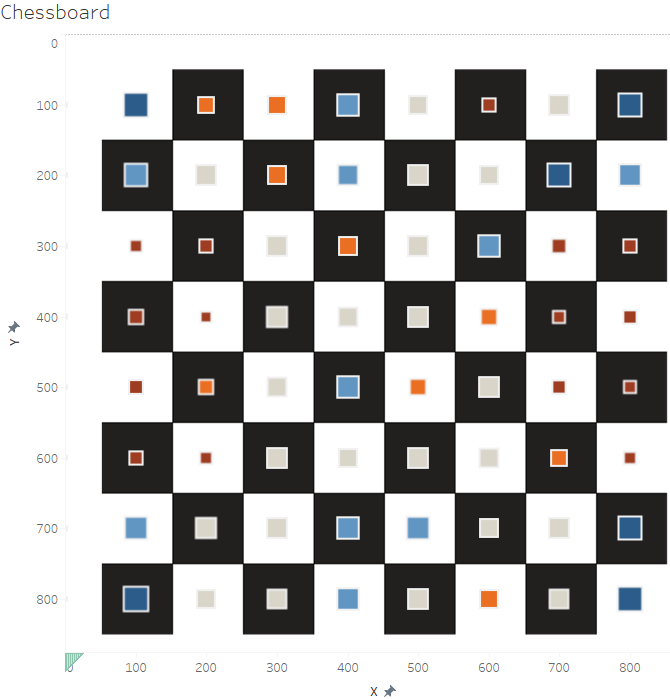
In the screenshot,
- the larger and bluer the square, the more frequently this space was occupied for a move.
- The smaller and the redder a square, the less frequently it was occupied.
- By hovering over a field, the amount of occupation will show as well.
To recap, we started off by creating an SVG file. We did so by creating three different code types, Header, Location Codes, and Lines, according to the standards of an SVG file. We then copied those three code pieces into a text editor program and saved it as an SVG file. Then we downloaded the Inkscape application and opened the SVG file to check and see the result of our work, a 10-by-10 square field.
We added an image of a chessboard to Inkscape and aligned the two. Now we could see which square number will be associated with which chessboard field. Just like in the bookshelf example, it is necessary to identify the shape ID(can be replaced with bookID), that is, the chessboard field ID(LocationCodes). Based on the chessboard field IDs, we were able to generate a second dataset containing the number of moves for which a field was occupied. By joining the Board Grid dataset with the Occupied Moves dataset, we got ourselves a use case. We added a background image of a chessboard to Tableau and on top of it, we drew squares and colored as well as sized them depending on the number of moves those fields were occupied for during the chess games. The numbers are very specific to each game, of course, but by collecting the data for multiple games, we would be able to visually analyze chess strategies and maybe even tell who the better player was. If you like chess, feel free to try it out and compare the different visual results per game, or see whether you usually end up with the same pattern, and is this also true for your opponent?
Talking about games, in the next exercise, we will visualize a dartboard. This exercise will be shorter than the chess one but also advanced. Follow along with the steps and learn more about polygons.
Creating polygons on a background image
Utilizing shapes on specific points of a visualization was sufficient for the previous exercise, but sometimes it may be advantageous to use polygons to outline shapes. In this section, we will utilize polygons on a background image and unlike with the books, we will fill out the areas such that the background image is not needed (as much) anymore.
The following are the steps:
- 1. Within the workbook associated with this chapter, navigate to the worksheet entitled Dashboard - Polygon and select the DartBoard_W_Polygons data source.
Total Hits	Case	David	Matthew	Number of Records	Point	Shape	X	Y
0	0	0	0	1	0	10A	534.460001834	254.649993896
0	0	0	0	1	1	10A	544.500002749	290.799987793
0	0	0	0	1	2	10A	527.230006106	294.009979248
0	0	0	0	1	3	10A	520.000010379	267.910003662
0	0	0	0	1	4	10A	508.350001223	236.179992676
0	0	0	0	1	5	10A	522.810007937	227.75
0	0	0	0	1	6	10A	534.460001834	254.649993896
0	0	0	0	1	1	10B	501.550001986	238.220001221
0	0	0	0	1	2	10B	454.560000308	261.91998291
0	0	0	0	1	3	10B	464.199999698	280.389984131
0	0	0	0	1	4	10B	470.630000003	304.089996338
0	0	0	0	1	5	10B	521.230002292	293.649993896
0	0	0	0	1	6	10B	511.589999087	263.929992676
2	2	0	2	1	0	10B	511.589999087	263.929992676
0	0	0	0	1	1	10C	448.949999698	264.729980469
0	0	0	0	1	2	10C	435.699999698	271.160003662
0	0	0	0	1	3	10C	442.130000003	287.220001221
0	0	0	0	1	4	10C	447.320002444	308.099975586
0	0	0	0	1	5	10C	463.390009768	304.889984131
0	0	0	0	1	6	10C	456.580000766	283.609985352
1	1	0	1	1	0	10C	456.580000766	283.609985352
0	0	0	0	1	1	10D	441.330000289	308.910003662
0	0	0	0	1	2	10D	346.960001834	326.579986572
0	0	0	0	1	3	10D	342.540003665	318.949981689
0	0	0	0	1	4	10D	429.689999469	273.970001221
0	0	0	0	1	5	10D	434.510000117	291.639984131
2	2	0	2	1	0	10D	434.510000117	291.639984131
0	0	0	0	1	0	11A	98.159998782	333.809997559
0	0	0	0	1	1	11A	101.769999392	370.749969482
0	0	0	0	1	2	11A	118.240000613	366.739959717
0	0	0	0	1	3	11A	115.83001221	333.409973145
0	0	0	0	1	4	11A	117.430003054	301.279998779
0	0	0	0	1	5	11A	100.970011599	298.059997559
0	0	0	0	1	6	11A	98.159998782	333.809997559
0	0	0	0	1	1	11B	123.680018313	365.939971924
0	0	0	0	1	2	11B	177.090006717	355.489990234
0	0	0	0	1	3	11B	174.680003054	333
0	0	0	0	1	4	11B	177.090006717	310.109985352
0	0	0	0	1	5	11B	122.469996341	302.079986572
0	0	0	0	1	6	11B	120.860010989	333
2	0	2	0	1	0	11B	120.860010989	333
0	0	0	0	1	1	11C	183.090021975	354.289978027
0	0	0	0	1	2	11C	198.74999512	352.679992676
0	0	0	0	1	3	11C	196.740015872	333.409973145
0	0	0	0	1	4	11C	197.950007327	311.720001221
0	0	0	0	1	5	11C	182.689997561	310.509979248
0	0	0	0	1	6	11C	180.680018313	332.599975586
3	0	3	0	1	0	11C	180.680018313	332.599975586
0	0	0	0	1	1	11D	203.980006106	314.529998779
0	0	0	0	1	2	11D	301.579996951	328.589996338
0	0	0	0	1	3	11D	300.769999392	333
0	0	0	0	1	4	11D	203.58001221	350.66998291
7	0	7	0	1	0	11D	202.780009158	333.809997559
0	0	0	0	1	0	12A	192.130000003	512.489959717
0	0	0	0	1	1	12A	222.250002749	532.160003662
0	0	0	0	1	2	12A	231.089999087	516.499969482
0	0	0	0	1	3	12A	207.390009768	501.639984131
0	0	0	0	1	4	12A	177.680003054	477.579986572
0	0	0	0	1	5	12A	165.630000003	490.839996338
0	0	0	0	1	6	12A	192.130000003	512.489959717
0	0	0	0	1	0	12B	201.189997561	491.639984131
0	0	0	0	1	1	12B	232.909998782	510.920013428
0	0	0	0	1	2	12B	256.210001834	461.1199646
0	0	0	0	1	3	12B	238.939997561	449.8699646
0	0	0	0	1	4	12B	218.860010989	434.209991455
0	0	0	0	1	5	12B	181.909998782	473.569976807
0	0	0	0	1	6	12B	201.189997561	491.639984131
0	0	0	0	1	0	12C	237.710017093	444.249969482
0	0	0	0	1	1	12C	259.390009768	455.489959717
0	0	0	0	1	2	12C	265.420008548	441.839996338
0	0	0	0	1	3	12C	250.960001834	433.410003662
0	0	0	0	1	4	12C	234.900019534	417.739959717
0	0	0	0	1	5	12C	222.850001223	430.189971924
0	0	0	0	1	6	12C	237.710017093	444.249969482
0	0	0	0	1	1	12D	236.920008548	414.129974365
0	0	0	0	1	2	12D	305.990000613	344.649993896
0	0	0	0	1	3	12D	315.230006106	349.470001221
0	0	0	0	1	4	12D	269.450007327	438.220001221
0	0	0	0	1	5	12D	255.790003665	428.179962158
3	1	2	1	1	0	12D	254.990000613	426.579986572
0	0	0	0	1	0	13A	539.280001529	392.809997559
0	0	0	0	1	1	13A	526.030009158	424.129974365
0	0	0	0	1	2	13A	509.560007937	418.110015869
0	0	0	0	1	3	13A	520.799998172	392.809997559
0	0	0	0	1	4	13A	527.630000003	362.279998779
0	0	0	0	1	5	13A	544.900004275	364.289978027
0	0	0	0	1	6	13A	539.280001529	392.809997559
0	0	0	0	1	1	13B	504.359999545	417.739959717
0	0	0	0	1	2	13B	454.159998782	394.049957275
0	0	0	0	1	3	13B	464.600001223	372.360015869
0	0	0	0	1	4	13B	469.019999392	352.279998779
0	0	0	0	1	5	13B	521.630000003	361.1199646
0	0	0	0	1	6	13B	516.810000308	388.019989014
3	3	0	3	1	0	13B	516.810000308	388.019989014
0	0	0	0	1	1	13C	458.969996341	370.749969482
0	0	0	0	1	2	13C	451.340006717	389.629974365
0	0	0	0	1	3	13C	436.480006106	383.199981689
0	0	0	0	1	4	13C	444.110010989	364.329986572
0	0	0	0	1	5	13C	448.930003054	348.259979248
0	0	0	0	1	6	13C	461.780009158	352.679992676
1	1	0	1	1	0	13C	461.780009158	352.679992676
0	0	0	0	1	1	13D	431.28999985	381.199981689
0	0	0	0	1	2	13D	342.140002139	341.839996338
0	0	0	0	1	3	13D	344.550005801	332.599975586
0	0	0	0	1	4	13D	441.330000289	347.059997559
0	0	0	0	1	5	13D	437.320000537	361.920013428
4	4	0	4	1	0	13D	437.320000537	361.920013428
0	0	0	0	1	0	14A	109.400004275	402.079986572
0	0	0	0	1	1	14A	120.650004275	430.189971924
0	0	0	0	1	2	14A	137.519999392	422.559967041
0	0	0	0	1	3	14A	127.070002444	394.850006104
0	0	0	0	1	4	14A	118.240000613	366.739959717
0	0	0	0	1	5	14A	101.769999392	370.749969482
0	0	0	0	1	6	14A	109.400004275	402.079986572
0	0	0	0	1	1	14B	142.549998172	420.549957275
0	0	0	0	1	2	14B	191.549998172	396.059967041
0	0	0	0	1	3	14B	182.710001834	376.379974365
0	0	0	0	1	4	14B	177.090006717	355.489990234
0	0	0	0	1	5	14B	123.680018313	365.939971924
0	0	0	0	1	6	14B	130.900019534	392.439971924
1	0	1	0	1	0	14B	130.900019534	392.439971924
0	0	0	0	1	0	14C	187.110010989	373.569976807
0	0	0	0	1	1	14C	195.540003665	394.449981689
0	0	0	0	1	2	14C	209.600001223	386.019989014
0	0	0	0	1	3	14C	203.570002444	371.160003662
0	0	0	0	1	4	14C	198.74999512	352.679992676
0	0	0	0	1	5	14C	183.090021975	354.289978027
0	0	0	0	1	6	14C	187.110010989	373.569976807
0	0	0	0	1	1	14D	204.390009768	350.269989014
0	0	0	0	1	2	14D	300.769999392	333
0	0	0	0	1	3	14D	302.380000003	340.229980469
0	0	0	0	1	4	14D	215.630000003	385.209991455
0	0	0	0	1	5	14D	210.409998782	368.749969482
7	0	7	0	1	0	14D	210.409998782	368.749969482
0	0	0	0	1	0	15A	506.36000336	198.809997559
0	0	0	0	1	1	15A	522.810007937	227.75
0	0	0	0	1	2	15A	508.350001223	236.179992676
0	0	0	0	1	3	15A	494.710001834	213.259979248
0	0	0	0	1	4	15A	466.600001223	180.729980469
0	0	0	0	1	5	15A	481.460001834	169.889984131
0	0	0	0	1	6	15A	506.36000336	198.809997559
0	0	0	0	1	0	15B	485.890002139	210.91998291
0	0	0	0	1	1	15B	501.550001986	238.220001221
0	0	0	0	1	2	15B	454.560000308	261.91998291
0	0	0	0	1	3	15B	442.920000918	242.639984131
0	0	0	0	1	4	15B	427.250002749	224.569976807
0	0	0	0	1	5	15B	443.320002444	206.899993896
0	0	0	0	1	6	15B	462.190005191	187.220001221
0	0	0	0	1	7	15B	485.890002139	210.91998291
0	0	0	0	1	0	15C	436.90000046	246.259979248
0	0	0	0	1	1	15C	422.850001223	228.989990234
0	0	0	0	1	2	15C	412.409998782	239.829986572
0	0	0	0	1	3	15C	424.049998172	253.489990234
0	0	0	0	1	4	15C	435.699999698	271.160003662
0	0	0	0	1	5	15C	448.949999698	264.729980469
0	0	0	0	1	6	15C	436.90000046	246.259979248
0	0	0	0	1	1	15D	429.689999469	273.970001221
0	0	0	0	1	2	15D	342.540003665	318.949981689
0	0	0	0	1	3	15D	338.519999392	314.129974365
0	0	0	0	1	4	15D	408.000002749	243.849975586
0	0	0	0	1	5	15D	418.440001376	257.899993896
2	2	0	2	1	0	15D	418.440001376	257.899993896
0	0	0	0	1	0	16A	150.570002444	214.869995117
0	0	0	0	1	1	16A	135.710017093	241.779998779
0	0	0	0	1	2	16A	118.040003665	233.349975586
0	0	0	0	1	3	16A	134.909998782	206.039978027
0	0	0	0	1	4	16A	157.400019534	176.319976807
0	0	0	0	1	5	16A	170.650019534	189.569976807
0	0	0	0	1	6	16A	150.570002444	214.869995117
0	0	0	0	1	1	16B	141.350001223	244.649993896
0	0	0	0	1	2	16B	189.540003665	267.539978027
0	0	0	0	1	3	16B	199.579996951	248.66998291
0	0	0	0	1	4	16B	214.040003665	231.399993896
0	0	0	0	1	5	16B	173.880000003	193.649993896
0	0	0	0	1	6	16B	153.799998172	218.549987793
1	0	1	0	1	0	16B	153.799998172	218.549987793
0	0	0	0	1	1	16C	195.140009768	268.75
0	0	0	0	1	2	16C	209.600001223	275.569976807
0	0	0	0	1	4	16C	229.680018313	245.049987793
0	0	0	0	1	5	16C	218.83001221	233.410003662
0	0	0	0	1	6	16C	205.980006106	250.66998291
3	0	3	0	1	0	16C	205.980006106	250.66998291
0	0	0	0	1	1	16D	233.299998172	249.069976807
0	0	0	0	1	2	16D	305.590006717	316.139984131
0	0	0	0	1	3	16D	302.380000003	320.149993896
0	0	0	0	1	4	16D	214.030009158	278.389984131
0	0	0	0	1	5	16D	222.060007937	263.929992676
8	1	7	1	1	0	16D	222.060007937	263.929992676
0	0	0	0	1	0	17A	388.710001834	114.069976807
0	0	0	0	1	1	17A	348.549998172	105.630004883
0	0	0	0	1	2	17A	347.750010379	122.899993896
0	0	0	0	1	3	17A	374.660006411	128.929992676
0	0	0	0	1	4	17A	409.190005191	140.16998291
0	0	0	0	1	5	17A	419.210001834	127.720001221
0	0	0	0	1	6	17A	388.710001834	114.069976807
0	0	0	0	1	0	17B	379.460001834	136.220001221
0	0	0	0	1	1	17B	408.380000003	147.059997559
0	0	0	0	1	2	17B	385.490000613	195.649993896
0	0	0	0	1	3	17B	369.019999392	190.029998779
0	0	0	0	1	4	17B	342.519999392	182.799987793
0	0	0	0	1	5	17B	346.930003054	130.190002441
0	0	0	0	1	6	17B	379.460001834	136.220001221
0	0	0	0	1	0	17C	364.210001834	193.239990234
0	0	0	0	1	1	17C	341.719996341	188.829986572
0	0	0	0	1	2	17C	338.909998782	203.690002441
0	0	0	0	1	3	17C	357.390009768	207.699981689
0	0	0	0	1	4	17C	377.870005496	214.929992676
0	0	0	0	1	5	17C	383.890002139	200.880004883
0	0	0	0	1	6	17C	364.210001834	193.239990234
0	0	0	0	1	1	17D	374.269999392	220.549987793
0	0	0	0	1	2	17D	331.699999698	308.910003662
0	0	0	0	1	3	17D	326.47000397	307.299987793
0	0	0	0	1	4	17D	336.920000918	210.109985352
0	0	0	0	1	5	17D	354.990000613	213.329986572
1	1	0	1	1	0	17D	354.990000613	213.329986572
0	0	0	0	1	0	18A	463.370005496	506.859954834
0	0	0	0	1	1	18A	431.86000336	526.939971924
0	0	0	0	1	2	18A	423.019999392	510.480010986
0	0	0	0	1	3	18A	446.909998782	495.6199646
0	0	0	0	1	4	18A	469.000010379	474.730010986
0	0	0	0	1	5	18A	483.049998172	487.179962158
0	0	0	0	1	6	18A	463.370005496	506.859954834
0	0	0	0	1	1	18B	420.030009158	506.100006104
0	0	0	0	1	2	18B	391.110010989	459.509979248
0	0	0	0	1	3	18B	411.189997561	449.470001221
0	0	0	0	1	4	18B	427.660006411	432.999969482
0	0	0	0	1	5	18B	466.210001834	469.949981689
0	0	0	0	1	6	18B	446.530001529	489.629974365
2	2	0	2	1	0	18B	446.530001529	489.629974365
0	0	0	0	1	1	18C	390.290003665	453.489959717
0	0	0	0	1	2	18C	382.260004885	441.040008545
0	0	0	0	1	3	18C	399.130000003	430.589996338
0	0	0	0	1	4	18C	413.990000613	417.739959717
0	0	0	0	1	5	18C	424.430003054	428.589996338
0	0	0	0	1	6	18C	407.960001834	443.449981689
1	1	0	1	1	0	18C	407.960001834	443.449981689
0	0	0	0	1	1	18D	381.900004275	435.819976807
0	0	0	0	1	2	18D	329.690005191	350.66998291
0	0	0	0	1	3	18D	338.519999392	345.859985352
0	0	0	0	1	4	18D	410.010001071	414.129974365
0	0	0	0	1	5	18D	396.760001071	424.970001221
4	4	0	4	1	0	18D	396.350001223	424.569976807
0	0	0	0	1	0	19A	248.159998782	116.079986572
0	0	0	0	1	1	19A	216.430003054	132.139984131
0	0	0	0	1	2	19A	224.070002444	147.799987793
0	0	0	0	1	3	19A	254.189997561	134.149993896
0	0	0	0	1	4	19A	283.890009768	125.309997559
0	0	0	0	1	5	19A	281.480006106	108.039978027
0	0	0	0	1	6	19A	248.159998782	116.079986572
0	0	0	0	1	0	19B	256.60999573	139.029998779
0	0	0	0	1	1	19B	226.090006717	152.679992676
0	0	0	0	1	2	19B	252.189997561	198.869995117
0	0	0	0	1	3	19B	272.670000918	189.630004883
0	0	0	0	1	4	19B	294.320002444	185.209991455
0	0	0	0	1	5	19B	284.279993899	131.799987793
0	0	0	0	1	6	19B	256.60999573	139.029998779
0	0	0	0	1	0	19C	274.659998782	196.459991455
0	0	0	0	1	1	19C	255.380000003	204.489990234
0	0	0	0	1	2	19C	263.010004885	218.949981689
0	0	0	0	1	3	19C	278.670008548	210.91998291
0	0	0	0	1	4	19C	297.150004275	205.289978027
0	0	0	0	1	5	19C	295.140009768	191.239990234
0	0	0	0	1	6	19C	274.659998782	196.459991455
0	0	0	0	1	1	19D	297.159998782	211.720001221
0	0	0	0	1	2	19D	315.630000003	308.509979248
0	0	0	0	1	3	19D	312.019999392	309.709991455
0	0	0	0	1	4	19D	265.829996951	224.16998291
0	0	0	0	1	5	19D	279.490000613	216.940002441
3	1	2	1	1	0	19D	279.490000613	216.940002441
0	0	0	0	1	0	1A	402.140002139	540.600006104
0	0	0	0	1	1	1A	361.170008548	551.439971924
0	0	0	0	1	2	1A	357.960001834	532.970001221
0	0	0	0	1	3	1A	390.089999087	524.939971924
0	0	0	0	1	4	1A	423.019999392	510.480010986
0	0	0	0	1	5	1A	431.86000336	526.939971924
0	0	0	0	1	6	1A	402.140002139	540.600006104
0	0	0	0	1	0	1B	390.310007937	519.350006104
0	0	0	0	1	1	1B	358.579996951	526.980010986
0	0	0	0	1	2	1B	348.939997561	474.3699646
0	0	0	0	1	3	1B	368.220011599	469.149993896
0	0	0	0	1	4	1B	391.110010989	459.509979248
0	0	0	0	1	5	1B	420.030009158	506.100006104
0	0	0	0	1	6	1B	390.310007937	519.350006104
0	0	0	0	1	0	1C	372.250010379	462.720001221
0	0	0	0	1	1	1C	348.150004275	468.749969482
0	0	0	0	1	2	1C	345.340006717	453.079986572
0	0	0	0	1	3	1C	365.019999392	447.859954834
0	0	0	0	1	4	1C	382.260004885	441.040008545
0	0	0	0	1	5	1C	390.290003665	453.489959717
0	0	0	0	1	6	1C	372.250010379	462.720001221
0	0	0	0	1	0	1D	364.229998477	443.449981689
0	0	0	0	1	1	1D	344.949999698	448.259979248
0	0	0	0	1	2	1D	325.269999392	352.679992676
0	0	0	0	1	3	1D	329.690005191	350.66998291
0	0	0	0	1	4	1D	381.490000613	437.019989014
0	0	0	0	1	0	20A	328.640009768	555.059967041
0	0	0	0	1	1	20A	290.519999392	553.449981689
0	0	0	0	1	2	20A	292.519999392	534.980010986
0	0	0	0	1	3	20A	321.010004885	536.179962158
0	0	0	0	1	4	20A	357.960001834	532.970001221
0	0	0	0	1	5	20A	361.170008548	551.439971924
0	0	0	0	1	6	20A	328.640009768	555.059967041
0	0	0	0	1	1	20B	358.579996951	526.980010986
0	0	0	0	1	2	20B	348.939997561	474.3699646
0	0	0	0	1	3	20B	325.250010379	476.379974365
0	0	0	0	1	4	20B	300.780001529	475.980010986
0	0	0	0	1	5	20B	294.36000336	529.389984131
0	0	0	0	1	6	20B	325.250010379	531.399993896
1	1	0	1	1	0	20B	325.250010379	531.399993896
0	0	0	0	1	1	20C	348.150004275	468.749969482
0	0	0	0	1	2	20C	345.340006717	453.079986572
0	0	0	0	1	3	20C	326.060007937	454.689971924
0	0	0	0	1	4	20C	302.370005496	453.079986572
0	0	0	0	1	5	20C	300.360010989	469.949981689
0	0	0	0	1	6	20C	324.049998172	471.160003662
1	1	0	1	1	0	20C	324.049998172	471.160003662
0	0	0	0	1	0	20D	325.269999392	449.470001221
0	0	0	0	1	1	20D	303.980006106	447.859954834
0	0	0	0	1	2	20D	316.030009158	351.079986572
0	0	0	0	1	3	20D	325.269999392	352.679992676
0	0	0	0	1	4	20D	344.949999698	448.259979248
0	0	0	0	1	5	20D	325.269999392	449.470001221
0	0	0	0	1	0	2A	452.939997561	145.789978027
0	0	0	0	1	1	2A	481.460001834	169.889984131
0	0	0	0	1	2	2A	466.600001223	180.729980469
0	0	0	0	1	3	2A	447.719996341	163.869995117
0	0	0	0	1	4	2A	413.990000613	142.979980469
0	0	0	0	1	5	2A	419.210001834	127.720001221
0	0	0	0	1	6	2A	452.939997561	145.789978027
0	0	0	0	1	0	2B	437.699999698	163.119995117
0	0	0	0	1	1	2B	463.000002749	187.220001221
0	0	0	0	1	2	2B	443.320002444	206.899993896
0	0	0	0	1	3	2B	427.250002749	224.569976807
0	0	0	0	1	4	2B	407.980006106	208.910003662
0	0	0	0	1	5	2B	387.900004275	195.25
0	0	0	0	1	6	2B	408.380000003	147.059997559
0	0	0	0	1	7	2B	437.699999698	163.119995117
0	0	0	0	1	0	2C	404.780001529	213.329986572
0	0	0	0	1	1	2C	383.890002139	200.880004883
0	0	0	0	1	2	2C	377.870005496	214.929992676
0	0	0	0	1	3	2C	393.930003054	226.179992676
0	0	0	0	1	4	2C	412.409998782	239.829986572
0	0	0	0	1	5	2C	422.850001223	228.989990234
0	0	0	0	1	6	2C	404.780001529	213.329986572
0	0	0	0	1	0	2D	389.130000003	232.599975586
0	0	0	0	1	1	2D	408.000002749	243.849975586
0	0	0	0	1	2	2D	338.519999392	314.129974365
0	0	0	0	1	3	2D	331.699999698	308.910003662
0	0	0	0	1	4	2D	374.269999392	220.549987793
0	0	0	0	1	5	2D	390.330000766	231.799987793
0	0	0	0	1	0	3A	316.019999392	104.029998779
0	0	0	0	1	1	3A	281.480006106	108.039978027
0	0	0	0	1	2	3A	283.890009768	125.309997559
0	0	0	0	1	3	3A	314.409998782	123.299987793
0	0	0	0	1	4	3A	347.750010379	122.899993896
0	0	0	0	1	5	3A	348.549998172	105.630004883
0	0	0	0	1	6	3A	316.019999392	104.029998779
0	0	0	0	1	0	3B	314.000010379	126.979980469
0	0	0	0	1	1	3B	346.930003054	130.190002441
0	0	0	0	1	2	3B	342.519999392	182.799987793
0	0	0	0	1	3	3B	316.010004885	183.199981689
0	0	0	0	1	4	3B	294.320002444	185.209991455
0	0	0	0	1	5	3B	289.49999512	157.5
0	0	0	0	1	6	3B	284.279993899	131.799987793
0	0	0	0	1	7	3B	314.000010379	126.979980469
0	0	0	0	1	0	3C	316.820002444	187.619995117
0	0	0	0	1	1	3C	295.140009768	191.239990234
0	0	0	0	1	2	3C	297.150004275	205.289978027
0	0	0	0	1	3	3C	316.420008548	203.690002441
0	0	0	0	1	4	3C	338.909998782	203.690002441
0	0	0	0	1	5	3C	341.719996341	188.829986572
0	0	0	0	1	6	3C	316.820002444	187.619995117
0	0	0	0	1	1	3D	336.920000918	210.109985352
0	0	0	0	1	2	3D	326.47000397	307.299987793
0	0	0	0	1	3	3D	315.630000003	308.509979248
0	0	0	0	1	4	3D	297.159998782	211.720001221
0	0	0	0	1	5	3D	318.040003665	210.509979248
2	0	2	0	1	0	3D	318.040003665	210.509979248
0	0	0	0	1	0	4A	508.350001223	457.8699646
0	0	0	0	1	1	4A	483.049998172	487.179962158
0	0	0	0	1	2	4A	469.000010379	474.730010986
0	0	0	0	1	3	4A	492.689997561	449.029998779
0	0	0	0	1	4	4A	509.560007937	418.110015869
0	0	0	0	1	5	4A	526.030009158	424.129974365
0	0	0	0	1	6	4A	508.350001223	457.8699646
0	0	0	0	1	0	4B	487.490000613	446.660003662
0	0	0	0	1	1	4B	466.210001834	469.949981689
0	0	0	0	1	2	4B	427.660006411	432.999969482
0	0	0	0	1	3	4B	440.510004885	415.329986572
0	0	0	0	1	4	4B	454.159998782	394.049957275
0	0	0	0	1	5	4B	504.359999545	417.739959717
0	0	0	0	1	6	4B	487.490000613	446.660003662
0	0	0	0	1	0	4C	440.090006717	409.309967041
0	0	0	0	1	1	4C	424.430003054	428.589996338
0	0	0	0	1	2	4C	413.990000613	417.739959717
0	0	0	0	1	3	4C	427.240000613	400.879974365
0	0	0	0	1	4	4C	436.480006106	383.199981689
0	0	0	0	1	5	4C	451.340006717	389.629974365
0	0	0	0	1	6	4C	440.090006717	409.309967041
0	0	0	0	1	1	4D	410.010001071	414.129974365
0	0	0	0	1	2	4D	338.519999392	345.859985352
0	0	0	0	1	3	4D	342.140002139	341.839996338
0	0	0	0	1	4	4D	431.28999985	381.199981689
0	0	0	0	1	5	4D	422.860001452	396.860015869
5	5	0	5	1	0	4D	422.860001452	396.860015869
0	0	0	0	1	0	5A	252.760004885	543.410003662
0	0	0	0	1	1	5A	290.519999392	553.449981689
0	0	0	0	1	2	5A	292.519999392	534.980010986
0	0	0	0	1	3	5A	265.210001834	528.149993896
0	0	0	0	1	4	5A	231.089999087	516.499969482
0	0	0	0	1	5	5A	222.250002749	532.160003662
0	0	0	0	1	6	5A	252.760004885	543.410003662
0	0	0	0	1	0	5B	259.420008548	520.959991455
0	0	0	0	1	1	5B	294.36000336	529.389984131
0	0	0	0	1	2	5B	300.780001529	475.980010986
0	0	0	0	1	3	5B	280.300005801	469.549957275
0	0	0	0	1	4	5B	256.210001834	461.1199646
0	0	0	0	1	5	5B	232.909998782	510.920013428
0	0	0	0	1	6	5B	259.420008548	520.959991455
0	0	0	0	1	0	5C	277.870005496	463.529998779
0	0	0	0	1	1	5C	300.360010989	469.949981689
0	0	0	0	1	2	5C	302.370005496	453.079986572
0	0	0	0	1	3	5C	284.700007327	449.470001221
0	0	0	0	1	4	5C	265.420008548	441.839996338
0	0	0	0	1	5	5C	259.390009768	455.489959717
0	0	0	0	1	6	5C	277.870005496	463.529998779
0	0	0	0	1	1	5D	269.450007327	438.220001221
0	0	0	0	1	2	5D	315.230006106	349.470001221
0	0	0	0	1	3	5D	303.980006106	447.859954834
0	0	0	0	1	4	5D	287.120005496	445.049957275
4	3	1	3	1	0	5D	287.120005496	445.049957275
0	0	0	0	1	0	6A	547.710001834	326.940002441
0	0	0	0	1	1	6A	544.900004275	364.289978027
0	0	0	0	1	2	6A	527.630000003	362.279998779
0	0	0	0	1	3	6A	530.840006717	335.379974365
0	0	0	0	1	4	6A	527.230006106	294.009979248
0	0	0	0	1	5	6A	544.500002749	290.799987793
0	0	0	0	1	6	6A	547.710001834	326.940002441
0	0	0	0	1	1	6B	521.230002292	293.649993896
0	0	0	0	1	2	6B	470.630000003	304.089996338
0	0	0	0	1	3	6B	470.630000003	327.379974365
0	0	0	0	1	4	6B	469.019999392	352.279998779
0	0	0	0	1	5	6B	521.630000003	361.1199646
0	0	0	0	1	6	6B	525.65000046	329.789978027
3	3	0	3	1	0	6B	525.65000046	329.789978027
0	0	0	0	1	1	6C	465.390009768	327.379974365
0	0	0	0	1	2	6C	464.590006717	350.269989014
0	0	0	0	1	3	6C	448.930003054	348.259979248
0	0	0	0	1	4	6C	450.130000003	327.379974365
0	0	0	0	1	5	6C	447.320002444	308.099975586
0	0	0	0	1	6	6C	463.390009768	304.889984131
1	1	0	1	1	0	6C	463.390009768	304.889984131
0	0	0	0	1	0	6D	344.550005801	332.599975586
0	0	0	0	1	2	6D	444.149999984	327.379974365
0	0	0	0	1	3	6D	441.330000289	308.910003662
0	0	0	0	1	4	6D	346.560000308	326.579986572
0	0	0	0	1	5	6D	344.550005801	332.599975586
3	3	0	3	1	1	6D	441.330000289	347.059997559
0	0	0	0	1	0	7A	185.110010989	151.41998291
0	0	0	0	1	1	7A	157.400019534	176.319976807
0	0	0	0	1	2	7A	170.650019534	189.569976807
0	0	0	0	1	3	7A	195.150004275	168.279998779
0	0	0	0	1	4	7A	224.070002444	147.799987793
0	0	0	0	1	5	7A	216.430003054	132.139984131
0	0	0	0	1	6	7A	185.110010989	151.41998291
0	0	0	0	1	0	7B	196.769999392	171.160003662
0	0	0	0	1	1	7B	173.880000003	193.649993896
0	0	0	0	1	2	7B	214.040003665	231.399993896
0	0	0	0	1	3	7B	231.310007937	213.329986572
0	0	0	0	1	4	7B	252.189997561	198.869995117
0	0	0	0	1	5	7B	226.090006717	152.679992676
0	0	0	0	1	6	7B	196.769999392	171.160003662
0	0	0	0	1	0	7C	235.30001343	217.739990234
0	0	0	0	1	1	7C	218.83001221	233.410003662
0	0	0	0	1	2	7C	233.299998172	249.069976807
0	0	0	0	1	3	7C	229.680018313	245.049987793
0	0	0	0	1	4	7C	242.930018313	232.599975586
0	0	0	0	1	5	7C	263.010004885	218.949981689
0	0	0	0	1	6	7C	255.380000003	204.489990234
0	0	0	0	1	7	7C	235.30001343	217.739990234
0	0	0	0	1	1	7D	265.829996951	224.16998291
0	0	0	0	1	2	7D	312.019999392	309.709991455
0	0	0	0	1	3	7D	305.590006717	316.139984131
0	0	0	0	1	4	7D	233.299998172	249.069976807
0	0	0	0	1	5	7D	248.560007937	234.209991455
2	0	2	0	1	0	7D	248.560007937	234.209991455
0	0	0	0	1	0	8A	108.200007327	263.470001221
0	0	0	0	1	1	8A	100.970011599	298.059997559
0	0	0	0	1	2	8A	117.430003054	301.279998779
0	0	0	0	1	3	8A	125.070002444	270.690002441
0	0	0	0	1	4	8A	135.710017093	241.779998779
0	0	0	0	1	5	8A	118.040003665	233.349975586
0	0	0	0	1	6	8A	108.200007327	263.470001221
0	0	0	0	1	1	8B	122.469996341	302.079986572
0	0	0	0	1	2	8B	177.090006717	310.109985352
0	0	0	0	1	3	8B	180.700007327	284.009979248
0	0	0	0	1	4	8B	189.540003665	267.539978027
0	0	0	0	1	5	8B	141.350001223	244.649993896
0	0	0	0	1	6	8B	130.100001223	269.949981689
4	0	4	0	1	0	8B	130.100001223	269.949981689
0	0	0	0	1	1	8C	182.689997561	310.509979248
0	0	0	0	1	2	8C	197.950007327	311.720001221
0	0	0	0	1	3	8C	202.370020755	293.239990234
0	0	0	0	1	4	8C	209.600001223	275.569976807
0	0	0	0	1	5	8C	195.140009768	268.75
0	0	0	0	1	6	8C	187.909998782	287.220001221
4	0	4	0	1	0	8C	187.909998782	287.220001221
0	0	0	0	1	1	8D	214.030009158	278.389984131
0	0	0	0	1	2	8D	303.579996951	319.349975586
0	0	0	0	1	3	8D	301.579996951	328.589996338
0	0	0	0	1	4	8D	203.980006106	314.529998779
2	2	0	2	1	5	8D	208.000010379	296.059997559
4	0	4	0	1	0	8D	208.000010379	296.059997559
0	0	0	0	1	0	9A	139.519999392	461.519989014
0	0	0	0	1	1	9A	165.630000003	490.839996338
0	0	0	0	1	2	9A	177.680003054	477.579986572
0	0	0	0	1	3	9A	157.600001223	452.679962158
0	0	0	0	1	4	9A	137.519999392	422.559967041
0	0	0	0	1	5	9A	120.650004275	430.189971924
0	0	0	0	1	6	9A	139.519999392	461.519989014
0	0	0	0	1	0	9B	158.210001834	447.059967041
0	0	0	0	1	1	9B	181.909998782	473.569976807
0	0	0	0	1	2	9B	218.860010989	434.209991455
0	0	0	0	1	3	9B	205.600001223	417.339996338
0	0	0	0	1	4	9B	191.549998172	396.059967041
0	0	0	0	1	5	9B	142.549998172	420.549957275
0	0	0	0	1	6	9B	158.210001834	447.059967041
0	0	0	0	1	0	9C	207.990015872	412.1199646
0	0	0	0	1	1	9C	222.850001223	430.189971924
0	0	0	0	1	2	9C	234.900019534	417.739959717
0	0	0	0	1	3	9C	221.240015872	404.089996338
0	0	0	0	1	4	9C	209.600001223	386.019989014
0	0	0	0	1	5	9C	195.540003665	394.449981689
0	0	0	0	1	6	9C	207.990015872	412.1199646
0	0	0	0	1	1	9D	215.630000003	385.209991455
0	0	0	0	1	2	9D	302.380000003	340.229980469
0	0	0	0	1	3	9D	305.990000613	344.649993896
0	0	0	0	1	4	9D	236.920008548	414.129974365
0	0	0	0	1	5	9D	225.269999392	400.069976807
2	1	1	1	1	0	9D	225.269999392	400.069976807
0	0	0	0	1	0	Bullseye	312.790001832	330.149993896
0	0	0	0	1	0	Bullseye	315.760003053	335.649993896
0	0	0	0	1	0	Bullseye	317.680001222	338.670013428
0	0	0	0	1	1	Bullseye	316.360001527	337.839996338
0	0	0	0	1	1	Bullseye	317.680001222	338.670013428
0	0	0	0	1	2	Bullseye	325.650002442	338.940002441
0	0	0	0	1	2	Bullseye	324.330002747	340.040008545
0	0	0	0	1	3	Bullseye	331.140007935	331.799987793
0	0	0	0	1	3	Bullseye	331.470002137	335.369995117
0	0	0	0	1	4	Bullseye	328.940010987	324.110015869
0	0	0	0	1	4	Bullseye	332.840004884	326.579986572
0	0	0	0	1	5	Bullseye	323.170006715	319.989990234
0	0	0	0	1	5	Bullseye	326.520005189	320.260009766
0	0	0	0	1	6	Bullseye	319.110001527	319.989990234
0	0	0	0	1	6	Bullseye	317.950005494	321.360015869
0	0	0	0	1	7	Bullseye	313.830010377	326.579986572
0	0	0	0	1	7	Bullseye	312.790001832	330.149993896
0	0	0	0	1	8	Bullseye	313.560006104	332.350006104
0	0	0	0	1		Other
0	0	0	0	1	0	Other	312.019999392	309.709991455
0	0	0	0	1	1	Other	313.219996341	309.709991455
0	0	0	0	1	2	Other	195.140009768	268.75
0	0	0	0	1	5	Other	195.140009768	268.75
- 2. Select Map | Background Images | Dartboard_W_Polygons. In the Background Images dialog box, select Add Image. Fill out the dialog box as shown:
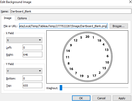
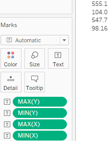
- 3. Create a parameter named Select Player with the following configuration:
- 4. This parameter will be used to either switch between player 1: Matthew and player 2: David or will show the dart[dɑːrt]飞镖 hits of both.
- 5. Display the parameter created in the previous step by right-clicking on it at the bottom of the Data pane and selecting Show Parameter Control.
- 6. Create a calculated field called Total Hits with the following code:
[David] + [Matthew]
- 7. Then, create a calculated field called Case with the following code:
CASE [Select Player]
    WHEN 1 THEN SUM([Matthew])
    WHEN 2 THEN SUM([David])
    WHEN 3 THEN SUM([Total Hits ])
END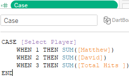
- 8. Set the Marks card to Polygon.
- 9. Survey the Data pane to ensure that Point and Shape are both dimensions (blue color). The other fields are measures:
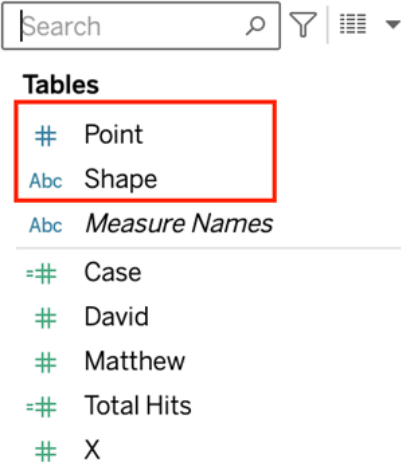
- 10. Place the fields X, Y, Point, Shape, and Case on their respective shelves:
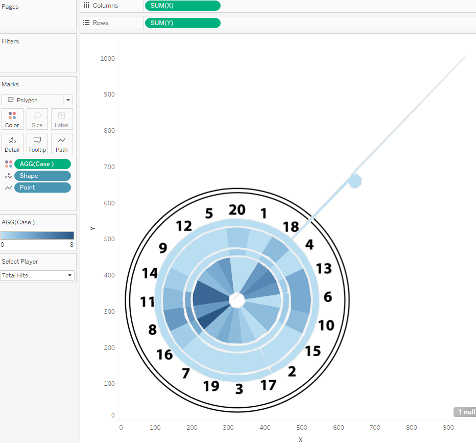
- 11. Right-click on each axis and set the Range from 0 to 650:
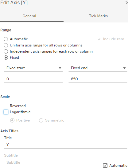
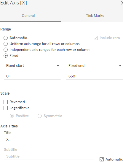
- 12. Click on the Color shelf and select Edit Colors. Adjust the color as desired. One possibility is represented in the following screenshot:
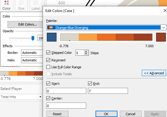
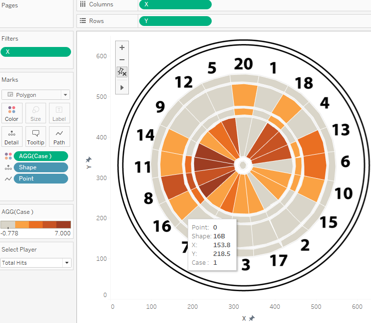
The final dashboard shows a dartboard with different colors. Gray color means that this area has not been hit during the game whereas the redder the color, the more often this field has been hit. By using the parameter, you can compare Matthew's score with David's, or you can show the total hits, like in the preceding screenshot.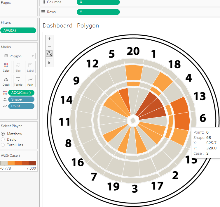
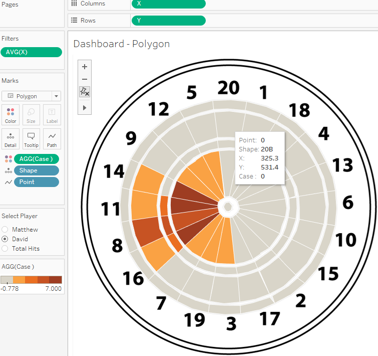 It is likely that you found completing this exercise in Tableau relatively easy. The challenge is in getting the data right, particularly the polygon points. A useful (and free) tool for generating polygon data can be found at http://powertoolsfortableau.com/tools/drawing-tool. This is one
of many tools created by InterWorks that are helpful for addressing common Tableau challenges. We used it in the bookshelf exercise.
You may have noticed that the curved sections of the polygons in this exercise aren't quite perfect. Look, for example, at the triple ring and double ring areas surrounding the bullseye; you can see that the area is not 100% even. That's simply the nature of working with points on a Cartesian grid in Tableau. This means that Tableau is based on a grid structure, so every curve we draw will still be many small lines connecting dots on a grid layout. The more dots you have and the shorter the lines between the dots, the more likely you will draw curves evenly. But if you followed along with the bookshelf exercise, you can imagine that a lot of effort has to go into such a background image. Nevertheless, I believe that polygons are absolutely worth it.
The next topic is a little bit different from the rest of this chapter. Have you heard about Tableau extensions yet? Extensions can help you get functionality into your dashboard that Tableau does not offer by default. Interested? Continue with the next section!
Tableau extensions
Another very helpful tool when it comes to going "beyond the basic chart types" is the Tableau Extensions API, which was released to the public in 2018. What does the Extensions API do? Basically, it allows you to use third-party tools directly in Tableau. Some selected extensions are available here: https://extensiongallery.tableau.com , and the list is always growing.
Please be aware that Tableau does not provide support or guarantees/security measures for extensions. Those APIs are built by external parties and should be treated as such. Check with your IT security team first if you want to use them at work.
Let's have a look at one example from Infotopics—a Sankey chart extension.
Using Show me More
In the associated workbook, create a new sheet called Show me More and select the Coffee Chain dataset. Now please reproduce the following worksheet layout by adding Type to Columns, Product Type to Rows, and Profit to the Text shelf: 
We want to utilize a Sankey chart for this worksheet, which is a kind of flow chart that shows based on the size of flow-lines how much of a given measure and a given dimension flows into a second given dimension. In this case, we want to know how much Profit of Regular type products comes from Coffee, Espresso, Herbal Tea, or Tea, and how much Profit can be associated with the Decaf types?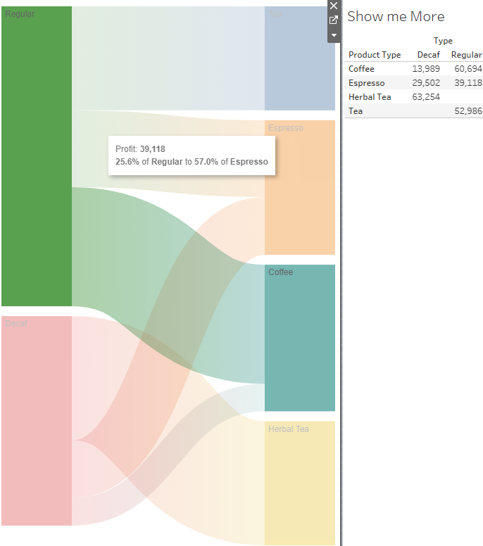
Say you know how to build a Sankey chart using calculated fields, but it is time-consuming. Instead, there is an extension to do so. The following are the steps required to use the extension and ultimately save us time when building a Sankey chart:
- 1. In the associated workbook, open a Dashboard tab.
- 2. Drag the Show me More sheet onto the dashboard. Now also drag the Extension object onto the dashboard:
- 3. From Tableau 2022.1, you will see the following pop-up window:
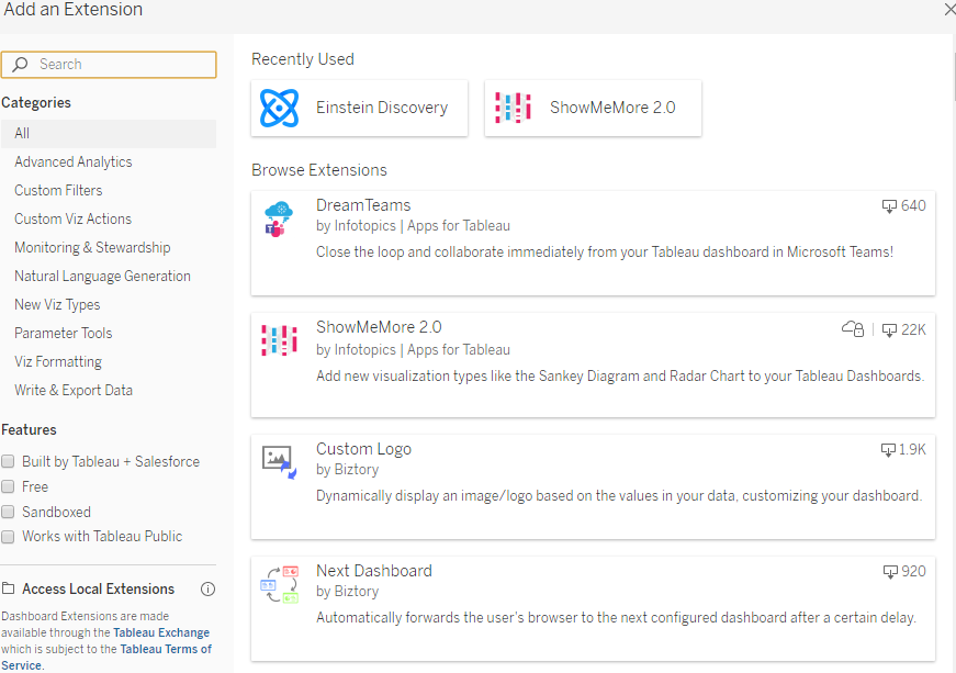
- 4. In the Extension Gallery search for the ShowMeMore extension. Click on it and select Add to Dashboard in the next screen:
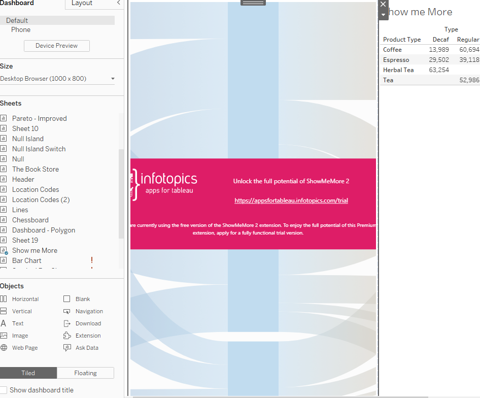
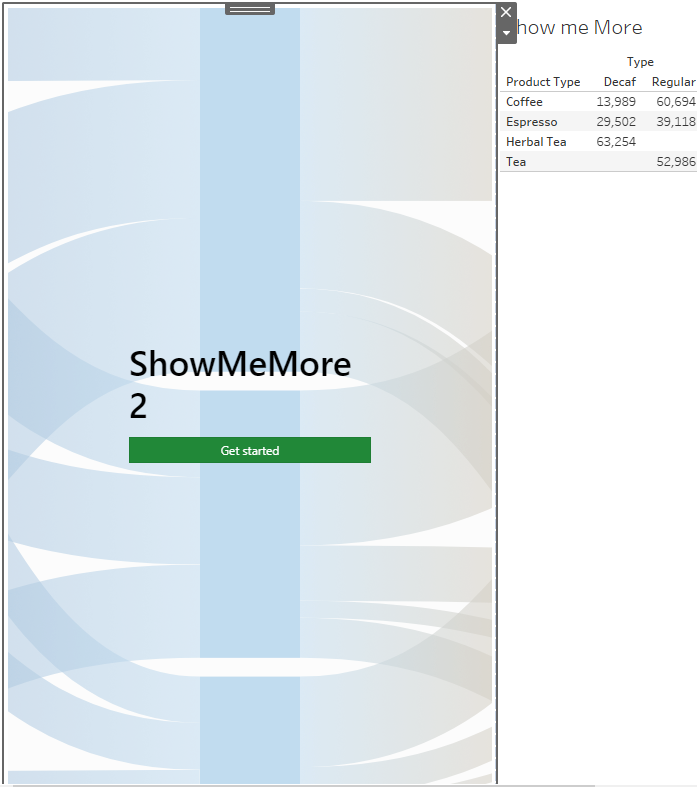
- 5. Then, select the Show me More sheet and the Sankey Diagram visualization:
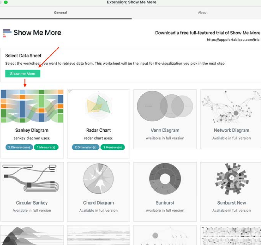
- 6. After selecting the Sankey diagram, configure the variables as follows:
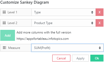
- 7. Hit the Ok button and voilà, you have your Sankey diagram:
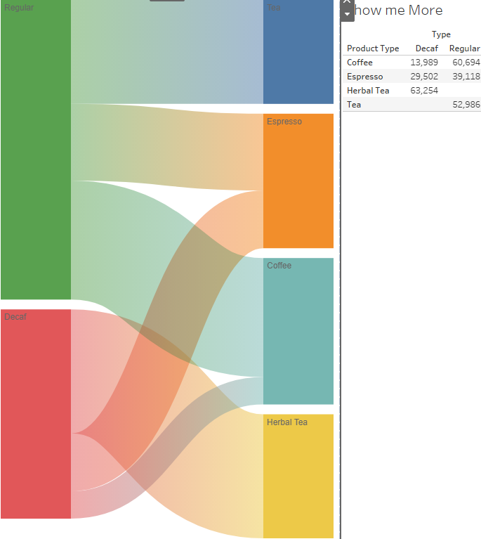
Besides this Sankey chart, I would highly recommend you have a look at the extensions library. There are many extensions for multiple different use cases; some are free, some have to be paid for, but you can also build your own. It is worth taking a look! The next section will be dedicated to a special extension, which is the most advertised new feature in Tableau 2021.1, Einstein Discovery.
Einstein Discovery
We have discussed extensions in the previous section, however, one deserves a little extra attention. But before we continue, a bit of a backstory. In August 2019 Tableau was acquired by Salesforce. Probably most of you know Salesforce and even work with it, but for all other readers, Salesforce is a cloud-native Customer Relationship Management (CRM) tool. Next to that, the company also developed an analytics portion, which allows Salesforce users to analyze data from the CRM system and other data sources.
Connecting Salesforce to Tableau was possible long before the acquisition, but what's new in Tableau 2021.1 is that the analytics piece of Salesforce is available to be called into Tableau, as an extension and in calculated fields. The Tableau community is very excited about this feature because of the built-in machine learning capability and real-time prediction power. This piece of software is called Einstein Discovery.
In order to make use of Einstein Discovery you need a Salesforce license and more specifically, the analytics license for Salesforce. The licensing details can be found here: https://www.salesforce.com/editions-pricing/crm-analytics/.
Now, to give you an idea what Einstein Discovery can do for you, I will walk you through an imaginary use-case. On a supply chain data dashboard you discover that shipment time can be improved, but you don't know which factors cause the delays. In this instance, you might decide to use Einstein Discovery for its analysis capabilities.
First, you would drag the Extensions object on to the dashboard, just like we did with the ShowMeMore extension. You would then select the Einstein Discovery item,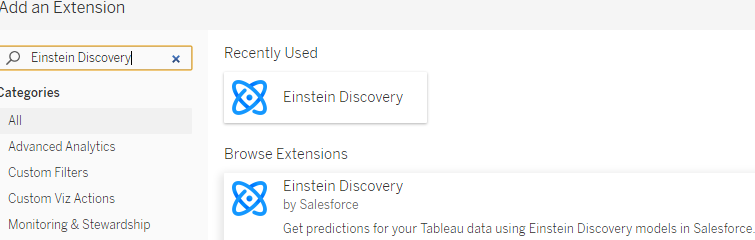 at which point a browser window will open to ask you to log in to Salesforce.
  After you have done so, you can select which model you want to use on your Tableau dashboard. The model (for example, a machine learning model) has to be prepared in Salesforce beforehand. Then, Einstein Discovery will be a part of your dashboard, and your worksheet will show the output from the model running in the background on Salesforce. In our example, the model will more easily be able to find the relevant
variables used on your dashboard that are best suited for predicting the time of delivery and will recommend actions you can take to improve the shipment time.
A video of the described use-case and another use-case can be viewed under: https://youtu.be/dMWuy6mVE_o.
Alternatively, you can call a Salesforce model directly in a calculated field. How this works is described here: https://help.tableau.com/current/pro/desktop/en-us/einstein_discovery_predictions.htm.
If you want to try out these new features, there is a way to test out the new Einstein capabilities if you do not have a Salesforce license yet. It is a longer process to set up but for those of you who do want to try, please check this video for assistance: https://youtu.be/ZReSwXK0reo.
Those are the cornerstones of the bespoke new Einstein features in Tableau 2021.1. Going into detail on the functionality of the Salesforce platform is unfortunately out of the scope of this book, but if you have Salesforce in place, I would most certainly set up the connection and test out running some models. If you do not use Salesforce, the licensing might change over time, so hopefully we can all run those models soon. For the time being, don't worry, as we will discuss machine learning model integration in Chapter 15, Programming Tool Integration.
Summary
We began this chapter by considering how to tweak popular visualization types. Specifically, we fine-tuned a bullet graph, considered a very different approach for using pie charts in mapping, and ended by tweaking a Pareto chart. Next, we turned our attention to custom background images, where we considered how to build a grid using XML to generate an SVG file to expedite generating data to use with background images. Then, we completed the chapter by building polygons on a background image and had a quick excursion into the world of Tableau extensions and Einstein Discovery.
There are too many options to put them all in this book but since you are an expert in replicating by now, I added more sheets with other visualizations to the solutions workbook for you to play with. You will find sheets with bar charts, stacked bar charts, diverging stacked bar charts, crosstabs, highlight tables, discrete highlight tables, trend lines, area charts, spark lines, combo charts, dual axis, histograms, box and whisker plots, scatterplots, filled maps, symbol maps, treemaps, tree bar charts, Gantt charts, KPI charts, funnel charts, jittered distribution, calendar, bump charts, slopegraphs, waterfall, target, and bar in bar charts. Always make sure to use the chart that is most suitable for your data and will add value to the story you are trying to tell. If you still need a little bit of help with deciding on the appropriate visualization technique, I advise you to look at the following dashboard published on Tableau Public: https://public.tableau.com/app/profile/andy.kriebel/viz/VisualVocabulary/VisualVocabulary. This dashboard was made to show you which visualization type to use depending on the data you have.
Bar chart
Bar Chart -Highlighting categories of interest
Let's say one of your primary responsibilities at the hospital is to monitor the number of patient visits for the ICU and Neonatal[ˌniːoʊˈneɪtl]新生的 departments. You don't necessarily care about the details of other departments, but you do want to keep track of how your two departments compare with others. You might design something like this
Create Group==>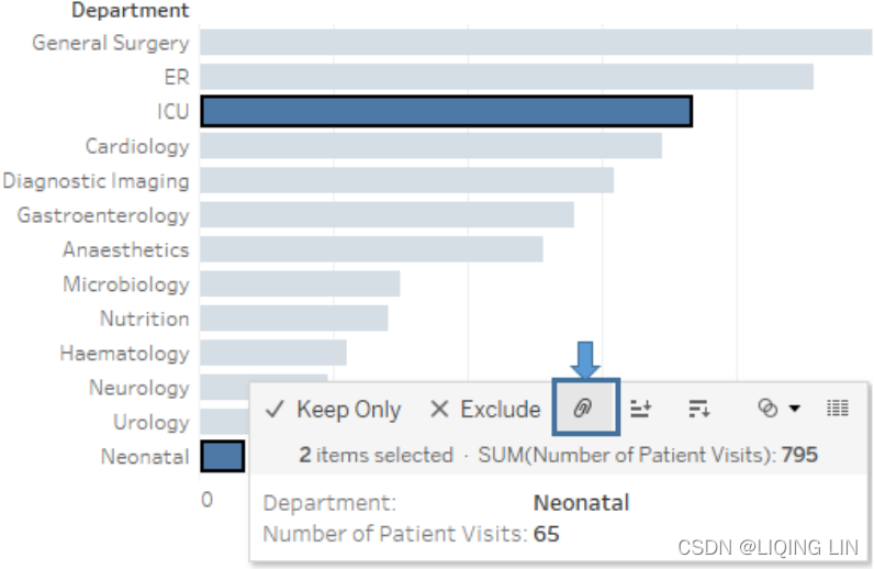 ==>
==>![]()
To add a label only to the bars for those two departments, right-click each bar and  select Mark label | Always show ==>

Bar chart
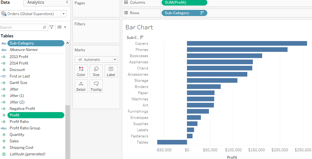
- Why?
Bar charts allow an extremely quick and easy comparison of a measure across a dimension. - Improvements?
Add some color or reference lines!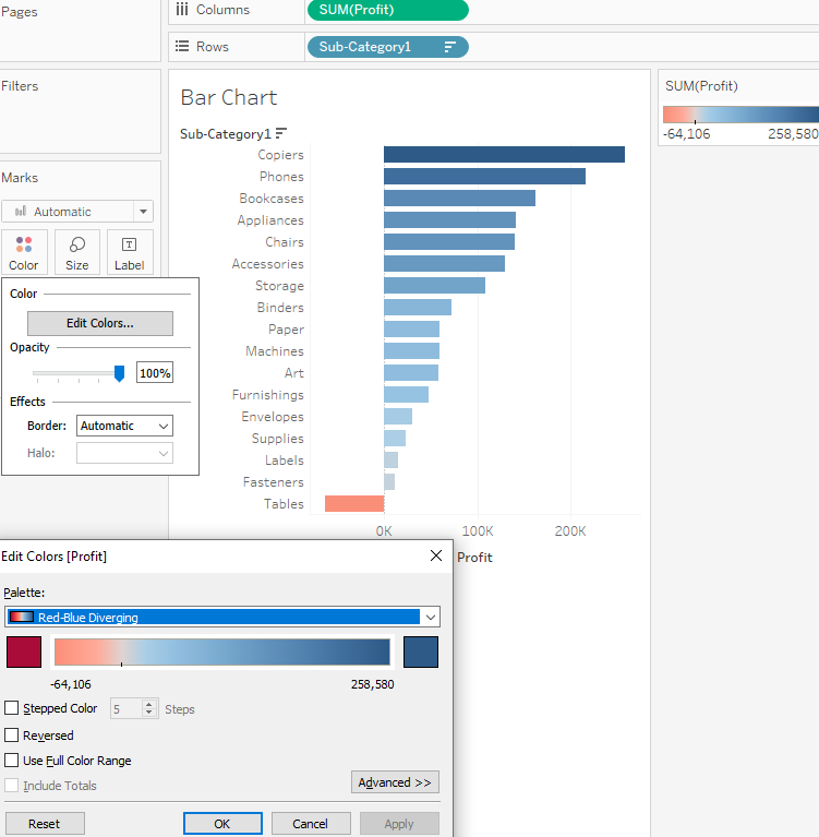 https://blog.youkuaiyun.com/Linli522362242/article/details/123116143
Bullet chart – comparing to a goal, target, or threshold
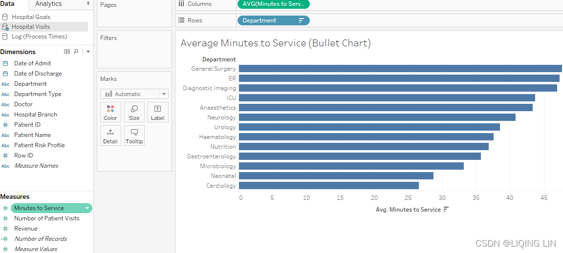 ==>Goal
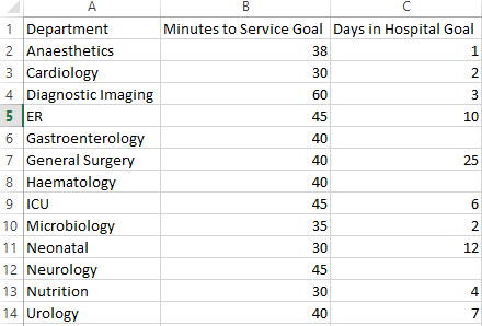
A bullet graph (sometimes also called a bullet chart) is a great way to visually compare a measure with a goal, target, or threshold.
-
The bar indicates the measure value
(Average Minutes to Service), - while the line indicates the target.
(Minutes to Service Goal:the number of minutes between the time a patient arrives at the hospital and the time they start receiving care)
- Tableau also defaults to shading to indicate 60% and 80% of the distance to the goal or threshold.
The line and the shading are reference lines that can be adjusted: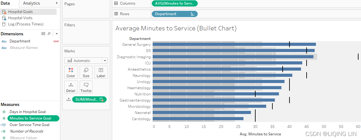
==>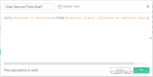
The calculation
returns true when the Average Minutes to Service values is greater than the goal value,
and false otherwise
Stacked Bar Chart
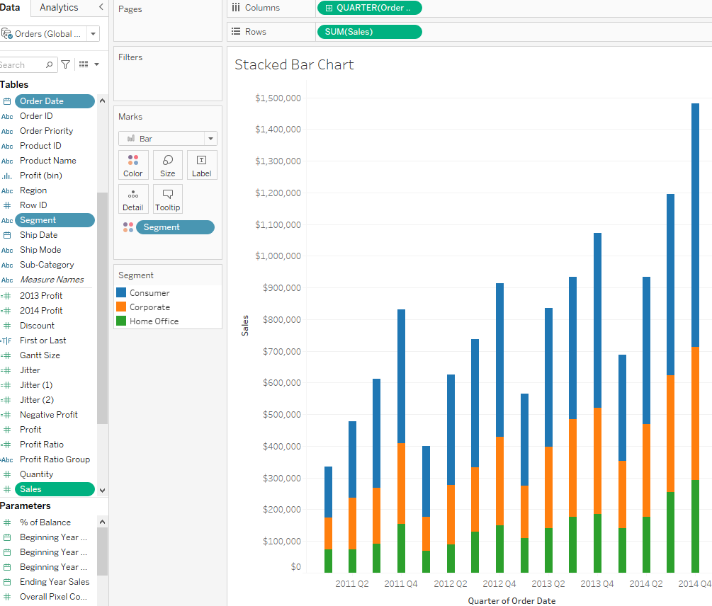
- Why?
Part to whole relationships - Common Uses?
Survey responses - Issues?
Difficult to read anything but the first color accurately - Improvements?
Make it % of Total, diverging stacked bar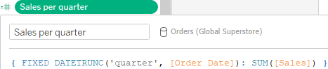
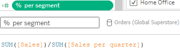
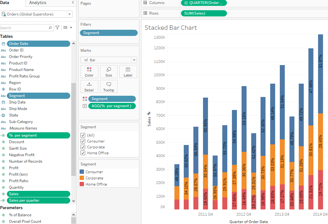
Trend Line
- Why?
Show the change over time of 1+ measures or dimensions
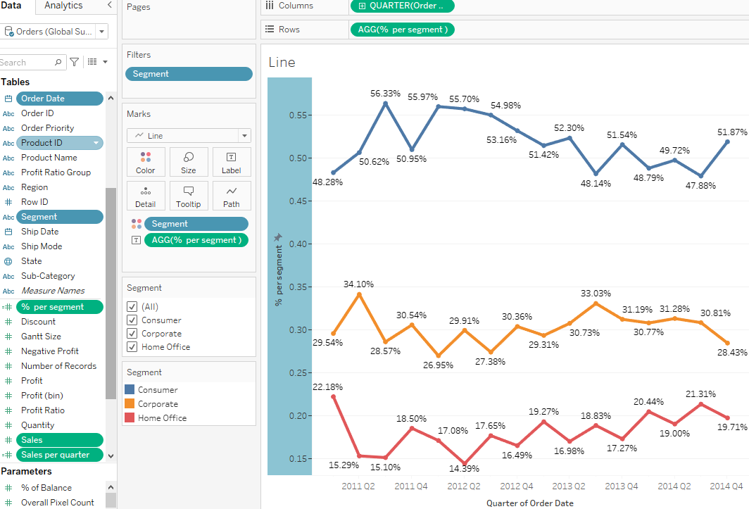
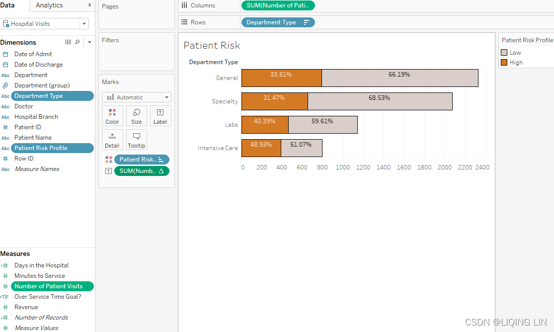
==>
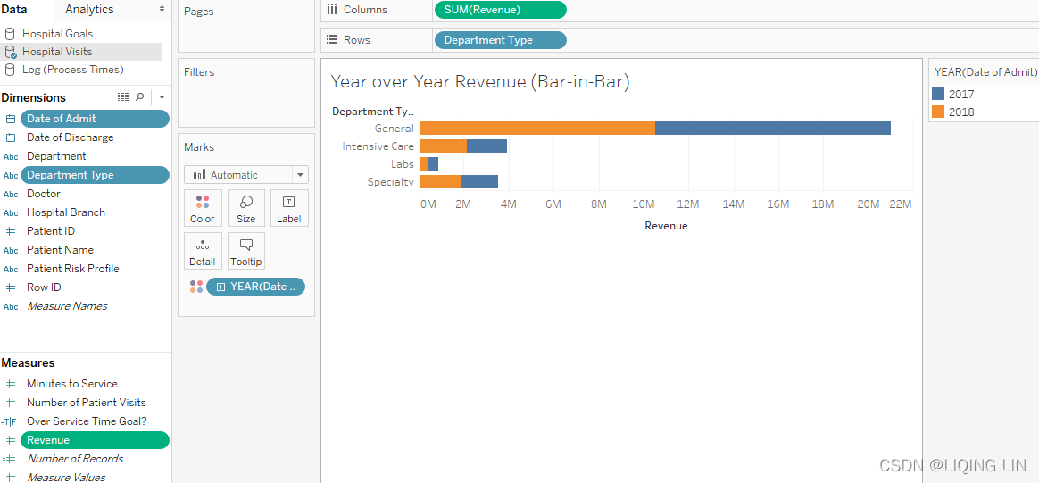
Bar-in-bar chart
Another possibility for showing relationships between two values for each category is a bar-in-bar chart. Like the bullet chart, the bar-in-bar chart can show progress toward a goal, but it can also be used to compare any two values. For example, you might compare revenue to a target, or you might compare the revenue for the current year to the previous year:
To turn off stacking Analysis | Stack Marks | Off.==>
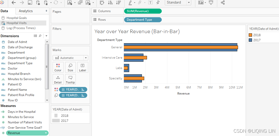
- Why?
Compare against a goal, or compare between years - Improvements?
Highlight through color or an additional column which things did well/poorly
Diverging Stacked Bar Chart
- Why?
Compare several sets of data that has a natural order (best to worst) - Common Uses?
Survey responses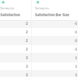
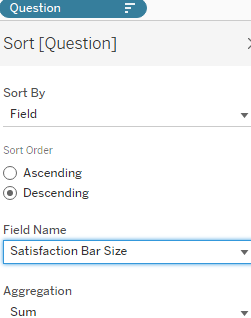
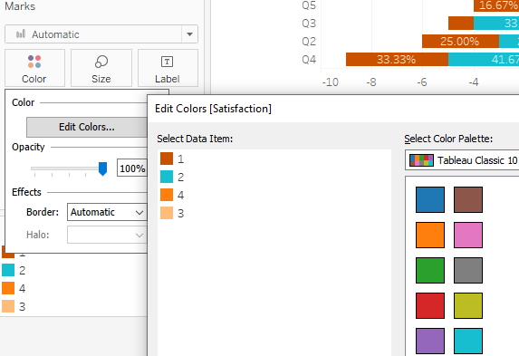
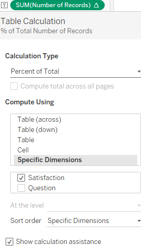

Crosstab Table
- Why?
People like being able to see numbers, displaying detailed data in a concise, easy to read format - Common Uses?
Show detail data
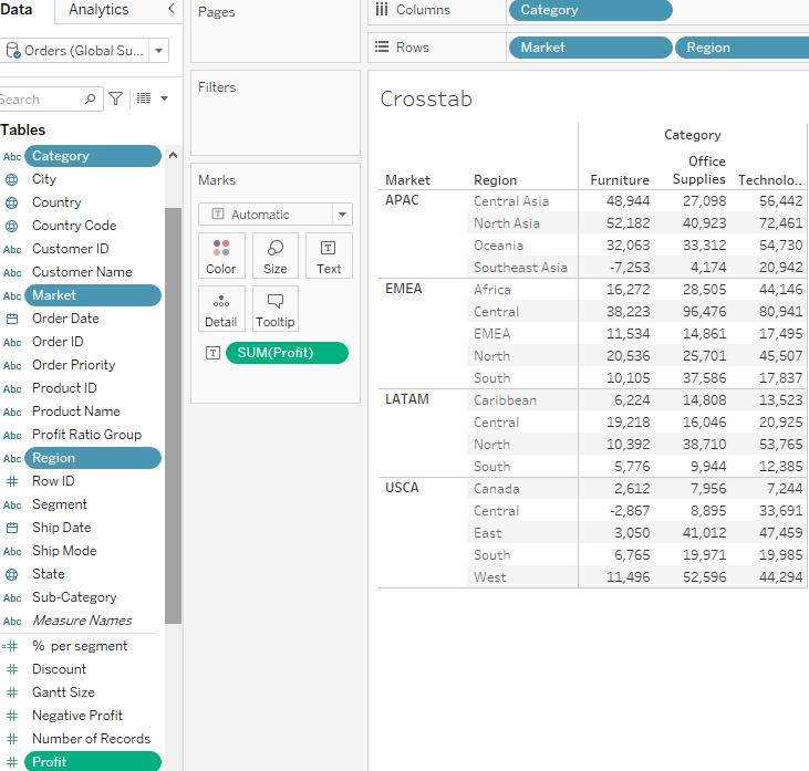
Highlight Crosstab
- Why?
Combines a familiar Excel-like format with a helpful coloring - Common Uses?
Show detail data - Issues?
With Tableau 9.1 and earlier, totals/subtotals can throw off color
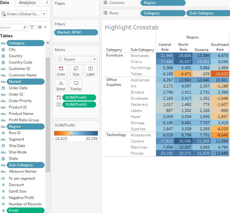
Discrete Highlight Crosstab
- Why?
Combines a familiar Excel-like format with a helpful coloring - Common Uses?
Highlight table colored on a dimension
Profit Ratio
SUM([Profit])/SUM([Sales])
Profit Ratio Group
IF [Profit Ratio] < 0
    THEN 'Negative'
ELSEIF [Profit Ratio] < .1
    THEN 'Worrisome'
ELSEIF [Profit Ratio] >= .1
    THEN 'Good'
END
==>
==>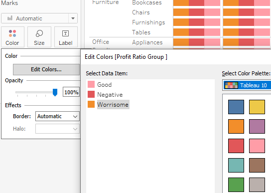
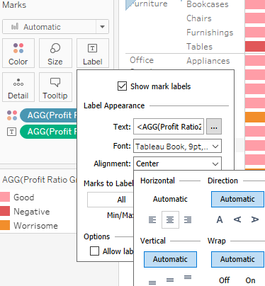
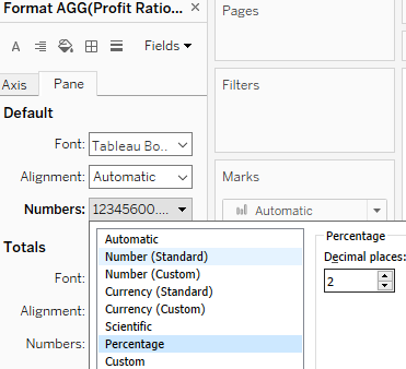
 VS
VS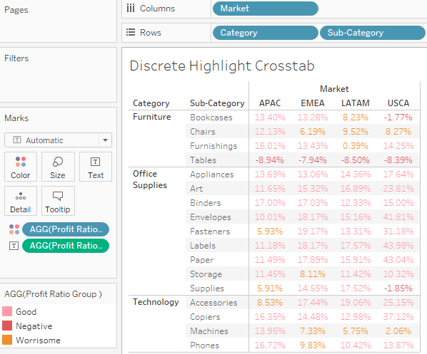
Area charts
- Why?
Show the change over time of a part to whole relationship - Issues?
Difficult to read if there are too many members
Take a line chart and then fill in the area beneath[bɪˈniːθ]在……下方 the line. If there are multiple lines, then stack the filled areas on top of each other. That's how you might think of an area chart.
In fact, in Tableau, you may find it easy to create a line chart, like you've done previously, and then change the mark type on the Marks card to Area. Any dimensions on the Color, Label, or Detail shelves will create slices of area that will be stacked on top of each other. The Size shelf is not applicable to an area chart.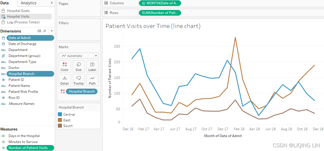
==>
Each band represents a different hospital branch location. In many ways, the view is aesthetically[esˈθetɪkli]审美地 pleasing and it does highlight some patterns in the data. However, it suffers from some of the same weaknesses as the stacked bar chart. Only the bottom band (South) can be read in terms of the values on the axis.
The other bands are stacked on top and it becomes very difficult to compare. For example, it is obvious that there is a spike in February of each year.
- But is it at each branch?
- Or is one of the lower bands pushing the higher bands up?
- Which band(which hospital branch location) has the most significant spike?
==>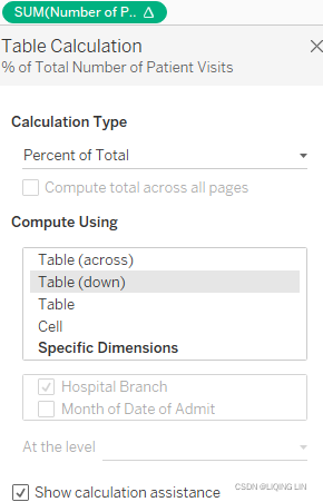 Table(down) (Addressing) : Computes down the length of the table and restarts calculation after every partition(here is each Month of Date of Admit).
 This view uses a quick table calculation, similar to the stacked bars example. It is no longer possible to see the spikes, as in the first chart. However, it is much easier to see that there was a dramatic increase in the percentage of patients seen by the East branch (the middle band) around February 2018, and that the branch continued to see a significant amount of patients through the end of the year.


 被折叠的 条评论
为什么被折叠?
被折叠的 条评论
为什么被折叠?
 到【灌水乐园】发言


