


 无监督学习致力于发现无目标变量数据中的隐藏模式或结构,如K-means聚类、PCA、SVD及深度自编码器等技术,应用于基因组学、搜索引擎优化、知识抽取、客户细分及社交网络分析等领域。
The goal of unsupervised learning is to discover the hidden patterns or structures of the data in which no target variable exists to perform either classification or regression methods. Unsupervised learning methods are often more challenging, as the outcomes are subjective and there is no simple goal for the analysis, such as predicting the class or continuous variable. These methods are performed as part of exploratory data analysis. On top of that, it can be hard to assess the results obtained from unsupervised learning methods, since there is no universally accepted mechanism for performing the validation of results.
Nonetheless, unsupervised learning methods have growing importance in various fields as a trending topic nowadays, and many researchers are actively working on them at the moment to explore this new horizon[həˈraɪzn]地平线;眼界. A few good applications are:
- Genomics: Unsupervised learning applied to understanding genomic-wide biological insights from DNA to better understand diseases and peoples. These types of tasks are more exploratory in nature.
- Search engine: Search engines might choose which search results to display to a particular individual based on the click histories of other similar users.
- Knowledge extraction: To extract the taxonomies[tækˈsɑːnəmi] 分类学 of concepts from raw text to generate the knowledge graph to create the semantic structures in the field of NLP.
- Segmentation of customers: In the banking industry, unsupervised learning like clustering is applied to group similar customers, and based on those segments, marketing departments design their contact strategies. For example, older, lowrisk customers will be targeted with fixed deposit products and high-risk, younger customers will be targeted with credit cards or mutual funds, and so on.
- Social network analysis: To identify the cohesive[koʊˈhiːsɪv]紧密结合的 groups of people in networks who are more connected with each other and have similar characteristics in common.
In this chapter, we will be covering the following techniques to perform unsupervised learning with data which is openly available:
- K-means clustering
- Principal component analysis
- Singular value decomposition
- Deep auto encoders
K-means clustering
Clustering is the task of grouping observations in such a way that members of the same cluster are more similar to each other and members of different clusters are very different from each other.
Clustering is commonly used to explore a dataset to either identify the underlying patterns in it or to create a group of characteristics. In the case of social networks, they can be clustered to identify communities and to suggest missing connections between people. Here are a few examples:
- In anti-money laundering measures在反洗钱措施中, suspicious activities and individuals can be identified using anomaly detection
- In biology, clustering is used to find groups of genes with similar expression patterns
- In marketing analytics, clustering is used to find segments of similar customers so that different marketing strategies can be applied to different customer segments accordingly
The k-means clustering algorithm is an iterative process of moving the centers of clusters or centroids to the mean position of their constituent[kənˈstɪtʃuənt]adj. 构成的, 成分 points, and reassigning instances to their closest clusters iteratively until there is no significant change in the number of cluster centers possible or number of iterations reached.
The cost function of k-means is determined by the Euclidean distance (square-norm, ![]() ,Note that, in the preceding equation, the index j refers to the jth dimension (feature column) of the sample points x and y) between the observations belonging to that cluster with its respective centroid value. An intuitive way to understand the equation is, if there is only one cluster (k=1), then the distances between all the observations are compared with its single mean. Whereas, if, number of clusters increases to 2 (k= 2), then two-means are calculated and a few of the observations are assigned to cluster 1 and other observations are assigned to cluster two based on proximity[prɑːkˈsɪməti]邻近. Subsequently, distances are calculated in cost functions by applying the same distance measure, but separately to their cluster centers:
,Note that, in the preceding equation, the index j refers to the jth dimension (feature column) of the sample points x and y) between the observations belonging to that cluster with its respective centroid value. An intuitive way to understand the equation is, if there is only one cluster (k=1), then the distances between all the observations are compared with its single mean. Whereas, if, number of clusters increases to 2 (k= 2), then two-means are calculated and a few of the observations are assigned to cluster 1 and other observations are assigned to cluster two based on proximity[prɑːkˈsɪməti]邻近. Subsequently, distances are calculated in cost functions by applying the same distance measure, but separately to their cluster centers:
cp11_Working with Unlabeled Data_Clustering Analysis_Kmeans_hierarchical_dendrogram_heat map_DBSCAN_Linli522362242的专栏-优快云博客
based on this Euclidean distance metric, we can describe the k-means algorithm as a simple optimization problem, an iterative approach for minimizing the within cluster sum of squared errors (SSE)簇内误差平方和, which is sometimes also called cluster inertia聚类惯性: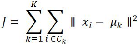 OR
OR 
Here, ![]() is the representative point (centroid) for cluster j, and
is the representative point (centroid) for cluster j, and ![]() =1 if the sample
=1 if the sample ![]() is in cluster j;
is in cluster j; ![]() = 0 otherwise.
= 0 otherwise.
In real-world applications of clustering, we do not have any ground truth category information about those samples; otherwise, it would fall into the category of supervised learning. Thus, our goal is to group the samples based on their feature similarities, which we can be achieved using the k-means algorithm that can be summarized by the following 4 steps:
- Randomly pick k centroids(averages of similar points) from the sample points as initial cluster centers.
https://towardsdatascience.com/machine-learning-algorithms-part-9-k-means-example-in-python-f2ad05ed5203
- Assign each sample to the nearest centroid
 ,
,  .
.
- Move the centroids质心 to the center中心 of the samples that were assigned to it.

- Repeat steps 2 and 3 until the cluster assignments do not change or a user-defined tolerance or a maximum number of iterations is reached.

K-means working methodology from first principles
The k-means working methodology[ˌmeθəˈdɑːlədʒi]方法论 is illustrated in the following example in which 12 instances are considered with their X and Y values. The task is to determine the optimal clusters out of the data. =>
=>
After plotting the data points on a 2D chart, we can see that roughly two clusters are possible, where below-left is the first cluster and the top-right is another cluster, but in many practical cases, there would be so many variables (or dimensions) that, we cannot simply visualize them. Hence, we need a mathematical and algorithmic way to solve these types of problems.
The following chart describes the assignment of instances to both centroids =>
=>
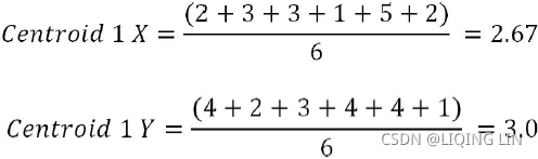
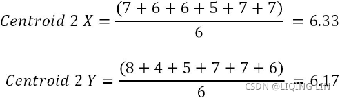
Iteration 1: Let us assume two centers from two instances out of all the twelve instances. Here, we have chosen instance 1 (X = 7, Y = 8) and instance 8 (X = 1, Y = 4), as they seem to be at both extremes. For each instance, we will calculate its Euclidean distances with respect to both centroids and assign it to the nearest cluster center.
The Euclidean distance between two points A (X1, Y1) and B (X2, Y2) is shown as follows:![]()
Centroid distance calculations are performed by taking Euclidean distances. A sample calculation has been shown as follows. For instance, six(index=6) with respect to both centroids (centroid 1 and centroid 2). 
If we carefully observe the preceding chart, we realize that all the instances seem to be assigned appropriately apart from instance 9 (X =5, Y = 4). However, in later stages, it should be assigned appropriately. Let us see in the below steps how the assignments evolve.
Iteration 2: In this iteration, new centroids are calculated from the assigned instances for that cluster or centroid. New centroids are calculated based on the simple average of the assigned points. =>
=>
Sample calculations for centroids 1 and 2 are shown as follows. A similar methodology will be applied on all subsequent iterations as well:![]()
![]()
After updating the centroids, we need to reassign the instances to the nearest centroids, which we will be performing in iteration 3.
Iteration 3: In this iteration, new assignments are calculated based on the Euclidean distance between instances and new centroids. In the event of any changes, new centroids will be calculated iteratively until no changes in assignments are possible or the number of iterations is reached. The following table describes the distance measures between new centroids and all the instances: 
It seems that there are no changes registered. Hence, we can say that the solution is converged. One important thing to note here is that all the instances are very clearly classified well, apart from instance 9 (X = 5, Y = 4). Based on instinct, it seems like it should be assigned to centroid 2, but after careful calculation, that instance is more proximate to cluster 1 than cluster 2. However, the difference in distance is low (2.54 with centroid 1 and 2.55 with centroid 2).
Although k-means clustering can be applied to data in higher dimensions, we will walk through the following examples using a simple two-dimensional dataset for the purpose of visualization:
from sklearn.datasets import make_blobs

X,y = make_blobs( n_samples=150,
                  n_features=2,
                  centers=3,  ######
                  cluster_std=0.5, #cluster_std--skip distance--diameter
                  shuffle=True,
                  random_state=0
                ) #制作团点


import matplotlib.pyplot as plt

plt.scatter(X[:,0], X[:,1], c='black', marker='o', s=50)
plt.grid()

plt.show()
The dataset that we just created consists of 150 randomly generated points that are roughly grouped into 3 regions with higher density(cluster_std=0.5), which is visualized via a two-dimensional scatterplot: 
from sklearn.metrics import pairwise_distances_argmin

def find_clusters(X, n_clusters, rseed=2):
    # https://jakevdp.github.io/PythonDataScienceHandbook/05.11-k-means.html
    # 1. Randomly pick k centroids from the sample points as initial cluster centers.

    rng = np.random.RandomState(rseed)
    k_centroids_indices = rng.permutation( X.shape[0] )[:n_clusters]
    centroids = X[k_centroids_indices]

    while True:
        # 2. Assign each sample to the nearest centroid
        # X --> nearest_centroids_indices
        X_labeled_centroids = pairwise_distances_argmin(X, centroids)

        #3. Move the centroids to the center of the samples that were assigned to it
        #3.1 Find new centers from means of points        #axis=0: mean( n_rows x 1_column )
        new_centers = np.array([ X[X_labeled_centroids==i].mean(axis=0)
                                 for i in range(n_clusters)
                               ])

        #4. Repeat steps 2 and 3 until the cluster assignments do not change
        #   or a user-defined tolerance or a maximum number of iterations is reached.
        #4.1 check for convergence
        if np.all( centroids == new_centers ):
            break
        centroids = new_centers #3.2 assign the new center to the centroids

    return centroids, X_labeled_centroids

centroids, y_km = find_clusters(X,3)

#plt.scatter(X[:,0], X[:,1], c=X_labeled_centroids, s=50, cmap="viridis")
plt.figure( figsize=(6,6) )

plt.scatter( X[y_km==0, 0], X[y_km==0, 1], s=50, c='lightgreen', marker='s', edgecolor='black',
            label='cluster 1' )
plt.scatter( X[y_km==1, 0], X[y_km==1, 1], s=50, c='orange', marker='o', edgecolor='black',
            label='cluster 2' )
plt.scatter( X[y_km==2, 0], X[y_km==2, 1], s=50, c='lightblue', marker='v', edgecolor='black',
            label='cluster 3' )
plt.scatter( centroids[:,0], centroids[:,1], s=250, marker='*', c='blue',
            edgecolor='black', label='centroids')
plt.legend( scatterpoints=1 )
plt.grid()

plt.show() 
sklearn.cluster.KMeans
Now that you have learned how the simple k-means algorithm works, let's apply it to our sample dataset using the KMeans class from scikit-learn's cluster module:
from sklearn.cluster import KMeans
             # n_clusters=3: set the number of desired clusters to 3
             # set n_init=10 to run the k-means clustering algorithms 10 times
             # independently with different "random" centroids to choose the final model
             # as the one with the lowest SSE
km = KMeans( n_clusters=3, init="random", n_init=10, max_iter=300, tol=1e-04, random_state=0)
y_km = km.fit_predict(X)
Using the preceding code, we set the number of desired clusters to 3; specifying the number of clusters a priori is one of the limitations(drawbacks) of k-means. We set n_init=10 to run the k-means clustering algorithms 10 times independently with different random centroids to choose the final model as the one with the lowest SSE(it is necessary to run the algorithm several times to avoid suboptimal solutions). Via the max_iter parameter, we specify the maximum number of iterations for each single run (here, 300). Note that the k-means implementation in scikit-learn stops early if it converges before the maximum number of iterations is reached.
However, it is possible that k-means does not reach convergence for a particular run, which can be problematic (computationally expensive) if we choose relatively large values for max_iter. One way to deal with convergence problems is to choose larger values for tol, which is a parameter that controls the tolerance with regard to the changes in the within-cluster sum-squared-error to declare convergence. In the preceding code, we chose a tolerance of 1e-04 (=0.0001).
Another problem with k-means is that one or more clusters can be empty. Note that this problem does not exist for k-medoids or fuzzy C-means, an algorithm that we will discuss in the next subsection. However, this problem is accounted for in the current k-means implementation in scikit-learn. If a cluster is empty, the algorithm will search for the sample that is farthest away from the centroid of the empty cluster. Then it will reassign the centroid to be this farthest point.
#################################################
Note
When we are applying k-means to real-world data using a Euclidean distance metric, we want to make sure that the features are measured on the same scale(尺度) and apply z-score standardization or min-max scaling if necessary.
#################################################
After we predicted the cluster labels y_km and discussed the challenges of the k-means algorithm, let's now visualize the clusters that k-means identified in the dataset together with the cluster centroids. These are stored under the cluster_centers_ attribute of the fitted KMeans object:
km.cluster_centers_
plt.figure( figsize=(6,6) )

plt.scatter( X[y_km==0, 0], X[y_km==0, 1], s=50, c='lightgreen', marker='s', edgecolor='black',
            label='cluster 1' )
plt.scatter( X[y_km==1, 0], X[y_km==1, 1], s=50, c='orange', marker='o', edgecolor='black',
            label='cluster 2' )
plt.scatter( X[y_km==2, 0], X[y_km==2, 1], s=50, c='lightblue', marker='v', edgecolor='black',
            label='cluster 3' )
plt.scatter( km.cluster_centers_[:,0], km.cluster_centers_[:,1], s=250, marker='*', c='blue',
            edgecolor='black', label='centroids')
plt.legend( scatterpoints=1 )
plt.grid()

plt.show()
In the following scatterplot, we can see that k-means placed the three centroids at the center of each sphere, which looks like a reasonable grouping given this dataset:
print('WC_SSE: %.2f' % km.inertia_) minimizing the within cluster sum of squared errors (SSE)簇内误差平方和, which is sometimes also called cluster inertia聚类惯性:
(K-means++, K-Means Variability,Acelerated K-Means, Mini-Batch K-Means)
K-Means++
Instead of initializing the centroids entirely randomly, it is preferable to initialize them using the following algorithm, proposed in a 2006 paper by David Arthur and Sergei Vassilvitskii(The initialization in k-means++ can be summarized as follows:):
- Initialize an empty set M to store the k centroids being selected.
- the first centroid
 (is the representative point (centroid) for cluster j ) be chosen uniformly at random from the input samples(or from the dataset) and assign it to M.
 - For each sample
 that is not in M, find the minimum squared distance
  to any of the centroids in M.
 - To randomly select the next centroid
 (Note: the instance be selected as next centroid is also not in M), use a weighted probability distribution equal to
  . This probability distribution ensures that instances that are further away from already chosen centroids are much more likely be selected as centroids.
The denominator is the sum of the distances between each sample and the nearest centroid in M
The numerator is the distance between the each sample and its nearest centroid,When this value / is larger, in the numerator is more likely to be selected as the centroids, ==> - Repeat the previous step until all k centroids have been chosen.
M: good_init = np.array([ [-3,3], [-3,2], [-3,1], [-1,2], [0,2] ])
The KMeans class uses this initialization method by default. If you want to force it to use the original method (i.e., picking k instances randomly to define the initial centroids), then you can set the init hyperparameter to "random". You will rarely need to do this.
The rest of the K-Means++ algorithm is just regular K-Means. With this initialization, the K-Means algorithm is much less likely to converge to a suboptimal solution, so it is possible to reduce n_init considerably. Most of the time, this largely compensates for the additional complexity of the initialization process.
To set the initialization to K-Means++, simply set init="k-means++" (this is actually the default):
KMeans()
If you happen to know approximately where the centroids should be (e.g., if you ran another clustering algorithm earlier), then you can set the init hyperparameter to a NumPy array containing the list of centroids, and set n_init to 1:
good_init = np.array([[-3, 3], [-3, 2], [-3, 1], [-1, 2], [0, 2]])
kmeans = KMeans(n_clusters=5, init=good_init, n_init=1)
Another solution is to run the algorithm multiple times with different random initializations and keep the best solution. The number of random initializations is controlled by the n_init hyperparameter: by default, it is equal to 10, which means that the whole algorithm described earlier runs 10 times when you call fit(), and Scikit-Learn keeps the best solution. But how exactly does it know which solution is the best? It uses a performance metric! That metric is called the model’s inertia, which is the mean squared distance between each instance and its closest centroid.
Optimal number of clusters and cluster evaluation
Though selecting number of clusters is more of an art than science, optimal number of clusters are chosen where there will not be a much marginal increase in explanation ability by increasing number of clusters are possible. In practical applications, usually business should be able to provide what would be approximate number of clusters they are looking for.
The elbow method
The elbow method is used to determine the optimal number of clusters in k-means clustering. The elbow method plots the value of the cost function( called inertia (the mean squared distance from each instance to its nearest centroid) ) produced by different values of k. As you know, if k increases, average distortion will decrease, each cluster will have fewer constituent instances, and the instances will be closer to their respective centroids. However, the improvements in average distortion will decline as k increases. The value of k at which improvement in distortion declines the most is called the elbow, at which we should stop dividing the data into further clusters.
08_09_Dimension Reduction_Gaussian mixture_kmeans++_extent_tick_params_silhouette_image segment_tSNE_Linli522362242的专栏-优快云博客
kmeans_per_k = [ KMeans(n_clusters=k, random_state=42).fit(X)
                 for k in range(1,10)
               ]
inertias = [ model.inertia_ for model in kmeans_per_k ]


plt.figure( figsize=(8,3.5) )

plt.plot( range(1,10), inertias, 'bo-' )

plt.xlabel("$k$", fontsize=14)
plt.ylabel("Inertia", fontsize=14)
plt.annotate('Elbow', xy=(4, inertias[3]),
             xytext=(0.55, 0.55), textcoords="figure fraction", fontsize=16,
             arrowprops=dict(facecolor="black", shrink=0.1)
            )
plt.axis([1,10, 0,1300])
plt.title('inertia_vs_k_diagram')

plt.show()
Figure 9-8. When plotting the inertia as a function of the number of clusters k, the curve often contains an inflexion[ɪnˈflekʃn]拐折 point called the “elbow”
As you can see, the inertia drops very quickly as we increase k up to 4, but then it decreases much more slowly as we keep increasing k. This curve has roughly the shape of an arm, and there is an “elbow” at k = 4. So, if we did not know better, 4 would be a good choice: any lower value would be dramatic, while any higher value would not help much, and we might just be splitting perfectly good clusters in half for no good reason.
As you can see, there is an elbow at k=4, which means that less clusters than that would be bad, and more clusters would not help much and might cut clusters in half. So k=4 is a pretty good choice. Of course in the following example it is not perfect since it means that the two blobs斑点 in the lower left will be considered as just a single cluster, but it's a pretty good clustering nonetheless.
plot_decision_boundaries(kmeans_per_k[4-1], X) #k=4
plt.show()
Quantifying量化 the quality品质 of clustering via silhouette轮廓 plots
Evaluation of clusters with silhouette coefficient: the silhouette coefficient is a measure of the compactness[kəmˈpæktnəs,ˈkɑːmpæktnəs]紧密度 and separation of the clusters. Higher values represent a better quality of cluster. The silhouette coefficient is higher for compact clusters that are well separated and lower for overlapping clusters. Silhouette coefficient values do change from -1 to +1, and the higher the value is, the better. Silhouette analysis can be used as a graphical tool to plot a measure of how tightly grouped the samples in the clusters are. To calculate the silhouette coefficient of a single sample in our dataset, we can apply the following three steps:
- Calculate the cluster cohesion[koʊˈhiːʒn]内聚度
 (is the mean intra cluster distance) as the average distance between a sample
  and all other points in the same cluster.
 - Calculate the cluster separation
 分离度 from the next closest cluster(depicts mean nearest cluster distance) as the average distance between the sample and all samples in the nearest cluster.
 - Calculate the silhouette
 as the difference between cluster cohesion and separation divided by the greater of the two, as shown here:
 : the silhouette coefficient==
The silhouette coefficient is bounded in the range -1 to 1
- a coefficient close to +1 means that the instance is well inside its own cluster and far from other clusters, while
- a coefficient close to 0 means that it is close to a cluster boundary, and
- finally a coefficient close to -1 means that the instance may have been assigned to the wrong cluster).
Based on the preceding formula, we can see that the silhouette coefficient is 0 if the cluster separation and cohesion are equal (=). Furthermore, we get close to an ideal silhouette coefficient of 1 if >> , since quantifies how dissimilar a sample is to other clusters, and tells us how similar it is to the other samples in its own cluster, respectively.
The silhouette coefficient is available as silhouette_samples from scikit-learn's metric module, and optionally the silhouette_scores can be imported. This calculates the average silhouette coefficient across all samples, which is equivalent to numpy.mean(silhouette_samples(…)).
To compute the silhouette score, you can use Scikit-Learn’s silhouette_score() function, giving it all the instances in the dataset and the labels they were assigned:
from sklearn.metrics import silhouette_score

# for k in range(1,101):
#     kmeans = KMeans( n_clusters=k, random_state=42 ) #finally, n_clusters=k=100,
# kmeans
# KMeans(algorithm='auto', copy_x=True, init='k-means++', max_iter=300,
#        n_clusters=100, n_init=10, n_jobs=None, precompute_distances='auto',
#        random_state=42, tol=0.0001, verbose=0)
silhouette_score(X, kmeans.labels_)
# kmeans_per_k = [ KMeans(n_clusters=k, random_state=42).fit(X) for k in range(1,10) ]
                                             #predictions
silhouette_scoreList = [ silhouette_score(X, model.labels_) for model in kmeans_per_k[1:] ]
# [1:] since the silhouette coefficient = (b-a)/max(a,b), the number of clusters >=2


plt.figure( figsize=(8,3) )
plt.plot( range(2,10), silhouette_scoreList, 'bo-' )
plt.xlabel( "$k$ clusters", fontsize=14 )
plt.ylabel( "Silhouette Score", fontsize=14)
plt.axis([1.8, 9.5, 0.55, 0.7])
plt.title("silhouette_score_vs_k_diagram")

plt.show()
Figure 9-9. Selecting the number of clusters k using the silhouette score
As you can see, this visualization is much richer than the previous one: in particular, although it confirms that k=4 is a very good choice, but it also underlines the fact that k=5 is quite good as well, and much better than k = 6 or 7. This was not visible when comparing inertias.
An even more informative visualization is given when you plot every instance's silhouette coefficient, sorted by the cluster they are assigned to and by the value of the coefficient. This is called a silhouette diagram(see Figure 9-10):
from sklearn.metrics import silhouette_samples
from matplotlib.ticker import FixedLocator, FixedFormatter
import matplotlib as mpl

plt.figure( figsize=(11,9) )

for k in (3,4,5,6):
    plt.subplot(2,2,k-2)

    y_pred = kmeans_per_k[k-1].labels_
    silhouette_coefficients = silhouette_samples(X, y_pred) #default metric='euclidean'

    padding = len(X) //30
    pos = padding
    ticks= []  #each cluster index as a tick on y-axis

    for i in range(k):
        coeffs = silhouette_coefficients[ y_pred==i ] # for the same cluster
        coeffs.sort() # ascending
        #cm.jet(X): For floats, X should be in the interval ``[0.0, 1.0]`` to
        #return the RGBA values ``X*100`` percent along the Colormap line.
        #color = mpl.cm.jet( float(i)/k)
        color = mpl.cm.Spectral( float(i)/k )
                         #padding
#         plt.barh( range(pos, pos+len(coeffs)), coeffs, height=1.0, edgecolor='none',
#               color=color)
                           #y: variable
        plt.fill_betweenx( np.arange(pos, pos+len(coeffs)),
                          0,      #x1~f(y), its curve is the y-axis when x1=0,
                          coeffs, #x2~f(y), width(horizontal) on x-axis
                          facecolor=color, edgecolor=color, alpha=0.7 )
        ticks.append( pos+len(coeffs)//2 ) #each cluster index as a tick
        pos += len(coeffs) + padding #The starting position of the next cluster silhouette
    #end inner for loop
    plt.gca().yaxis.set_major_locator( FixedLocator(ticks) )
    plt.gca().yaxis.set_major_formatter( FixedFormatter(range(k)) )

    if k in (3,5):
        plt.ylabel("Cluster")
    if k in (5,6):
        plt.gca().set_xticks([-0.1, 0, 0.2, 0.4, 0.6, 0.8, 1])
        plt.xlabel("Silhouette Coefficient")
    else:
        plt.tick_params(labelbottom=False)
    #silhouette_scoreList[] for clusters=[2,3,4,...]=index[0,1,2]
    # k=(3,4,5,6), if k=3 ==> k-2=1 ==> num_clusters=3, index=1
    plt.axvline(x=silhouette_scoreList[k-2], color='red', linestyle="--")
    plt.title("$k={}$".format(k), fontsize=16)

plt.show()
Each diagram contains one knife shape per cluster. The shape’s height(y-axis) indicates the number of instances the cluster contains, and its width represents the sorted silhouette coefficients of the instances in the cluster (wider is better). The dashed line indicates the mean silhouette coefficient(over all the instances).
 Figure 9-10. Analyzing the silhouette diagrams for various values of k
The vertical dashed lines represent the silhouette score for each number of clusters.
- When most of the instances in a cluster have a lower coefficient than this score (i.e., if many of the instances stop short of the dashed line, ending to the left of it), then the cluster is rather bad since this means its instances are much too close to other clusters. We can see that when k = 3 and when k = 6, we get bad clusters.
- But when k = 4 or k = 5, the clusters look pretty good: most instances extend beyond the dashed line, to the right and closer to 1.0. When k = 4, the cluster at index 1 (the third from the top) is rather big. When k = 5, all clusters have similar sizes. So, even though the overall silhouette score from k = 4 is slightly greater than for k = 5, it seems like a good idea to use k = 5 to get clusters of similar sizes.
Through a visual inspection of the silhouette plot, we can quickly scrutinize[ˈskruːtənaɪz] 仔细或彻底检查 the sizes of the different clusters( len(c_silhouette_vals) ) and identify clusters that contain outliers ; ##I believe k=5 may be the best clustering.
K-means clustering with the iris data example
The famous iris data has been used from the UCI machine learning repository for illustration purposes using k-means clustering. The link for downloading the data is here:
Index of /ml/machine-learning-databases/iris. The iris data has three types of flowers: setosa, versicolor, and virginica and their respective measurements of sepal length, sepal width, petal length, and petal width. Our task is to group the flowers based on their measurements. The code is as follows:
iris.names : https://archive.ics.uci.edu/ml/machine-learning-databases/iris/iris.names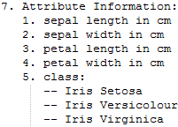
column_names = [ 'sepal_length', 'sepal_width', 'petal_length', 'petal_width', 'class' ]
import numpy as np
import pandas as pd

column_names = [ 'sepal_length', 'sepal_width',
                 'petal_length', 'petal_width',
                 'class'
               ]

iris = pd.read_csv('https://archive.ics.uci.edu/ml/machine-learning-databases/iris/iris.data',
                   header=None,
                   names=column_names)
iris.head() 
Following code is used to separate class variable as dependent variable for creating colors in plot and unsupervised learning algorithm applied on given x variables without any target variable does present:
x_iris = iris.drop( ['class'], axis=1 )
y_iris = iris['class']
y_iris[:5] 
As sample metrics, three clusters have been used, but in real life, we do not know how many clusters data will fall under in advance, hence we need to test the results by trial and error. The maximum number of iterations chosen here is 300 in the following, however, this value can also be changed and the results checked accordingly:
from sklearn.cluster import KMeans
from sklearn.metrics import silhouette_score
k_means_fit = KMeans( n_clusters=3, max_iter=300 )
k_means_fit.fit(x_iris)
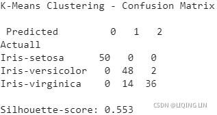
print( '\nK-Means Clustering - Confusion Matrix\n\n',
pd.crosstab( y_iris, k_means_fit.labels_,
rownames = ['Actuall'],
colnames = ['Predicted']
)
)
print( '\nSilhouette-score: %0.3f' % silhouette_score( x_iris,
k_means_fit.labels_,
metric = 'euclidean'
)
)
k_means_fit
Again, to reiterate, in real-life examples we do not have the category names in advance, so we cannot measure accuracy, and so on.
From the previous confusion matrix, we can see that all the setosa flowers are clustered correctly, whereas 2 out of 50 versicolor, and 14 out of 50 virginica flowers are incorrectly classified.
Following code is used to perform sensitivity analysis to check how many number of clusters does actually provide better explanation of segments:
for k in range( 2, 10 ):
  k_means_fit_k = KMeans( n_clusters=k, max_iter=300, n_init=10 )
  k_means_fit_k.fit( x_iris )

  print( 'For K value', k, ', Silhouette-score: %0.3f' %
         silhouette_score( x_iris, k_means_fit_k.labels_,
                           metric='euclidean'
                         )
       )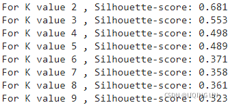
The silhouette coefficient values in the preceding results shows that K value 2 and K value 3 have better scores than all the other values. As a thumb rule, we need to take the next K value of the highest silhouette coefficient. Here, we can say that K value 3 is better. In addition, we also need to see the average within cluster variation value and elbow plot before concluding the optimal K value.
the within cluster sum of squared errors (SSE)簇内误差平方和, which is sometimes also called cluster inertia聚类惯性:
Here, ![]() is the representative point (centroid) for cluster j, and
is the representative point (centroid) for cluster j, and ![]() =1 if the sample
=1 if the sample ![]() is in cluster j;
is in cluster j; ![]() = 0 otherwise.(the following code use np.argmin since we don't know the actual cluster label for each sample)
= 0 otherwise.(the following code use np.argmin since we don't know the actual cluster label for each sample)
# Avg. within-clussster sum of squares
K = range(1, 10) # length=9
KM = [ KMeans(n_clusters=k).fit( x_iris )
for k in K
]
centroids = [ k.cluster_centers_ for k in KM ] # 9 x k x 4 dimensions
from scipy.spatial.distance import cdist, pdist
# from sklearn.metrics.pairwise import pairwise_distances
D_k = [ cdist(x_iris, centroid, 'euclidean') # ==pairwise_distances
for centroid in centroids
] #for each centroid shape: 150*4 dist k*4 ==> 150
# for D in D_k:
# print(D.shape)
# (150, 1)
# (150, 2)
# (150, 3)
# (150, 4)
# (150, 5)
# (150, 6)
# (150, 7)
# (150, 8)
# (150, 9)
nearest_cluster_index = [ np.argmin(D, axis=1)
for D in D_k
]
# the minimum of the distances between each sample and the nearest centroid in M
nearest_cluster_dist = [ np.min( D, axis=1 )
for D in D_k
]
# the average distance between each sample and its cluster centroid
avgWithinSS = [ sum(d)/x_iris.shape[0]
for d in nearest_cluster_dist
]
# Sum of Squared distances of samples to their closest Cluster center(cluster inetia)
wcss = [ sum(d**2)
for d in nearest_cluster_dist
]
wcss
OR
wc_sse = []
for k in K:
km=KMeans(n_clusters=k)
km.fit( x_iris )
wc_sse.append(km.inertia_)
wc_sse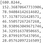 The reason for the difference comes from the precision in the calculation process
import matplotlib.pyplot as plt

#elbow curve - Avg. within-cluster sum of squares
fig = plt.figure()
ax = fig.add_subplot(111)
ax.plot( K, wcss, 'b*-')
plt.grid(True)
plt.xlabel( 'Number of clusters' )
plt.ylabel( 'wc_sse' )
                        # k=3, 2=k-1
plt.annotate( 'Elbow point', xy=(3,wcss[2]), # The xy parameter specifies the arrow's destination
              xytext=(0.5,0.55), textcoords ='figure fraction', # the text position
              fontsize=16,
              # if not arrowstyle: e.g shrink=0.1
              arrowprops=dict(facecolor='black', arrowstyle='->',connectionstyle='arc3'),
            )

plt.show()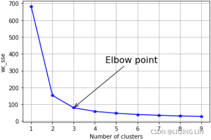
import matplotlib.pyplot as plt

#elbow curve - Avg. within-cluster sum of squares
fig = plt.figure()
ax = fig.add_subplot(111)
ax.plot( K, avgWithinSS, 'b*-')
plt.grid(True)
plt.xlabel( 'Number of clusters' )
plt.ylabel( 'Avg within-cluster sum of squares of distances to the centroid' )
                        # k=3, 2=k-1
plt.annotate( 'Elbow', xy=(3,avgWithinSS[2]), # The xy parameter specifies the arrow's destination
              xytext=(0.5,0.55), textcoords ='figure fraction', # the text position
              fontsize=16,
              arrowprops=dict(facecolor='black', shrink=0.1)
            )

plt.show()
From the elbow plot, it seems that at the value of 3, the slope changes drastically. Here, we can select the optimal k-value as three.
# Total with-in sum of square
# pdist则返回距离矩阵的 下三角 串联形式。
# 计算矩阵X 样本之间 (m*n)的欧氏距离(2-norm) ,返回值为 Y (m*m)为压缩距离元组或矩阵。
# 第二个参数默认为欧氏距离
# Pairwise distance between pairs of objects
tss = sum( pdist(x_iris, 'euclidean')**2 / x_iris.shape[0] )
# tss = 680.8243999999979

# Sum of Squared distances of samples to their closest Cluster center(cluster inetia)
# wcss = [ sum(d**2)
#          for d in nearest_cluster_dist
#        ]
bss = tss - wcss # exist a broadcasting operation

# elbow curve - Avg. within-cluster sum of squares
fig = plt.figure()
ax = fig.add_subplot( 111 )
ax.plot( K, bss/tss * 100, 'b*-' )
plt.grid(True)
plt.xlabel( 'Number of clusters' )
plt.ylabel( 'Percentage of variance explained' )

                        # k=3, 2=k-1
plt.annotate( 'Elbow point', xy=(3,bss[2]/tss*100), # The xy parameter specifies the arrow's destination
              xytext=(0.5,0.55), textcoords ='figure fraction', # the text position
              fontsize=16,
              # if not arrowstyle: e.g shrink=0.1
              arrowprops=dict(facecolor='black', arrowstyle='->',connectionstyle='arc3'),
            )

plt.show() 
Last but not least, the total percentage of variance explained value should be greater than 80 percent to decide the optimal number of clusters. Even here, a k-value of three seems to give a decent value of total variance explained. Hence, we can conclude from all the preceding metrics (silhouette, average within cluster variance, and total variance explained), that 3 clusters are ideal.
from sklearn.metrics import silhouette_samples
from matplotlib.ticker import FixedLocator, FixedFormatter
import matplotlib as mpl

# K = range(1, 10) # length=9

# KM = [ KMeans(n_clusters=k).fit( x_iris )
#        for k in K
#      ]

silhouette_scoreList = [ silhouette_score(x_iris, model.labels_)
                         for model in KM[1:5] # k=2,3,4,5
                       ] # index 1: start from k=2

plt.figure( figsize=(11,9) )

for k in (2,3,4,5):
    plt.subplot(2,2,k-1)

    y_pred = KM[k-1].labels_
    silhouette_coefficients = silhouette_samples(x_iris, y_pred) #default metric='euclidean'

    padding = len(x_iris) //30
    pos = padding
    ticks= []  #each cluster index as a tick
    for i in range(k):
        coeffs = silhouette_coefficients[ y_pred==i ] # for the same cluster
        coeffs.sort() # ascending
        #cm.jet(X): For floats, X should be in the interval ``[0.0, 1.0]`` to
        #return the RGBA values ``X*100`` percent along the Colormap line.
        #color = mpl.cm.jet( float(i)/k)
        color = mpl.cm.Spectral( float(i)/k )
                         #padding
#         plt.barh( range(pos, pos+len(coeffs)), coeffs, height=1.0, edgecolor='none',
#               color=color)
                           #y: variable
        plt.fill_betweenx( np.arange(pos, pos+len(coeffs)),
                          0,      #x1~f(y), its curve is the y-axis when x1=0,
                          coeffs, # x2~f(y)
                          facecolor=color, edgecolor=color, alpha=0.7 )
        ticks.append( pos+len(coeffs)//2 ) #each cluster index as a tick
        pos += len(coeffs) + padding #The starting position of the next cluster silhouette
    #end inner for loop
    plt.gca().yaxis.set_major_locator( FixedLocator(ticks) )
    plt.gca().yaxis.set_major_formatter( FixedFormatter(range(k)) )

    if k in (3,5):
        plt.ylabel("Cluster")
    if k in (4,5):
        plt.gca().set_xticks([-0.1, 0, 0.2, 0.4, 0.6, 0.8, 1])
        plt.xlabel("Silhouette Coefficient")
    else:
        plt.tick_params(labelbottom=False)
    #silhouette_scoreList[] for clusters=[2,3,4,...]=index[0,1,2]
    plt.axvline(x=silhouette_scoreList[k-2], color='red', linestyle="--")
    plt.title("$k={}$".format(k), fontsize=16)

plt.show()
Principal Component Analysis - PCA
Principal Component Analysis (PCA) is the dimensionality reduction technique which has so many utilities. PCA reduces the dimensions of a dataset by projecting the data onto a lower-dimensional subspace. For example, a 2D dataset could be reduced by projecting the points onto a line. Each instance in the dataset would then be represented by a single value, rather than a pair of values. In a similar way, a 3D dataset could be reduced to two dimensions by projecting variables onto a plane. PCA has the following utilities:
- Mitigate the course of dimensionality
- Compress the data while minimizing the information lost at the same time
- Principal components will be further utilized in the next stage of supervised learning, in random forest, boosting, and so on
- Understanding the structure of data with hundreds of dimensions can be difficult, hence, by reducing the dimensions to 2D or 3D, observations can be visualized easily
PCA can easily be explained with the following diagram of a mechanical bracket which has been drawn in the machine drawing module of a mechanical engineering course. The lefthand side of the diagram depicts the top view, front view, and side view of the component. However, on the right-hand side, an isometric[ˌaɪsəˈmetrɪk]等距的 view has been drawn, in which one single image has been used to visualize how the component looks. So, one can imagine that the left-hand images are the actual variables and the right-hand side is the first principal component, in which most variance has been captured. 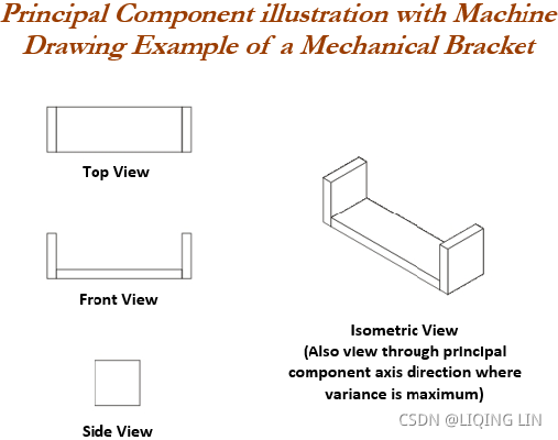
Finally, three images have been replaced by a single image by rotating the axis of direction. In fact, we replicate the same technique in PCA analysis.
Principal component working methodology is explained in the following sample example, in which actual data has been shown in a 2D space, in which X and Y axis are used to plot the data. Principal components are the ones in which maximum variation of the data is captured.
The above diagram illustrates how it looks after fitting the principal components. The first principal component covers the maximum variance in the data and the second principal component is orthogonal to the first principal component, as we know all principal components are orthogonal to each other. We can represent whole data with the first principal component itself. In fact, that is how it is advantageous to represent the data with fewer dimensions, to save space and also to grab maximum variance in the data, which can be utilized for supervised learning in the next stage. This is the core advantage of computing principal components.
Eigenvectors and eigenvalues have significant importance in the field of linear algebra, physics, mechanics, and so on. Refreshing, basics on eigenvectors and eigenvalues is necessary when studying PCAs. Eigenvectors![]() are the axes (directions) along which a linear transformation acts simply by stretching/compressing and/or flipping; whereas, eigenvalues λ give you the factors by which the compression occurs. In another way, an eigenvector of a linear transformation is a nonzero vector
are the axes (directions) along which a linear transformation acts simply by stretching/compressing and/or flipping; whereas, eigenvalues λ give you the factors by which the compression occurs. In another way, an eigenvector of a linear transformation is a nonzero vector![]() whose direction does not change when that linear transformation is applied to it.
whose direction does not change when that linear transformation is applied to it.
More formally, A is a linear transformation from a vector space and ![]() is a nonzero vector, then eigen vector of A if
is a nonzero vector, then eigen vector of A if ![]() is a scalar multiple of
is a scalar multiple of ![]() . The condition can be written as the following equation:
. The condition can be written as the following equation:![]()
In the preceding equation, ![]() is an eigenvector, A is a square matrix, and λ is a scalar called an eigenvalue. The direction of an eigenvector
is an eigenvector, A is a square matrix, and λ is a scalar called an eigenvalue. The direction of an eigenvector![]() remains the same after it has been transformed by A; only its magnitude has changed, as indicated by the eigenvalue λ, That is, multiplying a matrix by one of its eigenvectors is equal to scaling the eigenvector, which is a compact representation of the original matrix. The following graph describes eigenvectors and eigenvalues in a graphical representation in a 2D space:
remains the same after it has been transformed by A; only its magnitude has changed, as indicated by the eigenvalue λ, That is, multiplying a matrix by one of its eigenvectors is equal to scaling the eigenvector, which is a compact representation of the original matrix. The following graph describes eigenvectors and eigenvalues in a graphical representation in a 2D space:
The following example describes how to calculate eigenvectors and eigenvalues from the square matrix and its understanding. Note that eigenvectors and eigenvalues can be calculated only for square matrices (those with the same dimensions of rows and columns).![]()
Recall the equation![]() that the product of A and any eigenvector of A must be equal to the eigenvector multiplied by the magnitude of eigenvalue:
that the product of A and any eigenvector of A must be equal to the eigenvector multiplied by the magnitude of eigenvalue: ==>
==>![]()

A characteristic equation states that the determinant行列式 of the matrix, that is the difference between the data matrix and the product of the identity matrix单位矩阵 and an eigenvalue is 0.
Both eigenvalues λ for the preceding matrix are equal to -2. We can use eigenvalues λ to substitute for eigenvectors![]() in an equation:
in an equation:
Substituting the value of eigenvalue in the preceding equation, we will obtain the following formula:![]()
The preceding equation can be rewritten as a system of equations, as follows:
This equation indicates it can have multiple solutions of eigenvectors we can substitute with any values which hold the preceding equation for verification of equation. Here, we have used the vector [1 1] for verification, which seems to be proved.![]()
PCA needs unit eigenvectors![]() to be used in calculations, hence we need to divide the same with the norm or we need to normalize the eigenvector. The 2-norm equation is shown as follows:
to be used in calculations, hence we need to divide the same with the norm or we need to normalize the eigenvector. The 2-norm equation is shown as follows:
The norm of the output vector is calculated as follows:![]()
The unit eigenvector is shown as follows:![]()
PCA working methodology from first principles
PCA working methodology[ˌmeθəˈdɑːlədʒi]一套工作方法 is described in the following sample data, which has two dimensions for each instance or data point. The objective here is to reduce the 2D data into one dimension (also known as the principal component):  ==>
==>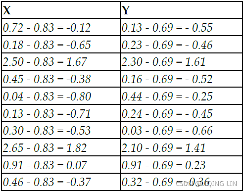
The first step, prior to proceeding with any analysis, is to subtract the mean from all the observations, which removes the scale factor of variables and makes them more uniform across dimensions.
- Covariance matrix of the data
- Singular value decomposition
We will be covering the singular value decomposition technique in the next section. In this section, we will solve eigenvectors and eigenvalues using covariance matrix methodology.
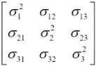
Covariance is a measure of how much two variables change together and it is a measure of the strength of the correlation between two sets of variables. If the covariance of two variables is zero, we can conclude that there will not be any correlation between two sets of the variables. The formula for covariance is as follows:![]() vs population covariances
vs population covariances![]() cp5_Compressing Data via Dimensionality Reduction_feature extraction_PCA_LDA_convergence_kernel PCA_Linli522362242的专栏-优快云博客
cp5_Compressing Data via Dimensionality Reduction_feature extraction_PCA_LDA_convergence_kernel PCA_Linli522362242的专栏-优快云博客 https://blog.youkuaiyun.com/Linli522362242/article/details/105196037 A sample covariance calculation is shown for X and Y variables in the following formulas. However, it is a 2 x 2 matrix of an entire covariance matrix (also, it is a square matrix).
Since the covariance matrix is square, we can calculate eigenvectors and eigenvalues from it. You can refer to the methodology explained in an earlier section.![]()
By solving the preceding equation, we can obtain eigenvectors and eigenvalues, as follows: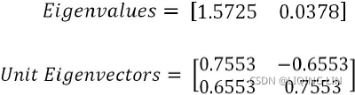 ==> projection matrix W
The preceding mentioned results can be obtained with the following Python syntax:
import numpy as np
                                                # Covariance matrix A
eigen_vals, eigen_vecs = np.linalg.eig( np.array([ [0.91335, 0.75969],
                                                   [0.75969, 0.69702]
                                                 ])
                                      )
print( '\nEigen Values\n', eigen_vals )
print( '\nEigen Vectors\n', eigen_vecs )
<==
<==
Once we obtain the eigenvectors and eigenvalues, we can project data into principal components. The first eigenvector has the greatest eigenvalue and is the first principal component, as we would like to reduce the original 2D data into 1D data.
(X-u_x, Y-u_y)==>
From the preceding result, we can see the 1D projection of the first principal component from the original 2D data. Also, the eigenvalue of 1.57253666 explains the fact that the principal component explains variance of 57 percent more than the original variables. In the case of multi-dimensional data, the thumb rule is to select the eigenvalues or principal components(eigenvectors) with a value greater than what should be considered for projection.
PCA applied on handwritten digits using scikitlearn
The PCA example has been illustrated with the handwritten digits example from scikitlearn datasets, in which handwritten digits are created from 0-9 and its respective 64 features (8 x 8 matrix) of pixel intensities. Here, the idea is to represent the original features of 64 dimensions into as few as possible:
# PCA - Principal Component Analysis
import matplotlib.pyplot as plt
from sklearn.decomposition import PCA
from sklearn.datasets import load_digits

digits = load_digits()
X = digits.data
y = digits.target

print( digits.data[0].reshape(8,8) ) 
X.shape![]()
Plot the graph using the plt.show function:
plt.matshow(digits.images[0])
plt.show() 
import matplotlib as mpl

plt.imshow(digits.images[0], cmap=mpl.cm.binary, interpolation="nearest")
plt.axis("off")
plt.show() 
Before performing PCA, it is advisable to perform scaling of input data to eliminate any issues due to different dimensions of the data. For example, while applying PCA on customer data, their salary has larger dimensions than the customer's age.
########################################m05_Extract Feature_Transformers(慎variances_)_download Adult互联网ads数据集_null value(?_csv_SVD_PCA_eigen_Linli522362242的专栏-优快云博客https://blog.youkuaiyun.com/Linli522362242/article/details/120398175For example -- Internet Advertisements Data Set:
import pandas as pd
import numpy as np

url_ads = 'http://archive.ics.uci.edu/ml/machine-learning-databases/internet_ads/ad.data'

def convert_number(x):
  try:
      return float(x)
  except ValueError:
      return np.nan

converters = {}
for i in range( 1558 ):# column_index=1558 : 'ad' or 'nonad'
  converters[i] = convert_number

converters[1558] = lambda x: 1 if x.strip() == 'ad.' else 0

ads = pd.read_csv( url_ads, # or 'adult.data',
                   sep=',',
                   keep_default_na=False,
                   header=None,
                   converters=converters
                 )
ads.dropna( inplace=True )

X = ads.drop(1558, axis=1).values
y = ads[1558]

from sklearn.decomposition import PCA

pca = PCA( n_components=5 )
Xd = pca.fit_transform(X)

from sklearn.preprocessing import StandardScaler

sc = StandardScaler()#############
X_std = sc.fit_transform(X)

pca_std = PCA( n_components=5 )
Xd_std = pca_std.fit_transform(X_std)
np.set_printoptions( precision=3, suppress=True )
pca.explained_variance_ratio_ shows us that the first feature accounts for 85.4 percent of the variance in the dataset(OR this tells you that 85.4% of the dataset’s variance lies along the first axis), the second accounts for 14.5 percent, and so on. By the fourth feature, less than one-tenth of a percent of the variance is contained in the feature. The other 1,553 features explain even less.
The variance explained ratio(方差解释比率或者方差贡献率) of an eigenvalue is simply the fraction of an eigenvalue and the total sum of the eigenvalues:
- np.square(s) == eigenvalues
 ; OR one singular value
  特征值eigenvalue取平方根来求奇异值
np.square( pca.singular_values_ ) / np.square( pca.singular_values_ ).sum()![]()
# The amount of variance explained by each of the selected components. The variance estimation uses n_samples-1 degrees of freedom.
pca.explained_variance_ # Equal to n_components largest eigenvalues of the covariance matrix of X.
pca.explained_variance_ #The amount of variance explained by each of the selected components.
total_ev = pca.explained_variance_.sum()
for ev in pca.explained_variance_:
  print( round( ev/total_ev, 3) )
==
== ![]()
np.set_printoptions( precision=3, suppress=True )
pca_std.explained_variance_ratio_ ==>PCA directions are highly sensitive to data scaling
########################################
Hence, if we do not put all the variables in a similar dimension, one variable will explain the entire variation rather than its actual impact. In the following code, we have applied scaling on all the columns separately:
from sklearn.preprocessing import scale

X_scale = scale( X, axis=0 )
In the following, we have used two principal components, so that we can represent the performance on a 2D graph. In later sections, we have applied 3D as well.
pca = PCA( n_components=2 )
reduced_X_scale = pca.fit_transform( X_scale )
# two components for each digit(class: 0~9)
zero_x, zero_y = [], []
one_x, one_y = [], []
two_x, two_y = [], []
three_x, three_y = [], []
four_x, four_y = [], []
five_x, five_y = [], []
six_x, six_y = [], []
seven_x, seven_y = [], []
eight_x, eight_y = [], []
nine_x, nine_y = [], []In the following section of code, we are appending the relevant principal components to each digit separately so that we can create a scatter plot of all 10 digits:
for i in range( len(reduced_X_scale) ):
  if y[i] == 0:
    zero_x.append( reduced_X_scale[i][0] )
    zero_y.append( reduced_X_scale[i][1] )
  elif y[i] == 1:
    one_x.append( reduced_X_scale[i][0] )
    one_y.append( reduced_X_scale[i][1] )
  elif y[i] == 2:
    two_x.append( reduced_X_scale[i][0] )
    two_y.append( reduced_X_scale[i][1] )
  elif y[i] == 3:
    three_x.append( reduced_X_scale[i][0] )
    three_y.append( reduced_X_scale[i][1] )
  elif y[i] == 4:
    four_x.append( reduced_X_scale[i][0] )
    four_y.append( reduced_X_scale[i][1] )
  elif y[i] == 5:
    five_x.append( reduced_X_scale[i][0] )
    five_y.append( reduced_X_scale[i][1] )
  elif y[i] == 6:
    six_x.append( reduced_X_scale[i][0] )
    six_y.append( reduced_X_scale[i][1] )
  elif y[i] == 7:
    seven_x.append( reduced_X_scale[i][0] )
    seven_y.append( reduced_X_scale[i][1] )
  elif y[i] == 8:
    eight_x.append( reduced_X_scale[i][0] )
    eight_y.append( reduced_X_scale[i][1] )
  elif y[i] == 9:
    nine_x.append( reduced_X_scale[i][0] )
    nine_y.append( reduced_X_scale[i][1] )
fig = plt.figure( figsize=(12,8) )
zero = plt.scatter( zero_x, zero_y, c='r', marker='x', label='zero' )
one = plt.scatter( one_x, one_y, c='g', marker='+' )
two = plt.scatter( two_x, two_y, c='b', marker='s' )
three = plt.scatter(three_x, three_y, c='m', marker='*' )
four = plt.scatter( four_x, four_y, c='c', marker='h' )
five = plt.scatter( five_x, five_y, c='r', marker='D' )
six = plt.scatter( six_x, six_y, c='y', marker='8' )
seven = plt.scatter( seven_x, seven_y,c='k', marker='*' )
eight = plt.scatter( eight_x, eight_y,c='r', marker='x' )
nine = plt.scatter( nine_x, nine_y, c='b', marker='D' )
plt.legend( ( zero, one, two,
three, four, five,
six, seven, eight, nine ),
('zero', 'one', 'two',
'three', 'four', 'five',
'six', 'seven', 'eight', 'nine')
)
plt.xlabel( 'PC 1' )
plt.ylabel( 'PC 2' )
# https://matplotlib.org/stable/tutorials/text/text_intro.html
plt.title( 'Digits projected on 2-Dimensional PCAs \n(2 Principal Components',
c='r',
fontdict={'fontsize':25,
'family':'serif',
},#fontsize='xxx-large', #
fontweight='bold', # or 'heavy', 'bold', 'normal'
fontstyle='italic' ) # rotation=45, bbox=dict(facecolor='y', edgecolor='blue', alpha=0.65 )
plt.show() 
Though the preceding plot seems a bit cluttered, it does provide some idea of how the digits are close to and distant from each other. We get the idea that digits 6 and 8 are very similar and digits 4 and 7 are very distant from the center group, and so on. However, we should also try with a higher number of PCAs, as, sometimes, we might not be able to represent every variation in two dimensions itself.
In the following code, we have applied three PCAs so that we can get a better view of the data in a 3D space. The procedure is very much similar as with two PCAs, except for creating one extra dimension for each digit (X, Y, and Z).
pca_3d = PCA( n_components=3 )
reduced_X3D_scale = pca_3d.fit_transform( X_scale )
import numpy as np

# three components for each digit(class: 0~9)
digits = {}
for i in range(10):
  digits[i]=[]
digits ![]()
for i in range( len(reduced_X3D_scale) ):
  digits[ y[i] ].append( reduced_X3D_scale[i] )

digits[0][:3] ### check 
convert a list array to ndarray:
for i in range( 10 ):
  digits[i] = np.array( digits[i] )

digits[0][:3] # check 
# digit=0, x-axis,           y-axis,             z-axis
digits[0][:,0][:3], digits[0][:,1][:3], digits[0][:,2][:3], 
# create a parameter dictionary
digit_param = { 0:{'c':'r', 'marker':'x', 'label':'zero'},
                1:{'c':'g', 'marker':'+', 'label':'one'},
                2:{'c':'b', 'marker':'s', 'label':'two'},

                3:{'c':'m', 'marker':'*', 'label':'three'},
                4:{'c':'c', 'marker':'h', 'label':'four'},
                5:{'c':'r', 'marker':'D', 'label':'five'},

                6:{'c':'y', 'marker':'8', 'label':'six'},
                7:{'c':'k', 'marker':'*', 'label':'seven'},
                8:{'c':'r', 'marker':'x', 'label':'eight'},

                9:{'c':'b', 'marker':'D', 'label':'nine'},
               }

from mpl_toolkits.mplot3d import Axes3D
fig = plt.figure( figsize=(12,8))
ax = fig.add_subplot(111, projection='3d')

for i in range(10): # digits: 0~9    # Pass the parameter dictionary to **kwargs
  ax.scatter( digits[i][:,0], digits[i][:,1], digits[i][:,2], **(digit_param[i]) )

ax.set_xlabel('PC1')
ax.set_ylabel('PC2')
ax.set_zlabel('PC3')

plt.legend( loc='upper left', numpoints=1, ncol=3, fontsize=14,
            bbox_to_anchor=(0,0) )
# https://matplotlib.org/stable/tutorials/text/text_intro.html
plt.title( 'Digits projected on 3-Dimensional PCAs \n(3 Principal Components',
            c='r',
            fontdict={'fontsize':25,
                      'family':'serif',
                      },#fontsize='xxx-large', #

            fontweight='bold',  # or 'heavy', 'bold', 'normal'
            fontstyle='italic' ) # rotation=45, bbox=dict(facecolor='y', edgecolor='blue', alpha=0.65 )
plt.show()
matplotlib plots have one great advantage over other software plots such as R plot, and so on. They are interactive, which means that we can rotate them and see how they look from various directions. We encourage the reader to observe the plot by rotating and exploring. In a 3D plot, we can see a similar story with more explanation. Digit 2 is at the extreme left and digit 0 is at the lower part of the plot. Whereas digit 4 is at the bottom-right end, digit 6 seems to be more towards the PC 1 axis. In this way, we can visualize and see how digits are distributed. In the case of 4 PCAs, we need to go for subplots and visualize them separately.
# create a parameter dictionary
#cmap = mpl.cm.get_cmap('jet')
# digit_param = { 0:{'c':[cmap(0/9)], 'marker':'x', 'label':'zero'},
#                 1:{'c':[cmap(1/9)], 'marker':'+', 'label':'one'},
#                 2:{'c':[cmap(2/9)], 'marker':'s', 'label':'two'},

#                 3:{'c':[cmap(3/9)], 'marker':'*', 'label':'three'},
#                 4:{'c':[cmap(4/9)], 'marker':'h', 'label':'four'},
#                 5:{'c':[cmap(5/9)], 'marker':'D', 'label':'five'},

#                 6:{'c':[cmap(6/9)], 'marker':'8', 'label':'six'},
#                 7:{'c':[cmap(7/9)], 'marker':'*', 'label':'seven'},
#                 8:{'c':[cmap(8/9)], 'marker':'x', 'label':'eight'},

#                 9:{'c':[cmap(9/9)], 'marker':'D', 'label':'nine'},
#                }

digit_param = { 0:{'c':'r', 'marker':'x', 'label':'zero'},
                1:{'c':'g', 'marker':'+', 'label':'one'},
                2:{'c':'b', 'marker':'s', 'label':'two'},

                3:{'c':'m', 'marker':'*', 'label':'three'},
                4:{'c':'c', 'marker':'h', 'label':'four'},
                5:{'c':'r', 'marker':'D', 'label':'five'},

                6:{'c':'y', 'marker':'8', 'label':'six'},
                7:{'c':'k', 'marker':'*', 'label':'seven'},
                8:{'c':'r', 'marker':'x', 'label':'eight'},

                9:{'c':'b', 'marker':'D', 'label':'nine'},
               }

from mpl_toolkits.mplot3d import Axes3D
fig = plt.figure( figsize=(12,8))
ax = fig.add_subplot(111, projection='3d')

for i in range(10): # digits: 0~9    # Pass the parameter dictionary to **kwargs
  ax.scatter( digits[i][:,0], digits[i][:,1], digits[i][:,2], **(digit_param[i]) )

  neighbors = np.array([ [20., 20. , 20.] ])
  for index, image_coord in enumerate( digits[i] ):
    closest_distance = np.linalg.norm( neighbors - image_coord, ord=2, # l2
                                      axis=0,
                                      keepdims=False).min() #l2
    if closest_distance > 17:
      neighbors = np.r_[ neighbors,  # [10., 10., 10,]
                         [image_coord]
                       ] # record the used image_coord and avoid redraw at same image_coord
      ax.text( image_coord[0], image_coord[1], image_coord[2],
                str(i),
                color =digit_param[i]['c'],# cmap(i/9),
                fontdict={ 'size':16}
              )

ax.set_xlabel('PC1')
ax.set_ylabel('PC2')
ax.set_zlabel('PC3')

plt.legend( loc='upper left', numpoints=1, ncol=3, fontsize=14,
            bbox_to_anchor=(0,0) )
# https://matplotlib.org/stable/tutorials/text/text_intro.html
plt.title( 'Digits projected on 3-Dimensional PCAs \n(3 Principal Components',
            c='r',
            fontdict={'fontsize':25,
                      'family':'serif',
                      },#fontsize='xxx-large', #

            fontweight='bold',  # or 'heavy', 'bold', 'normal'
            fontstyle='italic' ) # rotation=45, bbox=dict(facecolor='y', edgecolor='blue', alpha=0.65 )
plt.show()
# pca_3d = PCA( n_components=3 )

from sklearn.manifold import TSNE

tsne_3d = TSNE( n_components=3, random_state=42 )
reduced_X3D_scale = tsne_3d.fit_transform( X_scale )
import numpy as np

# three components for each digit(class: 0~9)
digits = {}
for i in range(10):
  digits[i]=[]

for i in range( len(reduced_X3D_scale) ):
  digits[ y[i] ].append( reduced_X3D_scale[i] )

for i in range( 10 ):
  digits[i] = np.array( digits[i] )


# create a parameter dictionary

digit_param = { 0:{'c':'r', 'marker':'x', 'label':'zero'},
                1:{'c':'g', 'marker':'+', 'label':'one'},
                2:{'c':'b', 'marker':'s', 'label':'two'},

                3:{'c':'m', 'marker':'*', 'label':'three'},
                4:{'c':'c', 'marker':'h', 'label':'four'},
                5:{'c':'r', 'marker':'D', 'label':'five'},

                6:{'c':'y', 'marker':'8', 'label':'six'},
                7:{'c':'k', 'marker':'*', 'label':'seven'},
                8:{'c':'r', 'marker':'x', 'label':'eight'},

                9:{'c':'b', 'marker':'D', 'label':'nine'},
               }

from mpl_toolkits.mplot3d import Axes3D
fig = plt.figure( figsize=(12,8))
ax = fig.add_subplot(111, projection='3d')

for i in range(10): # digits: 0~9    # Pass the parameter dictionary to **kwargs
  ax.scatter( digits[i][:,0], digits[i][:,1], digits[i][:,2], **(digit_param[i]) )

ax.set_xlabel('PC1')
ax.set_ylabel('PC2')
ax.set_zlabel('PC3')

plt.legend( loc='upper left', numpoints=1, ncol=3, fontsize=14,
            bbox_to_anchor=(0,0) )
# https://matplotlib.org/stable/tutorials/text/text_intro.html
plt.title( 'Digits projected on 3-Dimensional TSNEs \n(3 Principal Components',
            c='r',
            fontdict={'fontsize':25,
                      'family':'serif',
                      },#fontsize='xxx-large', #

            fontweight='bold',  # or 'heavy', 'bold', 'normal'
            fontstyle='italic' ) # rotation=45, bbox=dict(facecolor='y', edgecolor='blue', alpha=0.65 )
plt.show()

In a 3D plot, we can see a similar story with more explanation. Digit 2 is at the extreme left and digit 0 is at the lower part of the plot. Whereas digit 7 is at the bottom-right end, digit 6 seems to be more towards the PC 3 axis. (Better, but run TSNE is slower than pca)
Choosing the number of PCAs to be extracted is an open-ended question in unsupervised learning, but there are some turnarounds to get an approximated view. There are two ways we can determine the number of clusters:
- Check where the total variance explained is diminishing marginally
- Total variance explained greater than 80 percent
The following code does provide the total variance explained with the change in number of principal components. With the more number of PCs, more variance will be explained. But however, the challenge is to restrict it as fewer PCs possible, this will be achieved by restricting where the marginal increase in variance explained start diminishes.
# Choosing number of Principal Components
max_pc =30

pcs=[]
total_variance_explained_list = []

pca = PCA( n_components=30 )
reduced_X = pca.fit_transform( X_scale )

for i in range( max_pc ):
  total_variance_explained = pca.explained_variance_ratio_[:i+1].sum()
  pcs.append( i+1 )
  total_variance_explained_list.append( total_variance_explained )

plt.figure( figsize=(16,6) )
plt.plot( pcs, total_variance_explained_list, 'r')
plt.plot( pcs, total_variance_explained_list, 'bs')

plt.plot( [0,21], [0.8,0.8], 'k:')
plt.plot( [21,21], [0,0.8], 'k:')

plt.plot( [0,10], [0.6,0.6], 'k:')
plt.plot( [10,10], [0,0.6], 'k:')

plt.xlabel( 'No. of PCs', fontsize=13 )
plt.ylabel( 'Total Variance Explained', fontsize= 13 )
plt.xticks( pcs, fontsize=13 )
plt.yticks( fontsize=13 )

plt.title( 'Number of PCs vs. Total Variance Explained',
            c='r',
            fontdict={'fontsize':14,
                      'family':'serif',
                      },#fontsize='xxx-large', #

            fontweight='bold',  # or 'heavy', 'bold', 'normal'
            fontstyle='italic' ) # rotation=45, bbox=dict(facecolor='y', edgecolor='blue', alpha=0.65 )

plt.show()
From the plot, we can see that total variance explained diminishes marginally at 9 PCAs((>=60%, an elbow(肘部) in the curve));![]() whereas, total variance explained greater than 80 percent is given at 21 PCAs. It is
whereas, total variance explained greater than 80 percent is given at 21 PCAs. It is
up to the business and user which value to choose.
Yet another option is to plot the explained variance as a function of the number of dimensions. There will usually be an elbow(肘部) in the curve, where the explained variance stops growing fast. You can think of this as the intrinsic dimensionality of the dataset. In this case, you can see that reducing the dimensionality down to about 21 dimensions wouldn’t lose too much explained variance.
total variance explained
for i in range( 2,max_pc ):
  print(i-2+1,'-',i-1+1,'(',total_variance_explained_list[i-1],')-', i+1, ':',
        round(total_variance_explained_list[i-1]-total_variance_explained_list[i-2] -
              (total_variance_explained_list[i]-total_variance_explained_list[i-1]),
              3
             ),
       )
![]()
Singular value decomposition - SVD
Many implementations of PCA use singular value decomposition to calculate eigenvectors and eigenvalues. SVD is given by the following equation: <==
<==![]() ==>
==> ==>covariance matrix A
![]()
- Columns of U are called left singular vectors of the data matrix, Left singular vectors are the eigenvectors of the covariance matrix A
- the columns of V are its right singular vectors, and
 contains all the principal components that we are looking for
 ==> projection matrix W
 - the diagonal entries of Sigma
 are its singular values. and the diagonal element of are the square roots of the eigenvalues of the covariance matrix A.
Before proceeding with SVD, it would be advisable to understand a few advantages and important points about SVD:
- SVD can be applied even on rectangular matrices; whereas, eigenvalues are defined only for square matrices. The equivalent of eigenvalues obtained through the SVD method are called singular values, and vectors obtained equivalent to eigenvectors are known as singular vectors. However, as they are rectangular in nature, we need to have left singular vectors and right singular vectors respectively for their dimensions.
- If a matrix A has a matrix of eigenvectors P that is not invertible, then A does not have an eigen decomposition.
However, if A is m x n real matrix with m > n, then A can be written using a singular value decomposition. - Both U and V are orthogonal matrices, which means
 (I with m x m dimension) or
  (here I with n x n dimension), where two identity matrices单位矩阵 may have different dimensions.
 - is a non-negative diagonal matrix with m x n dimensions.
Then computation of singular values and singular vectors is done with the following set of equations:

since  is a square matrix==> previous equation
 ![]() ==>
==>![]() ==>eigenvalues ==>square root==>singular values and singular vectors(eigenvectors)
==>eigenvalues ==>square root==>singular values and singular vectors(eigenvectors)
for exampleand
Both eigenvalues λ for the preceding matrix are equal to -2 ==>==>![]()
The unit eigenvector is shown as follows:![]()
In the first stage, singular values/eigenvalues are calculated with the equation. Once we obtain the singular/eigenvalues, we will substitute to determine the V or right singular/eigen vectors:
Once we obtain the right singular vectors and diagonal values, we will substitute to obtain
the left singular vectors U using the equation mentioned as follows: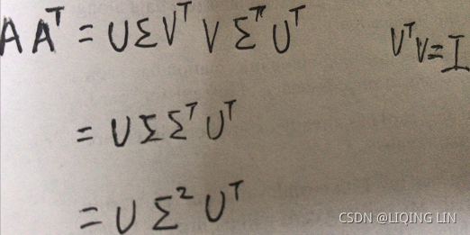 ==>
==>
In this way, we will calculate the singular value decompositions of the original system of equations matrix.
3. SVD计算举例

进而求出![]() 的特征值和特征向量
的特征值和特征向量![]() :
:


![]() ==>
==>![]() ,
, ![]()

接着求![]() 的特征值和特征向量
的特征值和特征向量![]() :
:

SVD applied on handwritten digits using scikitlearn
SVD can be applied on the same handwritten digits data to perform an apple-to-apple comparison of techniques.
# SVD
import matplotlib.pyplot as plt
from sklearn.datasets import load_digits

digits = load_digits()
X = digits.data
y = digits.target
In the following code, 15 singular vectors with 300 iterations are used, but we encourage the reader to change the values and check the performance of SVD. We have used two types of SVD functions, as a function randomized_svd provide the decomposition of the original matrix and a TruncatedSVD can provide total variance explained ratio. In practice, uses may not need to view all the decompositions and they can just use the TruncatedSVD function for their practical purposes.
from sklearn.utils.extmath import randomized_svd
import pandas as pd

U, Sigma, VT = randomized_svd( X, n_components = 15, n_iter=300, random_state=42)
VT_df = pd.DataFrame( VT )

print( '\nShape of Original Matrix:', X.shape )
print( '\nShape of Left Singular vector:', U.shape )
print( 'Shape of Singular value:', Sigma.shape )
print( 'Shape of Right Singular vector', VT.shape ) 
By looking at the previous screenshot, we can see that the original matrix of dimension (1797 x 64) has been decomposed into a left singular vector (1797 x 15), singular value (diagonal matrix of 15, 15x15), and right singular vector (15 x 64). We can obtain the original matrix by multiplying all three matrices in order.
Sigma 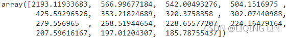
##################################################
import numpy as np

u, s, vt = np.linalg.svd( X )
s[:15] # since n_components=15
np.allclose( Sigma, s[:15]) ![]()
np.allclose( VT.T, vt.T[:,:15] ) ![]()
![]()
![]()
NOTE
The direction of the principal components(eigenvectors) is not stable: if you perturb打乱 the training set slightly and run PCA again, some of the new PCs(Principal Components) may point in the opposite direction of the original PCs. However, they will generally still lie on the same axes. In some cases, a pair of PCs may even rotate or swap, but the plane they define will generally remain the same.
np.allclose( np.abs(VT.T), np.abs(vt.T[:,:15]) ) ![]()
![]()
![]()
Perfect recover the 8x8 image projected on the 15D subspace. u.dot(S).dot(vt)
S = np.zeros(X.shape)
S[:len(s),:len(s)] = np.diag(s)

np.allclose( X, u.dot(S).dot(vt) )![]()
But:
from sklearn.decomposition import PCA

rnd_pca = PCA(n_components=15, svd_solver='randomized', iterated_power=300,random_state =42 )
x_reduced = rnd_pca.fit_transform(X)
rnd_pca.singular_values
Obviously the result is different from the previous SVD
![]()
![]()
- Standardize the d-dimensional dataset.
from sklearn.decomposition import PCA
from sklearn.preprocessing import StandardScaler

sc = StandardScaler()
X_std = sc.fit_transform(X)

rnd_pca = PCA(n_components=15, svd_solver='randomized', iterated_power=300,random_state =42 )
x_reduced_scaled = rnd_pca.fit_transform(X_std)
rnd_pca.singular_values_
from sklearn.utils.extmath import randomized_svd
import pandas as pd

U, Sigma, VT = randomized_svd( X_std, n_components = 15, n_iter=300, random_state=42)
VT_df = pd.DataFrame( VT )

Sigma
np.allclose( Sigma, rnd_pca.singular_values_ )![]()
![]()
![]()
np.allclose( VT, rnd_pca.components_ ) ![]() There is no need to use their absolute values here, because the fitting/training is performed under the same condition.
There is no need to use their absolute values here, because the fitting/training is performed under the same condition.
##################################################
np.allclose( X, U.dot(np.diag(Sigma)).dot(VT) )![]() It is because our n_components=15<X.shape[1], resulting in loss in the reconstruction process, which causes the image to be distorted after reconstruction
It is because our n_components=15<X.shape[1], resulting in loss in the reconstruction process, which causes the image to be distorted after reconstruction
Let us continue to use the unstandardized d-dimensional data set.
n_comps = 15
from sklearn.decomposition import TruncatedSVD

truncated_svd = TruncatedSVD( n_components= n_comps, n_iter =300, random_state =42 )
reduced_X = truncated_svd.fit_transform(X)

print( '\nTotal Variance explained for %d singular features are %0.3f' %
       ( n_comps, truncated_svd.explained_variance_ratio_.sum() )
) ![]()
The total variance explained for 15 singular value features is 83.4 percent. But the reader needs to change the different values to decide the optimum value.
The following code illustrates the change in total variance explained with respective to change in number of singular values:
for i in range( 2,max_comps ):
  print(i-2+1,'-',i-1+1,'(',total_explained_variance_list[i-1],')-', i+1, ':',
        round(total_explained_variance_list[i-1]-total_explained_variance_list[i-2] -
              (total_explained_variance_list[i]-total_explained_variance_list[i-1]),
              3
             ),
) 
# Choosing number of Singular Values

max_comps = 30
num_comps = range(max_comps)
total_explained_variance_list = []
for i in range( max_comps ):
  svd = TruncatedSVD( n_components=i+1, n_iter=300, random_state=42 )
  reduced_X = svd.fit_transform(X)
  total_cur_exp_var = svd.explained_variance_ratio_.sum()
  total_explained_variance_list.append(total_cur_exp_var)

plt.figure( figsize=(10,8) )
plt.plot( num_comps, total_explained_variance_list )
plt.plot( num_comps, total_explained_variance_list, 'bs' )
plt.xlabel( 'No. of Components', fontsize=13 )
plt.yticks( fontsize=13 )
plt.plot( [0,15], [0.8,0.8], 'k:')
plt.plot( [15,15], [0,0.8], 'k:')

plt.plot( [0,6], [0.6,0.6], 'k:')
plt.plot( [6,6], [0,0.6], 'k:')

plt.title( 'Number of SVD Components vs. Total Variance Explained',
            c='r',
            fontdict={'fontsize':14,
                      'family':'serif',
                      },#fontsize='xxx-large', #

            fontweight='bold',  # or 'heavy', 'bold', 'normal'
            fontstyle='italic' ) # rotation=45, bbox=dict(facecolor='y', edgecolor='blue', alpha=0.65
plt.show() 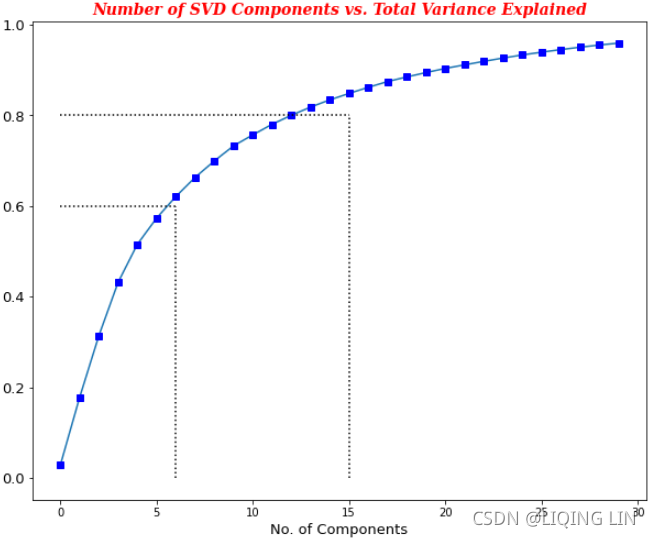
From the previous plot, we can choose either 7(>=60%, an elbow(肘部) in the curve) or 15(>80%, 13,14, 15) singular vectors based on the requirement.
Deep auto encoders
The auto encoder neural network is an unsupervised learning algorithm that applies backpropagation setting the target values to be equal to the inputs ![]() . Auto encoder
. Auto encoder
tries to learn a function ![]() , means it tries to learn an approximation to the identity function, so that output
, means it tries to learn an approximation to the identity function, so that output![]() that is similar to x.
that is similar to x. vs
vs
Though trying to replicate the identity function seems trivial function to learn, by placing the constraints on the network, such as by limiting number of hidden units, we can discover interesting structures about the data. Let's say input picture of size 10 x 10 pixels has intensity values which have, altogether, 100 input values, the number of neurons in the second layer (hidden layer) is 50 units, and the output layer, finally, has 100 units of neurons as we need to pass the image to map it to itself and while achieving this representation in the process we would force the network to learn a compressed representation of the input, which is hidden unit activations ![]() , with which we must try to reconstruct the 100 pixel input x. If the input data is completely random without any correlations, and so on. it would be very difficult to compress, whereas if the underlying data have some correlations or detectable structures, then this algorithm will be able to discover the correlations and represent them compactly. In fact, auto encoder often ends up learning a low-dimensional representation very similar to PCAs.
, with which we must try to reconstruct the 100 pixel input x. If the input data is completely random without any correlations, and so on. it would be very difficult to compress, whereas if the underlying data have some correlations or detectable structures, then this algorithm will be able to discover the correlations and represent them compactly. In fact, auto encoder often ends up learning a low-dimensional representation very similar to PCAs.
Autoencoders are composed of two networks concatenated together: an encoder network(or recognition network) and a decoder network(or generative network). The encoder network receives a d-dimensional input feature vector associated with example x (that is, 𝒙 ∈![]() ) and encodes it into a p-dimensional vector, 𝒛 (that is, 𝒛 ∈
) and encodes it into a p-dimensional vector, 𝒛 (that is, 𝒛 ∈![]() ). In other words, the role of the encoder is to learn how to model the function 𝒛 = 𝑓(𝒙) . The encoded vector, 𝒛, is also called the latent vector, or the latent feature representation. Typically, the dimensionality of the latent vector is less than that of the input examples; in other words, p < d. Hence, we can say that the encoder acts as a data compression function. Then, the decoder decompresses 𝒙̂ from the lower-dimensional latent vector, z, where we can think of the decoder as a function,𝒙̂ = 𝑔(𝒛). A simple autoencoder architecture is shown in the previous right figure, where the encoder and decoder parts consist of only one fully connected layer each.
). In other words, the role of the encoder is to learn how to model the function 𝒛 = 𝑓(𝒙) . The encoded vector, 𝒛, is also called the latent vector, or the latent feature representation. Typically, the dimensionality of the latent vector is less than that of the input examples; in other words, p < d. Hence, we can say that the encoder acts as a data compression function. Then, the decoder decompresses 𝒙̂ from the lower-dimensional latent vector, z, where we can think of the decoder as a function,𝒙̂ = 𝑔(𝒛). A simple autoencoder architecture is shown in the previous right figure, where the encoder and decoder parts consist of only one fully connected layer each.
Model building technique using encoderdecoder architecture
Training the auto encoder model is a bit tricky, hence a detailed illustration has been provided for better understanding. During the training phase, the whole encoder-decoder section is trained against the same input as an output of decoder. In order to achieve the desired output, features will be compressed during the middle layer, as we are passing through the convergent and divergent layers. Once enough training has been done by reducing the error values over the number of iterations, we will use the trained encoder section to create the latent features for next stage of modeling, or for visualization, and so on.
In the following diagram, a sample has been shown. The input and output layers have five neurons, whereas the number of neurons has been gradually decreased in the middle sections. The compressed layer has only two neurons, which is the number of latent dimensions we would like to extract from the data.
The following diagram depicts using the trained encoder section to create latent features from the new input data, which will be utilized for visualization or for utilizing in the next stage of the model:
Deep auto encoders applied on handwritten digits using Keras
Deep auto encoders are explained with same handwritten digits data to show the comparison of how this non-linear method differs to linear methods like PCA and SVD. Non-linear methods generally perform much better, but these methods are kind of blackbox models and we cannot determine the explanation behind that. Keras software has been utilized to build the deep auto encoders here, as they work like Lego blocks, which makes it easy for users to play around with different architectures and parameters of the model for better understanding:
# Deep Auto Encoders
import matplotlib.pyplot as plt
from sklearn.preprocessing import StandardScaler
from sklearn.datasets import load_digits

digits = load_digits()
X = digits.data
y = digits.target

print( X.shape ) ![]()
print( y.shape )
x_vars_stdscale = StandardScaler().fit_transform(X)
print( x_vars_stdscale.shape ) ![]()
Dense neuron modules from Keras used for constructing encoder-decoder architecture:
from keras.layers import Input, Dense
from keras.models import Model
The reader needs to consider one important point that, syntax of Keras code, will remain same in both CPU and GPU mode.
The following few lines of codes are the heart of the model. Input data have 64 columns. We need to take those columns into the input of the layers, hence we have given the shape of 64. Also, names have been assigned to each layer of the neural network, which we will explain the reason for in an upcoming section of the code. In the first hidden layer, 32 dense neurons are utilized, which means all the 64 inputs from the input layer are connected to 32 neurons in first hidden layer. The entire flow of dimensions are like 64, 32, 16, 2, 16, 32, 64. We have compressed input to two neurons, in order to plot the components on a 2D plot, whereas, if we need to plot a 3D data (which we will be covering in the next section), we need to change the hidden three-layer number to three instead of two. After training is complete, we need to use encoder section and predict the output.
# 2-Dimensional Architecture
input_layer = Input( shape=(64,), name='input' )

encoded = Dense( 32, activation='relu', name='h1_encoder' )( input_layer )
encoded = Dense( 16, activation='relu', name='h2_encoder' )( encoded )
encoded = Dense( 2, activation='relu', name ='h3latent_layer' )( encoded )

decoded = Dense( 16, activation='relu', name='h4_decoder' )( encoded )
decoded = Dense( 32, activation='relu', name='h5_decoder' )( decoded )
decoded = Dense( 64, activation='sigmoid', name='h6_decoder' )( decoded )
To train the model, we need to pass the starting and ending point of the architecture. In the following code, we have provided input as input_layer and output as decoded, which is the last layer (the name is h6decode):
autoencoder = Model( input_layer, decoded)

autoencoder.build( input_shape=(None, 64) )
autoencoder.summary() 
OR
#######################################
from tensorflow import keras

stacked_encoder = keras.models.Sequential([
                    keras.layers.InputLayer( input_shape=(64,), name ='input' ),
                    keras.layers.Dense( 32, activation='relu', name ='h1_encoder' ),
                    keras.layers.Dense( 16, activation='relu', name='h2_encoder' ),
                    keras.layers.Dense( 2, activation='relu', name ='h3_encoder' ),
], name='encoder')

stacked_decoder = keras.models.Sequential([
                    keras.layers.Dense( 16, activation='relu', name='h4_decoder' ),
                    keras.layers.Dense( 32, activation='relu', name='h5_decoder' ),
                    keras.layers.Dense( 64, activation='sigmoid', name='h6_decoder' ),
], name='decoder')

stacked_ae = keras.models.Sequential( [stacked_encoder, stacked_decoder],
                                      name='autoEncoder' )
stacked_ae.build( input_shape=(None, 64) )
stacked_ae.summary()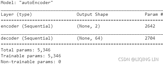
stacked_encoder.summary()
stacked_decoder.summary()
#######################################
Adam optimization has been used to optimize the mean square error, as we wanted to reproduce the original input at the end of the output layer of the network:
import tensorflow as tf

tf.random.set_seed(2)
np.random.seed(2)

keras.backend.clear_session()
autoencoder.compile( optimizer='adam', loss='mse' )
The network is trained with 100 epochs and a batch size of 256 observations per each batch. Validation split of 20 percent is used to check the accuracy on randomly selected validation data in order to ensure robustness, as if we just train only on the train data may create the overfitting problem, which is very common with highly non-linear models:
# Fitting Encoder-Decoder model
autoencoder.fit( x_vars_stdscale, x_vars_stdscale,
                 epochs=100, batch_size=256,
                 shuffle=True, validation_split=0.2
               )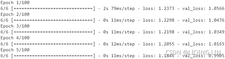
... ...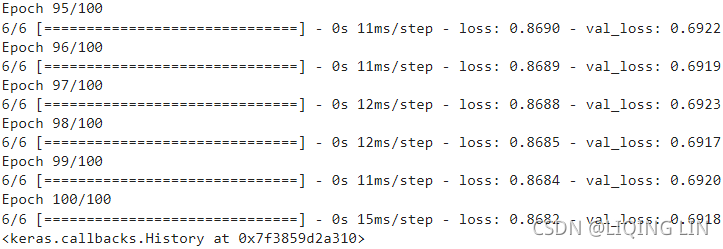
From the previous results, we can see that the model has been trained on 1,437(=1797*0.8) train examples and validation on 360(=1797*0.2) examples. By looking into the loss value, both train and validation losses have decreased from 1.2373 to 0.8682 and 1.0566 to 0.6918 respectively. Hence, we are moving in the right direction. However, readers are encouraged to try various architectures and number of iterations, batch sizes, and so on to see how much the accuracies can be further improved.
###################
stacked_ae.compile( loss='mse', optimizer='adam' )
stacked_ae.fit( x_vars_stdscale, x_vars_stdscale,
                 epochs=100, batch_size=256,
                 shuffle=True, validation_split=0.2
               )
... ...
###################
Once the encoder-decoder section has been trained, we need to take only the encoder section to compress the input features in order to obtain the compressed latent features, which is the core idea of dimensionality reduction altogether! In the following code, we have constructed another model with a trained input layer and a middle hidden layer (h3latent_layer). This is the reason behind assigning names for each layer of the network.
# Extracting Encoder section of the Model for prediction of latent variables
encoder = Model( autoencoder.input,
                 autoencoder.get_layer("h3latent_layer").output
               )
Extracted encoder section of the whole model used for prediction of input variables to generate sparse 2-dimensional representation, which is being performed with the following code
# Predicting latent variables with extracted Encoder model
reduced_X = encoder.predict( x_vars_stdscale )

print( reduced_X.shape ) ![]() we can see 2 dimensions or 2 column vector
we can see 2 dimensions or 2 column vector
encoder.summary()  This encoder is actually stacked_encoder
The following section of the code is very much similar to 2D PCA:
# 2 components for each digit(class: 0~9)
digits = {}
for i in range(10):
  digits[i]=[]

for i in range( len(reduced_X) ):
  digits[ y[i] ].append( reduced_X[i] )

# digits[0][:2] ### check
# [[11.828083 ,  6.0393114],
#  [16.037289 ,  6.703146 ],
#  [ 8.56296  ,  5.988532 ]], dtype=float32)

for i in range( 10 ):
  digits[i] = np.array( digits[i] )

digits[0][:2] # check 
# create a parameter dictionary
digit_param = { 0:{'c':'r', 'marker':'x', 'label':'zero'},
                1:{'c':'g', 'marker':'+', 'label':'one'},
                2:{'c':'b', 'marker':'s', 'label':'two'},

                3:{'c':'m', 'marker':'*', 'label':'three'},
                4:{'c':'c', 'marker':'h', 'label':'four'},
                5:{'c':'r', 'marker':'D', 'label':'five'},

                6:{'c':'y', 'marker':'8', 'label':'six'},
                7:{'c':'k', 'marker':'*', 'label':'seven'},
                8:{'c':'r', 'marker':'x', 'label':'eight'},

                9:{'c':'b', 'marker':'D', 'label':'nine'},
               }

fig = plt.figure( figsize=(12,8))
ax = fig.add_subplot(111,)

for i in range(10): # digits: 0~9    # Pass the parameter dictionary to **kwargs
  ax.scatter( digits[i][:,0], digits[i][:,1], **(digit_param[i]) )

ax.set_xlabel('Latent Feature 1')
ax.set_ylabel('Latent Feature 2')

plt.legend( loc='best', # numpoints=1, # The number of marker points in the legend when creating a legend entry for a Line2D (line).
            scatterpoints = 1, #The number of marker points in the legend when creating a legend entry for a PathCollection (scatter plot).
            ncol=3, fontsize=14,
          )
# https://matplotlib.org/stable/tutorials/text/text_intro.html
plt.title( 'Digits projected on 2-Dimensional Latent Feature \nspace using Deep Auto Encoders',
            c='r',
            fontdict={'fontsize':25,
                      'family':'serif',
                      },#fontsize='xxx-large', #

            fontweight='bold',  # or 'heavy', 'bold', 'normal'
            fontstyle='italic' ) # rotation=45, bbox=dict(facecolor='y', edgecolor='blue', alpha=0.65 )
plt.show() 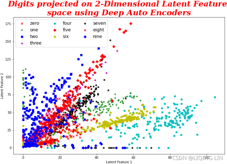
From the previous plot we can see that data points are well separated, but the issue is the direction of view, as these features do not vary as per the dimensions perpendicular to each other, similar to principal components, which are orthogonal to each other. In the case of deep auto encoders, we need to change the view of direction from the (0, 0) to visualize this non-linear classification, which we will see in detail in the following 3D case.
The following is the code for 3D latent features. All the code remains the same apart from the h3latent_layer, in which we have to replace the value from 2 to 3, as this is the end of encoder section and we will utilize it in creating the latent features and, eventually, it will be used for plotting purposes.
from tensorflow import keras

stacked_encoder = keras.models.Sequential([
                    keras.layers.InputLayer( input_shape=(64,), name ='input' ),
                    keras.layers.Dense( 32, activation='relu', name ='h1_encoder' ),
                    keras.layers.Dense( 16, activation='relu', name='h2_encoder' ),
                    keras.layers.Dense( 3, activation='relu', name ='h3latent_layer' ),
], name='encoder')

stacked_decoder = keras.models.Sequential([
                    keras.layers.Dense( 16, activation='relu', name='h4_decoder' ),
                    keras.layers.Dense( 32, activation='relu', name='h5_decoder' ),
                    keras.layers.Dense( 64, activation='sigmoid', name='h6_decoder' ),
], name='decoder')

stacked_ae = keras.models.Sequential( [stacked_encoder, stacked_decoder],
                                      name='autoEncoder' )
stacked_ae.build( input_shape=(None, 64) )

stacked_encoder.summary() 
stacked_ae.compile( loss='mse', optimizer='adam' )
stacked_ae.fit( x_vars_stdscale, x_vars_stdscale,
                 epochs=100, batch_size=256,
                 shuffle=True, validation_split=0.2
               )
... ...
From the previous results we can see that, with the inclusion of 3 dimensions instead of two, loss values obtained are less than in the 2D use case. Train and validation losses for two latent factors after 100 epochs are 1.2372 and 0.8783, and for three latent factors after 100 epochs, are 1.0588 and 0.6988. This signifies that, with the inclusion of one more dimension, we can reduce the errors significantly. This way, the reader can change various parameters to determine the ideal architecture for dimensionality reduction:
# Predicting latent variables with extracted Encoder model
reduced_X3D = stacked_encoder.predict( x_vars_stdscale )

# three components for each digit(class: 0~9)
digits = {}
for i in range(10):
  digits[i]=[]

for i in range( len(reduced_X3D) ):
  digits[ y[i] ].append( reduced_X3D[i] )

for i in range( 10 ):
  digits[i] = np.array( digits[i] )

digits[0][:3] # check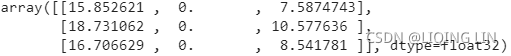
# create a parameter dictionary
digit_param = { 0:{'c':'r', 'marker':'x', 'label':'zero'},
1:{'c':'g', 'marker':'+', 'label':'one'},
2:{'c':'b', 'marker':'s', 'label':'two'},
3:{'c':'m', 'marker':'*', 'label':'three'},
4:{'c':'c', 'marker':'h', 'label':'four'},
5:{'c':'r', 'marker':'D', 'label':'five'},
6:{'c':'y', 'marker':'8', 'label':'six'},
7:{'c':'k', 'marker':'*', 'label':'seven'},
8:{'c':'r', 'marker':'x', 'label':'eight'},
9:{'c':'b', 'marker':'D', 'label':'nine'},
}
# 3-Dimensional plot
from mpl_toolkits.mplot3d import Axes3D
fig = plt.figure( figsize=(12,8))
ax = fig.add_subplot(111, projection='3d')
for i in range(10): # digits: 0~9 # Pass the parameter dictionary to **kwargs
ax.scatter( digits[i][:,0], digits[i][:,1], digits[i][:,2], **(digit_param[i]) )
ax.set_xlabel('Latent Feature 1', fontsize=12)
ax.set_ylabel('Latent Feature 2', fontsize=12)
ax.set_zlabel('Latent Feature 3', fontsize=12)
ax.set_xlim3d(0,60)
plt.legend( loc='best', numpoints=1, # The number of marker points in the legend when creating a legend entry for a Line2D (line).
# scatterpoints = 1, #The number of marker points in the legend when creating a legend entry for a PathCollection (scatter plot).
ncol=3, fontsize=14,
bbox_to_anchor=(1,0), # move to right
)
# https://matplotlib.org/stable/tutorials/text/text_intro.html
plt.title( 'Digits projected on 3-Dimensional Latent Feature \nspace using Deep Auto Encoders',
c='r',
fontdict={'fontsize':25,
'family':'serif',
},#fontsize='xxx-large', #
fontweight='bold', # or 'heavy', 'bold', 'normal'
fontstyle='italic' ) # rotation=45, bbox=dict(facecolor='y', edgecolor='blue', alpha=0.65 )
ax.view_init(195,#z-plane
295)#xy-plane
plt.show()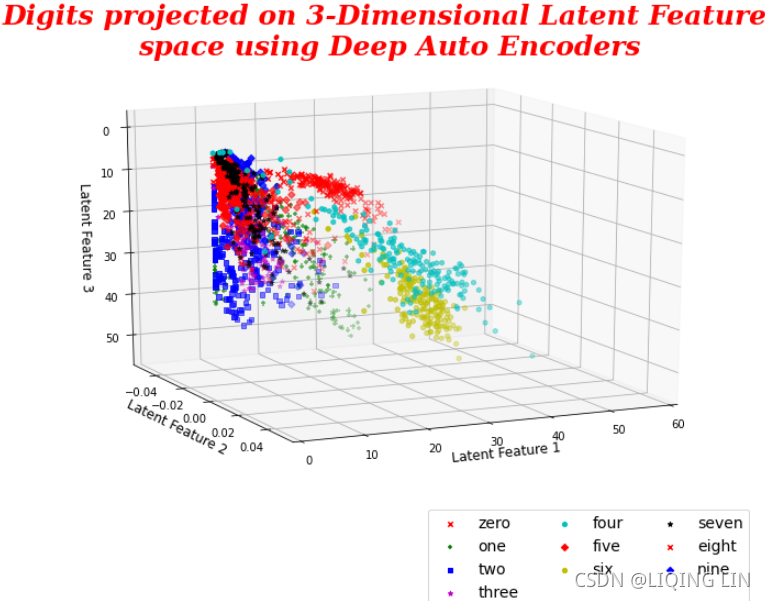 Great!
3D plots from deep auto encoders do provide well separated classification compared with three PCAs. Here we have got better separation of the digits. One important point the reader should consider here is that the above plot is the rotated view from (0, 0, 0), as data separation does not happen across orthogonal planes (like PCAs), hence we need to see the view from origin in order to see this non-linear classification.
Summary
In this chapter, you have learned about various unsupervised learning methods to identify the structures and patterns within the data using k-mean clustering, PCA, SVD and deep auto encoders. Also, the k-means clustering algorithm explained with iris data. Methods were shown on how to choose the optimal k-value based on various performance metrics. Handwritten data from scikit-learn was been utilized to compare the differences between linear methods like PCA and SVD with non-linear techniques and deep auto encoders. The differences between PCA and SVD were given in detail so that the reader can understand SVD, which can be applied even on rectangular matrices where the number of users and number of products is not necessarily equal. In the end, through visualization, it has been proven that deep auto encoders are better at separating digits than linear unsupervised learning methods like PCA and SVD.


 3202
3202

 被折叠的 条评论
为什么被折叠?
被折叠的 条评论
为什么被折叠?
 到【灌水乐园】发言


