


Echarts
基本使用
<!DOCTYPE html>
<html lang="en">
<head>
<meta charset="UTF-8" />
<meta http-equiv="X-UA-Compatible" content="IE=edge" />
<meta name="viewport" content="width=device-width, initial-scale=1.0" />
<title>Document</title>
<!-- 1、引入 ECharts 文件 -->
<script src="./lib/echarts.js"></script>
</head>
<body>
<!-- 2、准备一个呈现图表的盒子 -->
<div style="width: 600px; height: 400px"></div>
<script>
// 3、基于准备好的dom,初始化echarts实例
var myCharts = echarts.init(document.querySelector("div"));
// 4、指定图表的配置项和数据(实际项目只需要修改这部分的即可,看官方的配置项手册https://echarts.apache.org/zh/option.html#title)
var option = {
title: {
text: "ECharts 入门示例",
},
tooltip: {},
legend: {
data: ["销量"],
},
xAxis: {
data: ["衬衫", "羊毛衫", "雪纺衫", "裤子", "高跟鞋", "袜子"],
},
yAxis: {},
series: [
{
name: "销量",
type: "bar",
data: [5, 20, 36, 10, 10, 20],
},
],
};
// 5、使用刚指定的配置项和数据显示图表。
myCharts.setOption(option);
</script>
</body>
</html>相关配置
-
xAxis:直角坐标系 中的x轴,是个对象
-
yAxis:直角坐标系 中的y轴,是个对象
-
series:系列列表,是个数组里面包含对象。每个系列通过type决定自己的图表类型
哪个轴需要数据设置为value,它所取的值是在series的data里面
通用配置 title标题
-
文字样式textStyle
-
标题边框borderWidth、borderColor、borderRadius
-
标题位置:left、right、top、bottom
通用配置 tooltip提示
提示框组件,用于配置鼠标滑过或点击图表时的显示框
-
触发类型:tigger【item需在柱状内才触发、axis在y轴上都可触发】
-
触发时机:triggerOn【mouseover、click】
-
格式化:formatter【字符串模板、回调函数】
通用配置 yAxisY轴
当需要设置双Y轴时:
如下图的【金额】和【数量】
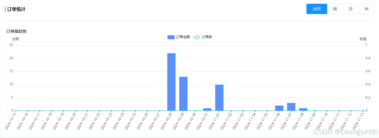
1、在yAxis里设置
        yAxis: [
          {
            type: "value",
            name: "金额",
          },
          {
            type: "value",
            name: "数量",
          },
        ],
2、在series里设置yAxisIndex,即选择yAxis的索引
        series: [
          {
            name: "订单金额",
            itemStyle: {
              normal: {
                color: "#5b90fa",
                lineStyle: {
                  color: "#5b90fa",
                  width: 2,
                },
              },
            },
            smooth: true,
            type: "bar",
            yAxisIndex: 0, // 使用索引为 0 的 Y 轴
            data: moneyData,
            animationDuration: 2800,
            animationEasing: "cubicInOut",
          },
          {
            name: "订单数",
            smooth: true,
            type: "line",
            yAxisIndex: 1, // 使用索引为 1 的 Y 轴
            itemStyle: {
              normal: {
                color: "#4bc9d5",
                lineStyle: {
                  color: "#4bc9d5",
                  width: 2,
                },
              },
            },
            data: numData,
            animationDuration: 2800,
            animationEasing: "quadraticOut",
          },
        ]
通用配置 toolbox工具按钮
工具栏,内置有导出图片,数据视图,动态类型切换,数据区域缩放,重置五个工具。
-
各工具配置项feature:【saveAsImage导出图片、dataView数据视图、restore重置、dataZoom区域缩放、magicType动态图表类型的切换】
通用配置 legend图例
图例,用于筛选系列,需要和series配合使用
-
legend中的data是一个数组
-
legend中的data的值需要和series数组中某组数据的name值一致
柱状图
type:'bar'
常见效果series
-
标记:最大值、最小值 markPoint;平均值markLine
-
显示:数值显示label;柱宽度barWidth;横向柱状图 更改x轴和y轴的角色
折线图
type:'line'
常见效果series
-
标记:最大值、最小值 markPoint;平均值markLine、标注区间markArea
-
线条控制:平滑smooth、风格lineStyle
-
填充风格:areaStyle
-
紧挨边缘:直接从y轴开始boundaryGap 【x轴上配置!】
-
缩放:开始值不从0开始scale【y轴上配置!】
-
堆叠图:stack
散点图
type:'scatter'
xAxis和yAxis的type都要设置为value
它需要的是二维数组
处理方法如下:
var data=[{}]//拿到的数据
var axisData = []
// 通过for循环把里面的item另外拿出来放到数组里面
for(var i=0;i<data.length;i++){
    var height = data[i].height
    var weight = data[i].weight
    var newArr = [height,weight]
    axisData.push(newArr)
}
常见效果:
-
气泡图效果:
散点的大小不同symbolSize、散点的颜色不同itemStyle.color
symbolSize:function(arg){
    var height = arg[0]/100
    var weight =arg[1]
    //bmi=体重kg / (身高m*身高m) 大于28代表肥胖
    var bmi = weight /(height * height)
    if(bmi>28){
        return 10
    }
    return 5
},
itemStyle:{
    color:function(arg){
        var height = arg.data[0]/100
        var weight =arg.data[1]
        var bmi = weight /(height * height)
        if(bmi>28){
            return 'red'
        }
        return 'green'
    }
}
常见问题
图表数据发生变化视图没有自动更新
解决:使用watch监听数据的变化
watch:{
    "heartLineChartData.testTime"(val, oldVal) {
      this.heartInitChart();
    },
}
图表报警告在同一个 DOM 元素上尝试初始化了多个 ECharts 实例
[ECharts] There is a chart instance already initialized on the dom
解决:
-
第一种:在初始化新实例之前,先销毁旧的实例
echarts.dispose(document.getElementById("ninth"));-
第二种:复用已有的实例
DataV
边框
边框内布局需要重新布局,在使用时在外面套一个盒子设置height:100vh
动态环图
可以另外封装成组件,后面调用
数据添加在config里设置
RingChart.vue
<template>
<div class="box">
<div class="title">热门手机销量占比</div>
<div class="content">
<div class="list">
<div class="item" :class="{active:activeIndex=index}" @click="activeIndex=index" v-for="(item,index) in list" :key="index">{{item.name}}</div>
</div>
</div>
<dv-active-ring-chart
:config="config"
style="width: 200px; height: 200px"
/>
</div>
</template>
<script>
export default {
data() {
//高亮索引
activeIndex:0,
//后端返回的数据
list: [
{
id: 1,
name: "苹果手机",
data: [
{
name: "一季度",
value: 255,
},
{
name: "二季度",
value: 356,
},
{
name: "三季度",
value: 456,
},
{
name: "四季度",
value: 336,
},
],
},
{
id: 2,
name: "小米手机",
data: [
{
name: "一季度",
value: 465,
},
{
name: "二季度",
value: 386,
},
{
name: "三季度",
value: 276,
},
{
name: "四季度",
value: 678,
},
],
},
];
//图标配置项
config: {
//图标的数据
data: [];
}
},
created(){
this.config.fata = this.list[this.activeIndex].data
},
watch:{
activeIndex(){
this.config = {
//当config里面有多种配置,需要把别的配置保留
...this.config,
data:this.list[this.activeIndex].data
}
}
}
};
</script>
<style lang="scss">
.box {
.title {
font-size: 22px;
text-align: center;
}
.content {
display: flex;
align-items: center;
}
.list {
padding-left: 20px;
.item {
margin: 10px 0;
cursor: pointer;
background-color: rgba(255, 255, 255, 0.2);
padding: 4px 10px;
&.active {
background-color: rgba(255, 255, 255, 0.5);
}
}
}
}
</style>App.vue
<template>
<!-- 这个是前提,做响应式 -->
<dv-full-screen-container>content</dv-full-screen-container>
<div class="container">
<div class="row">
<div class="cell">
<dv-border-box-12>
<RingChart></RingChart>
</dv-border-box-12>
</div>
<div class="cell"></div>
<div class="cell"></div>
</div>
</div>
</template>
<script>
import RingChart from "./components/RingChart.vue";
export default {
components: {
RingChart,
},
};
</script>飞线图
mounted(){
  let timer = setInterval(()=>{
    let[obj] = this.list.splice(0,1)
    if(!obj){
      clearnInterval(timer)
      return
    }else{
      this.config = {
        ...this.config,
        points:[...this.config.points,obj]
      }
    }
  },3000)
}


 1086
1086

 被折叠的 条评论
为什么被折叠?
被折叠的 条评论
为什么被折叠?
 到【灌水乐园】发言


