


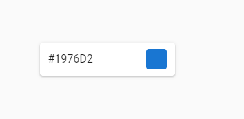
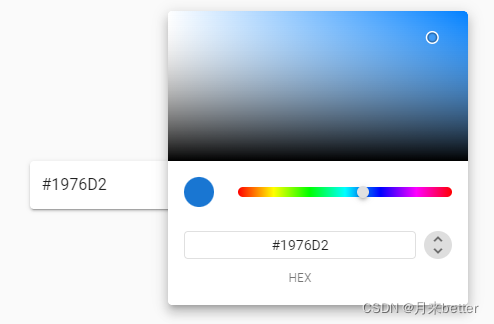
 这篇博客展示了如何利用Vuetify库创建一个交互式的颜色选择器输入框。通过结合`v-text-field`、`v-menu`和`v-color-picker`组件,实现了点击输入框后弹出颜色选择器的界面效果。代码示例中详细地定义了元素样式和数据绑定,使得用户可以方便地选取并显示颜色。
Vuetify Color Picker Input地址:https://codepen.io/kiruthika-yue/pen/yLPXJxO
<div id="app">
  <v-app id="inspire">
    <v-row justify="center" align="center">
		<v-col class="shrink" style="min-width: 220px;">
			<v-text-field v-model="color" hide-details class="ma-0 pa-0" solo>
				<template v-slot:append>
					<v-menu v-model="menu" top nudge-bottom="105" nudge-left="16" :close-on-content-click="false">
						<template v-slot:activator="{ on }">
							<div :style="swatchStyle" v-on="on" />
						</template>
						<v-card>
							<v-card-text class="pa-0">
								<v-color-picker v-model="color" flat />
							</v-card-text>
						</v-card>
					</v-menu>
				</template>
			</v-text-field>
		</v-col>
		</v-row>
  </v-app>
</div>


Vue.use(VueTheMask)

new Vue({
  el: '#app',
  vuetify: new Vuetify(),
	data: () => ({
		color: '#1976D2',
		menu: false,
	}),
  computed: {
    swatchStyle() {
      const { color, menu } = this
      return {
        backgroundColor: color,
        cursor: 'pointer',
        height: '30px',
        width: '30px',
        borderRadius: menu ? '50%' : '4px',
        transition: 'border-radius 200ms ease-in-out'
      }
    }
  }
})


 扫一扫
扫一扫


 2万+
2万+

 被折叠的 条评论
为什么被折叠?
被折叠的 条评论
为什么被折叠?
 到【灌水乐园】发言


