


1,基本使用
总结
代码演示
<style>
.box1{
width: 200px;
height: 200px;
background-color: orange;
opacity: .5;
/* 设置哪个属性需要过渡效果 */
/* transition-property: height,width; */
/* 让所有能过渡的属性都过渡 */
transition-property: all;
/* 设置过渡的时间-分别设置时间 */
/* transition-duration: 1s,5s; */
/* 设置过渡的时间-设置一个时间所有人都用 */
transition-duration: 1s;
}
.box1:hover{
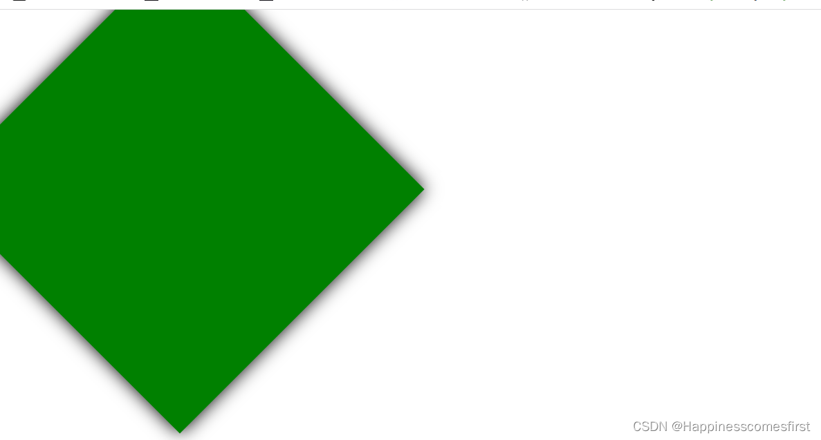
height: 400px;
width: 400px;
background-color: green;
transform: rotate(45deg);
box-shadow: 0px 0px 20px black;
opacity: 1;
}
</style>
</head>
<body>
<div class="box1"></div>
</body>运行结果
2,高级使用
总结
代码演示
<style>
.outer{
width: 1300px;
height: 900px;
border: 1px solid black;
}
.outer:hover .box{
width: 1300px;
}
.box{
width: 200px;
height: 100px;
background-color: orange;
/* 让所有能过渡的属性都过渡 */
transition-property: all;
/* 设置过渡的时间-设置一个时间所有人都用 */
transition-duration: 5s;
/* 过渡延迟 */
transition-delay: 1s;
}
.box1{
background-color: skyblue;
transition-timing-function: ease;
}
.box2{
background-color: orange;
transition-timing-function: linear;
}
.box3{
background-color: gray;
transition-timing-function: ease-in;
}
.box4{
background-color: tomato;
transition-timing-function: ease-out;
}
.box5{
background-color: green;
transition-timing-function: ease-in-out;
}
.box6{
background-color: purple;
transition-timing-function: step-start;
}
.box7{
background-color: deeppink;
transition-timing-function: step-end;
}
.box8{
background-color: chocolate;
transition-timing-function: steps(20);
}
.box9{
background-color: black;
transition-timing-function: cubic-bezier(.76,1.07,.81,1.1);
}
</style>
</head>
<body>
<div class="outer">
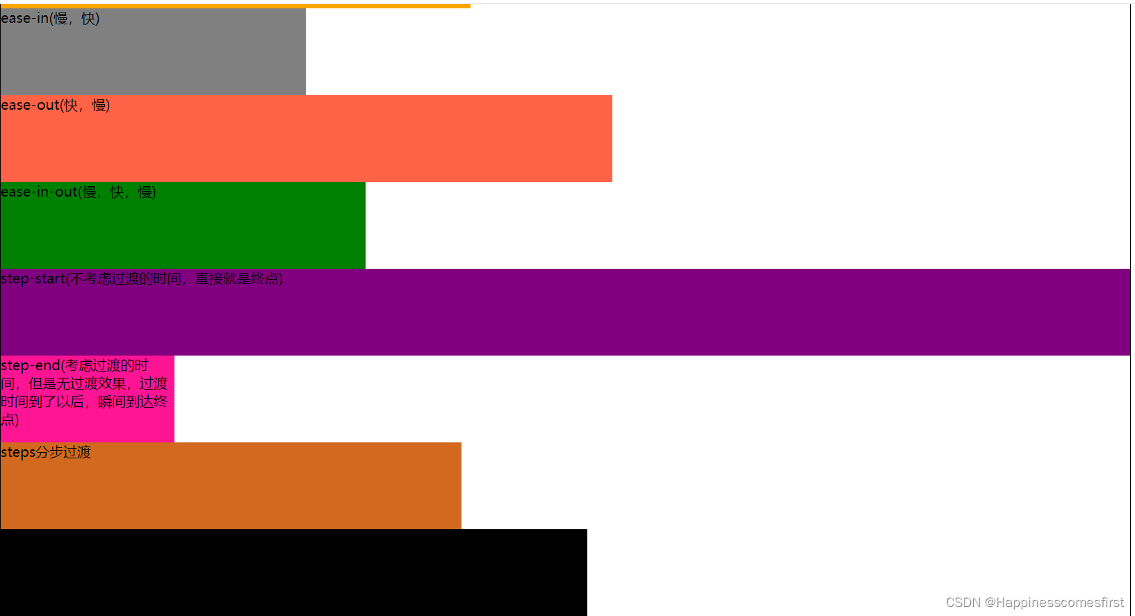
<div class="box box1">ease(慢,快,慢)</div>
<div class="box box2">linear(匀速)</div>
<div class="box box3">ease-in(慢,快)</div>
<div class="box box4">ease-out(快,慢)</div>
<div class="box box5">ease-in-out(慢,快,慢)</div>
<div class="box box6">step-start(不考虑过渡的时间,直接就是终点)</div>
<div class="box box7">step-end(考虑过渡的时间,但是无过渡效果,过渡时间到了以后,瞬间到达终点)</div>
<div class="box box8">steps分步过渡</div>
<div class="box box9">贝赛尔曲线</div>
</div>
</body>运行结果
3,复合属性
总结
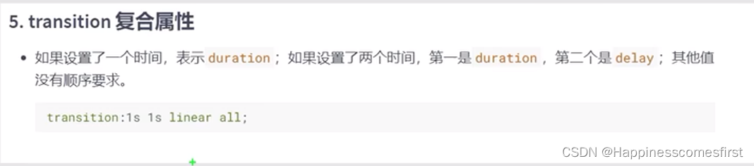
代码演示
<style>
    .outer{
      width: 1000px;
      height: 100px;
      border: 1px solid black;
    }
    .inner{
      width: 100px;
      height: 100px;
      background-color: orange;
      transition: 3s all .5s linear;
    }
    .outer:hover .inner{
      width: 1000px;
    }
  </style>
</head>
<body>
  <div class="outer">
    <div class="inner"></div>
  </div>
</body>
运行结果
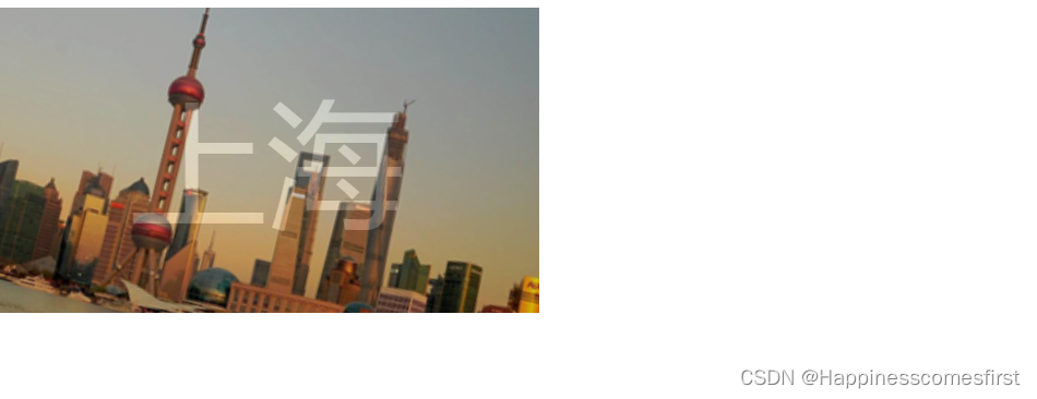
4,过渡小案例
代码演示
 <style>
    .outer{
      width: 400px;
      height: 224px;
      position: relative;
      overflow: hidden;
    }
    .outer img{
      transition: .5s all linear;
    }
    .outer:hover img{
      transform: scale(1.6) rotate(20deg);
    }
    .mask{
      width: 400px;
      height: 224px;
      background-color: black;
      opacity: 0;
      color: white;
      text-align: center;
      line-height: 224px;
      font-size: 100px;
      position: absolute;
      top: 0;
      left: 0;
      transition: 1s all linear;
      cursor: pointer;
    }
    .outer:hover .mask{
      opacity: .5;

    }
  </style>
</head>
<body>
  <div class="outer">
    <img src="../images/shanghai.jpg" alt="">
    <div class="mask">上海</div>
  </div>

</body>
运行结果


 扫一扫
扫一扫


 被折叠的 条评论
为什么被折叠?
被折叠的 条评论
为什么被折叠?
 到【灌水乐园】发言


