CSS--贝塞尔曲线(cubic-bezier)
如果感兴趣,可以通过下边的链接了解。
cubic-bezier.comhttps://cubic-bezier.com/#.13,1.38,.24,1.03
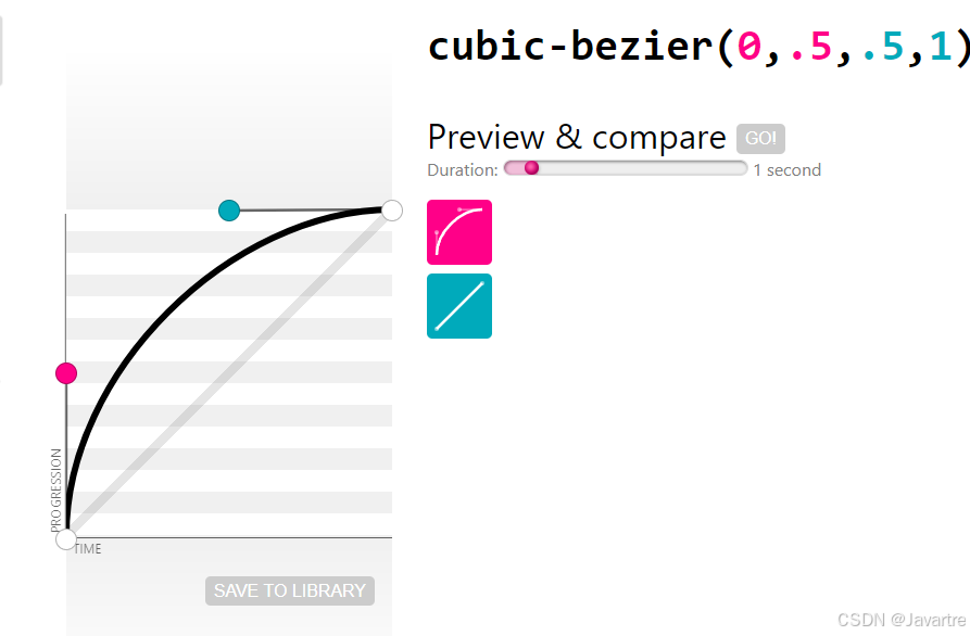
CSS中的贝塞尔曲线是有四个参数值 cubic-bezier(P0,P1,P2 , P3)
贝塞尔曲线曲线由四个点 P0,P1,P2 和 P3 定义。P0 和 P3 是曲线的起点和终点。P0是(0,0)并且表示初始时间和初始状态,P3是(1,1)并且表示最终时间和最终状态。
抛物线动画代码:
x轴方向一个匀速的运动,y轴方向一个贝塞尔曲线运动,两个运动的轨迹结合最终形成了一个抛物线的效果
<!DOCTYPE html>
<html lang="en">
<head>
<meta charset="UTF-8">
<meta name="viewport" content="width=device-width, initial-scale=1.0">
<title></title>
</head>
<style>
body,
html {
position: relative;
width: 100vw;
height: 100vh;
margin: 0;
padding: 0;
overflow: hidden;
}
.box {
position: absolute;
z-index: 5;
bottom: 5%;
left: 5%;
width: 40px;
height: 40px;
}
.box {
animation: moveX 2.5s linear infinite;
}
.box-child {
background: red;
border-radius: 50%;
}
.box-child {
width: 100%;
height: 100%;
animation: moveY 2.5s cubic-bezier(0, 0.5, 0.5, 1) infinite;
}
@keyframes moveX {
0% {
transform: translateX(0);
}
100% {
transform: translateX(100vw);
}
}
@keyframes moveY {
0% {
transform: translateY(0);
}
100% {
transform: translateY(-80vh);
}
}
</style>
<body>
<div class="box">
<div class="box-child">
</div>
</div>
</body>
</html>