


边框按钮动画实现过程
1、定义初始按钮
<body>
    <div class="button">边框按钮</div>
</body>
2、写按钮样式
<style>
.button {
/* 定义一个框200px,高80px的按钮,颜色是aqua */
width: 200px;
height: 80px;
color: aqua;
/* 字体大小设置为20px,字体醒目 */
font-size: 20px;
font-weight: bold;
/* 按钮中文字水平垂直居中 */
text-align: center;
line-height: 80px;
/* 设置为相对定位 */
position: relative;
/* 离可视化窗口顶部100px */
top: 100px;
/* 按钮水平居中 */
margin: 0 auto;
border-radius: 8px;
/* 隐藏超出范围的伪元素 */
overflow: hidden;
/* 模拟边框 */
border: 2px solid;
}
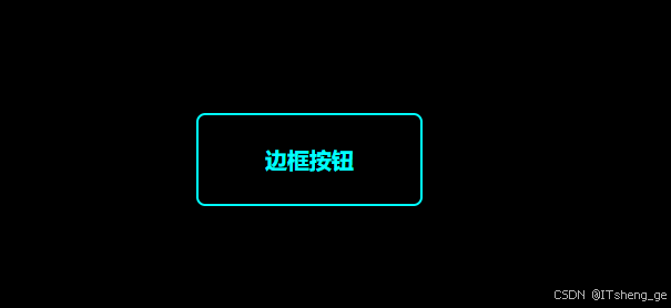
</style>此时可以看到的效果如下图所示
3、使用before伪元素创建一个元素用于实现边框动画
/* before伪元素创建旋转体 */
.button::before {
content: "";
/* 设置绝对定位 */
position: absolute;
/* 相对于按钮向下移动50%向左移动50% */
top: 50%;
left: 50%;
/* 宽高分别是按钮的200% */
width: 200%;
height: 200%;
/* 设置背景为equa */
background: aqua;
z-index: -2;
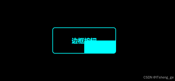
}此时可以看到的效果如下图所示
4、使用after伪元素创建一个元素覆盖住右下角那一大片背景,只留边框的一点缝隙
/* 定义覆盖层 */
.button::after {
content: "";
/* 设置绝对定位 */
position: absolute;
/* 定义空隙变量 */
--w: 2px;
/* 覆盖层居中 */
top: var(--w);
left: var(--w);
width: calc(100% - 2 * var(--w));
height: calc(100% - 2 * var(--w));
background: #000;
z-index: -1;
/* border-radius继承父元素 */
border-radius: inherit;
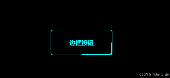
}此时可以看到的效果如下图所示
5、添加转圈动画
/* 旋转一圈的动画 */
@keyframes rotation {
    to {
        transform: rotate(1turn);
    }
}
6、给before伪元素添加上动画
/* before伪元素创建旋转体 */
.button::before {
    content: "";
    /* 设置绝对定位 */
    position: absolute;
    /* 相对于按钮向下移动50%向左移动50% */
    top: 50%;
    left: 50%;
    /* 宽高分别是按钮的200% */
    width: 200%;
    height: 200%;
    /* 设置背景为equa */
    background: aqua;
    z-index: -2;
    /* 无限转圈动画 */
    /* 转圈原点设置为左上角 */
    transform-origin: left top;
    /* 运动一圈的时间是4s,匀速无限重复 */
    animation: rotation 4s linear infinite;
}
这样就实现了按钮边框动画
如下是实现按钮边框动画的全部代码
<!DOCTYPE html>
<html lang="en">
<head>
    <meta charset="UTF-8">
    <meta name="viewport" content="width=device-width, initial-scale=1.0">
    <title>Document</title>
</head>
<body>
    <div class="button">边框按钮</div>
</body>
<style>
body {
    width: 100vw;
    height: 100vh;
    background: #000;
}
.button {
    /* 定义一个框200px,高80px的按钮,颜色是aqua */
    width: 200px;
    height: 80px;
    color: aqua;
    /* 字体大小设置为20px,字体醒目 */
    font-size: 20px;
    font-weight: bold;
    /* 按钮中文字水平垂直居中 */
    text-align: center;
    line-height: 80px;
    /* 设置为相对定位 */
    position: relative;
    /* 离可视化窗口顶部100px */
    top: 100px;
    /* 按钮水平居中 */
    margin: 0 auto;
    border-radius: 8px;
    /* 隐藏超出范围的伪元素 */
    overflow: hidden;
}
/* before伪元素创建旋转体 */
.button::before {
    content: "";
    /* 设置绝对定位 */
    position: absolute;
    /* 相对于按钮向下移动50%向左移动50% */
    top: 50%;
    left: 50%;
    /* 宽高分别是按钮的200% */
    width: 200%;
    height: 200%;
    /* 设置背景为equa */
    background: aqua;
    z-index: -2;
    /* 无限转圈动画 */
    /* 转圈原点设置为左上角 */
    transform-origin: left top;
    /* 运动一圈的时间是4s,匀速无限重复 */
    animation: rotation 4s linear infinite;
}
/* 定义覆盖层 */
.button::after {
    content: "";
    /* 设置绝对定位 */
    position: absolute;
    /* 定义空隙变量 */
    --w: 2px;
    /* 覆盖层居中 */
    top: var(--w);
    left: var(--w);
    width: calc(100% - 2 * var(--w));
    height: calc(100% - 2 * var(--w));
    background: #000;
    z-index: -1;
    /* border-radius继承父元素 */
    border-radius: inherit;
}

/* 旋转一圈的动画 */
@keyframes rotation {
    to {
        transform: rotate(1turn);
    }
}
</style>
</html>


 扫一扫
扫一扫


 被折叠的 条评论
为什么被折叠?
被折叠的 条评论
为什么被折叠?
 到【灌水乐园】发言


