


前言
我们知道在正常的元素中的排版方式叫做文档流,而块级元素,行内元素的排版都属于文档流,块级元素就是从上到下的排版形式,行内元素就是从左到右的排版形式。而CSS中的某些定位,就是使标签脱离文档流,不受布局限制。
一、CSS四个定位
| absolute | 绝对定位 |
| relative | 相对定位 |
| fixed | 固定定位 |
| sticky | 粘性定位 |
1、绝对定位
当一个元素进行了绝对定位时,这个元素会脱离原本的文档流,以浏览器左上角为原点,自身重新生成一个层级。
例如
<html lang="en">
<head>
    <meta charset="UTF-8">
    <meta http-equiv="X-UA-Compatible" content="IE=edge">
    <meta name="viewport" content="width=device-width, initial-scale=1.0">
    <title>Document</title>
</head>
<style>
    .div1{
        width: 200px;
        height: 200px;
        background-color: red;
    }
    .div2{
    width: 300px;
    height: 300px;
     background-color: royalblue;
    }
</style>
<body>
    <div class="div1">
      利物浦
    </div>
    <div class="div2">
     切尔西
    </div>
</body>
</html>
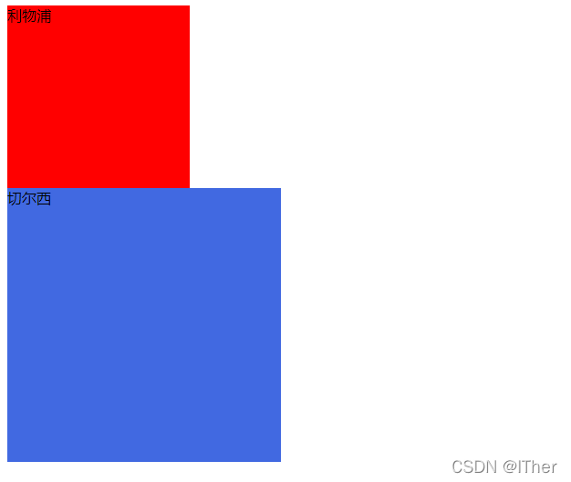
这是还未设置绝对定位时的样子,当我在某个盒子上设置绝对定位后,将会变成如下的样子:
<html lang="en">
<head>
    <meta charset="UTF-8">
    <meta http-equiv="X-UA-Compatible" content="IE=edge">
    <meta name="viewport" content="width=device-width, initial-scale=1.0">
    <title>Document</title>
</head>
<style>
    .div1{
        width: 200px;
        height: 200px;
        background-color: red;
        position:absolute;
        opacity:0.7;
    }
    .div2{
    width: 300px;
    height: 300px;
     background-color: royalblue;
    }
</style>
<body>
    <div class="div1">
      利物浦
    </div>
    <div class="div2">
     切尔西
    </div>
</body>
</html>
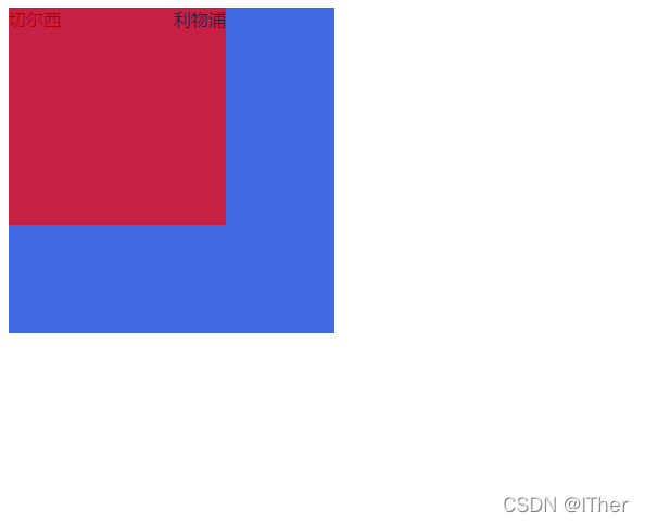
可以看到在我设置向利物浦盒子设置了绝对定位后,它自身产生了新的层级,而切尔西盒子则跑到了它的下方。当然这里之所以能看清被覆盖在下方的切尔西是因为我对利物浦的部分设置了透明度,在进行了绝对定位后,可以设置上方或下方部分的透明度,可以使用opcity专门设置透明度的元素;设置范围在0-1之间,可以用小数点,例如我目前设置的就是opacity:0.7,效果如上图。
关于绝对定位还有一个知识点。有时绝对定位可能会分成好几个层级,就会出现你不知道某一层的具体位置在哪,这时就要用到一个定位元素自带的z-index属性,这是每个定位元素都会自带的一个属性,一般在默认时z-index为0。还是拿上一个举例子,目前利物浦的部分在最上方,那么通过设置z-index就可以让切尔西部分覆盖在利物浦的上方。如图:
<html lang="en">
<head>
    <meta charset="UTF-8">
    <meta http-equiv="X-UA-Compatible" content="IE=edge">
    <meta name="viewport" content="width=device-width, initial-scale=1.0">
    <title>Document</title>
</head>
<style>
    .div1{
        width: 200px;
        height: 200px;
        background-color: red;
        postion:absolute;

    }
    .div2{
    width: 300px;
    height: 300px;
     background-color: royalblue;
     postion:absolute;
      z-index:2px;
    }
</style>
<body>
    <div class="div1">
      利物浦
    </div>
    <div class="div2">
     切尔西
    </div>
</body>
</html>
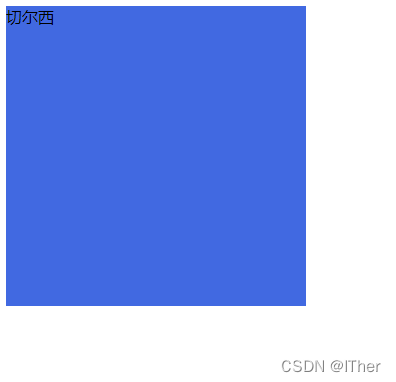
可以看到当我将切尔西部分的z-index改为2时,切尔西的部分就会到利物浦部分上面的层级覆盖利物浦部分。
2、相对定位
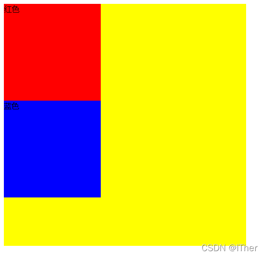
相对定位与绝对定位刚好相反,相对定位的参照物为当前元素的所在位置,并且不会脱离文档流。
<html lang="en">
<head>
    <meta charset="UTF-8">
    <meta http-equiv="X-UA-Compatible" content="IE=edge">
    <meta name="viewport" content="width=device-width, initial-scale=1.0">
    <title>Document</title>
</head>
<style>
 .box{
     width: 500px;
     background-color: yellow;
     height: 500px;
 }
 .litte{
     width: 200px;
     height: 200px;
     background-color: red;
 }
 .litte-1{
    width: 200px;
    height: 200px;
    background-color: blue;
 }
</style>
<body>
    <div class="box">
        <div class="litte">
            红色
        </div>
        <div class="litte-1">
            蓝色
        </div>
    </div>

</body>
</html>
进行相对定位后:
<html lang="en">
<head>
    <meta charset="UTF-8">
    <meta http-equiv="X-UA-Compatible" content="IE=edge">
    <meta name="viewport" content="width=device-width, initial-scale=1.0">
    <title>Document</title>
</head>
<style>
 .box{
     width: 500px;
     background-color: yellow;
     height: 500px;
     position: relative;
 }
 .litte{
     width: 200px;
     height: 200px;
     background-color: red;
     position: relative;
     left: 200px;
 }
 .litte-1{
    width: 200px;
    height: 200px;
    background-color: blue;
 }
</style>
<body>
    <div class="box">
        <div class="litte">
            红色
        </div>
        <div class="litte-1">
            蓝色
        </div>
    </div>

</body>
</html>
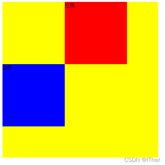
可以看到,在进行了相对定位后,红色部分进行了移动,但它并没有影响到蓝色部分,因为红色部分并没有产生新的层级分离原本的文档流。
3、固定定位
固定定位会脱离文档流,相对于浏览器视口进行定位,固定定位会固定在浏览器的某个位置,不会随浏览器滚动而消失。
例如:
<html lang="en">
<head>
    <meta charset="UTF-8">
    <meta http-equiv="X-UA-Compatible" content="IE=edge">
    <meta name="viewport" content="width=device-width, initial-scale=1.0">
    <title>Document</title>
</head>
<style>
    *{
        margin: 0;
        padding: 0;
    }
    .head{
        height: 100px;
        background-color: chartreuse;
        opacity: 0.2;
        width: 100vw;

    }
    .list{
        height: 1000px;
        background-color: cornflowerblue;
    }
</style>
<body>
    <div class="head">

    </div>
    <div class="list">
         <h1>存在</h1><h1>存在</h1><h1>存在</h1><h1>存在</h1><h1>存在</h1><h1>存在</h1>
         <h1>存在</h1><h1>存在</h1><h1>存在</h1><h1>存在</h1><h1>存在</h1><h1>存在</h1>
         <h1>存在</h1><h1>存在</h1><h1>存在</h1><h1>存在</h1><h1>存在</h1><h1>存在</h1>
         <h1>存在</h1><h1>存在</h1><h1>存在</h1><h1>存在</h1><h1>存在</h1><h1>存在</h1>
    </div>
</body>
</html>
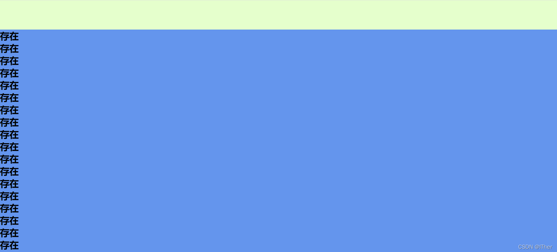
将以上设置为固定定位后:
<html lang="en">
<head>
    <meta charset="UTF-8">
    <meta http-equiv="X-UA-Compatible" content="IE=edge">
    <meta name="viewport" content="width=device-width, initial-scale=1.0">
    <title>Document</title>
</head>
<style>
    *{
        margin: 0;
        padding: 0;
    }
    .head{
        height: 100px;
        background-color: chartreuse;
        opacity: 0.5;
        width: 100vw;
        position: fixed;

    }
    .list{
        height: 1000px;
        background-color: cornflowerblue;
    }
</style>
<body>
    <div class="head">

    </div>
    <div class="list">
         <h1>存在</h1><h1>存在</h1><h1>存在</h1><h1>存在</h1><h1>存在</h1><h1>存在</h1>
         <h1>存在</h1><h1>存在</h1><h1>存在</h1><h1>存在</h1><h1>存在</h1><h1>存在</h1>
         <h1>存在</h1><h1>存在</h1><h1>存在</h1><h1>存在</h1><h1>存在</h1><h1>存在</h1>
         <h1>存在</h1><h1>存在</h1><h1>存在</h1><h1>存在</h1><h1>存在</h1><h1>存在</h1>
    </div>
</body>
</html>
观察一下会发现最上方设置了固定定位给的部分,脱离了原本的文档流。但也能从中看到固定定位的问题,它会影响整个界面的布局,当它脱离文档流后,自身就会消除原本的位置,它下方的部分会上移,从而影响下方的部分的布局。所以这时就需要使用粘性定位来设置这一部分。
4、粘性定位
不会脱离文档流,参照物为相对浏览器窗口定位,不会影响后面元素的布局。
例如:
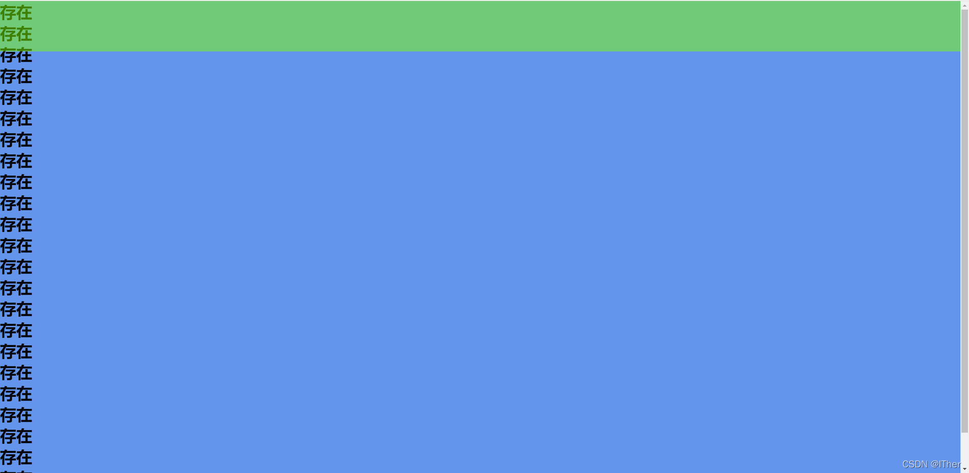
<html lang="en">
<head>
    <meta charset="UTF-8">
    <meta http-equiv="X-UA-Compatible" content="IE=edge">
    <meta name="viewport" content="width=device-width, initial-scale=1.0">
    <title>Document</title>
</head>
<style>
    *{
        margin: 0;
        padding: 0;
    }
    .head{
        height: 100px;
        background-color: chartreuse;
        opacity: 0.5;
        width: 100vw;
        position: sticky;
        top: 0;

    }
    .list{
        height: 1000px;
        background-color: cornflowerblue;
    }
</style>
<body>
    <div class="head">

    </div>
    <div class="list">
         <h1>存在</h1><h1>存在</h1><h1>存在</h1><h1>存在</h1><h1>存在</h1><h1>存在</h1>
         <h1>存在</h1><h1>存在</h1><h1>存在</h1><h1>存在</h1><h1>存在</h1><h1>存在</h1>
         <h1>存在</h1><h1>存在</h1><h1>存在</h1><h1>存在</h1><h1>存在</h1><h1>存在</h1>
         <h1>存在</h1><h1>存在</h1><h1>存在</h1><h1>存在</h1><h1>存在</h1><h1>存在</h1>
    </div>
</body>
</html>
看到上图就可以看到,和固定定位不同,粘性并不会消除自身原本的位置,也因此不会影响页面其他布局。


 扫一扫
扫一扫


 1200
1200

 被折叠的 条评论
为什么被折叠?
被折叠的 条评论
为什么被折叠?
 到【灌水乐园】发言


