


Seaborn 是基于 Matplotlib 的高级可视化库,专注于统计数据的可视化。它提供了高层次的图形接口,适合快速生成专业图表。以下是 Seaborn 的常用方法及详细说明。
1. 安装和导入 Seaborn
安装 Seaborn:
pip install seaborn
导入 Seaborn:
import seaborn as sns
import matplotlib.pyplot as plt
加载内置数据集(Seaborn 提供了一些自带的数据集):
# 加载内置数据集
df = sns.load_dataset("iris")
2. 数据分布的可视化
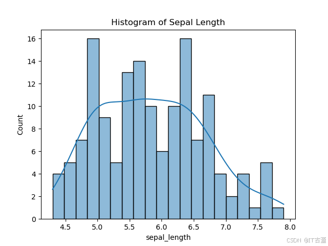
2.1 直方图(Histogram)
展示单变量的分布。
sns.histplot(data=df, x="sepal_length", kde=True, bins=20)
plt.title("Histogram of Sepal Length")
plt.show()
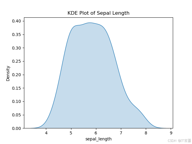
2.2 核密度图(KDE Plot)
平滑分布。
sns.kdeplot(data=df, x="sepal_length", fill=True)
plt.title("KDE Plot of Sepal Length")
plt.show()
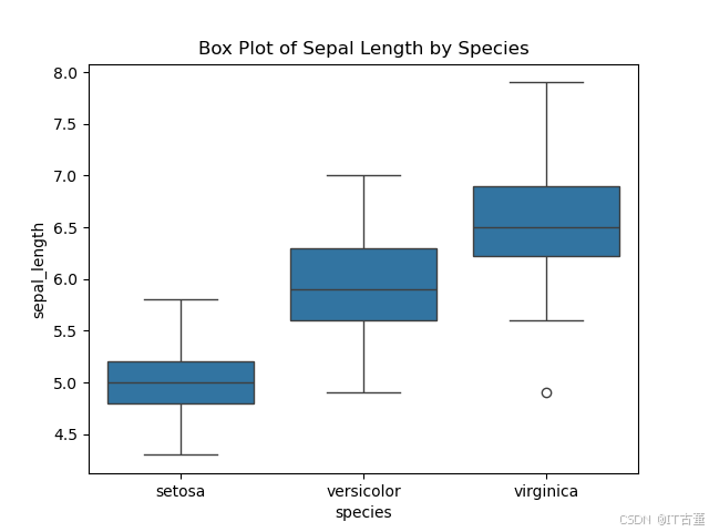
2.3 箱线图(Box Plot)
展示分布特征和异常值。
sns.boxplot(data=df, x="species", y="sepal_length")
plt.title("Box Plot of Sepal Length by Species")
plt.show()
3. 数据关系的可视化
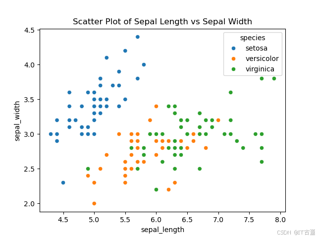
3.1 散点图(Scatter Plot)
显示两个变量间的关系。
sns.scatterplot(data=df, x="sepal_length", y="sepal_width", hue="species")
plt.title("Scatter Plot of Sepal Length vs Sepal Width")
plt.show()
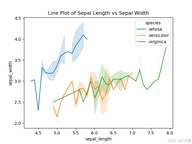
3.2 折线图(Line Plot)
适用于时间序列等连续数据。
sns.lineplot(data=df, x="sepal_length", y="sepal_width", hue="species")
plt.title("Line Plot of Sepal Length vs Sepal Width")
plt.show()
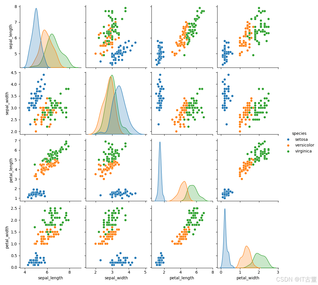
3.3 关联矩阵(Pair Plot)
多个变量的关系图。
sns.pairplot(df, hue="species", diag_kind="kde")
plt.suptitle("Pair Plot of Iris Dataset", y=1.02)
plt.show()
4. 类别数据的可视化
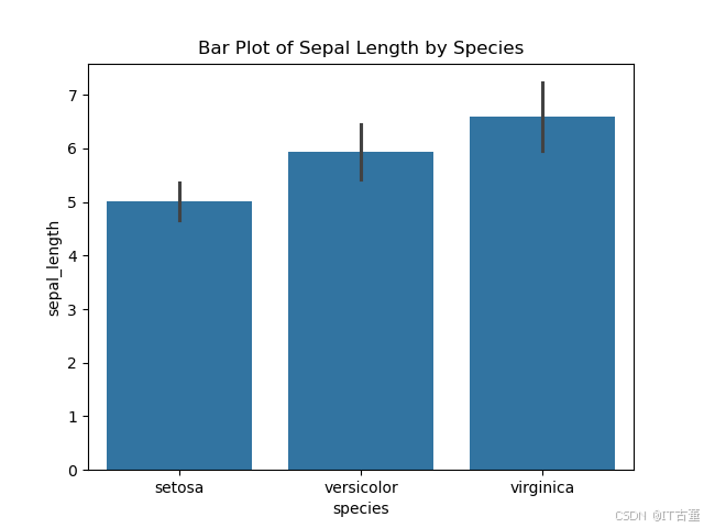
4.1 条形图(Bar Plot)
展示类别变量的平均值。
sns.barplot(data=df, x="species", y="sepal_length", ci="sd")
plt.title("Bar Plot of Sepal Length by Species")
plt.show()
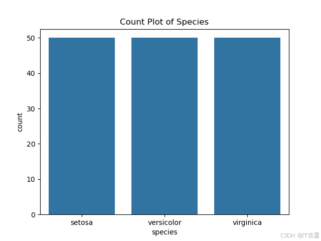
4.2 计数图(Count Plot)
展示类别数据的计数分布。
sns.countplot(data=df, x="species")
plt.title("Count Plot of Species")
plt.show()
5. 数据分布的高级可视化
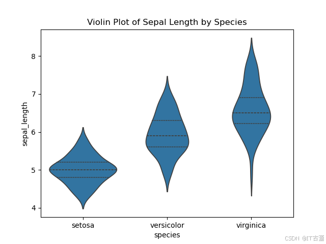
5.1 小提琴图(Violin Plot)
结合箱线图和 KDE 图。
sns.violinplot(data=df, x="species", y="sepal_length", inner="quartile")
plt.title("Violin Plot of Sepal Length by Species")
plt.show()
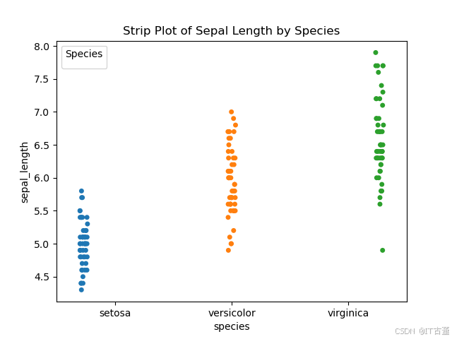
5.2 条带图(Strip Plot)
点分布。
sns.stripplot(data=df, x="species", y="sepal_length", jitter=True, hue="species", dodge=True)
plt.title("Strip Plot of Sepal Length by Species")
plt.legend(title="Species")
plt.show()
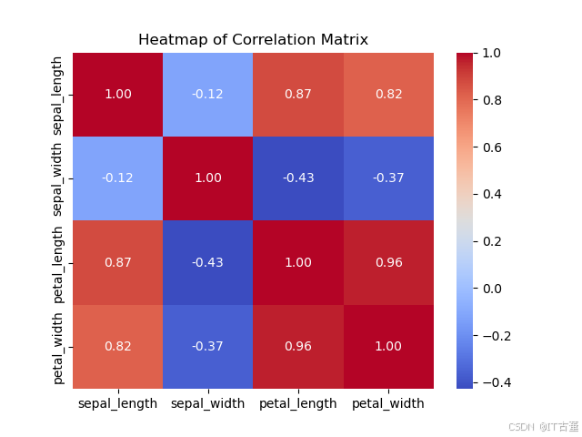
6. 热力图(Heatmap)
展示矩阵数据。
# 计算相关矩阵
corr = df.corr()

# 绘制热力图
sns.heatmap(corr, annot=True, cmap="coolwarm", fmt=".2f")
plt.title("Heatmap of Correlation Matrix")
plt.show()
7. 风格设置
Seaborn 提供多种风格设置,使图表更美观。
sns.set_theme(style="darkgrid") # 可选 "whitegrid", "dark", "white", "ticks"
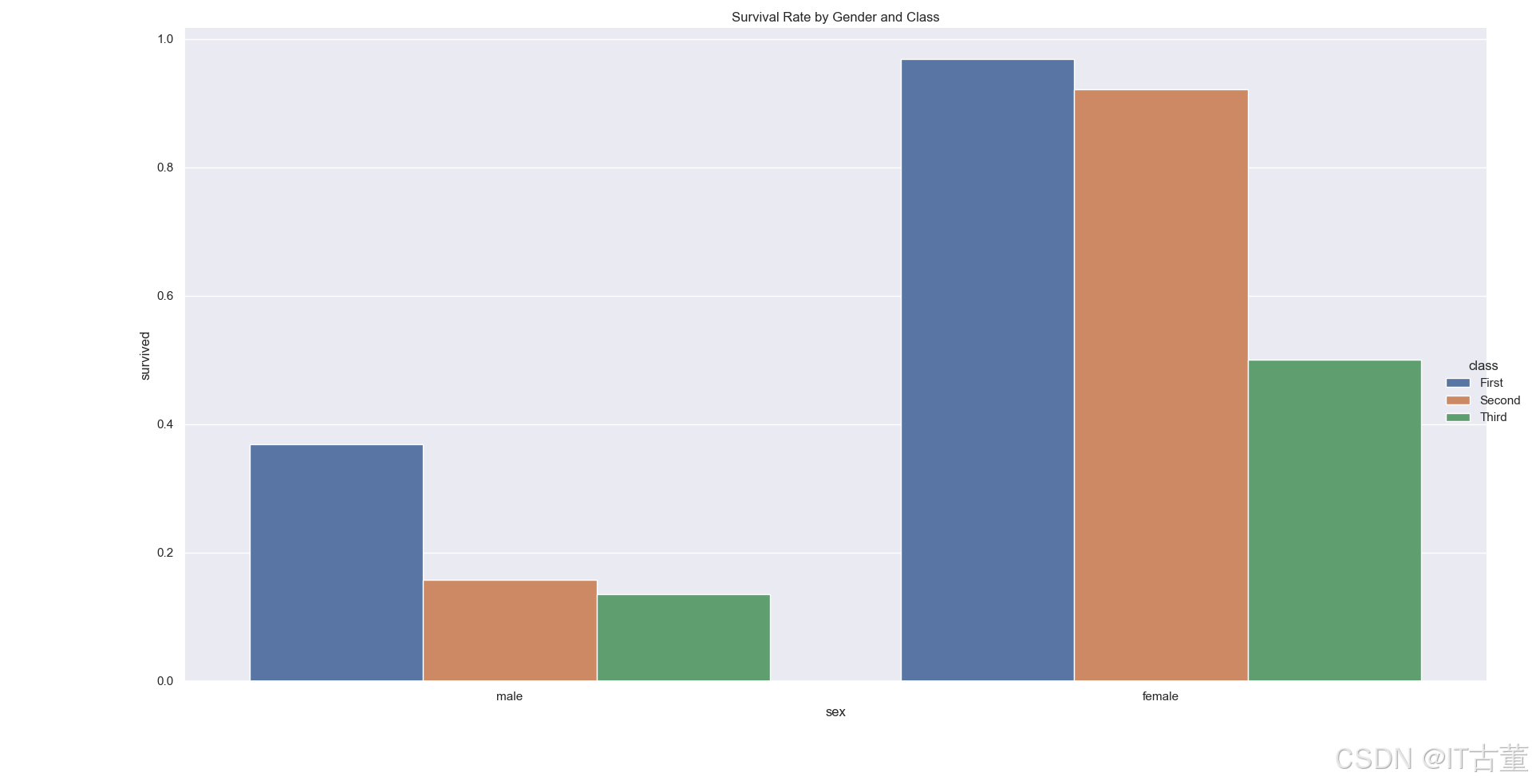
8. 案例:展示多变量数据关系
# 使用 Titanic 数据集
titanic = sns.load_dataset("titanic")

# 绘制分类图,展示乘客性别和生还率的关系
sns.catplot(data=titanic, x="sex", y="survived", kind="bar", hue="class", ci=None)
plt.title("Survival Rate by Gender and Class")
plt.show()
总结
Seaborn 提供了高层次的接口和直观的可视化方法,特别适用于探索性数据分析(EDA)。通过熟练掌握上述方法,可以高效地绘制专业的统计图表。


 644
644

 被折叠的 条评论
为什么被折叠?
被折叠的 条评论
为什么被折叠?
 到【灌水乐园】发言


