


 本文详细介绍了SVG中的闭合折线路径来绘制五角星,并探讨了镜像、渐变等效果的实现。通过使用feBlend和feConvolveMatrix实现图形镜像,调整渐变角度以创建独特的视觉效果,同时展示了如何应用渐变到不同形状如矩形和圆形。
闭合折线 画五角星
 <svg width="800" height="800">
          <polygon points="100 87, 160 273, 3 160, 197 160, 40 273" fill="red"
></polygon>

    </svg>
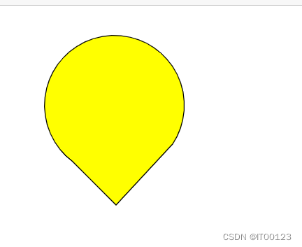
找出五角星的五个点 如图 在填充上红色

 <svg width="500" height="500">
       <path d="M 70 170 A 80 80  1 1 1 185 150 L120 220Z " stroke="#000" fill="yellow" fill-opacity="1"></path>


    </svg>
svg使用的是 xml 格式,那么与 xml 相类似<path> 属于 element(元素),用来描述路径。d 属于<path> property(属性)。M L Z 属于d 属性中的 command(命令)
对于大部分命令,都有使用绝对坐标和使用相对坐标两种形式,其中绝对位置使用大写的指令,例如L, 相对位置使用小写的指令,例如l
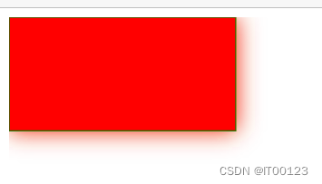
镜像
<svg>
<defs>
<filter id="dns" width="200%" height="200%">
<feConvolveMatrix result="matrixOut" in="matrixOut" in="of2"></feConvolveMatrix>
<feOffset in="SourceGraphic" result="of2" type="matrix"
values="0.2 0 0 0 0 0 0.2 0 0 0 0 0 0.2 0 0 0 0 0 1 0"></feOffset>
<feGaussianBlur in="of2" stdDeviation="10"></feGaussianBlur>
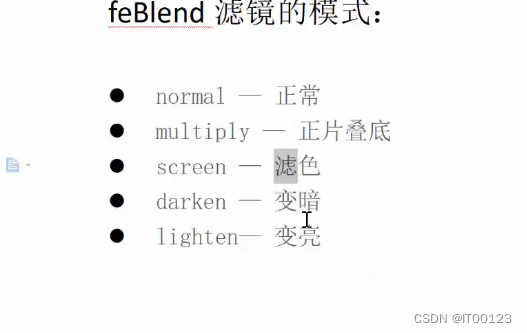
<feBlend in="SourceGraphic" in2="of3" mode="normal"> </feBlend>
</filter>
</defs>
<rect x="0" y="0" width="200" height="100" fill="red" stroke="green"
filter="url(#dns)"></rect>
</svg>
feBlend 里边的 in2="of3" 和 feConvolveMatrix in="of2"是不能相同的
因为feOffset镜像在 feConvolveMatrix 里面 (result="of2") 只能一个使用不然没有效果
效果
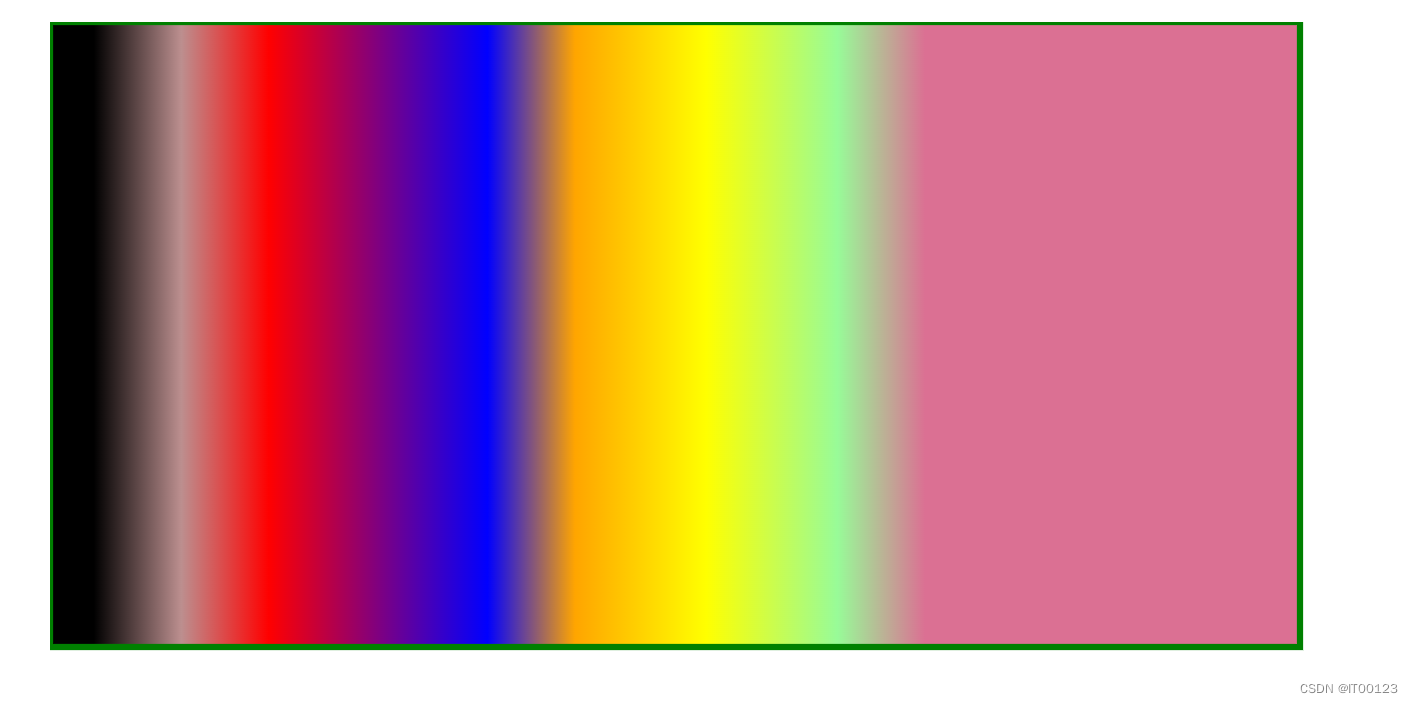
渐变
 <svg width="500" height="800">
        <defs >
            <linearGradient id="ient" xl="0%" y1="0%" x2="70%" y2="0%">
                <stop offset="5%" stop-color="gaiznsboro"></stop>
                <stop offset="15%" stop-color="rosybrown"></stop>
                <stop offset="25%" stop-color="red"></stop>
                <stop offset="50%" stop-color="blue"></stop>
                <stop offset="60%" stop-color="orange"></stop>
                <stop offset="75%" stop-color="yellow"></stop>
                <stop offset="90%" stop-color="palegreen"></stop>
                <stop offset="100%" stop-color="palevioletred"></stop>
            </linearGradient>

        </defs>
        <rect x="0" y="0" width="200" height="100" fill="url(#ient)" stroke="green">

        </rect>

    </svg>
xl="0%" y1="0%" x2="70%" y2="0%" 是调整渐变角度的
fill="url(#ient)" 后面加属性的id
效果
<radialGradient id="radial" cx="70%" cy="50%" r="80%" fx="50%" fy="30%">
                   <stop offset="40%" stop-color="blue"></stop>
                   <stop offset="70%" stop-color="palevioletred"></stop>
            </radialGradient>
和上面一样
<rect x="0" y="0" width="200" height="100" fill="url(#ient)" stroke="green">
</rect>
改id 就是圆形渐变


 扫一扫
扫一扫


 249
249

 被折叠的 条评论
为什么被折叠?
被折叠的 条评论
为什么被折叠?
 到【灌水乐园】发言


