


 本文介绍如何在屏幕宽度小于600px时,调整HTML/CSS代码实现响应式导航,重点讲解了@media查询、浮动布局和移动端适配策略,确保网站在不同设备上用户体验良好。

<style>
.center {
width: 100%;
height: 40px;
background-color: green;
}
.box {
width: 1000px;
height: 40px;
background-color: green;
margin: 0 auto;
/* overflow: auto; */
}
.box a {
display: inline-block;
width: 150px;
height: 40px;
text-align: center;
text-decoration: none;
line-height: 40px;
color: white;
}
.box a:first-child {
font-size: 18px;
font-weight: bold;
}
.box a:not(:first-child):hover {
background-color: red;
color: blue;
}
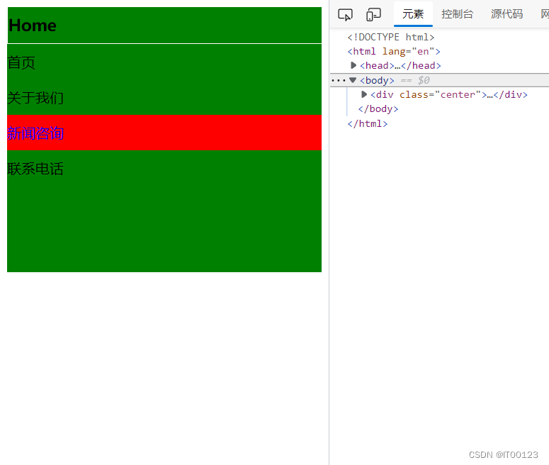
@media screen and (max-width:600px) {
.box {
width: 100%;
height: 300px;
}
.box a {
float: left;
width: 100%;
color: black;
text-align: left;
}
.box a:first-child {
border: 1px solid white;
}
}
</style>
</head>
<body>
<div class="center">
<div class="box">
<a href="">Home</a>
<a href="">首页</a>
<a href="">关于我们</a>
<a href="">新闻咨询</a>
<a href="">联系电话</a>
</div>
</div>
</body>
</html>
@media screen and (max-width:600px) 小于600px后变化


 扫一扫
扫一扫


 被折叠的 条评论
为什么被折叠?
被折叠的 条评论
为什么被折叠?
 到【灌水乐园】发言


