 SwiftUI 实战教程


前言:
Swift知识点,大至看完了,公司项目是Swift语言写的,后续苹果新出的SwiftUI,也需要学习一下
不知觉间,SwiftUI是19年出的,现在24年,5年前的东西了
学习的几个原因:
- 项目工程里面有一部分SwiftUI的代码;
- 跟上脚步,学习新知识,给自己加分;
- Vision AR的开发语言是SwiftUI,以后想开发或者接触这些新东西,语言需要提前准备
这次学习,参考的是:B站SwiftUI Bootcamp (Beginner Level),一个歪果仁的课,讲的很不错~
本博客所有代码已上传至github,欢迎下载~
SwiftUI_Bootcamp_Learn_Code
struct ContentView: View {


	//xxx
}
定义一个ContentView,继承View?
不对,联想swift,struct没有继承,难道swiftUI的结构体可以继承???
点击进去,看到View的定义:
public protocol View {


    associatedtype Body : View
    @ViewBuilder @MainActor var body: Self.Body {

    get }
}
原来,View被定义为了protocol协议
struct可以遵守协议,因此,上述写法不是继承,而是遵守协议。
UI介绍
Text介绍
import SwiftUI
import SwiftData
struct ContentView: View {
@Environment(\.modelContext) private var modelContext
@Query private var items: [Item]
var body: some View {
VStack {
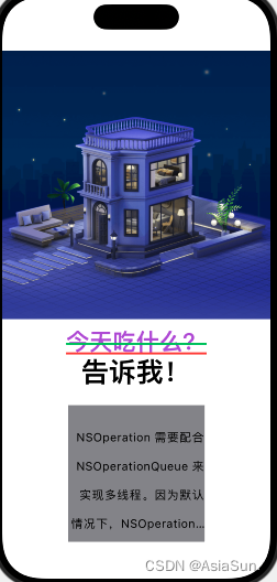
Image("dinner")
.resizable()
.aspectRatio(contentMode: .fit)
Text("今天吃什么?")
.font(.largeTitle)//字体大小
.fontWeight(.semibold)//字体样式
.bold()//粗体
.underline(true, color: Color.red)//下划线
.italic()//斜线
.strikethrough(true, color: Color.green)//穿过线
.foregroundStyle(.purple)//颜色
//原来那一套,size设置字体大小,weight设置是bold还是什么样式,design设置自己的字体
Text("告诉我!")
.font(.system(size: 40, weight: .bold, design: .default))
Text("NSOperation 需要配合 NSOperationQueue 来实现多线程。因为默认情况下,NSOperation 单独使用时系统同步执行操作,配合 NSOperationQueue 我们能更好的实现异步执行。")
.multilineTextAlignment(.trailing)
.kerning(1)//左右间距调大
// .baselineOffset(20)//行间距调大:每一行,下面留20间距
.baselineOffset(-20)//行间距调大:每一行,上面留20间距
.frame(width: 200, height: 200, alignment: .center)//frame大小
.background(.gray)//背景颜色
}
}
}
#Preview {
ContentView()
.modelContainer(for: Item.self, inMemory: true)
}
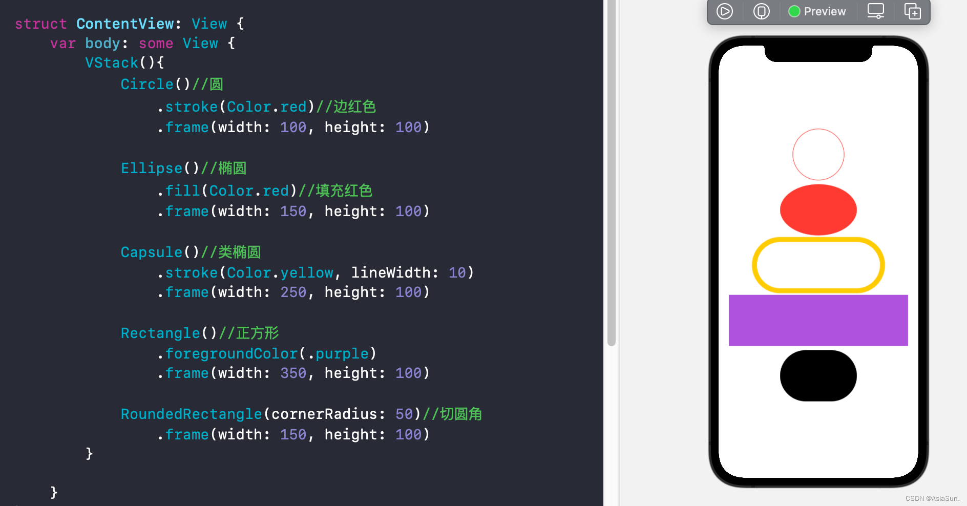
形状UI介绍
Color介绍
var body: some View {


        RoundedRectangle(cornerRadius: 25.0)
            //填充颜色
			//.fill(Color.red)
            .fill(
				//Color(UIColor.blue)
                Color("CustomColor")//自定义颜色
            )
            .frame(width: 250, height: 100)
            //阴影
            .shadow(color: .gray, radius: 20, x: 0, y: 1)
    }
 最低0.47元/天 解锁文章


 扫一扫
扫一扫


 4664
4664

 被折叠的 条评论
为什么被折叠?
被折叠的 条评论
为什么被折叠?
 到【灌水乐园】发言


