


 本文详细介绍了如何使用Echarts库在前端展示漏斗图,包括配置项如min、max、minSize和maxSize的应用,以及处理过滤后数据为0时的图形调整。
什么是漏斗图
漏斗图:顾名思义就是想漏斗一样的图标,用梯形面积表示某个环节业务量与上一个环节之间的差异。
业务需求
根据数据实现漏斗图,要求用梯形的边长来反映某个环节业务量与上一环节之间的差异。最后一个数据如果经过过滤后不为0,数据要能漏下去(也就是漏斗图最后一个框不是尖的三角形而是个矩形)。如果过滤后为0,则需要数据漏下去,也就是最后一个为尖三角形。
这里拿Echarts官网的漏斗图实例来模拟一下。
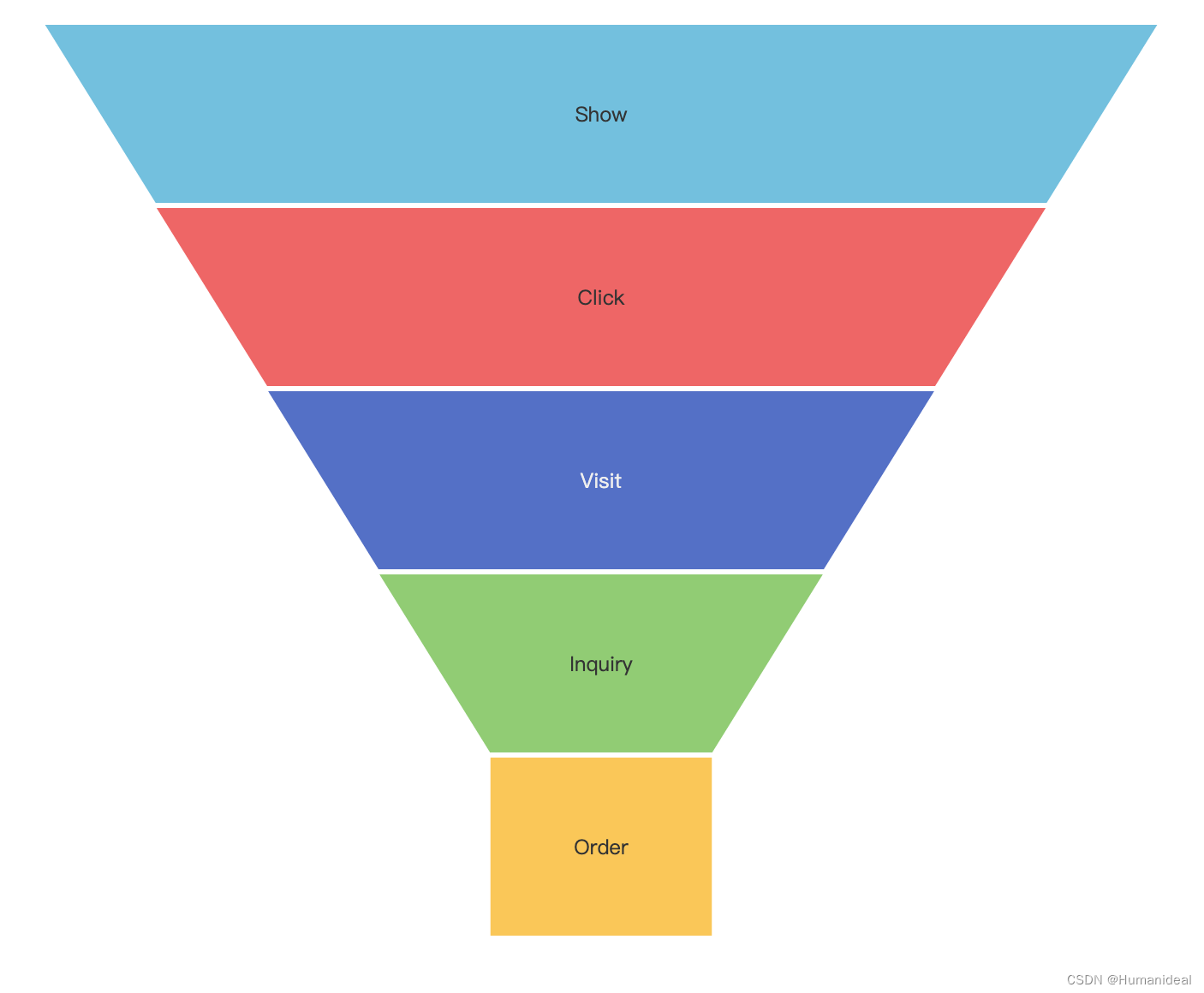
过滤后数据为0的情况
option = {
  title: {
    text: 'Funnel'
  },
  tooltip: {
    trigger: 'item',
    formatter: '{a} <br/>{b} : {c}%'
  },
  toolbox: {
    feature: {
      dataView: { readOnly: false },
      restore: {},
      saveAsImage: {}
    }
  },
  legend: {
    data: ['Show', 'Click', 'Visit', 'Inquiry', 'Order']
  },
  series: [
    {
      name: 'Funnel',
      type: 'funnel',
      left: '10%',
      top: 60,
      bottom: 60,
      width: '80%',
      min: 20,
      max: 100,
      minSize: '20%',
      maxSize: '100%',
      sort: 'descending',
      gap: 2,
      label: {
        show: true,
        position: 'inside'
      },
      labelLine: {
        length: 10,
        lineStyle: {
          width: 1,
          type: 'solid'
        }
      },
      itemStyle: {
        borderColor: '#fff',
        borderWidth: 1
      },
      emphasis: {
        label: {
          fontSize: 20
        }
      },
      data: [
        { value: 60, name: 'Visit' },
        { value: 40, name: 'Inquiry' },
        { value: 20, name: 'Order' },
        { value: 80, name: 'Click' },
        { value: 100, name: 'Show' }
      ]
    }
  ]
};
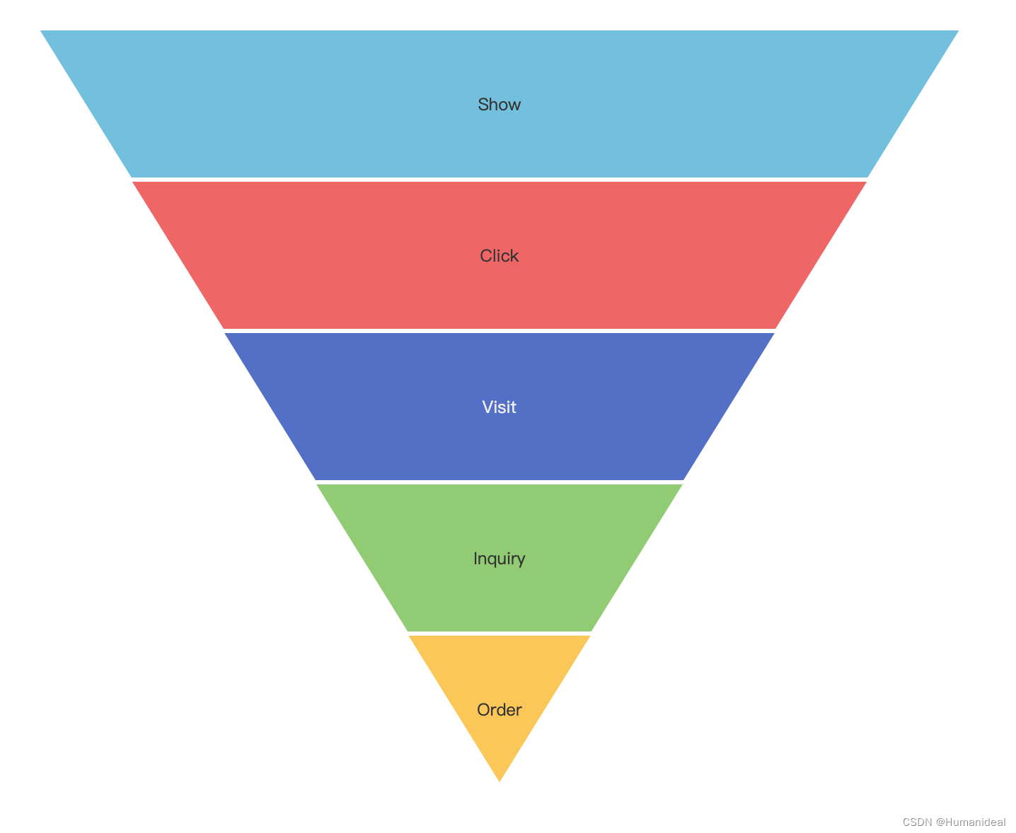
过滤后数据不为0的情况
option = {
  title: {
    text: 'Funnel'
  },
  tooltip: {
    trigger: 'item',
    formatter: '{a} <br/>{b} : {c}%'
  },
  toolbox: {
    feature: {
      dataView: { readOnly: false },
      restore: {},
      saveAsImage: {}
    }
  },
  legend: {
    data: ['Show', 'Click', 'Visit', 'Inquiry', 'Order']
  },
  series: [
    {
      name: 'Funnel',
      type: 'funnel',
      left: '10%',
      top: 60,
      bottom: 60,
      width: '80%',
      min: 0,
      max: 100,
      minSize: '0%',
      maxSize: '100%',
      sort: 'descending',
      gap: 2,
      label: {
        show: true,
        position: 'inside'
      },
      labelLine: {
        length: 10,
        lineStyle: {
          width: 1,
          type: 'solid'
        }
      },
      itemStyle: {
        borderColor: '#fff',
        borderWidth: 1
      },
      emphasis: {
        label: {
          fontSize: 20
        }
      },
      data: [
        { value: 60, name: 'Visit' },
        { value: 40, name: 'Inquiry' },
        { value: 20, name: 'Order' },
        { value: 80, name: 'Click' },
        { value: 100, name: 'Show' }
      ]
    }
  ]
};
这里最主要的是操作配置项里面min,max,minSize,maxSize来实现的。
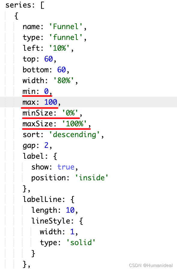
这里min取data里面value的最小值,max取data里面value的最大值,maxSize一直设置为‘100%’,
minSize为min/max%就可以实现上面的效果。不过实际开发中不是只给一个数组的数据让你判断过滤掉的数据,实现这样的效果一般有两组数据形成对比。比如下面这样的:

项目中实际代码体现
//按需引入echarts
import * as echarts from 'echarts/core'
import {
  TitleComponent,
  ToolboxComponent,
  TooltipComponent,
  LegendComponent
} from 'echarts/components'
import { FunnelChart } from 'echarts/charts'
import { CanvasRenderer } from 'echarts/renderers'

echarts.use([
  TitleComponent,
  ToolboxComponent,
  TooltipComponent,
  LegendComponent,
  FunnelChart,
  CanvasRenderer
])


//配置项数据
data(){
  return {
      option: {
        title: {
          text: '数据概览',
          show: false
        },
        tooltip: {
          trigger: 'item',
          formatter: '{b}'
        },
        toolbox: {
          feature: {
            saveAsImage: {}
          }
        },
        legend: {
          data: []
        },
        series: [
          {
            name: '',
            type: 'funnel',
            left: '10%',
            top: 54,
            bottom: 0,
            min: 0,
            max: 0,
            width: '90%',
            height: '100%',
            minSize: '0%',
            maxSize: '100%',//这里以最大数来作为100%来占据长度
            sort: 'descending',
            gap: 1,
            label: {
              show: true,
              position: 'inside',
              textStyle: {
                color: '#FFFFFF'
              }
            },
            labelLine: {
              length: 10,
              lineStyle: {
                width: 1,
                type: 'solid'
              }
            },
            itemStyle: {
              borderColor: '#fff',
              borderWidth: 1
            },
            emphasis: {
              label: {
                fontSize: 20
              }
            },
            data: []
          }
        ]
      }
  }
}

//方法
methods:{
  // 数据纵览
    async dataView() {
      await this.$axios
        .post(
          'xxx',
          params
        )
        .then((res) => {
          if (+res?.ret === 0) {
            this.dataViewList = res?.data || []
            this.$nextTick(() => {
              const chartDom = document.getElementById('main')
              this.myChart = echarts.init(chartDom)
              const arr = this.dataViewList?.map((item) => item.arriveCount)
              const arrPassCount = this.dataViewList?.map(
                (item) => item.passCount
              )
              this.option.series[0].data = this.dataViewList?.map((item) => {
                return {
                  name: `${item.dataLifePoint} ${item.arriveCount}`,
                  value: item.arriveCount
                }
              })

              this.option.series[0].min =
                arrPassCount[arrPassCount.length - 1] === 0
                  ? 0
                  : Math.min(...arr)

              this.option.series[0].max = Math.max(...arr)
              this.option.series[0].minSize =
                arrPassCount[arrPassCount.length - 1] === 0
                  ? 0
                  : (Math.min(...arr) * 100) / Math.max(...arr) + '%'
              this.option.series[0].height = this.dataViewList.length * 47.99
              this.funnelHeight = this.dataViewList.length * 47.99 + 54

              this.myChart.setOption(this.option)
            })
          } else {
            this.$Message.error(res.msg)
          }
        })
    },
}


 9734
9734

 被折叠的 条评论
为什么被折叠?
被折叠的 条评论
为什么被折叠?
 到【灌水乐园】发言


