


dp(密度无关像素)是一个用于定义用户界面尺寸的抽象单位,它旨在提供在不同屏幕密度下的一致的显示尺寸。然而,由于不同设备的实际物理尺寸和像素密度不同,将 dp 转换为实际像素(px)时会有所差异。
假设一个设备的屏幕密度为 160dpi(每英寸点数),那么 1dp 就等于 1px。但是,大多数现代设备的屏幕密度都高于 160dpi,例如 240dpi、320dpi、480dpi 等。在这些高密度屏幕上,1dp 会转换为更多的像素。
对于一个分辨率为 480x800 的手机,如果其屏幕密度为 160dpi,那么 100dp 将等于 100px。但是,这种屏幕密度的手机在现代市场上已经非常罕见,因为大多数手机都采用了更高密度的屏幕。
1. Android 的各种布局
线性布局 (LinearLayout)
-
特点:子视图按线性排列,可以是水平或垂直。
-
优点:简单,易于理解和使用。
-
缺点:不支持复杂布局,子视图间的间距需要手动设置。
-
它可以让子视图按照水平或垂直方向排列,并且可以通过 weight 属性来控制子视图在布局中的占比。线性布局非常灵活,但在复杂的布局中可能会导致视图层级过多的问题。
约束布局 (ConstraintLayout)
-
特点:基于约束的布局,可以创建复杂的布局而不牺牲性能。
(1)
Chains链的基本用法如下:选中多个控件,右键Chains->Create Horizontal Chains即可将父布局的剩余空间进行均匀分布。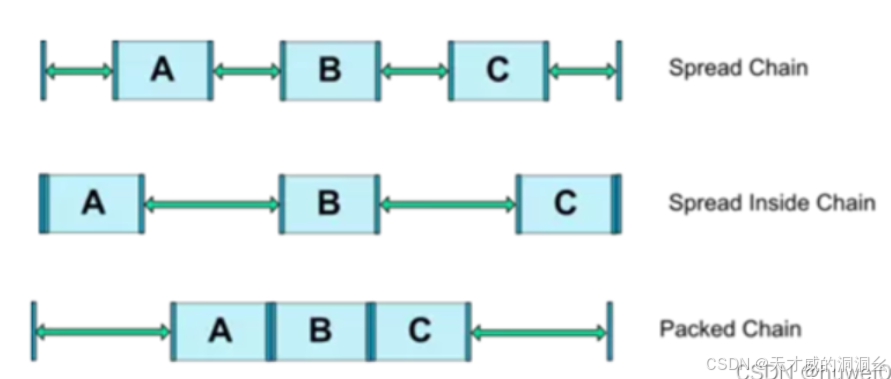
(2)
百分比布局,ConstraintLayout 还支持控件的尺寸按照父布局尺寸的百分比来设置app:layout_constraintWidth_percent 宽度占父布局百分比比例
app:layout_constraintHeight_percent 高度占父布局百分比比例
tips:只有宽度和高度尺寸为0dp百分比属性才会生效
  <!-- 一个子视图,占据父容器的50%宽度和高度 -->
     <View
         android:layout_width="0dp"
         android:layout_height="0dp"
         android:layout_gravity="left|top"
         android:background="#FF0000"
         app:layout_percentWidth="50%"
         app:layout_percentHeight="50%" />
(3)
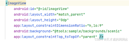
radio属性给图片宽度设置
match_parent, 高度设置成约束尺寸0dp,然后再添加一个layout_constraintDimensionRatio属性,属性的值可以设置h,16:9其中 h 表示高宽比的比值,也可以设置成将值设置w,9:16,w 表示宽高比的比值。 -
(4)
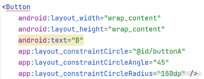
圆形定位将一个控件的中心以一定的角度和距离约束到另一个控件的中心上,相当于在一个圆上放置一个控件。
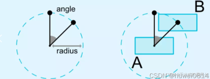
圆形定位主要通过以下三个属性值来控制
layout_constraintCircle:引用另一个控件的 id。
layout_constraintCircleRadius:到另一个控件中心的距离。
layout_constraintCircleAngle:控件的角度(顺时针,0 - 360 度)。
-
优点:灵活,支持链式连接,可以减少布局嵌套。
-
缺点:学习曲线较陡峭,对于简单的布局可能过于复杂。
-
是 Android Studio 中最新的布局类型,它提供了强大的约束机制,可以在视图之间建立复杂的依赖关系。约束布局允许开发者通过拖放和调整界面元素来创建自适应的界面。相对于其他布局类型,约束布局在性能和灵活性方面具有优势,但也需要更多的学习和实践。
相对布局 (RelativeLayout)
-
特点:
-
相对定位:子视图的位置可以相对于父布局的特定边(如顶部、底部、左侧、右侧)或者相对于其他子视图的特定边来设置。
-
嵌套:相对布局可以嵌套在其他相对布局中,也可以包含其他相对布局作为子视图。
-
灵活性:可以创建复杂的布局结构,适合需要精细控制布局位置的情况。
-
性能考虑:虽然相对布局非常灵活,但如果过度使用或嵌套过深,可能会影响性能。
-
-
优点:可以创建复杂的布局结构。
-
缺点:过度使用可能导致性能问题,不支持链式连接。
-
它通过指定子视图相对于其他视图或布局的位置来控制布局。相对布局通常使用相对位置关系和对齐方式来组织子视图,相对布局适合于复杂的界面设计,但在性能方面,相对布局比线性布局稍差。
帧布局 (FrameLayout)
-
特点:
-
堆叠性:所有子控件都默认显示在屏幕的左上角,并按照先后放入的顺序重叠摆放。先放入的控件位于更底层,后放入的控件显示在最顶层,子视图堆叠在一起,一次只能看到一个。
-
自动对齐:帧布局会根据子控件的gravity属性执行自动对齐。
-
无法改变层叠顺序:一旦子控件被添加到帧布局中,底层的帧不能被移到上层。
-
-
优点:适合需要覆盖或动画的布局。
-
缺点:不支持子视图间的相对位置调整。
-
它允许子视图重叠在一起。帧布局通常用于显示单个视图或一组非交互性视图,例如图像或文本。帧布局不支持权重(weight)属性,因此子视图的位置是固定的,但是我们也可以通过 layout_gravity 属性, 指定到其他的位置!
layout_gravity:用于设置子视图(View)在其父容器(ViewGroup)中的对齐方式或位置,包括
left、right、top、bottom、center_vertical、center_horizontal等,分别表示子视图在父容器中的水平和垂直方向上的对齐方式。
网格布局 (GridLayout)
-
特点:子视图按网格排列。
网格布局相对于表格布局来说自由度更高, 是以行数和列数来确定位置进行排列。就像一间教室,确定好行数与列数就能让同学有序入座。
-
二维布局:通过行和列的交叉形成单元格,每个单元格可以放置一个子元素。
-
灵活性:可以定义任意数量的行和列,并指定每行和每列的大小。
-
子元素定位:可以精确地将子元素放置在指定的单元格中。
GridLayout 常用布局标签:
<android:columnCount="4":设置最大列数,这里设置为 4。<android:rowCount="5":设置最大行数,这里设置为 6。<android:orientation="horizontal":设置元素布局方向,这里设置为平行。GridLayout 单元格常用布局标签:<android:layout_row="0":指定单元格的显示的列数,这里设置控件的列数为第 1 列。<android:layout_column="3":指定单元格显示的列数,设置控件的行数为第 4 列。<android:layout_columnSpan="2":指定单元格占据的列数。<android:layout_rowSpan="2":指定单元格占据的行数。 -
-
优点:适合需要等分空间的布局。
-
缺点:对于不规则布局不够灵活。
-
它将视图组织在网格中,可以通过指定行和列的数量来控制网格的大小。网格布局可以自动调整子视图的大小和位置,使其适应屏幕的尺寸和方向。网格布局适合用于创建灵活的网格结构,但在某些情况下可能会导致视图重叠的问题。
2. 布局的适用场景及优缺点
-
线性布局:适用于简单的列表或表单。
-
约束布局:适用于需要复杂布局和优化性能的场景。
-
相对布局:适用于需要相对定位的复杂布局,通过相对定位的方式让控件出现在布局任意位置。
-
帧布局:适用于需要层叠视图或动画的场景。
列表项布局:在列表(如ListView或RecyclerView)中,Frame Layout常用于垂直排列列表项。
按钮组:当需要在界面上垂直排列多个按钮时,Frame Layout是一个简单且有效的选择。
标题栏:在某些应用中,可能会使用Frame Layout来垂直排列应用的标题和一些额外的按钮或文本。
-
网格布局:适用于需要等分空间的布局,如棋盘游戏界面。
3. 制作五种布局的示例
为了制作五种布局的示例,你需要创建一个Android项目,并在res/layout目录下创建不同的XML布局文件。以下是每种布局的基本示例代码。
LinearLayout——线性布局:
方向属性 orientation:内容摆放的方向,有垂直(vertical)、水平(horizontal)两种
match_parent值表示布局的宽度和高度将匹配其父容器的宽度和高度
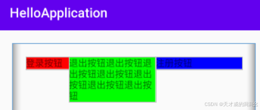
  <?xml version="1.0" encoding="utf-8"?>
     <!--XML命名空间(namespace)声明,用于指定Android UI组件的命名空间-->
     <!--它告诉Android系统这个XML文件是用于定义用户界面的布局,并且包含了对Android SDK中定义的XML属性的引用,使用了Android的UI组件和属性。-->
     <LinearLayout xmlns:android="http://schemas.android.com/apk/res/android"
         android:orientation="horizontal"
         android:layout_width="match_parent"
         android:layout_height="match_parent"
         <!--外边距 布局与其父容器的边缘之间有20dp的空间-->
         android:layout_margin="20dp"
         <!--内边距 子视图之间以及子视图与布局边缘之间有20dp的空间-->
         android:padding="20dp">

         <Button
             android:layout_width="wrap_content" // wrap_content,表示Button的大小将根据其内容自动调整。
             android:layout_height="wrap_content"
             android:background="#ff0000"
             android:text="登录按钮"/>
         <Button
             android:layout_width="wrap_content"
             android:layout_height="wrap_content"
             android:background="#00ff00"
             android:text="退出按钮"/>
         <Button
             android:layout_width="wrap_content"
             android:layout_height="wrap_content"
             android:background="#0000ff"
             android:text="注册按钮"/>
     </LinearLayout>
辨析layout_weight与layout_width\layout_height的使用
对于水平的
LinearLayout(即android:orientation="horizontal"),子视图的高度通常是固定的(要么由子视图自身决定,要么由layout_height属性指定),而宽度可以在剩余空间内按比例分配。
设置
layout_width="0dp":这表示子视图的宽度不是固定的,而是可以动态分配的。"0dp"(dp是密度无关像素的缩写)在这里是一个特殊值,它告诉系统“我不关心这个视图的确切宽度,我希望它根据layout_weight来分配”。设置
layout_weight:这是一个浮点数值,表示子视图相对于其他子视图的权重。权重越高,子视图在剩余空间中所占的比例越大。对于垂直的
LinearLayout(即android:orientation="vertical"),逻辑是类似的,但是应用于子视图的高度上:
设置`layout_height="0dp"":这表示子视图的高度不是固定的,而是可以动态分配的。
设置
layout_weight:同样,这是一个浮点数值,表示子视图相对于其他子视图在垂直方向上的权重。
ConstraintLayout——约束布局:
<?xml version="1.0" encoding="utf-8"?> <androidx.constraintlayout.widget.ConstraintLayout xmlns:android="http://schemas.android.com/apk/res/android" xmlns:app="http://schemas.android.com/apk/res-auto" android:layout_width="match_parent" android:layout_height="match_parent"> <!-- 第一个按钮 --> <Button android:id="@+id/button1" android:layout_width="wrap_content" android:layout_height="wrap_content" android:text="按钮1" <--!约束了按钮在垂直方向上的位置,使它们在父布局中垂直居中。--> app:layout_constraintTop_toTopOf="parent" app:layout_constraintBottom_toBottomOf="parent" app:layout_constraintLeft_toLeftOf="parent" app:layout_constraintRight_toLeftOf="@+id/button2" /> <!-- 第二个按钮 --> <Button android:id="@+id/button2" android:layout_width="wrap_content" android:layout_height="wrap_content" android:text="按钮2" app:layout_constraintTop_toTopOf="parent" app:layout_constraintBottom_toBottomOf="parent" <!--按钮1的左边与按钮2的右边对齐--> app:layout_constraintLeft_toRightOf="@+id/button1" app:layout_constraintRight_toRightOf="parent" /> </androidx.constraintlayout.widget.ConstraintLayout>
RelativeLayout——相对布局:
<RelativeLayout xmlns:android="http://schemas.android.com/apk/res/android" android:layout_width="match_parent" android:layout_height="match_parent"> <TextView <!--对父容器定位--> android:id="@+id/textView1" android:layout_width="wrap_content" android:layout_height="wrap_content" android:text="TextView 1" android:layout_alignParentTop="true" android:layout_centerHorizontal="true" /> <TextView <!--对兄弟控件定位--> android:id="@+id/textView2" android:layout_width="wrap_content" android:layout_height="wrap_content" android:text="TextView 2" android:layout_below="@id/textView1" android:layout_centerHorizontal="true" /> </RelativeLayout>
android:id="@+id/textView1"的作用:
你可以使用
findViewById(Java)或requireViewById(Kotlin)方法通过ID来获取视图实例。TextView textView1 = findViewById(R.id.textView1); val textView1: TextView = requireViewById(R.id.textView1)
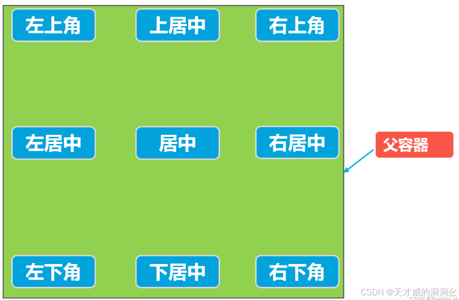
根据父容器定位
常用属性
-
android:layout_centerHorizontal="true":水平方向居中 -
android:layout_centerVertical="true":垂直方向居中 -
android:layout_alignParentTop:子视图顶部与父布局顶部对齐。 -
android:layout_alignParentBottom:子视图底部与父布局底部对齐。 -
android:layout_alignParentLeft:子视图左侧与父布局左侧对齐。 -
android:layout_alignParentRight:子视图右侧与父布局右侧对齐。 -
android:layout_centerInParent:子视图在其父布局中居中显示。 -
android:layout_above:子视图位于另一子视图的上方。 -
android:layout_below:子视图位于另一子视图的下方。 -
android:layout_toLeftOf:子视图位于另一子视图的左侧。 -
android:layout_toRightOf:子视图位于另一子视图的右侧。 -
android:layout_margin:子视图与父布局或其他子视图的间距。
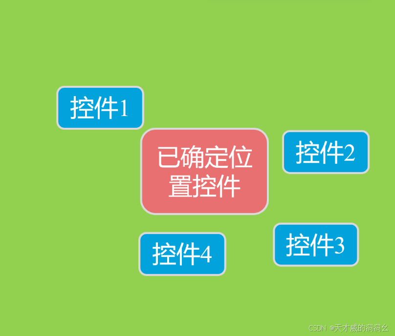
根据兄弟控件定位
在相对布局中,还支持通过已确定位置的控件作为参考来确定其他控件的位置,以下的属性让的组合让控件处于另外控件左上角、右上角、左下角、右下角、正上方、正下方、正左方、正右方等位置。属性如下:android:layout_toLeftOf="@+id/button1":在 button1 控件左方android:layout_toRightOf="@+id/button1":在 button1 控件右方android:layout_above="@+id/button1":在 button1 控件上方android:layout_below="@+id/button1":在 button1 控件下方android:layout_alignLeft="@+id/button1":与 button1 控件左边平齐android:layout_alignRight="@+id/button1":与 button1 控件右边平齐android:layout_alignTop="@+id/button1":与 button1 控件上边平齐android:layout_alignBottom="@+id/button1":与 button1 控件下边平齐
FrameLayout——帧布局:
 <FrameLayout
     android:layout_width="match_parent"
     android:layout_height="match_parent"
     tools:context=".MainActivity">

     <TextView
         android:layout_width="500dp"
         android:layout_height="500dp"
         android:background="#ff0000" /> <!-- 红色,底层 -->

     <TextView
         android:layout_width="300dp"
         android:layout_height="300dp"
         android:background="#00ff00" /> <!-- 绿色,中层 -->

     <TextView
         android:layout_width="100dp"
         android:layout_height="100dp"
         android:background="#0000ff" /> <!-- 蓝色,顶层 -->

 </FrameLayout>
tools:context 是一个 Android Studio 提供的特殊属性,它主要是帮助开发者在布局预览时更好地模拟实际的界面效果。
当你在布局文件的根元素中看到 tools:context=".MainActivity" 这样的代码时,它其实是在告诉 Android Studio:“这个布局文件是与 MainActivity 关联的,所以在预览的时候,请尽量模拟 MainActivity 的环境来展示这个布局。”
这样做的好处是,你可以更准确地看到布局在不同配置下的样子,比如不同的主题、字体大小等。同时,它也有助于 Android Studio 提供更智能的代码提示和重构建议。
但是tools:context 只在 Android Studio 的布局预览中有用,当你实际运行应用时,这个属性是会被忽略的,也就是说它不会影响应用的运行效果。
GridLayout——网格布局:
在XML布局文件中使用GridLayout或GridView组件来创建网格布局容器。GridLayout适用于静态的网格布局,而GridView适用于动态生成和管理的网格布局。
<GridLayout android:id="@+id/gridLayout" android:layout_width="match_parent" android:layout_height="match_parent" android:columnCount="3" android:rowCount="3"> <Button android:id="@+id/button1" android:layout_width="wrap_content" android:layout_height="wrap_content" android:text="Button 1" <!--放到一行一列--> android:layout_column="0" android:layout_row="0" /> <Button android:id="@+id/button2" android:layout_width="wrap_content" android:layout_height="wrap_content" android:text="Button 2" <!--放到一行二列--> android:layout_column="0" android:layout_row="1" /> </GridLayout>
-
配置网格属性(对于
GridLayout):-
columnCount和rowCount:定义网格的行数和列数。 -
columnWidth和rowHeight:定义列的宽度和行的高度。这些属性可以接受绝对尺寸(如dp)、百分比或“wrap_content”等值。 -
padding和margin:用于设置网格布局容器或其子元素的内边距和外边距。
-
-
动态管理网格(对于
GridView):-
使用适配器(如
BaseAdapter)来管理数据和布局。适配器负责将数据与视图绑定,以便在GridView中显示。 -
监听器:可以为
GridView添加项点击监听器等,以处理用户交互。 -
<!-- GridView 会根据 columnWidth 和可用空间自动计算列数,它能够适应不同的屏幕尺寸和方向。-->
<GridView
    android:id="@+id/grid_view"
    android:layout_width="match_parent"
    android:layout_height="match_parent"
    android:columnWidth="100dp"
    android:numColumns="auto_fit"
    android:verticalSpacing="10dp"
    android:horizontalSpacing="10dp"
    android:padding="16dp"
    android:gravity="center" />
-
android:columnWidth 被设置为 100dp,意味着每一列的理想宽度是 100dp。但是,实际的列宽可能会根据屏幕的可用空间而有所不同。
情况一:较小的屏幕
假设在一个较小的屏幕(例如,分辨率为 480x800 的手机)上,如果 GridView 尝试使用 100dp 的列宽来显示 4 列或更多列,那么这些列的总宽度可能会超过屏幕的宽度。在这种情况下,GridView 会自动减少列数,以便每列的宽度不超过 columnWidth 指定的值,并且所有列的总宽度能够适应屏幕的宽度。因此,在这个较小的屏幕上,GridView 可能只会显示 3 列或更少的列。
情况二:较大的屏幕
相反,如果在一个较大的屏幕(例如,分辨率为 1080x1920 的平板电脑)上,GridView 可以使用 100dp 的列宽来显示更多的列,而不会导致列宽超出屏幕的宽度。因此,在这个较大的屏幕上,GridView 可能会显示 4 列、5 列或更多的列。
4. ViewStub 的适用场景
-
ViewStub是一个不可见、没有大小且不占用布局位置的View。
-
它通常用于在程序运行时,根据需要动态加载和显示某个布局。
ViewStub 是一个用于延迟加载布局的轻量级视图。
-
延迟加载:通过ViewStub,可以在应用启动时只加载必要的视图,而将其他视图延迟到需要时才加载,从而优化应用的启动速度和内存使用。
-
节省资源:ViewStub可以在需要时多次使用,以加载和显示不同的布局。但需要注意的是,ViewStub本身在被inflate后会被置空,无法再次用于加载同一个布局。
-
条件渲染:根据用户的选择或应用的状态来决定是否渲染布局。
-
一次性使用:一旦ViewStub被inflate,它就会被置空,无法再次用于加载同一个布局。如果需要多次显示和隐藏某个布局,应该使用View的可见性控制而不是ViewStub。
在代码中,你可以通过调用ViewStub.inflate()方法来按需加载布局。
-
假设你有一个复杂的界面,其中包含一个只有在用户点击某个按钮时才需要显示的额外布局。为了优化性能,你可以使用ViewStub来包裹这个额外布局,并在用户点击按钮时动态加载和显示它。
ViewStub只能用于加载一个布局文件,而不是某个具体的View。如果需要控制某个View的显示与隐藏,应该使用View的可见性控制。
-
ViewStub的inflate()方法会返回一个被加载的布局的根View,你可以通过这个View来访问和操作布局中的其他组件。
一、示例
有一个简单的Android布局,其中包含一个按钮和一个ViewStub。当按钮被点击时,我们希望动态加载并显示一个包含文本的布局。
-
XML布局文件 (activity_main.xml)
<LinearLayout
    xmlns:android="http://schemas.android.com/apk/res/android"
    android:layout_width="match_parent"
    android:layout_height="match_parent"
    android:orientation="vertical">

    <Button
        android:id="@+id/btn_show_text"
        android:layout_width="wrap_content"
        android:layout_height="wrap_content"
        android:text="显示文本" />

    <ViewStub
        android:id="@+id/vs_text_stub"
        android:layout_width="wrap_content"
        android:layout_height="wrap_content"
        android:layout="@layout/text_layout" />
    <!-- 这里引用我们要加载的布局 -->

</LinearLayout>
-
要加载的布局文件 (text_layout.xml)
<TextView
    xmlns:android="http://schemas.android.com/apk/res/android"
    android:layout_width="wrap_content"
    android:layout_height="wrap_content"
    android:text="这是通过ViewStub加载的文本!" />
-
Java代码 (MainActivity.java)
public class MainActivity extends AppCompatActivity {
    private ViewStub viewStubText;
    View inflatedView = viewStubText.inflate();
二、详细解释
-
ViewStub的作用
-
在这个示例中,ViewStub用于包裹我们要动态加载的文本布局(text_layout.xml)。在初始状态下,它不占用任何布局位置,也不会绘制任何内容。
-
-
加载布局
-
当按钮被点击时,我们调用ViewStub的inflate()方法。这个方法会加载并返回ViewStub所指向的布局(text_layout.xml)的根View。
-
加载完成后,ViewStub本身会被新加载的布局替换,不再存在于视图层次结构中。
-
-
性能优化
-
通过使用ViewStub,我们可以避免在应用启动时加载所有布局,从而节省内存和CPU资源。只有在实际需要时,才会加载和显示相应的布局。
-
-
注意事项
-
一旦ViewStub被inflate,它就不能再次用于加载同一个布局。如果需要多次显示和隐藏某个布局,应该使用View的可见性控制而不是ViewStub。
-
ViewStub只能用于加载整个布局文件,而不是单个View组件。如果需要动态添加或删除某个View,应该使用其他方法(如addView()和removeView())。
-
<?xml version="1.0" encoding="utf-8"?>
<androidx.constraintlayout.widget.ConstraintLayout xmlns:android="http://schemas.android.com/apk/res/android"
    xmlns:app="http://schemas.android.com/apk/res-auto"
    xmlns:tools="http://schemas.android.com/tools"
    android:layout_width="3840px"
    android:layout_height="820px"
    android:background="@color/black"

    tools:context=".MainActivity">

    <!-- 状态栏 -->
    <ImageView
        android:id="@+id/imageView_status_bar"
        android:layout_width="0dp"
        android:layout_height="50dp"

        android:src="@drawable/status_bar_image"

        app:layout_constraintEnd_toEndOf="parent"
        app:layout_constraintStart_toStartOf="parent"
        app:layout_constraintTop_toTopOf="parent" />

    <!-- 侧边栏 -->
    <FrameLayout
        android:id="@+id/frame_layout_side_bar"
        android:layout_width="50dp"
        android:layout_height="310dp"
        android:background="@drawable/side_bar_image"
        app:layout_constraintBottom_toBottomOf="parent"
        app:layout_constraintStart_toStartOf="parent"
        app:layout_constraintTop_toBottomOf="@id/imageView_status_bar">

    </FrameLayout>

    <!-- 主体内容 -->
    <androidx.constraintlayout.widget.ConstraintLayout
        android:id="@+id/constraint_layout_main"
        android:layout_width="580dp"
        android:layout_height="356dp"
        android:background="@color/blueB"
        app:layout_constraintBottom_toBottomOf="parent"
        app:layout_constraintEnd_toEndOf="parent"

        app:layout_constraintHorizontal_bias="0.0"
        app:layout_constraintStart_toEndOf="@id/frame_layout_side_bar"
        app:layout_constraintTop_toBottomOf="@id/imageView_status_bar"
        app:layout_constraintVertical_bias="0.0">

        <com.google.android.material.tabs.TabLayout
            android:id="@+id/tab_layout"
            android:layout_width="match_parent"
            android:layout_height="wrap_content"
            android:layout_marginTop="16dp"
            android:background="@color/black"
            app:layout_constraintEnd_toEndOf="parent"
            app:layout_constraintHorizontal_bias="0.03"
            app:layout_constraintStart_toStartOf="parent"
            app:layout_constraintTop_toTopOf="parent"
            app:tabGravity="fill"
            app:tabTextColor="@color/white">

            <com.google.android.material.tabs.TabItem
                android:layout_width="wrap_content"
                android:layout_height="wrap_content"
                android:text="扫码" />

            <com.google.android.material.tabs.TabItem
                android:layout_width="wrap_content"
                android:layout_height="wrap_content"
                android:text="手机" />

            <com.google.android.material.tabs.TabItem
                android:layout_width="wrap_content"
                android:layout_height="wrap_content"
                android:text="人脸" />

            <com.google.android.material.tabs.TabItem
                android:layout_width="wrap_content"
                android:layout_height="wrap_content"
                android:text="声纹" />
        </com.google.android.material.tabs.TabLayout>

        <EditText
            android:id="@+id/edit_text_phone_number"
            android:layout_width="565dp"
            android:layout_height="32dp"
            android:layout_marginTop="16dp"
            android:background="@color/inputColor"
            android:hint="请输入手机号码"
            android:inputType="phone"
            android:textColorHint="#FFFFFF"
            app:layout_constraintEnd_toEndOf="parent"
            app:layout_constraintHorizontal_bias="0.0"
            app:layout_constraintStart_toStartOf="parent"
            app:layout_constraintTop_toBottomOf="@id/tab_layout" />

        <EditText
            android:id="@+id/edit_text_verification_code"
            android:layout_width="422dp"
            android:layout_height="34dp"
            android:layout_marginTop="16dp"
            android:background="@color/inputColor"
            android:hint="请输入验证码"
            android:inputType="text"
            android:textColorHint="#FFFFFF"
            app:layout_constraintEnd_toEndOf="parent"
            app:layout_constraintHorizontal_bias="0.0"
            app:layout_constraintStart_toStartOf="parent"
            app:layout_constraintTop_toBottomOf="@id/edit_text_phone_number" />

        <Button
            android:id="@+id/button_get_verification_code"
            android:layout_width="wrap_content"
            android:layout_height="wrap_content"
            android:layout_marginEnd="12dp"
            android:background="@color/buttonColor"
            android:text="获取验证码"
            app:layout_constraintBaseline_toBaselineOf="@id/edit_text_verification_code"
            app:layout_constraintEnd_toEndOf="parent"
            app:layout_constraintTop_toBottomOf="@id/edit_text_verification_code" />

        <CheckBox
            android:id="@+id/checkbox_terms"
            android:layout_width="442dp"
            android:layout_height="33dp"
            android:text="我已阅读并同意《个人信息保护政策》"
            android:textColor="@color/white"
            tools:ignore="MissingConstraints"
            tools:layout_editor_absoluteX="0dp"
            tools:layout_editor_absoluteY="170dp" />

        <Button
            android:id="@+id/button_login"
            android:layout_width="match_parent"
            android:layout_height="41dp"
            android:layout_marginTop="48dp"
            android:background="@color/buttonColor"
            android:text="登录"
            app:layout_constraintEnd_toEndOf="parent"
            app:layout_constraintHorizontal_bias="0.0"
            app:layout_constraintStart_toStartOf="parent"
            app:layout_constraintTop_toBottomOf="@id/edit_text_verification_code" />


    </androidx.constraintlayout.widget.ConstraintLayout>

    <androidx.constraintlayout.widget.Guideline
        android:id="@+id/guideline"
        android:layout_width="wrap_content"
        android:layout_height="wrap_content"
        android:orientation="vertical"
        app:layout_constraintGuide_begin="20dp" />

    <androidx.constraintlayout.widget.Guideline
        android:id="@+id/guideline2"
        android:layout_width="wrap_content"
        android:layout_height="wrap_content"
        android:orientation="horizontal"
        app:layout_constraintGuide_begin="20dp" />

    <androidx.constraintlayout.widget.Guideline
        android:id="@+id/guideline3"
        android:layout_width="wrap_content"
        android:layout_height="wrap_content"
        android:orientation="vertical"
        app:layout_constraintGuide_begin="20dp" />


</androidx.constraintlayout.widget.ConstraintLayout>


 扫一扫
扫一扫


 1429
1429

 被折叠的 条评论
为什么被折叠?
被折叠的 条评论
为什么被折叠?
 到【灌水乐园】发言


