


文章目录
前言
之前一直觉得可视化大屏比较炫酷 最近还算有点时间 因此研究了一下
涉及到的网址:
阿里云地图json数据
echarts官网
echarts中文网
放上实现后的成果

echarts
echarts官网
echarts中文网
echarts官网是搭载在外国服务器 因此打开可能比较慢可以用加速器
中文网并不是echarts官方的 里面有更多的范例
ps:如果用电脑自带的浏览器开了加速器也打不开 可以尝试用edge浏览器
1.使用方法
在项目中下载
npm install echarts --save
基本使用方法
官方文档
import * as echarts from 'echarts';

// 基于准备好的dom,初始化echarts实例
var myChart = echarts.init(document.getElementById('main'));
// 绘制图表
myChart.setOption({
  title: {
    text: 'ECharts 入门示例'
  },
  tooltip: {},
  xAxis: {
    data: ['衬衫', '羊毛衫', '雪纺衫', '裤子', '高跟鞋', '袜子']
  },
  yAxis: {},
  series: [
    {
      name: '销量',
      type: 'bar',
      data: [5, 20, 36, 10, 10, 20]
    }
  ]
});
注意:在与vue3结合时使用ref获取组件并且要与onMounted结合
因为setup语法糖是在挂载前执行的如果不用onMounted包裹 挂载前是获取不到mycharts的
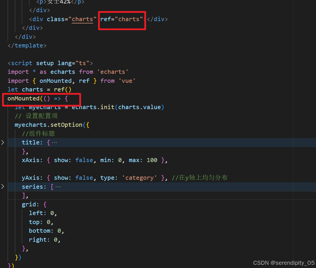
官方文档中已经有对应的层级关系 今年echarts更新 好像默认不显示xy轴了
2.常用属性
title:设置图标的标题
option = {
    title: {
        text: '主标题',  // 主标题文本
        subtext: '副标题',  // 副标题文本
        left: 'center'  // 标题水平位置,还可以是 'left'、'right' 或具体像素值
    }
};
tooltip 鼠标悬停在图表元素上时显示的提示框
option = {
    tooltip: {
        trigger: 'axis',  // 触发类型,'axis' 表示坐标轴触发,'item' 表示数据项触发
        axisPointer: {
            type: 'cross'  // 指示器类型,'cross' 表示十字准星
        }
    }
};
xAxis yAxis 坐标轴
- type 坐标轴类型,常见的有 ‘value’(数值轴)、‘category’(类目轴)、‘time’(时间轴)等。
当给yAxis设置为 categroy时 y为主轴(柱状统计图横向排列)- axisLabel 坐标轴刻度标签相关设置
option = {
    xAxis: {
        type: 'category',
        data: ['周一', '周二', '周三', '周四', '周五', '周六', '周日']  // 类目轴的数据
        axisLabel: {
            rotate: 45,  // 刻度标签旋转角度
            interval: 'auto'  // 刻度标签显示间隔,'auto' 表示自动计算
        }
    }
};
系列配置项 series
- type :bar (柱状图) line (折线图) pie (饼图)
- itemStyle :数据项的样式 (在折现图中为弯折处圆点的样式)
- label 数据标签的设置 用于显示数据值等信息(如柱状图的数值)
option = {
    series: [
        {
            type: 'bar',
            data: [10, 20, 30, 40, 50],  // 系列的数据
            name: '系列1'  // 系列名称,对应图例中的名称
            itemStyle: {
                color: 'skyblue'  // 数据项的颜色
            }
            label: {
                show: true,  // 是否显示标签
                position: 'outside'  // 标签位置,'outside' 表示柱状外侧
            }
        }
    ]
};
数据大屏实现
一些属性的用途已经在代码中注释
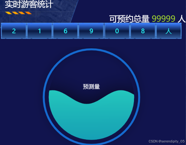
水球图(实时游客统计)
布局就不写了 实际上中文echarts中就有类似的代码 稍加修改就行
<script setup lang="ts">
import { ref, onMounted } from 'vue'
let people = ref('216908人')
import * as echarts from 'echarts'
// 水球图
import 'echarts-liquidfill'

// 获取节点
let charts = ref()
onMounted(() => {
  //获取echarts
  let mycharts = echarts.init(charts.value)
  // 设置实例的配置项
  mycharts.setOption({
    title: {
      text: '预测量',
      textStyle: {
        fontSize: 14,
        fontFamily: 'Microsoft Yahei',
        fontWeight: 'normal',
        color: '#fff',
      },
      x: 'center', //设置标题text位置
      y: '35%',
    },
    series: [
      {
        type: 'liquidFill', //配置echarts图类型
        radius: '95%', //设置echarts图半径
        center: ['50%', '50%'],
        //  shape: 'roundRect',// 设置水球图类型(矩形[rect],菱形[diamond],三角形[triangle],水滴状[pin],箭头[arrow]...) 默认为圆形
        data: [0.5, 0.5], //设置波浪的值 //百分比
        //waveAnimation:false, //静止的波浪
        backgroundStyle: {
          borderWidth: 50,
          color: 'transparent', //水球图内部背景色
          // boxShadow: '0 0 10px rgba(0, 0, 0, 0.5)',
          itemStyle: {
            borderColor: 'red',
            shadowBlur: 20,
            shadowColor: 'rgba(0, 0, 0, 0.5)',
          },
        },
        outline: {
          borderDistance: 10, //表示外轮廓与水球图内容的距离为 10 像素
          itemStyle: {
            borderWidth: 5,
            borderColor: '#156ACF',
            shadowBlur: 20,
            shadowColor: 'rgba(0, 0, 0, 0.5)',
          },
        },
        label: {
          normal: {
            formatter: '',
          },
        },
        itemStyle: {
          color: new echarts.graphic.LinearGradient(0, 0, 0, 1, [
            { offset: 0, color: '#24c9bf' },
            { offset: 1, color: '#16a2b7' },
          ]), // 渐变颜色设置
        },
      },
    ],
  })
})
</script>
柱状(男女比例)
男女比例的柱状图实际上是两个柱状图合并在一起 蓝色覆盖在红色上面
barGap属性可以调整两个柱状图之间的间隔

<script setup lang="ts">
import * as echarts from 'echarts'
import { onMounted, ref } from 'vue'
let charts = ref()
onMounted(() => {
  let myecharts = echarts.init(charts.value)
  // 设置配置项
  myecharts.setOption({
    //组件标题
    title: {
      text: '男女比例', //主标题
      textStyle: {
        color: 'skyblue',
      },
      left: '50%',
    },
    xAxis: { show: false, min: 0, max: 100 },

    yAxis: { show: false, type: 'category' }, //在y轴上均匀分布
    series: [
      {
        type: 'bar', //柱状图
        data: [58],
        barWidth: 20, //柱条的宽度
        z: 3,
        itemStyle: {
          borderRadius: 20,
          color: '#007afe',
        },
      },
      {
        type: 'bar', //柱状图
        data: [100],
        barWidth: 20,
        // 调整女士柱条的位置 与男士重叠
        barGap: '-97%',
        //柱条样式

        itemStyle: {
          color: '#ff4b7a',
          borderRadius: 20,
        },
      },
    ],
    grid: {
      left: 0,
      top: 0,
      bottom: 0,
      right: 0,
    },
  })
})
</script>
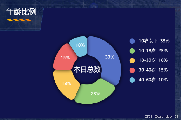
年龄比例(饼图)
lagend的formatter函数调用时会传一个参数 里面有图表的一些数据(可自行打印看看)
formatter就是用来自定义一些显示的数据
这里我用来定义了 10岁以下 33% 等数据
graphic 用于在图表中添加文本
<script setup lang="ts">
import { ref, onMounted } from 'vue'
import * as echarts from 'echarts'
let charts = ref()
// 组件挂载完毕初始化图形图表
onMounted(() => {
  let myecharts = echarts.init(charts.value)
  const data = [
    { value: 1048, name: '10岁以下' },
    { value: 735, name: '10-18岁' },
    { value: 580, name: '18-30岁' },
    { value: 484, name: '30-40岁' },
    { value: 300, name: '40-60岁' },
  ]
  const total = data.reduce((sum, item) => sum + item.value, 0)
  // 设置配置项
  myecharts.setOption({
    tooltip: {
      trigger: 'item',
    },
    legend: {
      top: '40',
      right: '10',
      orient: 'vertical', //布局方向
      textStyle: {
        color: 'white',
      },
      icon: 'circle',
      data: data,
      formatter: (name: any) => {
        const item = data.find((item) => item.name === name)
        const value = item ? item.value : 0
        return `${name}  ${Math.round((value / total) * 100)}%`
      }, //自定义格式
    },
    series: [
      {
        name: 'Access From',
        type: 'pie',
        radius: ['30%', '70%'],
        avoidLabelOverlap: false,
        itemStyle: {
          borderRadius: 10,
          borderColor: 'transparent',
          borderWidth: 2,
          shadowBlur: 10, //阴影
        },

        label: {
          show: true,
          position: 'inside',
          color: 'white',
          fontsize: 14,
          formatter: (params: any) => {
            const value = params.value
            return ` ${Math.round((value / total) * 100)}%`
          },
        },

        labelLine: {
          show: false,
        },
        data: [
          { value: 1048, name: '10岁以下' },
          { value: 735, name: '10-18岁' },
          { value: 580, name: '18-30岁' },
          { value: 484, name: '30-40岁' },
          { value: 300, name: '40-60岁' },
        ],
      },
    ],
    // 调整位置
    grid: {
      left: 0,
      top: 0,
      bottom: 0,
      right: 0,
    },
    //graphic 是一个数组,数组中的每个元素代表一个图形元素,每个图形元素通过 type 属性指定其类型,常见的类型有 'text'(文本)、'rect'(矩形)、'circle'(圆形)、'image'(图片)等。
    graphic: [
      {
        type: 'text',
        left: 'center',
        top: 'center',
        style: {
          text: '本日总数',
          fill: '#fff',
          fontSize: 18,
          textAlign: 'center',
        },
      },
    ],
  })
})
</script>
中国地图

这个就要好好说说了
我写的地图只进行到了省
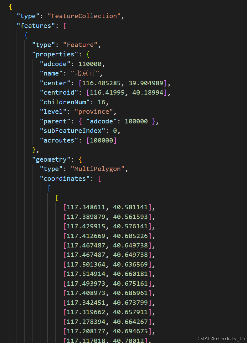
打开阿里云网址(前言提到) 复制json网址 在浏览器打开网址后复制json数据
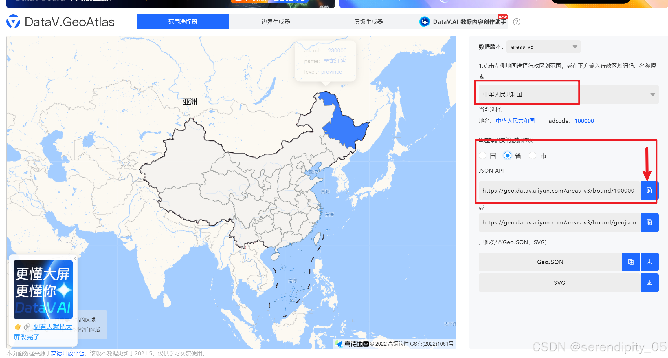
创建json文件夹
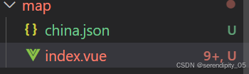
大概这样
代码
<script setup lang="ts">
import { ref, reactive, onMounted } from 'vue'
import * as echarts from 'echarts'
import chinaJSON from './china.json'

// 获取dom元素
let map = ref()
// 注册中国地图
echarts.registerMap('china', chinaJSON as any)
onMounted(() => {
  let mychart = echarts.init(map.value)
  var chinaGeoCoordMap = {
    黑龙江: [127.9688, 45.368],
    内蒙古: [110.3467, 41.4899],
    吉林: [125.8154, 44.2584],
    北京市: [116.4551, 40.2539],
    辽宁: [123.1238, 42.1216],
    河北: [114.4995, 38.1006],
    天津: [117.4219, 39.4189],
    山西: [112.3352, 37.9413],
    陕西: [109.1162, 34.2004],
    甘肃: [103.5901, 36.3043],
    宁夏: [106.3586, 38.1775],
    青海: [101.4038, 36.8207],
    新疆: [87.611053, 43.828171],
    西藏: [91.117212, 29.646922],
    四川: [103.9526, 30.7617],
    重庆: [108.384366, 30.439702],
    山东: [117.1582, 36.8701],
    河南: [113.4668, 34.6234],
    江苏: [118.8062, 31.9208],
    安徽: [117.29, 32.0581],
    湖北: [114.3896, 30.6628],
    浙江: [119.5313, 29.8773],
    福建: [119.4543, 25.9222],
    江西: [116.0046, 28.6633],
    湖南: [113.0823, 28.2568],
    贵州: [106.6992, 26.7682],
    云南: [102.9199, 25.4663],
    广东: [113.12244, 23.009505],
    广西: [108.479, 23.1152],
    海南: [110.3893, 19.8516],
    台湾: [120.702967, 24.123621],
    上海: [121.4648, 31.2891],
  }
  var series = [] as any
  var chinaDatas = [
    [
      {
        name: '北京市',
        value: 0,
      },
      {
        name: '黑龙江',
        value: 0,
      },
      { name: '上海市' },
    ],
    [
      {
        name: '内蒙古',
        value: 0,
      },
    ],
    [
      {
        name: '吉林',
        value: 0,
      },
    ],
    [
      {
        name: '辽宁',
        value: 0,
      },
    ],
    [
      {
        name: '河北',
        value: 0,
      },
    ],
    [
      {
        name: '天津',
        value: 0,
      },
    ],
    [
      {
        name: '山西',
        value: 0,
      },
    ],
    [
      {
        name: '陕西',
        value: 0,
      },
    ],
    [
      {
        name: '甘肃',
        value: 0,
      },
    ],
    [
      {
        name: '新疆',
        value: 0,
      },
    ],
    [
      {
        name: '西藏',
        value: 0,
      },
    ],
    [
      {
        name: '台湾',
        value: 0,
      },
    ],
    [
      {
        name: '黑龙江',
        value: 0,
      },
    ],
    [
      {
        name: '云南',
        value: 0,
      },
    ],
    [
      {
        name: '宁夏',
        value: 0,
      },
    ],
    [
      {
        name: '青海',
        value: 0,
      },
    ],
    [
      {
        name: '四川',
        value: 0,
      },
    ],
    [
      {
        name: '重庆',
        value: 0,
      },
    ],
    [
      {
        name: '山东',
        value: 0,
      },
    ],
    [
      {
        name: '河南',
        value: 0,
      },
    ],
    [
      {
        name: '江苏',
        value: 0,
      },
    ],
    [
      {
        name: '安徽',
        value: 0,
      },
    ],
    [
      {
        name: '湖北',
        value: 0,
      },
    ],
    [
      {
        name: '浙江',
        value: 0,
      },
    ],
    [
      {
        name: '福建',
        value: 0,
      },
    ],
    [
      {
        name: '江西',
        value: 0,
      },
    ],
    [
      {
        name: '湖南',
        value: 0,
      },
    ],
    [
      {
        name: '贵州',
        value: 0,
      },
    ],
    [
      {
        name: '广西',
        value: 0,
      },
    ],
    [
      {
        name: '海南',
        value: 0,
      },
    ],
    [
      {
        name: '上海',
        value: 0,
      },
    ],
  ]
  var convertData = function (data) {
    var res = []
    for (var i = 0; i < data.length; i++) {
      var dataItem = data[i]
      var fromCoord = chinaGeoCoordMap[dataItem[0].name]
      var toCoord = [
        [121.4648, 31.2891],
        [117.1582, 36.8701],
        [117.1582, 36.8701],
        [117.1582, 36.8701],
        [117.1582, 36.8701],
        [117.1582, 36.8701],
        [117.1582, 36.8701],
        [117.1582, 36.8701],
        [117.1582, 36.8701],
        [117.1582, 36.8701],
        [117.1582, 36.8701],
        [117.1582, 36.8701],
        [117.1582, 36.8701],
        [117.1582, 36.8701],
        [117.1582, 36.8701],
        [117.1582, 36.8701],
        [117.1582, 36.8701],
        [117.1582, 36.8701],
        [117.1582, 36.8701],
        [117.1582, 36.8701],
        [117.1582, 36.8701],
        [117.1582, 36.8701],
        [117.1582, 36.8701],
        [117.1582, 36.8701],
        [117.1582, 36.8701],
        [117.1582, 36.8701],
        [117.1582, 36.8701],
        [117.1582, 36.8701],
        [117.1582, 36.8701],
      ] //被攻击点
      if (fromCoord && toCoord[i]) {
        res.push([
          {
            coord: toCoord[i],
          },
          {
            coord: fromCoord,
            value: dataItem[0].value,
            // visualMap: false
          },
        ])
      }
    }
    return res
  }

  ;[['山东', chinaDatas]].forEach(function (item) {
    console.log(item)
    series.push(

      {
        type: 'lines',
        zlevel: 2,
        effect: {
          show: true,
          period: 3, //箭头指向速度,值越小速度越快
          trailLength: 0.02, //特效尾迹长度[0,1]值越大,尾迹越长重
          symbol: 'arrow', //箭头图标
          symbolSize: 5, //图标大小
        },
        lineStyle: {
          normal: {
            color: '#00eaff',
            width: 1, //尾迹线条宽度
            opacity: 0.7, //尾迹线条透明度
            curveness: 0.3, //尾迹线条曲直度
          },
        },
        data: convertData(item[1]),
      },
      {
        type: 'effectScatter',
        coordinateSystem: 'geo',
        zlevel: 2,
        rippleEffect: {
          //涟漪特效
          period: 4, //动画时间,值越小速度越快
          brushType: 'stroke', //波纹绘制方式 stroke, fill
          scale: 4, //波纹圆环最大限制,值越大波纹越大
        },
        label: {
          normal: {
            show: true,
            position: 'right', //显示位置
            offset: [5, 0], //偏移设置
            formatter: function (params) {
              //圆环显示文字
              return params.data.name
            },
            fontSize: 13,
          },
          emphasis: {
            show: true,
          },
        },
        symbol: 'circle',
        symbolSize: function (val) {
          return 5 + val[2] * 5 //圆环大小
        },
        itemStyle: {
          normal: {
            show: true,
            color: '#00eaff',
          },
        },
        data: item[1].map(function (dataItem) {
          return {
            name: dataItem[0].name,
            value: chinaGeoCoordMap[dataItem[0].name].concat([
              dataItem[0].value,
            ]),
            // visualMap: false
          }
        }),
      },
      //被攻击点
      {
        type: 'scatter',
        coordinateSystem: 'geo',
        zlevel: 2,
        rippleEffect: {
          period: 4,
          brushType: 'stroke',
          scale: 4,
        },
        label: {
          normal: {
            show: false, //定位点名字
            position: 'right',
            // offset:[5, 0],
            color: '#0f0',
            formatter: '{b}',
            textStyle: {
              color: '#0f0',
            },
          },
          emphasis: {
            // show: false,   //定位标记
            color: '#f60',
          },
        },
        symbol: 'pin', //定位图标样式
        symbolSize: 50,
        data: [
          {
            name: item[0],
            value: chinaGeoCoordMap[item[0]].concat([10]),
          },
        ],
      },
    )
  })
  mychart.setOption({
    geo: {
      map: 'china',
      left: 50,
      top: 10,
      right: 100,
      bottom: -20,
      itemStyle: {
        normal: {
          areaColor: '#12235c',
          borderColor: '#2ab8ff',
          borderWidth: 0.5,
          shadowColor: 'rgba(0,54,255, 0.4)',
          shadowBlur: 100,
        },
        //鼠标hover到某一块的效果
        emphasis: {
          areaColor: '#122360',
          label: {
            color: 'white',
          },
        },
        //对指定地点进行自定义样式
        regions: [
          {
            name: '南海诸岛',
            itemStyle: {
              areaColor: 'rgba(0, 10, 52, 1)',
              borderColor: 'rgba(0, 10, 52, 1)',
              normal: {
                opacity: 0,
                label: {
                  show: false,
                  color: '#009cc9',
                },
              },
            },
            label: {
              show: false,
              color: '#FFFFFF',
              fontSize: 12,
            },
          },
        ],
      },
    },
    emphasis: {
      areaColor: '#122360',
      label: {
        color: 'white',
      },
    },
    grid: {
      left: 0,
      top: 0,
      bottom: 0,
      right: 0,
    },

    series: series,
  })
})
</script>
折线图(未来一年游客量趋势图)
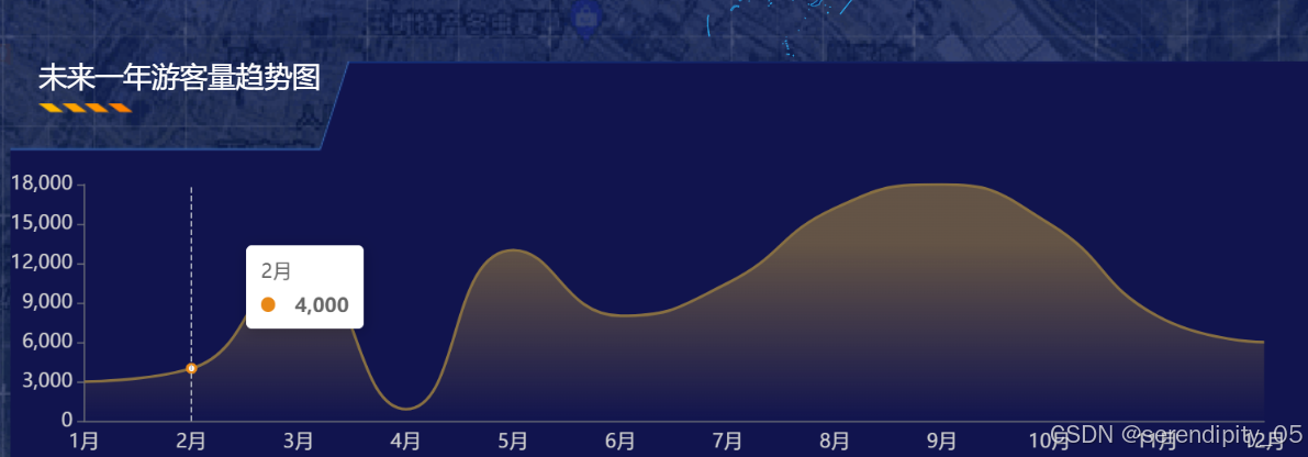
- 折线图默认起始位置不在起点 结束位置也不再坐标轴终点 整个折线图是处于中间位置的
可以给xAxis设置boundaryGap: false,来达到起(终)点 在开始(结尾)处 - axisTick用于设置坐标轴刻度,customValues用于设置在哪个位置显示刻度线

<script setup lang="ts">
import { ref, reactive, onMounted } from 'vue'
import * as echarts from 'echarts'
let charts = ref()
onMounted(() => {
  let mycharts = echarts.init(charts.value)
  mycharts.setOption({
    tooltip: {
      trigger: 'axis',
    },
    grid: {
      top: '50',
      left: '0',
      right: '50',
      bottom: '20',
      containLabel: true,
    },
    xAxis: {
      type: 'category',
      dataMin: '1月',
      //设置起始位置在0处(默认类目轴是在中间区域并不和0刻度线交接)
      boundaryGap: false,
      data: [
        '1月',
        '2月',
        '3月',
        '4月',
        '5月',
        '6月',
        '7月',
        '8月',
        '9月',
        '10月',
        '11月',
        '12月',
      ],
      axisLabel: {
        color: '#CFCFCF',
        interval: 0,
        fontSize: 14,
      },
      axisTick: {
        show: false,
      },
    },
    yAxis: {
      type: 'value',
      axisLabel: {
        show: true,
        color: '#CFCFCF',
        fontSize: 14,
      },
      //轴线的设置
      axisLine: {
        show: true,
      },
      //轴线的刻度
      axisTick: {
        show: true,
      },
      splitLine: {
        show: false, //设置纵坐标没有刻度线
        lineStyle: {
          width: 0.8,
          color: 'rgba(127, 214, 255, .4)',
          type: 'dashed',
        },
      },
    },
    series: [
      {
        type: 'line',
        //
        showSymbol: false,
        smooth: true, //曲线为平滑的
        // symbolSize: 8,
        lineStyle: {
          color: '#7b653c',
        },
        //节点圆圈颜色
        itemStyle: {
          color: '#e88817',
          borderColor: '#e88817',
          borderWidth: 15,
        },
        //设置区域填充样式
        areaStyle: {
          color: {
            type: 'linear',
            x: 0,
            y: 0,
            x2: 0,
            y2: 1,
            colorStops: [
              {
                offset: 0.25,
                color: '#7b653c',
              },
              {
                offset: 1,
                color: '#7b653c00',
              },
            ],
          },
        },
        data: [
          3000, 4000, 12000, 900, 13000, 8000, 10500, 16200, 18000, 15000, 8000,
          6000,
        ],
      },
    ],
  })
})
</script>
柱状图和折线图结合(热门景区排行)
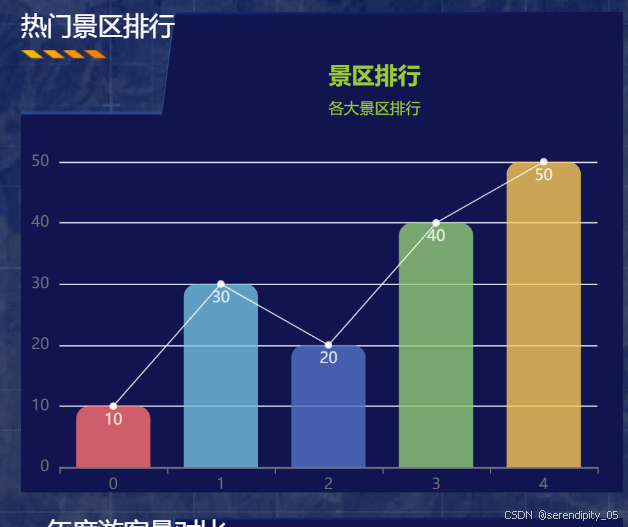
这个实际上只需要在series写两个对象 一个类型是bar 一个是line就可以了 data设置成一样的就行
<script setup lang="ts">
import { ref, reactive, onMounted } from 'vue'

import * as echarts from 'echarts'
import LeftTable from 'element-plus/es/components/table-v2/src/renderers/left-table.mjs'

// 获取dom节点
let charts = ref()

onMounted(() => {
  // 一个容器可以同时展示多个图形图表
  let myChart = echarts.init(charts.value)
  const data = [10, 30, 20, 40, 50]
  myChart.setOption({
    // 标题组件
    title: {
      // 主标题
      text: '景区排行',
      //   标题的位置
      left: '50%',
      //   主标题文字样式
      textStyle: {
        color: 'yellowgreen',
      },
      subtext: '各大景区排行',
      //   子标题样式
      subtextStyle: {
        color: 'yellowgreen',
      },
    },

    //x\y
    xAxis: {
      type: 'category', //图形图标在x轴上均匀分布
      color: 'white',
    },
    yAxis: {},
    //布局组件
    grid: {
      left: 30,
      top: 80,
      bottom: 20,
      right: 20,
    },
    // 系列 :决定显示的图形图表是哪一种的
    series: [
      {
        type: 'bar',
        data: data,
        // 柱状图上的文本标签
        label: {
          show: true,
          position: 'insideTop',
          // 文字颜色
          color: '#fff',
        },

        // 是否显示背景颜色
        // showBackground: true,
        backgroundStyle: {},
        // 柱条的样式
        itemStyle: {
          borderRadius: [10, 10, 0, 0],
          color: function (data: any) {
            let arr = ['#ff7070', '#73c0de', '#5470c6', '#91cc75', '#fac858']
            return arr[data.dataIndex]
          },
          opacity: 0.8,
        },
      },
      {
        type: 'line',
        data: data,
        lineStyle: {
          color: 'white',
          opacity: 0.8,
          width: 1,
        },
        itemStyle: {
          color: 'white',
          opacity: 0.8,
        },
      },
    ],
  })
})
</script>
多个折线图(年度游客量对比)

<script setup lang="ts">
import { ref, reactive, onMounted } from 'vue'
import * as echarts from 'echarts'
let charts = ref()

onMounted(() => {
  let data = [
    '01周',
    ' 02周',
    ' 03周',
    ' 04周',
    ' 05周',
    ' 06周',
    ' 07周',
    ' 08周',
    ' 09周',
    ' 10周',
    ' 11周',
    ' 12周',
    ' 13周',
    ' 14周',
  ]

  let mycharts = echarts.init(charts.value)
  mycharts.setOption(

    {
      tooltip: {
        trigger: 'axis',
      },
      grid: {
        left: '3%',
        right: '12%',
        bottom: 20,
        top: 20,
        containLabel: true,
      },
      legend: {
        bottom: 0,
        itemWidth: 20,
        itemHeight: 10,
        data: ['2023年','2024年', '2025年'],
        textStyle: {
          color: 'white',
          fontSize: 12,
        },
      },
      xAxis: {
        type: 'category',
        data: data,
        axisLabel: {
          rotate: 320, //坐标轴字体颜色
          textStyle: {
            color: '#cbcbcd',
            fontSize: 12,
          },
        },
        axisLine: {
          show: true,
          lineStyle: {
            color: '#242424',
          },
        },
        axisTick: {
          //y轴刻度线
          show: false,
        },
        splitLine: {
          //网格
          show: false,
        },
        boundaryGap: false,
      },
      yAxis: {
        type: 'value',
        axisLabel: {
          //坐标轴字体颜色
          textStyle: {
            color: '#cbcbcd',
            fontSize: 12,
          },
        },
        axisLine: {
          show: true,
          lineStyle: {
            color: '#242424',
          },
        },
        axisTick: {
          //y轴刻度线
          show: false,
        },
        splitLine: {
          //网格
          show: false,
          // lineStyle:{
          //   color:'#dadde4',
          //   type:"dashed"
          // }
        },
      },

      series: [
        {
          name: '2023年',
          type: 'line',
          smooth: true,
          showSymbol: false,
          // symbol: 'circle',
          // symbolSize: 8,
          itemStyle: {
            color: 'orange',
            borderColor: '#fff',
            borderWidth: 2,
          },
          lineStyle: {
            width: 0,
          },
          areaStyle: {
            normal: {
              color: new echarts.graphic.LinearGradient(0, 0, 0, 1, [
                {
                  offset: 0,
                  color: 'orange',
                },
                {
                  offset: 1,
                  color: '#0086ff00',
                },
              ]),
            },
          },
          data: [20, 2, 9, 64, 39, 93, 62, 30, 80, 39, 93, 62, 30, 80],
        },
        {
          name: '2024年',
          type: 'line',
          smooth: true,
          showSymbol: false,
          // symbol: 'circle',
          // symbolSize: 8,
          itemStyle: {
            color: '#34C7FE',
            borderColor: '#fff',
            borderWidth: 2,
          },
          lineStyle: {
            width: 0,
          },
          areaStyle: {
            normal: {
              color: new echarts.graphic.LinearGradient(0, 0, 0, 1, [
                {
                  offset: 0,
                  color: '#0086ff',
                },
                {
                  offset: 1,
                  color: '#0086ff00',
                },
              ]),
            },
          },
          data: [
            40, 162, 109, 164, 139, 193, 162, 130, 80, 139, 193, 162, 130, 80,
          ],
        },
        {
          name: '2025年',
          type: 'line',
          smooth: true,
          //
          showSymbol: false,
          // symbol: 'circle',
          // symbolSize: 8,
          itemStyle: {
            color: '#ff5286',
            borderColor: '#fff',
            borderWidth: 2,
          },
          lineStyle: {
            width: 0,
          },
          areaStyle: {
            normal: {
              color: new echarts.graphic.LinearGradient(0, 0, 0, 1, [
                {
                  offset: 0,
                  color: '#ff4b7a',
                },
                {
                  offset: 1,
                  color: '#ff4b7a00',
                },
              ]),
            },
          },
          data: [80, 0, 119, 94, 29, 163, 12, 30, 45, 129, 163, 112, 30, 45],
        },
      ],
      dataZoom: [
        {
          type: 'slider',
          show: false,
          startValue: data.length - 14, // 展示后14个数据的索引
          endValue: data.length, // 展示全部数据
        },
        {
          type: 'inside', // 这个 dataZoom 组件是 inside 型 dataZoom 组件
          start: 0, // 左边在 0% 的位置。
          end: 10, // 右边在 10% 的位置。
        },
      ],
    },
  )
})
</script>
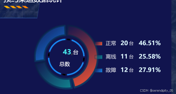
饼图 (预约渠道统计)
<script setup lang="ts">
import { ref, onMounted } from 'vue'
import * as echarts from 'echarts'
let charts = ref()
onMounted(() => {
  let myChart = echarts.init(charts.value)

  let peopleList = [
    { name: '正常', value: 20, percent: 0 },
    { name: '离线', value: 11, percent: 0 },
    { name: '故障', value: 12, percent: 0 },
  ]
  let total = peopleList.reduce((pre, next) => {
    return pre + next.value
  }, 0)

  let numberWidth = String(total).length * 8 + 8

  peopleList.forEach((item) => {
    item.percent =
      total === 0 ? 0 : parseFloat(((item.value / total) * 100).toFixed(2))
  })

  let color = [
    'rgba(113, 226, 135, 1)',
    'rgba(119, 247, 253, 1)',
    'rgba(44, 104, 231, 1)',
    'rgba(93, 202, 250, 1)',
  ]

  let option = {
    color: color,

    tooltip: {
      trigger: 'item',
    },
    legend: {
      show: true,
      orient: 'vertical',
      top: 'center',
      right: '5%',
      icon: 'rect',
      itemGap: 20,
      itemWidth: 20,
      itemHeight: 10,
      color: '#fff',
      formatter: function (name: string) {
        let items = peopleList.find((item) => item.name == name)
        return `{name|${name}}  {number| ${items?.value || ''}} {unit|台}    {percent|${
          items?.percent + '%' || ''
        }}`
      },
      itemStyle: {
        borderWidth: 1,
      },
      textStyle: {
        rich: {
          number: {
            width: numberWidth,
            color: '#DDF6FD',
            align: 'left',
            fontSize: 16,
            fontWeight: 'bold',
            padding: [0, 0, 0, 0],
          },
          name: {
            color: 'rgba(255,255,255,0.8)',
            fontSize: 14,
            fontWeight: 400,
            fontFamily: 'Source Han Sans CN',
            padding: [0, 0, 0, 4],
          },
          unit: {
            color: 'rgba(255,255,255,0.8)',
            fontSize: 12,
            fontWeight: 400,
            fontFamily: 'Source Han Sans CN',
            padding: [0, 0, 0, 0],
          },
          percent: {
            color: '#DDF6FD',
            align: 'left',
            fontSize: 16,
            fontWeight: 'bold',
            padding: [0, 0, 0, 0],
          },
        },
      },
    },
    title: [
      {
        text: '{title|总数}',
        left: '38%',
        top: '53%',
        textAlign: 'center',
        textStyle: {
          rich: {
            title: {
              color: '#fff',
              fontSize: 14,
              fontWeight: '400',
            },
          },
        },
      },
      {
        text: '{num|' + total + '},{unit|台}',
        left: '37%',
        top: '40%',
        textStyle: {
          rich: {
            num: {
              fontSize: 18,
              color: '#49F1F2',
              fontFamily: 'DIN Alternate',
              fontWeight: 'bold',
            },
            unit: {
              color: '#fff',
              fontSize: 14,
              fontWeight: '400',
              padding: [0, 0, -0, 0],
            },
          },
        },
      },
    ],

    series: [
      {
        type: 'pie',
        radius: ['45%', '65%'],
        center: ['40%', '50%'],
        padAngle: 5,
        label: {
          show: false,
        },
        itemStyle: {
          // shadowColor: 'rgba(255, 255, 255, 0.5)',
          // shadowBlur: 2,
          borderWidth: 5,
          borderColor: {
            type: 'linear', // 使用线性渐变
            x: 0,
            y: 0,
            x2: 1,
            y2: 1,
            colorStops: [
              { offset: 0, color: 'rgba(7, 36, 66, 0.5)' }, // 起始颜色
              { offset: 1, color: 'rgba(11, 57, 102, 1)' }, // 结束颜色
            ],
          },
          opacity: 1,
          color: function (params: { dataIndex: number }) {
            // 为每个扇区设置不同的渐变色
            const colorList = [
              {
                type: 'linear',
                x: 0,
                y: 0,
                x2: 1,
                y2: 1,
                colorStops: [
                  { offset: 0, color: 'rgba(255, 87, 51, 0)' }, // 起始颜色
                  { offset: 1, color: 'rgba(255, 87, 51, 1)' }, // 结束颜色
                ],
              },
              {
                type: 'linear',
                x: 0,
                y: 0,
                x2: 1,
                y2: 1,
                colorStops: [
                  { offset: 0, color: 'rgba(17, 135, 145, 0)' }, // 起始颜色
                  { offset: 1, color: 'rgba(17, 135, 145, 1)' }, // 结束颜色
                ],
              },
              {
                type: 'linear',
                x: 0,
                y: 0,
                x2: 1,
                y2: 1,
                colorStops: [
                  { offset: 0, color: 'rgba(24, 132, 236, 0)' }, // 起始颜色
                  { offset: 1, color: 'rgba(24, 132, 236, 1)' }, // 结束颜色
                ],
              },
            ]
            return colorList[params.dataIndex % colorList.length] // 循环使用渐变色
          },
        },
        emphasis: {
          scale: false,
        },
        data: peopleList,
      },

      {
        name: '黄线',
        type: 'pie',

        radius: ['35%', '38%'],
        center: ['40%', '50%'],
        hoverAnimation: false,
        startAngle: 90,
        padAngle: 5,
        tooltip: {
          // show: false,
        },
        itemStyle: {
          borderCap: 'round',

          normal: {
            color: function (data: { data: number }) {
              let tempColor = data.data == 10 ? '#000000  ' : '#1884EC'
              return tempColor
            },
          },
        },
        zlevel: 4,
        labelLine: {
          show: false,
        },
        data: [10, 50, 10, 50, 10, 50, 10, 50],
      },
    ],
  }
  myChart.setOption(option)
})
</script>


 2607
2607

 被折叠的 条评论
为什么被折叠?
被折叠的 条评论
为什么被折叠?
 到【灌水乐园】发言


