


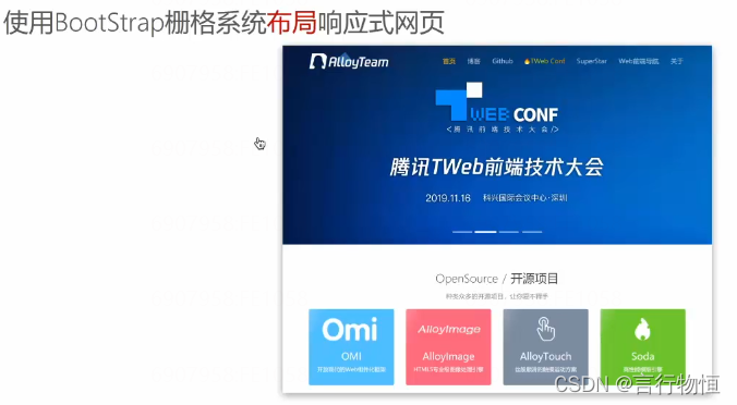
 本文介绍如何使用Bootstrap框架实现响应式网页设计。通过栅格系统将页面分为12等份,便于不同屏幕尺寸下的适配。文章提供了一个示例代码,展示了表格和按钮样式,并简要提及了JS插件的使用。
学习完移动适配后,我们知道不同宽度需要不同的media适配,那么有没有一种框架可以解决编写众多media适配,也可以减少css编写量呢?BootStrap
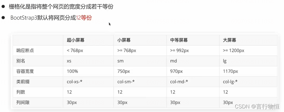
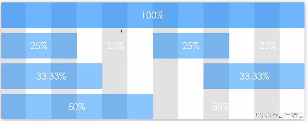
所谓栅格布局就是将视口平分成12份。
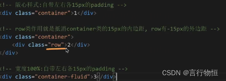
在使用container时,我们发现左右各有15px的边距,那么我们应该怎么抵消呢,我们可以使用row抵消盒子的外盒子内边距,也有一些别的方法。
Bootstrap中文网 http://www.bootcss.com使用时,优先应用bootstrap.css。
下面是我测试的一段代码,以示例基本的使用,详细可以查看官方文档。
<!DOCTYPE html>
<html lang="en">
<head>
	<meta charset="UTF-8">
	<title>表格和按钮样式的使用</title>
	<meta name="viewport" content="width=device-width, initial-scale=1.0">
	<link rel="stylesheet" href="/Res/Less/Index.css">
	<link rel="stylesheet" href="/Res/bootstrap3.4.1/css/bootstrap.min.css">
	<style>
		html,body{
			width: 100%;
			height: 100%;
		}
		.tableBox{
            position: absolute;
			top: 50%;
			left: 10px;
			transform: translate(0,-50%);
			width: 60vw;
			border: 1px solid black;
			border-radius: 5px;

		}
		.table{
			margin-bottom: 0;
		}
		.btn-submit{
			width: 50%;
		}
		button:focus{
			outline: 0;
        }
	</style>
</head>
<body>
<div class="tableBox">
	<table class="table table-hover">
		<thead>
		<tr>
			<th>序号</th>
			<th>姓名</th>
			<th>成绩</th>
		</tr>
		</thead>

		<tbody>
		<tr>
			<td>1</td>
			<td>王五</td>
			<td>100</td>
		</tr>
		<tr>
			<td>2</td>
			<td>李四</td>
			<td>90</td>
		</tr>
		<tr>
			<td>3</td>
			<td>赵六</td>
			<td>80</td>
		</tr>
		<tr>
			<td>4</td>
			<td>孙七</td>
			<td>110</td>
		</tr>
		</tbody>
	</table>
</div>
<div class="container-fluid row">
	<button type="submit" class="float btn btn-default btn-success active btn-submit">提交</button>
	<button type="reset" class="float btn btn-default">重置</button>
</div>
</body>
</html>
下面我们来看看JS插件:
首先,看看怎么映入:
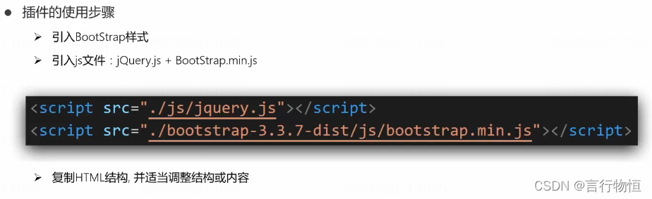
更多详情可以去官方文档了解!


 扫一扫
扫一扫


 1991
1991

 被折叠的 条评论
为什么被折叠?
被折叠的 条评论
为什么被折叠?
 到【灌水乐园】发言


