


Material UI 5 学习01-按钮组件
一、安装Material UI
首先我们创建React工程。然后安装样式和字体。下面使用yarn安装
//Material UI
yarn add @mui/material @emotion/react @emotion/styled
//styled-components
yarn add @mui/material @mui/styled-engine-sc styled-components
//安装Roboto字体
yarn add @fontsource/roboto
//安装MUI图标
yarn add @fontsource/roboto

//在public index.html引入google字体样式
<link rel="preconnect" href="https://fonts.googleapis.com" />
<link rel="preconnect" href="https://fonts.gstatic.com" crossorigin />
<link rel="stylesheet" href="https://fonts.googleapis.com/css2?family=Roboto:wght@300;400;500;700&display=swap"/>
//在public index.html引入google MUI字体样式
<link rel="stylesheet" href="https://fonts.googleapis.com/icon?family=Material+Icons"/>
二、 组件
我们先学习MUI的组件
1、Button组件
1、基础按钮
最基本的button按钮定义:
import {

   Button} from "@mui/material";
function App() {


  return (
    <div>
        <Button>这是一个按钮</Button>
    </div>
  );
}
export default App;
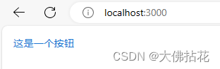
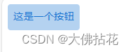
可以看出,最基本的按钮没有边框,字体默认是蓝色的,其鼠标点击上去有背景颜色,是淡蓝色。其他的就没有什么了。
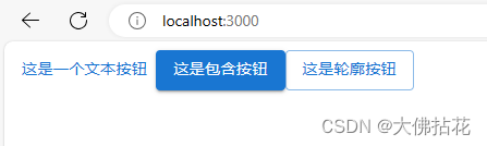
2、variant属性
| 序号 | 属性值 | 含义 |
|---|---|---|
| 1 | text | 文本按钮,这个是按钮的默认属性。文本按钮 通常用于不太明显的动作,包括那些位于对话框、卡片中的动作。 在卡片中,文本按钮有助于保持卡片内容的重点。 |
| 2 | contained | 包含按钮。包含按钮 是高度强调的,以其使用的抬高和填充来区分。 它们包含对你的应用来说是主要的操作。 |
| 3 | outlined | 轮廓按钮。轮廓按钮也是包含按钮的一种较低强调度的选择, 或者更强调文本按钮的替代品。 |
代码演示:
<Button variant='text'>这是一个文本按钮</Button>
<Button variant='contained'>这是包含按钮</Button>
<Button variant='outlined'>这是轮廓按钮</Button>
3、禁用按钮
加上disabled属性可以禁用按钮。默认是true。false就不是禁用了。
<Button variant='text' disabled>禁用文本按钮</Button>
4、可跳转的按钮
加尚href属性,可以进行跳转
<Button variant='text' href="#">禁用文本按钮< 最低0.47元/天 解锁文章


 扫一扫
扫一扫


 634
634

 被折叠的 条评论
为什么被折叠?
被折叠的 条评论
为什么被折叠?
 到【灌水乐园】发言


