


相信当家对DOM元素上的尺寸及位置属性一定不陌生,常见的clientHeight、offsetHeight等属性在日常开发中会经常用到,但也会常常忘记各个属性具体的边界情况。本文整理了DOM元素上的尺寸及位置属性,方便大家日后在使用过程中能快速回想起各个属性的边界。
DOM元素上的尺寸及位置
DOM元素上的尺寸及位置属性我分为以下三类方便记忆,分别是clinet类、offset类、scroll类。
1、clientHeight、clientWidth、clientTop、clientLeft;
2、offsetHeight、offsetWidth、offsetTop、offsetLeft;
3、scrollHeight、scrollWidth、scrollTop、scrollLeft;
client(可视区)类型
clientHeight:指向元素可视部分的padding-top+padding-bottom+height部分。
clientWidth:指向元素可视部分的padding-left+padding-right+width部分。
clientTop:指向元素的border-top的宽度。
clientLeft:指向元素的border-left的宽度。
注意,这里的可视部分指的是该元素未被折叠起来的部分,而不是指我们所看到的部分,这里从字面上看很容易造成误导。让我们来看一个实例代码。
<!DOCTYPE html>
<html lang="en">
<head>
    <meta charset="UTF-8">
    <meta http-equiv="X-UA-Compatible" content="IE=edge">
    <meta name="viewport" content="width=device-width, initial-scale=1.0">
    <title>尺寸及位置</title>
    <style>
        #container{
            background-color: red;
            height: 400px;
            width: 400px;
            padding: 20px;
            border-top: 10px solid;
            border-bottom: 12px solid;
            border-left: 13px solid;
            border-right: 14px solid;
            overflow: auto;
        }
    </style>
</head>
<body>
    <div id="container">
    </div>
    <script>
        const container = document.getElementById('container')
        console.log('clientHeight:',container.clientHeight) //clientHeight: 440
        console.log('clientWidth:',container.clientWidth) //clientWidth: 440
        console.log('clientTop:',container.clientTop)//clientTop: 10
        console.log('clientLeft:',container.clientLeft)//clientLeft: 13
    </script>
</body>
</html> 
根据代码我们可以很清楚的得到该元素的位置和尺寸值,现在我们将元素的高度改为2000px,使整个浏览器出现纵向滚动条。
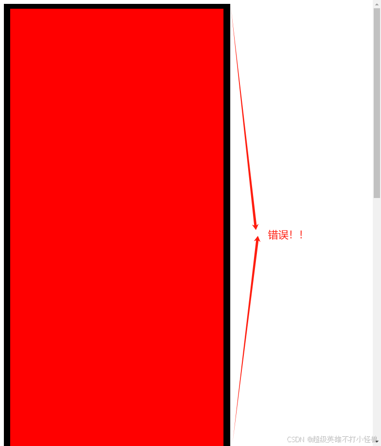
这个时候我们获取该元素clientHeight应该等于 2000+20+20=2400 ,而不是照片中字面意思上的可视区域高度。我们再看一个案例,当这个元素出现滚动条时,他的clinetHeight又是多少?
<!DOCTYPE html>
<html lang="en">
<head>
    <meta charset="UTF-8">
    <meta http-equiv="X-UA-Compatible" content="IE=edge">
    <meta name="viewport" content="width=device-width, initial-scale=1.0">
    <title>尺寸及位置</title>
    <style>
        #container{
            background-color: red;
            height: 400px;
            width: 400px;
            padding: 20px;
            border-top: 10px solid;
            border-bottom: 12px solid;
            border-left: 13px solid;
            border-right: 14px solid;
            overflow: auto;

        }
    </style>
</head>
<body>
    <div id="container">
        <div style="height: 1000px;"></div>
    </div>
    <script>
        const container = document.getElementById('container')
        console.log('clientHeight:',container.clientHeight) //clientHeight: 440
        console.log('clientWidth:',container.clientWidth) //clientWidth: 430  由于滚动条存在宽度
        console.log('clientTop:',container.clientTop)//clientTop: 10
        console.log('clientLeft:',container.clientLeft)//clientLeft: 13
    </script>
</body>
</html>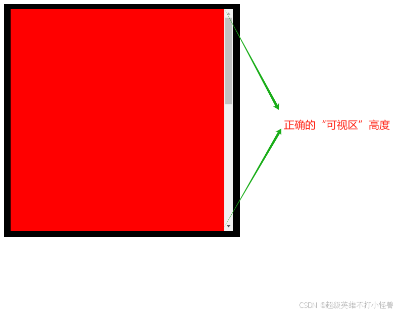
当该元素出现滚动条时,元素的clientHeight= 400+20+20 = 440,这是没有问题的,看到这里你一定清楚了“可视区域的”含义,我们接着往下看。
offset类型
offsetHeight:指向元素可视部分的padding-top+padding-bottom+height+border-top+border-bottom部分。
offsetWidth:指向元素可视部分的padding-left+padding-right+width+border-left+border-right部分。
clientTop:指当前元素距离最近的已经定位过的祖先元素的上边距。
clientLeft:指当前元素距离最近的已经定位过的祖先元素的左边距。
这里offsetHight/Width和clientHeight/Width是差不多的,区别在于offsetHeight/Width部分多添加了border部分, 我们着重看一下offsetTop和offsetLeft。代码如下。
<!DOCTYPE html>
<html lang="en">
<head>
    <meta charset="UTF-8">
    <meta http-equiv="X-UA-Compatible" content="IE=edge">
    <meta name="viewport" content="width=device-width, initial-scale=1.0">
    <title>尺寸及位置</title>
    <style>
        *{
            padding: 0;
            margin: 0;
        }
        #container{
            width: 300px;
            height: 300px;
            background-color: antiquewhite;
            margin: 30px 60px;
            position: relative;
            padding: 30px;
            border: 10px solid;
        }
        #item{
            background-color: red;
            height: 40px;
            width: 40px;
            padding: 20px;
            border: 10px solid;
            overflow: auto;

        }
    </style>
</head>
<body>
    <div id="container">
        <div id="item"></div>
    </div>
    <script>
        const container = document.getElementById('item')
        console.log('offsetHeight:',container.offsetHeight) //offsetHeight: 100
        console.log('offsetWidth:',container.offsetWidth) //offsetWidth: 100
        console.log('offsetTop:',container.offsetTop)//offsetTop: 30
        console.log('offsetLeft:',container.offsetLeft)//offsetLeft: 30
    </script>
</body>
</html>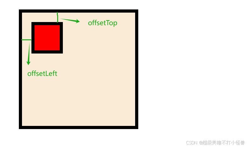
从代码及结果图里相信你就已经理解了offsetTop和Left的边界,这里一定要注意是相对于最近的定位过的祖先元素,只要定位过就可以,无论是绝对定位或者相对定位或者固定定位,只要定位(不包含initial) 即可。
scroll类型
scrollHeight:指向元素内容的实际高度,包含该元素滚动卷起来的部分高度。
scrollWidth:向元素内容的实际宽度,包含该元素滚动卷起来的部分宽度。
scrollTop:指向元素卷起来的高度。
clientLeft:指向元素卷起来的宽度。
scroll类型的尺寸及位置通常用在该元素存在滚动条情况,当元素不存在滚动的情况下,scrollHeight/Width等同于 clientHeight/Width,让我们看一下示例。
<!DOCTYPE html>
<html lang="en">
<head>
    <meta charset="UTF-8">
    <meta http-equiv="X-UA-Compatible" content="IE=edge">
    <meta name="viewport" content="width=device-width, initial-scale=1.0">
    <title>尺寸及位置</title>
    <style>
        *{
            padding: 0;
            margin: 0;
        }
        #container{
            width: 300px;
            height: 300px;
            background-color: antiquewhite;
            position: initial;
            padding: 30px;
            border: 10px solid;
            overflow: auto;
        }

    </style>
</head>
<body>
    <div id="container">
        <div style="height: 1000px;"></div>
    </div>
    <script>
        const container = document.getElementById('container')
        console.log('scrollHeight:',container.scrollHeight) //scrollHeight: 1060
        console.log('scrollWidth:',container.scrollWidth) //scrollWidth: 343
        console.log('scrollTop:',container.scrollTop)//scrollTop: 0
        console.log('scrollLeft:',container.scrollLeft)//scrollLeft: 0
    </script>
</body>
</html>
从代码这可以看出,元素的高度300px,但是内部的元素将整个父元素撑大,这个时候元素的高度变为 1000+30+30,也就是内部元素所占据的content大小加上上下padding,本质与clientHeight的算法是相同的,只是内容区域的高度不同。
此时我将滚动条滑动到底部,这个时候再看scrollTop的值。
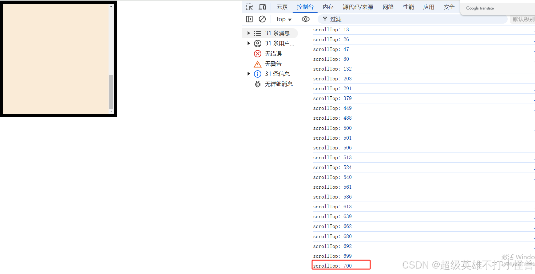
我们能看到随着滚动条的滚动,scrollTop的值也在发生改变,指向卷起部分的高度,我们将卷起部分的高度加上可视部分的高度结果算出来的值等于scrollHeight,既 700+300+30+30 = 1060,因此在实际开发中,如果我们想要在滚动条滑到底部进行额外操作的化,我们可以通过该公式判断滚动条是否滑倒了元素底部。


 扫一扫
扫一扫


 被折叠的 条评论
为什么被折叠?
被折叠的 条评论
为什么被折叠?
 到【灌水乐园】发言


