


pie plot
library(ggpie)
library(ggplot2)
library(tidyverse)

data(diamonds)
str(diamonds)
tibble [53,940 × 10] (S3: tbl_df/tbl/data.frame)
 $ carat  : num [1:53940] 0.23 0.21 0.23 0.29 0.31 0.24 0.24 0.26 0.22 0.23 ...
 $ cut    : Ord.factor w/ 5 levels "Fair"<"Good"<..: 5 4 2 4 2 3 3 3 1 3 ...
 $ color  : Ord.factor w/ 7 levels "D"<"E"<"F"<"G"<..: 2 2 2 6 7 7 6 5 2 5 ...
 $ clarity: Ord.factor w/ 8 levels "I1"<"SI2"<"SI1"<..: 2 3 5 4 2 6 7 3 4 5 ...
 $ depth  : num [1:53940] 61.5 59.8 56.9 62.4 63.3 62.8 62.3 61.9 65.1 59.4 ...
 $ table  : num [1:53940] 55 61 65 58 58 57 57 55 61 61 ...
 $ price  : int [1:53940] 326 326 327 334 335 336 336 337 337 338 ...
 $ x      : num [1:53940] 3.95 3.89 4.05 4.2 4.34 3.94 3.95 4.07 3.87 4 ...
 $ y      : num [1:53940] 3.98 3.84 4.07 4.23 4.35 3.96 3.98 4.11 3.78 4.05 ...
 $ z      : num [1:53940] 2.43 2.31 2.31 2.63 2.75 2.48 2.47 2.53 2.49 2.39 ...
获取填充色
library(ggsci)

cl=pal_lancet("lanonc", alpha = 0.9)(6)
cl
[1] "#00468BE5" "#ED0000E5" "#42B540E5" "#0099B4E5" "#925E9FE5" "#FDAF91E5"
常规pie
输入数据:dataframe类长数据;
参数意义:
- group_key:关注的分类变量;
- count_type:
对于原始数据(full),对于已经拿到频数的数据可以直接使用count列的数据显示百分比(count); - label_info:选择label的类型,仅显示个数(count),仅显示百分比(ratio),同时显示两者(all);
- label_type: label的朝向,水平,circle或者没有label(none);
- label_split:以什么分隔符分离
label_info = all时的label,
分隔符要存在于label中; - label_pos:在饼图内,还是外显示label;
- label_threshold:当频率低于阈值时,label显示在饼图外;
- fill_color:指定填充色;
# with no label
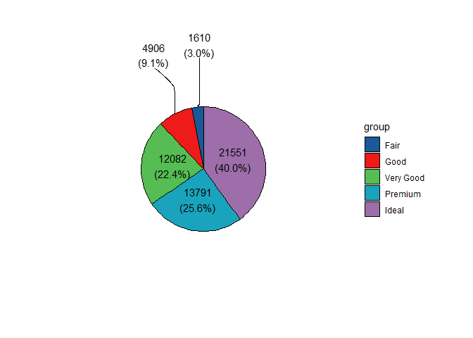
ggpie(data = diamonds,
group_key = "cut",
count_type = "full",
label_info = "all",
label_type = "horizon",
fill_color = cl[1:5],
label_split = "[[:space:]]+",
label_size = 4,
label_pos = "in",
label_threshold = 10)
agg_data <- table(diamonds$cut) %>%
  as.data.frame() %>%
  setNames(c("cut", "count"))
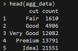
count_type = "count"输入数据已经计算了频数可以直接使用。
ggpie(data = agg_data,
      group_key = "cut",
      count_type = "count",      # 使用该列的值
      label_info = "all",
      label_type = "horizon",
      label_split = "[[:space:]]+",
      label_size = 4,
      label_pos = "in",
      label_threshold = 10)
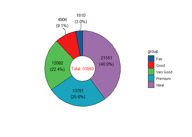
donut
甜甜圈图
ggdonut(data = diamonds,
        group_key = "cut",
        count_type = "full",
        label_info = "all",
        label_type = "horizon",
        fill_color = cl[1:5],
        label_size = 4,
        label_pos = "in",
        label_threshold = 10)
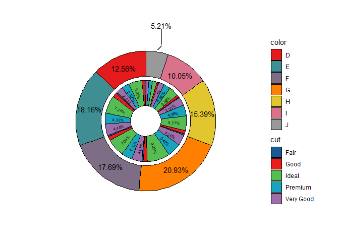
双变量甜甜圈图
只能接受两个分类变量
问题:inner label ratio小数点位数过长
- inner_label_threshold:小于阈值的label不显示;
p <- ggnestedpie(data = diamonds,
            group_key = c("color", "cut"),
            count_type = "full",
            r0 = 0.5, r1 = 1.7, r2 = 2.8,
            inner_label_info = "ratio",
            inner_label_split = NULL,
            inner_label_threshold = 2,
            inner_label_size = 2,
            inner_fill_color = cl[1:5],
            outer_label_type = "horizon",
            outer_label_pos = "in",
            outer_label_info = "ratio",
            outer_label_threshold = 10,
            outer_fill_color = NULL)
print(p)

debug
解决inner pie显示比例小数点位数冗余的问题。
通过ggplot_build和ggplot_gtable直接对上述生成的ggplot对象自行修改。
# 格式化函数
format_percent <- function(x) {
  # 如果是空字符串,直接返回
  if (x == "" || is.na(x)) return(x)

  # 提取数字部分(去掉 %)
  num <- sub("%", "", x)

  # 转为数值,四舍五入到小数点后2位
  rounded <- round(as.numeric(num), 2)

  # 格式化为字符串并加 %,确保总是保留两位小数(如 5.00%)
  sprintf("%.2f%%", rounded)
}


p.build = ggplot_build(p)
p.build$data[[2]]$label = sapply(p.build$data[[2]]$label, format_percent, USE.NAMES = FALSE)
final.plot <- ggplot_gtable(p.build)

plot(final.plot)
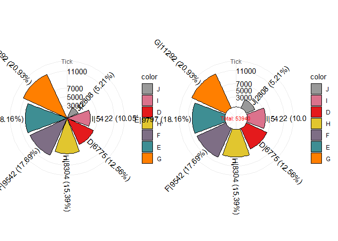
单变量玫瑰图
- tick_break:自定义频数刻度;
# pie plot
p1=ggrosepie(diamonds, group_key = "color", count_type = "full", label_info = "all",
             tick_break = c(3000,5000,7000,11000), donut_frac=NULL)
# donut plot
p2=ggrosepie(diamonds, group_key = "color", count_type = "full", label_info = "all",
             tick_break = c(3000,5000,7000,11000), donut_frac=0.3,donut_label_size=3)
cowplot::plot_grid(p1,p2)
双变量玫瑰图
可以发现上述直接使用cowplot::plot_grid(p1,p2)拼图得到的玫瑰图,图列冗余。在此处通过单独提取图例的方式,分别拼接没有图例的两个主图和图例即可优化整体布局。
library(ggpie)
library(cowplot)

# Step 1: 创建无图例的 pie plot
p1 <- ggrosepie(diamonds,
                group_key = c("color", "cut"),
                count_type = "full",
                label_info = "all",
                show_tick = FALSE,
                donut_frac = NULL) +
  theme(legend.position = "none")

# Step 2: 创建带图例的 donut plot(用于提取水平图例)
p2_with_legend <- ggrosepie(diamonds,
                            group_key = c("color", "cut"),
                            count_type = "full",
                            label_info = "all",
                            show_tick = FALSE,
                            donut_frac = 0.3,
                            donut_label_size = 3) +
  theme(
    legend.position = "bottom",        # 图例放在图下方
    legend.box = "horizontal",         # 图例项水平排列
    legend.text = element_text(size = 9),
    legend.title = element_text(size = 10, face = "bold")
  )

# Step 3: 提取图例
legend <- get_legend(p2_with_legend)

# Step 4: 创建无图例的 p2 用于拼图
p2 <- p2_with_legend + theme(legend.position = "none")

# Step 5: 拼接两个主图(p1 和 p2)
plot_main <- plot_grid(
  p1, p2,
  ncol = 2,
  align = "h",
  rel_heights = c(1, 1)
)

# Step 6: 将主图与水平图例拼接(图例在下方)
plot_final <- plot_grid(
  plot_main,  # 上部分:两个图形
  legend,     # 下部分:横向图例
  ncol = 1,
  rel_heights = c(1, 0.15),  # 主图占大部分高度,图例占小部分
  align = "v"
)

print(plot_final)
- 推文多平台同步发布,公众号内容食用更佳
- 更多内容,请关注微信公众号“生信矿工”
- 如有意见或建议可以在评论区讨论


 被折叠的 条评论
为什么被折叠?
被折叠的 条评论
为什么被折叠?
 到【灌水乐园】发言


