


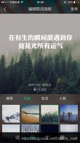
初学模仿QQ音乐界面
大概功能效果实现,css/html 部分代码集合,图片是本地图片需要的话可以在后置文件中提取
<head>
<style>
body {}
header {
width: 100%;
height: 80px;
background: rgba(0, 0, 0, .3);
position: absolute;
z-index: 33;
line-height: 80px;
position: fixed;
}
.head-wrapper {
width: 996px;
height: 46px;
}
/* .head-logo {
width: 600px;
height: 100%;
} */
.head-jieshao {
/* width: 300px; */
height: 100%;
}
.head-qq {
width: 159px;
height: 100%;
margin-right: 80px;
margin-top: 15px;
background-image: url('./image/logo.png');
}
.head-nav {
width: 280px;
height: 40px;
}
.head-nav li {
font-size: 20px;
margin-right: 80px;
color: #fff;
}
.head-nav li:nth-of-type(1) {
color: #31c27c;
}
.head-jieshao li {
font-size: 20px;
margin-left: 30px;
color: #fff;
}
.first_container {
height: calc(100vh + 80px);
height: 110vh;
background-image: url('./image/banner_pc.jpg');
position: relative;
top: -80px;
z-index: 1;
overflow: hidden;
background-size: 100vw calc(100vh + 80px);
}
.download-title {
width: 595px;
height: 153px;
position: absolute;
top: 255px;
left: 50%;
transform: translateX(-50%);
background-image: url('./image/img_index_6bc275f9.png');
background-position: 0 -312px;
z-index: 2;
}
.download-btn {
width: 293px;
height: 69px;
position: absolute;
top: 470px;
left: 50%;
transform: translateX(-50%);
background-image: url('./image/img_index_6bc275f9.png');
background-position: -416px -859px;
}
.download-bottom {
height: 190px;
position: absolute;
bottom: 0;
width: 100%;
left: 50%;
transform: translateX(-50%);
border-top: 1px solid rgba(255, 255, 255, .12);
}
.download-bottom ul {
width: 1000px;
margin: 0 auto;
}
.download-bottom li {
width: 110px;
height: 170px;
background-image: url('./image/img_index_6bc275f9.png');
background-position: -366px -940px;
opacity: .4;
cursor: pointer;
margin-right: 170px;
box-sizing: border-box;
}
.download-bottom li:last-of-type {
margin-right: 0px;
}
.download-bottom li:first-of-type {
border-top: 1px solid #fff;
opacity: 1;
}
.download-bottom li:hover {
opacity: 1;
border-top: 1px solid #fff;
}
.download-jiantou {
width: 36px;
height: 20px;
position: absolute;
bottom: 50px;
left: 50%;
transform: translateX(-50%);
animation: move 2s linear infinite;
background-image: url('./image/img_index_6bc275f9.png');
background-position: -1091px -161px;
cursor: pointer;
}
@keyframes move {
0% {
bottom: 50px;
opacity: 0;
}
50% {
bottom: 45px;
opacity: 1;
}
100% {
bottom: 30px;
opacity: 0;
}
}
.star {
width: 108px;
height: 152px;
display: block;
position: absolute;
right: -200px;
top: -200px;
animation: star 5s infinite;
background-image: url('./image/star.png');
}
.star1 {
width: 108px;
height: 152px;
display: block;
position: absolute;
right: 800px;
top: -200px;
animation: star1 11s infinite 1s;
background-image: url('./image/star.png');
}
.star2 {
width: 108px;
height: 152px;
display: block;
position: absolute;
right: 300px;
top: -200px;
animation: star2 6s infinite 3s;
background-image: url('./image/star.png');
}
.star3 {
width: 108px;
height: 152px;
display: block;
position: absolute;
right: 940px;
top: -200px;
animation: star3 6s infinite 1s;
background-image: url('./image/star.png');
}
.star4 {
width: 108px;
height: 152px;
display: block;
position: absolute;
right: 300px;
top: -200px;
animation: star4 12s infinite 0s;
background-image: url('./image/star.png');
}
@keyframes star4 {
0% {
right: 300px;
top: -200px;
opacity: .8;
}
100% {
right: 1300px;
top: 700px;
opacity: 0;
}
}
@keyframes star2 {
0% {
right: 940px;
top: -200px;
opacity: .8;
}
100% {
right: 1600px;
top: 700px;
opacity: 0;
}
}
@keyframes star3 {
0% {
right: 300px;
top: -200px;
opacity: .8;
}
100% {
right: 1000px;
top: 700px;
opacity: 0;
}
}
@keyframes star1 {
0% {
right: 800px;
top: -200px;
opacity: .8;
}
100% {
right: 1800px;
top: 500px;
opacity: 0;
}
}
@keyframes star {
0% {
right: -200px;
top: -200px;
opacity: .8;
}
100% {
right: 500px;
top: 500px;
opacity: 0;
}
}
/* letter-spacing:20px 改变字间距 */
/* ~~~~~~~~~~~~~~~~~~~~~~~~~~~~~~~~~~~~~~~~~~~~~~~~~~~~~~~~~~~~~~~~~~~~ ~~~~~~~~~~~~~~~~~~~~~~~~~~~~~~~~~~ ~~~~~~~~~~~~~~~~~~~~~~~~~~~~~~~~~~ ~~~~~~~~~~~~~~~~~~~~~~~~~~~~~~~~~~ */
/* ~~~~~~~~~~~~~~~~~~~~~~~~~~~~~~~~~~~~~~~~~~~~~~~~~~~~~~~~~~~~~~~~~~~~ ~~~~~~~~~~~~~~~~~~~~~~~~~~~~~~~~~~ ~~~~~~~~~~~~~~~~~~~~~~~~~~~~~~~~~~ ~~~~~~~~~~~~~~~~~~~~~~~~~~~~~~~~~~ */
/* ~~~~~~~~~~~~~~~~~~~~~~~~~~~~~~~~~~~~~~~~~~~~~~~~~~~~~~~~~~~~~~~~~~~~ ~~~~~~~~~~~~~~~~~~~~~~~~~~~~~~~~~~ ~~~~~~~~~~~~~~~~~~~~~~~~~~~~~~~~~~ ~~~~~~~~~~~~~~~~~~~~~~~~~~~~~~~~~~ */
/* ~~~~~~~~~~~~~~~~~~~~~~~~~~~~~~~~~~~~~~~~~~~~~~~~~~~~~~~~~~~~~~~~~~~~ ~~~~~~~~~~~~~~~~~~~~~~~~~~~~~~~~~~ ~~~~~~~~~~~~~~~~~~~~~~~~~~~~~~~~~~ ~~~~~~~~~~~~~~~~~~~~~~~~~~~~~~~~~~ */
.second_container {
height: 100vh;
overflow: hidden;
position: relative;
top: -80px;
z-index: 1;
background-color: rgb(0, 0, 0);
width: 100vw;
/* overflow: hidden; */
}
.second_container:hover li {
animation: blink1 1.2s both;
display: block;
}
.pic_list1 li {
height: 211px;
width: 211px;
background-image: url('./image/sprite1.jpg');
background-repeat: no-repeat;
/* animation: blink1 1.2s both; */
display: none;
}
.second_little ul {
height: 211PX;
width: 100%;
}
.second_little {
position: absolute;
top: -90px;
right: 0px;
float: left;
/* overflow: hidden; */
}
@keyframes blink1 {
0% {
opacity: 0;
transform: scale(1.2);
}
100% {
opacity: 1;
transform: scale(1);
}
}
.second_container h2 {
position: absolute;
top: 450px;
left: 660px;
width: 587px;
height: 145px;
text-indent: -99em;
overflow: hidden;
background-image: url(./image/img_index_6bc275f9.png);
background-position: -556px -630px;
z-index: 100;
}
.second_container h3 {
position: absolute;
top: 550px;
left: 750px;
width: 404px;
height: 69px;
background-image: url(./image/img_index_6bc275f9.png);
background-position: 0 -859px;
z-index: 100;
}
/* ------—————————————————————————————————————————————————————————————————————————————————————————————————————————————————————————————————————————————————— */
/* ------—————————————————————————————————————————————————————————————————————————————————————————————————————————————————————————————————————————————————— */
/* ------—————————————————————————————————————————————————————————————————————————————————————————————————————————————————————————————————————————————————— */
/* ------—————————————————————————————————————————————————————————————————————————————————————————————————————————————————————————————————————————————————— */
.third_container {
height: 100vh;
width: 100vw;
background-color: rgb(0, 0, 0);
position: relative;
top: -80px;
z-index: 1;
background-image: url('./image/banner2.jpg');
background-size: 100vw calc(100vh + 80px);
overflow: hidden;
}
.third_container h2 {
position: absolute;
top: 50%;
left: 50%;
margin-left: -504px;
margin-top: -130px;
width: 554px;
height: 149px;
background-image: url('./image/img_index_6bc275f9.png');
background-position: 0 -469px;
z-index: 2;
}
.third_container h3 {
position: absolute;
top: 50%;
left: 50%;
margin-left: -504px;
margin-top: 50px;
width: 468px;
height: 69px;
background-image: url('./image/img_index_6bc275f9.png');
background-position: -636px -493px;
z-index: 2;
}
.tel {
position: absolute;
right: 0;
top: 0%;
width: 580px;
height: 892px;
right: 100px;
background-image: url('./image/lyric_phonebox.png');
/* animation: move1 3s; */
}
.tel1,
.tel2 {
width: 338px;
height: 598px;
position: absolute;
transform: rotate(7.6deg);
left: 102px;
top: 137px;
background-image: url('./image/lyric_phone1.jpg');
}
.tel2 {
background-image: url('./image/lyric_phone2.jpg');
/* animation: chuxian1 2s 3s forwards; */
opacity: 0;
}
.third_container:hover .tel2 {
animation: chuxian1 2s 3s forwards;
}
.third_container:hover .tel {
animation: move1 3s;
}
@keyframes move1 {
0% {
right: 0px;
opacity: 0;
}
100% {
right: 100px;
opacity: 1;
}
}
@keyframes chuxian1 {
0% {
opacity: 0;
}
100% {
opacity: 1;
}
}
.fourth_banner {
height:100vh;
width: 100vw;
background-color: rgb(0, 0, 0);
position: relative;
top: -80px;
z-index: 1;
background-image: url('./image/banner3.jpg');
background-size: 100vw calc(100vh + 80px);
overflow: hidden;
}
.fourth_banner:hover .like_pic {
animation: move2 3s forwards;
}
.fourth_banner:hover .like_phonein {
animation: goon 3s linear forwards 4.5s;
}
.fourth_banner h2 {
position: absolute;
top: 50%;
left: 50%;
margin-left: -50px;
margin-top: -113px;
width: 615px;
height: 143px;
background-image: url('./image/img_index_6bc275f9.png');
background-position: 0 -157px;
z-index: 2;
}
.fourth_banner h3 {
position: absolute;
top: 50%;
left: 50%;
margin-left: -50px;
margin-top: 68px;
width: 550px;
height: 69px;
background-image: url('./image/img_index_6bc275f9.png');
background-position: 0 -778px;
z-index: 2;
}
.like_phone {
position: absolute;
top: 36px;
left: 0px;
width: 450px;
height: 778px;
background: url('./image/like_phonebox.png') no-repeat;
background-position-y: 0px;
}
@keyframes move2 {
0% {
left: 350px;
opacity: 0;
}
100% {
left: 450px;
opacity: 1;
}
}
@keyframes goon {
0% {
background-position-y: 0;
}
100% {
background-position-y: -210px;
}
}
.like_phonein {
position: absolute;
top: 208px;
left: 57px;
width: 316px;
height: 430px;
background-position-y: 0;
background: url('./image/like_phone.jpg') no-repeat;
transform: rotate(-5.7deg);
/* animation: goon 3s linear forwards 5.5s; */
overflow: hidden;
}
.like_pic {
/* animation: move2 3s forwards; */
position: absolute;
top: 36px;
left: 350px;
}
.fiveth_banner {
height: 110VH;
width: 100vw;
background-color: rgb(0, 0, 0);
position: relative;
top: -80px;
z-index: 1;
background-image: url('./image/banner4.jpg');
background-size: 100vw calc(100vh + 80px);
overflow: hidden;
}
.fiveth_banner h2 {
position: absolute;
top: 50%;
left: 50%;
margin-left: -580px;
margin-top: -270px;
width: 544px;
height: 136px;
background-image: url('./image/img_index_6bc275f9.png');
background-position: 0 -630px;
z-index: 2;
}
.fiveth_banner h3 {
position: absolute;
top: 50%;
left: 50%;
margin-left: -580px;
margin-top: -108px;
width: 454px;
height: 63px;
background-image: url('./image/img_index_6bc275f9.png');
background-position: -562px -778px;
z-index: 2;
}
.five_phone {
position: absolute;
top: 50%;
left: 50%;
margin-left: -400px;
margin-top: 0;
width: 255px;
height: 329px;
transform-origin: 90% 50%;
background-image: url('./image/synchro_phone.png');
}
.fiveth_banner:hover .five_phone {
animation: move3 3s forwards .5s;
}
@keyframes move3 {
0% {
opacity: 0;
transform: translateX(-60px);
}
80% {
opacity: 1;
}
100% {
opacity: 1;
transform: translateX(0);
}
}
@keyframes move4 {
0% {
opacity: 0;
transform: translateX(60px);
}
80% {
opacity: 1;
}
100% {
opacity: 1;
transform: translateX(0);
}
}
.fiveth_banner:hover .five_mac1 {
animation: move4 2s forwards;
}
.five_mac1 {
position: absolute;
top: 50%;
left: 50%;
margin-top: -392px;
width: 620px;
height: 784px;
background: url('./image/synchro_mac1.png') 0 0 no-repeat;
z-index: 2;
}
.five_mac2 {
position: absolute;
bottom: 0;
left: 0;
width: 620px;
height: 376px;
background: url('./image/synchro_mac2.png') 0 0 no-repeat;
}
footer {
position: absolute;
bottom: 0px;
height: 44px;
background: rgba(0, 0, 0, .3);
z-index: 999;
color: #fff;
padding: 14px 0;
font-size: 12px;
font-family: Tahoma, Arial;
width: 100%;
clear: both;
text-align: center;
line-height: 25px;
}
footer a{
color: #fff;
}
footer a:hover{
text-decoration: underline;
}
</style>
</head>
<body>
    <header class=" flex a_c j_c ">
        <div class="head-wrapper  flex j_s_a">
            <div class="head-logo  flex a_c">
                <div class="head-qq ">

                </div>
                <ul class="head-nav  flex a_c">
                    <li>产品动态</li>
                    <li>下载</li>
                </ul>

            </div>
            <ul class="head-jieshao  flex a_c">
                <li>PC版介绍</li>
                <li>MAC版介绍</li>
                <li>轻听介绍</li>
            </ul>
        </div>
    </header>
    <div class="first_container">
        <div class="download-title ">

        </div>
        <div class="download-btn ">

        </div>
        <div class="download-bottom">
            <ul class="flex j-s">
                <li class=""></li>
                <li style="background-position: -244px -940px"></li>
                <li style="background-position: -122px -940px" class=""></li>
                <li style="background-position: 0px -940px" class=""></li>
            </ul>
        </div>
        <div>
            <span class="star"></span>
            <span class="star1"></span>
            <span class="star2"></span>
            <span class="star3"></span>
            <span class="star4"></span>


        </div>
        <div class="download-jiantou ">

        </div>
    </div>


    <div class="second_container">
        <div class="second_title">

        </div>
        <div class="second_little  ">
            <ul class="pic_list1 flex f_s">
                <li style="    animation-delay: .9s;"></li>
                <li style="background-position: 0 -212px;    animation-delay: 2.7s; "></li>
                <li style="background-position: 0 -424px;    animation-delay: 1.5s;"></li>
                <li style="background-position: 0 -636px;    animation-delay: 2.4s;"></li>
                <li style="background-position: 0 -848px;    animation-delay: 2.5s;"></li>
                <li style="background-position: 0 -1060px;    animation-delay: 2s;"></li>
                <li style="background-position: 0 -1272px;    animation-delay: 1.5s;"></li>
                <li style="background-position: 0 -1482px;    animation-delay: 1.2s;"></li>
                <li style="background-position: 0 -1696px;    animation-delay: 3.1s;"></li>
            </ul>
            <ul class="pic_list1 flex f_s">
                <li style="background-position: 0 -1908px; "></li>
                <li style="background-position: 0 -2120px;    animation-delay: 2s;"></li>
                <li style="    animation-delay: 3s;"><img src="./image/singer1-1.jpg" alt=""></li>
                <li style="    animation-delay: 2.4s;"><img src="./image/singer1-3.jpg" alt=""></li>
                <li style="background-position: 0 -2332px;    animation-delay: 2.4s;"></li>
                <li style="background-position: 0 -2544px; "></li>
                <li style="background-position: 0 -2756px;    animation-delay: .3s;"></li>
                <li style="    animation-delay: 2.7s;"><img src="./image/singer1-2.jpg" alt=""></li>
                <li style="background-position: 0 -2968px;    animation-delay: 1.5s;"></li>
            </ul>
            <ul class="pic_list1 flex f_s">
                <li style="    animation-delay: 2.4s;"><img src="./image/singer2-1.jpg" alt=""></li>
                <li style="    animation-delay: 0.6s;"><img src="./image/singer2-2.jpg" alt=""></li>
                <li style="    animation-delay: .3s;"><img src="./image/singer2-3.jpg" alt=""></li>
                <li style="background-position: 0 -3180px;    animation-delay: 2.4s;"></li>
                <li style="background-image: url('./image/sprite2.jpg');    animation-delay: 1.2s;"></li>
                <li
                    style="background-image: url('./image/sprite2.jpg');background-position: 0 -212px;    animation-delay: 2.3s;">
                </li>
                <li style="    animation-delay: 3s;"><img src="./image/singer2-4.jpg" alt=""></li>
                <li
                    style="background-image: url('./image/sprite2.jpg');background-position: 0 -424px;    animation-delay: .3s;">
                </li>
                <li
                    style="background-image: url('./image/sprite2.jpg');background-position: 0 -636px;    animation-delay: 2s;">
                </li>


            </ul>
            <ul class="pic_list1 flex f_s">
                <li
                    style="background-image: url('./image/sprite2.jpg');background-position: 0 -848px;    animation-delay: 1.8s;">
                </li>
                <li
                    style="background-image: url('./image/sprite2.jpg');background-position: 0 -1060px;    animation-delay: 1.3s;">
                </li>
                <li style="    animation-delay: 0.6s;"><img src="./image/singer3-1.jpg" alt=""> </li>
                <li
                    style="background-image: url('./image/sprite2.jpg');background-position: 0 -1272px;    animation-delay: .5s;">
                </li>
                <li style="    animation-delay: 3.1s;"><img src="./image/singer3-2.jpg" alt=""></li>
                <li
                    style="background-image: url('./image/sprite2.jpg');background-position: 0 -1482px;    animation-delay: 1.5s;">
                </li>
                <li
                    style="background-image: url('./image/sprite2.jpg');background-position: 0 -1694px;    animation-delay: 2.4s;">
                </li>
                <li style="    animation-delay: .9s;"><img src="./image/singer3-3.jpg"> </li>
                <li
                    style="background-image: url('./image/sprite2.jpg');background-position: 0 -1908px;    animation-delay: 1.4s;">
                </li>
            </ul>
            <ul class="pic_list1 flex f_s">
                <li style="background-image: url('./image/sprite2.jpg');background-position: 0 -2120px; "></li>
                <li
                    style="background-image: url('./image/sprite2.jpg');background-position: 0 -2332px;    animation-delay: .9s;">
                </li>
                <li
                    style="background-image: url('./image/sprite2.jpg');background-position: 0 -2544px;    animation-delay: .6s;">
                </li>
                <li
                    style="background-image: url('./image/sprite2.jpg');background-position: 0 -2756px;    animation-delay: 2.4s;">
                </li>
                <li
                    style="background-image: url('./image/sprite2.jpg');background-position: 0 -2968px;    animation-delay: .5s;">
                </li>
                <li
                    style="background-image: url('./image/sprite2.jpg');background-position: 0 -3180px;    animation-delay: 1.8s;">
                </li>
                <li
                    style="background-image: url('./image/sprite2.jpg');background-position: 0 -3392px;    animation-delay: 1.2s;">
                </li>
                <li
                    style="background-image: url('./image/sprite2.jpg');background-position: 0 -3604px;    animation-delay: 2.5s;">
                </li>
                <li
                    style="background-image: url('./image/sprite2.jpg');background-position: 0 -3816px;    animation-delay: 1.8s;">
                </li>
            </ul>


            <h2>

            </h2>
            <h3></h3>

            <div class="download-jiantou ">

            </div>

        </div>
    </div>

    <div class="third_container">

        <h2></h2>
        <h3></h3>

        <div class="tel absolute">
            <div class="tel1">

            </div>
            <div class="tel2">

            </div>
        </div>

        <div class="download-jiantou ">

        </div>
    </div>

    <div class="fourth_banner">
        <h2></h2>
        <h3></h3>
        <div class="like_pic">
            <div class="like_phone">

            </div>
            <div class="like_phonein">

            </div>
        </div>
        <div class="download-jiantou ">

        </div>
    </div>

    <div class="fiveth_banner">
        <h2></h2>
        <h3></h3>

        <div class="five_phone">

        </div>

        <div class="five_mac1">
            <div class="five_mac2"></div>
        </div>
        <footer>
            <p>Copyright © 1998 - 2020 </p>
            <p>腾讯公司 <a href="">版权所有 </a> <a href="">腾讯网络文化经营许可证 </a> </p>
        </footer>

    </div>


</body>
图片集,也可以去官网提取:


 扫一扫
扫一扫


 613
613

 被折叠的 条评论
为什么被折叠?
被折叠的 条评论
为什么被折叠?
 到【灌水乐园】发言


