


 本文深入介绍了CSS的基础知识,包括W3C组织及其制定的Web标准,以及CSS的引入方式(行内、内嵌、外链和导入)。详细阐述了选择器的类型,如基本选择器、包含选择器、属性选择器和伪类/伪元素选择器,并展示了如何使用这些选择器来控制文本样式。此外,还探讨了CSS的布局概念,如盒子模型、浮动布局、定位布局和弹性盒子模型。最后,讨论了CSS3的一些新特性,如overflow、zoom和弹性盒子属性。文章通过实例代码帮助读者更好地理解和应用CSS。
1. css的介绍
1.1 W3C的介绍
其实就是World Wide Web Consortium的缩写,中文是W3C组织或者万维网联盟,W3C这个组织
是做什么的呢?简单的说,就是出网页标准的。那么又W3C组织推出的标准就被称为W3C标准或web标准
大家所看到的W3C的文档,其实就是万维网联盟提出的标准
W3C标准或者叫web标准 web标准是一系列的标准
结构层: HTML 用于描述网页的展示结构
表现层: CSS 用于修饰装饰网页的美观度
行为层: JavaScript 用于完成页面的组件
(按钮,动画 事件 或者窗口等一些动态效果)
1.2 什么是CSS
CSS是Cascading Style Sheets(层叠样式表单)的简称。CSS是一种用来表现HTML或XML等文件样式的计算机语言。CSS不仅可以静态地修饰网页,还可以配合各种脚本语言动态地对网页各元素进行格式化。
2. css层叠样式表
2.1 css引入方式
四种
行内样式
内嵌样式
外链样式
导入样式
2.1.1行内样式
行内样式又叫做标签样式,它是在标签里面加上style属性
<!DOCTYPE html>
<html lang="en">
<head>
  <meta charset="UTF-8">
  <title>css样式</title>
</head>
<body>
<h2 style="color:red;text-align:center">这是一个标题</h2>
 </body>
</html>
2.1.2 内嵌样式
样式写在style标签里面(style标签在head标签内)
<!DOCTYPE html>
<html lang="en">
 <head>
  <meta charset="UTF-8">
  <title>css样式</title>
 <style type="text/css"> h2{
color: blue;
text-align: center;
 }
 </style>
 </head>
 <body>
<h2>这是一个标题</h2>
 </body>
</html>
2.1.3 外链样式
第一步:新建一个.css的文件,专门写css样式
第二步:head标签内写入link标签 (link标签可以存在在body标签内,但是不推荐使用)
第三步:link 里href属性 将css文件引入 (路径(绝对路径和相对路径))
<!DOCTYPE html>
<html lang="en">
<head>
<meta charset="UTF-8">
   <title>css样式</title>
   <link rel="stylesheet" type="text/css" href="1.css">
 </head>
 <body>
<h2>这是一个标题</h2>
</body>
</html>
2.1.4 导入样式
<!DOCTYPE html>
<html lang="en">
<head>
<meta charset="UTF-8">
  <title>css样式</title>
  <style type="text/css"> @import url("1.css");
  </style>
</head>
<body>
<h2>这是一个标题</h2>
</body>
 </html>
注意:就近原则,修饰的样式距离标签越近优先级越高
3. 选择器
3.1基本选择器
1、标签选择器
2、ID选择器
3、类选择器
4、通用选择器(通配符选择器)
注意:id > 类 > 标签 > 通配符
<!DOCTYPE html>
<html lang="en">
<head>
   <meta charset="UTF-8">
 <title>选择器</title>
 <style type="text/css">
 /*注释 标签选择器*/
 h2{
 color: red;
   }
/*id选择器*/
#one{
color: blue;
}
/*类选择器*/
 .two{
color: green;
    }
/*通配符选择器*/
 *{
color: yellow;
  }
</style>
 </head>
<body>
 <h2>这是一个标题</h2>
 <p id="one">这是一段话</p>
 <div class="two">这是一个div</div>
 <div>这是第二个div</div>
 <p>这是第二个段落</p>
</body>
</html>
3.2 包含选择器
1、子代选择器 ------获取的某个标签的第一级子标签
2、后代选择器----- 获取某个标签内的所有子标签
3、分组选择器(也叫做逗号选择器,可以给多个标签加上样式,通过,隔开)
<!DOCTYPE html>
 <html lang="en">
 <head>
<meta charset="UTF-8">
<title>选择器优先级</title>
 <style type="text/css">
 /* 子代选择器 */
 /* .list>ul{
color: green;
 }*/
 /* 后代选择器 */
/* .list li{
color: red;
 }*/
 /* 分组选择器 */
 h2,.list,#list{
 color: blue;
 }
 </style>
</head>
<body>
 <h2>这是一个标签</h2>
  <p id="list">这是一个段落</p>
  <div class="list">
   <ul>
    <li>这是列表1</li>
    <li>这是列表2</li>
    <li>这是列表3</li>
    <li>这是列表4</li>
    <li>这是列表5</li>
   </ul>
    <li>这是列表6</li>
    <li>这是列表7</li>
    <li>这是列表8</li>
    <li>这是列表9</li>
 </div>
</body>
</html>
3.3 属性选择器
<!DOCTYPE html>
 <html lang="en">
 <head>
<meta charset="UTF-8">
 <title>属性选择器</title>
 <style type="text/css">
 /* 选中某个标签的某个属性 */
 div[title]{
 color: red;
 }
/* 确切的等于 */
 input[type="text"]
{
background: pink;
 }
/* 某个属性含有某个值 */
 input[type*="e"]
{
 background: red;
}
/* 某个属性以什么开始 */
 input[type^="e"]{
 background: green;
}
/* 某个属性以什么结束 */
input[type$="rl"]{
background: blue;
 }
/* 表示下一个标签 */
 .msg + {
 color: red;
}
/* 属性名称等于某个值 */
 [title="这是一个标题"]{
color: yellow;
 }
</style>
</head>
<body>
 <div title="one">这是一个div</div>
 <p class="two">这是一个段落</p>
 <input type="text" id="" class="" value="张三">
 <input type="url" id="" class="" value="李四">
 <input type="email" id="" class="" value="王五">
 <div class="msg">这是第二个div</div>
 <div title="这是一个标题">这是第三个div</div>
 <p id="msg1">这是第二个段落</p>
</body>
 </html>
3.4 伪类选择器
同一个标签,根据不同的状态,有不同的样式,这就叫做伪类,使用的是冒号表示的。
:link -------- 超链接点击之前的样式
:visited -------- 链接被访问之后
:hover ------ 悬停,鼠标放到标签上的样式
:active --------被激活的时候,鼠标点击的时候,但是不松手的时候
:focus -------- 某个标签获得焦点的时候
<!DOCTYPE html>
<html lang="en">
<head>
<meta charset="UTF-8">
 <title>伪类选择器</title>
 <style type="text/css">
 /* 让超链接点击之前是红色 */
 a:link{
 color: red;
 }
 /* 让超链接点击之后是绿色 */
a:visited{
 color: green;
 }
 /* 让鼠标悬停的时,放到标签上变成粉色 */
 a:hover{
 color: pink;
 }
 /* 让鼠标点击链接不松手的时候橙色 */
 a:active{
color: orange;
 }
 </style>
 </head>
<body>
<a href="https://www.baidu.com/">点击我</a>
 </body>
 </html>
注意:顺序是一定的,不可以改变,他们的顺序 :link :visited :hover :active
3.5 伪元素选择器
:after ------- CSS2提供的
:before
::after ----- CSS3提供
::before
注意:如果要使用before和after,一定要加上content(内容)属性
<!DOCTYPE html> <html lang="en">
 <head><meta charset="UTF-8">
 <title>伪元素选择器</title>
 <style type="text/css">
 p::before{
content: "zhangsan";
 color: red;
 }
 p::after{
 content: "lisi";
}
</style>
 </head>
<body>
 <p>这是一个段落</p>
</body>
</html>
4. CSS常见样式
4.1 Css样式的基本语法
选择器{
属性:属性值;
}
4.2 常见样式
4.2.1 控制字体
设置字号 ------ font-size:12px
设置颜色 ------ color:#rrggbb
设置字体 ------- font-family:"宋体"
设置行高 ------ line-height:150% 1.5em
设置字体的粗细 ------- font-weight:normal(正常,默认值) blod(粗体)
<style type="text/css">
#one{
 font-size: 12px;
 color: #0000ff;
 font-family: "宋体";
 line-height: 300%;
 font-weight: bold;
 }
</style>
4.2.2 样式特点
1、继承性
2、层叠性
4.2.3 控制文本
设置文本的缩进------text-indent:2em (可以取负值)
文本对齐方式 ------ text-align : left center right
对象中的空白处理-------white-space:normal pre nowrap
文本大小写的控制 -------text-transform:none (按照原文本大小写显示)capitalize(每个单词首字母
大写)uppercase(将小写转换大写)lowercase(将大写转换为小写)
vertical-align
导航栏案例:
<!DOCTYPE html>
<html lang="en">
 <head>
<meta charset="UTF-8">
<title>导航栏</title>
 <style type="text/css">
 *{
margin: 0; padding: 0;
 }
a{
color: white;
font-size: 18px;
 font-weight: bolder;
 text-decoration: none;
 }
ul{
list-style: none;
 }
.nav
{ width: 900px;
 height: 65px;
 /*border: 1px solid black;*/
background-image: url(bg.jpg);
 background-repeat: repeat-x;
 }
.nav ul{
 width: 900px;
 height: 65px;
 text-align: center;
 }
.nav>ul>li{
 width: 100px; height: 65px; float: left; line-height: 64px;
 }
.nav>ul>li:hover{
 background-color: red; cursor: pointer;
 }
</style>
</head>
<body>
<div class="nav">
 <ul>
  <li><a href="#">游戏1</a></li>
  <li><a href="#">游戏2</a></li>
  <li><a href="#">游戏3</a></li>
  <li><a href="#">游戏4</a></li>
  <li><a href="#">游戏5</a></li>
  <li><a href="#">游戏6</a></li>
  <li><a href="#">游戏7</a></li>
  <li><a href="#">游戏8</a></li>
  <li><a href="#">游戏9</a></li>
 </ul>
</div>
</body>
 </html>
商品展示页面:
<!DOCTYPE html>
 <html lang="en">
 <head>
<meta charset="UTF-8">
 <title>商品展示</title>
<style type="text/css">
 *{
padding: 0;
margin: 0;
}
a{
color: #999999;
 font-size: 18px;
 font-weight: bolder;
 text-decoration: none;
 }
.goods{
width: 250px;
 height: 400px;
float: left;
 margin: 10px;
 border: 1px solid white;
}
.goods:hover{
 border: 1px solid red;
 }
.goods>img{
 width: 250px;
 height: 251px;
 }
.goods>.prices{
 width: 250px;
 height: 30px;
 /* border: 1px solid black;
 */ line-height: 30px;
}
.goods>.prices>.price
{
 color: red;
font-size: 18px;
font-weight: bold;
 font-family: "仿宋";
 }
.goods>p{
 margin: 5px;
 }
.goods>p>a{
font-size: 12px;
 }
.goods>p>a:hover{
 text-decoration: underline;
 color: red;
}
.counts{
font-size: 14px;
 float: right;
 color: #666;
 margin-right: 10px;
}
.shop_name{
 font-size: 14px;
 color: #999999;
 float: left;
}
.container{
 width: 1200px;
height: 2000px;
 /* border: 1px solid black; */ m
argin:0 auto;
}
</style>
</head>
<body>
<div class="container">
<div class="goods">
 <img src="哆啦A梦.jpg">
<div class="prices">
 <span class="price">¥78</span>
<span class="counts">2000人付款</span>
 </div>
 <p><a href="#">哆啦A梦玩偶 重庆直邮</a></p>
 <div class="prices"> <a class="shop_name">XXX玩偶旗舰店</a>
 <span class="counts">重庆 永川</span>
 </div>
 </div>
 <div class="goods">
<img src="哆啦A梦.jpg">
 <div class="prices">
 <span class="price">¥78</span>
<span class="counts">2000人付款</span>
 </div>
<p>
<a href="#">哆啦A梦玩偶 重庆直邮</a>
</p>
 <div class="prices">
 <a class="shop_name">XXX玩偶旗舰店</a>
<span class="counts">重庆 永川</span>
</div>
</div>
<div class="goods">
<img src="哆啦A梦.jpg">
 <div class="prices">
 <span class="price">¥78</span>
 <span class="counts">2000人付款</span>
 </div>
 <p><a href="#">哆啦A梦玩偶 重庆直邮</a></p>
 <div class="prices">
 <a class="shop_name">XXX玩偶旗舰店</a>
<span class="counts">重庆 永川</span> </div> </div> <div class="goods"> <img src="哆啦A梦.jpg">
 <div class="prices">
 <span class="price">¥78</span>
 <span class="counts">2000人付款</span>
</div> <p><a href="#">哆啦A梦玩偶 重庆直邮</a>
</p>
 <div class="prices">
<a class="shop_name">XXX玩偶旗舰店</a>
 <span class="counts">重庆 永川</span>
 </div>
</div>
 <div class="goods"> <img src="哆啦A梦.jpg">
 <div class="prices"> <span class="price">¥78</span>
<span class="counts">2000人付款</span>
</div>
 <p><a href="#">哆啦A梦玩偶 重庆直邮</a>
</p>
 <div class="prices">
<a class="shop_name">XXX玩偶旗舰店</a>
 <span class="counts">重庆 永川</span>
 </div> </div> <div class="goods">
<img src="哆啦A梦.jpg"> <div class="prices">
 <span class="price">¥78</span>
<span class="counts">2000人付款</span>
</div> <p><a href="#">哆啦A梦玩偶 重庆直邮</a></p>
 <div class="prices"> <a class="shop_name">XXX玩偶旗舰店</a>
 <span class="counts">重庆 永川</span>
 </div>
 </div>
<div class="goods">
<img src="哆啦A梦.jpg"> <div class="prices">
<span class="price">¥78</span> <span class="counts">2000人付款</span>
 </div>
<p><a href="#">哆啦A梦玩偶 重庆直邮</a></p>
 <div class="prices"> <a class="shop_name">XXX玩偶旗舰店</a>
<span class="counts">重庆 永川</span>
 </div>
</div>
<div class="goods"> <img src="哆啦A梦.jpg">
 <div class="prices">
<span class="price">¥78</span>
 <span class="counts">2000人付款</span>
 </div>
 <p><a href="#">哆啦A梦玩偶 重庆直邮</a>
</p>
 <div class="prices"> <a class="shop_name">XXX玩偶旗舰店</a>
 <span class="counts">重庆 永川</span>
 </div>
 </div>
 </div>
</body>
</html>
5. 布局
5.1 盒子布局

border:

padding
margin
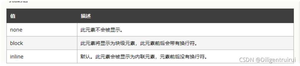
5.2 元素分类
块级元素
独占一行,可以设置宽和高
div p hn 等
内联元素
不会自动换行,设置宽和高的时候是不起作用的
span a等
块级元素和内联元素可以进行相互转换:
display
<!DOCTYPE html>
<html lang="en">
<head>
<meta charset="UTF-8">
 <title>块级元素和内联元素</title>
<style type="text/css">
 .box{
width: 200px;
 height: 200px;
 border: 1px solid black;
 background-color: blue;
 display: inline;
}
.box1{
width: 200px;
 height: 200px;
 border: 1px solid black;
background-color: red;
}
.box2{width: 200px;
 height: 200px;
 border: 1px solid black;
 background-color: yellow;
}
a{ width: 200px;
height: 200px;
display: block;
}
 </style>
 </head>
 <body>
  <div class="box">这是第一个div</div>
  <div class="box1">这是第二个div</div>
  <div class="box2">这是第三个div</div>
 <a href="#">这是一个a标签
</a>
 <a href="#">这是一个a标签</a>
 <a href="#">这是一个a标签</a>
 </body>
 </html>
注意:css隐藏元素的方式:
display:none;
width:0 height:0
5.3 浮动布局
通过设置float属性进行布局
none ----- 不浮动
left -------- 对象向左浮动,而后面的内容会流向对象的右侧
right--------------- 对象向右浮动,而后面的内容会流向对象的左侧
清除浮动:
clear

5.4 定位布局
属性:position -------- 定位方式
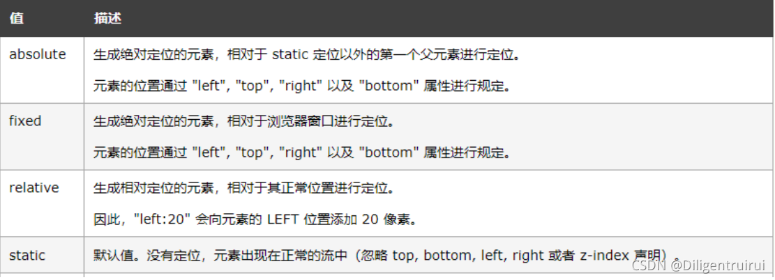
static : 默认值
absolute: 绝对定位,会将对象从文档流中分离出来,通过设置Left right top bottom 四个方向上的
值相较于父级元素的绝对定位,如果不存在这样的父级元素,相较于body
relative: 相对定位,不会将对象从文档流中分离出来,通过设置Left right top bottom 四个方向上
的值进行相对定位
<!DOCTYPE html>
 <html lang="en">
<head>
<meta charset="UTF-8">
 <title>定位</title>
 <style type="text/css">
 *{ padding: 0; margin: 0; }
.main{width: 300px;
 height: 300px;
 border:1px solid black;
margin: 200px;
 position: relative;
 }
.one{
width: 100px;
 height: 100px;
 background-color: red;
 position: absolute;
top: 100px;
 left: 200px;
 }
.two{
width: 100px;
 height: 100px;
 background-color: blue;
}
.three{
width: 100px;
height: 100px;
 background-color: yellow;
 }
</style>
 </head>
<body>
<div class="main">
<div class="one">这是第一个div</div>
<div class="two">这是第一个div</div>
 <div class="three">这是第一个div</div>
</div>
</body>
 </html>
5.5 其他的属性
5.5.1 overflow

<!DOCTYPE html>
 <html lang="en">
 <head>
  <meta charset="UTF-8">
  <title>overflow</title>
  <style type="text/css">
  #main{
  height: 400px;
  width: 300px;
  border: 1px solid black;
  overflow: scroll;
  }
</style>
 </head>
 <body><div id="main">
<img src="哆啦A梦.jpg">
 </div>
</body>
 </html>
3种隐藏元素的方式:
1、display:none
2、width:0 height:0
3、overflow:hidden
5.5.2 zoom
对图片进行放大和缩小的一个属性,一般取1或者100%的时候是按照原比例显示的
<!DOCTYPE html> <html lang="en">
 <head>
<meta charset="UTF-8">
 <title>overflow</title>
 <style type="text/css">
 #main{
height: 1000px;
 width: 1000px;
 /*border: 1px solid black;
 overflow: scroll;*/
}
img{
zoom:0.5;
 }
</style>
 </head>
 <body><div id="main">
 <img src="哆啦A梦.jpg">
 </div>
</body>
 </html>
5.6 css3 弹性盒子
display:flex; --------- 弹性盒子
主要的属性:
flex-direction:弹性盒子中子元素的排列方式
flex-wrap:设置子元素超过父元素后是否自动换行
flex-flow:flex-direction和flex-wrap的简写
align-items:设置弹性盒子在侧轴(纵轴)上的对齐方式
align-content:对flex-wrap的一个修改,和align-items相似,但不是设置对齐方式
justify-content:设置弹性盒子在横轴(主轴)上的对齐方式
5.6.1 flex-direction

<!DOCTYPE html>
<html lang="en">
 <head><meta charset="UTF-8">
 <title>弹性盒子</title>
<style type="text/css">
.flex-container{
 width: 400px;
 height: 250px;
 background-color: lightgrey;
 display: flex;
 flex-direction:column-reverse;
}
.flex-item{
width: 100px;
 height: 100px;
 background-color: red;
 margin: 10px;
} </style>
 </head>
 <body>
<div class="flex-container">
 <div class="flex-item">弹性盒子1</div>
<div class="flex-item">弹性盒子2</div>
 <div class="flex-item">弹性盒子3</div>
 </div>
 </body>
</html>
5.6.2 flex-wrap

<!DOCTYPE html> <html lang="en">
 <head><meta charset="UTF-8">
 <title>弹性盒子</title>
 <style type="text/css">
 .flex-container{
width: 400px;
 height: 250px;
 background-color: lightgrey;
 display: flex; flex-wrap:wrap-reverse;
 /* margin-top: 400px;*/
}
.flex-item{
 width: 100px;
 height: 100px;
background-color: red;
 margin: 10px;
}
</style>
</head>
 <body>
 <div class="flex-container">
 <div class="flex-item">弹性盒子1</div>
 <div class="flex-item">弹性盒子2</div>
 <div class="flex-item">弹性盒子3</div>
 <div class="flex-item">弹性盒子4</div>
 <div class="flex-item">弹性盒子5</div>
 <div class="flex-item">弹性盒子6</div>
 <div class="flex-item">弹性盒子7</div>
 <div class="flex-item">弹性盒子8</div>
 <div class="flex-item">弹性盒子9</div>
 </div>
</body>
 </html>
5.6.3 flex-flow
<!DOCTYPE html>
<html lang="en">
 <head>
<meta charset="UTF-8">
<title>弹性盒子</title>
<style type="text/css">
 .flex-container{
 width: 400px;
height: 250px;
 background-color: lightgrey;
 display: flex;
/* flex-direction:row-reverse;
 flex-wrap:wrap; */
 flex-flow:row-reverse wrap;
 /* margin-top: 400px;*/
}
.flex-item{
 width: 100px;
 height: 100px;
 background-color: red;
 margin: 10px;
 }
</style>
</head>
<body>
<div class="flex-container">
 <div class="flex-item">弹性盒子1</div>
 <div class="flex-item">弹性盒子2</div>
 <div class="flex-item">弹性盒子3</div>
 <div class="flex-item">弹性盒子4</div>
 <div class="flex-item">弹性盒子5</div>
 <div class="flex-item">弹性盒子6</div>
 <div class="flex-item">弹性盒子7</div>
 <div class="flex-item">弹性盒子8</div>
 <div class="flex-item">弹性盒子9</div>
 </div>
</body>
 </html>
5.6.4 align-items

5.6.5 align-content

5.6.6 justify-content

扩展:
order------可以改变子元素的顺序
flex - grow :规定在相同的容器中,项目相对于其余弹性项目的增长量
flex-shrink :固定在相同的容器中,项目相对于其余弹性项目的收缩量
flex-basis :规定弹性项目的初始长度
flex:flex - grow、flex-shrink、flex-basis
align-self :指定弹性容器内所选项目的对齐方式


 扫一扫
扫一扫


 776
776

 被折叠的 条评论
为什么被折叠?
被折叠的 条评论
为什么被折叠?
 到【灌水乐园】发言


