


 本文介绍了Python中用于绘图的Matplotlib库,可将数据可视化以利分析。阐述了引入pyplot模块的方法,讲解了绘制与编辑图像的操作,包括plot、Figure窗口、Axes等,还介绍了图像性质、轴的设置、Annotation标注,最后列举了散点图、折线图等多种图像种类。
Matplotlib库
Matplotib库类似matlab,是Python中用于绘图的库,可以根据给定数据绘制出各种图表、函数动画等,将数据可视化更有利于对数据进行系统的分析。
引入Matplotlib库pyplot模块
import matplotlib.pyplot as plt
后使用时简称为plt
绘制与编辑图像
plot以及Figure窗口
在plt模块里,我们可以直接用plot绘制出图像 (同时引用numpy库)
import numpy as np
p=np.pi
x=np.arange(0, 2*p, 0.001)
y=np.sin(x)
plt.plot(x,y)
plt.show()                    #输出图像的执行语句
这样我们就得到了sin函数的部分图像,x的范围则是我们定义的0到2派;输出图像的是Figure窗口,如图可对图像视图进行操作

可以对坐标轴可以进行更改,更改他们的初始单位长度,并给予他们名字; 同时可以增加标题:
p=np.pi
x=np.arange(0, 2*p, 0.001)
y=np.sin(x)
plt.plot(x,y)
plt.title('sin x')			#添加标题
plt.xlabel('x')
plt.ylabel('y')				#设置x、y轴名字
plt.xlim(-2*p,2*p)
plt.ylim(-2,2)				#设置x、y的初始单位长度以及区间
plt.show()

使用 plt.xticks(数组),plt.yticks(数组) 可以对x、y坐标轴显示的初始值
p=np.pi
x=np.arange(0, 2*p, 0.001)
y=np.sin(x)
plt.plot(x,y)
plt.show()

p=np.pi
n=np.linspace(0,6,4)
x=np.arange(0, 2*p, 0.001)
y=np.sin(x)
plt.xticks(n)
plt.plot(x,y)
plt.show()

p=np.pi
x=np.arange(0, 2*p, 0.001)
y=np.sin(x)
plt.xticks([0,2,4,6],
           ['A','L','WAN','SUI'])	#对坐标值进行替换
plt.plot(x,y)
plt.show()


x坐标轴显示的初始值发生了改变
Axes
对于 plot,写入坐标轴需要分别写入;而 Axes 使用 set 可以直接在一行语句中写入需要更改的东西,而且使用 plt.plot 的作画方式只适合简单的绘图,快速的将图绘出。在处理复杂的绘图工作时,我们还是需要使用 Axes 来完成作画的。
fig=plt.figure()					#插入“画布”
ax=fig.add_subplot(111)				#这里的‘111’表示:在画板的第1行第1列的第一个位置生成一个Axes对象来准备作画
p=np.pi
x=np.arange(0, 2*p, 0.001)
y=np.sin(x)
ax.set(xlabel='x',ylabel='y',xlim=[-2*p,2*p],ylim=[-2,2],title='sin x')
ax.plot(x,y)
plt.show()
效果同上
对于现实的数据分析,画出一个图是不够的,所以会在一个画布中同时生成多个Axes对象,便于进行对比分析
fig = plt.figure()
ax1 = fig.add_subplot(221)
ax2 = fig.add_subplot(222)
ax3 = fig.add_subplot(224)
plt.show()

图像性质与legend图示
便于进行对比分析,通常也会把两个图像放在同一个axe里,我们需要区分图线,并且设置legend图示:
ax_1=fig.add_subplot(111)
x=np.arange(0.1, 5, 0.001)
y_1 = x**3
y_2 = x**(-1)
ax_1.set(xlim=(0,5), ylim=(0,10))
l1, = ax_1.plot(x,y_1,label='^3')
l2, = ax_1.plot(x,y_2,label='^-1',color='red')
plt.legend(handles=[l1,l2,]) 		#设置图示
plt.show()

- 代码中 l1, 与 l2, 中的 “ , ” 一定要加!否则会报错。
- label参数用来定义函数图线的名字
- color参数用来设置图线的颜色,另外
- linestyle参数可以设置函数图线的线种类 (有:“-”(实线),“–”(划虚线),“:” (点虚线) )
- linewidth参数可以设置图线的粗细
轴
改变轴的位置,交点的位置,去掉边框,使图像更加像一个数学函数图像
ax = plt.gca()
ax.spines['top'].set_visible(False)     #顶边界不可见
ax.xaxis.set_ticks_position('bottom')   #ticks的位置为下方,分上下的。
ax.spines['right'].set_visible(False)   #右边界不可见
ax.yaxis.set_ticks_position('left')
ax.spines['bottom'].set_position(('data',0))
ax.spines['left'].set_position(('data',0))
plt.show()

Annotation标注
从函数上的某一点标注出虚线指到坐标轴,可以这样
fig=plt.figure()
ax=fig.add_subplot(111)
x=np.arange(0.1, 5, 0.001)
y = x**3
x0=1
y0=x0**3
ax.set(xlim=(0,5), ylim=(0,10))
ax.plot(x,y,label='^3')
ax.plot([x0,x0],[0,y0],linestyle='--',color='k')
ax.plot([0,x0],[y0,y0],linestyle='--',color='k')
plt.show()

使用annotate来标注图像的特征点
ax.annotate('?',xy=(x0,y0),xytext=(2,0.5),fontsize=16,
            arrowprops=dict(arrowstyle='->',connectionstyle='arc3,rad=0.2',color='blue'))
#第一个‘?’,表示了想要返回的描述文本
#xy=(,)表示了箭头指向的终点
#xytext=(,)表示了返回的描述文本的起始点
#arrowprops是箭头的相关参数字典
plt.show()

以下来自原文:Matplotlib 中文用户指南 4.5 标注_布客飞龙的博客-优快云博客
arrowprops参数
arrowprops键 | 描述 |
|---|---|
width | 箭头宽度,以点为单位 |
frac | 箭头头部所占据的比例 |
headwidth | 箭头的底部的宽度,以点为单位 |
shrink | 移动提示,并使其离注释点和文本一些距离 |
**kwargs | matplotlib.patches.Polygon的任何键,例如facecolor |
connectionstyle键 (决定连接的线的路径)
| 名称 | 属性 |
|---|---|
| angle | angleA=90,angleB=0,rad=0.0 |
| angle3 | angleA=90,angleB=0 |
| arc | angleA=0,angleB=0,armA=None,armB=None,rad=0.0 |
| arc3 | rad=0.0 |
| bar | armA=0.0,armB=0.0,fraction=0.3,angle=None |

箭头补丁,arrowstyle
| 名称 | 属性 |
|---|---|
| - | None |
| -> | head_length=0.4,head_width=0.2 |
| -[ | widthB=1.0,lengthB=0.2,angleB=None |
| |-| | widthA=1.0,widthB=1.0 |
| -|> | head_length=0.4,head_width=0.2 |
| <- | head_length=0.4,head_width=0.2 |
| <-> | head_length=0.4,head_width=0.2 |
| <|- | head_length=0.4,head_width=0.2 |
| < | -|> |
| fancy | head_length=0.4,head_width=0.4,tail_width=0.4 |
| simple | head_length=0.5,head_width=0.5,tail_width=0.2 |
| wedge | tail_width=0.3,shrink_factor=0.5 |

图像种类
散点图
用 scatter 函数,可以看出数据的分布、密集程度
x = np.arange(10)
y = np.random.randn(10)
plt.scatter(x, y, marker='+')
plt.show()

散点图可以升级为 泡泡图
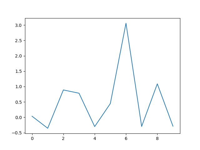
折线图
折线图可以看出数据的变化
fig=plt.figure()
ax=fig.add_subplot(111)
x=np.arange(0,10)
y=np.random.randn(10)
ax.plot(x,y)
plt.show()
通过grid函数,添加网格,让数据更明显
fig=plt.figure()
ax=fig.add_subplot(111)
x=np.arange(0,10)
y=np.random.randn(10)
plt.grid()
ax.plot(x,y)
plt.show()

柱状图
使用bar,来绘制出柱状图
fig=plt.figure()
ax=fig.add_subplot(111)
x=np.arange(5)
y1=np.random.uniform(0.5,1.0,5)
y2=np.random.uniform(0.5,1.0,5)
ax.bar(x,y1,facecolor='pink',edgecolor='white')
ax.bar(x,-y2,facecolor='c',edgecolor='white')
plt.show()

下进行优化
fig=plt.figure()
ax=fig.add_subplot(111)
x1=np.arange(5)
y1=np.random.uniform(0.5,1.0,5)
y2=np.random.uniform(0.5,1.0,5)
ax.set(xlim=(-1,5),ylim=(-2,2))
ax.bar(x1,y1,facecolor='pink',edgecolor='white')
ax.bar(x1,-y2,facecolor='c',edgecolor='white')

for x,y in zip(x1,y1):
    ax.text(x,y+0.05,'%.2f'%y,ha='center')
for x,y in zip(x1,y2):
    ax.text(x,-y-0.1,'%.2f'%y,ha='center')

plt.show()

通过 barh,我们可以画出水平的柱状图
fig,ax=plt.subplots(ncols=2,figsize=plt.figaspect(1/2))   		#设置两个axes,一个占整个fig的二分之一
x=np.arange(5)
y1=np.random.uniform(0.5,1.0,5)
y2=np.random.uniform(0.5,1.0,5)
ax[0].bar(x,y1,facecolor='pink',edgecolor='white')
ax[1].barh(x,-y2,facecolor='c',edgecolor='white')
plt.show()

饼图
labels='A','B','C','D'
score=[10,30,40,20]
fig=plt.figure()
ax=fig.add_subplot(111)
ax.pie(score,labels=labels,autopct='%1.1f%%',shadow=True)	#autopct是标在饼上的百分比;shadow是阴影,默认False
plt.show()

对其进行美化
labels='A','B','C','D'
score=[10,30,40,20]
explode = (0.1, 0, 0, 0)
fig=plt.figure()
ax=fig.add_subplot(111)
ax.pie(score,autopct='%1.1f%%',shadow=True,explode=explode,pctdistance=1.2)   #explode是突出哪一块,pctdistance是设定autopct距离饼图圆心的距离
ax.legend(labels=labels,loc='best')
plt.show()

热力图
通过对色块着色来显示数据的统计图表,每个色块表示数据的大小
可以将一个二维数组输入到imshow函数来绘制出一个热力图
points=np.random.randn(100).reshape(10,10)
plt.imshow(points)
plt.tight_layout()
plt.colorbar() #添加数值和颜色的对应规则图示
plt.show()

通过tick也是可以更改坐标数值的
(x _ x)好多制图类型好多参数呜(x _ x)


 569
569


 被折叠的 条评论
为什么被折叠?
被折叠的 条评论
为什么被折叠?
 到【灌水乐园】发言


