


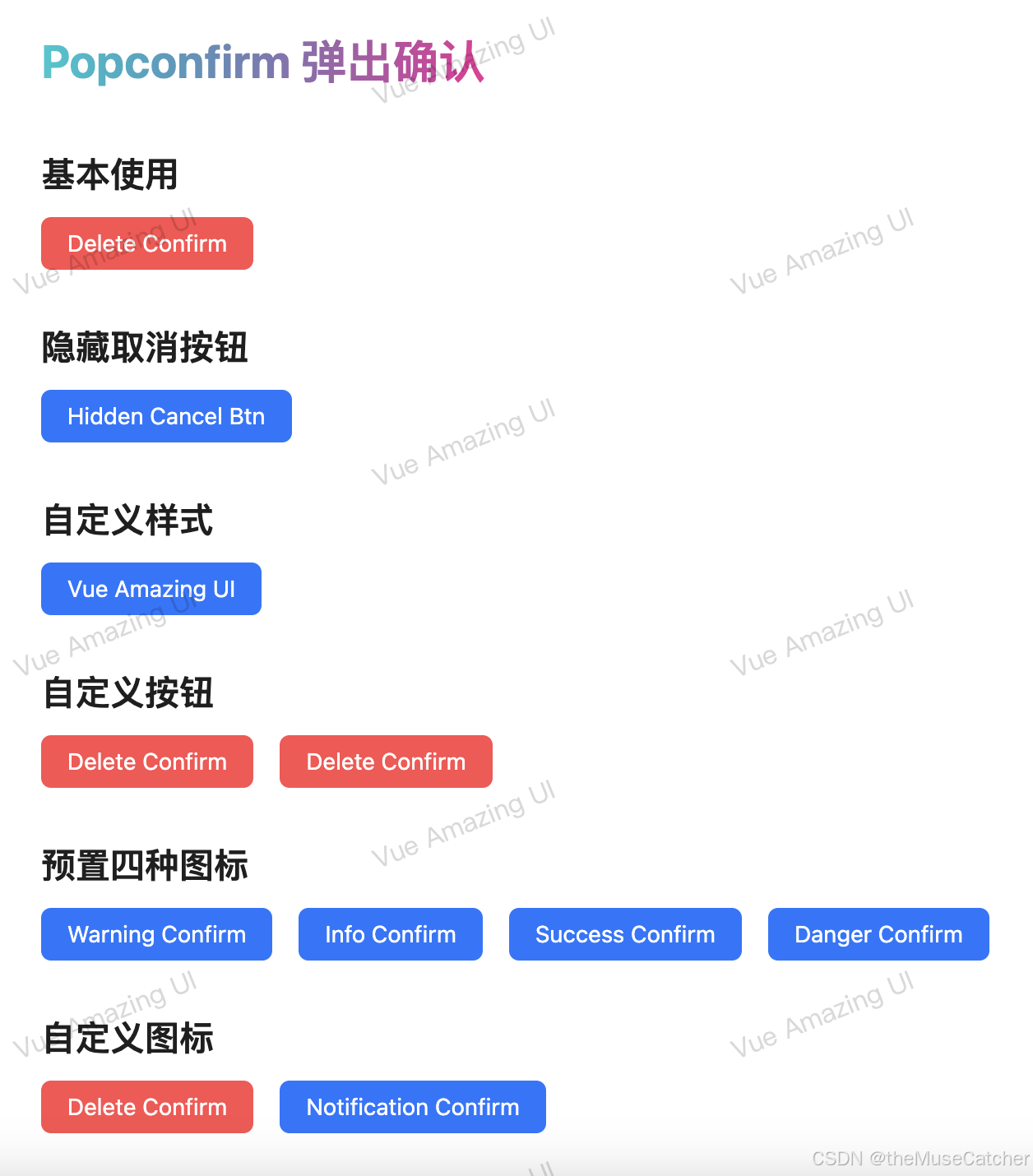
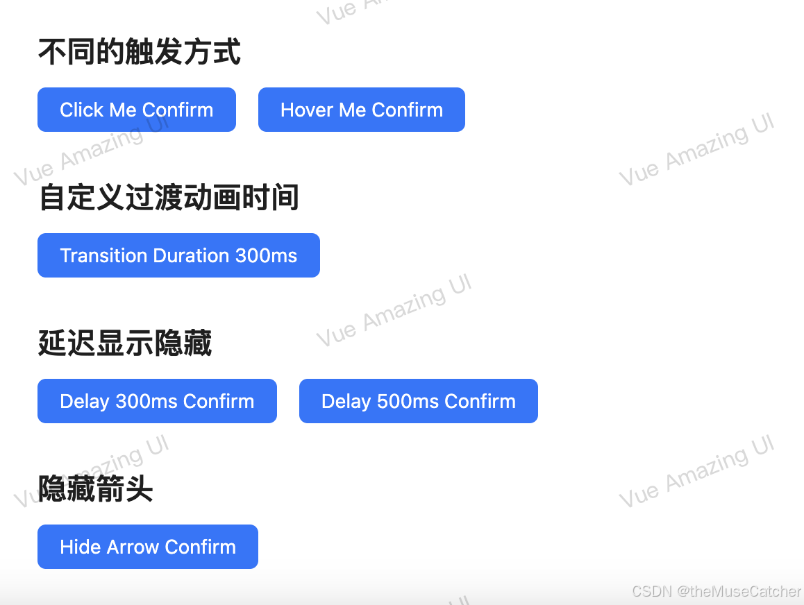
效果如下图:
在线预览
APIs
Popconfirm
| 参数 | 说明 | 类型 | 默认值 |
|---|---|---|---|
| title | 弹出确认框的标题 | string | slot | undefined |
| titleStyle | 设置标题的样式 | CSSProperties | {} |
| description | 弹出确认框的内容描述 | string | slot | undefined |
| descriptionStyle | 设置内容描述的样式 | CSSProperties | {} |
| keyboard | 是否支持按键操作 (enter 显示;esc 关闭) | boolean | true |
| tooltipStyle | 设置弹出提示的样式 | CSSProperties | {} |
| icon | 自定义弹出确认框 Icon 图标 | ‘success’ | ‘info’ | ‘warning’ | ‘danger’ | VNode | Slot | ‘warning’ |
| iconStyle | 设置 Icon 图标的样式,一般不需要设置,主要用于自定义 Icon 图标时 | CSSProperties | {} |
| cancelText | 取消按钮文字 | string | slot | ‘取消’ |
| cancelType | 取消按钮类型 | ‘default’ | ‘reverse’ | ‘primary’ | ‘danger’ | ‘dashed’ | ‘text’ | ‘link’ | ‘default’ |
| cancelProps | 取消按钮 props,优先级高于 cancelType,参考 Button Props | object | {} |
| okText | 确认按钮文字 | string | slot | ‘确定’ |
| okType | 确认按钮类型 | ‘default’ | ‘reverse’ | ‘primary’ | ‘danger’ | ‘dashed’ | ‘text’ | ‘link’ | ‘primary’ |
| okProps | 确认按钮 props,优先级高于 okType,参考 Button Props | object | {} |
| showCancel | 是否显示取消按钮 | boolean | true |
更多属性请参考 Tooltip
Slots
| 名称 | 说明 | 类型 |
|---|---|---|
| title | 自定义弹出确认框的标题 | v-slot:title |
| description | 自定义弹出确认框的内容描述 | v-slot:description |
| icon | 自定义图标 | v-slot:icon |
| cancelText | 自定义取消按钮文字 | v-slot:cancelText |
| okText | 自定义确认按钮文字 | v-slot:okText |
| default | 自定义内容 | v-solt:default |
Events
| 名称 | 说明 | 类型 |
|---|---|---|
| cancel | 点击取消的回调 | (e: Event) => void |
| ok | 点击确认的回调 | (e: Event) => void |
| openChange | 显示隐藏的回调 | (open: boolean) => void |
创建弹出确认组件Popconfirm.vue
其中引入使用了以下工具函数:
<script setup lang="ts">
import { ref, computed } from 'vue'
import type { CSSProperties, VNode, Slot } from 'vue'
import Tooltip from 'components/tooltip'
import Button from 'components/button'
import { useSlotsExist, useInject } from 'components/utils'
export interface Props {
  title?: string // 弹出确认框的标题 string | slot
  titleStyle?: CSSProperties // 设置标题的样式
  description?: string // 弹出确认框的内容描述 string | slot
  descriptionStyle?: CSSProperties // 设置内容描述的样式
  keyboard?: boolean // 是否支持按键操作 (enter 显示;esc 关闭)
  tooltipStyle?: CSSProperties // 设置弹出提示的样式
  icon?: 'success' | 'info' | 'warning' | 'danger' | VNode | Slot // 自定义 Icon 图标,预置四种类型图标 string | VNode | slot
  iconStyle?: CSSProperties // 设置 Icon 图标的样式,一般不需要设置,主要用于自定义 Icon 图标时
  cancelText?: string // 取消按钮文字 string | slot
  cancelType?: 'default' | 'reverse' | 'primary' | 'danger' | 'dashed' | 'text' | 'link' // 取消按钮类型
  cancelProps?: object // 取消按钮 props,优先级高于 cancelType,参考 Button 组件 props
  okText?: string // 确认按钮文字 string | slot
  okType?: 'default' | 'reverse' | 'primary' | 'danger' | 'dashed' | 'text' | 'link' // 确认按钮类型
  okProps?: object // 确认按钮 props,优先级高于 okType,参考 Button 组件 props
  showCancel?: boolean // 是否显示取消按钮
}
const props = withDefaults(defineProps<Props>(), {
  title: undefined,
  titleStyle: () => ({}),
  description: undefined,
  descriptionStyle: () => ({}),
  keyboard: true,
  tooltipStyle: () => ({}),
  icon: 'warning',
  iconStyle: () => ({}),
  cancelText: '取消',
  cancelType: 'default',
  cancelProps: () => ({}),
  okText: '确定',
  okType: 'primary',
  okProps: () => ({}),
  showCancel: true
})
const tooltipRef = ref() // Tooltip 组件模板引用
const { colorPalettes } = useInject('Popconfirm') // 主题色注入
const emits = defineEmits(['cancel', 'ok'])
const slotsExist = useSlotsExist(['description'])
const showDesc = computed(() => {
  return slotsExist.description || props.description
})
function onCancel(e: Event): void {
  emits('cancel', e)
  tooltipRef.value.hide()
}
function onOk(e: Event): void {
  emits('ok', e)
  tooltipRef.value.hide()
}
</script>
<template>
  <Tooltip
    ref="tooltipRef"
    max-width="auto"
    bg-color="#fff"
    :tooltip-style="{
      padding: '12px',
      borderRadius: '8px',
      textAlign: 'start',
      ...tooltipStyle
    }"
    trigger="click"
    :keyboard="keyboard"
    :transition-duration="200"
    :style="`
      --popconfirm-primary-color: ${colorPalettes[5]};
      --popconfirm-success-color: #52c41a;
      --popconfirm-danger-color: #ff4d4f;
      --popconfirm-warning-color: #faad14;
    `"
    v-bind="$attrs"
  >
    <template #tooltip>
      <div class="popconfirm-wrap">
        <span class="popconfirm-icon" :style="iconStyle">
          <slot name="icon">
            <svg
              v-if="icon === 'info'"
              class="icon-info"
              focusable="false"
              width="1em"
              height="1em"
              fill="currentColor"
              viewBox="64 64 896 896"
              data-icon="info-circle"
              aria-hidden="true"
            >
              <path
                d="M512 64C264.6 64 64 264.6 64 512s200.6 448 448 448 448-200.6 448-448S759.4 64 512 64zm32 664c0 4.4-3.6 8-8 8h-48c-4.4 0-8-3.6-8-8V456c0-4.4 3.6-8 8-8h48c4.4 0 8 3.6 8 8v272zm-32-344a48.01 48.01 0 0 1 0-96 48.01 48.01 0 0 1 0 96z"
              ></path>
            </svg>
            <svg
              v-else-if="icon === 'success'"
              class="icon-success"
              focusable="false"
              width="1em"
              height="1em"
              fill="currentColor"
              viewBox="64 64 896 896"
              data-icon="check-circle"
              aria-hidden="true"
            >
              <path
                d="M512 64C264.6 64 64 264.6 64 512s200.6 448 448 448 448-200.6 448-448S759.4 64 512 64zm193.5 301.7l-210.6 292a31.8 31.8 0 0 1-51.7 0L318.5 484.9c-3.8-5.3 0-12.7 6.5-12.7h46.9c10.2 0 19.9 4.9 25.9 13.3l71.2 98.8 157.2-218c6-8.3 15.6-13.3 25.9-13.3H699c6.5 0 10.3 7.4 6.5 12.7z"
              ></path>
            </svg>
            <svg
              v-else-if="icon === 'danger'"
              class="icon-danger"
              focusable="false"
              width="1em"
              height="1em"
              fill="currentColor"
              viewBox="64 64 896 896"
              data-icon="close-circle"
              aria-hidden="true"
            >
              <path
                d="M512 64C264.6 64 64 264.6 64 512s200.6 448 448 448 448-200.6 448-448S759.4 64 512 64zm165.4 618.2l-66-.3L512 563.4l-99.3 118.4-66.1.3c-4.4 0-8-3.5-8-8 0-1.9.7-3.7 1.9-5.2l130.1-155L340.5 359a8.32 8.32 0 0 1-1.9-5.2c0-4.4 3.6-8 8-8l66.1.3L512 464.6l99.3-118.4 66-.3c4.4 0 8 3.5 8 8 0 1.9-.7 3.7-1.9 5.2L553.5 514l130 155c1.2 1.5 1.9 3.3 1.9 5.2 0 4.4-3.6 8-8 8z"
              ></path>
            </svg>
            <svg
              v-else-if="icon === 'warning'"
              class="icon-warning"
              focusable="false"
              width="1em"
              height="1em"
              fill="currentColor"
              viewBox="64 64 896 896"
              data-icon="exclamation-circle"
              aria-hidden="true"
            >
              <path
                d="M512 64C264.6 64 64 264.6 64 512s200.6 448 448 448 448-200.6 448-448S759.4 64 512 64zm-32 232c0-4.4 3.6-8 8-8h48c4.4 0 8 3.6 8 8v272c0 4.4-3.6 8-8 8h-48c-4.4 0-8-3.6-8-8V296zm32 440a48.01 48.01 0 0 1 0-96 48.01 48.01 0 0 1 0 96z"
              ></path>
            </svg>
            <component v-else-if="icon" :is="icon" />
          </slot>
        </span>
        <div class="popconfirm-title" :class="{ 'title-font-weight': showDesc }" :style="titleStyle">
          <slot name="title">{{ title }}</slot>
        </div>
      </div>
      <div v-if="showDesc" class="popconfirm-description" :style="descriptionStyle">
        <slot name="description">{{ description }}</slot>
      </div>
      <div class="popconfirm-btns">
        <Button v-if="showCancel" size="small" :type="cancelType" @click="onCancel" v-bind="cancelProps">
          <slot name="cancelText">{{ cancelText }}</slot>
        </Button>
        <Button size="small" :type="okType" @click="onOk" v-bind="okProps">
          <slot name="okText">{{ okText }}</slot>
        </Button>
      </div>
    </template>
    <slot></slot>
  </Tooltip>
</template>
<style lang="less" scoped>
.popconfirm-wrap {
  position: relative;
  margin-bottom: 8px;
  font-size: 14px;
  color: rgba(0, 0, 0, 0.88);
  display: flex;
  flex-wrap: nowrap;
  align-items: start;
  .popconfirm-icon {
    flex: none;
    font-size: 14px;
    line-height: 1;
    padding-top: 4px;
    display: inline-block;
    text-align: center;
    .icon-svg {
      display: inline-block;
      fill: currentColor;
    }
    :deep(svg) {
      fill: currentColor;
    }
  }
  .icon-info {
    color: var(--popconfirm-primary-color);
  }
  .icon-success {
    color: var(--popconfirm-success-color);
  }
  .icon-danger {
    color: var(--popconfirm-danger-color);
  }
  .icon-warning {
    color: var(--popconfirm-warning-color);
  }
  .popconfirm-title {
    flex: auto;
    margin-left: 8px;
  }
  .title-font-weight {
    font-weight: 600;
  }
}
.popconfirm-description {
  position: relative;
  margin-left: 22px;
  margin-bottom: 8px;
  font-size: 14px;
  color: rgba(0, 0, 0, 0.88);
}
.popconfirm-btns {
  text-align: end;
  .m-btn {
    margin-left: 8px;
  }
}
</style>
在要使用的页面引入
其中引入使用了以下组件:
<script setup lang="ts">
import Popconfirm from './Popconfirm.vue'
import { ref, h } from 'vue'
import { FireFilled, QuestionCircleFilled, SoundFilled } from '@ant-design/icons-vue'
const message = ref()
const confirm = (e: MouseEvent) => {
  console.log('confirm', e)
  message.value.success('Click on Yes')
}
const cancel = (e: MouseEvent) => {
  console.log('cancel', e)
  message.value.error('Click on No')
}
const openChange = (open: boolean) => {
  console.log('open', open)
}
</script>
<template>
  <div>
    <h1>{{ $route.name }} {{ $route.meta.title }}</h1>
    <h2 class="mt30 mb10">基本使用</h2>
    <Popconfirm
      title="Are you sure delete this task ?"
      description="This will have other effects..."
      @ok="confirm"
      @cancel="cancel"
      @openChange="openChange"
    >
      <Button type="danger">Delete Confirm</Button>
    </Popconfirm>
    <h2 class="mt30 mb10">隐藏取消按钮</h2>
    <Popconfirm title="It's friendly reminder ..." :show-cancel="false" icon="info" @ok="confirm">
      <Button type="primary">Hidden Cancel Btn</Button>
    </Popconfirm>
    <h2 class="mt30 mb10">自定义样式</h2>
    <Popconfirm
      :max-width="280"
      :show-cancel="false"
      :title-style="{ fontSize: '16px', fontWeight: 'bold', color: '#1677ff' }"
      :description-style="{ color: '#fff' }"
      bg-color="#000"
      :tooltip-style="{ padding: '16px 18px', borderRadius: '12px' }"
      :icon-style="{ fontSize: '16px', paddingTop: '5px' }"
      ok-text="Awesome"
      :ok-props="{ shape: 'round' }"
      @ok="confirm"
      @cancel="cancel"
    >
      <template #title>
        <a href="https://themusecatcher.github.io/vue-amazing-ui/" target="_blank">Vue Amazing UI</a>
      </template>
      <template #description> An Amazing Vue3 UI Components Library </template>
      <template #icon>
        <FireFilled style="color: #d4380d" />
      </template>
      <Button type="primary">Vue Amazing UI</Button>
    </Popconfirm>
    <h2 class="mt30 mb10">自定义按钮</h2>
    <Space>
      <Popconfirm title="Are you sure ?" ok-text="Yes" cancel-text="No" @ok="confirm" @cancel="cancel">
        <Button type="danger">Delete Confirm</Button>
      </Popconfirm>
      <Popconfirm
        title="Are you sure ?"
        ok-text="Yes"
        :ok-props="{ ghost: true }"
        cancel-text="No"
        :cancel-props="{ type: 'danger', ghost: true }"
        @ok="confirm"
        @cancel="cancel"
      >
        <Button type="danger">Delete Confirm</Button>
      </Popconfirm>
    </Space>
    <h2 class="mt30 mb10">预置四种图标</h2>
    <Space>
      <Popconfirm title="Are you sure delete this task ?" @ok="confirm" @cancel="cancel">
        <Button type="primary">Warning Confirm</Button>
      </Popconfirm>
      <Popconfirm title="Are you sure delete this task ?" icon="info" @ok="confirm" @cancel="cancel">
        <Button type="primary">Info Confirm</Button>
      </Popconfirm>
      <Popconfirm title="Are you sure delete this task ?" icon="success" @ok="confirm" @cancel="cancel">
        <Button type="primary">Success Confirm</Button>
      </Popconfirm>
      <Popconfirm title="Are you sure delete this task ?" icon="danger" @ok="confirm" @cancel="cancel">
        <Button type="primary">Danger Confirm</Button>
      </Popconfirm>
    </Space>
    <h2 class="mt30 mb10">自定义图标</h2>
    <Space>
      <Popconfirm
        title="Are you sure ?"
        :icon="() => h(QuestionCircleFilled, { style: 'color: #ff4d4f' })"
        @ok="confirm"
        @cancel="cancel"
      >
        <Button type="danger">Delete Confirm</Button>
      </Popconfirm>
      <Popconfirm title="Are you sure ?" @ok="confirm" @cancel="cancel">
        <template #icon>
          <SoundFilled style="color: #faad14" />
        </template>
        <Button type="primary">Notification Confirm</Button>
      </Popconfirm>
    </Space>
    <h2 class="mt30 mb10">不同的触发方式</h2>
    <Space>
      <Popconfirm title="It's friendly reminder ..." @ok="confirm" @cancel="cancel">
        <Button type="primary">Click Me Confirm</Button>
      </Popconfirm>
      <Popconfirm title="It's friendly reminder ..." trigger="hover" @ok="confirm" @cancel="cancel">
        <Button type="primary">Hover Me Confirm</Button>
      </Popconfirm>
    </Space>
    <h2 class="mt30 mb10">自定义过渡动画时间</h2>
    <Popconfirm title="Transition Duration 300ms" :transition-duration="300" @ok="confirm" @cancel="cancel">
      <Button type="primary">Transition Duration 300ms</Button>
    </Popconfirm>
    <h2 class="mt30 mb10">延迟显示隐藏</h2>
    <Space>
      <Popconfirm
        :show-delay="300"
        :hide-delay="300"
        title="Are you confirm ?"
        description="delay 300ms"
        @ok="confirm"
        @cancel="cancel"
      >
        <Button type="primary">Delay 300ms Confirm</Button>
      </Popconfirm>
      <Popconfirm
        :show-delay="500"
        :hide-delay="500"
        title="Are you confirm ?"
        description="delay 500ms"
        @ok="confirm"
        @cancel="cancel"
      >
        <Button type="primary">Delay 500ms Confirm</Button>
      </Popconfirm>
    </Space>
    <h2 class="mt30 mb10">隐藏箭头</h2>
    <Popconfirm :arrow="false" title="My arrow is hidden" @ok="confirm" @cancel="cancel">
      <Button type="primary">Hide Arrow Confirm</Button>
    </Popconfirm>
    <Message ref="message" />
  </div>
</template>


 扫一扫
扫一扫


 1329
1329

 被折叠的 条评论
为什么被折叠?
被折叠的 条评论
为什么被折叠?
 到【灌水乐园】发言


