


 本文介绍如何使用Python的Matplotlib库绘制带有标签的分组条形图,并展示了如何为条形图添加数据标签,设置Y轴名称及图表标题。
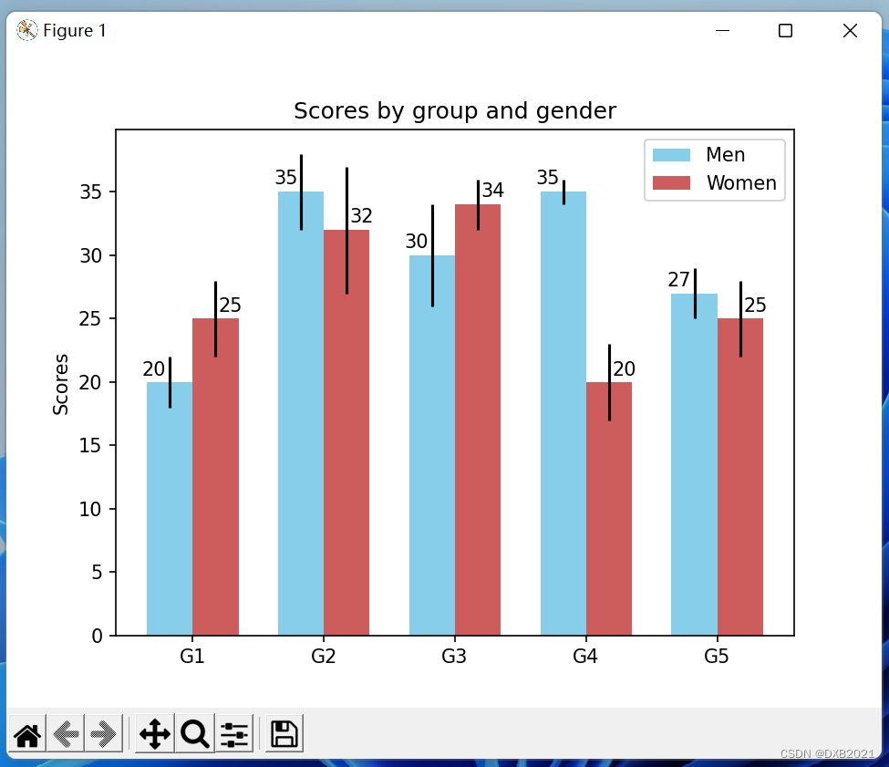
Grouped bar chart with labels条形图
import numpy as np
import matplotlib.pyplot as plt

men_means, men_std = (20, 35, 30, 35, 27), (2, 3, 4, 1, 2)
women_means, women_std = (25, 32, 34, 20, 25), (3, 5, 2, 3, 3)

ind = np.arange(len(men_means))  # the x locations for the groups
width = 0.35  # the width of the bars

fig, ax = plt.subplots()
rects1 = ax.bar(ind - width/2, men_means, width, yerr=men_std,
                color='SkyBlue', label='Men')
rects2 = ax.bar(ind + width/2, women_means, width, yerr=women_std,
                color='IndianRed', label='Women')

# Add some text for labels, title and custom x-axis tick labels, etc.
ax.set_ylabel('Scores')
ax.set_title('Scores by group and gender')
ax.set_xticks(ind)
ax.set_xticklabels(('G1', 'G2', 'G3', 'G4', 'G5'))
ax.legend()


def autolabel(rects, xpos='center'):
    """
    Attach a text label above each bar in *rects*, displaying its height.

    *xpos* indicates which side to place the text w.r.t. the center of
    the bar. It can be one of the following {'center', 'right', 'left'}.
    """

    xpos = xpos.lower()  # normalize the case of the parameter
    ha = {'center': 'center', 'right': 'left', 'left': 'right'}
    offset = {'center': 0.5, 'right': 0.57, 'left': 0.43}  # x_txt = x + w*off

    for rect in rects:
        height = rect.get_height()
        ax.text(rect.get_x() + rect.get_width()*offset[xpos], 1.01*height,
                '{}'.format(height), ha=ha[xpos], va='bottom')


autolabel(rects1, "left")
autolabel(rects2, "right")

plt.show()
set_ylabel是Y轴名称
set_title是标题名称


 689
689

 被折叠的 条评论
为什么被折叠?
被折叠的 条评论
为什么被折叠?
 到【灌水乐园】发言


