


 本文介绍了三种不同的方法来创建一个三栏布局,其中两边固定宽度,中间自适应。首先,通过CSS的Flexbox布局,设置了父元素为display:flex,并给左右子元素设定固定宽高,中间元素设置flex:1。其次,利用定位技术,通过设置父元素相对定位,左右子元素绝对定位并分别设置left和right属性。最后,通过块级格式化上下文(BFC),使左右浮动元素不影响中间元素,中间元素通过overflow:hidden自适应。这三种方法都是现代网页布局中常用的技术。
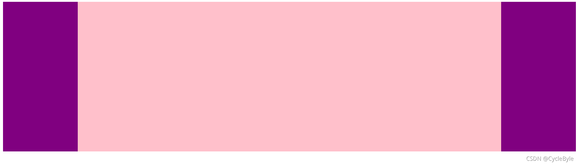
1.利用flex实现
1.父盒子设置 display:flex;
2.左右盒子设置固定宽高
3.中间盒子设置 flex:1 ;
<!DOCTYPE html>
<html>
	<head>
		<meta charset="utf-8">
		<title></title>
		<style type="text/css">
			.father {
				display: flex;
				height: 500%;
				background-color: hotpink;
			}
			.left,.right {
				width: 200px;
				height: 400px;
				background-color: purple;
			}
			.center {
				flex: 1;
				background-color: pink;
			}
		</style>
	</head>
	<body>
		<div class="father">
			<div class="left"></div>
			<div class="center"></div>
			<div class="right"></div>
		</div>
	</body>
</html>
结果如下:
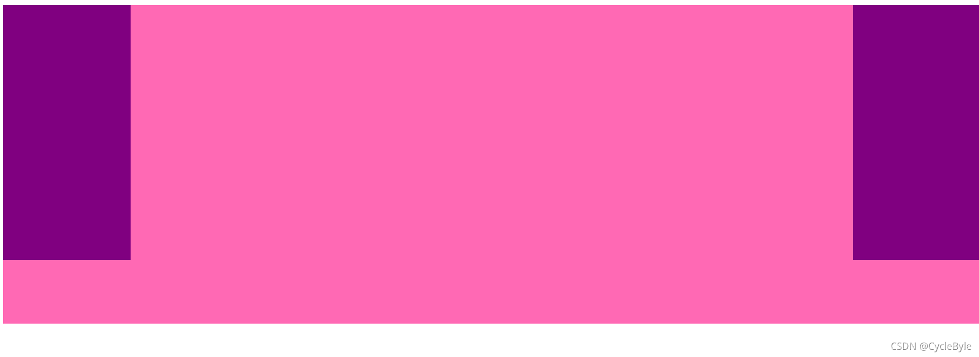
2.利用定位实现
1.父盒子设置左右 padding 值
2.给左右盒子的 width 设置父盒子的 padding 值,然后分别定位到 padding 处
3.中间盒子自适应
<!DOCTYPE html>
<html>
	<head>
		<meta charset="utf-8">
		<title></title>
		<style type="text/css">
			.father {
				position: relative;
				height: 500px;
				background-color: hotpink;
				padding: ;
			}
			.left,.right {
				position: absolute;
				width: 200px;
				height: 400px;
				background-color: purple;
				top: 0;
			}
			.left {
				left: 0;
			}
			.right {
				right: 0;
			}
			.center {
				background-color: pink;
			}
		</style>
	</head>
	<body>
		<div class="father">
			<div class="left"></div>
			<div class="center"></div>
			<div class="right"></div>
		</div>
	</body>
</html>
结果如下:
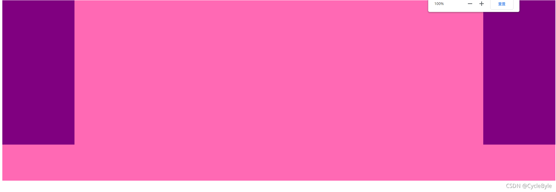
3.利用 bfc 块级格式化上下文, 实现两侧固定中间自适应
1.左右固定宽高,进行浮动
2.中间 overflow: hidden;
注意:这里的html结构中left和right必须放在center之前
<!DOCTYPE html>
<html>
	<head>
		<meta charset="utf-8">
		<title></title>
		<style type="text/css">
			.father {
				height: 500px;
				background-color: hotpink;
			}
			.left,.right {
				width: 200px;
				height: 400px;
				background-color: purple;
			}
			.left {
				float: left;
			}
			.right {
				float: right;
			}
			.center {
				overflow: hidden;
				background-color: pink;
			}
		</style>
	</head>
	<body>
		<div class="father">
			<div class="left"></div>
			<div class="right"></div>
			<div class="center"></div>
		</div>
	</body>
</html>
结果如下:


 扫一扫
扫一扫


 344
344

 被折叠的 条评论
为什么被折叠?
被折叠的 条评论
为什么被折叠?
 到【灌水乐园】发言


