<!DOCTYPE html>
<html lang="en">
<head>
<meta charset="UTF-8">
<meta name="viewport" content="width=device-width, initial-scale=1.0">
<meta http-equiv="X-UA-Compatible" content="ie=edge">
<title>Document</title>
<style>
.cont {
width: 500px;
height: 200px;
background: linear-gradient(#78C9DC 70%, #0acfff 0%);
/*线性渐变*/
background-size: 100% 20px;
/*指定背景图片的大小*/
}
.cont1 {
width: 500px;
height: 200px;
background: linear-gradient(to top right, #1E90FF 50%, #98FB98 50%);
background-size: 30px 30px;
}
.cont2 {
width: 500px;
height: 200px;
background: linear-gradient(-45deg, #0acf00 50%, #78C9DB 50%);
background-size: 30px 100%;
}
.cont3 {
width: 500px;
height: 200px;
background: repeating-linear-gradient(-45deg, #ADFF2F, #ADFF2F 15px, #D2691E 0, #D2691E 30px);
/*重复的线性渐变
第一个值为定义渐变的角度方向。从0到360 默认180
*/
background-size: 30px 30px;
}
.cont4 {
width: 500px;
height: 200px;
background: #fff repeating-linear-gradient(30deg, rgba(0, 0, 0, .5), rgba(0, 0, 0, .5)15px, transparent 0, transparent 30px);
}
.cont5 {
width: 500px;
height: 200px;
background: #fff;
background: linear-gradient(90deg, rgba(100, 0, 0, .5) 50%, transparent 0), linear-gradient(rgba(100, 0, 0, .5) 50%, transparent 0);
background-size: 30px 30px;
}
.cont6 {
width: 500px;
height: 200px;
background: #C71585;
background-image: radial-gradient(#fff 30%, transparent 0), radial-gradient(#fff 30%, transparent 0);
/*径向渐变*/
background-size: 20px 20px;
background-position: 0 0, 10px 10px;
/*必须是background-size尺寸的1/2 */
}
.cont7 {
width: 500px;
height: 200px;
background: #fff;
background-image: linear-gradient(45deg, #FF7F50 26%, transparent 0, transparent 75%, #FF7F50 0), linear-gradient(45deg, #FF7F50 26%, transparent 0, transparent 75%, #FF7F50 0);
background-size: 30px 30px;
background-position: 0 0, 15px 15px;
}
</style>
</head>
<body>
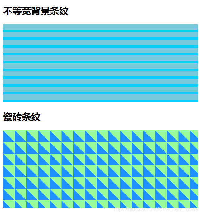
<h2>不等宽背景条纹</h2>
<div class="cont"></div>
<h2>瓷砖条纹</h2>
<div class="cont1"></div>
<h2>草地</h2>
<div class="cont2"> </div>
<h2>斜条纹</h2>
<div class="cont3"> </div>
<h2>单色斜条纹</h2>
<div class="cont4"></div>
<h2>格子衫条纹</h2>
<div class="cont5"></div>
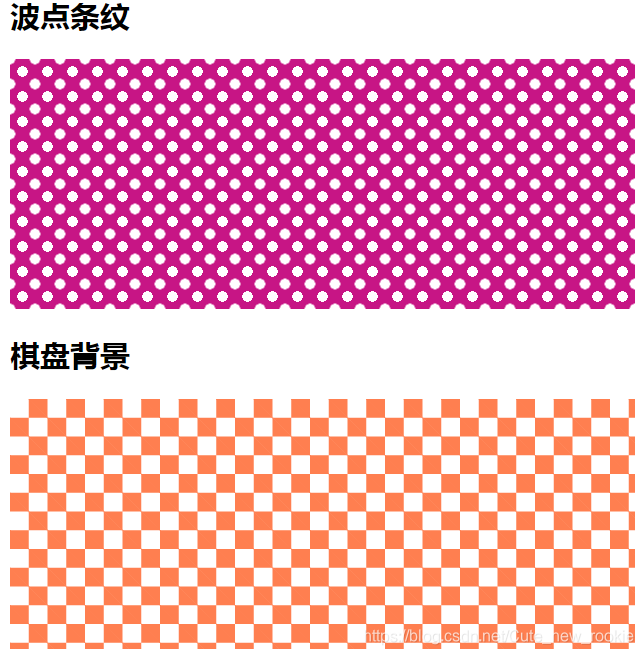
<h2>波点条纹</h2>
<div class="cont6"></div>
<h2>棋盘背景</h2>
<div class="cont7"></div>
</body>
</html>


 扫一扫
扫一扫


 被折叠的 条评论
为什么被折叠?
被折叠的 条评论
为什么被折叠?
 到【灌水乐园】发言


