


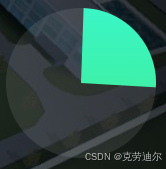
1. 利用conic-gradient 圆锥渐变
   <div class="progress" ></div>
   <style>
    .progress{
      height: 170px;
      width: 170px;
      border-radius: 50%;
      background: conic-gradient(
        rgb(25, 252, 236) 36deg,
        rgba(255, 255, 255, 0.1) 36deg 170deg
      );
    }
    </style>
2.中间加一遮罩层
   <div class="progress" >
        <div class="pie"></div>
  </div>
<style>
   .progress{
      height: 170px;
      width: 170px;
      border-radius: 50%;
      background: conic-gradient(
        rgb(25, 252, 236) 36deg,
        rgba(255, 255, 255, 0.1) 36deg 170deg
      );
      display: flex;
      justify-content: center;
      align-items: center;
    }
    .pie {
        height: 145px;
        width: 145px;
        background-color: rgb(12, 41, 76);
        border-radius: 50%;
    }
</style>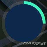
3.添加动画转动效果
   <div class="progress" >
        <div class="pie"></div>
  </div>
  <style>
   @keyframes rotate {
    0% {
        transform:rotate(0deg);
    }
    25% {
        /* 基于x,y轴   (-300px) 正值向下移动 负值向上移动*/
        transform:rotate(90deg);
    }
    50% {
        transform:rotate(180deg);
    }
    75% {
        transform:rotate(270deg);
    }
    100% {
        transform:rotate(360deg);
    }
   }
   .progress{
      height: 170px;
      width: 170px;
      border-radius: 50%;
      background: conic-gradient(
        rgb(25, 252, 236) 36deg,
        rgba(255, 255, 255, 0.1) 36deg 170deg
      );
      display: flex;
      justify-content: center;
      align-items: center;
      animation-name: rotate;
      /* 关键帧动画需要的时长 */
      animation-duration: 3s;
      /* 指定关键帧动画执行的次数  infinite 无限次数*/
      animation-iteration-count: infinite;
      /* 动画执行函数  */
      animation-timing-function: linear;
    }
    .pie {
        height: 145px;
        width: 145px;
        background-color: rgb(12, 41, 76);
        border-radius: 50%;
    }
  </style>
最终效果:

动态样式:
 <div
   class="progress"
   :style="{
      background:`conic-gradient(rgb(25, 252, 236)${graditentLeft}deg,
               rgba(255, 255, 255, 0.1) ${graditentLeft}deg 360deg)` }">
<div class="pie"></div>
</div>

  data() {
    return {
      graditentLeft: 360 * 0.25,
      graditentRight: 360 * 0.75,
    };
  },


 扫一扫
扫一扫


 306
306

 被折叠的 条评论
为什么被折叠?
被折叠的 条评论
为什么被折叠?
 到【灌水乐园】发言


