


 本文通过CSS3实现了一个动态效果,展示了一个包含两层文字的盒子,当鼠标悬停时,文字会以3D翻转的形式旋转。使用了`transform-style: preserve-3d`来保留立体空间,`rotateX`控制了翻转角度。
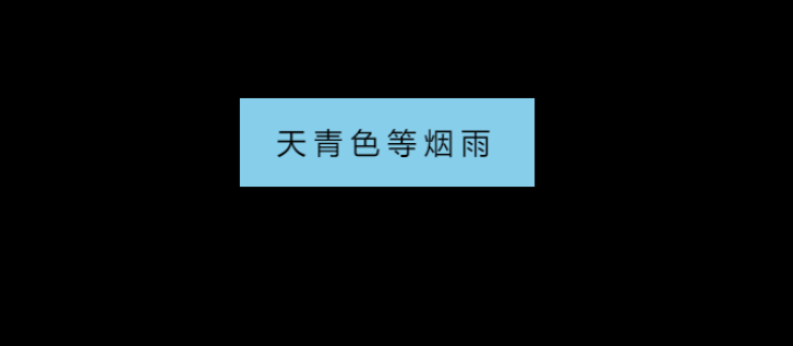
预览效果
<!DOCTYPE html>
<html lang="en">

<head>
    <meta charset="UTF-8">
    <meta http-equiv="X-UA-Compatible" content="IE=edge">
    <meta name="viewport" content="width=device-width, initial-scale=1.0">
    <title>Document</title>
    <style>
        body {
            background-color: black;
            /* 设置透视距离 */
            perspective: 400px;
        }

        .box {
            position: relative;
            width: 200px;
            height: 60px;
            margin: 100px auto;
            transition: all .2s;
            /* 让子盒子保留立体空间 */
            transform-style: preserve-3d;
        }

        /* 鼠标经过box,翻转box */
        .box:hover {
            transform: rotateX(90deg);
        }

        .front,
        .bottom {
            position: absolute;
            width: 200px;
            height: 60px;
            text-align: center;
            line-height: 60px;
            font-size: 20px;
            /* 文字间距5px */
            letter-spacing: 5px;
        }

        .front {
            background-color: skyblue;
            /* 向Z轴正方向移动30px */
            transform: translateZ(30px);
        }

        .bottom {
            background-color: rgb(125, 255, 147);
            /* 先向Y轴正方向移动30px,在沿X轴翻转-90度 */
            transform: translateY(30px) rotateX(-90deg);
        }
    </style>
</head>

<body>
    <div class="box">
        <div class="front">天青色等烟雨</div>
        <div class="bottom">而我在等你</div>
    </div>
</body>

</html>


 扫一扫
扫一扫


 1297
1297

 被折叠的 条评论
为什么被折叠?
被折叠的 条评论
为什么被折叠?
 到【灌水乐园】发言


