


【Python 2D绘图】Matplotlib绘图(特殊图表)
1. 辅助统计图表
1.1 雷达图
雷达图(Radar Chart,又称蜘蛛图/星形图):一种通过多个辐射轴展示多维数据的图表,数据点在各轴上的值连接成多边形,用于对比多个变量在多个实体中的表现或分析综合能力。
雷达图以 “极坐标+多边形” 形式浓缩多维信息,适合强调综合能力或平衡性的场景,但需谨慎设计以确保可读性。
1.1.1 方法参数
Matplotlib并未直接提供绘制雷达图的API接口,但可以借助 极坐标 和 极坐标网格 实现,分为以下三步。
# 创建投影为极坐标的子图
fig, ax = plt.subplots(subplot_kw={'projection': 'polar'})
# 根据指标个数 计算角度(等分2π - 弧度制)
angles = np.linspace(0, 2 * np.pi, len(indicators), endpoint=False)		# indicators - 雷达图指标
# 设置雷达图网格(转换回 - 角度制)
ax.set_thetagrids(angles * 180 / np.pi, indicators)
1.1.2 自行绘制
依据以上代码,执行以下代码,便可得到圆形外观的雷达图坐标系。
import matplotlib.pyplot as plt
import numpy as np

indicators = np.array(['Chinese', 'Math', 'English', "Art", "PE"])

# 创建投影为极坐标的子图
fig, ax = plt.subplots(subplot_kw={'projection': 'polar'})
# 根据指标个数 计算角度(等分2π - 弧度制)
angles = np.linspace(0, 2 * np.pi, len(indicators), endpoint=False)		# indicators - 雷达图指标
# 设置雷达图网格(转换回 - 角度制)
ax.set_thetagrids(angles * 180 / np.pi, indicators)

首先,完善需要雷达图所展示的数据。
# 雷达图指标
indicators = np.array(['Chinese', 'Math', 'English', "Art", "PE"])

# 衡量指标对象
categories = np.array(['ClassA', 'ClassB', 'ClassC', "ClassD", "ClassE", "ClassF"])

# 对应数据
data = np.array([[92.3, 95.1, 90.2, 65.2, 75.1],
                 [50.3, 65.2, 80.4, 90.2, 77.6],
                 [45.2, 55.3, 86.2, 45.2, 88.3],
                 [85.2, 65.3, 98.2, 47.2, 58.6],
                 [88.5, 95.3, 65.2, 84.5, 78.6],
                 [67.3, 79.3, 93.2, 86.4, 88.6],])		# ClassF 前两次样例中因作者遗忘导致未绘制,不影响代码逻辑
其次,我们定义三个函数框架,分别代表雷达图绘制、雷达图网格绘制、雷达图内容绘制。
# 雷达图
def radar(data, indicator, categories, frame='circle'):
    fig, ax = plt.subplots(subplot_kw={'projection': 'polar'})

    # 绘制雷达图网格
    def radar_circle_grid(data, indicator, categories):
        angles = np.linspace(0, 2 * np.pi, len(indicators), endpoint=False)
    	ax.set_thetagrids(angles * 180 / np.pi, indicators)

    # 绘制雷达图数据
    def draw_rader_data(data, indicator, categories):
        pass
    radar_circle_grid(data, indicator, categories)
    draw_rader_data(data, indicator, categories)
    plt.show()
随后,利用plot函数绘制简单路径图的方式,完成雷达图的绘制(见本文2.3小节)
# 雷达图
def radar(data, indicator, categories, frame='circle'):
    fig, ax = plt.subplots(subplot_kw={'projection': 'polar'})

    # 绘制雷达图网格
    def radar_circle_grid(data, indicator, categories):
        angles = np.linspace(0, 2 * np.pi, len(indicators), endpoint=False)
    	ax.set_thetagrids(angles * 180 / np.pi, indicators)

    # 绘制雷达图数据
    def draw_rader_data(data, indicator, categories):
        for i in range(len(data)):
            ax.plot(angles, data[i], 'o-', linewidth=2, label=categories[i])
    radar_circle_grid(data, indicator, categories)
    draw_rader_data(data, indicator, categories)
    plt.show()
调用该方法,我们发现雷达图并未完全闭合,需要将0位置数据追加至原始列表中。

# 雷达图
def radar(data, indicator, categories, frame='circle'):
    fig, ax = plt.subplots(subplot_kw={'projection': 'polar'})

    # 绘制雷达图网格
    def radar_circle_grid(data, indicator, categories):
        angles = np.linspace(0, 2 * np.pi, len(indicators), endpoint=False)
    	ax.set_thetagrids(angles * 180 / np.pi, indicators)

    # 绘制雷达图数据
    def draw_rader_data(data, indicator, categories):
        # 闭合路径
        angles = np.concatenate((angles, [angles[0]]))
        data = np.concatenate((data, data[:, None, 0]), axis=1)
        indicators = np.concatenate((indicators, [indicators[0]]))

        # 绘制plot折线
        for i in range(len(data)):
            ax.plot(angles, data[i], 'o-', linewidth=2, label=categories[i])
    radar_circle_grid(data, indicator, categories)
    draw_rader_data(data, indicator, categories)
    plt.show()

此时,雷达图有所偏移,需要对其进行调整;并为雷达图增加图例。
# 调整样式
ax.set_theta_zero_location('N')				# 将极坐标0°置于正北N方向
plt.grid(True, c='gray', linestyle='--')	# 设置网格格式
plt.legend(loc='upper right')

图例挡住了图形,将图例移动至图形外部。
plt.legend(loc='upper right', bbox_to_anchor=(1.2, 1.2))
这样圆形雷达图就绘制完成了,但是这并非多边形雷达图,想要绘制多边形雷达图,则需要手动绘制网格线。
首先,关闭原本存在的网格线和轴脊线。
# 关闭原有网格线和轴脊线
plt.grid(visible=False)
ax.spines['polar'].set_visible(False)

定义新方法,利用plot函数绘制刻度线。
# 绘制雷达图网格 - 多边形
def radar_polygon_grid(data, indicators, categories, angles):
    # 绘制标签线
    for i in range(len(indicator)):
        ax.plot([angles[i], angles[i]],[0, 100], c='gray', ls='--', linewidth=0.8)
    # 绘制刻度线
    ticks = np.transpose(np.array([[20, 40, 60, 80, 100]] * 6))
    for i in range(len(ticks)):
        ax.plot(angles, ticks[i], c='gray', ls='--', linewidth=0.8)
    return angles
在稍加更改后,完整代码如下所示:
import matplotlib.pyplot as plt
import numpy as np
from matplotlib.patches import Polygon

# 雷达图
def radar(data, indicator, categories, frame='circle'):
    fig, ax = plt.subplots(subplot_kw={'projection': 'polar'})

    # 调整样式
    ax.set_theta_zero_location('N')				# 将极坐标0°置于正北N方向
    # 关闭原有网格线和轴脊线
    if frame == 'polygon':
        plt.grid(visible=False)
        ax.spines['polar'].set_visible(False)
    elif frame == 'circle':
        plt.grid(True, c='gray', linestyle='--')	# 设置网格格式

    # 绘制雷达图网格 - 圆形
    def radar_circle_grid(data, indicators, categories):
        angles = np.linspace(0, 2 * np.pi, len(indicators), endpoint=False)
        ax.set_thetagrids(angles * 180 / np.pi, indicators)
        # 提前处理角度
        angles = np.concatenate((angles, [angles[0]]))
        return angles
    # 绘制雷达图网格 - 多边形
    def radar_polygon_grid(data, indicators, categories, angles):
        # 绘制标签线
        for i in range(len(indicator)):
            ax.plot([angles[i], angles[i]],[0, 100], c='gray', ls='--', linewidth=0.8)
        # 绘制刻度线
        ticks = np.transpose(np.array([[20, 40, 60, 80, 100]] * 6))
        for i in range(len(ticks) - 1):
            ax.plot(angles, ticks[i], c='dimgray', ls='--', linewidth=0.8)
        # 最后刻度线单独绘制
        ax.plot(angles, ticks[len(ticks) - 1], c='black', ls='-', linewidth=1)

        return angles
    # 绘制雷达图数据
    def draw_rader_data(data, indicators, categories, angles):
        # 闭合路径
        data = np.concatenate((data, data[:, None, 0]), axis=1)
        indicators = np.concatenate((indicators, [indicators[0]]))

        # 绘制plot折线
        for i in range(len(data)):
            ax.plot(angles, data[i], 'o-', linewidth=2, label=categories[i])
    angles = radar_circle_grid(data, indicators, categories)
    if frame=='polygon':
        angles = radar_polygon_grid(data, indicators, categories, angles)
    draw_rader_data(data, indicators, categories, angles)
    plt.legend(loc='upper right', bbox_to_anchor=(1.2, 1.2))
    plt.tight_layout()
    plt.show()

if __name__ == '__main__':
    # 要展示的指标
    indicators = np.array(['Chinese', 'Math', 'English', "Art", "PE"])

    # 每个数据的名字
    categories = np.array(['ClassA', 'ClassB', 'ClassC', "ClassD", "ClassE", "ClassF"])

    # 数据
    data = np.array([[92.3, 95.1, 90.2, 65.2, 75.1],
                     [50.3, 65.2, 80.4, 90.2, 77.6],
                     [45.2, 55.3, 86.2, 45.2, 88.3],
                     [85.2, 65.3, 98.2, 47.2, 58.6],
                     [88.5, 95.3, 65.2, 84.5, 78.6],
                     [67.3, 79.3, 93.2, 86.4, 88.6],])
    # 绘制雷达图
    radar(data, indicators, categories, frame='polygon')

为其添加标题与填充功能,得到最终版本:
import matplotlib.pyplot as plt
import numpy as np
from matplotlib.patches import Polygon

# 雷达图
def radar(data, indicator, categories, frame='circle', filled=False, title=None):
    fig, ax = plt.subplots(subplot_kw={'projection': 'polar'})

    # 调整样式
    ax.set_theta_zero_location('N')				# 将极坐标0°置于正北N方向
    # 关闭原有网格线和轴脊线
    if frame == 'polygon':
        plt.grid(visible=False)
        ax.spines['polar'].set_visible(False)
    elif frame == 'circle':
        plt.grid(True, c='gray', linestyle='--')	# 设置网格格式
    if title is not None:
        ax.set_title(title, fontweight='bold')

    # 绘制雷达图网格 - 圆形
    def radar_circle_grid(data, indicators, categories):
        angles = np.linspace(0, 2 * np.pi, len(indicators), endpoint=False)
        ax.set_thetagrids(angles * 180 / np.pi, indicators)
        # 提前处理角度
        angles = np.concatenate((angles, [angles[0]]))
        return angles
    # 绘制雷达图网格 - 多边形
    def radar_polygon_grid(data, indicators, categories, angles):
        # 绘制标签线
        for i in range(len(indicator)):
            ax.plot([angles[i], angles[i]],[0, 100], c='gray', ls='--', linewidth=0.8)
        # 绘制刻度线
        ticks = np.transpose(np.array([[20, 40, 60, 80, 100]] * 6))
        for i in range(len(ticks) - 1):
            ax.plot(angles, ticks[i], c='dimgray', ls='--', linewidth=0.8)
        # 最后刻度线单独绘制
        ax.plot(angles, ticks[len(ticks) - 1], c='black', ls='-', linewidth=1)

        return angles
    # 绘制雷达图数据
    def draw_rader_data(data, indicators, categories, angles):
        # 闭合路径
        data = np.concatenate((data, data[:, None, 0]), axis=1)
        indicators = np.concatenate((indicators, [indicators[0]]))

        # 绘制plot折线
        for i in range(len(data)):
            line, = ax.plot(angles, data[i], 'o-', linewidth=2, label=categories[i])
            if filled:
                shade_router = np.transpose(np.vstack((angles, data[i])))
                poly = Polygon(xy=shade_router,facecolor=line.get_color(), alpha=0.1, linewidth=1.2)
                ax.add_patch(poly)

    angles = radar_circle_grid(data, indicators, categories)
    if frame=='polygon':
        angles = radar_polygon_grid(data, indicators, categories, angles)
    draw_rader_data(data, indicators, categories, angles)

    plt.legend(loc='upper right', bbox_to_anchor=(1.2, 1.2))
    plt.tight_layout()
    plt.show()

if __name__ == '__main__':
    # 要展示的指标
    indicators = np.array(['Chinese', 'Math', 'English', "Art", "PE"])

    # 每个数据的名字
    categories = np.array(['ClassA', 'ClassB', 'ClassC', "ClassD", "ClassE", "ClassF"])

    # 数据
    data = np.array([[92.3, 95.1, 90.2, 65.2, 75.1],
                     [50.3, 65.2, 80.4, 90.2, 77.6],
                     [45.2, 55.3, 86.2, 45.2, 88.3],
                     [85.2, 65.3, 98.2, 47.2, 58.6],
                     [88.5, 95.3, 65.2, 84.5, 78.6],
                     [67.3, 79.3, 93.2, 86.4, 88.6],])
    # 绘制雷达图
    radar(data, indicators, categories, frame='polygon', filled=True, title="Example")

1.1.3 官网样例
官网实现思路未新建了一种基于极坐标投影的雷达图投影,注册并调用该投影。
这种直接修改坐标轴与投影方式的方法更为美观。
import matplotlib.pyplot as plt
import numpy as np

from matplotlib.patches import Circle, RegularPolygon
from matplotlib.path import Path
from matplotlib.projections import register_projection
from matplotlib.projections.polar import PolarAxes
from matplotlib.spines import Spine
from matplotlib.transforms import Affine2D


def radar_factory(num_vars, frame='circle'):
    """
    Create a radar chart with `num_vars` Axes.

    This function creates a RadarAxes projection and registers it.

    Parameters
    ----------
    num_vars : int
        Number of variables for radar chart.
    frame : {'circle', 'polygon'}
        Shape of frame surrounding Axes.

    """
    # calculate evenly-spaced axis angles
    theta = np.linspace(0, 2*np.pi, num_vars, endpoint=False)

    class RadarTransform(PolarAxes.PolarTransform):

        def transform_path_non_affine(self, path):
            # Paths with non-unit interpolation steps correspond to gridlines,
            # in which case we force interpolation (to defeat PolarTransform's
            # autoconversion to circular arcs).
            if path._interpolation_steps > 1:
                path = path.interpolated(num_vars)
            return Path(self.transform(path.vertices), path.codes)

    class RadarAxes(PolarAxes):

        name = 'radar'
        PolarTransform = RadarTransform

        def __init__(self, *args, **kwargs):
            super().__init__(*args, **kwargs)
            # rotate plot such that the first axis is at the top
            self.set_theta_zero_location('N')

        def fill(self, *args, closed=True, **kwargs):
            """Override fill so that line is closed by default"""
            return super().fill(closed=closed, *args, **kwargs)

        def plot(self, *args, **kwargs):
            """Override plot so that line is closed by default"""
            lines = super().plot(*args, **kwargs)
            for line in lines:
                self._close_line(line)

        def _close_line(self, line):
            x, y = line.get_data()
            # FIXME: markers at x[0], y[0] get doubled-up
            if x[0] != x[-1]:
                x = np.append(x, x[0])
                y = np.append(y, y[0])
                line.set_data(x, y)

        def set_varlabels(self, labels):
            self.set_thetagrids(np.degrees(theta), labels)

        def _gen_axes_patch(self):
            # The Axes patch must be centered at (0.5, 0.5) and of radius 0.5
            # in axes coordinates.
            if frame == 'circle':
                return Circle((0.5, 0.5), 0.5)
            elif frame == 'polygon':
                return RegularPolygon((0.5, 0.5), num_vars,
                                      radius=.5, edgecolor="k")
            else:
                raise ValueError("Unknown value for 'frame': %s" % frame)

        def _gen_axes_spines(self):
            if frame == 'circle':
                return super()._gen_axes_spines()
            elif frame == 'polygon':
                # spine_type must be 'left'/'right'/'top'/'bottom'/'circle'.
                spine = Spine(axes=self,
                              spine_type='circle',
                              path=Path.unit_regular_polygon(num_vars))
                # unit_regular_polygon gives a polygon of radius 1 centered at
                # (0, 0) but we want a polygon of radius 0.5 centered at (0.5,
                # 0.5) in axes coordinates.
                spine.set_transform(Affine2D().scale(.5).translate(.5, .5)
                                    + self.transAxes)
                return {'polar': spine}
            else:
                raise ValueError("Unknown value for 'frame': %s" % frame)

    register_projection(RadarAxes)
    return theta


def example_data():
    # The following data is from the Denver Aerosol Sources and Health study.
    # See doi:10.1016/j.atmosenv.2008.12.017
    #
    # The data are pollution source profile estimates for five modeled
    # pollution sources (e.g., cars, wood-burning, etc) that emit 7-9 chemical
    # species. The radar charts are experimented with here to see if we can
    # nicely visualize how the modeled source profiles change across four
    # scenarios:
    #  1) No gas-phase species present, just seven particulate counts on
    #     Sulfate
    #     Nitrate
    #     Elemental Carbon (EC)
    #     Organic Carbon fraction 1 (OC)
    #     Organic Carbon fraction 2 (OC2)
    #     Organic Carbon fraction 3 (OC3)
    #     Pyrolyzed Organic Carbon (OP)
    #  2)Inclusion of gas-phase specie carbon monoxide (CO)
    #  3)Inclusion of gas-phase specie ozone (O3).
    #  4)Inclusion of both gas-phase species is present...
    data = [
        ['Sulfate', 'Nitrate', 'EC', 'OC1', 'OC2', 'OC3', 'OP', 'CO', 'O3'],
        ('Basecase', [
            [0.88, 0.01, 0.03, 0.03, 0.00, 0.06, 0.01, 0.00, 0.00],
            [0.07, 0.95, 0.04, 0.05, 0.00, 0.02, 0.01, 0.00, 0.00],
            [0.01, 0.02, 0.85, 0.19, 0.05, 0.10, 0.00, 0.00, 0.00],
            [0.02, 0.01, 0.07, 0.01, 0.21, 0.12, 0.98, 0.00, 0.00],
            [0.01, 0.01, 0.02, 0.71, 0.74, 0.70, 0.00, 0.00, 0.00]]),
        ('With CO', [
            [0.88, 0.02, 0.02, 0.02, 0.00, 0.05, 0.00, 0.05, 0.00],
            [0.08, 0.94, 0.04, 0.02, 0.00, 0.01, 0.12, 0.04, 0.00],
            [0.01, 0.01, 0.79, 0.10, 0.00, 0.05, 0.00, 0.31, 0.00],
            [0.00, 0.02, 0.03, 0.38, 0.31, 0.31, 0.00, 0.59, 0.00],
            [0.02, 0.02, 0.11, 0.47, 0.69, 0.58, 0.88, 0.00, 0.00]]),
        ('With O3', [
            [0.89, 0.01, 0.07, 0.00, 0.00, 0.05, 0.00, 0.00, 0.03],
            [0.07, 0.95, 0.05, 0.04, 0.00, 0.02, 0.12, 0.00, 0.00],
            [0.01, 0.02, 0.86, 0.27, 0.16, 0.19, 0.00, 0.00, 0.00],
            [0.01, 0.03, 0.00, 0.32, 0.29, 0.27, 0.00, 0.00, 0.95],
            [0.02, 0.00, 0.03, 0.37, 0.56, 0.47, 0.87, 0.00, 0.00]]),
        ('CO & O3', [
            [0.87, 0.01, 0.08, 0.00, 0.00, 0.04, 0.00, 0.00, 0.01],
            [0.09, 0.95, 0.02, 0.03, 0.00, 0.01, 0.13, 0.06, 0.00],
            [0.01, 0.02, 0.71, 0.24, 0.13, 0.16, 0.00, 0.50, 0.00],
            [0.01, 0.03, 0.00, 0.28, 0.24, 0.23, 0.00, 0.44, 0.88],
            [0.02, 0.00, 0.18, 0.45, 0.64, 0.55, 0.86, 0.00, 0.16]])
    ]
    return data


if __name__ == '__main__':
    N = 9
    theta = radar_factory(N, frame='polygon')

    data = example_data()
    spoke_labels = data.pop(0)

    fig, axs = plt.subplots(figsize=(9, 9), nrows=2, ncols=2,
                            subplot_kw=dict(projection='radar'))
    fig.subplots_adjust(wspace=0.25, hspace=0.20, top=0.85, bottom=0.05)

    colors = ['b', 'r', 'g', 'm', 'y']
    # Plot the four cases from the example data on separate Axes
    for ax, (title, case_data) in zip(axs.flat, data):
        ax.set_rgrids([0.2, 0.4, 0.6, 0.8])
        ax.set_title(title, weight='bold', size='medium', position=(0.5, 1.1),
                     horizontalalignment='center', verticalalignment='center')
        for d, color in zip(case_data, colors):
            ax.plot(theta, d, color=color)
            ax.fill(theta, d, facecolor=color, alpha=0.25, label='_nolegend_')
        ax.set_varlabels(spoke_labels)

    # add legend relative to top-left plot
    labels = ('Factor 1', 'Factor 2', 'Factor 3', 'Factor 4', 'Factor 5')
    legend = axs[0, 0].legend(labels, loc=(0.9, .95),
                              labelspacing=0.1, fontsize='small')

    fig.text(0.5, 0.965, '5-Factor Solution Profiles Across Four Scenarios',
             horizontalalignment='center', color='black', weight='bold',
             size='large')

    plt.show()

1.2 表格
1.2.1 方法参数
Axes.table(cellText=None, cellColours=None, cellLoc='right', colWidths=None, rowLabels=None, rowColours=None, rowLoc='left', colLabels=None, colColours=None, colLoc='center', loc='bottom', bbox=None, edges='closed', **kwargs)
参数说明:
cellText2D:表格单元格文本 二维表格数据pandas.DataFramecellColours2D:表格单元格背景色 颜色二维列表cellLoc:表格单元格对齐方式 字符串 ‘right’ / ‘center’ / ‘left’colWidths:列宽度 可选 浮点型数值列表rowLabels|colLabels:行|列标题单元格文本 可选 字符串列表rowColours|colColours:行|列标题单元格背景色 可选 颜色列表rowLoc|colLoc:行|列标题单元格文本对齐方式 字符串 ‘right’ / ‘center’ / ‘left’loc:单元格相对位置 字符串 默认’bottom’edges:单元格边框 字符串 ‘closed’ / ‘open’ / ‘horizontal’ / ‘vertical’alpha:单元格透明度figure:画布Figurevisible:是否可见fontSize:字体大小
1.2.2 单独绘制
在Matplotlib中表格类似颜色条,仅作为图表数据的参照形式,默认在图表下方绘制。
倘若需要单独绘制,则需将画布高度尽可能小的数值 (如0.01)。
# 导入三方库
import matplotlib.pyplot as plt

# 准备数据
labelr = ['1', '2', '3']
labelc = ['A', 'B', 'C']
chars = [[1, 2 ,3], [4, 5, 6], [7, 8 ,9]]

# 创建子图
fig, ax = plt.subplots(figsize=(6, 0.01))

# 绘制表格
table = ax.table(cellText=chars, rowLabels=labelr, colLabels=labelc)
ax.set_axis_off()
plt.show()

利用所学参数,对表格进行美化。
# 导入三方库
import matplotlib.pyplot as plt

# 准备数据
labelr = ['  1  ', '  2  ', '  3  ']
labelc = ['A', 'B', 'C']
chars = [[1, 2 ,3], [4, 5, 6], [7, 8 ,9]]

# 样式
labelcw = [0.2] * 3
labelrh = [0.3] * 3
rowColours = ["violet"] * 3
colColours = ["steelblue"] * 3

# 创建子图
fig, ax = plt.subplots(figsize=(6, 0.01))

# 绘制表格
table = ax.table(cellText=chars, rowLabels=labelr, colLabels=labelc, colWidths=labelcw, rowColours=rowColours, colColours=colColours, cellLoc='center',)
ax.set_axis_off()
plt.show()

2. 其他特殊图表
2.1 鱼骨图
鱼骨图(Ishikawa Diagram):由日本管理大师石川馨先生所发展出来的,故又名石川图。
它一种发现问题“根本原因”的方法,它也可以称之为“因果图”。
鱼骨图是表示质量特性与原因关系的图,鱼骨图主要用于工商管理中建立分析模型。

2.1.1 鱼骨分析法
鱼骨分析法,又名因果分析法。
一种发现问题“根本原因”的分析方法,现代工商管理教育如MBA、EMBA等将其划分为问题型、原因型及对策型鱼骨分析等几类先进技术分析。
鱼骨分析法因其形状如鱼骨而得名,它是一种透过现象看本质的分析方法。
问题的特性总是受到一些因素的影响,通过 头脑风暴 找出这些因素,并将它们与特性值一起,按相互关联性整理而成的层次分明、条理清楚,因其形状如鱼骨,所以叫鱼骨图。
头脑风暴法(Brain Storming):一种通过集思广益、发挥团体智慧,从各种不同角度找出问题所有原因或构成要素的会议方法。BS有四大原则:严禁批评、自由奔放、多多益善、搭便车。
鱼骨图类型
- 整理问题型鱼骨图
- 各要素与特性值间不存在原因关系 而是结构构成关系
- 原因型鱼骨图
- 鱼头在右 特性值通常以 “为什么……” 来写
- 对策型鱼骨图
- 鱼头在左 特性值通常以 “如何提高/改善……” 来写
鱼骨图要因绘制
- 大要因必须用中性词描述(不说明好坏)
- 中/小要因必须使用价值判断(如…不良)
2.1.2 鱼骨图绘制
Matplotlib并未直接提供绘制鱼骨图的API接口,而是结合标签、文字、注解及连线等共同组成鱼骨图,在官网以样例的方式间接呈现给用户。
我们将一步步探究,如何利用Matplotlib绘制鱼骨图。
这里需要使用并导入的包如下:
import math
import matplotlib.pyplot as plt
from matplotlib.patches import Polygon, Wedge
准备好需要绘画的区域,即创建画布与子图,由于鱼骨图并非统计图表,故关闭坐标轴。
# 创建子图
fig, ax = plt.subplots(figsize=(10, 6), layout='constrained')
# 限定图片:以原点为中心-以长度5为边长的正方形
ax.set_xlim(-5, 5)
ax.set_ylim(-5, 5)
# 关闭坐标轴
ax.axis('off')
首先,先来看看鱼骨图绘制的最终结果。

从图中不难发现,鱼骨图中大要因包含众多小要因,因此字典结构更符合这种数据形式。
# 定义鱼骨图分类数据(因果之因)
categories = {
    'Method': ['Time consumption', 'Cost', 'Procedures', 'Inefficient process',
               'Sampling'],
    'Machine': ['Faulty equipment', 'Compatibility'],
    'Material': ['Poor-quality input', 'Raw materials', 'Supplier',
                 'Shortage'],
    'Measurement': ['Calibration', 'Performance', 'Wrong measurements'],
    'Environment': ['Bad conditions'],
    'People': ['Lack of training', 'Managers', 'Labor shortage',
               'Procedures', 'Sales strategy']
}
由于Matplotlib并未直接提供绘制鱼骨图的API接口,所以我们需要自定义方法。
由于鱼骨图的数据为字典类型,这里我们限定方法的传入参数为字典类型。
def draw_body(data: dict):
    pass
根据“问题”类别的数量来设置脊柱的长度。
鱼骨图的主体结构因果之果为鱼骨干部分,我们再定义一个绘制鱼骨干的方法。

这个方法需要传入鱼骨干的长度与标题,将 头、脊、尾 分为三块进行绘制。
头部使用plot绘制直线、脊椎使用text并绘制半圆形、尾部绘制三角形。
def draw_spines(xmin: int, xmax: int, xtitle: str):
    ## 绘制头部
    ax.plot([xmin - 0.1, xmax], [0, 0], color='tab:blue', linewidth=2)
    ## 绘制脊椎
    ax.text(xmax + 0.1, - 0.05, xtitle, fontsize=10, weight='bold', color='white')
    semicircle = Wedge((xmax, 0), 1, 270, 90, fc='tab:blue')
    ax.add_patch(semicircle)
    ## 绘制尾部
    tail_pos = [[xmin - 0.8, 0.8], [xmin - 0.8, -0.8], [xmin, -0.01]]
    triangle = Polygon(tail_pos, fc='tab:blue')
    ax.add_patch(triangle)
这样就完成了鱼骨干的绘制,下面我们要完成大要因的绘制方法,这需要借助注释annotate完成。
def problems(data: str,
             problem_x: float, problem_y: float,
             angle_x: float, angle_y: float):
    ax.annotate(str.upper(data), xy=(problem_x, problem_y),
                xytext=(angle_x, angle_y),
                fontsize=10,
                color='white',
                weight='bold',
                xycoords='data',
                verticalalignment='center',
                horizontalalignment='center',
                textcoords='offset fontsize',
                arrowprops=dict(arrowstyle="->", facecolor='black'),
                bbox=dict(boxstyle='square',
                          facecolor='tab:blue',
                          pad=0.8))
方法参数:
data:用于绘制主要因的数据problem_x:箭头头部横坐标(应分分开计算 错开所有鱼骨)problem_y:箭头头部纵坐标(本例情况应默认为0)angle_x:箭头尾部横坐标(本例情况应默认为-12)angle_y:箭头尾部纵坐标(应分分开计算 错开所有鱼骨)
如果在函数draw_body中计算坐标并调用该函数,则会呈现如下结果。

下面我们要完成小要因的绘制方法,这同样需要借助注释annotate完成。
def causes(data: list,
           cause_x: float, cause_y: float,
           cause_xytext=(-9, -0.3), top: bool = True):

    for index, cause in enumerate(data):
        # [<x pos>, <y pos>]
        coords = [[0.02, 0],
                  [0.23, 0.5],
                  [-0.46, -1],
                  [0.69, 1.5],
                  [-0.92, -2],
                  [1.15, 2.5]]

        cause_x -= coords[index][0]
        cause_y += coords[index][1] if top else -coords[index][1]

        ax.annotate(cause, xy=(cause_x, cause_y),
                    horizontalalignment='center',
                    xytext=cause_xytext,
                    fontsize=9,
                    xycoords='data',
                    textcoords='offset fontsize',
                    arrowprops=dict(arrowstyle="->",
                                    facecolor='black'))
方法参数:
data:用于绘制小要因的数据cause_x:小要因相对横坐标(应分分开计算 错开所有鱼骨)cause_y:小要因相对纵坐标(本例情况应默认为0)cause_xytext:文本坐标top:主要因是否在鱼骨干上方
最后,完善鱼骨图绘制方法:
def draw_body(data: dict):
	# 计算长度
    length = (math.ceil(len(data) / 2)) - 1
    # 绘制鱼骨干(核心问题)
    draw_spine(-2 - length, 2 + length)

    # 绘制鱼刺(大要因与小要因)
    offset = 0
    prob_section = [1.55, 0.8]
    for index, problem in enumerate(data.values()):
        plot_above = index % 2 == 0
        cause_arrow_y = 1.7 if plot_above else -1.7
        y_prob_angle = 16 if plot_above else -16

        # 计算大要因与小要因坐标
        prob_arrow_x = prob_section[0] + length + offset
        cause_arrow_x = prob_section[1] + length + offset
        if not plot_above:
            offset -= 2.5
        if index > 5:
            raise ValueError(f'Maximum number of problems is 6, you have entered '
                             f'{len(data)}')
        # 绘制大要因与小要因
        problems(list(data.keys())[index], prob_arrow_x, 0, -12, y_prob_angle)
        causes(problem, cause_arrow_x, cause_arrow_y, top=plot_above)
最终,调用方法 完成鱼骨图绘制:
draw_body(categories)
plt.show()

2.2 条形码 & 二维码
Matplotlib并未直接提供绘制条形码的API接口,而是利用imshow函数绘制条形码,根据1的数量调节条状宽度。
# 导入三方库
import matplotlib.pyplot as plt
import numpy as np

# 条形码
code = np.array([
    1, 0, 1, 0, 1, 1, 1, 0, 1, 1, 0, 0, 0, 1, 0, 0, 1, 0, 1, 0, 0, 1, 1, 1,
    0, 0, 0, 1, 0, 1, 1, 0, 0, 0, 0, 1, 0, 1, 0, 0, 1, 1, 0, 0, 1, 0, 1, 0,
    1, 0, 1, 0, 0, 0, 0, 1, 0, 1, 1, 1, 0, 1, 0, 0, 1, 1, 0, 1, 1, 0, 0, 1,
    1, 0, 0, 1, 1, 0, 1, 0, 1, 1, 1, 0, 0, 1, 0, 0, 0, 1, 0, 0, 1, 0, 1])

# 柱状图像素
pixel_per_bar = 4
# 图片分辨率
dpi = 100

# 绘制图像
fig = plt.figure(figsize=(len(code) * pixel_per_bar / dpi, 2), dpi=dpi)
ax = fig.add_axes([0, 0, 1, 1])
ax.set_axis_off()  # 关闭坐标轴
ax.imshow(code.reshape(1, -1), cmap='binary', aspect='auto', interpolation='nearest')
plt.show()

同理,还可以利用imshow函数或热力图绘制二维码。
# 导入三方库
import matplotlib.pyplot as plt
import numpy as np

# 准备数据
x = np.arange(21)
y = np.arange(21)
Z = np.array([
    [1, 1, 1, 1, 1, 1, 1, 0, 1, 1, 1, 0, 0, 0, 1, 1, 1, 1, 1, 1, 1],
    [1, 0, 0, 0, 0, 0, 1, 0, 0, 1, 0, 0, 1, 0, 1, 0, 0, 0, 0, 0, 1],
    [1, 0, 1, 1, 1, 0, 1, 0, 0, 1, 1, 0, 1, 0, 1, 0, 1, 1, 1, 0, 1],
    [1, 0, 1, 1, 1, 0, 1, 0, 1, 0, 1, 0, 0, 0, 1, 0, 1, 1, 1, 0, 1],
    [1, 0, 1, 1, 1, 0, 1, 0, 0, 1, 0, 0, 1, 0, 1, 0, 1, 1, 1, 0, 1],
    [1, 0, 0, 0, 0, 0, 1, 0, 1, 0, 1, 0, 1, 0, 1, 0, 0, 0, 0, 0, 1],
    [1, 1, 1, 1, 1, 1, 1, 0, 1, 0, 1, 0, 1, 0, 1, 1, 1, 1, 1, 1, 1],
    [0, 0, 0, 0, 0, 0, 0, 0, 0, 1, 1, 1, 0, 0, 0, 0, 0, 0, 0, 0, 0],
    [1, 0, 1, 1, 0, 1, 1, 1, 1, 0, 0, 0, 1, 0, 0, 1, 0, 0, 1, 1, 1],
    [1, 1, 0, 0, 1, 1, 0, 0, 0, 1, 0, 1, 0, 1, 0, 0, 1, 1, 1, 0, 0],
    [1, 1, 0, 1, 1, 0, 1, 0, 1, 1, 0, 0, 1, 0, 0, 1, 0, 0, 0, 1, 0],
    [0, 0, 1, 1, 0, 1, 0, 1, 0, 1, 1, 0, 1, 0, 0, 1, 1, 0, 1, 1, 0],
    [1, 0, 0, 0, 0, 1, 1, 0, 0, 1, 0, 1, 1, 0, 1, 1, 0, 1, 1, 1, 1],
    [0, 0, 0, 0, 0, 0, 0, 0, 1, 1, 0, 1, 1, 1, 0, 0, 0, 0, 1, 1, 0],
    [1, 1, 1, 1, 1, 1, 1, 0, 0, 0, 1, 0, 1, 1, 1, 0, 0, 0, 1, 0, 0],
    [1, 0, 0, 0, 0, 0, 1, 0, 1, 1, 0, 1, 0, 0, 0, 0, 1, 0, 0, 1, 1],
    [1, 0, 1, 1, 1, 0, 1, 0, 0, 0, 1, 0, 0, 1, 1, 1, 0, 1, 1, 0, 1],
    [1, 0, 1, 1, 1, 0, 1, 0, 0, 1, 0, 0, 1, 1, 0, 0, 1, 1, 1, 0, 0],
    [1, 0, 1, 1, 1, 0, 1, 0, 1, 1, 0, 1, 0, 1, 1, 1, 1, 0, 0, 1, 1],
    [1, 0, 0, 0, 0, 0, 1, 0, 1, 0, 1, 1, 0, 0, 0, 0, 1, 1, 0, 1, 0],
    [1, 1, 1, 1, 1, 1, 1, 0, 0, 1, 1, 1, 0, 1, 0, 1, 0, 1, 0, 1, 0]])
Z = np.transpose(Z)

# 创建子图
fig, ax = plt.subplots()
fig.set_size_inches(5, 5)

# 绘制图像
ax.spines[['top', 'bottom', 'left','right']].set_visible(False)
ax.imshow(Z, cmap='binary', aspect='auto', interpolation='nearest')
ax.set_xticks([])
ax.set_yticks([])
以下两句代码在这里是等价的:
# 利用imshow绘制
ax.imshow(Z, cmap='binary', aspect='auto', interpolation='nearest')
# 利用pcolormesh绘制
ax.pcolormesh(x, y, Z, cmap='binary')
(此二维码虚构 无扫描结果)
2.3 简单路径图
简单路径图利用折线函数plot便可实现,如下所示。
# 导入三方库
import matplotlib.pyplot as plt

# 创建子图
fig, ax = plt.subplots()

# 准备数据
x = [1.58, 0.35, -1.75, 0.375, 0.85, 2.2, 3, 2.0, 1.58]
y = [-2.57, -1.1, 2.0, 2.0, 1.15, 3.2, 0.05, -0.5, -2.57]

# 绘制图像
line, = ax.plot(x, y, 'go-')
ax.grid()
ax.axis('equal')
plt.show()

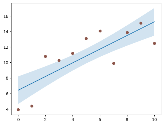
2.4 曲线拟合 - 置信带绘制
线性拟合置信带公式如下:
置信带
=
真值
±
Z
∗
标准差
置信带=真值\pm Z*标准差
置信带=真值±Z∗标准差
核心方法:
Axes.fill_between(x, y1, y2=0, where=None, interpolate=False, step=None, *, data=None, **kwargs)[source]
-
x:两曲线x坐标 -
y1:第一条曲线y坐标 -
y2:第二条曲线y坐标 -
where:定义在何处排除一些水平区域不被填充 布尔值数组 -
interpolate:用于y1 > y2是否进行剪切 默认False -
step阶跃函数步长- pre: y值从每个x位置持续向左移动 即间隔(x[i-1], x[i]]的值为y[i]
- post: y值从每个x位置持续向右移动 即区间[x[i], x[i+1])的值为y[i]
- mid:步骤发生在x位置的中间
示例:
# 创建数据
x = np.linspace(0, 10, 11)
y = [3.9, 4.4, 10.8, 10.3, 11.2, 13.1, 14.1,  9.9, 13.9, 15.1, 12.5]

# 拟合一条线性曲线并估计其y值及其误差
a, b = np.polyfit(x, y, deg=1)
# 绘制所拟合线性曲线
y_est = a * x + b
# 绘制置信带范围
y_err = x.std() * np.sqrt(1/len(x) + (x - x.mean())**2 / np.sum((x - x.mean())**2))

# 绘图
fig, ax = plt.subplots()
ax.plot(x, y_est, '-')
ax.fill_between(x, y_est - y_err, y_est + y_err, alpha=0.2)
ax.plot(x, y, 'o', color='tab:brown')
plt.show()


 被折叠的 条评论
为什么被折叠?
被折叠的 条评论
为什么被折叠?
 到【灌水乐园】发言


