


地理特征类可视化图表总结
地理特征可视化作为连接空间数据与人类认知的桥梁,通过多元化的图表形态将抽象的地理信息转化为直观的视觉语言。在当今大数据时代,这类可视化工具不仅能够整合地形、气候、人口等多维数据,更能通过空间分布规律揭示地理要素的内在联系。例如,蜂窝热力地图通过六边形网格量化区域密度,有效解决数据重叠问题;变形地图以面积变形直观呈现经济权重;关联地图用动态线条刻画物流网络,而气泡地图则以大小与色彩的双重编码实现多维指标同步表达。这些图表共同构建了从宏观格局到微观机理的地理认知体系,为城市规划、环境监测等场景提供决策支撑。
- 蜂窝热力地图
• 特点:将地理区域划分为六边形网格,通过颜色深浅展示数据密度或数值分布,避免点重叠问题,适合高密度数据场景。
• 应用场景:人流密度分析(如景区、地铁站)、环境监测(如空气质量分布)、经济指标区域对比等。
• Python实现:
import numpy as np
import matplotlib.pyplot as plt
from matplotlib import font_manager

plt.rcParams['font.sans-serif'] = ['SimHei']
plt.rcParams['axes.unicode_minus'] = False

np.random.seed(42)
temperature = np.random.normal(25, 5, 2000)
temperature = np.clip(temperature, 15, 35)
humidity = np.random.normal(60, 15, 2000)
humidity = np.clip(humidity, 30, 90)

plt.figure(figsize=(10, 8))
plt.hexbin(temperature, humidity, gridsize=25, cmap='YlOrRd')
plt.colorbar(label=u'数据点数量')

plt.xlabel(u'温度 (°C)')
plt.ylabel(u'相对湿度 (%)')
plt.title(u'城市一天内温度-湿度分布图')

plt.tight_layout()
plt.show()

- 变形地图
• 特点:通过调整地理区域面积或形状,使其与数据值成比例,突出高值区域。
• 应用场景:人口密度对比、GDP分布、选举结果可视化等。
• Python实现:
import geopandas as gpd
import folium
import numpy as np
from branca.colormap import LinearColormap
import requests
import os
from pathlib import Path
import time

def download_geojson():
    """下载并缓存自然地球数据"""
    cache_dir = Path("data")
    cache_file = cache_dir / "ne_110m_admin_0_countries.geojson"

    if not cache_dir.exists():
        cache_dir.mkdir()

    if not cache_file.exists():
        # 备用下载地址列表
        urls = [
            "https://raw.githubusercontent.com/nvkelso/natural-earth-vector/master/geojson/ne_110m_admin_0_countries.geojson",
            "https://cdn.jsdelivr.net/gh/nvkelso/natural-earth-vector@master/geojson/ne_110m_admin_0_countries.geojson"
        ]

        for url in urls:
            try:
                print(f"尝试从 {url} 下载数据...")
                response = requests.get(url, timeout=10)
                if response.status_code == 200:
                    with open(cache_file, 'wb') as f:
                        f.write(response.content)
                    print("下载成功!")
                    break
            except Exception as e:
                print(f"从 {url} 下载失败: {str(e)}")
                time.sleep(1)  # 在尝试下一个地址前等待
        else:
            raise Exception("所有下载地址均失败,请检查网络连接或手动下载文件")

    return cache_file

try:
    # 读取或下载地图数据
    geojson_path = download_geojson()
    china = gpd.read_file(geojson_path)
    china = china[china['CONTINENT'] == 'Asia']

    # 生成示例数据
    china['value'] = np.random.randint(100, 1000, size=len(china))

    # 创建地图中心点
    center = [35, 105]
    m = folium.Map(location=center, zoom_start=4)

    # 创建颜色映射
    colormap = LinearColormap(
        colors=['#FFEDA0', '#FEB24C', '#F03B20'],
        vmin=china['value'].min(),
        vmax=china['value'].max()
    )

    # 添加GeoJson图层
    folium.GeoJson(
        china,
        name='geojson',
        style_function=lambda x: {
            'fillColor': colormap(x['properties']['value']),
            'color': 'black',
            'weight': 1,
            'fillOpacity': 0.7
        },
        tooltip=folium.GeoJsonTooltip(
            fields=['NAME', 'value'],  # 更新字段名
            aliases=['国家名称:', '数值:'],
            localize=True
        )
    ).add_to(m)

    # 添加图例
    colormap.add_to(m)

    # 保存地图
    m.save('china_map.html')

except Exception as e:
    print(f"发生错误: {str(e)}")

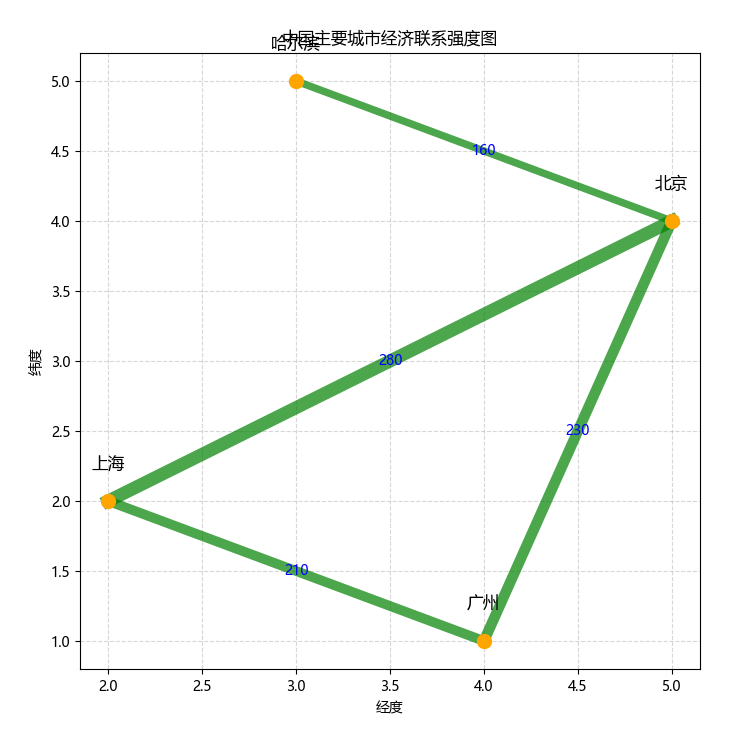
- 关联地图
• 特点:用线条连接地理节点,展示空间关联关系(如交通路线、贸易流向)。
• 应用场景:物流路径分析、人口迁移追踪、经济合作网络。
• Python实现:
import matplotlib.pyplot as plt
from shapely.geometry import LineString

plt.rcParams['font.sans-serif'] = ['Microsoft YaHei']
plt.rcParams['axes.unicode_minus'] = False

city_coords = [(2, 2), (5, 4), (3, 5), (4, 1)]
city_names = ['上海', '北京', '哈尔滨', '广州']

relations = [
    {'from': (2, 2), 'to': (5, 4), 'value': 280},  # 上海-北京
    {'from': (2, 2), 'to': (4, 1), 'value': 210},  # 上海-广州
    {'from': (5, 4), 'to': (3, 5), 'value': 160},  # 北京-哈尔滨
    {'from': (4, 1), 'to': (5, 4), 'value': 230}   # 广州-北京
]

plt.figure(figsize=(8, 8))
for (x, y), name in zip(city_coords, city_names):
    plt.scatter(x, y, s=100, color='orange', zorder=3)
    plt.text(x, y+0.2, name, ha='center', va='bottom', fontsize=12, color='black', family='Microsoft YaHei')  # 指定字体
for rel in relations:
    line = LineString([rel['from'], rel['to']])
    x, y = line.xy
    mid_x = (rel['from'][0] + rel['to'][0]) / 2
    mid_y = (rel['from'][1] + rel['to'][1]) / 2
    plt.plot(x, y, linewidth=rel['value']/30, color='green', alpha=0.7, zorder=2)
    plt.text(mid_x, mid_y, str(rel['value']), color='blue', fontsize=10, ha='center', va='center', family='Microsoft YaHei')
plt.title('中国主要城市经济联系强度图', family='Microsoft YaHei')
plt.xlabel('经度', family='Microsoft YaHei')
plt.ylabel('纬度', family='Microsoft YaHei')
plt.grid(True, linestyle='--', alpha=0.5)
plt.show()
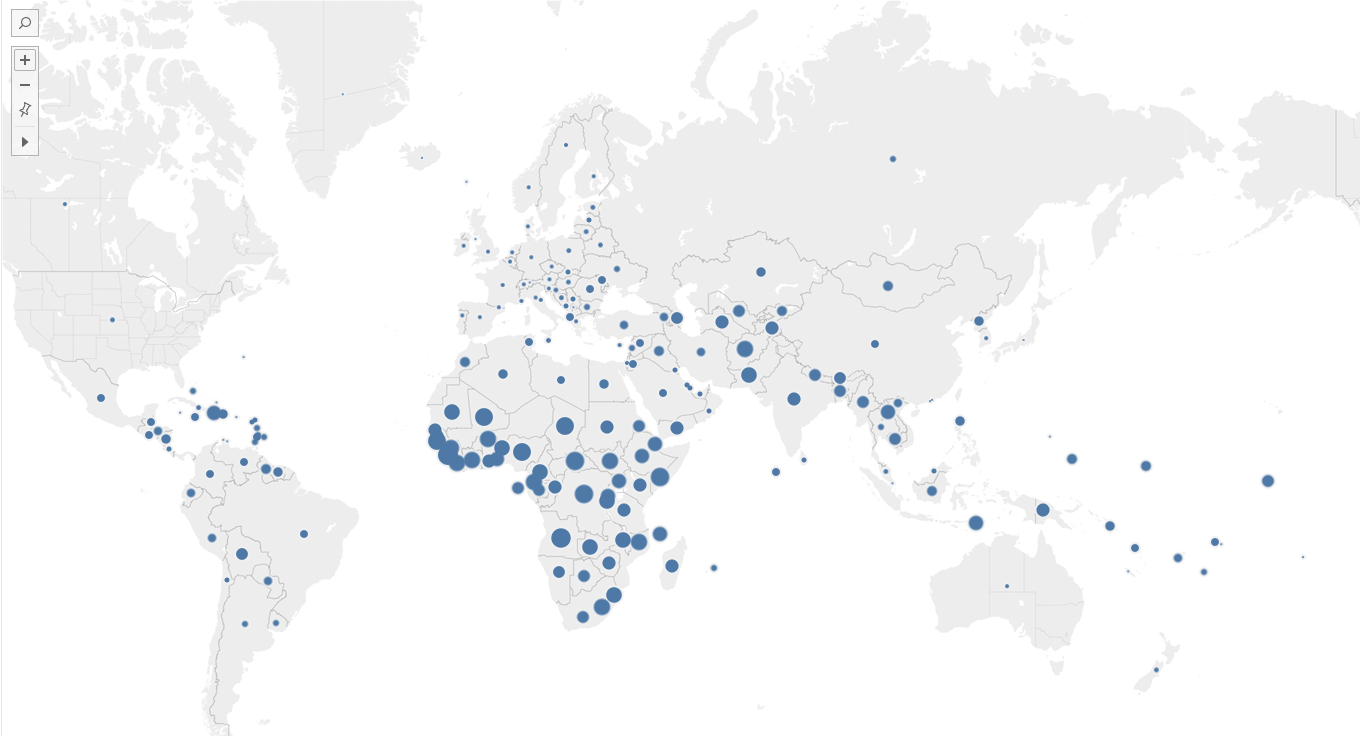
- 气泡地图
• 特点:以气泡大小表示数据值,支持多维数据(大小+颜色)展示。
• 应用场景:区域经济指标对比(如GDP)、资源分布(如石油储量)、人口规模。
实现工具:tableau。

在软件自带的数据源“世界发展指标”下,以“国家/地区”、“总计(新生儿死亡率)”为指标,得到如下气泡图
| 图表类型 | 核心优势 | 适用数据维度 |
|---|---|---|
| 蜂窝热力地图 | 避免数据重叠,适合高密度 | 密度/数值 |
| 变形地图 | 直观反映数据权重 | 比例数据 |
| 关联地图 | 展示空间关联关系 | 连接关系 |
| 气泡地图 | 多维数据同时展示 | 数值+类别 |


 1763
1763

 被折叠的 条评论
为什么被折叠?
被折叠的 条评论
为什么被折叠?
 到【灌水乐园】发言


