 鸿蒙5.0进阶教程:EditableTitleBar组件解析


往期鸿蒙5.0全套实战文章必看:(文中附带全栈鸿蒙5.0学习资料)
EditableTitleBar
编辑型标题栏,适用于多选界面或者内容的编辑界面,一般采取左叉右勾的形式。
说明
该组件从API Version 10开始支持。后续版本如有新增内容,则采用上角标单独标记该内容的起始版本。
导入模块
import { EditableTitleBar } from '@kit.ArkUI'子组件
无
属性
不支持通用属性
EditableTitleBar
EditableTitleBar({leftIconStyle: EditableLeftIconType, imageItem?: EditableTitleBarItem, title: ResourceStr, subtitle?: ResourceStr, menuItems?: Array<EditableTitleBarMenuItem>, isSaveIconRequired: boolean, onSave?: () => void, onCancel?: () =>void, options: EditableTitleBarOptions, contentMargin?: LocalizedMargin})
装饰器类型:@Component
系统能力: SystemCapability.ArkUI.ArkUI.Full
参数:
| 名称 | 参数类型 | 必填 | 装饰器类型 | 说明 |
|---|---|---|---|---|
| leftIconStyle | EditableLeftIconType | 是 | - | 左侧按钮类型。 默认值:EditableLeftIconType.Back,表示返回。 元服务API: 从API version 11开始,该接口支持在元服务中使用。 |
| imageItem12+ | EditableTitleBarItem | 否 | - | 用于左侧头像的单个菜单项目。 默认值:undefined。 元服务API: 从API version 12开始,该接口支持在元服务中使用。 |
| title | ResourceStr | 是 | - | 标题。 默认值:'',表示标题内容为空。 元服务API: 从API version 11开始,该接口支持在元服务中使用。 |
| subtitle12+ | ResourceStr | 否 | - | 副标题。 默认值:'',表示副标题内容为空。 元服务API: 从API version 12开始,该接口支持在元服务中使用。 |
| menuItems | Array<EditableTitleBarMenuItem> | 否 | - | 右侧菜单项目列表。 默认值:undefined。 元服务API: 从API version 11开始,该接口支持在元服务中使用。 |
| isSaveIconRequired12+ | boolean | 是 | - | 是否需要右侧的保存按钮。 默认值:true,表示需要右侧的保存按钮。 说明: 未使用@Require装饰,构造时不强制校验参数。 元服务API: 从API version 12开始,该接口支持在元服务中使用。 |
| onSave | () => void | 否 | - | 保存时的动作闭包。 默认值:() => void。 元服务API: 从API version 11开始,该接口支持在元服务中使用。 |
| onCancel | () => void | 否 | - | 当左侧按钮类型为 Cancel,触发取消时的动作闭包。 默认值:() => void。 从API version 12开始,当左侧按钮类型为 Back,触发返回时的动作闭包。 元服务API: 从API version 11开始,该接口支持在元服务中使用。 |
| options12+ | EditableTitleBarOptions | 是 | - | 标题样式。 默认值: { safeAreaTypes: [SafeAreaType.SYSTEM], safeAreaEdges: [SafeAreaEdge.TOP], backgroundColor: '#00000000' }。 说明: 未使用@Require装饰,构造时不强制校验参数。 元服务API: 从API version 12开始,该接口支持在元服务中使用。 |
| contentMargin12+ | LocalizedMargin | 否 | @Prop | 标题栏外边距,不支持设置负数。 默认值: {start: LengthMetrics.resource($r('sys.float.margin_left')), end: LengthMetrics.resource($r('sys.float.margin_right'))}。 元服务API: 从API version 12开始,该接口支持在元服务中使用。 |
说明
入参对象不可为undefined,即EditableTitleBar(undefined)。
EditableLeftIconType
元服务API: 从API version 11开始,该接口支持在元服务中使用。
| 名称 | 值 | 说明 |
|---|---|---|
| Back | 0 | 返回按钮。 |
| Cancel | 1 | 取消按钮。 |
EditableTitleBarMenuItem
元服务API: 从API version 11开始,该接口支持在元服务中使用。
| 名称 | 类型 | 必填 | 说明 |
|---|---|---|---|
| value | ResourceStr | 是 | 图标资源。 |
| label12+ | ResourceStr | 否 | 图标标签描述。 |
| isEnabled | boolean | 否 | 是否启用,默认启用。 isEnabled为true时,表示为启用。 isEnabled为false时,表示为禁用。 |
| action | () => void | 否 | 触发时的动作闭包。 |
EditableTitleBarItem12+
元服务API: 从API version 12开始,该接口支持在元服务中使用。
| 类型 | 说明 |
|---|---|
| EditableTitleBarMenuItem | 左侧头像的单个菜单类型。 |
EditableTitleBarOptions12+
元服务API: 从API version 12开始,该接口支持在元服务中使用。
| 名称 | 类型 | 必填 | 说明 |
|---|---|---|---|
| backgroundColor | ResourceColor | 否 | 标题栏背景色。 默认值: '#00000000' |
| backgroundBlurStyle | BlurStyle | 否 | 标题栏背景模糊样式。 默认值: [BlurStyle.NONE] |
| safeAreaTypes | Array <SafeAreaType> | 否 | 非必填,配置扩展安全区域的类型。 默认值: [SafeAreaType.SYSTEM] |
| safeAreaEdges | Array <SafeAreaEdge> | 否 | 非必填,配置扩展安全区域的方向。 默认值: [SafeAreaEdge.TOP] |
事件
不支持通用事件
示例
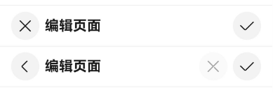
示例1(右侧图标自定义标题栏)
该示例主要演示EditableTitleBar设置左侧图标、主标题及自定义右侧图标区的效果。
import { EditableLeftIconType, EditableTitleBar, promptAction } from '@kit.ArkUI';

@Entry
@Component
struct Index {
  build() {
    Row() {
      Column() {
        Divider().height(2).color(0xCCCCCC)
        // 左侧取消按钮,右侧保存按钮。
        EditableTitleBar({
          leftIconStyle: EditableLeftIconType.Cancel,
          title: '编辑页面',
          menuItems: [],
          onCancel: () => {
            promptAction.showToast({ message: 'on cancel' });
          },
          onSave: () => {
            promptAction.showToast({ message: 'on save' });
          }
        })
        Divider().height(2).color(0xCCCCCC)
        // 左侧返回按钮,右侧自定义取消按钮(disabled)、保存按钮。
        EditableTitleBar({
          leftIconStyle: EditableLeftIconType.Back,
          title: '编辑页面',
          menuItems: [
            {
              value: $r('sys.media.ohos_ic_public_cancel'),
              isEnabled: false,
              action: () => {
                promptAction.showToast({ message: 'show toast index 2' });
              }
            }
          ],
          onSave: () => {
            promptAction.showToast({ message: 'on save' })
          }
        })
        Divider().height(2).color(0xCCCCCC)
      }.width('100%')
    }.height('100%')
  }
}
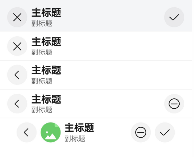
示例2(头像与背景模糊标题栏)
该示例主要演示EditableTitleBar设置背景模糊、头像;取消右侧保存图标及自定义标题栏外边距的效果。
import { EditableLeftIconType, EditableTitleBar, LengthMetrics, promptAction, router } from '@kit.ArkUI';

@Entry
@Component
struct Index {
  @State titleBarMargin: LocalizedMargin = {
    start: LengthMetrics.vp(35),
    end: LengthMetrics.vp(35),
  };

  build() {
    Row() {
      Column() {
        EditableTitleBar({
          leftIconStyle: EditableLeftIconType.Cancel,
          title: '主标题',
          subtitle: '副标题',
          // 设置背景模糊效果
          options: {
            backgroundBlurStyle: BlurStyle.COMPONENT_THICK,
          },
          onSave: () => {
            promptAction.showToast({ message: "on save" });
          },
        })
        Divider().height(2).color(0xCCCCCC);
        EditableTitleBar({
          leftIconStyle: EditableLeftIconType.Cancel,
          title: '主标题',
          subtitle: '副标题',
          // 取消右侧保存按钮
          isSaveIconRequired: false,
        })
        Divider().height(2).color(0xCCCCCC);
        EditableTitleBar({
          leftIconStyle: EditableLeftIconType.Back,
          title: '主标题',
          subtitle: '副标题',
          isSaveIconRequired: false,
          onCancel: () => {
            router.back();
          },
        })
        Divider().height(2).color(0xCCCCCC);
        EditableTitleBar({
          leftIconStyle: EditableLeftIconType.Back,
          title: '主标题',
          subtitle: '副标题',
          menuItems: [
            {
              value: $r('sys.media.ohos_ic_public_remove'),
              isEnabled: true,
              action: () => {
                promptAction.showToast({ message: "show toast index 1" });
              }
            }
          ],
          isSaveIconRequired: false,
          // 点击左侧Back图标,触发的动作。
          onCancel: () => {
            router.back();
          },
        })
        Divider().height(2).color(0xCCCCCC);
        EditableTitleBar({
          leftIconStyle: EditableLeftIconType.Back,
          title: '主标题',
          subtitle: '副标题',
          // 设置可点击头像
          imageItem: {
            value: $r('sys.media.ohos_ic_normal_white_grid_image'),
            isEnabled: true,
            action: () => {
              promptAction.showToast({ message: "show toast index 2" });
            }
          },
          // 设置标题栏外边距
          contentMargin: this.titleBarMargin,
          // 右侧图标配置
          menuItems: [
            {
              value: $r('sys.media.ohos_ic_public_remove'),
              isEnabled: true,
              action: () => {
                promptAction.showToast({ message: "show toast index 3" });
              }
            }
          ],
          onCancel: () => {
            router.back();
          },
        })
      }
    }
  }
}


 扫一扫
扫一扫


&spm=1001.2101.3001.5002&articleId=145516224&d=1&t=3&u=100e2e1e01684d539db027f8f079f712)
 1130
1130

 被折叠的 条评论
为什么被折叠?
被折叠的 条评论
为什么被折叠?
 到【灌水乐园】发言


