


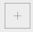
 本文介绍了如何使用CSS创建带有虚线边框的div,并通过伪元素实现横线和竖线效果。详细讲解了`::before`和`::after`的选择器用法及样式设置。
css
<style>
	#img_div{
		width:100px;
		height:100px;
		border:1px dashed #000; <!-- 虚线 -->
		margin:0 auto;
		position: relative;
	}
	<!-- 伪元素:横线 -->
	#img_div::before{
		content: "";
		position: absolute;
		left: 35%;
		top: 50%;
		width: 30px;
		border-top: 1px solid;
	}
	<!-- 伪元素:竖线 -->
	#img_div::after {
		content: "";
		position: absolute;
		left: 50%;
		top: 35%;
		height: 30px;
		border-left: 1px solid;
	}
	#img_div>img{
        width: 100%;
        height: 100%;
    }
</style>
html
<div id="img_div">
	<img id="imgSelf">
	<input type="file" id="imgUpload" accept="image/*" style="display:none;">
</div>
页面样式:
样式接下一篇:js 选择图片并在页面预览(以base64形式)


 扫一扫
扫一扫


 2275
2275

 被折叠的 条评论
为什么被折叠?
被折叠的 条评论
为什么被折叠?
 到【灌水乐园】发言


