


 本文深入讲解CSS的基本语法,包括选择器、属性设置、字体、颜色、背景、边框、阴影、动画等核心概念,帮助初学者快速掌握CSS的使用技巧。
css基本语法
基本语法   在<head></head>标签之间书写css基本语法
<style type="text/css">
选择器{
       属性1:属性值;
       属性2:属性值
       ......
     }
</style>
选择器介绍
1.类选择器
<style type="text/css">
基本语法:  控制类名相同的标签
.类名{
属性一:属性值;
属性二:属性值;
......
}
</style>
例:
<html>
	<head>
		<meta charset="utf-8">
		<title></title>
		<style type="text/css">
			.div1 {
				     width: 50px; 设置宽度
				     height:50px;  设置高度
				     background: #8A2BE2; 设置背景颜色
			}
		</style>
	</head>
	       <body>
		           <div id="" class="div1">  类名为:div1

		           </div>
	       </body>
</html>
2.id选择器
<style type="text/css">
基本语法:
#ID名{
    属性一:属性值;
    属性二:属性值;
    ......
}
</style>
<head>
		<meta charset="utf-8">
		<style type="text/css">
			#div1{
				width: 50px;
				height:50px;
				border: 5px blue solid;
			}
		</style>
	</head>
	<body>
		<div id="div1" class=""></div>
	</body>
3.标签选择器
<style type="text/css">
基本语法: 控制类型相同的标签
标签类型{
    属性一:属性值;
    属性二:属性值;
    ......
}
<head>
		<meta charset="utf-8">
		<style type="text/css">
			div{
				width: 50px;
				height:50px;
				border: 5px blue solid;
				background: #FF0000;
			}
		</style>
	</head>
	<body>
		<div id="div1" class=""></div>
	</body>
4.包含选择器
<html>
 <head>
  <title> New Document </title>
  <style>
	ol  ul  li{font-size:50px; color:red}
  </style>
 </head>
 <body>
    <ol>
	            <li>zhangsan
	            <li>23
	            <ul>
                <li>lisi
	            </ul>
	</ol>
 </body>
</html>
5.伪类
四种状态:
link{}链接状态 hover{} 鼠标悬浮 active{}按下鼠标 visited{}访问过后
<html>
   <head>
   	<meta charset="utf-8">
   	<style type="text/css">
   		    a:hover{font-size:50px;}  //鼠标悬浮在链接上时,使字体大小变为50px;
   			a:active{font-size:30px; color: #ADFF2F; font-family: 楷体;} // 鼠标点击链接时,颜色改变,字体变为楷体,字体大小改变;
   	</style>
   </head>
   <body>
   	    <a  href="#">我的链接</a>
   </body>
</html>
选择器优先级:内联样式>ID选择器>类选择器>标签选择器
css属性
字体设置
font-family :设置字体
font-size : 绝对尺寸/关键字/相对尺寸/百分比
font-style : 设置字体的样式(设置字体是否为斜体字)
取值:
- normal----正常显示字体
- italic—斜体字
- oblique–歪斜体(倾斜角度大一点)
font-weight 设置字体的加粗
取值:
- normal ---- 正常显示、bold ----粗体(数字700粗细值)
- bolder —加粗
- lighter —细体(比正常字体稍微细一点)
- number ----数字型(一般整百设置,有9个级别(100----900)数字取值越大越粗)
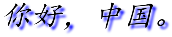
text-shadow 设置字体阴影
<html>
	<head>
		<meta charset="utf-8">
		<title></title>
		<style type="text/css">
			div{
				font-family: 楷体;
				font-size: 100px;
				font-style: oblique;
				text-shadow: 10px 10px 10px blue;
			}
		</style>
	</head>
	<body>
		<div id="">
			你好,中国。
		</div>
	</body>
</html>
颜色的设置
关键字 color
背景设置
1、设置背景颜色 background-color
2、设置背景图片 background-image
3、background-attachment 是指设置背景图片是否随着滚动条的移动而移动
取值:
- scroll —表示背景图片随着滚动条的移动而移动
- fixed—表示背景图片固定在页面上不动,不随滚动条移动而移动
设置背景图片的重复
background-repeat 设置背景图片总是在水平和垂直方向重复显示铺平整个网页。
取值:
- repeat 背景图片在水平和垂直方向平铺
- repeat-x 背景图片在水平方向平铺
- repeat-y 背景图片在垂直方向平铺
- no-repeat 背景图片不平铺
背景图片位置设置
background-position
关键字            百分比              位置说明
top left          0%  0%              左上位置
top center        50%  0%             靠上居中
top right         100%  0%            右上位置
left  center      0%  50%             靠左居中
center center     50%  50%            正中位置
right center      100%  50%           靠右居中
bottom  left      0%  100%            左下位置
bottom  center    50%  100%            靠下居中
bottom  right     100%  100%           右下位置
边框设置
边框的样式
border-style
基本语法
- border-style
- border-top-style
- border-bottom-style
- border-left-style
- border-right-style
取值:
- none 没有边框
- dotted 点线
- dashed 虚线
- solid 实线
- double 双实线
- groove 凹型线
- ridge 凸型线
- inset 嵌入式
- outset 嵌出式
取同一个值:四条边框线是同一个线型
取两个值:上下边框使用第一个取值,左右边框使用第二个取值
取三个值: 上边框取第一个值,左右取第二个值,下边框取第三个值
取4个值:上第一个值,右取第二个值,下取第三个值,左取第四个值
边框的宽度
border-width
基本语句:
- border-width
- border-top-width
- border-bottom-width
- border-left-width
- border-right-width
取值:
- thin ----细边框
- medium —中等边框
- thick–粗边框
- 长度—数字
边框颜色
border-color
基本设置语法:
- border-color
- border-top-color
- border-bottom-color
- border-left-color
- border-right-color
<html>
	<head>
		<meta charset="utf-8">
		<title></title>
		<style type="text/css">
			#div1{
				width:500px;
				height: 500px;
				background:red ;  //设置背景颜色
				border-style:groove ;  //设置边框类型
				border-top-color: aqua;  //设置上边框颜色类型
				border-bottom-color: blue; //设置下边框颜色类型
				border-left-style:solid ; //设置左边框类型
				border-right-style: dashed; //设置右边框类型
				border-width: 20px;//设置边框宽度
			}
		</style>
	</head>
	<body>
		<div id="div1">

		</div>
	</body>
</html>
边框的综合设置和边距
边距指的是设置网页中某个元素的四边和网页中其他元素之间的空白距离
- 上边距 margin-top
- 下边距 margin-bottom
- 左边距 margin-left
- 右边距 margin-right
- 复合设置 margin
边框的圆角
border-radius设置边框圆角
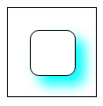
边框的阴影
box-shadow: 10px 10px 5px #888888;//添加阴影
X方向的偏移像素
Y方向的偏移像素
模糊的像素值
阴影颜色
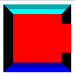
<html>
	<head>
		<meta charset="utf-8">
		<title></title>
		<style type="text/css">
			#div1{
				width: 100px;
				height: 100px;
				border:1px black solid;
			}
			#div2{
				width: 50px;
				height: 50px;
				margin-top: 25px;
				margin-left: 25px;
				border:1px black solid;
				border-radius: 10px;
				box-shadow: 10px 10px 20px #00FFFF;

			}
		</style>
	</head>
	<body>
		<div id="div1">
			<div id="div2"></div>
		</div>
	</body>
</html>
内间距
用来设置边框和其内部的元素之间的空白距离
上边距 padding-top
下边距 padding-bottom
左边距 padding-left
右边距 padding-right
复合设置 padding
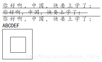
调整字符间距
letter-spacing
用来控制字符之间的间距,这个间距实际上就是在浏览器中所显示的字符间的空格距离。
添加文字的修饰
text-decoration
属性的取值:
- underline----添加下划线
- overline—添加上划线
- line-through–添加删除线
- blink—添加闪烁效果(只能在Netscape的浏览器中正常显示)
- none–没有任何的修饰
文本的对齐方式
text-align
用来控制文本的排列和对齐方式
属性的取值:
- left–左对齐
- right–右对齐
- center–居中对齐
- justify–两端对齐
字母大小写转换
text-transform:uppercase;
<html>
	<head>
		<meta charset="utf-8">
		<title></title>
		<style type="text/css">
			#div1{
				width: 100px;
				height: 100px;
				border:1px black solid;
				padding-top:25px ;
				padding-left: 25px;
				box-sizing: border-box;  /* 不会诚达外框 */
			}
			#div2{
				width: 50px;
				height: 50px;
				border:1px black solid;
			}
			#spn1{
				font-family: 楷体;
				font-size: 5mm;
				letter-spacing: 5px;  /* 字间距5px */
				text-decoration: underline; /* 添加下划线 */
				text-align: center;
			}
			#spn2{
				font-family: 楷体;
				font-size: 5mm;
				letter-spacing: 2px;  /* 字间距2px */
				text-decoration: line-through; /* 添加删除线 */
				text-align: left;
			}
			#spn3{
				font-family: 楷体;
				font-size: 5mm;
				letter-spacing: 5px;  /* 字间距5px */
				text-decoration: overline; /* 添加上划线 */
				text-align: right;
			}
			#spn4{
				font-family: 楷体;
				font-size: 5mm;
				text-transform: uppercase;  /* 变成大写字母 */
			}
		</style>
	</head>
	<body>
		<span id="spn1">
			你好啊,中国,快要上学了;
		</span>
		<br>
		<span id="spn2">
			你好啊,中国,快要上学了;
		</span>
		<br>
		<span id="spn3">
			你好啊,中国,快要上学了;
		</span>
		<br>
		<span id="spn4">
			abcdef
		</span>
		<div id="div1">
			<div id="div2">
			</div>
		</div>
	</body>
</html>
设置鼠标指针样式
cursor:auto/crosshair/default/pointer/move/e-resize/ne-resize/nw-resize/n-resize/wait/text/help
cursor:url(’’),default;
<html>
	<head>
		<meta charset="utf-8">
		<title></title>
		<style type="text/css">
			#div1{
				width: 100px;
				height: 100px;
				border:1px black solid;
			}
			#div1:hover{  /* 设置手标悬浮状态 */
				cursor: pointer;  //变为小手
				cursor: crosshair; /* 变为十字光标 */
			}
		</style>
	</head>
	<body>
		<div id="div1">
			<div id="div2"></div>
		</div>
	</body>
</html>
段落的缩进设置
text-indent
用来控制每个段落的首行缩进的距离。
<html>
  <head>
  	<meta charset="utf-8">
  	<title></title>
  	<style type="text/css">
  		p{
  			text-indent: 2em;
  		}
  	</style>
  </head>
  <body>
  	<p>你好,中国;你好,中国;你好,中国;你好,中国;你好,中国;你好,中国;你好,中国;你好,中国;你好,中国;你好,中国;你好,中国;你好,中国;你好,中国;你好,中国;</p>
  </body>
</html>

列表属性
list-style:none 去掉列表的标记图形
list-style-image:url(a.jpg); 列表的标记图片
list-style-position: inside/outside; 列表的位置
list-style-type:disc/circle/square/…; 列表前面的图型
<html>
	<head>
		<meta charset="utf-8">
		<title></title>
		<style type="text/css">
			#ul1{
				list-style-type: disc;  /* 将前面的标记换为实心点 */
			}
			#ul2{
				list-style: none;  /* 去掉前面的标记 */
			}
		</style>
	</head>
	<body>
		<ul id="ul1">
			<li>lala</li>
		</ul>
		<br>
		<br>
		<br>
		<ul id="ul2">
			<li>haha</li>
		</ul>
	</body>
</html>
行高的设置
line-height
用来控制文本内容之间行间距
属性取值
normal—浏览器默认的行高
彩色图片变白(滤镜)
filter: grayscale(100%);
filter: gray;
放大缩小位移
Transform
transform:rotate(30deg);//旋转30度
transform:translate(50px,100px) 把元素从左侧移动 50 像素,从顶端移动 100 像素
transform:scale(2,4) 把宽度转换为原始尺寸的 2 倍,把高度转换为原始高度的 4 倍。
transform:skew(30deg,20deg) 围绕 X 轴把元素翻转 30 度,围绕 Y 轴翻转 20 度。
<html>
	<head>
		<meta charset="utf-8">
		<title></title>
		<style type="text/css">
			div{
				width: 150px;
				height: 150px;
				float: left;
				border: 1px black solid;
			}
			#div2>img{
				  filter: grayscale(100%);
				  filter: gray;
			}
		</style>
	</head>
	<body>
		<div id="div1">
			<img src="20150708112951_Ts8dW.jpeg" style="width: 100%; height: 100%;">
		</div>
		<div id="div2">
			<img src="20150708112951_Ts8dW.jpeg" style="width: 100%; height: 100%;">
		</div>
		<div id="div3" style="transform:rotate(30deg); margin-left: 2%;">  <!-- 旋转30度 -->

		</div>
		<div id="div4" style="transform:scale(0.5,0.5);margin-left: 2%;">  <!-- 尺寸缩小一半 -->

		</div>
		<div id="div5" style="transform:skew(45deg);margin-left: 2%;">  <!-- x轴扭动45度 -->

		</div>
	</body>
</html>
过渡动画
transition
格式:transition: width 2s; (应用于宽度,时间2秒)
渐变动画:transition: transition-property transition-duration transition-timing- function transition-delay;
transition-property:width;
transition-duration:5s;
transition-delay:2s;
transition-timing-function:
linear 规定以相同速度开始至结束的过渡效果。
ease 规定慢速开始,然后变快,然后慢速结束的过渡效果。
ease-in 规定以慢速开始的过渡效果
ease-out 规定以慢速结束的过渡效果。
transform 动画
/位移动画 左右位置,上下位置/
transform: translate(300px,200px);
/transform: translateX(100px);/
/transform: translateY(100px);/
/旋转动画/
transform: rotate(45deg);
/transform: rotateX(45deg);/
缩放动画
transform: scale(2);
/transform: scaleX();/
/扭曲动画/
transform: skew(45deg);
/transform: skewX(35deg);/
<html>
	<head>
		<meta charset="utf-8">
		<title></title>
		<style type="text/css">
			#div1{
				border: 30px whitesmoke solid;
				width: 300px;
				height: 300px;
				border-style: inset;
				float: left;
			}
			img{
				margin-top: 50px;
				margin-left: 50px;
				width: 200px;
				height: 200px;
				transition: transform 1s;  //过渡动画
			}
			#div1:hover>img{
				transform: rotate(10deg);  //旋转动画
				transition: transform 1s;
			}
			#div2{
				border: 20px whitesmoke solid;
				width: 100px;
				margin-left: 50px;
				margin-top: 50px;
				height:100px;
				border-style: inset;
				float: left;
				transition: transform 1s;
			}
			#div3{
				border: 20px whitesmoke solid;
				width: 100px;
				margin-left: 50px;
				margin-top: 50px;
				height:100px;
				border-style: inset;
				float: left;
				transition: transform 1s;
			}
			#div4{
				border: 20px whitesmoke solid;
				width: 100px;
				margin-left: 50px;
				margin-top: 50px;
				height:100px;
				border-style: inset;
				float: left;
				transition: transform 1s;
			}
			#div2:hover{
				transform: skew(30deg,30deg); // 扭曲动画
				transition: transform 1s;
			}
			#div3:hover{
				transform: scale(0.5,0.6);
				transition: transform 1s;
			}
			#div4:hover{
				transform: translate(600px,0px); //位移动画
				transition: transform 1s;
			}
		</style>
	</head>
	<body>
		<div id="div1">
			<img src="img/touxiang.png">
		</div>
		<div id="div2">
		</div>
		<div id="div3">
		</div>
		<div id="div4">
		</div>
	</body>
</html>
自定义动画
Animation
格式:animation:myfirst 5s;(myfirst动画名,5s动画时间)
@keyframes myfirst
{ 0% {background: red;}
25% {background: yellow;}
50% {background: blue;}
100% {background: green;} }
@keyframes myfirst
{ from {background: red;}
to {background: yellow;}}
自定义动画详细属性
混合调用语法
animation: name duration timing-function delay iteration-count direction fill-mode play-state;
单个使用属性
animation-name 指定要绑定到选择器的关键帧的名称
animation-duration 动画指定需要多少秒或毫秒完成
animation-timing-function 设置动画将如何完成一个周期
animation-delay 设置动画在启动前的延迟间隔。
animation-iteration-count 定义动画的播放次数。 infinite无限次
animation-direction 指定是否应该轮流反向播放动画。
animation-fill-mode 规定当动画不播放时(当动画完成时,或当动画有一个延迟未开始播放时),要应用到元素的样式。
animation-play-state 指定动画是否正在运行或已暂停。
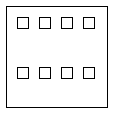
盒子模型
顺序排列,用于div设置显示方式为盒子模型给父布局设置,其子元素按父元素设置的效果排列:
//设置盒子模型
display: flex;
// 排列方式横向或竖向 后面加上wrap可自动控制宽高
flex-direction: row | row-reverse | column | column-reverse
justify-content:flex-start | flex-end | center;按方向居开始 中间 末尾
flex-flow:和上面的属性值相同 加上warp可以换行或换列
例子:flex-flow:row wrap; 横向排列 如果排不下 自动换到下一行
flex-flow:column wrap; 竖向排列 排不下 自动换列
flex-wrap:wrap;//自动换行 或换列
设置盒子模型display: flex;后给其子元素设置margin:auto;为自动居中
例子:margin:auto; 盒子的层上下左右都居中
margin:10px auto; 盒子的层 距离顶部10px 左右居中
设置多个控件排列顺序:order:1;
<html>
	<head>
		<meta charset="utf-8">
		<title></title>
		<style type="text/css">
			#div1 {
				width: 100px;
				height: 100px;
				border: 1px black solid;
				display: flex;
				flex-wrap: wrap;
			}
			#div2 {
				width: 10px;
				height: 10px;
				border: 1px black solid;
				margin-top:10px ;
				margin-left: 10px ;
			}
		</style>
	</head>
	<body>
		<div id="div1">
			<div id="div2"></div>
			<div id="div2"></div>
			<div id="div2"></div>
			<div id="div2"></div>
			<div id="div2"></div>
			<div id="div2"></div>
			<div id="div2"></div>
			<div id="div2"></div>
		</div>
	</body>
</html>
数字时钟
<html>
	<head>
		<meta charset="utf-8">
		<title></title>
	</head>
	<body>
		<span id="span1">

		</span>
	</body>
	<script type="text/javascript">
		setInterval(showTime,1000);
		function showTime(){
			var date= new Date().toLocaleString();
		    document.getElementById("span1").innerText=date;
		}
		showTime();
	</script>
</html>


 扫一扫
扫一扫


 681
681

 被折叠的 条评论
为什么被折叠?
被折叠的 条评论
为什么被折叠?
 到【灌水乐园】发言


