


 本文详细介绍了CSS3中的背景特性,包括背景图像区域、定位、大小设置,特别是多重背景图像的使用。同时,深入讲解了线性渐变和径向渐变,以及如何在IE浏览器中实现渐变效果,提供了具体的代码示例。
目录
*** css3背景 ***
-
背景图像区域


<!DOCTYPE html>
<html lang="en">
<head>
<meta charset="UTF-8">
<title>Clip</title>
<style type="text/css">
* {
    margin: 0;
    padding: 0;
    border: none;
}
div {
    width: 800px;
    height: 400px;
    padding: 50px;
    border: 50px solid transparent;  /*边框透明*/
    background: url('bg1.jpg') no-repeat center center;
    background-clip: border-box;
    background-clip: padding-box;
    background-clip: content-box;
}
span.div_border {   /*虚拟边框*/
    position: absolute;
    top: 0;
    left: 0;
    width: 800px;
    height: 400px;
    padding: 50px;
    border: 50px solid rgba(255, 0, 0, .25);
}
span.div_padding {    /*虚拟div填充*/
    position: absolute;
    top: 50px;
    left: 50px;
    width: 800px;
    height: 400px;
    border: 50px solid rgba(255, 255, 0, .25);
}
</style>
</head>
<body>
<div></div>
<span class="div_border"></span>
<span class="div_padding"></span>
</body>
</html>
-
背景图像定位

<!DOCTYPE html>
<html lang="en">
<head>
<meta charset="UTF-8">
<title>Clip</title>
<style type="text/css">
* {
    margin: 0;
    padding: 0;
    border: none;
}
div {
    width: 800px;
    height: 400px;
    padding: 50px;
    border: 50px solid transparent;
    background: url('bg1.jpg') no-repeat 50px 100px;
    background-origin: border-box;
    background-origin: padding-box;
    background-origin: content-box;
}
span.div_border {
    position: absolute;
    top: 0;
    left: 0;
    width: 800px;
    height: 400px;
    padding: 50px;
    border: 50px solid rgba(255, 0, 0, .25);
}
span.div_padding {
    position: absolute;
    top: 50px;
    left: 50px;
    width: 800px;
    height: 400px;
    border: 50px solid rgba(255, 255, 0, .25);
}
</style>
</head>
<body>
<div></div>
<span class="div_border"></span>
<span class="div_padding"></span>
</body>
</html>
-
背景图像大小
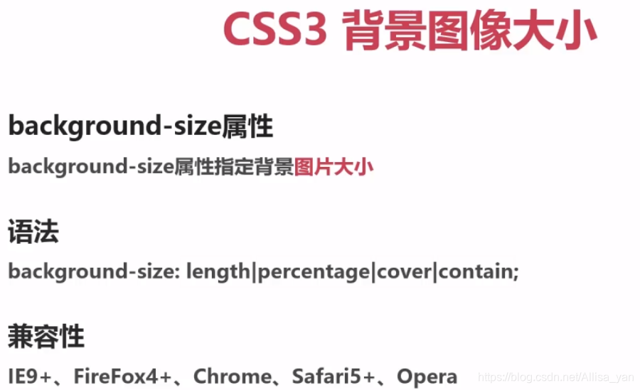
A、length,设置背景图片的高和宽
B、cover,把背景图片扩展至足够大,以使背景图片完全覆盖区域
C、percentage,以父元素的百分比来设置图像的宽度和高度
D、contain,把图像扩展至最大尺寸,以使其宽度和高度完全适应内容区域
<!DOCTYPE html>
<html lang="en">
<head>
<meta charset="UTF-8">
<title>Size</title>
<style type="text/css">
div {
	width: 800px;
	height: 500px;
	background: url("bg1.jpg") no-repeat;
	background-size: contain;  /*将背景图片等比缩放至某一边紧贴容器边缘为止*/
	background-size: cover;   /*将背景图片等比缩放以填满容器*/
	background-size: 800px 500px;
	background-size: 800px;  /*如果只写一个值,则宽会显示800,高度会自动缩放合适大小*/
	background-size: 50% 50%;
	background-size: 50%;
	background-size: 100% 100%;
	background-size: 100%;  /*只写一个值,默认第二个值为auto,图片会被压缩跟div一样大*/
}
</style>
</head>
<body>
<div></div>
</body>
</html>
-
多重背景图像
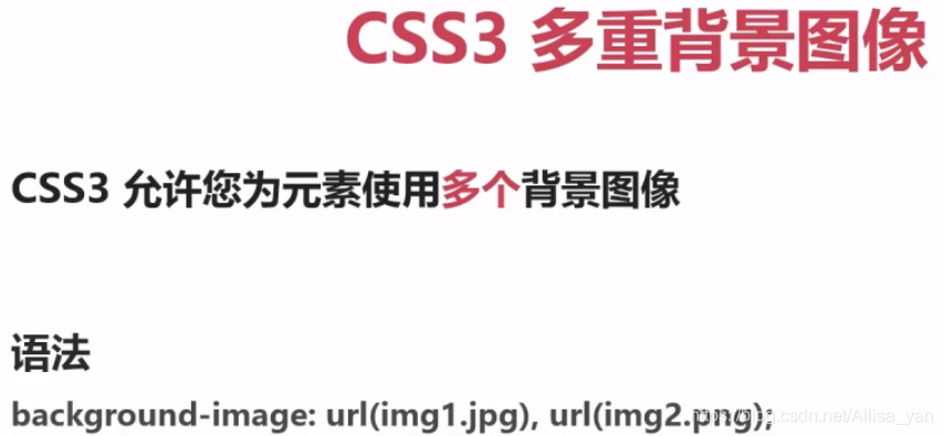 // 前面图片会依次覆盖
<!DOCTYPE html>
<html lang="en">
<head>
<meta charset="UTF-8">
<title>Size</title>
<style type="text/css">
div {
    width: 800px;
    height: 500px;
    background-image: url('bg2.png'), url('bg1.jpg');
    background-image: url('bg1.jpg'), url('bg2.png');
}
</style>
</head>
<body>
<div></div>
</body>
</html>
-
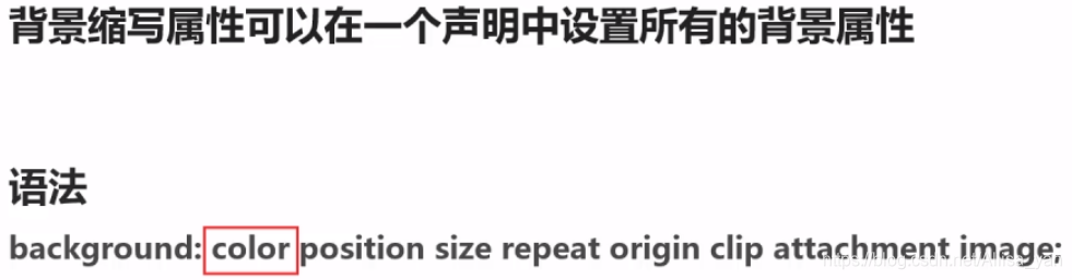
背景属性整合
<!DOCTYPE html>
<html lang="en">
<head>
<meta charset="UTF-8">
<title>Size</title>
<style type="text/css">
* {
    margin: 0;
    padding: 0;
    border: none;
}
div {
    width: 800px;
    height: 400px;
    padding: 50px;
    border: 50px solid transparent;
    /*background: color position size repeat origin clip attachment image;*/
    background: #abcdef center 50% no-repeat content-box content-box fixed url('bg1.jpg');
    /*建议如下书写方式:*/
    background: #abcdef url('bg1.jpg') no-repeat center center;
    background-size: 50%;
    background-origin: content-box;
    background-clip: content-box;
    background-attachment: fixed;
}
span.div_border {
    position: absolute;
    top: 0;
    left: 0;
    width: 800px;
    height: 400px;
    padding: 50px;
    border: 50px solid rgba(255, 0, 0, .25);
}
span.div_padding {
    position: absolute;
    top: 50px;
    left: 50px;
    width: 800px;
    height: 400px;
    border: 50px solid rgba(255, 255, 0, .25);
}
</style>
</head>
<body>
<div></div>
<span class="div_border"></span>
<span class="div_padding"></span>
</body>
</html>
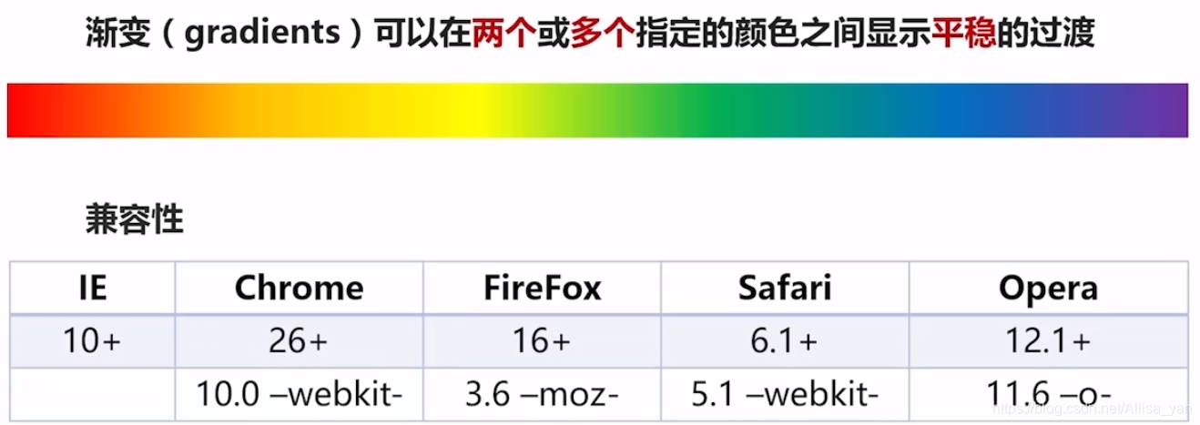
*** css3渐变 ***
-
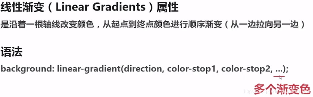
线性渐变
 // direction-方向
<!DOCTYPE html>
<html lang="en">
<head>
<meta charset="UTF-8">
<title>线性渐变 - 从上到下(默认情况)</title>
<style type="text/css">
div {
width: 800px; height: 500px;
background: -webkit-linear-gradient(red, blue); /*兼容性*/
background: -moz-linear-gradient(red, blue);
background: -o-linear-gradient(red, blue);
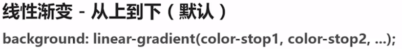
background: linear-gradient(red, blue); /*从上红到下蓝*/
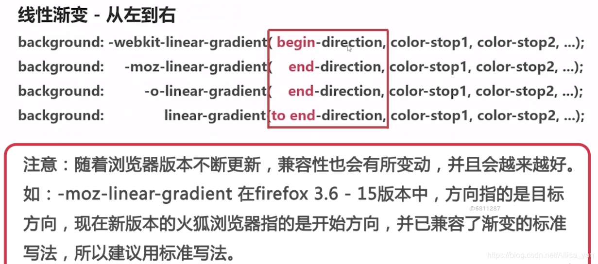
background: -webkit-linear-gradient(left, red , blue); /*从左开始到右*/
background: -moz-linear-gradient(right, red, blue); /*结尾是右边*/
background: -o-linear-gradient(right, red, blue);
background: linear-gradient(to right, red , blue); /*到达右边*/
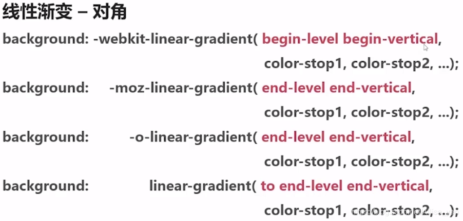
background: -webkit-linear-gradient(left top, red, yellow, blue);/*从左上角开始*/
background: -moz-linear-gradient(right bottom, red, yellow, blue);/*右下角结束*/
background: -o-linear-gradient(right bottom, red, yellow, blue);/*右下角结束*/
background: linear-gradient(to right bottom, red, yellow, blue);/*到达右下角*/
}
</style>
</head>
<body>
<div></div>
</body>
</html>
<!DOCTYPE html>
<html lang="en">
<head>
<meta charset="UTF-8">
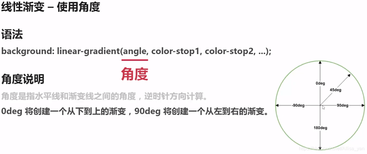
<title>线性渐变 - 使用角度</title>
<style type="text/css">
div {
width: 800px; height: 500px;
background: -webkit-linear-gradient(135deg, red, yellow, blue);
background: -moz-linear-gradient(135deg, red, yellow, blue);
background: -o-linear-gradient(135deg, red, yellow, blue);
background: linear-gradient(135deg, red, yellow, blue);
}
</style>
</head>
<body>
<div></div>
</body>
</html>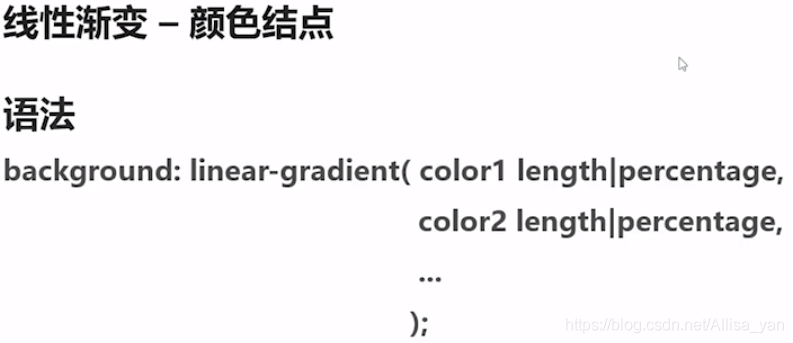
// 第一个颜色不写默认0%,最后一个不写默认100%
<!DOCTYPE html>
<html lang="en">
<head>
<meta charset="UTF-8">
<title>线性渐变 - 颜色结点</title>
<style type="text/css">
div {
	width: 800px; height: 500px;
	background: -webkit-linear-gradient(90deg, red, orange, yellow, green, blue, indigo, violet);
	background:    -moz-linear-gradient(90deg, red, orange, yellow, green, blue, indigo, violet);
	background:      -o-linear-gradient(90deg, red, orange, yellow, green, blue, indigo, violet);
	background:         linear-gradient(90deg, red, orange, yellow, green, blue, indigo, violet);

        background: -webkit-linear-gradient(90deg, red 10%, orange 15%, yellow 20%, green 50%, blue 70%, indigo 80%, violet 100%);
	background:    -moz-linear-gradient(90deg, red 10%, orange 15%, yellow 20%, green 50%, blue 70%, indigo 80%, violet 100%);
	background:      -o-linear-gradient(90deg, red 10%, orange 15%, yellow 20%, green 50%, blue 70%, indigo 80%, violet 100%);
	background:         linear-gradient(90deg, red 10%, orange 15%, yellow 20%, green 50%, blue 70%, indigo 80%, violet 100%);

        background: -webkit-linear-gradient(90deg, rgba(255, 0, 0, 0), rgba(255, 0, 0, 1));
	background:    -moz-linear-gradient(90deg, rgba(255, 0, 0, 0), rgba(255, 0, 0, 1));
	background:      -o-linear-gradient(90deg, rgba(255, 0, 0, 0), rgba(255, 0, 0, 1));
	background:         linear-gradient(90deg, rgba(255, 0, 0, 0), rgba(255, 0, 0, 1));
}
</style>
</head>
<body>
<div></div>
</body>
</html>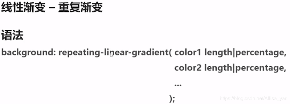
<!DOCTYPE html>
<html lang="en">
<head>
<meta charset="UTF-8">
<title>线性渐变 - 使用透明</title>
<style type="text/css">
div {
	width: 800px; height: 500px;
	background: -webkit-repeating-linear-gradient(90deg, red 0%, blue 10%, red 20%);
	background:    -moz-repeating-linear-gradient(90deg, red 0%, blue 10%, red 20%);
	background:      -o-repeating-linear-gradient(90deg, red 0%, blue 10%, red 20%);
	background:         repeating-linear-gradient(90deg, red 0%, blue 10%, red 20%);
}
</style>
</head>
<body>
<div></div>
</body>
</html>
-
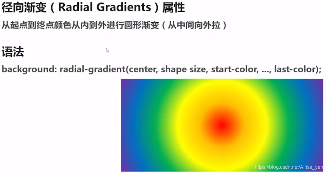
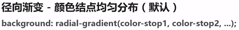
径向渐变(径-半径)

<!DOCTYPE html>
<html lang="en">
<head>
<meta charset="UTF-8">
<title>径向渐变 - 颜色结点均匀分布(默认情况)</title>
<style type="text/css">
div {
	width: 800px; height: 500px;
	background: -webkit-radial-gradient(red, blue);
	background:    -moz-radial-gradient(red, blue);
	background:      -o-radial-gradient(red, blue);
	background:         radial-gradient(red, blue);

        background: -webkit-radial-gradient(red 50%, blue 70%);
	background:    -moz-radial-gradient(red 50%, blue 70%);
	background:      -o-radial-gradient(red 50%, blue 70%);
	background:         radial-gradient(red 50%, blue 70%);
}
</style>
</head>
<body>
<div></div>
</body>
</html>
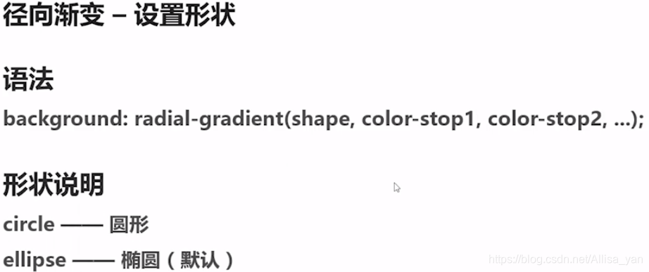
【注意】:如果设置宽高一样,那参数不论设置为ellipse还是circle,显示效果均为圆形
<!DOCTYPE html>
<html lang="en">
<head>
<meta charset="UTF-8">
<title>径向渐变 - 设置形状</title>
<style type="text/css">
div {
	width: 800px; height: 500px;
	background: -webkit-radial-gradient(circle, red, blue);
	background:    -moz-radial-gradient(circle, red, blue);
	background:      -o-radial-gradient(circle, red, blue);
	background:         radial-gradient(circle, red, blue);
}
</style>
</head>
<body>
<div></div>
</body>
</html>
<!DOCTYPE html>
<html lang="en">
<head>
<meta charset="UTF-8">
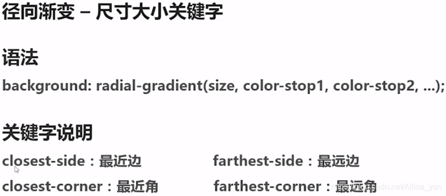
<title>径向渐变 - 不同尺寸大小关键字的使用</title>
<style type="text/css">
div.closest-side {
width: 300px; height: 200px; margin: 50px;
background: -webkit-radial-gradient(30% 70%, closest-side, red, blue);/*第一个参数为圆心位置*/
background: -moz-radial-gradient(30% 70%, closest-side, red, blue);
background: -o-radial-gradient(30% 70%, closest-side, red, blue);
background: radial-gradient(30% 70%, closest-side, red, blue);
}
div.farthest-side {
width: 300px; height: 200px; margin: 50px;
background: -webkit-radial-gradient(30% 70%, farthest-side circle, red, blue);
background: -moz-radial-gradient(30% 70%, farthest-side circle, red, blue);
background: -o-radial-gradient(30% 70%, farthest-side circle, red, blue);
background: radial-gradient(30% 70%, farthest-side circle, red, blue);
}
div.closest-corner {
width: 300px; height: 200px; margin: 50px;
background: -webkit-radial-gradient(30% 70%, closest-corner, red, blue);
background: -moz-radial-gradient(30% 70%, closest-corner, red, blue);
background: -o-radial-gradient(30% 70%, closest-corner, red, blue);
background: radial-gradient(30% 70%, closest-corner, red, blue);
}
div.farthest-corner {
width: 300px; height: 200px; margin: 50px;
background: -webkit-radial-gradient(30% 70%, farthest-corner, red, blue);
background: -moz-radial-gradient(30% 70%, farthest-corner, red, blue);
background: -o-radial-gradient(30% 70%, farthest-corner, red, blue);
background: radial-gradient(30% 70%, farthest-corner, red, blue);
}
</style>
</head>
<body>
<div class="closest-side"></div>
<div class="farthest-side"></div>
<div class="closest-corner"></div>
<div class="farthest-corner"></div>
</body>
</html>
<!DOCTYPE html>
<html lang="en">
<head>
<meta charset="UTF-8">
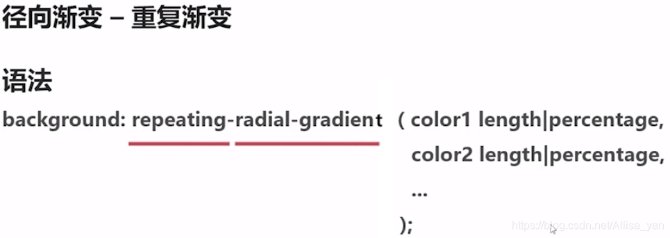
<title>径向渐变 - 重复渐变</title>
<style type="text/css">
div {
width: 800px; height: 500px;
background: -webkit-repeating-radial-gradient(red 0%, blue 10%, red 20% );
background: -moz-repeating-radial-gradient(red 0%, blue 10%, red 20% );
background: -o-repeating-radial-gradient(red 0%, blue 10%, red 20% );
background: repeating-radial-gradient(red 0%, blue 10%, red 20% );
}
</style>
</head>
<body>
<div></div>
</body>
</html>
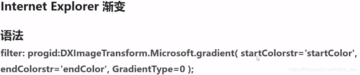
*** IE浏览器渐变 ***
// 颜色必须是 十六进制
// gradientType=0(从上至下)、1(从左到右)、2
<!DOCTYPE html>
<html lang="en">
<head>
<meta charset="UTF-8">
<title>IE6-8</title>
<style type="text/css">
div {
	width: 800px;
	height: 500px;
	filter: progid:DXImageTransform.Microsoft.gradient( startColorstr='#ff0000', endColorstr='#0000ff',GradientType=2 );
}
</style>
</head>
<body>
<div></div>
</body>
</html>
<!DOCTYPE html>
<html lang="en">
<head>
<meta charset="UTF-8">
<title>线性渐变 - 特殊案例</title>
<style type="text/css">
div {
width: 800px; height: 500px; background: #abcdef; background-size: 50px 50px;
background-image:
-webkit-gradient(linear, 0 0, 100% 100%, color-stop(.25, #555), color-stop(.25, transparent), to(transparent)),
-webkit-gradient(linear, 0 100%, 100% 0, color-stop(.25, #555), color-stop(.25, transparent), to(transparent)),
-webkit-gradient(linear, 0 0, 100% 100%, color-stop(.75, transparent), color-stop(.75, #555)),
-webkit-gradient(linear, 0 100%, 100% 0, color-stop(.75, transparent), color-stop(.75, #555));
background-image:
-moz-linear-gradient(45deg, #555 25%, transparent 25%, transparent),
-moz-linear-gradient(-45deg, #555 25%, transparent 25%, transparent),
-moz-linear-gradient(45deg, transparent 75%, #555 75%),
-moz-linear-gradient(-45deg, transparent 75%, #555 75%);
background-image:
-o-linear-gradient(45deg, #555 25%, transparent 25%, transparent),
-o-linear-gradient(-45deg, #555 25%, transparent 25%, transparent),
-o-linear-gradient(45deg, transparent 75%, #555 75%),
-o-linear-gradient(-45deg, transparent 75%, #555 75%);
background-image:
linear-gradient(45deg, #555 25%, transparent 25%, transparent),
linear-gradient(-45deg, #555 25%, transparent 25%, transparent),
linear-gradient(45deg, transparent 75%, #555 75%),
linear-gradient(-45deg, transparent 75%, #555 75%);
}
</style>
</head>
<body>
<div></div>
</body>
</html>


 扫一扫
扫一扫


 914
914

 被折叠的 条评论
为什么被折叠?
被折叠的 条评论
为什么被折叠?
 到【灌水乐园】发言


