


 本文介绍了如何通过CSS和伪元素(before/after)技巧,解决页面中复杂圆角问题,特别是在右侧下角部分的实现,详细展示了代码示例和调整过程。
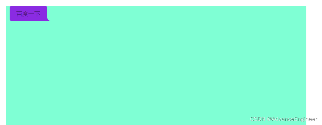
对于开发页面有些这样的需求,页面内嵌好多页面,打开页面要设置成这种效果,要利用border-radius来实现,但是最难的地方在右侧下方这圆角 主要他用的的圆角外面这一块内容
实现思路就是在元素外面设置两个伪元素,before和after设置同样的大小定位到同样位置,上面覆盖下面的,使用z-index和radius知识点
先看实现效果
现在来看代码 大家都可以看懂
<!DOCTYPE html>
<html lang="en">
<head>
    <meta charset="UTF-8">
    <meta http-equiv="X-UA-Compatible" content="IE=edge">
    <meta name="viewport" content="width=device-width, initial-scale=1.0">
    <title>Document</title>
    <style>
        div {
            width: 800px;
            height: 600px;
            background-color: aquamarine;
            margin: 0 auto;
        }
        a {
            display: inline-block;
            width: 100px;
            height: 40px;
            background-color: blueviolet;
            /* 去掉a的下划线 */
            text-decoration: none;
            text-align: center;
            line-height: 40px;
            margin-left: 10px;
            border-top-left-radius: 5px;
            border-top-right-radius: 5px;
            border-bottom-left-radius: 5px;
            position: relative;
        }
        a::after {
            content: '';
            position: absolute;
            display: inline-block;
            width: 20px;
            height: 40px;
            background-color: aquamarine;
            left: 100px;
            border-bottom-left-radius: 10px;
            z-index: 10;

        }
        a::before {
            content: '';
            position: absolute;
            display: inline-block;
            width: 20px;
            height: 40px;
            background-color:blueviolet;
            left: 100px;
            z-index: 0;
            /* border-bottom-left-radius: 10px; */
            /* z-index: -10; */
        }

    </style>
</head>
<body>
    <div>
        <a href="">百度一下<span></span></a>
    </div>
</body>
</html>
然后效果就出来,样式不满意自己再慢慢调下就好了


 扫一扫
扫一扫


 989
989

 被折叠的 条评论
为什么被折叠?
被折叠的 条评论
为什么被折叠?
 到【灌水乐园】发言


