


 媒体查询用于根据设备特性应用不同的CSS样式,如屏幕尺寸、设备类型等。BFC则是CSS布局中的一种概念,解决margin塌陷和元素覆盖问题。通过设置如浮动、绝对定位或overflow属性可开启BFC。文章介绍了如何利用媒体查询实现多屏幕适配,并给出了不同屏幕尺寸下加载不同样式表的例子。
媒体查询
媒体类型
| 值 | 含义 |
|---|---|
| all | 检测所有设备 |
| screen | 检测电子屏幕,包括:电脑屏幕、平板屏幕、手机屏幕等。 |
| 检测打印机 |
完整列表可参考:https://developer.mozilla.org/zh-CN/docs/Web/CSS/@media
媒体特性
| 值 | 含义 |
|---|---|
| width | 检测视口宽度。 |
| max-width | 检测视口最大宽度。 |
| min-width | 检测视口最小宽度。 |
| height | 检测视口高度。 |
| max-height | 检测视口最大高度。 |
| min-height | 检测视口最小高度。 |
| device-width | 检测视口屏幕的宽度。 |
| max-device-width | 检测视口屏幕的最大宽度。 |
| min-device-width | 检测视口屏幕的最小宽度。 |
| orientation | 检测视口的旋转方向(是否横屏)。1. portrait:视口处于纵向,即高度大于等于宽度。2. landscape:视口处于横向,即宽度大于高度。 |
完整列表请参考:https://developer.mozilla.org/zh-CN/docs/Web/CSS/@media
运算符
| 值 | 含义 |
|---|---|
| and | 并且 |
,或or | 或 |
not | 否定 |
only | 肯定 |
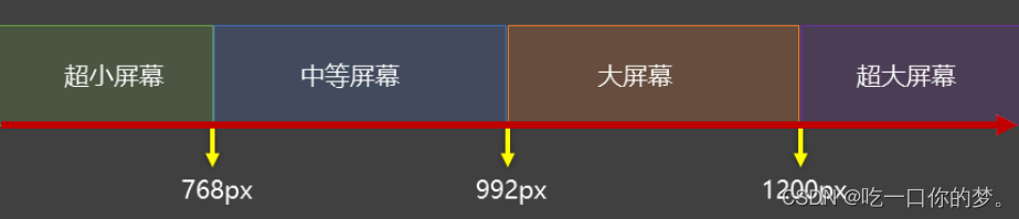
常用阈值
在实际开发钟,会将屏幕划分为几个区间,例如:
结合外部样式的用法
- 用法一:
	/* index为样式 */
	<link rel="stylesheet" href="./css/index.css">
	/* small最小屏幕 */
    <link rel="stylesheet" href="./css/small.css">
	/* middle中等屏幕 */
    <link rel="stylesheet" href="./css/middle.css">
	/* large大屏幕 */
    <link rel="stylesheet" href="./css/large.css">
	/* huge超大屏幕 */
    <link rel="stylesheet" href="./css/huge.css">
- 用法二
	<!-- 视口宽度 小于等于 768px,网页背景为粉色 -->
    <link rel="stylesheet" media="(max-width:768px)" href="./ping.css">
    <!-- 视口宽度 大于等于 1200px,网页背景为绿色 -->
    <link rel="stylesheet" media="(min-width:1200px)" href="./green.css">
BFC
什么是BFC
BFC是Block Formatting Context(块级格式上下文),可以理解成元素的一个“特意功能”。
开启了BFC能解决什么问题
- 元素开启
BFC后,其子元素不会在产生margin塌陷问题。 - 元素开启
BFC后,自己不会被其他浮动元素所覆盖。 - 元素开启
BFC后,就算其子元素浮动,元素自身高度也不会塌陷。
如何开启BFC
- 根元素
- 浮动元素
- 绝对定位,固定定位元素。
- 行内块元素。
- 表格单元素:
table、thead、tfoot、th、td、tr、caption。 overflow的值不为visible的块元素。- 伸缩项目。
- 多列容器。
column-span为all的元素(即使该元素没有包裹在多列容器中)。display的值,设置为flow-root。


 扫一扫
扫一扫


 219
219


 到【灌水乐园】发言


