


 文章介绍了如何使用ECharts库在Vue组件中创建一个带有白色背景的柱状图,并实现数据滚动功能,通过设置选项和事件监听器来动态更新背景和显示当前数据区间。
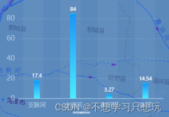
echarts柱状图添加白色柱状图背景+滚动
<template>
  <div class="stream-water-wrapper">

    <div id="biologybgchart" class="bck-chart"></div>

    <div id="biologychart" class="biology-chart"></div>

  </div>
</template>

<script>
export default {
  name: 'streamwater',
  data() {
    return {
      biologyChart: '',
      bckchart: '',
      data: [23, 32, 41, 16, 27, 25, 35],
      xAxis: [],
      currentArr: []
    }
  },
  mounted() {
    // this.initBiologyChart()
    this.getData()
  },
  methods: {
    getData() {
      this.axios.post(this.api.getRiverFlow)
        .then((response) => {
          let res = response.data;
          if (res.code == 1) {
            this.data = Object.values(res.result)
            this.xAxis = Object.keys(res.result)
            this.currentArr.push(this.data[0])
            this.currentArr.push(this.data[1])
            this.currentArr.push(this.data[2])
            this.currentArr.push(this.data[3])

          } else {
            this.$message.error(res.message)
          }
        }).finally(() => {
          this.initBiologyChart()
          this.initBiologyBck()
        })
    },
    // 初始化
    initBiologyChart() {
      this.biologyChart = this.$echarts.init(document.getElementById('biologychart'))
      var option = {
        xAxis: {
          type: 'category',
          data: this.xAxis,
          axisLine: {       //x轴显示
            "show": true,
          },
          axisTick: {
            "show": false   //去掉x轴刻度线
          },
          //坐标轴颜色
          axisLine: {
            lineStyle: {
              // background: rgba(186,231,255,0.4);
              color: 'rgba(186,231,255,0.4)',
              width: 2
            }
          },
          // x轴文字旋转
          axisLabel: {
            rotate: 0,
            interval: 0,
            interval: 0,  //设置 X 轴数据间隔几个显示一个,为0表示都显示
            color: "rgba(230,247,255,0.5)"  //坐标轴的文本颜色
          },
        },
        yAxis: {
          name: 'ind/m³',
          type: 'value',
          // interval: 10,
          min: 0, // 配置 Y 轴刻度最小值
          // max: 400,  // 配置 Y 轴刻度最大值
          // splitNumber:10,  // 配置 Y 轴数值间隔
          nameTextStyle: {
            color: 'rgba(230,247,255,0.5)', //  字体颜色
            fontSize: 12, //  字体大小
            fontWeight: '400',
            //关键代码
            padding: [0, 0, -20, -30] //标题位置调整 上 右 下 左
          },
          splitLine: {           //分割线
            show: true,     //控制分割线是否显示
            lineStyle: {       //分割线的样式
              color: ['rgba(230,247,255,0.2)'],
              width: 1,
              type: 'dashed'
            }
          },
          axisLine: {       //y轴不显示
            "show": false
          },
          axisTick: {       //y轴刻度线不显示
            "show": false
          },
          axisLabel: {
            showMaxLabel: false,
            color: "rgba(230,247,255,0.5)", //刻度线标签颜色
            fontSize: 14,
            // formatter: function (value) {
            //   if (value / 100 % 2 === 1) {
            //     return value;
            //   } else {
            //     return ''
            //   }
            // }
          },

        },
        grid: {          //设置图表显示在区域的哪个位置,控制图表的位置,可以是具体数值或者百分比
          left: '20px',
          right: '0px',
          bottom: '10px',
          top: '20px',
          containLabel: true,   //containLabel(grid 区域是否包含坐标轴的刻度标签,默认不包含)为true的情况下,无法使图表紧贴着画布显示,但可以防止标签标签长度动态变化时溢出容器或者覆盖其他组件,将containLabel设置为false即可解决
        },
        //滚动条样式
        dataZoom: [

          {

            id: 'biologychart',

            type: 'slider',

            show: true,

            // start: 0,//默认为0

            // end: 50,//默认为100

            startValue: 0, // 从头开始。

            endValue: 3, // 一次性展示6个。

            xAxisIndex: [0],

            handleSize: 0,//滑动条的 左右2个滑动条的大小

            height: 4,//组件高度

            bottom: 0,//右边的距离

            borderColor: "#e3e3e3",

            fillerColor: '#51B7F9',

            borderRadius: 10,

            backgroundColor: '#e3e3e3',//两边未选中的滑动条区域的颜色

            showDataShadow: false,//是否显示数据阴影 默认auto

            showDetail: false,//即拖拽时候是否显示详细数值信息 默认true

            realtime: true, //是否实时更新

            filterMode: 'filter',

            // zlevel: 10,

          },
          //以下重点: 让鼠标滚动从缩放变成移动
          {

            type: 'inside',

            xAxisIndex: [0],

            zoomOnMouseWheel: false, //滚轮不触发缩放

            moveOnMouseMove: true,   //鼠标移动触发平移

            moveOnMouseWheel: true,  //鼠标滚轮触发平移

          },

        ],
        series: [
          {
            data: this.data,
            type: 'bar',
            hoverAnimation: false,
            animation: false,
            emphasis: {
              disabled: true,
            },
            barWidth: 12, //设置柱子宽度
            color: 'blue',
            // showBackground: true,
            // backgroundStyle: {
            //   color: 'rgba(255,255,255,0.1)',
            // },
            label: {  //在柱状图上显示数据
              show: true,
              position: 'top',
              color: '#fff',
              fontWeight: 500,
              fontSize: 10,
            },
            markPoint: {
              symbol: 'rect',
              symbolSize: '15',
            },
            itemStyle: {  // 柱状图渐变
              color: {
                type: 'linear',
                x: 0,  //右
                y: 0,  //下
                x2: 0,  //左
                y2: 1,  //上
                colorStops: [
                  {
                    offset: 0,
                    color: '#1A96F9' // 0% 处的颜色
                  },
                  {
                    offset: 1,
                    color: '#4CECFF' // 100% 处的颜色
                  }
                ]
              },

            },
          },
          {		//顶部的白色横杠
            type: 'pictorialBar',
            symbol: 'rect',
            symbolSize: [12, 2],
            symbolOffset: [0, -2],
            symbolPosition: 'end',
            data: this.data,
            itemStyle: {
              color: '#00BBFF',
            },
          },
        ],

      };
      this.biologyChart.setOption(option);

      let that = this;
      // 当滑动条变化时触发
      this.biologyChart.on('datazoom', function (params) {
        that.currentArr = []
        that.$nextTick(() => {
          let xAxis = that.biologyChart.getModel().option.dataZoom[0];
          let startrang = xAxis.startValue
          let endrang = xAxis.endValue
          let i = 0
          for (i; i++; i < 4) {
            that.currentArr.push(that.data[startrang + i])
          }
          that.currentArr.push(that.data[startrang])
          that.currentArr.push(that.data[startrang + 1])
          that.currentArr.push(that.data[startrang + 2])
          that.currentArr.push(that.data[startrang + 3])

          var bckOptions = {
            xAxis: {
              data: this.xAxis
            },
            yAxis: {
              max: Math.ceil(Math.max(...that.currentArr)),
            },
            series: [0, 0, 0, 0]
          }
          that.bckchart.setOption(bckOptions);
        })
      });
    },
    // 初始化生物多样性背景图
    initBiologyBck() {
      this.bckchart = this.$echarts.init(document.getElementById('biologybgchart'))
      var option = {
        xAxis: {
          type: 'category',
          data: this.xAxis,
          axisPointer: {
            // 设置为 dataZoom,并指定 dataZoom 的 id
            type: 'dataZoom',
            dataZoomId: 'biologychart'
          },
          axisLine: {       //x轴显示
            "show": false,
          },
          axisTick: {
            "show": false   //去掉x轴刻度线
          },
          // x轴文字旋转
          axisLabel: {
            rotate: 0,
            interval: 0,
            interval: 0,  //设置 X 轴数据间隔几个显示一个,为0表示都显示
            color: "rgba(0,0,0,0)"  //坐标轴的文本颜色
          },
          //坐标轴颜色
          axisLine: {
            show: false,
            lineStyle: {
              color: '#00bbff',
              width: 2
            }
          },
        },
        yAxis: {
          name: 'ind/m³',
          type: 'value',
          // minInterval: 1,
          min: 0, // 配置 Y 轴刻度最小值
          // this.isShowScroll
          // max: Math.ceil(Math.max(...this.option.series[0].data)),  // 配置 Y 轴刻度最大值
          max: Math.ceil(Math.max(...this.currentArr)),
          // splitNumber:10,  // 配置 Y 轴数值间隔
          nameTextStyle: {
            color: 'rgba(230,247,255,0)',
            fontSize: 16, //  字体大小
            fontWeight: 'bolder',
            //关键代码
            padding: [0, 0, 0, -30] //标题位置调整 上 右 下 左
          },
          splitLine: {           //分割线
            show: false,     //控制分割线是否显示
            lineStyle: {       //分割线的样式
              color: ['rgba(255,255,255,0.3)'],
              width: 2,
              type: 'dashed'
            }
          },
          axisLine: {       //y轴不显示
            "show": false
          },
          axisTick: {       //y轴刻度线不显示
            "show": false
          },
          axisLabel: {
            color: "rgba(255,0,0,0)", //刻度线标签颜色
            fontSize: 14,
          },
        },
        grid: {          //设置图表显示在区域的哪个位置,控制图表的位置,可以是具体数值或者百分比
          left: '20px',
          right: '0px',
          bottom: '10px',
          top: '20px',
          containLabel: true,   //containLabel(grid 区域是否包含坐标轴的刻度标签,默认不包含)为true的情况下,无法使图表紧贴着画布显示,但可以防止标签标签长度动态变化时溢出容器或者覆盖其他组件,将containLabel设置为false即可解决
        },
        //滚动条样式
        dataZoom: [

          {

            id: 'biologychart',

            type: 'slider',

            show: false,

            // start: 0,//默认为0

            // end: 50,//默认为100

            startValue: 0, // 从头开始。

            endValue: 3, // 一次性展示6个。

            xAxisIndex: [0],

            handleSize: 0,//滑动条的 左右2个滑动条的大小

            height: 4,//组件高度

            bottom: 0,//右边的距离

            borderColor: "#e3e3e3",

            fillerColor: '#51B7F9',

            borderRadius: 10,

            backgroundColor: '#e3e3e3',//两边未选中的滑动条区域的颜色

            showDataShadow: false,//是否显示数据阴影 默认auto

            showDetail: false,//即拖拽时候是否显示详细数值信息 默认true

            realtime: true, //是否实时更新

            filterMode: 'filter',

            // zlevel: 10,

          },
          //以下重点: 让鼠标滚动从缩放变成移动
          // {

          //   type: 'inside',

          //   xAxisIndex: [0],

          //   zoomOnMouseWheel: false, //滚轮不触发缩放

          //   moveOnMouseMove: true,   //鼠标移动触发平移

          //   moveOnMouseWheel: true,  //鼠标滚轮触发平移

          // },

        ],
        series: [
          {
            data: [0, 0, 0, 0, 0],
            type: 'bar',
            barWidth: 40, //设置柱子宽度
            showBackground: true,
            backgroundStyle: {
              color: 'rgba(190,216,240,0.06)'
            }
          },

        ]
      };

      this.bckchart.setOption(option);

    },
  }
}
</script>

<style scoped>
.stream-water-wrapper {
  width: 100%;
  height: 300px;
}

.bck-chart {
  width: 90%;
  height: 250px;
  position: absolute;
}

.biology-chart {
  width: 90%;
  height: 250px;
}
</style>


 3037
3037

 被折叠的 条评论
为什么被折叠?
被折叠的 条评论
为什么被折叠?
 到【灌水乐园】发言


