


 本文详细介绍了CSS3中垂直外边距折叠的现象,并提供了三种消除外边距折叠的方法:1) 使用`display:inline-block`;2) 设置元素`float`属性不为`none`;3) 应用绝对定位。通过这些技巧,开发者可以更好地控制元素间的间距。
1简介
外边距折叠: 即垂直方向上的两个外边距相遇时,会折叠成一个外边距,且折叠之后的外边距高度为两者之中较大的那一个。
示例:
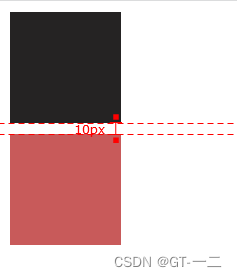
代码:
<!DOCTYPE html>
<html>
    <head>
        <meta charset=utf-8>
        <style type="text/css">
            * {
                margin: 0;
                padding: 0;
            }
            .top{
                width:100px;
                height:100px;
                margin:10px;
                background-color: rgb(37, 35, 35);
            }
            .bottom{
                width:100px;
                height:100px;
                margin:10px;
                background-color: rgb(200, 90, 90);
            }
        </style>
    </head>
    <body>
        <section class="top"></section>
        <section class="bottom"></section>
    </body>
</html>
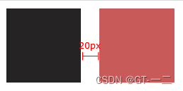
2 消除外边距内折
2.1 display: inline-block
样式:
代码:
<!DOCTYPE html>
<html>
    <head>
        <meta charset=utf-8>
        <style type="text/css">
            * {
                margin: 0;
                padding: 0;
            }
            .top{
                width:100px;
                height:100px;
                margin:10px;
                background-color: rgb(37, 35, 35);
                display: inline-block  /* 只为其中一个元素添加也可达到效果*/
            }
            .bottom{
                width:100px;
                height:100px;
                margin:10px;
                background-color: rgb(200, 90, 90);
                display: inline-block
            }
        </style>
    </head>
    <body>
        <section class="top"></section>
        <section class="bottom"></section>
    </body>
</html>
2.2 float属性值不是"none"的元素
代码:
<!DOCTYPE html>
<html>
    <head>
        <meta charset=utf-8>
        <style type="text/css">
            * {
                margin: 0;
                padding: 0;
            }
            .top{
                width:100px;
                height:100px;
                margin:10px;
                background-color: rgb(37, 35, 35);
                float: left;  /* 两个元素都要添加*/
            }
            .bottom{
                width:100px;
                height:100px;
                margin:10px;
                background-color: rgb(200, 90, 90);
                float: left; /* 两个元素都要添加*/
            }
        </style>
    </head>
    <body>
        <section class="top"></section>
        <section class="bottom"></section>
    </body>
</html>
2.3 绝对定位
代码:
<!DOCTYPE html>
<html>
    <head>
        <meta charset=utf-8>
        <style type="text/css">
            * {
                margin: 0;
                padding: 0;
            }
            .top{
                width:100px;
                height:100px;
                margin:10px;
                background-color: rgb(37, 35, 35);

            }
            .bottom{
                width:100px;
                height:100px;
                margin:10px;
                background-color: rgb(200, 90, 90);
                position: absolute; /* 只能给该元素添加*/

            }
        </style>
    </head>
    <body>
        <section class="top"></section>
        <section class="bottom"></section>
    </body>
</html>


 扫一扫
扫一扫


 被折叠的 条评论
为什么被折叠?
被折叠的 条评论
为什么被折叠?
 到【灌水乐园】发言


