


this.eventType = 'Down'
} else if (event.type === TouchType.Up) {
this.eventType = 'Up'
} else if (event.type === TouchType.Move) {
this.eventType = 'Move'
}
// 更新 text 状态变量,显示触摸事件的详细信息
this.text = 'TouchType:' + this.eventType + '\nDistance between touch point and touch element:\nx: '
+ event.touches[0].x + '\n' + 'y: ' + event.touches[0].y + '\nComponent globalPos:('
+ event.target.area.globalPosition.x + ',' + event.target.area.globalPosition.y + ')\nwidth:'
+ event.target.area.width + '\nheight:' + event.target.area.height
})
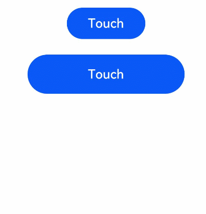
// 第二个 Button 组件,高度为 50,宽度为 200,外边距为 20
Button('Touch').height(50).width(200).margin(20)
// 与第一个 Button 组件的触摸事件处理相同
.onTouch((event: TouchEvent) => {
if (event.type === TouchType.Down) {
this.eventType = 'Down'
} else if (event.type === TouchType.Up) {
this.eventType = 'Up'
} else if (event.type === TouchType.Move) {
this.eventType = 'Move'
}
this.text = 'TouchType:' + this.eventType + '\nDistance between touch point and touch element:\nx: '
+ event.touches[0].x + '\n' + 'y: ' + event.touches[0].y + '\nComponent globalPos:('
+ event.target.area.globalPosition.x + ',' + event.target.area.globalPosition.y + ')\nwidth:'
+ event.target.area.width + '\nheight:' + event.target.area.height
})
// Text 组件显示 text 状态变量的值,即触摸事件的详细信息
Text(this.text)
// 设置 Column 的宽度为 '100%',设置内边距为 30(用于增加布局间距)
}.width('100%').padding(30)
} // build 方法结束,表示组件构建完成
} // TouchExample 结构体定义结束
## 四、挂载卸载事件
挂载卸载事件指组件从组件树上挂载、卸载时触发的事件。
##### 事件
| 名称 | 支持冒泡 | 功能描述 |
| --- | --- | --- |
| onAppear(event: () => void) | 否 | 组件挂载显示时触发此回调。 从API version 9开始,该接口支持在ArkTS卡片中使用。 |
| onDisAppear(event: () => void) | 否 | 组件卸载消失时触发此回调。 从API version 9开始,该接口支持在ArkTS卡片中使用。 |
##### 示例
// 导入ohos的promptAction模块,用于显示提示信息
import promptAction from ‘@ohos.promptAction’;
// 使用@Entry装饰器表示这个组件是整个应用的主入口
// 使用@Component装饰器表示这个组件是Flutter应用的一部分
@Entry
@Component
struct AppearExample {
// 定义一个名为isShow的状态变量,类型为boolean,初始值为true
@State
isShow: boolean = true;
// 定义一个名为changeAppear的状态变量,类型为string,初始值为’点我卸载挂载组件’
@State
changeAppear: string = ‘点我卸载挂载组件’;
// 定义一个私有变量myText,类型为string,初始值为’Text for onAppear’
private myText: string = ‘Text for onAppear’;
// build方法是一个特殊的方法,在Flutter中用于构建和渲染组件
build() {
// 创建一个Column垂直布局容器,用于放置其他组件
Column() {
// 创建一个Button组件,显示changeAppear变量的值
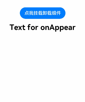
// 当点击这个按钮时,将触发onClick函数,切换isShow的值
Button(this.changeAppear)
.onClick(() => {
this.isShow = !this.isShow;
})
.margin(15); // 设置按钮的外边距为15
// 如果isShow为true,即显示下面的Text组件
if (this.isShow) {
// 创建一个Text组件,显示myText变量的值,字体大小为26,加粗
Text(this.myText).fontSize(26).fontWeight(FontWeight.Bold)
// 当这个Text组件首次显示时,触发onAppear函数,显示提示信息’The text is shown’
.onAppear(() => {
promptAction.showToast({
message: ‘The text is shown’,
duration: 2000 // 提示信息的显示时间为2000毫秒(2秒)
});
})
// 当这个Text组件被隐藏时,触发onDisAppear函数,显示提示信息’The text is hidden’
.onDisAppear(() => {
promptAction.showToast({
message: ‘The text is hidden’,
duration: 2000 // 提示信息的显示时间为2000毫秒(2秒)
});
});
} // if条件结束
} // Column组件结束
// 设置padding为30,设置宽度为100%,即占据整个屏幕宽度
.padding(30).width(‘100%’);
} // build方法结束,表示组件构建完成
} // AppearExample结构体定义结束
#### 五、拖拽事件
拖拽事件指组件被长按后拖拽时触发的事件。
#####  最低0.47元/天 解锁文章


 扫一扫
扫一扫


 1491
1491

 被折叠的 条评论
为什么被折叠?
被折叠的 条评论
为什么被折叠?
 到【灌水乐园】发言


