


6.1 使用CSS设置字体样式
6.1.1.字体类型
font-family 属性用于指定元素中文本的字体系列。为了确保跨平台的一致性,通常会列出多个字体名称作为“后备”机制,浏览器会尝试按顺序使用列表中的字体,直到找到一个可用的为止。如果都没有找到,则使用默认字体。字体名如果是多词组成的需要加引号。
p {
  font-family: "Arial", "Helvetica", sans-serif;
}
通用字体族:当具体的字体不可用时,可以使用通用字体族作为最终备选。常见的通用字体族包括 serif, sans-serif, monospace, cursive, 和 fantasy。
网页安全字体:一些字体几乎可以在所有主流操作系统上找到,比如 Arial, Verdana, Times New Roman 等,这些被称为网页安全字。
6.1.2.字体大小
font-size 属性用来设置文本的尺寸。它接受多种单位,如像素(px)、相对单位(em, rem, %)等。选择合适的单位可以帮助提高网站的可访问性和响应式设计能力。
绝对单位:例如 px (像素) 是固定大小,不随屏幕分辨率变化。
相对单位:如 em 或者 rem 是相对于父元素或根元素的字体大小,而百分比则是相对于父元素的字体大小。
示例:
h1 {
  font-size: 2rem; /* 相对于根元素的字体大小 */
}
p {
  font-size: 16px; /* 固定大小 */
}
6.1.3.字体粗细
font-weight 属性定义了文本的粗细程度。它可以是预定义的关键字,也可以是数字值。关键字包括 normal 和 bold,而数值范围从 100 到 900,其中 400 等同于 normal,700 等同于 bold。
示例:
.bold-text {
  font-weight: 700;
}
.lighter-text {
  font-weight: 300;
}
6.1.4.字体倾斜
font-style 属性用于设置文本是否为斜体。主要取值有 normal(正常)、italic(斜体)和 oblique(倾斜)。虽然 italic 和 oblique 都表示斜体,但它们之间存在细微差别,italic 更倾向于采用字体设计师特别设计的斜体形式,而 oblique 则通常是通过将正常字符倾斜得到的效果。
示例:
.italic-text {
  font-style: italic;
}
.oblique-text {
  font-style: oblique;
}
综上所述,通过对 font-family, font-size, font-weight, 和 font-style 这些基本属性的运用,我们可以对网页中的文字进行丰富的样式调整,以满足不同的设计需求。此外,还可以使用简写属性 font 来一次性设置多个字体相关的属性,从而简化代码。
.styled-text {
  font: italic bold 20px/1.5 "Arial", sans-serif;
}在这个例子中,.styled-text 类的文本将会是斜体、粗体、20像素高,并且行间距为1.5倍,首选字体为 Arial,若不可用则使用任何无衬线字体。
6.2 使用CSS设置文本样式
6.2.1.文本水平对齐方式
text-align 属性用来控制元素内文本的水平对齐方式。常见的值包括 left(左对齐)、right(右对齐)、center(居中对齐)和 justify(两端对齐)。当使用 justify 时,浏览器会自动调整单词间的间距,使每行文本的左右边缘都与容器边缘对齐。
示例:
.center-text {
  text-align: center;
}
.justify-text {
  text-align: justify;
}
6.2.2.行高
line-height 属性定义了文本行之间的垂直距离。它通常用于改善段落文本的可读性。这个属性可以接受绝对单位(如px, pt)或相对单位(如em, %),也可以直接指定一个数值,该数值将被解释为相对于当前字体大小的倍数。
- 示例:
p {
  line-height: 1.6; /* 相对于字体大小的1.6倍 */
}
6.2.3.文本的修饰.
-
text-decoration 属性用来添加或移除文本的装饰线。常用值有 none(无装饰)、underline(下划线)、overline(上划线)、line-through(删除线)等。注意,不推荐使用 blink 值,因为它会导致闪烁效果,这可能会引起用户的不适。
示例:
a {
  text-decoration: none; /* 移除链接默认的下划线 */
}
.strikethrough {
  text-decoration: line-through; /* 添加删除线 */
}
6.2.4.段落首行缩进
text-indent属性用于设置段落首行的缩进量。通常用以区分新的段落开始。单位可以是像素、百分比或其他长度单位。 - 示例:
p {
  text-indent: 2em; /* 首行缩进两个字符宽度 */
}
6.2.6.字符间距
letter-spacing属性用于控制字符之间的额外间距。它可以接受正负值,正值表示增加间距,负值则减少间距。适当调整字符间距可以帮助提高某些情况下文本的可读性。 - 示例:
.spaced-out {
  letter-spacing: 2px; /* 字符间增加2像素的间距 */
}
6.2.7.文本的截断
-
当文本内容超过其容器宽度时,text-overflow 属性决定如何显示溢出的内容。常用的值有 clip(简单裁剪)和 ellipsis(显示省略号)。为了配合 text-overflow: ellipsis 工作,还需要设置 white-space: nowrap; 和 overflow: hidden;。
示例:
.truncated {
  white-space: nowrap;
  overflow: hidden;
  text-overflow: ellipsis;
}
6.2.8.文本的颜色
color属性用于设置文本的颜色。颜色值可以是预定义的颜色名、十六进制颜色码、RGB值、RGBA值、HSL值或HSLA值。选择合适的方法取决于具体需求和个人偏好。 - 示例:
.highlighted {
  color: #FF0000; /* 红色 */
}
.highlighted-alt {
  color: rgba(255, 0, 0, 0.8); /* 半透明红色 */
}
6.2.9.文本的背景颜色
background-color属性用于设置元素的背景颜色。同样,颜色值可以采用上述提到的各种形式。给文本设置背景颜色可以帮助突出显示重要信息或改变视觉焦点。 - 示例:
.bg-highlight {
  background-color: #FFFF00; /* 黄色背景 */
}
6.3 使用CSS设置图像样式
6.3.1.设置图像边框 - 定义:
border属性用来给图像添加边框。 - 示例:
img {
  border: 5px solid black;
}
6.3.2.图像缩放
- 定义:通过设置
width和height属性来控制图像尺寸。 - 示例:
.resized-image {
  width: 200px;
  height: auto; /* 保持比例 */
}
6.3.3.设置背景图像
- 定义:
background-image属性用来指定一个元素的背景图片。 - 示例:
.bg-img {
  background-image: url('path/to/image.jpg');
}
6.3.4设置背景重复
- 定义:
background-repeat属性控制背景图片如何平铺。 - 值:repeat, no-repeat, repeat-x, repeat-y。
- 示例:
.no-repeat-bg {
  background-repeat: no-repeat;
}
6.3.5.背景图像定位
- 定义:
background-position属性用于设定背景图像的起始位置。 -
6.3.5.1 使用关键字进行背景定位
-
.positioned-bg {
  background-position: top right;
}
6.3.5.2 使用长度进行背景定位
- 示例:
.positioned-bg {
  background-position: 50px 100px;
}
6.3.5.3 使用百分比进行背景定位
- 示例:
.positioned-bg {
  background-position: 50% 50%;
}
6.4 使用CSS设置表单样式
1. 基本表单布局
首先,我们需要考虑整个表单的布局。通常,我们会使用
<form>标签来包裹所有的表单控件,并通过CSS控制其外观。我们可以利用CSS Grid或Flexbox来实现灵活的响应式布局。 - 示例:
form {
  display: flex;
  flex-direction: column;
  max-width: 300px;
  margin: auto;
  padding: 20px;
  border: 1px solid #ccc;
  border-radius: 5px;
  background-color: #f8f8f8;
}
2. 文本输入框样式
对于文本输入框(
<input type="text">),我们可以设置宽度、内边距、边框、背景色以及聚焦时的样式。使用box-sizing: border-box;可以让包含边框和内边距在内的总宽度保持一致。 - 示例:
input[type="text"] { width: 100%; padding: 12px 20px; margin: 8px 0; box-sizing: border-box; border: 1px solid #ccc; border-radius: 4px; } input[type="text"]:focus { border: 2px solid #4CAF50; /* 聚焦时改变边框颜色 */ } -
3. 按钮样式
按钮(
<input type="submit">,<button>)可以通过设置背景颜色、文字颜色、边框、圆角以及悬停效果来进行美化。我们还可以为按钮添加一些额外的效果,比如阴影或者渐变背景。 - 示例:
input[type="submit"],
button {
  width: 100%;
  background-color: #4CAF50;
  color: white;
  padding: 14px 20px;
  margin: 8px 0;
  border: none;
  border-radius: 4px;
  cursor: pointer;
}

input[type="submit"]:hover,
button:hover {
  background-color: #45a049; /* 鼠标悬停时改变背景颜色 */
}
4. 下拉菜单样式
下拉菜单(
<select>)同样需要一定的样式来匹配整体的设计风格。这包括了设置宽度、内边距、边框、圆角以及可能的背景颜色。注意某些浏览器可能对下拉菜单的样式支持有限。 - 示例:
select {
  width: 100%;
  padding: 12px 20px;
  margin: 8px 0;
  display: inline-block;
  border: 1px solid #ccc;
  border-radius: 4px;
  box-sizing: border-box;
}
5. 复选框和单选按钮
复选框(
<input type="checkbox">)和单选按钮(<input type="radio">)默认的样式比较难以自定义,但可以通过隐藏原始控件并使用伪元素来创建自定义的外观。 -
示例:
.custom-checkbox input[type="checkbox"] { display: none; /* 隐藏原生复选框 */ } .custom-checkbox label::before { content: ""; display: inline-block; width: 16px; height: 16px; margin-right: 10px; border: 1px solid #ccc; vertical-align: middle; } .custom-checkbox input[type="checkbox"]:checked + label::before { background-color: #4CAF50; border-color: #4CAF50; }示例(单选按钮):
.custom-radio input[type="radio"] {
  display: none; /* 隐藏原生单选按钮 */
}

.custom-radio label::before {
  content: "";
  display: inline-block;
  width: 16px;
  height: 16px;
  margin-right: 10px;
  border: 1px solid #ccc;
  border-radius: 50%;
  vertical-align: middle;
}

.custom-radio input[type="radio"]:checked + label::before {
  background-color: #4CAF50;
  border-color: #4CAF50;
}
6. 文本区域样式
文本区域(
<textarea>)与文本输入框类似,但是它们允许多行输入。因此,除了基本的样式外,还需要考虑是否允许用户调整大小(通过resize属性)。 - 示例:
textarea {
  width: 100%;
  height: 150px;
  padding: 12px 20px;
  box-sizing: border-box;
  border: 1px solid #ccc;
  border-radius: 4px;
  resize: vertical; /* 只允许垂直方向上调整大小 */
}
7. 表单验证提示
当表单中的字段未正确填写时,通常会显示错误消息。为了确保这些消息能够清晰地传达给用户,应该为其设置合适的样式。例如,可以使用红色字体以突出错误信息。
示例:
.error-message {
  color: red;
  font-size: 14px;
  margin-top: 5px;
}
6.21例题
<!DOCTYPE html>
<html>
	<head>
		<meta charset="utf-8">
		<title>文本域修饰</title>
		<style type="text/css">
			.text1{
				border: 1px solid #f60;
				color: #03c;
			}
			.text2{
				border: 1px solid #c3c;
				height: 20px;
				background: #fff url(img/password_bg.JPG)left center no-repeat;
				padding-left: 20px;
			}
			.area{
				border: 1px solid #00f;
				overflow: auto;
				width: 99%;
				height: 100px;
			}
		</style>
	</head>
	<body>
		<p>
			<input type="text" name="normal"/>
			默认样式的文本域
		</p>
		<p>
			<input name="chbd" type="text" value="输入的文字显示为蓝色" class="text1"/>
			改变边框颜色和文字颜色的文本域,看起来更加醒目
		</p>
		<p>
			<input name="pass" type="password" class="text2"/>
			增加了背景图片的文本域,看起来更加形象直观
		</p>
		<p>
			<textarea name="cha" cols="45" rows="5" class="area">改变边框颜色的多行文本域</textarea>
		</p>
	</body>
</html>
6.22例题
<!DOCTYPE html>
<html>
	<head>
		<meta charset="utf-8">
		<title>按钮修饰</title>
		<style type="text/css">
			.btn01{
				background: url(img/btn_bg02.jpg) repeat-x;
				border: 1px solid #f00;
				height: 32px;
				font-weight: bold;/* 字体加粗 */
				padding-top: 2px;
				cursor: pointer;/* 鼠标样式为手形 */
				font-size: 14px;
				color: #fff;
			}
			.btn02{
				background: url(img/btn_bg03.jpg) 0 0 no-repeat;
				width: 107px;
				height: 37px;
				border: none;
				font-size: 14px;
				font-weight: bold;
				color: #d84700;
				cursor: pointer;
			}
		</style>
	</head>
	<body>
		<p>
			<input name="button" type="submit" value="提交"/>
			默认风格的“提交”按钮
		</p>
		<p>
			<input name="button01" type="submit" class="btn01" id="button1" value="自适应宽度按钮"/>
			自适应宽度按钮
		</p>
		<p>
			<input name="button02" type="submit" class="btn02" id="button02" value="免费注册"/>
			固定背景图片的按钮
		</p>
	</body>
</html>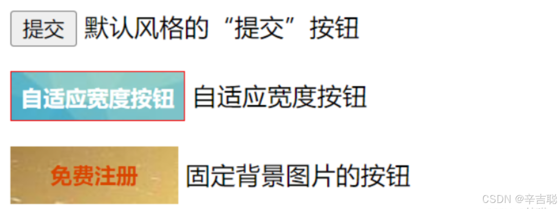
6.23例题
<!DOCTYPE html>
<html>
<head>
<meta charset="utf-8">
<title>登录表单的制作</title>
<style type="text/css">
.login{
margin: 0 auto;/* 容器水平居中对齐 */
width: 280px;
padding: 14px;
border: dashed 2px #b7ddf2;
background: #ebf4fb;
}
.login *{
margin: 0;
padding: 0;
font-family: "宋体";
font-size: 12px;
line-height: 1.5em;
}
.login h2{
text-align: center;
font-size: 18px;
font-weight: bold;
margin-bottom: 10px;
padding-bottom: 5px;
border-bottom: solid 1px #b7ddf2;
}
.login content{
padding: 5px;
}
.login.frm_cont{
margin-bottom: 8px;
}
.login.username input,.login.password input{
width: 180px;
height: 18px;
padding: 2px 0px 2px 18px;
border: solid 1px #aacfe4;
}
.username input{
background: #fff url(img/username.JPG)no-repeat left center;
}
.password input{
background: #fff url(img/lock.JPG)no-repeat left center;
}
.login.btns{
text-align: center;
}
</style>
</head>
<body>
<div class="login">
<h2>用户登录</h2>
<div class="content">
<form action="" method="post">
<div class="frm_cont username">用户名:
<label for="username"></label>
<input type="text" name="username" id="username"/>
</div>
<div class="frm_cont password">密 码
<label for="password"></label>
<input type="password" name="password" id="password"/>
</div>
<div class="btns">
<input type="submit" name="button1" id="button1" value="登录"/>
<input type="button" name="button2" id="button2" value="注册"/>
</div>
</form>
</div>
</div>
</body>
</html>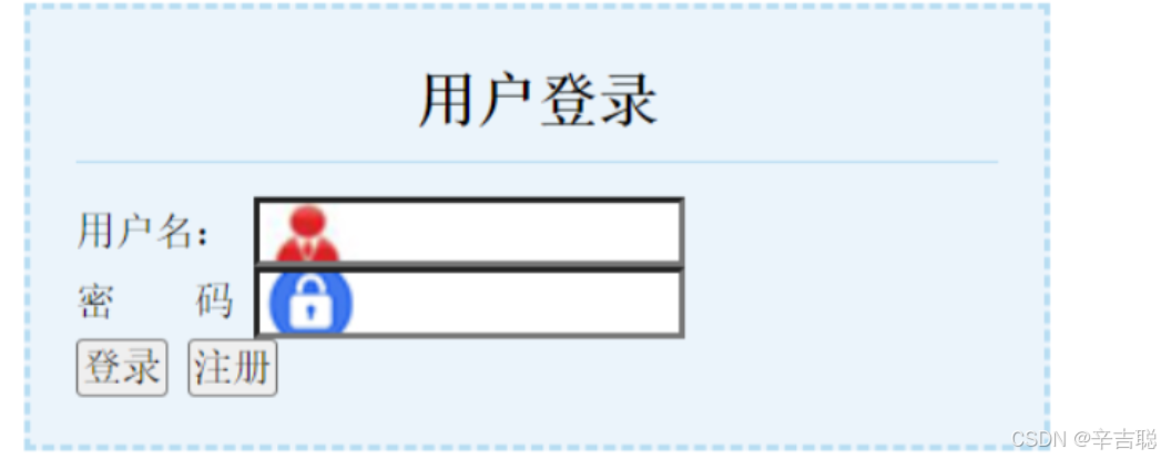
综合案例
<!DOCTYPE html>
<html lang="en">
<head>
<meta charset="UTF-8">
<meta name="viewport" content="width=device-width, initial-scale=1.0">
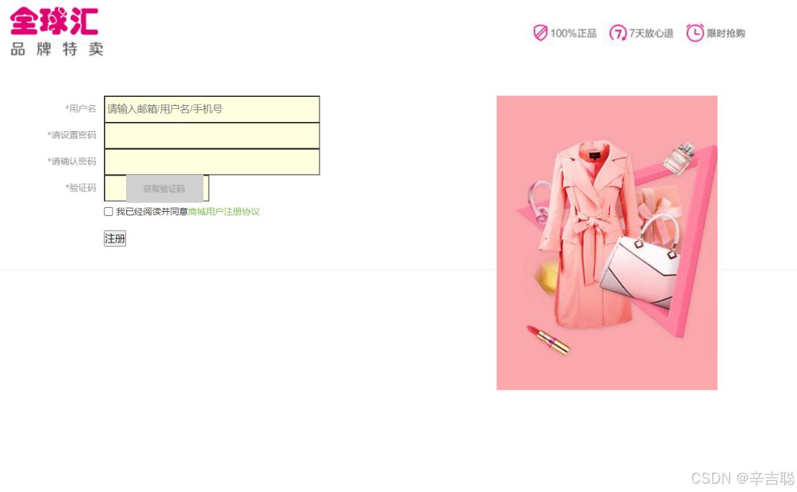
<title>会员注册</title>
<link rel="stylesheet" href="css测试.css" type="text/css"/>
</head>
<body style="background: #fff;">
<div class="loginLogo">
<div class="logoMid">
<h1 class="logo">
<a href="index.html">
<img src="照片/logo.jpg" alt="Logo"/>
</a>
</h1>
<div class="loginBox">
<img src="照片/chengguo.jpg" width="295" height="393" class="chengnuo" alt="Chengnuo"/>
<form action="#.html" method="get" class="reg">
<div class="regList">
<label><span class="red">*</span>用户名</label>
<input type="text" name="username" placeholder="请输入邮箱/用户名/手机号" required/>
</div>
<div class="regList">
<label><span class="red">*</span>请设置密码</label>
<input type="password" name="password" required/>
</div>
<div class="regList">
<label><span class="red">*</span>请确认密码</label>
<input type="password" name="confirm_password" required/>
</div>
<div class="regList">
<label><span class="red">*</span>验证码</label>
<input type="text" class="yanzheng" name="captcha" required/>
<img src="照片/yanzheng.jpg" width="103" height="38" alt="验证码"/>
</div>
<div class="xieyi">
<input type="checkbox" name="agreement" required/>
我已经阅读并同意<a href="#">商城用户注册协议</a>
</div>
<div class="reg">
<input type="submit" value="注册" />
</div>
</form>
<div class="clears"></div>
</div>
</div>
</div>
</body>
</html>css代码
*{
    margin: 0;
    padding: 0;
}
body{
    font-size: 12px;
    color: #333;
}
ol,ul{
    list-style: none;
}
img,a{
    border: 0;
    text-decoration: none;
}
a{
    color: #333;
}
a:hover{
    color: #f00;
}
.loginLogo{
    width: 100%;
    border-bottom: #efefef 1px solid;
}
.logoMid{
    width: 1040px;
    margin: 0 auto;
}
.loginReg{
    height: 30px;
    line-height: 30px;
    text-align: right;
}
.loginReg a{
    color: #7bc144;
}
.loginReg a:hover{
    color: #f00;
}
.loginBox{
    width: 1050px;
    margin: 30px auto;
    position: relative;
}
.regList{
    height: 35px;
    line-height: 35px;
}
.regList label{
    float: left;
    width: 105px;
    margin-right: 10px;
    text-align: right;
    color: #999;
}
.regList input{
    margin: 0;
    padding: 0;
    width: 283px;
    height: 33px;
    border: 3738400 1px solid;
    background: #feffdf;
    padding-left: 3px;
}
.regList .yanzheng{
    width: 135px;
}
.regList img{
    left: 260px;
    position: absolute;
}
.xieyi{
    height: 30px;
    line-height: 30px;
    font-size: 12px;
    padding-left: 115px;
}
.xieyi input{
    position: relative;
    top: 2px;
}
.xieyi a{
    color: #7bc144;
}
.reg{
    padding-left: 115px;
    margin-top: 10px;
}
.chengnuo{
    position: absolute;
    right: 0;
    top: 0;
}


 扫一扫
扫一扫


 1014
1014

 被折叠的 条评论
为什么被折叠?
被折叠的 条评论
为什么被折叠?
 到【灌水乐园】发言


