


9.1 DIV+CSS概述
9.1.1 认识DIV
DIV是HTML中用于布局的块级元素,它允许开发者将页面分割成多个部分,每个部分可以有自己的样式和行为。在现代网页设计中,DIV元素与CSS结合使用,可以创建复杂的布局和响应式设计。
9.1.2 DIV的宽高设置
9.1.2.1 宽高属性
在CSS中,`width`和`height`属性用于设置元素的宽度和高度。这些属性可以设置为像素值、百分比或其他CSS单位。
9.1.2.2 div标签内直接设置宽高
在HTML标签内直接设置宽高是一种不推荐的做法,因为它将样式与结构混合,不利于维护。正确的做法是在CSS中设置。
html
<div style="width: 200px; height: 100px;">内容</div>9.1.2.3 div使用选择器设置宽高
使用CSS选择器设置宽高是推荐的做法,它保持了结构与样式的分离。
css
.box {
  width: 200px;
  height: 100px;
}
html
<div class="box">内容</div>9.1.2.4 div高度的百分比设置问题
当使用百分比设置高度时,DIV的高度会相对于其父元素的高度来计算。如果父元素没有明确的高度,DIV的高度可能不会如预期显示
<!DOCTYPE html>
<html>
	<head>
		<meta charset="utf-8" />
		<title></title>
		<!-- <link type="text/css" href="css/index.css" rel="stylesheet"/> -->
		<style type="text/css">
			*{
				width: 100%;
				height: 100%;
			}
			.d1{
				width: 100px;
				height: 100px;
				border: #000000 solid 2px;
			}
			.d2{
				width: 50%;
				height: 50%;
				border: #000000 solid 2px;
			}
		</style>
	</head>
	<body>
		<div class="d1">数值</div>
		<div class="d2">百分比</div>
	</body>
</html>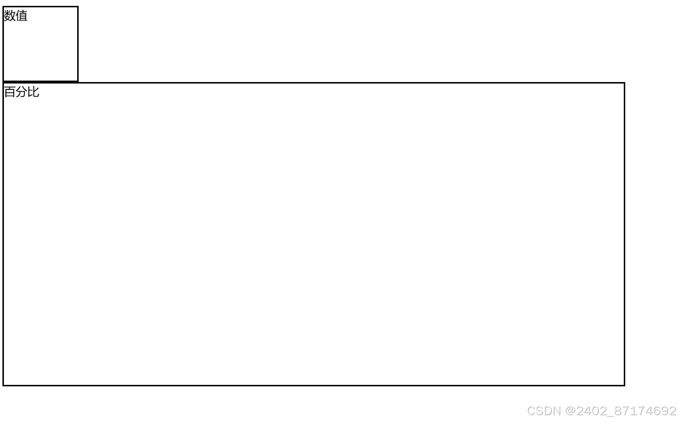
9.2 DIV+CSS的应用
9.2.1 DIV元素的布局技巧
使用浮动(float)和定位(position)属性可以控制DIV元素在页面上的布局。
9.2.2 DIV元素的宽度自适应
通过设置`width: auto;`或使用`max-width`和`min-width`属性,可以使DIV元素的宽度自适应内容或视口宽度。
9.2.3 DIV内容的居中
使用`text-align: center;`可以水平居中内容,而垂直居中则可以通过`display: flex;`和`align-items: center;`实现。
css
.center {
  display: flex;
  align-items: center;
  justify-content: center;
}
html
<div class="center">内容</div><!DOCTYPE html>
<html>
<head>
<meta charset="utf-8" />
<title></title>
<!-- <link type="text/css" href="css/index.css" rel="stylesheet"/> -->
<style type="text/css">
*{
width: 100%;
height: 100%;
}
.d1{
width: 100px;
height: 100px;
border: #000000 solid 2px;
margin: auto;
}
.d2{
width: 50%;
height: 50%;
border: #000000 solid 2px;
margin: auto;
}
</style>
</head>
<body>
<div class="d1">数值</div>
<div class="d2">百分比</div>
</body>
</html>9.2.4 DIV元素的嵌套
DIV元素可以嵌套使用,以创建更复杂的布局结构
<!DOCTYPE html>
<html>
	<head>
		<meta charset="utf-8" />
		<title></title>
		<!-- <link type="text/css" href="css/index.css" rel="stylesheet"/> -->
		<style type="text/css">
			*{
				width: 100%;
				height: 100%;
			}
			div{
				border: #000000 solid 2px;
			}
			.d1{
				width: 100px;
				height: 100px;
				margin: auto;
			}
			.d2{
				width: 10%;
				height: 10%;
				border: #000000 solid 2px;
				margin: auto;
			}
			.da{
				margin: auto;
				width: 50%;
				height: 50%;
			}
			#db{
				width: 100px;
				float: left;
			}
			#dc{
				margin-left: 100px;
			}
		</style>
	</head>
	<body>
		<div class="d1">数值</div>
		<div class="d2">百分比</div>
		<div class="da">
			<div id="db">左边</div>
			<div id="dc">右边</div>
		</div>
	</body>
</html>
9.3 DIV+CSS的典型布局
9.3.1 左中右布局
<!DOCTYPE html>
<html lang="en">
<head>
<meta charset="UTF-8">
<title>左中右布局</title>
<style>
  .container {
    display: flex; /* 使用flex布局 */
  }
  .left, .center, .right {
    flex: 1; /* 每个部分等宽 */
    height: 100px; /* 容器高度 */
    border: 1px solid #000; /* 边框 */
  }
  .left {
    background-color: #f00; /* 左边背景色 */
  }
  .center {
    background-color: #0f0; /* 中间背景色 */
  }
  .right {
    background-color: #00f; /* 右边背景色 */
  }
</style>
</head>
<body>

<div class="container">
  <div class="left">左边</div>
  <div class="center">中间</div>
  <div class="right">右边</div>
</div>

</body>
</html>
使用浮动或Flexbox可以实现左中右布局。
css
.left, .right {
  float: left;
  width: 20%;
}

.center {
  margin: 0 20%;
}
html
<div class="left">左侧</div>
<div class="center">中间</div>
<div class="right">右侧</div>
9.3.2 上中下布局
使用Flexbox可以轻松实现上中下布局
<!DOCTYPE html>
<html lang="en">
<head>
<meta charset="UTF-8">
<title>上中下</title>
<style>
.container {
  display: flex;
  flex-direction: column;
}

.top, .middle, .bottom {
  flex: 1;
}
</style>
</head>
<body>
<div class="container">
  <div class="top">顶部</div>
  <div class="middle">中间</div>
  <div class="bottom">底部</div>
</div>
</body>
</html>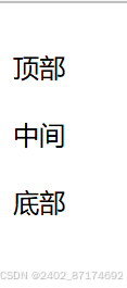
css
.container {
display: flex;
flex-direction: column;
}
.top, .middle, .bottom {
flex: 1;
}html
<div class="container">
<div class="top">顶部</div>
<div class="middle">中间</div>
<div class="bottom">底部</div>
</div>9.3.3 混合布局
<!DOCTYPE html>
<html lang="en">
<head>
<meta charset="UTF-8">
<title>左中右布局</title>
<style>
.flex-container {
  display: flex;
  flex-direction: column;
  height: 100vh; /* 视口高度 */
}

.header, .footer {
  flex: 0 0 auto; /* 不伸缩 */
}

.main {
  display: flex;
  flex: 1; /* 占据剩余空间 */
}

.left, .center, .right {
  flex: 1; /* 等分空间 */
}

.left {
  background-color: lightblue; /* 仅为了区分区域 */
}

.center {
  background-color: lightgreen;
}

.right {
  background-color: lightcoral;
}
</style>
</head>
<body>
<div class="flex-container">
  <div class="header">顶部</div>
  <div class="main">
    <div class="left">左侧</div>
    <div class="center">中间</div>
    <div class="right">右侧</div>
  </div>
  <div class="footer">底部</div>
</div>
</body>
</html>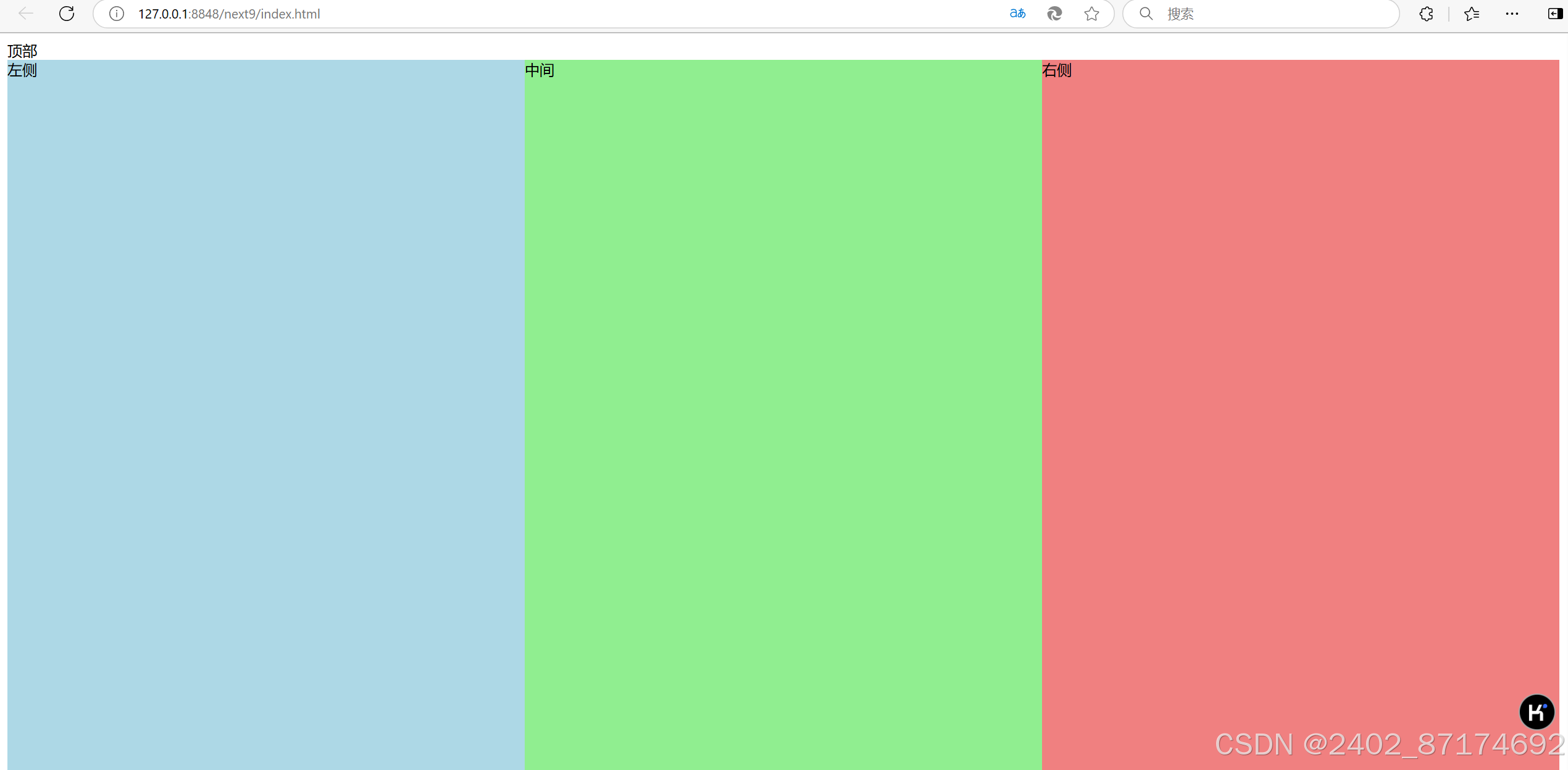
混合布局结合了多种布局技术,以适应复杂的页面设计需求
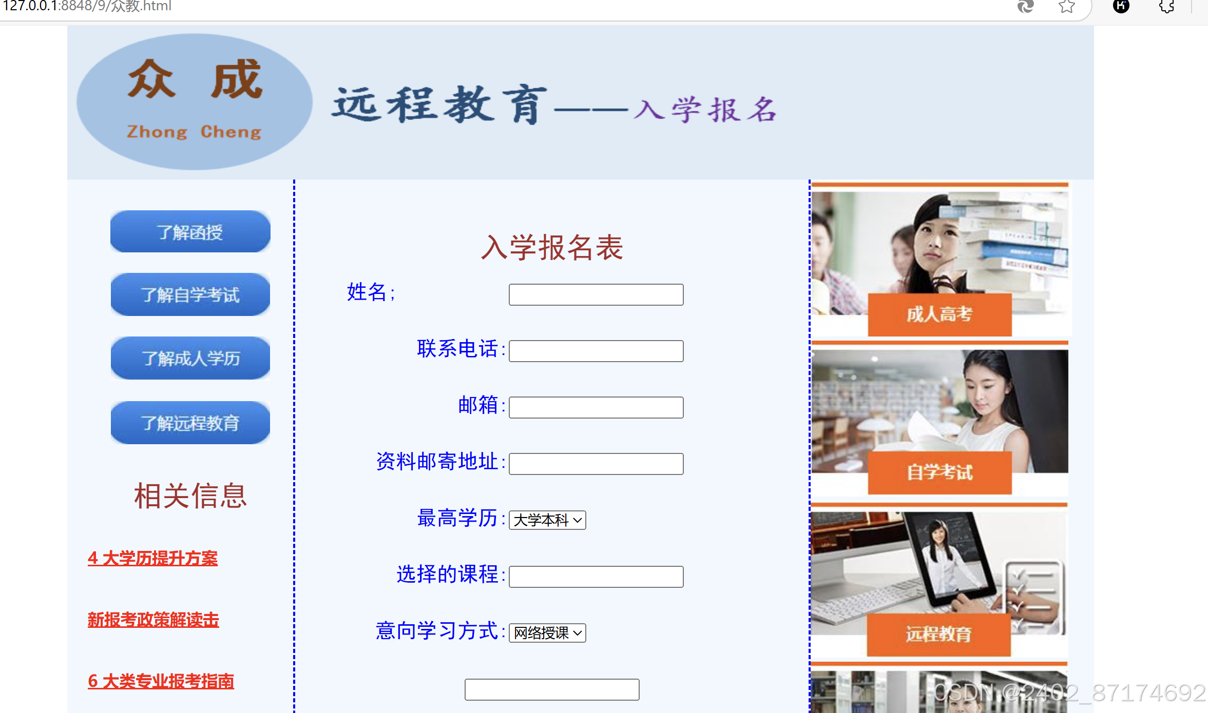
9.4 综合案例——众成远程教育
html代码
<!DOCTYPE html>
<html>
<head>
<meta charset="utf-8">
<title>众成远程教育</title>
<style type="text/css">
*{
margin: 0px auto;
}
.all{
width: 1000px;
height: 840px;
background-image: url(img/9-bg.jpg);
}
.top{
width:1000px;
height:150px;
}
.main{
background-color:aliceblue ;
width:1000px;
height:630px;
}
.left{
padding-top:30px;
padding-left:20px ;
width:200px;
height:570px;
float:left;
line-height:60px;
}
.center{
border-left:2px dashed blue;
border-right:2px dashed blue;
padding-top:50px;
width:500px;
height:580px;
float:left;
}
right{
padding-left:20px;
width:250px;
height;630px ;
float;left;
}
.footer{
width:1000px;
height:60px;
font-family: "楷体";
font-size: 18px;
text-align: center;
line-height: 30px;
}
a,span{
color: red;
font-weight: 700;
text-align: center;
}
p{
font-family: "黑体";
font-weight: 700px;
color: brown;
font-size: 28px;
text-align: center;
}
table{
font-family: "黑体";
font-weight: 700px;
color: blue;
font-size: 20px;
line-height: 55px;
}
</style>
</head>
<body>
<div class=" all">
<div class="top">
<img src="img/9-logo.jpg" width ="708px" height="150px" />
</div>
<div class=" main" >
<div class=" left" >
<p><img src="img/but2.jpg" /></p >
<p><img src="img/but3.jpg" /></p >
<p><img src ="img/but4.jpg" /></p >
<p><img src ="img/but5.jpg" /></p >
<p>相关信息</p >
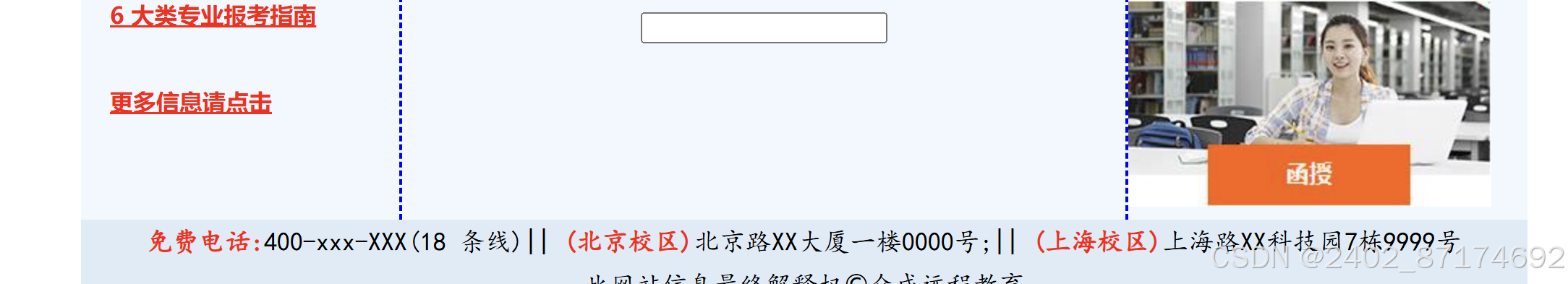
<a href="#">4 大学历提升方案</a><br>
<a href="#">新报考政策解读击</a><br>
<a href="#">6 大类专业报考指南</a><br>
<a href="#">更多信息请点击</a>
</div>
<div class=" center" >
<p>入学报名表</p >
<form id="form2" name =" form2" method=" post" action="" >
<table width="400" border="0" align=" center" cellpadding="0" cellspacing="0">
<tr>
<td width="158" align=" night" >姓名;<label for="textfield"></label>
</td>
<td width =" 242" ><input type=" text" name=" textfield" id=" textfield" />
</td>
</tr>
<tr>
<td align =" right" >联系电话:
</td>
<td><input type="text" name = " textfield2" id="textfield2" />
</td>
</tr>
<tr>
<td align ="right">邮箱:
</td>
<td><input type=" text" name =" textfield3" id=" textfield3" />
</td>
</tr>
<tr>
<td align ="right" >资料邮寄地址:
</td>
<td><input type=" text" name=" textfield4" id=" textfield4" />
</td>
</tr>
<tr>
<td align=" right" >最高学历:
</td>
<td>
<select name=" select2"id="select2">
<option>大学本科</option>
<option>大专</option>
<option>高中</option>
<option>初中</option>
<option>小学</option>
</select>
</td>
</tr>
<tr>
<td align =" right" >选择的课程:
</td>
<td><input type =" text" name =" textfield6"id= " textfield6"/>
</td>
</tr>
<tr>
<td align =" right" >意向学习方式:
<label for =" select2"></label>
</td>
<td>
<select name=" select" id=" select">
<option>网络授课</option>
<option>周末班</option>
<option>全日制</option>
</select>
</td>
</tr>
<tr>
<td colspan="2" align =" center">
<input type =" image" name =" imageField" id="imageField" sre ="img/but1.jpg" />
</td>
</tr>
</table>
</form>
</div>
<div class="right">
<img src="img/pho1.jpg" alt="" />
<img src="img/pho2.jpg" />
<img src="img/pho3.jpg" />
<img src="img/pho4.jpg" /></div></div>
<div class =" footer">
<span>免费电话:</span>400-xxx-XXX(18 条线)||
<span>(北京校区)</span>北京路XX大厦一楼0000号;||
<span>(上海校区)</span>上海路XX科技园7栋9999号<br>
此网站信息最终解释权©众成远程教育
</div>
</div>
</body>
</html>运行结果
<!DOCTYPE html>
<html>
	<head>
		<meta charset="utf-8">
		<title>众成远程教育---布局</title>
	</head>
	<style>
		*{
			margin:0px auto;
			font-family:"宋体";
			font-size:30px;
			text-align:center;
			font-weight:700;
		}

		.all{
		width:1000px; height:840px;
		background-image:url(img/9-bg.jpg);
		}
		.top{
		width:1000px; height:150px;
		}
		.main{
		background-color:aliceblue;
		width:1000px;
		height:630px;
		}
		.left{
		width:200px;
		height:630px;
		float:left;
		}
		.center{
		border-left :2px dashed blue;
		border-right:2px dashed blue;
		width:500px;
		height:630px;
		float :left ;
		}
		.right{
			width: 250px;
			height: 630px;
			float: left;
		}
		.footer{
			width: 1000px;
			height: 60px;
		}
	</style>
	<body>
		<div class =" all">
		<div class =" top" >top</div><div class =" main" >
		<div class =" left" >left</div>
		<div class = " center" >center</div><div class = " right" >right</div></div>
		<div class =" footer" >footer</div></div>
	</body>
</html>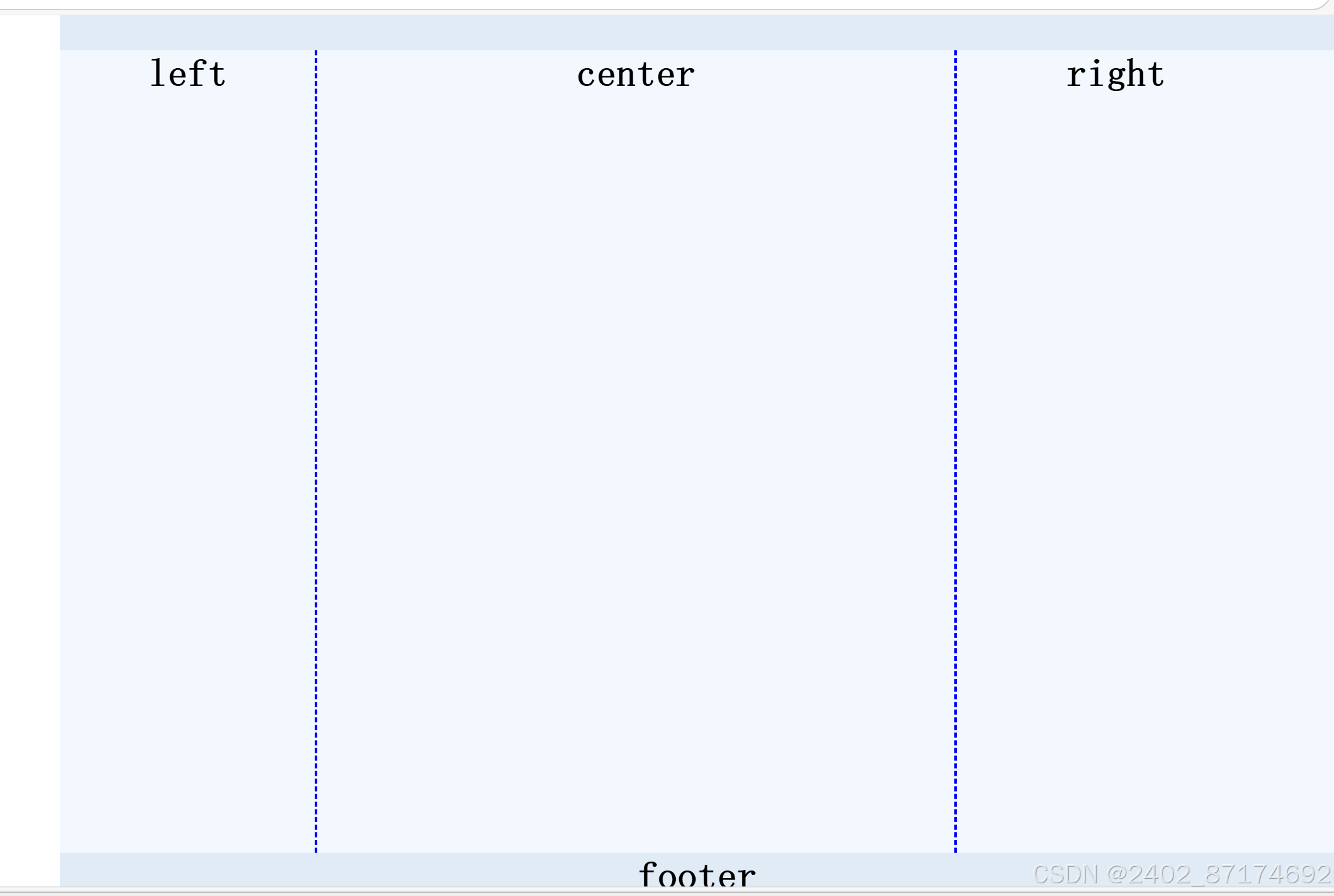


 扫一扫
扫一扫


 1万+
1万+

 被折叠的 条评论
为什么被折叠?
被折叠的 条评论
为什么被折叠?
 到【灌水乐园】发言


