


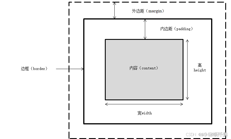
5.1盒模型的定义
CSS 盒模型(Box Model)是网页布局和设计的核心概念之一,它定义了一个元素在网页上的空间分配方式。每个元素都被表示为一个矩形盒子,这个盒子由四个主要部分组成:内容(content)、内边距(padding)、边框(border)和外边距(margin)。以下是对这四个部分的详细解释:
内容(Content):
这是盒子的核心部分,包含了元素的实际内容,比如文本、图像或其他媒体。
内容的大小通过 width 和 height 属性来设置。
内边距(Padding):
内边距是内容与边框之间的空间。
它用于增加内容与边框之间的距离,使内容看起来不那么紧贴边框。
内边距的大小可以通过 padding-top、padding-right、padding-bottom 和 padding-left 属性分别设置,或使用 padding 简写属性一次性设置所有四个方向的内边距。
边框(Border):
边框是围绕内容和内边距的线条,用于突出显示元素或与其他元素区分开来。
边框的宽度、样式和颜色可以通过 border-width、border-style 和 border-color 属性分别设置,或使用 border 简写属性一次性设置所有这三个属性。
边框可以分别应用于元素的顶部、右侧、底部和左侧,例如 border-top、border-right、border-bottom 和 border-left。
外边距(Margin):
外边距是元素与其他元素之间的空间。
它用于控制元素之间的间距,使页面布局更加美观和有序。
外边距的大小可以通过 margin-top、margin-right、margin-bottom 和 margin-left 属性分别设置,或使用 margin 简写属性一次性设置所有四个方向的外边距。
5.2 CSS元素的高度和宽度
在CSS中,元素的高度和宽度是通过height和width属性来设置的。这些属性定义了元素内容区域的大小,但需要注意的是,它们的行为可能会受到盒模型(Box Model)的影响,特别是当考虑到内边距(padding)、边框(border)和外边距(margin)时。
示例:
<!DOCTYPE html>
<html>
<head>
<meta charset="utf-8" />
<title>示例</title>
<style type="text/css">
* {
margin: 0;
padding: 0;
}
div {
width: 100px;
border: 10px solid red;
padding: 30px;
margin: 10px;
float: left;
}
</style>
</head>
<body>
<h1>盒模型示例</h1>
<p>CSS盒模型本质上是一个盒子,外边距10px;内边距30px;边框10px的红色实线;盒子左浮动在同一行处。</p>
<div><img src="img/a1.jpg" /></div>
<div><img src="img/a2.jpg" /></div>
</body>
</html>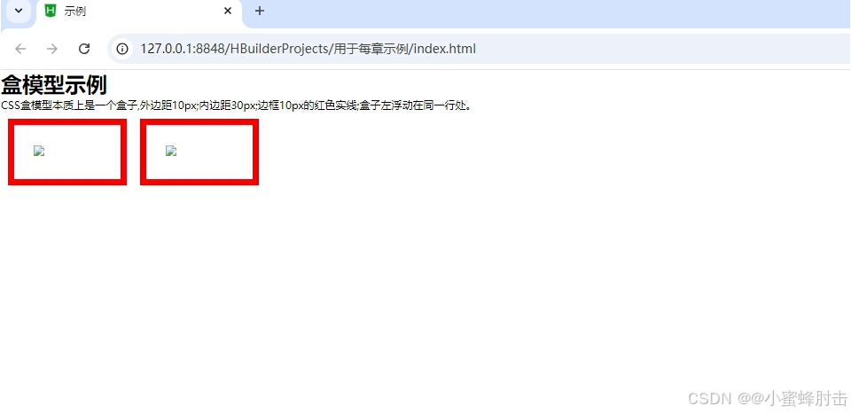
5.2.1 盒模型的宽度
盒模型的宽度=左边距(margin-left)+左边框(border-left)+左内边距(padding-left)+内容宽度(width)+右内边距(padding-right)+右边框(border-right)+右外边距(margin-right)
5.2.2 盒模型的高度
盒模型的高度=上外边距(margin-top)+上边框(border-top)+上内边距(padding-top)+内容高度(height)+下内边距(padding-bottom)+下边框(border-bottom)+下外边距(margin-bottom)
5.2.3示例
<!DOCTYPE html>
<html>
<head>
<meta charset=" UTF-8">
<title>示例</title>
<style type="text/css">
.ap{
width: 200px;
height: 100px;
border: 2px solid red;
margin: 10px;
background-color: lightblue;
}
</style>
</head>
<body>
<div class="ap">这是div块级元素,可设置宽度和高度</div>
<span class="ap">这是span行级元素,不能设置宽度和高度</span>
</body>
</html>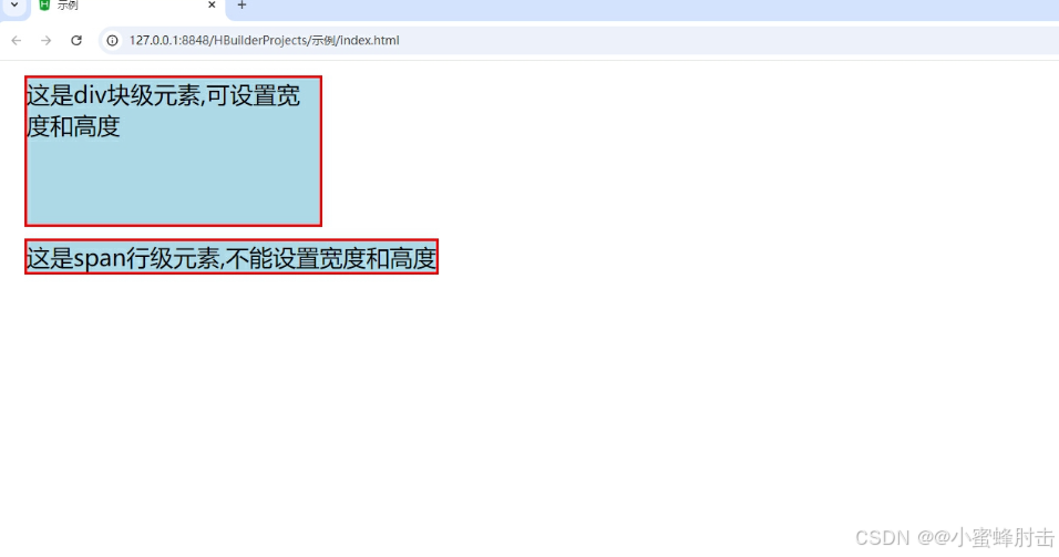
5.3 边距设置和边框设置
在CSS中,边距设置和边框设置是控制元素布局和空间的关键属性,它们共同定义了元素的视觉外观和元素之间的空间关系
5.3.1 外边距设置
在CSS中,外边距(Margin)用于控制元素外部的空间,即元素边框与其他元素之间的距离。外边距的设置对于网页布局至关重要,它可以帮助你调整元素之间的间距,创建出整洁、有序且美观的网页。
5.3.1.1 上外边距
定义:上外边距是指元素顶部与其上方元素或父容器之间的距离。
设置方法:使用margin-top属性来设置。
取值:可以是长度值(如像素px、厘米cm等)、百分比值(基于父容器的宽度计算)或auto(让浏览器自动计算)。
5.3.1.2 右外边距
定义:右外边距是指元素右侧与其右侧元素或父容器之间的距离。
设置方法:使用margin-right属性来设置。
取值:与上外边距相同,可以是长度值、百分比值或auto。
5.3.1.3 下外边距
定义:下外边距是指元素底部与其下方元素或父容器之间的距离。
设置方法:使用margin-bottom属性来设置。
取值:与上外边距相同,可以是长度值、百分比值或auto。
5.3.1.4 左外边距
定义:左外边距是指元素左侧与其左侧元素或父容器之间的距离。
设置方法:使用margin-left属性来设置。
取值:与上外边距相同,可以是长度值、百分比值或auto。
示例:
<!DOCTYPE html>
<html>
<head>
<meta charset=" UTF-8">
<title>示例</title>
<style type="text/css">
#big{
width: 450px;
height: 200px;
margin: 0px;
background-color: #ff0;
}
#small1,#small2,#small3,#small4{
width: 200px;
height: 50px;
text-align: center;
background-color: #0ff;
}
#small1{
margin-left: 20px;
margin-bottom: 30px;
}
#small2{
margin-right: 20px;
margin-top: 10px;
float: right;
}
#small3{
margin-bottom: 5px;
}
#small4{
margin-left: 10px;
margin-top: 15px;
}
</style>
</head>
<body>
<div id="big">
<div id="small1">A:左外边距20像素,下外边距30像素</div>
<div id="small2">B:右外边距20像素,上外边距10像素,右浮动</div>
<div id="small3">C:下外边距5像素</div>
<div id="small4">D:左外边距10像素,上外边距15像素</div>
</div>
</body>
</html>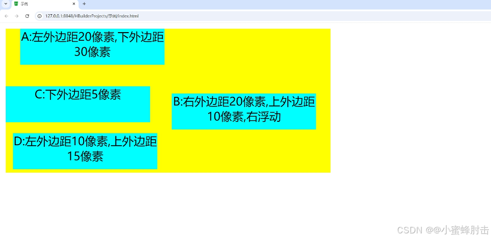
5.3.1.5 外边距
CSS外边距(Margin)是控制元素周围外部空间的重要属性,它决定了元素边框与其他元素或父容器之间的距离。外边距可以用于调整元素之间的间距,创建整洁、有序且美观的网页布局。
外边距的基本属性
CSS提供了四个单独的属性来设置元素的上、右、下、左外边距:
margin-top:设置元素顶部的外边距。
margin-right:设置元素右侧的外边距。
margin-bottom:设置元素底部的外边距。
margin-left:设置元素左侧的外边距。
示例:
<!DOCTYPE html>
<html>
<head>
<meta charset=" UTF-8">
<title>示例</title>
<style type="text/css">
div{
border: solid #0000ff 1px;
width: auto;
margin: 5px;
float: left;
}
.margin1{
background-color: #9f6;
border: none;
width: 200px;
height: 80px;
margin: 0px 15px 5px 30px;
}
.margin2{
background-color: yellow;
border: none;
width: 200px;
height: 80px;
margin: 5px 30px 15px;
}
.margin3{
background-color: lightgreen;
border: none;
width: 200px;
height: 80px;
margin: 10px 30px;
}
.margin4{
background-color: #fc0;
border: none;
width: 200px;
height: 80px;
margin: 15px;
}
</style>
</head>
<body>
<div>
<div class="margin1">上,右,下,左外边距分别为:0px、15px、5px、30px</div>
</div>
<div>
<div class="margin2">上外边距分别为:5px,下外边距分别为:15px,左右外边距分别为:30px,</div>
</div>
<div>
<div class="margin3">上,下外边距分别为:10px,左、右外边距分别为:30px</div>
</div>
<div>
<div class="margin4">上,右,下,左外边距均为:15px</div>
</div>
</body>
</html>
5.3.2 外边距的合并
CSS 中的外边距合并(Margin Collapsing)是一种机制,当两个垂直相邻的块级元素(block-level elements)的外边距相遇时,它们不会叠加起来,而是会合并成一个外边距,其大小等于两个外边距中的较大值
5.3.2.1 行级元素外边距合并
在CSS中,行级元素(inline elements)通常不会受到外边距(margin)的影响,因为它们的布局是基于内容流而不是块级布局。然而,当行级元素被设置为块级显示(例如,通过 display: block; 或 display: inline-block;)时,它们的外边距行为会发生变化,并且可能出现外边距合并(margin collapsing)的情况。
外边距合并(Margin Collapsing)
外边距合并主要发生在垂直方向上的相邻块级元素之间。当两个或多个块级元素的垂直外边距相遇时,它们不会叠加,而是合并为一个外边距,其大小等于两个外边距中较大的一个。这种合并行为适用于以下情况:
相邻兄弟元素:两个垂直相邻的块级元素。
父元素和第一个/最后一个子元素:父元素和它的第一个或最后一个子块级元素(如果父元素没有其他内边距、边框或内容)。
5.3.2.1行级元素与外边距合并
当行级元素(如 <span>)本身,其外边距是不会合并的,因为行级元素的外边距通常不会生效。然而,如果将行级元素设置为 display: inline-block;,它们就会表现得像块级元素,并且垂直外边距可能会合并。
示例:
<!DOCTYPE html>
<html>
<head>
<meta charset=" UTF-8">
<title>示例</title>
<style type="text/css">
*{
margin: 50px;
}
.hb1{
background-color: yellow;
margin-right: 20px;
padding: 30px;
}
.hb2{
background-color: lightpink;
margin-left: 30px;
padding: 30px;
}
</style>
</head>
<body>
<span class="hb1">黄色span</span>
<span class="hb2">粉色span</span>
</body>
</html>
5.3.2.2 块级元素外边距合并
外边距合并是指在垂直方向上,两个相邻的块级元素的外边距(margin)发生重叠,而不是简单地取两者之间的较大值或相加。合并后的外边距的高度等于两个发生合并的外边距的高度中的最大值 。
示例:
<!DOCTYPE html>
<html>
<head>
<meta charset=" UTF-8">
<title>示例</title>
<style type="text/css">
*{
margin: 50px;
}
.div1{
background-color: yellow;
margin-bottom: 30px;
padding: 30px;
}
.div2{
background-color: lightpink;
margin-top: 30px;
padding: 30px;
}
</style>
</head>
<body>
<div class="div1">黄色div</div>
<div class="div2">粉红色div</div>
</body>
</html>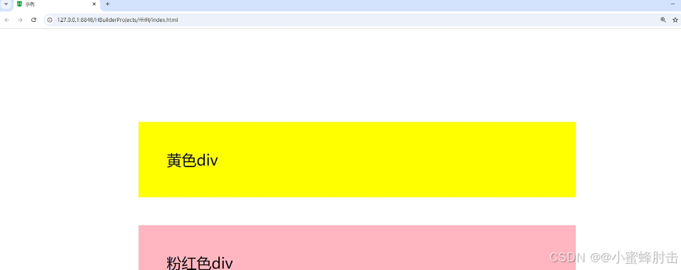
5.3.3 内边距设置
在CSS中,内边距(padding)是指元素内容与边框之间的空间。通过调整内边距,可以控制元素内部的空间大小,进而影响元素的整体布局和视觉效果。
设置内边距
CSS提供了多种方式来设置元素的内边距,包括使用padding属性及其子属性(padding-top、padding-right、padding-bottom、padding-left)
示例:
<!DOCTYPE html>
<html>
<head>
<meta charset=" UTF-8">
<title>示例</title>
<style type="text/css">
span{
background-color: #ffff99;
}
div{
border:solid #000000 1px;
width: auto;
height: auto;
margin: 15px;
float: left;
}
.padding1{
padding-top: 30px;
padding-left: 15px;
}
.padding2{
padding-bottom: 30px;
padding-right: 30px;
}
.padding3{
padding: 5px 30px;
}
.padding4{
padding: 20px;
}
</style>
</head>
<body>
<div class="padding1">
<span>文字元素上内边距为30px,左内边距为15px</span>
</div>
<div class="padding2">
<span>文字元素下内边距为30px,右内边距为30px</span>
</div>
<div class="padding3">
<span>文字元素上、下内边距为5px,左、右内边距为:30px</span>
</div>
<div class="padding4">
<span>文字元素上、右、下、左、内边距均为:20px</span>
</div>
</body>
</html>
5.3.4 边框设置
CSS边框设置涉及多个属性,包括边框宽度(border-width)、边框样式(border-style)、边框颜色(border-color)以及边框圆角(border-radius)。
5.3.4.1 上边框
要使用CSS设置上边框,您可以使用border-top简写属性或border-top-style、border-top-width和border-top-color这三个单独的属性
5.3.4.2 右边框
类似地,设置右边框可以使用border-right简写属性或border-right-style、border-right-width和border-right-color。
5.3.4.3 下边框
设置下边框使用border-bottom简写属性或相应的子属性。
5.3.4.4 左边框
设置左边框使用border-left简写属性或相应的子属性。
5.3.4.5 边框样式
border-style属性用于设置元素边框的样式 。
border-style属性值
5.3.4.6边框宽度
border-width属性用于设置元素边框的宽度。可以使用像素(px)、em、rem等单位来指定宽度。
border-width属性值
5.3.4.7 边框颜色
border-color属性允许您设置所有四个方向的边框颜色。
示例:
<!DOCTYPE html>
<html>
<head>
<meta charset=" UTF-8">
<title>示例</title>
<style type="text/css">
h2{
text-align: center;
border-bottom: dashed 5px red;
}
p{
font-family: "楷体";
border-top: solid thin purple;
border-right: dashed 5px #99ff66;
border-bottom: double thick purple;
border-left: dashed 5px #ff9999;
}
div{
border-style: solid dashed double;
border-width: 10px;
border-color: deepskyblue;
}
</style>
</head>
<body>
<h2>边框的实现</h2>
<p>这个页面主要显示边框的不同样式、宽度和颜色,已实现对象的没观化。</p>
<div>1.h2处所用边框CSS是5像素红色虚线的下边框;<br />
2.p处所用边框CSS是细的紫色实线上边框、5像素水绿色虚线右边框、粗的紫色双实线下边框、5像素粉红色虚线左边框;<br />
3.div处所用边框CSS是10像素蓝色实线、虚线、双实线。
</div>
</body>
</html>
5.3.5 新增边框属性
CSS中对边框新增了几个属性,设计者可以通过这些属性创建圆角边框,添加边框阴影、使用图片来绘制边框等。
5.3.5.1 圆角边框
圆角边框是通过border-radius属性来实现的。这个属性允许您设置元素边框的圆角半径,从而使边框的角变得圆润。
示例:
<!DOCTYPE html>
<html>
<head>
<meta charset=" UTF-8">
<title>示例</title>
<style type="text/css">
div{
border: 2px solid red;
border-radius: 25px;
}
</style>
</head>
<body>
<center>
<div>利用border-radius属性设置四个圆角边框。</div>
</center>
</body>
</html>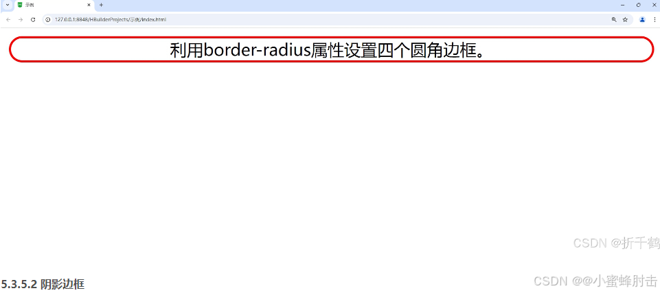
5.3.5.2 阴影边框
阴影边框(或更准确地说是元素阴影)是通过box-shadow属性来实现的。这个属性允许您在元素周围添加阴影效果。
示例:
<!DOCTYPE html>
<html>
<head>
<meta charset=" UTF-8">
<title>示例</title>
<style type="text/css">
div{
margin: 100px;
border: 2px solid blue;
box-shadow: -15px -10px 50px red;
}
</style>
</head>
<body>
<div>利用box-shadow属性设置边框的红色阴影。其中阴影向左偏移15像素,向上偏移20像素,模糊距离为50像素。</div>
</body>
</html>
5.3.5.3 图片绘制边框
虽然CSS没有直接允许您使用图片作为边框的属性,但您可以通过一些技巧来实现类似的效果。一个常用的方法是使用background-image属性配合background-clip和background-origin(在某些情况下)以及适当的padding来模拟图片边框。
另一种方法是使用border-image属性,它允许您使用图片来绘制边框。
示例:
<!DOCTYPE html>
<html>
<head>
<meta charset="utf-8" />
<title></title>
<style>
div{
margin: 100px;
border: 50px solid blue;
border-image: url(img/hhh.jpg)5 10 round;
}
</style>
</head>
<body>
<div>利用border-image属性设置图片边框铺满效果。上下向内偏移5像素,左右向内偏移10像素。</div>
</body>
</html>
5.4 CSS元素的定位
在CSS中,元素的定位是一项关键技能,用于精确控制元素在页面上的位置。CSS提供了多种定位机制,主要包括以下几种:
5.4.1 static 定位
这是元素的默认定位方式。
元素会按照正常的文档流进行排列,不会受到 top、right、bottom、left 或 z-index 属性的影响
示例:
<!DOCTYPE html>
<html>
<head>
<meta charset="utf-8" />
<title></title>
<style type="text/css">
.father {
border: 2px solid red;
width: 300px;
height: 250px;
/* 相对父盒子绝对定位 */
position: relative;
}
.son1 {
border: 2px double red;
background-color: yellow;
width: 200px;
height: 80px;
}
.son2 {
border: 2px double red;
width: 200px;
height: 25px;
margin-top: 50px;
}
</style>
</head>
<body>
<div class="father">父盒子:无定位
<div class="son1">子盒子1:无定位的盒子
<h2>静态定位盒子</h2>
</div>
<div class="son2">子盒子2:无定位
</div>
</div>
</body>
</html>
5.4.2 relative 定位
relative定位:当 position 属性设置为 relative 时,元素会相对于其正常位置进行偏移。偏移后的空间仍然保留在原位置,这意味着元素仍然占据原来的空间,但视觉上会移动到新的位置。
可以使用 top、right、bottom、left 属性来指定元素相对于其正常位置的偏移量。
Relative 定位的元素仍然会参与文档流的布局,但视觉上会按照指定的偏移量进行移动。
示例:
<!DOCTYPE html>
<html>
<head>
<meta charset="utf-8" />
<title></title>
<style type="text/css">
.father {
border: 2px solid red;
width: 300px;
height: 250px;
/* 相对父盒子绝对定位 */
position: relative;
}
.son1 {
border: 2px double red;
background-color: yellow;
width: 200px;
height: 80px;
position: relative;
top: 10px;
left: 30px;
}
.son2 {
border: 2px double red;
width: 200px;
height: 25px;
margin-top: 50px;
}
</style>
</head>
<body>
<div class="father">父盒子:无定位
<div class="son1">子盒子1:相对父盒子左边水平偏离30像素,相对父盒子上边垂直偏离10像素
</div>
<div class="son2">子盒子2:无定位
</div>
</div>
</body>
</html>
5.4.3 absolute定位
Absolute 定位的元素会脱离文档流,并相对于其包含块(即最近的已定位祖先元素)进行定位。如果没有已定位的祖先元素,则相对于初始包含块(通常是 <html> 元素或 <body> 元素)进行定位。
5.4.3.1 相对浏览器绝对定位
当元素的祖先元素都没有设置 position 属性(或设置为 static),或者祖先元素的 position 属性设置为 relative、absolute、fixed 但被设置为 overflow: hidden;、overflow: auto; 或 overflow: scroll; 且元素滚动出了可视区域时,该元素会相对于浏览器窗口(或称为视口)进行定位。
可以使用 top、right、bottom、left 属性来指定元素相对于浏览器窗口的偏移量。
示例:
<!DOCTYPE html>
<html>
<head>
<meta charset="utf-8" />
<title></title>
<style type="text/css">
.father {
border: 2px solid red;
width: 300px;
height: 250px;
}
.son1 {
border: 2px double red;
background-color: yellow;
width: 200px;
height: 80px;
position: absolute;
top: 10px;
right: 30px;
}
.son2 {
border: 2px double red;
width: 200px;
height: 25px;
margin-top: 50px;
}
</style>
</head>
<body>
<div class="father">父盒子:无定位
<div class="son1">子盒子1:相对父盒子左边水平偏离30像素,相对父盒子上边垂直偏离10像素
</div>
<div class="son2">子盒子2:无定位
</div>
</div>
</body>
</html>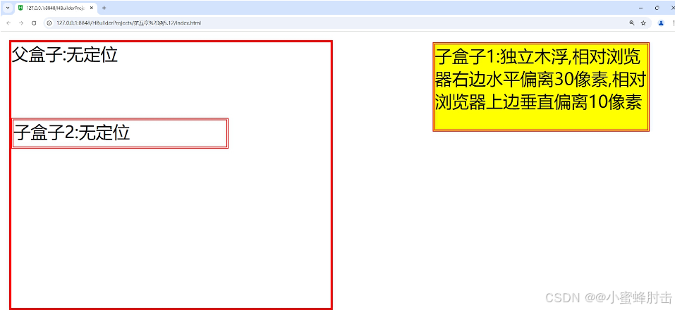
5.4.3.2 相对父盒子绝对定位
当元素的某个祖先元素设置了 position 属性为 relative、absolute 或 fixed 时,该元素会相对于这个最近的已定位祖先元素进行定位。
同样可以使用 top、right、bottom、left 属性来指定元素相对于这个祖先元素的偏移量。
需要注意的是,如果祖先元素设置了 transform、filter 或 perspective 等属性,它们可能会创建一个新的包含块,从而影响绝对定位元素的定位。
示例:
<!DOCTYPE html>
<html>
<head>
<meta charset="utf-8" />
<title></title>
<style type="text/css">
.father {
border: 2px solid red;
width: 300px;
height: 250px;
position: relative;
}
.son1 {
border: 2px double red;
background-color: yellow;
width: 200px;
height: 80px;
position: absolute;
top: 30px;
right: 10px;
}
.son2 {
border: 2px double red;
width: 200px;
height: 25px;
margin-top: 50px;
}
</style>
</head>
<body>
<div class="father">父盒子:无定位
<div class="son1">子盒子1:独立上浮,相对父盒子右边水平偏离10像素,相对父盒子上边垂直偏离30像素
</div>
<div class="son2">子盒子2:无定位
</div>
</div>
</body>
</html>
5.4.4fixed定位,即固定定位,是CSS定位属性position的一个值
示例:
<!DOCTYPE html>
<html>
<head>
<meta charset="utf-8" />
<title></title>
<style type="text/css">
.father {
border: 2px solid red;
width: 300px;
height: 250px;
}
.son1 {
border: 2px double red;
background-color: yellow;
width: 200px;
height: 80px;
position: fixed;
top: 30px;
right: 10px;
}
.son2 {
border: 2px double red;
width: 200px;
height: 25px;
margin-top: 50px;
}
</style>
</head>
<body>
<div class="father">父盒子:无定位
<div class="son1">子盒子1:固定定位,相对浏览器右边水平偏离10像素,相对浏览器上边垂直偏离30像素
</div>
<div class="son2">子盒子2:无定位
</div>
<br /><br /><br /><br /><br /><br /><br /><br /><br /><br /><br /><br /><br /><br /><br /><br /><br /><br /><br /><br /><br /><br /><br /><br /><br /><br /><br /><br /><br /><br />
</div>
</body>
</html>
5.5 CSS元素的浮动
浮动是CSS中一个重要的布局方式,它允许元素在水平方向上左右浮动,从而实现复杂的页面布局效果。以下是关于盒子浮动添加和浮动清除的详细解释。
5.5.1 盒子的浮动添加
在CSS中,可以通过float属性为元素添加浮动效果。float属性有三个可能的值:left、right和none(默认值)。
float: left;:元素会向左浮动,直到它的左边缘碰到包含框或另一个浮动元素的左边缘。
float: right;:元素会向右浮动,直到它的右边缘碰到包含框或另一个浮动元素的右边缘。
float: none;:元素不浮动,按照正常的文档流进行布局。
示例:
<!DOCTYPE html>
<html>
<head>
<meta charset="utf-8" />
<title></title>
<style type="text/css">
.father{
background-color: #ffccff;
border: 2px solid red;
padding: 5px;
}
.father div{
width: 100px;
height: 20px;
padding: 10px;
margin: 10px;
border: 2px dashed blue;
background-color: #ccffff;
}
.father p{
border: 2px dotted green;
background-color: #ffff99;
}
</style>
</head>
<body>
<div class="father">
<h2>父盒子</h2>
<div style="float: right;">右浮动盒子1</div>
<div style="float: right;">标准流盒子2</div>
<div style="float: right;">标准流盒子3</div>
<p>css中,有一个float属性,默认为none,也就是标准流通常的情况。若果将float属性的值设置为left或right,元素就会向其父级元素的左侧或右侧靠近,同时默认的
情况下,盒子的宽度不在伸展,而是根据盒子里面的内容的宽度确定。</p>
</div>
</body>
</html>
5.5.2 盒子的浮动清除
当元素浮动后,它们会脱离正常的文档流,这可能会导致父元素的高度塌陷,从而影响页面的布局。因此,需要清除浮动来避免这个问题。以下是几种常见的清除浮动的方法:
使用空标签带clear属性:
在浮动元素之后添加一个空标签(如<div>、<br>或<hr>),并为其设置clear: both;属性。这种方法简单直接,但会增加额外的HTML代码,不利于代码的简洁性和可维护性。
给浮动元素的父元素添加overflow属性:
为浮动元素的父元素设置overflow: hidden;或overflow: auto;属性。这种方法可以清除浮动,并且不需要添加额外的HTML代码。但是,它可能会隐藏超出父元素边界的内容,因此在使用时需要谨慎。
使用伪元素清除浮动:
在CSS中使用:after伪元素来清除浮动。这种方法是推荐的做法,因为它不会增加额外的HTML代码,并且可以通过CSS选择器精确地控制清除浮动的范围。
具体做法是为浮动元素的父元素添加一个类名(如.clearfix),然后在CSS中为这个类名添加:after伪元素,并设置display: block; clear: both; content: "";等属性。
示例:
<!DOCTYPE html>
<html>
<head>
<meta charset="utf-8" />
<title></title>
<style type="text/css">
.father{
width: 500px;
background-color: #ffccff;
border: 2px solid red;
padding: 5px;
}
.father div{
width: 100px;
height: 20px;
padding: 10px;
margin: 10px;
border: 2px dashed blue;
background-color: #ccffff;
}
.father p{
border: 2px dotted green;
background-color: #ffff99;
clear: both;
}
</style>
</head>
<body>
<div class="father">
<h2>父盒子</h2>
<div style="float: right;">右浮动盒子1</div>
<div style="float: right;">标准流盒子2</div>
<div style="float: right;">标准流盒子3</div>
<p>css中,有一个float属性,默认为none,也就是标准流通常的情况。若果将float属性的值设置为left或right,元素就会向其父级元素的左侧或右侧靠近,同时默认的
情况下,盒子的宽度不在伸展,而是根据盒子里面的内容的宽度确定。</p>
</div>
</body>
</html>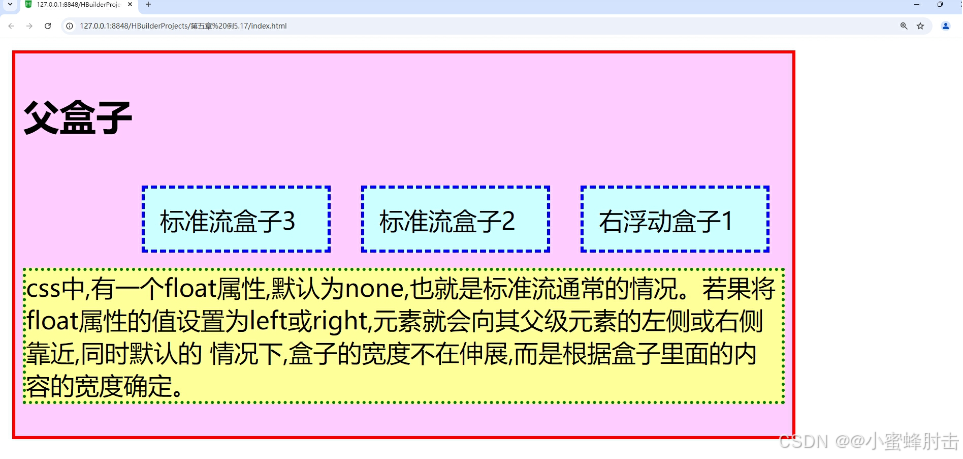
5.6 综合案例——昵心美食空间
代码示例:
<!DOCTYPE html>
<html>
<head>
<meta charset="utf-8">
<title>昵心美食空间</title>
<style type="text/css">
*{
background-color:#FFFF99;
}
a{
color: red;
}
.all{
width:700px;
height:650px;
margin:10px auto;
padding:5px;
background-image:url(img/bg1.JPG);
}
.banner{
width:700px;
height:70px;
}
.menu{
width:690px;
height:40px;
padding:5px;
}
.main{
width:700px;
height:450px;
margin:5px 0px;
position: relative;
}
.left,.right{
width:150px;
height:440px;
border:1px solid #999;
float:left;
}
.middle{
width:384px;
height:450px;
margin:0px 5px;
float:left;
font-size:20px;
font-family:"楷体";
font-weight:700;
color:#0000FF;
}
.one{
width:380px;
height: 155px;
border: 1px solid #999;
}
.two{
width:255px;
height:100px;
border:5px double red;
margin-top:20px;
margin-bottom:20px;
border-radius:25px;
}
.three{
width:380px;
height:135px;
border: 1px solid #999;
}
.bottom{
width:700px;
height:70px;
}
</style>
</head>
<body>
<div class="all">
<div class="banner">
<img src="img/banner.jpg" width="700px" height="70px"/>
</div>
<div class="menu">
<img src="img/menu.jpg" width="690px" height="40px"/>
</div>
<div class="main">
<div class="left">
<marquee direction="up">
<img src="img/mm_1.jpg" width="150px" height="140px"/>
<img src="img/mm_2.jpg" width="150px" height="140px"/>
<img src="img/mm_3.jpg" width="150px" height="140px"/>
</marquee>
</div>
<div class="middle">
<div class="one">
<img src="img/font.jpg" width="25px"height="25px"/>为您推荐
<br><br>
<img src="img/x_1.jpg" width="80px" height="40px"/>
<img src="img/x_2.jpg" width="80px" height="40px"/>
<img src="img/x_3.jpg" width="80px" height="40px"/>
<img src="img/x_4.jpg" width="80px" height="40px"/>
<img src="img/x_5.jpg" width="80px" height="40px"/>
<img src="img/x_6.jpg" width="8Opx" height="4Opx"/>
</div>
<center>
<div class="two">
<h1>昵心美食空间</h1>
</div>
</center>
<div class="three">
<img src="img/font.jpg" width="25px" height="25px"/>团购信息
<br>
<a href="#">1.火锅团购</a><br>
<a href="#">2.烧烤团购</a><br>
<a href="#">3.自助餐团购</a><br>
<a href="#">4.新春特惠</a>
</div>
</div>
<div class="right">
<marquee direction="up">
<img src="img/good_1.jpg" width="150px" height="140px"/>
<img src="img/good_2.jpg" width="148px" height="140px"/>
<img src="img/good_3.jpg" width="148px" height="140px"/>
</marquee>
</div>
</div>
<div class="bottom">
<hr color="#0000FF">
<center style="font-family:'楷体'";>版权所有©昵心美食空间<br/>
地址:江门市大学路XXX号邮编:500000电话:0750-9999999</center>
</div>
</div>
</body>
</html>


 扫一扫
扫一扫


 2123
2123

 被折叠的 条评论
为什么被折叠?
被折叠的 条评论
为什么被折叠?
 到【灌水乐园】发言


