


目录
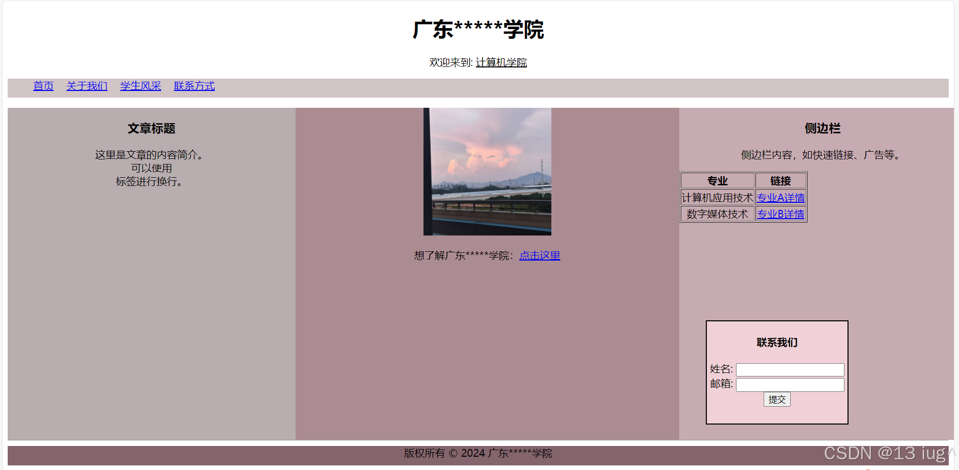
一、经典两列布局
经典两列布局是指一种网页布局方式,其中一列宽度固定,另一列宽度自适应。 这种布局方式在网页设计中非常常见,因为它能够提供良好的视觉效果和用户体验。
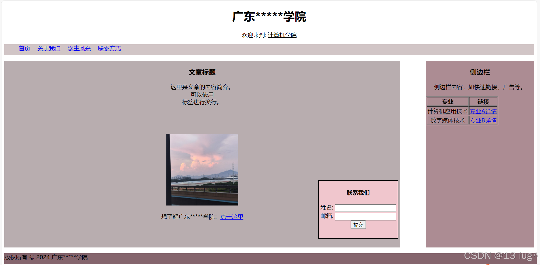
网页示例,如下人民日报:

可以看成这样:
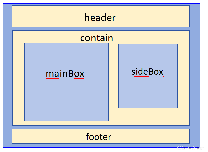
经典两列布局示例:
代码如下:
<head>
<title>典型的网页结构示例:经典两列布局</title>
<style>
nav ul{
height:30px; /*给父盒设置高度,避免高度塌陷影响其他兄弟盒*/
background-color: #D1C5C6;
}
nav ul li{
margin-right: 20px;
float:left;
}
#contact{
width: 220px;
height: 160px;
background-color: rgb(240, 198, 205);
border: 2px black solid;
position: fixed;
left:880px;
top:500px;
text-align:center
}
article{
width: 1100px;
height: 520px;
background-color:#B8ADAF;
float: left;
text-align:center
}
#aside1{
width: 300px;
height: 520px;
background-color:#AC8C93;
float: right;
text-align:center
}
footer{
width: 1900px;
height: 30px;
background-color: #85656D;
}
</style>
</head>
<body>
<header>
<h1 align="center">广东*****学院</h1>
<p align="center">欢迎来到: <ins>计算机学院</ins></p>
<nav >
<ul type="none" >
<li><a href="#">首页</a></li>
<li><a href="#">关于我们</a></li>
<li><a href="#">学生风采</a></li>
<li><a href="#">联系方式</a></li>
</ul>
</nav>
</header>
<main>
<section>
<article>
<h3>文章标题</h3>
<p>这里是文章的内容简介。<br>可以使用<br>标签进行换行。</p>
<br><br><br>
<img src="D:\盒子\网页布局\MVIMG_20240622_191847.jpg" alt="文章配图" width="200" height="200">
<p>想了解广东*****学院:<a href="https://gdyfvccm.edu.cn/">点击这里</a></p>
</article>
<aside id="aside1">
<h3>侧边栏</h3>
<p>侧边栏内容,如快速链接、广告等。</p>
<table border="1">
<tr>
<th>专业</th>
<th>链接</th>
</tr>
<tr>
<td>计算机应用技术</td>
<td><a href="专业A详情页.html">专业A详情</a></td>
</tr>
<tr>
<td>数字媒体技术</td>
<td><a href="专业B详情页.html">专业B详情</a></td>
</tr>
</table>
</aside>
</section>
<section id="contact">
<h4>联系我们</h4>
<form>
姓名:
<input type="text" id="name" name="name"><br>
邮箱:
<input type="email" id="email" name="email"><br>
<input type="submit" value="提交">
</form>
</section>
</main>
<hr>
<div style="clear:both"></div>
<footer>
<p>版权所有 © 2024 广东*****学院</p>
</footer>
</body>
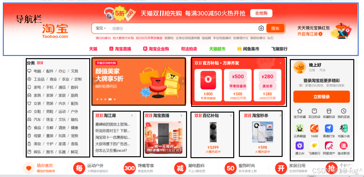
二、经典三列布局
经典三列布局是指一种页面布局方式,其中包含三列,左右两列宽度固定,中间一列宽度自适应。 这种布局方式在许多网站的首页中广泛应用。
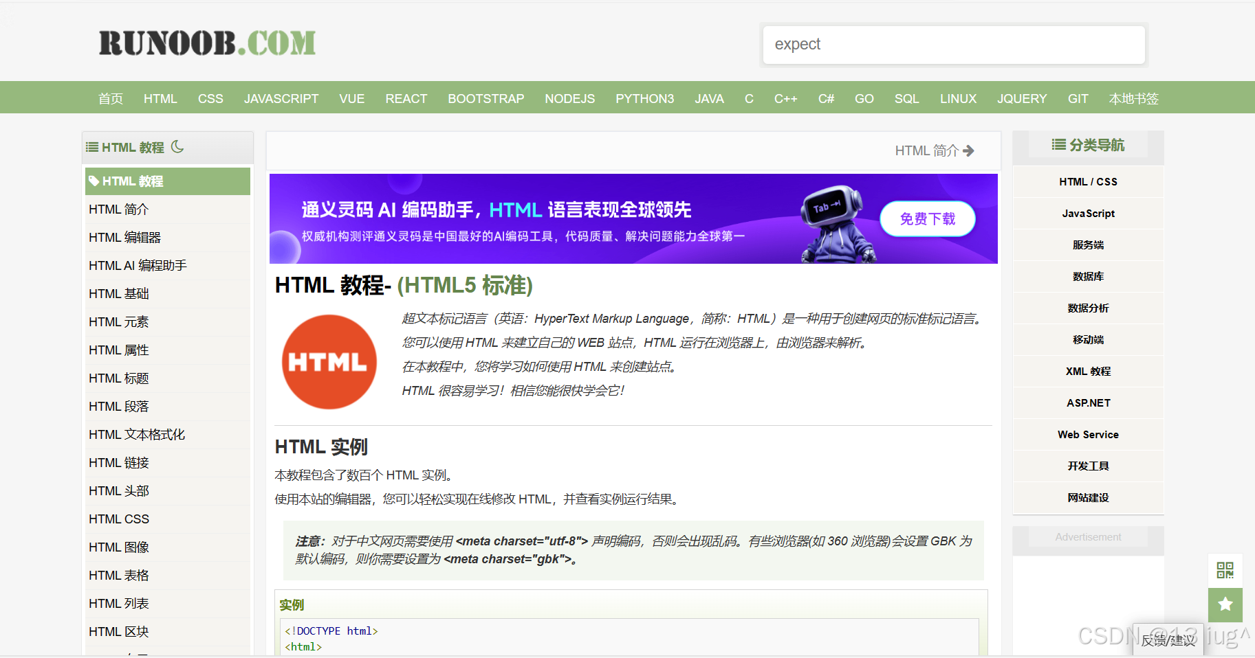
网页示例,例如菜鸟教程官网
可以简单看成这样:
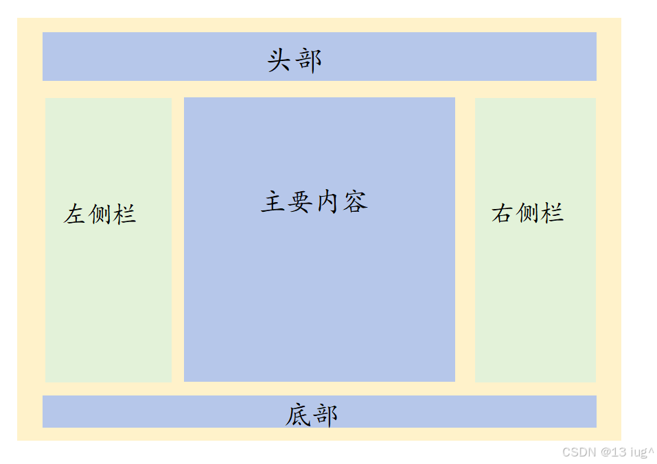
经典三列布局示例:
代码如下:
<head>
<title>典型的网页结构示例:三列布局</title>
<style>
nav ul{
height:30px;
background-color: #D1C5C6;
}
nav ul li{
margin-right: 20px;
float:left;
}
#contact{
width: 220px;
height: 160px;
background-color: rgb(240, 209, 215);
border: 2px black solid;
position: fixed;
left:1100px;
top:500px;
text-align:center
}
section{
width:1500px;
}
article{
width: 450px;
height: 520px;
background-color:#B8ADAF;
float: left;
text-align:center
}
#d1{
width: 600px;
height: 520px;
background-color:#AC8C93;
float: left;
text-align:center
}
aside{
width: 450px;
height: 520px;
background-color:#c7abb2;
float:right;
text-align:center
}
footer{
width: 100%;
height:30px;
background-color:#85656D;
text-align:center
}
</style>
</head>
<body>
<header >
<h1 align="center">广东*****学院</h1>
<p align="center">欢迎来到: <ins>计算机学院</ins></p>
<!-- <hr> -->
<nav>
<ul type="none">
<li><a href="#">首页</a></li>
<li><a href="#">关于我们</a></li>
<li><a href="#">学生风采</a></li>
<li><a href="#">联系方式</a></li>
</ul>
</nav>
</header>
<!-- <hr> -->
<main>
<section>
<article >
<h3>文章标题</h3>
<p>这里是文章的内容简介。<br>可以使用<br>标签进行换行。</p>
<!-- <br><br><br> -->
</article>
<nav id="d1">
<img src="D:\盒子\网页布局\MVIMG_20240622_191847.jpg" alt="文章配图" width="200" height="200">
<p>想了解广东*****学院:<a href="https://gdyfvccm.edu.cn/">点击这里</a></p>
</nav>
<aside>
<h3 >侧边栏</h3>
<p >侧边栏内容,如快速链接、广告等。</p>
<table border="1" id="h1">
<tr>
<th>专业</th>
<th>链接</th>
</tr>
<tr>
<td>计算机应用技术</td>
<td><a href="专业A详情页.html">专业A详情</a></td>
</tr>
<tr>
<td>数字媒体技术</td>
<td><a href="专业B详情页.html">专业B详情</a></td>
</tr>
</table>
</aside>
</section>
<section id="contact">
<h4>联系我们</h4>
<form>
姓名:
<input type="text" id="name" name="name"><br>
邮箱:
<input type="email" id="email" name="email"><br>
<input type="submit" value="提交">
</form>
</section>
<hr>
<div style="clear: both;"></div>
</main>
<footer>
版权所有 © 2024 广东*****学院
</footer>
</body> 三、多行多列布局
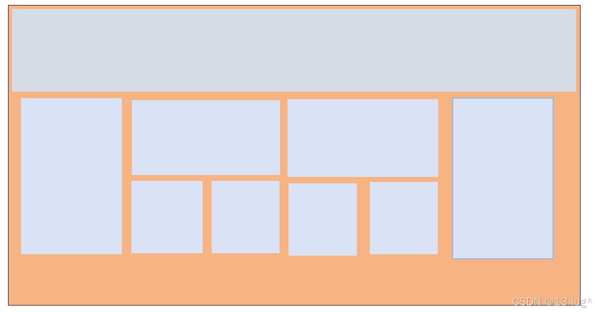
多行多列布局是一种网页布局方式,可以将内容分为多个列进行展示,在水平方向上进行排列。 这种布局方式允许内容在不同的列中展示,使得页面看起来更加丰富和有层次感。多行多列布局在各大电商网站和素材网站中非常常见,如淘宝网
融合两列,三列,多列布局, 可以简单看成这样:
四、拓展:百分比布局 (帮你解决调整宽高的烦恼)
百分比布局是一种布局方式,其中控件的宽度或高度通过百分比来定义,而不是使用固定的像素值。 这种布局方式使得控件的大小可以根据父容器的尺寸动态调整,从而适应不同屏幕尺寸的设备。主要优点有:灵活度高,兼容性好,使用场景广泛。
百分比布局示例:
<head>
    <title>典型的网页结构示例:百分比布局</title>
        /* 使用百分比可以让元素自适应网页大小 */
        section{
            width: 100%;
        }
        article{
            width: 30%;
            height: 520px;
             background-color:#B8ADAF;
              float: left;
        }
        #d1{
            width: 40%;
            height: 520px;
             background-color:#AC8C93;
              float: left;
        }

        aside{
            width: 30%;
            height: 520px;
            background-color:#c7abb2;
            float:right;
        }
        footer{
                width: 100%;
                height:30px;
                background-color:#85656D;
        }
    </style>
</head>
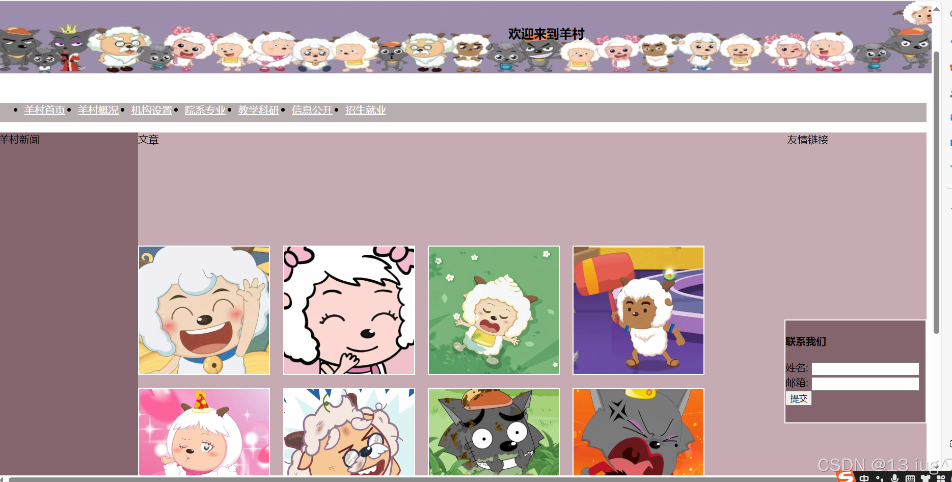
五、综合练习
练习:做出类似的网页,如下:
代码如下:
<head>
<title>网页布局综合练习</title>
<style>
header{
background-image: url(./img_src/top.jpg);
}
nav ul{
height:30px;
background-color: #B8ADAF;
}
nav ul li{
margin-right: 20px;
float:left;
}
.clear_ele a:link{
color: white;
}
.clear_ele a:visited{
color: #c7abb2;
}
#aside-left{
width: 15%;
height: 800px;
background-color:#85656D;
/* border: 3px solid #000; */
float: left;
}
#aside-right{
width: 15%;
height: 800px;
background-color:#c7abb2;
/* border: 3px solid #000; */
float: right;
}
article{
width: 70%;
height: 800px;
background-color:#c7abb2;
float: left;
}
.container3{
width: 220px;
height: 160px;
background-color: #85656D;
border: 2px white solid;
position: fixed;
right: 8px;
top:500px;
}
.clear_ele img{
list-style: none;
width: 20%;
height: 200px;
background-color: #c7abb2;
border: 2px white solid;
margin-right: 2%;
margin-bottom: 2%;
float: left;
}
footer{
width: 100%;
height: 50px;
background-color:#c7abb2;
text-align: center;
}
.clear_ele::after{
/* 内容是空的 */
content: ""; /* 这是必须配置的属性,代表这个盒子的存在 */
display: block;
clear: both;
}
#b1{
position: relative;
left: 800px;
bottom: 80px;
font-size: 20px;
}
#img1{
height: 200px;
width: 1470px;
}
</style>
</head>
<body>
<header>
<section class="container1">
<img src="大合照.jpg" id="img1">
</section>
</header>
<b id="b1">欢迎来到羊村</b>
<nav>
<ul class="clear_ele">
<li><a href="https://gdyfvccm.edu.cn/">羊村首页</a></li>
<li><a href="#">羊村概况</a></li>
<li><a href="#">机构设置</a></li>
<li><a href="#">院系专业</a></li>
<li><a href="#">教学科研</a></li>
<li><a href="#">信息公开</a></li>
<li><a href="#">招生就业</a></li>
</ul>
</nav>
<main>
<section class="container2 clear_ele">
<aside id="aside-left">
羊村新闻
</aside>
<aside id="aside-right">
友情链接
</aside>
<article>文章
<ul class="clear_ele">
<br><br><br><br><br><br>
</ul>
<img src="mmexport1730452351531.png" alt="">
<img src="mmexport1730452356775.jpg" alt="">
<img src="mmexport1730452359188.jpg" alt="">
<img src="mmexport1730452361987.jpg" alt="">
<img src="mmexport1730452364485.jpg" alt="">
<img src="mmexport1730452367469.png" alt="">
<img src="mmexport1730452370315.jpg" alt="">
<img src="mmexport1730452373482.png" alt="">
</article>
</section>
<section class="container3">
<h4>联系我们</h4>
<form>
姓名:
<input type="text" id="name" name="name"><br>
邮箱:
<input type="email" id="email" name="email"><br>
<input type="submit" value="提交">
</form>
</section>
</main>
<footer>
<p>版权所有 © 2024 羊村</p>
</footer>
</body>


 扫一扫
扫一扫


 被折叠的 条评论
为什么被折叠?
被折叠的 条评论
为什么被折叠?
 到【灌水乐园】发言


