


9.1 DIV+CSS概述
9.1.1 认识DIV
div标签在Web标准的网页中使用非常频繁,属于块状元素。div标签是双标签,即以<div></div>的形式存在,中间可以放置任何内容,包括其他的div标签。
但是在没有CSS的影响下,每个div标签只占据一行,即一行只能容纳一个div标签。
9.1.2 DIV的宽高设置
对div设置宽高样式,既div宽度和高度同时设置。
9.1.2.1 宽高属性
9.1.2.2 div标签内直接设置宽高
9.1.2.3 div使用选择器设置宽高
把CSS样式改为选择器形式
<!DOCTYPE html>
<html>
	<head>
		<meta charset="utf-8">
		<title></title>
		<style>
			/* <!-- 9.1 DIV+CSS概述  */
			/* <!-- 9.1.1 认识DIV */
			/* <!-- 9.1.2 DIV的宽高设置 */
			/* <!-- 9.1.2.1 宽高属性 */
			/* <!-- 9.1.2.2 div标签内直接设置宽高 */
			/* <!-- 9.1.2.3 div使用选择器设置宽高  */
			.d1{
				width: 300px;
				height: 100px;
				border: #aa00ff solid 3px;
			}
			/* <!-- 9.1.2.4 div高度的百分比设置问题 --> */
			/* <!-- 9.2 DIV+CSS的应用 --> */
			/* <!-- 9.2.1 DIV元素的布局技巧 --> */
			/* <!-- 9.2.2 DIV元素的宽度自适应 --> */
			/* <!-- 9.2.3 DIV内容的居中 --> */
			/* <!-- 9.2.4 DIV元素的嵌套 --> */
			/* <!-- 9.3 DIV+CSS的典型布局 */
			/* <!-- 9.3.1 左中右布局 --> */
			/* <!-- 9.3.2 上中下布局 --> */
			/* <!-- 9.3.3 混合布局 --> */
		</style>
	</head>
	<body>
		<div class="d1">使用px值设置宽度高度</div>
		<div id="d2">使用百分比设置宽度高度</div>
	</body>
</html>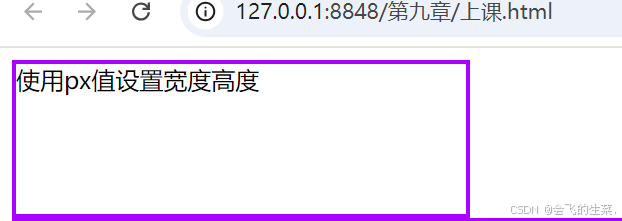
9.1.2.4 div高度的百分比设置问题
<!DOCTYPE html>
<html>
	<head>
		<meta charset="utf-8">
		<title></title>
		<style>
			/* <!-- 9.1 DIV+CSS概述  */
			/* <!-- 9.1.1 认识DIV */
			/* <!-- 9.1.2 DIV的宽高设置 */
			/* <!-- 9.1.2.1 宽高属性 */
			/* <!-- 9.1.2.2 div标签内直接设置宽高 */
			/* <!-- 9.1.2.3 div使用选择器设置宽高  */
			/* <!-- 9.1.2.4 div高度的百分比设置问题 --> */
			*{
				width: 100%;
				height: 100%;
			}
			#d2{
				width: 50%;
				height: 20%;
				border: #aa00ff solid 3px;
			}
			/* <!-- 9.2 DIV+CSS的应用 --> */
			/* <!-- 9.2.1 DIV元素的布局技巧 --> */
			/* <!-- 9.2.2 DIV元素的宽度自适应 --> */
			/* <!-- 9.2.3 DIV内容的居中 --> */
			/* <!-- 9.2.4 DIV元素的嵌套 --> */
			/* <!-- 9.3 DIV+CSS的典型布局 */
			/* <!-- 9.3.1 左中右布局 --> */
			/* <!-- 9.3.2 上中下布局 --> */
			/* <!-- 9.3.3 混合布局 --> */
		</style>
	</head>
	<body>
		<div class="d1">使用px值设置宽度高度</div>
		<div id="d2">使用百分比设置宽度高度</div>
	</body>
</html>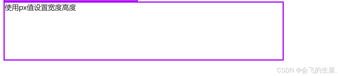
9.2 DIV+CSS的应用
9.2.1 DIV元素的布局技巧
由于用户的计算机显示屏分辨率不同,因此在布局页面时,要充分考虑页面内容的布局宽度情况,并保证页面整体内容在页面居中。一旦内容宽度超过显示宽度,页面将出现水平滚动条。应尽量保证网页只有垂直滚动条,才符合用户的习惯,所以高度不需要考虑,一般都是由页面内容决定网页高度即可。
网页设计与制作教程又因为浏览器的兼容情况,所以在布局页面前,设计者一定要把页面的默认边距清除。传统的表格布局时,可以使用属性“align:center;”设置表格居中问题,但是DIV的居中
是没有属性可以设置的,只能通过CSS样式控制其位置。使div元素水平居中的方法有多种,常用的方法是用CSS设置div的左右边距。
<!DOCTYPE html>
<html>
	<head>
		<meta charset="utf-8">
		<title></title>
		<style>
			/* <!-- 9.1 DIV+CSS概述  */
			/* <!-- 9.1.1 认识DIV */
			/* <!-- 9.1.2 DIV的宽高设置 */
			/* <!-- 9.1.2.1 宽高属性 */
			/* <!-- 9.1.2.2 div标签内直接设置宽高 */
			/* <!-- 9.1.2.3 div使用选择器设置宽高  */
			.d1{
				width: 300px;
				height: 100px;
				border: #aa00ff solid 3px;
			}
			/* <!-- 9.1.2.4 div高度的百分比设置问题 --> */
			*{
				width: 100%;
				height: 100%;
			}
			#d2{
				width: 50%;
				height: 20%;
				border: #aa00ff solid 3px;
			}
			/* <!-- 9.2 DIV+CSS的应用 --> */
			/* <!-- 9.2.1 DIV元素的布局技巧 --> */
			#d3{
				width: 50%;
				height: 20%;
				border: #aa00ff solid 3px;
				margin-left: auto;
				margin-right: auto;
			}
			/* <!-- 9.2.2 DIV元素的宽度自适应 --> */
			/* <!-- 9.2.3 DIV内容的居中 --> */
			/* <!-- 9.2.4 DIV元素的嵌套 --> */
			/* <!-- 9.3 DIV+CSS的典型布局 */
			/* <!-- 9.3.1 左中右布局 --> */
			/* <!-- 9.3.2 上中下布局 --> */
			/* <!-- 9.3.3 混合布局 --> */
		</style>
	</head>
	<body>
		<div class="d1">使用px值设置宽度高度</div>
		<div id="d2">使用百分比设置宽度高度</div>
		<div id="d3">DIV盒子居中</div>
	</body>
</html>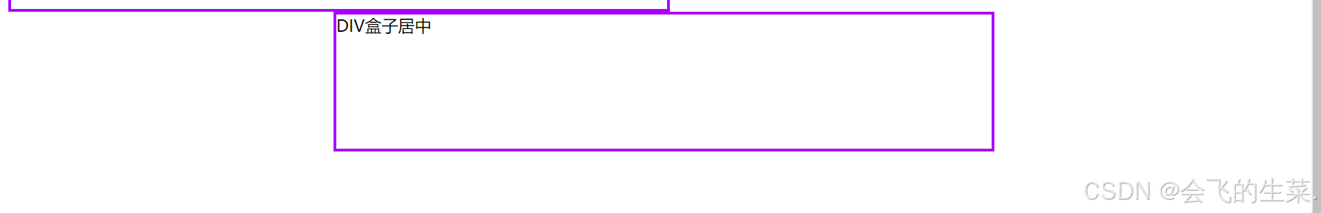
9.2.2 DIV元素的宽度自适应
有时会用到浮动效果,实现 DIV元素的宽度自适应。宽度自适应是指两个并排的div,其中左边的div为固定宽度,右边div则根据浏览器的宽度自动调整,这种用法常用于文章列表和文章内容的页面布局。
<!DOCTYPE html>
<html>
	<head>
		<meta charset="utf-8">
		<title></title>
		<style>
			/* <!-- 9.1 DIV+CSS概述  */
			/* <!-- 9.1.1 认识DIV */
			/* <!-- 9.1.2 DIV的宽高设置 */
			/* <!-- 9.1.2.1 宽高属性 */
			/* <!-- 9.1.2.2 div标签内直接设置宽高 */
			/* <!-- 9.1.2.3 div使用选择器设置宽高  */
			.d1{
				width: 300px;
				height: 100px;
				border: #aa00ff solid 3px;
			}
			/* <!-- 9.1.2.4 div高度的百分比设置问题 --> */
			*{
				width: 100%;
				height: 100%;
			}
			#d2{
				width: 50%;
				height: 20%;
				border: #aa00ff solid 3px;
			}
			/* <!-- 9.2 DIV+CSS的应用 --> */
			/* 9.2.1 DIV元素的布局技巧 */
			#d3{
				width: 50%;
				height: 20%;
				border: #aa00ff solid 3px;
				margin-left: auto;
				margin-right: auto;
			}
			/* 9.2.2 DIV元素的宽度自适应 */
			*{
				padding: 0;
				margin: 0;
			}
			#all{
				height: 200px;
				border: #aa00aa solid 3px;
			}
			#left{
				height: 100px;
				width: 100px;
				float: left;
				border: #00ffaa solid 3px;
			}
			#right{
				height: 200px;
				border: #00aaff solid 3px;
				margin-left: 100px;
			}
			/* 9.2.3 DIV内容的居中  */
			/* 9.2.4 DIV元素的嵌套  */
			/* 9.3 DIV+CSS的典型布局 */
			/* 9.3.1 左中右布局 */
			/* 9.3.2 上中下布局 */
			/*9.3.3 混合布局 */
		</style>
	</head>
	<body>
		<div class="d1">使用px值设置宽度高度</div>
		<div id="d2">使用百分比设置宽度高度</div>
		<div id="d3">DIV盒子居中</div>
		<div id="all">
			<div id="left">左侧盒子 宽度固定</div>
			<div id="right">右侧盒子 自适应</div>
		</div>
	</body>
</html>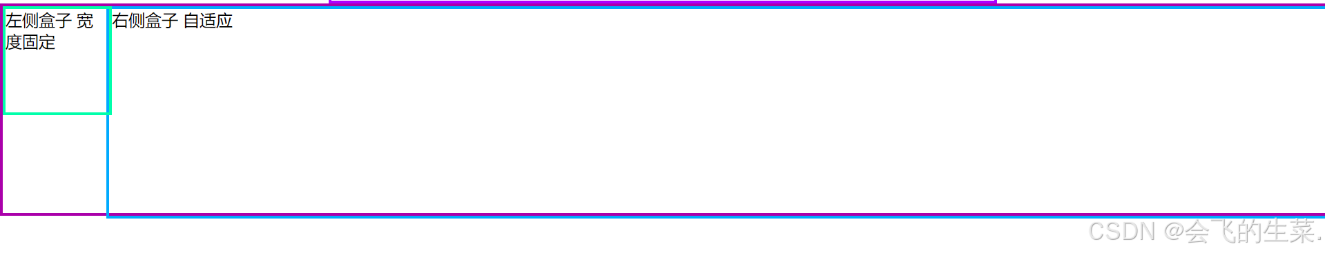
9.2.3 DIV内容的居中
平时说的div内容居中,只是保持div内容的水平居中。但是很多网站需要用到的是水平和垂直居中。这里用行高(line-height)属性来实现,当行高的值等于容器的高度值,内容便垂直居中。
<!DOCTYPE html>
<html>
	<head>
		<meta charset="utf-8">
		<title></title>
		<style>
			/* <!-- 9.1 DIV+CSS概述  */
			/* <!-- 9.1.1 认识DIV */
			/* <!-- 9.1.2 DIV的宽高设置 */
			/* <!-- 9.1.2.1 宽高属性 */
			/* <!-- 9.1.2.2 div标签内直接设置宽高 */
			/* <!-- 9.1.2.3 div使用选择器设置宽高  */
			.d1{
				width: 300px;
				height: 100px;
				border: #aa00ff solid 3px;
			}
			/* <!-- 9.1.2.4 div高度的百分比设置问题 --> */
			*{
				width: 100%;
				height: 100%;
			}
			#d2{
				width: 50%;
				height: 20%;
				border: #aa00ff solid 3px;
			}
			/* <!-- 9.2 DIV+CSS的应用 --> */
			/* 9.2.1 DIV元素的布局技巧 */
			#d3{
				width: 50%;
				height: 20%;
				border: #aa00ff solid 3px;
				margin-left: auto;
				margin-right: auto;
			}
			/* 9.2.2 DIV元素的宽度自适应 */
			*{
				padding: 0;
				margin: 0;
			}
			#all{
				height: 200px;
				border: #aa00aa solid 3px;
			}
			#left{
				height: 100px;
				width: 100px;
				float: left;
				border: #00ffaa solid 3px;
			}
			#right{
				height: 200px;
				border: #00aaff solid 3px;
				margin-left: 100px;
			}
			/* 9.2.3 DIV内容的居中  */
			#d4{
				width: 300px;
				height: 100px;
				border: #00aaff solid 3px;
				text-align: center;
				line-height: 100px;
			}
			/* 9.2.4 DIV元素的嵌套  */
			/* 9.3 DIV+CSS的典型布局 */
			/* 9.3.1 左中右布局 */
			/* 9.3.2 上中下布局 */
			/*9.3.3 混合布局 */
		</style>
	</head>
	<body>
		<div class="d1">使用px值设置宽度高度</div>
		<div id="d2">使用百分比设置宽度高度</div>
		<div id="d3">DIV盒子居中</div>
		<div id="all">
			<div id="left">左侧盒子 宽度固定</div>
			<div id="right">右侧盒子 自适应</div>
		</div>
		<div id="d4">DIV内容居中</div>
	</body>
</html>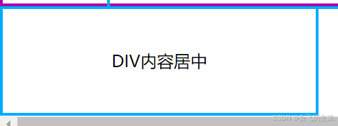
9.2.4 DIV元素的嵌套
传统的表格布局中,搜索引擎如果遇到多层表格嵌套时,可能抓取不到3层以上的内容,或者会跳过嵌套的内容直接放弃整个页面。
而DIV+CSS 布局则不会存在这样的问题,为了实现复杂的布局结构,div元素也需要互相嵌套。但在布局页面时尽量少嵌套,否则将影响浏览器对代码的解析速度。
<!DOCTYPE html>
<html>
	<head>
		<meta charset="utf-8">
		<title></title>
		<style>
			.all{
				width: 700px;
				height: 700px;
				border: 2px solid red;
				margin: 0px auto;
			}
			.top{
				width: 700px;
				height: 100px;
				background-color: lightcyan;
			}
			.main{
				width: 700px;
				height: 520px;
			}
			.main .left{
				width: 180px;
				height: 520px;
				background-color: yellow;
				float: left;
				margin: 10px;
			}
			.main .right{
				width: 480px;
				height: 500px;
				background-color: lightgreen;
				float: left;
				margin: 10px;
			}
			.footer{
				width: 700px;
				height: 80px;
				background-color: lightgray;
			}
		</style>
	</head>
	<body>
		<div class="all">
			<div class="top"></div>
			<div class="main">
			<div class="left"></div>
			<div class="right"></div>
		</div>
		<div class="footer"></div>
		</div>
	</body>
</html>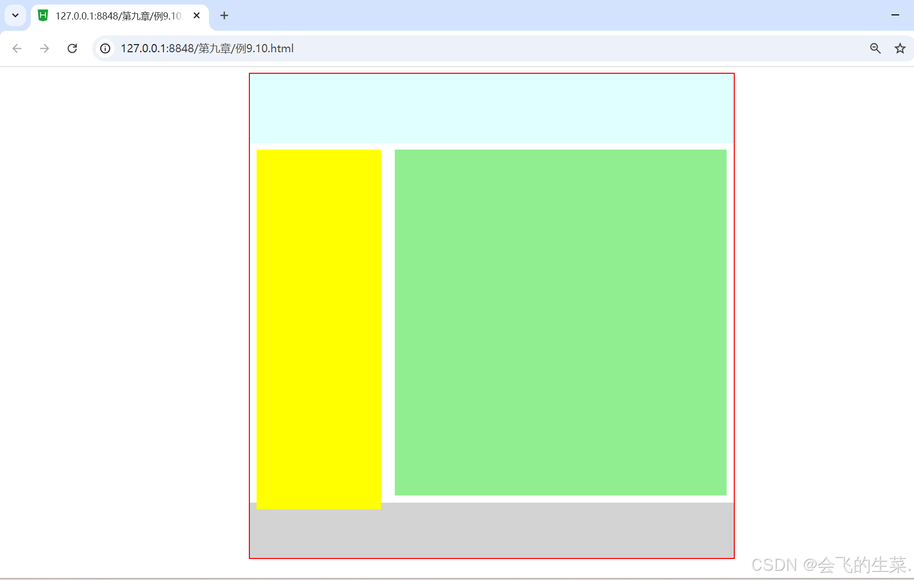
9.3 DIV+CSS的典型布局
9.3.1 左中右布局
左中右布局在网页设计时最为常用,即div-left是导航菜单,div-mai是视觉集中点,放置主要内容,div-right是表单或链接等。而左中右三个区域一并被包含在一个大的div-all中。
<!DOCTYPE html>
<html>
	<head>
		<meta charset="utf-8">
		<title></title>
		<style>
		*{
			margin: 10px auto;
			padding: 0px auto;
			font-size: large;
		}
		.all{
			background-color: red;
			width: 700px;
			height: 500px;
		}
		.left,.main,.right{
			text-align: center;
			height: 480px;
			line-height: 480px;
			float: left;
		}
		.left{
			background-color: antiquewhite;
			width: 150px;
		}
		.main{
			background-color: lightcyan;
			width: 400px;
		}
		.right{
			background-color: antiquewhite;
			width: 150px;
		}
		</style>
	</head>
	<body>
		<div class="all">
			<div class="left">导航菜单</div>
			<div class="main">视觉集中区域,主要内容</div>
			<div class="right">表单或链接</div>
		</div>
	</body>
</html>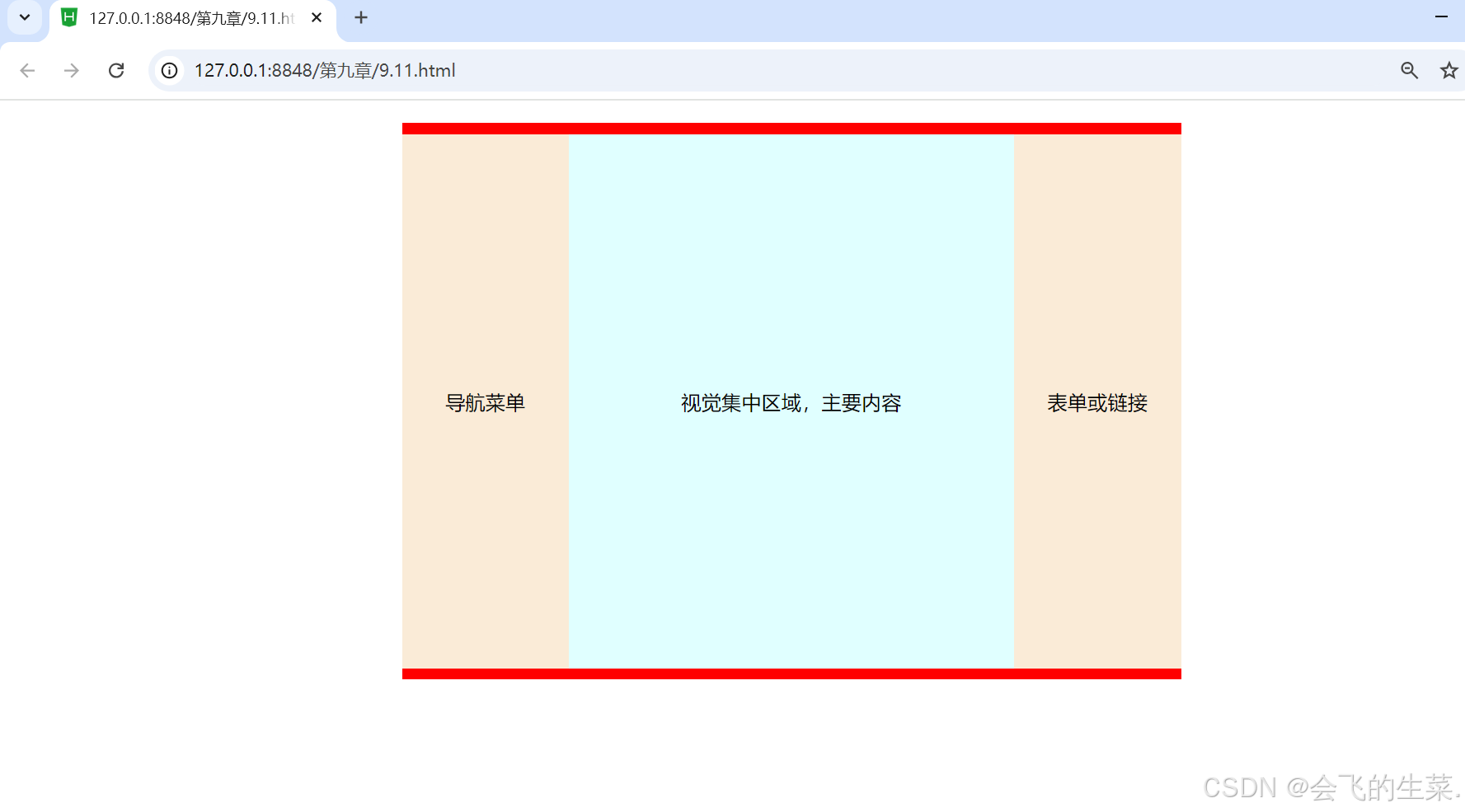
9.3.2 上中下布局
上中下布局符合许多网站共同的特点,即div-top是导航或者横幅广告,diw-main是视觉集中点,放置主要内容,div-footer是版权信息等。而上中下三个区域一并被包含在一个大的div-all中。
<!DOCTYPE html>
<html>
	<head>
		<meta charset="utf-8">
		<title></title>
		<style>
		*{
			margin: 0px auto;
			padding: 0px auto;
			font-size: large;
		}
		.all{
			background-color: red;
			width: 700px;
			height: 500px;
		}
		.top{
			background-color: antiquewhite;
			width: 680px;
			height: 80px;
			line-height: 80px;
		}
		.main{
			background-color: lightcyan;
			width:680px;
			height: 340px;
			line-height: 340px;
		}
		.footer{
			background-color: antiquewhite;
			width: 680px;
			height: 80px;
			line-height: 80px;
		}
		</style>
	</head>
	<body>
		<div class="all">
			<div class="top">导航或者横幅广告</div>
			<div class="main">视觉集中区域,主要内容</div>
			<div class="footer">版权信息</div>
		</div>
	</body>
</html>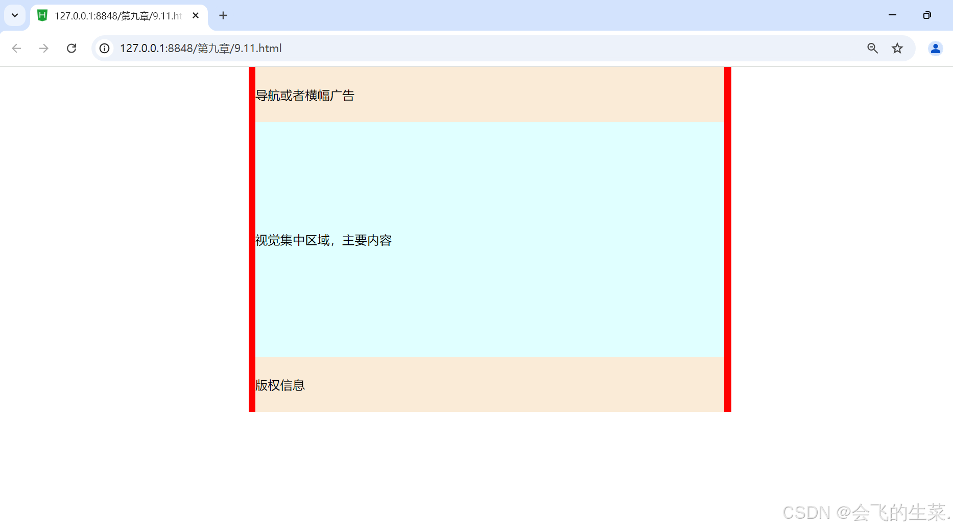
9.3.3 混合布局
在了解左中右和上中下布局之后,混合布局也就不难理解了,混合布局也可以叫综合型布局。混合布局可以在一列或一行布局的基础之上,分为多列或多行布局。网页布局的结构普遍都是三列布局,或者可以根据实际需求,对网页再进行划分。
<!DOCTYPE html>
<html>
	<head>
		<meta charset="utf-8">
		<title></title>
		<style>
		*{
			margin: 0px auto;
			padding: 0px auto;
			width: 100%;
			height: 100%;
		}
		.all{
			border: 2px dashed red;
			width: 95%;
			height: 70%;
		}
		.top{
			background-color: pink;
			width:100%;
			height: 35%;
		}
		.main{
			width: 100%;
			height: 45%;
		}
		.left{
			background-color: yellow;
			width: 20%;
			float: left;
		}
		.center{
			background-color: lightcyan;
			width: 60%;
			float: left;
		}
		.right{
			background-color: yellow;
		}
		.footer{
			background-color: pink;
			width: 100%;
			height: 30%;
		}
		</style>
	</head>
	<body>
		<div class="all">
			<div class="top"></div>
			<div class="main">
			<div class="left"></div>
			<div class="center"></div>
			<div class="right"></div>
			</div>
			<div class="footer"></div>
		</div>
	</body>
</html>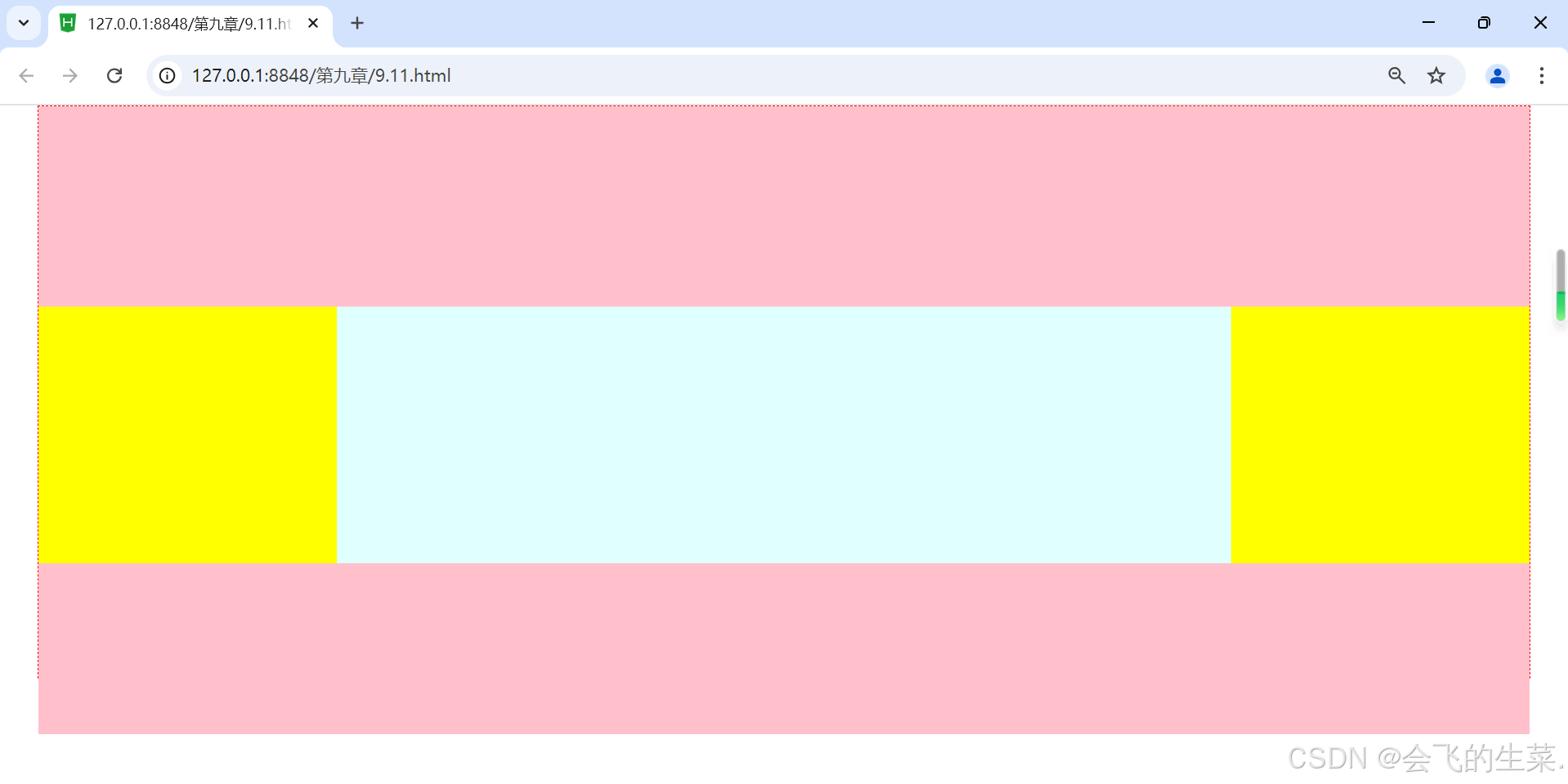
9.4 综合案例——众成远程教育
<!DOCTYPE html>
<html>
	<head>
		<meta charset="utf-8">
		<title></title>
		<style>
			*{
				margin: 0px auto;
				font-family: "宋体";
				font-size: 30px;
				text-align: center;
				font-weight: 700;
			}
			.all{
				width: 1000px;
				height: 840px;
				background-image: url(img/9-bg.jpg);
			}
			.top{
				width: 1000px;
				height: 150px;
			}
			.main{
				background-color: aliceblue;
				width: 1000px;
				height: 630px;
			}
			.left{
				width: 200px;
				height: 630px;
				float: left;
			}
			.center{
				border-left: 2px dashed  blue;
				border-right: 2px dashed blue;
				width: 500px;
				height: 630px;
				float: left;
			}
			.right{
				width: 250px;
				height: 630px;
				float: left;
			}
			.footer{
				width: 1000px;
				height: 60px;
			}
		</style>
	</head>
	<body>
		<div class="all">
			<div class="top">top</div>
			<div class="main">
				<div class="left">left</div>
				<div class="center">center</div>
				<div class="right">right</div>
			</div>
			<div class="footer">footer</div>
		</div>
	</body>
</html>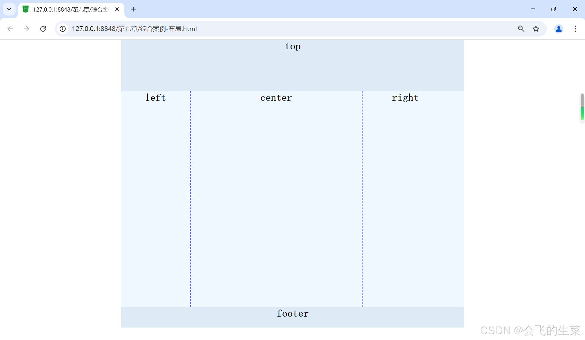
-<!DOCTYPE html>
<html>
<head>
<meta charset="utf-8" />
<title>众成远程教育</title>
<style>
*{
margin: 0px auto;
}
.all{
width: 1000px;
height: 840px;
background-image: url(img/9-bg.jpg);
}
.top{
width: 1000px;
height: 150px;
}
.main{
background-color: aliceblue;
width: 1000px;
height: 630px;
}
.left{
padding-top: 30px;
padding-left: 20px;
width: 200px;
height: 570px;
float: left;
line-height: 60px;
}
.center{
border-left: 2px dashed blue;
border-right: 2px dashed blue;
padding-top: 50px;
width: 500px;
height: 580px;
float: left;
}
.right{
padding-left: 20px;
width: 250px;
height: 630px;
float: left;
}
.footer{
width: 1000px;
height: 60px;
font-family: "楷体";
font-size: 18px;
text-align: center;
line-height: 30px;
}
a,span{
color: red;
font-weight: 700;
text-align: center;
}
p{
font-family: "黑体";
font-family: 700px;
color: brown;
font-size: 28px;
text-align: center;
}
table{
font-family: "黑体";
font-weight: 700px;
color: blue;
font-size: 20px;
line-height: 55px;
}
</style>
</head>
<body>
<div class="all">
<div class="top">
<img src="img/9-logo.jpg" width="708px" height="150px"/>
</div>
<div class="main">
<div class="left">
<p><img src="img/but2.jpg"/></p>
<p><img src="img/but3.jpg"/></p>
<p><img src="img/but4.jpg"/></p>
<p><img src="img/but5.jpg"/></p>
<p>相关信息</p>
<a href="#">4 大学历提升方案</a><br />
<a href="#">新报考政策解读击</a><br />
<a href="#">6 大类专业报考指南</a><br />
<a href="#">更多信息请点击</a><br />
</div>
<div class="center">
<p>入学报名报</p>
<form id="form2" name="form2" method="post" action="">
<table width="400" border="0" align="center" cellpadding="0" cellspacing="0">
<tr>
<td width="158" align="right">姓名:<label for="textfield"></label></td>
<td width="242"><input type="text" name="textfield" id="textfield"/></td>
</tr>
<tr>
<td align="right">联系电话:</td>
<td><input type="text" name="textfield2" id="textfield2"/></td>
</tr>
<tr>
<td align="right">邮箱:</td>
<td><input type="text" name="textfield3" id="textfield3"/></td>
</tr>
<tr>
<td align="right">资料邮寄地址:</td>
<td><input type="text" name="textfield4" id="textfield4"/></td>
</tr>
<tr>
<td align="right">最高学历:</td>
<td>
<select name="select2" id="select2">
<option>大学本科</option>
<option>专科</option>
<option>高中</option>
<option>初中</option>
<option>小学</option>
</select>
</td>
</tr>
<tr>
<td align="right">选择的课程:</td>
<td><input type="text" name="textfield6" id="textfield6"/></td>
</tr>
<tr>
<td align="right">意向学习方式:
<label for="select2"></label></td>
<td>
<select name="select" id="select">
<option>网络授课</option>
<option>周末班</option>
<option>全日制</option>
</select>
</td>
</tr>
<tr>
<td colspan="2" align="center">
<input type="image" name="imageFied" id="imageFied" src="img/but1.jpg"/>
</td>
</tr>
</table>
</form>
</div>
<div class="right">
<img src="img/pho1.jpg"/>
<img src="img/pho2.jpg"/>
<img src="img/pho3.jpg"/>
<img src="img/pho4.jpg"/>
</div>
</div>
<div class="footer">
<span>免费电话:</span>400-XXX-XXX(18条线)||
<span>(北京校区)</span>北京路XX大厦一楼0000号;||
<span>(上海校区)</span>上海路XX科技园7栋9999号<br />
此网站信息最终解释权©众诚远程教育
</div>
</div>
</body>
</html>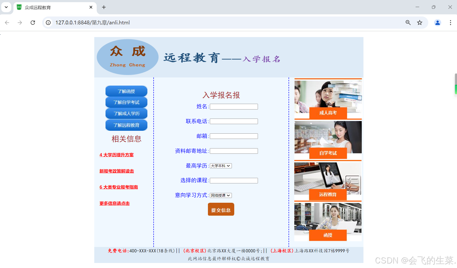


 扫一扫
扫一扫


 1172
1172

 被折叠的 条评论
为什么被折叠?
被折叠的 条评论
为什么被折叠?
 到【灌水乐园】发言


