


一、传统网页布局的三种方式
网页布局第一准则:多个块级元素纵向排列找标准流,多个块级元素横向排列找浮动
1、标准流——标签按照规定好默认方式排列
种类:块级元素(一个元素占一行)、行内元素(多个元素占一行)、行内块元素
2、浮动——改变元素默认的排列方式
(1)定义
可以让多个块级元素在一行内排列且相互之间没有间隔
float属性用于创建浮动框,将其移动到一边,知道左边缘或者右边缘触及包含块或者另一个浮动框的边缘
(2)语法规范
选择器{float:属性值;}
其中:属性值有三种①none 元素不浮动,默认值
②left 元素向左浮动
③right 元素向右浮动
例子:
    <style>
        .one {
            width: 100px;
            height: 100px;
            background-color: rosybrown;
            float: left;
        }

        .two {
            width: 100px;
            height: 100px;
            background-color: greenyellow;
            float: left;
        }
    </style>
<body>
    <div class="one">
        我是懒羊羊
    </div>
    <div class="two">
        我是喜羊羊
    </div>
</body>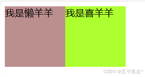
(3)浮动特性
①浮动的元素会脱离标准流,移动到指定位置,不在保留原来的位置(脱标)
例子:“我是懒羊羊”的这个盒子被设置了浮动,所以“我是喜羊羊”的这个盒子会自然的位于“我是懒羊羊”脱标的位置
    <style>
        .one {
            width: 100px;
            height: 100px;
            background-color: rosybrown;
            float: left;
        }

        .two {
            width: 200px;
            height: 200px;
            background-color: greenyellow;
        }
    </style>
<body>
    <div class="one">
        我是懒羊羊
    </div>
    <div class="two">
        我是喜羊羊
    </div>
</body>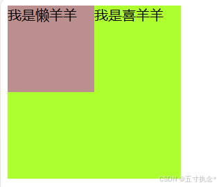
②多个盒子设置了浮动,它们会按照属性值一行内显示并且顶端对齐排列
且浮动的元素式相互贴靠在一起的,不会有缝隙,如果父级宽度装不下这些盒子,多出的盒子会另起一行对齐
例子:
    <style>
        div {
            float: left;

        }

        .one {
            width: 100px;
            height: 100px;
            background-color: rosybrown;

        }

        .two {
            width: 200px;
            height: 200px;
            background-color: greenyellow;
        }

        .three {
            width: 200px;
            height: 100px;
            background-color: gold;
        }

        .four {
            width: 100px;
            height: 200px;
            background-color: royalblue;
        }
    </style>
</head>

<body>
    <div class="one">
        我是懒羊羊
    </div>
    <div class="two">
        我是喜羊羊
    </div>
    <div class="three">
        我是沸羊羊
    </div>
    <div class="four">
        我是美羊羊
    </div>
</body>
③浮动的元素具有行内块元素的特性
如果块盒子没有设置宽度,默认宽度和父级一样宽,但是在添加浮动之后,其大小根据内容决定
浮动的盒子中间是没有空隙的,紧挨在一起的,行内元素同理
例子:
    <style>
        span {
            float: left;
            width: 100px;
            height: 100px;
            background-color: pink;
        }

        div {
            width: 400px;
            height: 400px;
            background-color: yellowgreen;
        }
    </style>
<body>
    <span>1</span>
    <span>2</span>
    <span>3</span>
    <div>盒子</div>
</body>
为了约束浮动匀速位置:
一般采取先用标准流的父元素排列上下位置,之后内部子元素采取浮动排列左右位置
二、综合案例
例子一
有父盒子、内部子元素
    <style>
        .box {
            width: 1200px;
            height: 300px;
            background-color: pink;
            margin: 0 auto;
        }

        .left {
            width: 400px;
            height: 300px;
            background-color: royalblue;
            float: left;
        }

        .right {
            width: 800px;
            height: 300px;
            background-color: yellowgreen;
            float: left;
        }
    </style>
<body>
    <div class="box">
        <div class="left">左边子盒子</div>
        <div class="right">右边子盒子</div>
    </div>
</body>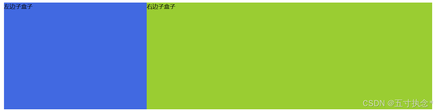
例子二
   <style>
        * {
            padding: 0;
            margin: 0;
        }

        li {
            list-style: none;
        }

        .box {
            width: 860px;
            height: 200px;
            background-color: rosybrown;
            margin: 0 auto;
        }

        .box li {
            width: 200px;
            height: 200px;
            background-color: powderblue;
            margin-right: 20px;
            float: left;
        }

        /* 最后一个盒子不用设置右边距,避免父盒子容纳不下,以至于第四个盒子位于下一行 */
        .box .last {
            margin-right: 0;
        }
    </style>

<body>
    <ul class="box">
        <li>1</li>
        <li>2</li>
        <li>3</li>
        <li class="last">4</li>
    </ul>
</body>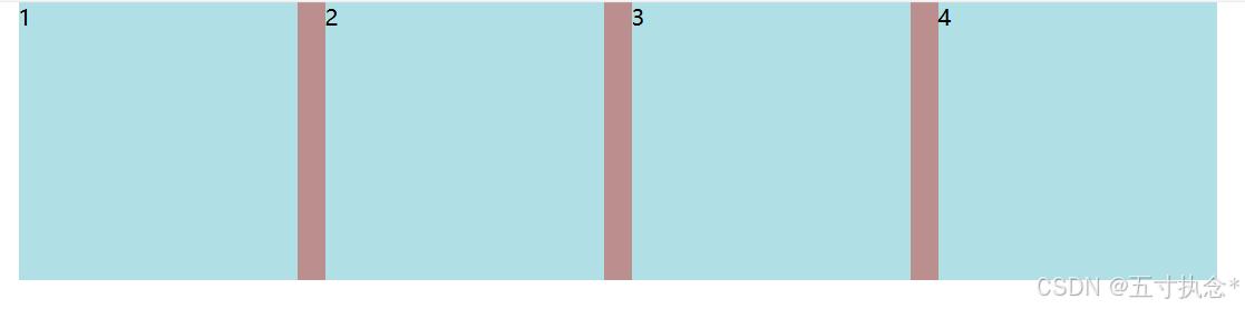
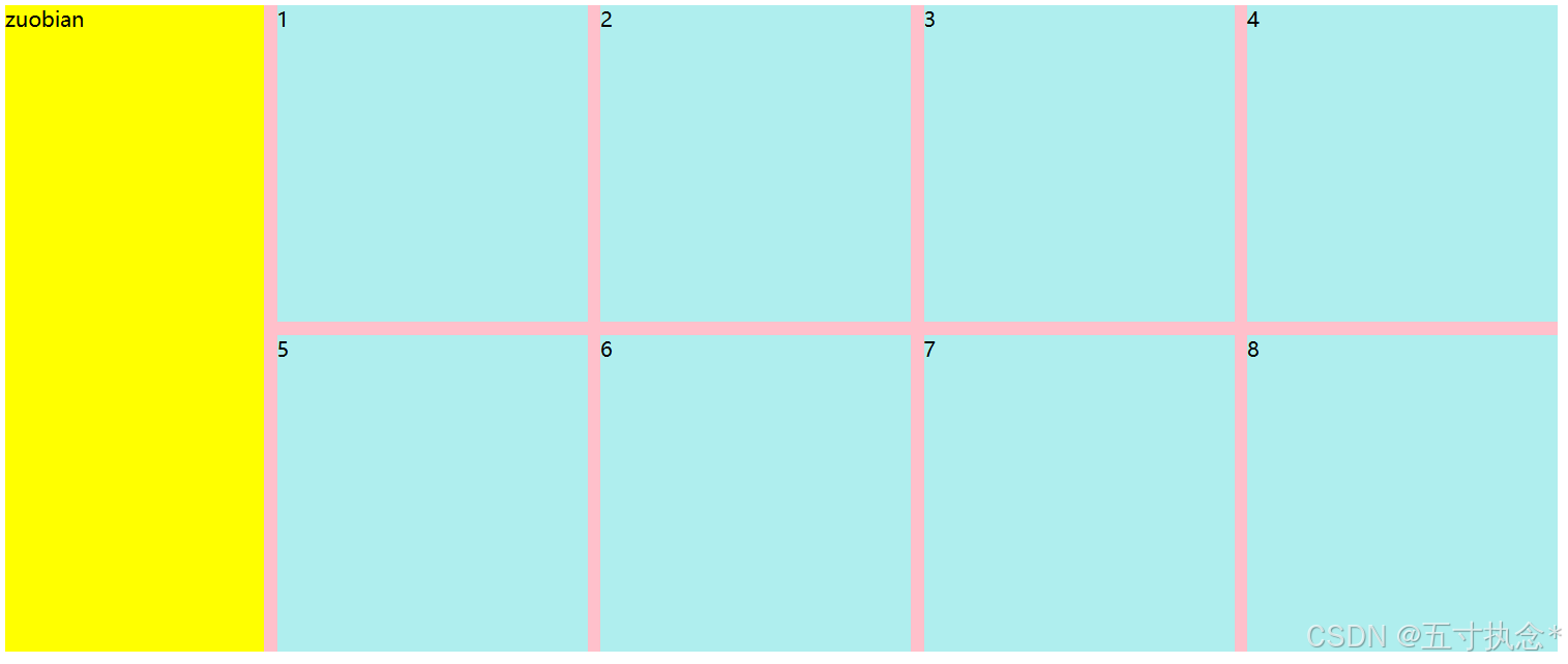
例子三
    <style>
        .box {
            width: 1200px;
            height: 500px;
            background-color: pink;
            margin: 0 auto;
        }

        .box .left {
            width: 200px;
            height: 500px;
            background-color: yellow;
            float: left;
        }

        .right>div {
            width: 240px;
            height: 245px;
            background-color: paleturquoise;
            float: left;
            margin-left: 10px;
            margin-bottom: 10px;
        }
    </style>
<body>
    <div class="box">
        <div class="left">zuobian</div>
        <div class="right">
            <div>1</div>
            <div>2</div>
            <div>3</div>
            <div>4</div>
            <div>5</div>
            <div>6</div>
            <div>7</div>
            <div>8</div>
        </div>
    </div>
</body>


 扫一扫
扫一扫


 被折叠的 条评论
为什么被折叠?
被折叠的 条评论
为什么被折叠?
 到【灌水乐园】发言


