


一、两列布局
概念解析
两列布局是指网页设计中一种常见的布局方式,其中一列宽度固定,另一列宽度自适应。这种布局方式能够提供良好的视觉效果和用户体验,常见于现代网页设计中。
定义和特点
两列布局的特点是一列宽度固定,另一列宽度自适应。固定宽度的列通常用于放置导航栏、侧边栏等固定内容,而自适应宽度的列则用于显示主要内容,能够根据屏幕大小自动调整宽度,以适应不同设备的显示需求。
实际应用场景
两列布局在网页设计中非常常见,适用于多种场景:
导航栏和主要内容:左侧固定宽度的列可以放置导航栏,右侧自适应宽度的列显示主要内容。
侧边栏和文章内容:左侧固定宽度的列作为侧边栏,右侧自适应宽度的列显示文章内容。
广告栏和主要内容:页面顶部放置广告栏,下方内容自适应宽度显示主要信息。
通过这些实现方式和应用场景,两列布局在网页设计中发挥了重要作用,满足了不同用户的需求和设备的显示要求。
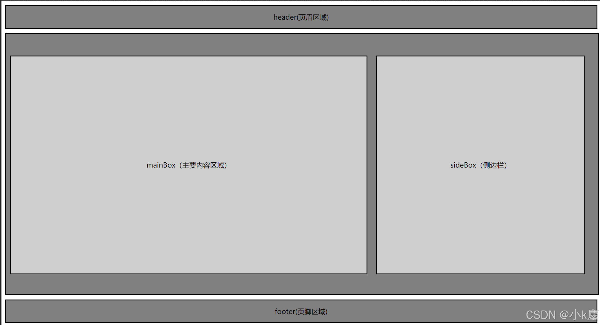
用浮动制作经典的三行两列宽度固定布局:
 代码示例
代码示例
<!DOCTYPE html>
<html lang="en">
<head>
    <meta charset="UTF-8">
    <meta name="viewport" content="width=device-width, initial-scale=1.0">
    <title>Document</title>
    <style>
        header{
            height: 50px;
            border: 2px black solid;
            background-color: gray;
            text-align: center;
            line-height: 50px;
            margin-bottom: 10px;
        }
        #container{
            height: 600px;
            width: 100%;
            border: 2px black solid;
            background-color: gray;
            text-align: center;
            margin-bottom: 10px;
            float: left;
        }
        #mainBox{
            height: 500px;
            width: 60%;
            border: 2px black solid;
            background-color: rgb(207, 207, 207);
            text-align: center;
            line-height: 500px;
            margin: 50px 10px;
            float: left;
        }
        #sideBox{
            height: 500px;
            width: 35%;
            border: 2px black solid;
            background-color: rgb(207, 207, 207);
            text-align: center;
            line-height: 500px;
            margin: 50px 10px;
            float: left;
        }
        footer{
            height: 50px;
            border: 2px black solid;
            background-color: gray;
            text-align: center;
            line-height: 50px;
            margin-bottom: 10px;
            clear: both;
        }
    </style>
</head>
<body>
    <header>
        header(页眉区域)
    </header>
    <main id="container">
        <div id="mainBox">mainBox(主要内容区域)</div>
        <div id="sideBox">sideBox(侧边栏)</div>
    </main>
    <footer>
        footer(页脚区域)
    </footer>
</body>
</html>
还可以运用行内块元素display: inline-block;属性也可以制作出相同的效果。
(只需要把浮动float: left;全部删除还有把清除浮动clear: both;删除。在#mainBox{}和#sideBox{}里面加入display: inline-block;属性。)
练习
<!DOCTYPE html>
<html lang="zh">
<head>
<meta charset="UTF-8">
<meta name="viewport" content="width=device-width, initial-scale=1.0">
<title>典型的网页结构示例</title>
<style>
nav{
height: 30px;
background-color: aquamarine;
margin-top: 0px;
}
li{
float: left;
margin-right: 100px;
}
#section1{
position: fixed;
right: 50px;
bottom: 100px;
background-color: pink;
border: 2px rgb(255, 88, 116) solid;
padding: 5px;
}
aside{
height: 500px;
position: absolute;
right: 0px;
background-color: rgb(192, 255, 141);
}
#section2{
width: 70%;
height: 500px;
position: absolute;
background-color: beige;
}
footer{
width: 100%;
background-color: gold;
position: absolute;
bottom: 0px;
}
</style>
</head>
<body>
<header>
<h1 align="center">广东云浮中医药职业学院</h1>
<p align="center">欢迎来到: <ins>计算机学院</ins></p>
<hr> <!-- 水平分割线 -->
<nav>
<ul type="none">
<li><a href="#">首页</a></li>
<li><a href="#">关于我们</a></li>
<li><a href="#">学生风采</a></li>
<li><a href="#">联系方式</a></li>
</ul>
</nav>
</header>
<hr> <!-- 水平分割线 -->
<main>
<section id="section2">
<h2>最新文章</h2>
<article>
<h3>文章标题</h3>
<p>这里是文章的内容简介。<br>可以使用<br>标签进行换行。</p>
<br><br><br>
<img src="./img_src/云中医校徽.jpg" alt="文章配图" width="200" height="200">
<p>想了解广东云浮中医药职业学院:<a href="https://gdyfvccm.edu.cn/">点击这里</a></p>
</article>
<br>
</section>
<aside>
<h3>侧边栏</h3>
<p>侧边栏内容,如快速链接、广告等。</p>
<table border="1">
<tr>
<th>专业</th>
<th>链接</th>
</tr>
<tr>
<td>计算机应用技术</td>
<td><a href="专业A详情页.html">专业A详情</a></td>
</tr>
<tr>
<td>数字媒体技术</td>
<td><a href="专业B详情页.html">专业B详情</a></td>
</tr>
</table>
</aside>
<section id="section1">
<h4>联系我们</h4>
<form>
姓名:
<input type="text" id="name" name="name"><br>
邮箱:
<input type="email" id="email" name="email"><br>
<input type="submit" value="提交">
</form>
</section>
</main>
<footer>
<hr> <!-- 水平分割线 -->
<p>版权所有 © 2024 广东云浮中医药职业学院计算机学院</p>
</footer>
</body>
</html>二、三列布局
概念解析
三列布局是指网页布局中包含三列,其中左右两列宽度固定,中间一列宽度自适应屏幕宽度的布局方式。这种布局方式常见于许多网站的首页设计。
三列布局的特点
- 两边固定:左右两列的宽度是固定的,通常根据设计需求设定具体的像素值。
- 中间自适应:中间列的宽度会根据屏幕宽度自动调整,以适应不同设备的显示需求。
- 优先加载:在实现上,中间列的内容通常会优先加载,以确保主要内容的快速显示
三列布局的应用场景
三列布局广泛应用于各种网页设计中,特别是在需要展示主要内容、侧边导航或广告栏的场景中。例如:
- 新闻网站:主要内容区域显示新闻文章,侧边栏提供分类导航或相关文章推荐。
- 电商网站:主要内容区域展示商品信息,侧边栏提供筛选条件或购物车功能。
- 博客或个人主页:主要内容区域展示博客文章,侧边栏提供归档、标签或社交链接等
代码示例
- 方法一:使用浮动(Float)实现三列布局
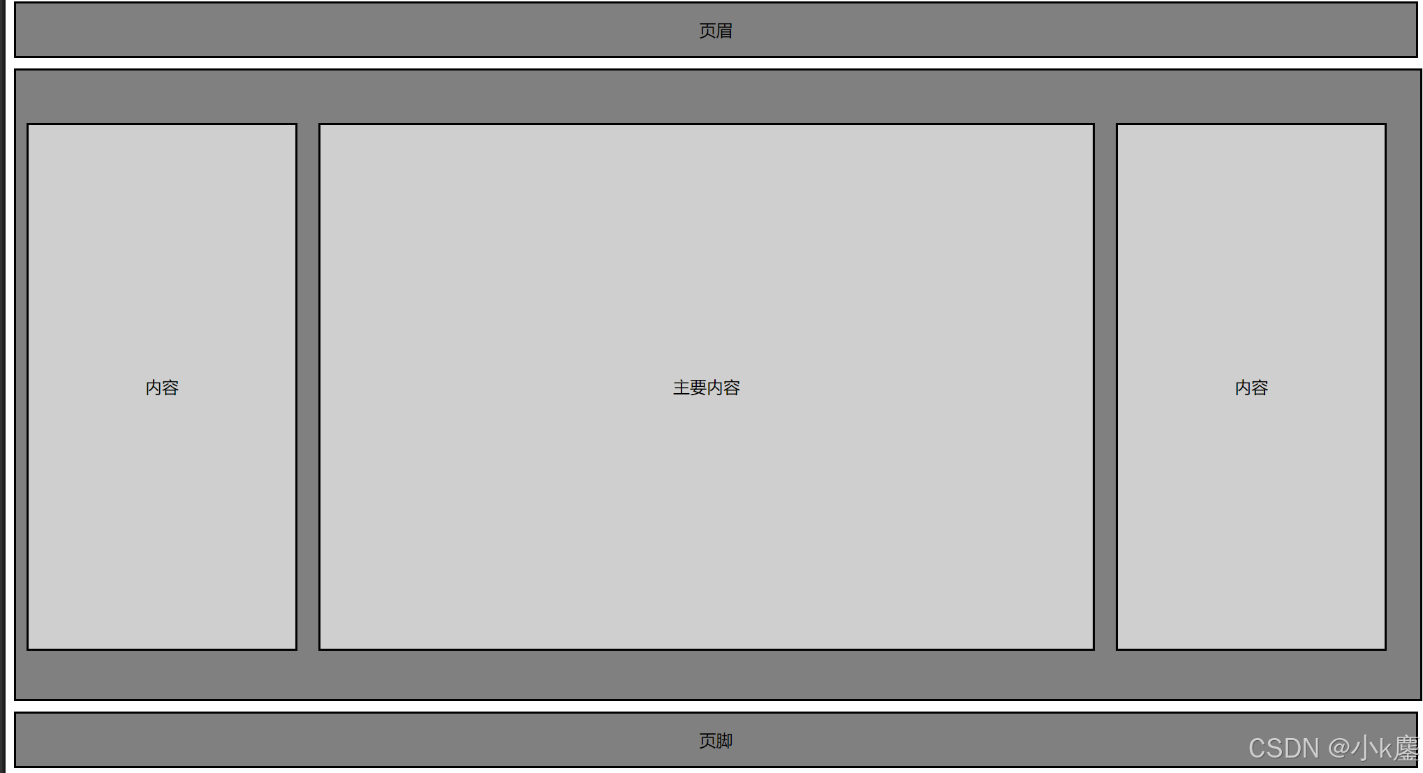
<!DOCTYPE html>
<html lang="en">
<head>
    <meta charset="UTF-8">
    <meta name="viewport" content="width=device-width, initial-scale=1.0">
    <title>Document</title>
    <style>
        header{
            height: 50px;
            border: 2px black solid;
            background-color: gray;
            text-align: center;
            line-height: 50px;
            margin-bottom: 10px;
        }
        #container{
            height: 600px;
            width: 100%;
            border: 2px black solid;
            background-color: gray;
            text-align: center;
            margin-bottom: 10px;
            float: left;
        }
        #SubsideBox{
            height: 500px;
            width: 19%;
            border: 2px black solid;
            background-color: rgb(207, 207, 207);
            text-align: center;
            line-height: 500px;
            margin: 50px 10px;
            float: left;
        }
        #mainBox{
            height: 500px;
            width: 55%;
            border: 2px black solid;
            background-color: rgb(207, 207, 207);
            text-align: center;
            line-height: 500px;
            margin: 50px 10px;
            float: left;
        }
        #sideBox{
            height: 500px;
            width: 19%;
            border: 2px black solid;
            background-color: rgb(207, 207, 207);
            text-align: center;
            line-height: 500px;
            margin: 50px 10px;
            float: left;
        }
        footer{
            height: 50px;
            border: 2px black solid;
            background-color: gray;
            text-align: center;
            line-height: 50px;
            margin-bottom: 10px;
            clear: both;
        }
    </style>
</head>
<body>
    <header>
        页眉
    </header>
    <main id="container">
        <div id="SubsideBox">内容</div>
        <div id="mainBox">主要内容</div>
        <div id="sideBox">内容</div>
    </main>
    <footer>
        页脚
    </footer>
</body>
</html>-
方法二:使用Flex布局实现三列布局
一、整体结构调整
1.HTML部分
无需对HTML结构进行大规模改动,只需要保留原有的HTML标签结构,包括header、main(包含内部的三个div)和footer标签。
2.CSS部分
首先,需要对整体布局进行调整。在body样式中,可添加margin: 0;和padding: 0;,这有助于在使用Flex布局时避免一些间距问题。
二、容器样式修改
#container元素
1.移除#container元素中与浮动布局相关的float: left;属性。
2.添加display: flex;属性,将其设置为Flex容器,这样它内部的子元素(#SubsideBox、#mainBox和#sideBox)将按照Flex布局规则进行排列。
三、子元素样式调整
1.#SubsideBox、#mainBox和#sideBox元素
1.移除这些元素中与浮动布局相关的float: left;属性,因为在Flex布局下,它们将由Flex容器(#container)控制排列方式,不再需要浮动。这些元素的其他样式属性(如高度、宽度、边框、背景色、文本对齐和行高)可以保持不变。
四、其他元素样式
1.header和footer元素
1.这两个元素的样式无需因为布局转换而进行修改,保持原来的高度、边框、背景色、文本对齐和行高设置即可。
三、多行多列布局
1、概念解析
多行多列布局是一种将页面内容分成多个行和列进行展示的布局方式。这种布局方式可以有效地利用页面空间,使得内容更加紧凑和有序。多行多列布局常见于新闻网站、杂志、博客等需要展示大量文本和图片的场景。
2、实际应用场景
- 新闻网站:新闻网站通常需要将文章标题、摘要和图片等元素按照多行多列的方式展示,以便用户快速浏览和获取信息。
- 博客:博客页面可以将文章内容、侧边栏和底部信息按照多行多列的方式排列,使得页面更加整洁和有序。
- 杂志和报纸:类似于传统报纸的排版方式,多行多列布局可以使内容更加符合阅读习惯,提升用户体验。
代码示例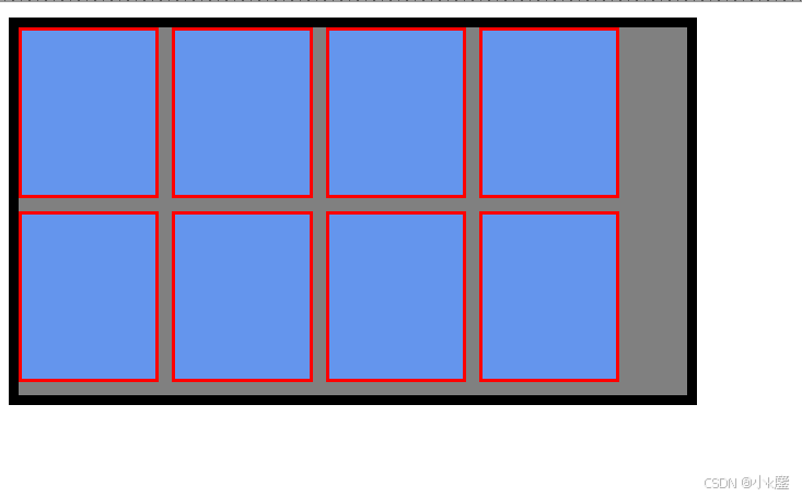
通过 float 属性实现多行多列布局时,如果要控制排布方式,可以通过为每个元素设置相应的 float 属性值(left 或者 right)来实现元素的左浮动或者右浮动。当元素的总宽度超出容器的宽度时,会自动换行进行布局。
代码
<!DOCTYPE html>
<html lang="zh">
<head>
    <meta charset="UTF-8">
    <meta name="viewport" content="width=device-width, initial-scale=1.0">
    <title>经典多行多列布局</title>
    <style>

        /* 这个伪元素的内容属性必须有 */
        .clear_ele::after{
            content: "";
            display: block;
            clear: both;
        }

        .container{
            width: 30%;
            background-color: gray;
            border: 6px black solid;
        }

        .container ul{
            margin: 0;
            padding: 0;
        }

        .container ul li{
            list-style: none;

            width: 20%;
            height: 100px;
            background-color:cornflowerblue;
            border: 2px red solid;
            margin-right: 2%;
            margin-bottom: 2%;
            float: left;
        }

    </style>

</head>
<body>
    <section class="container">
        <ul class="clear_ele">
            <li></li>
            <li></li>
            <li></li>
            <li></li>

            <li></li>
            <li></li>
            <li></li>
            <li></li>
        </ul>
    </section>
</body>
</html>


 扫一扫
扫一扫


 2415
2415

 被折叠的 条评论
为什么被折叠?
被折叠的 条评论
为什么被折叠?
 到【灌水乐园】发言


