


内容:
·基础概念
·绘图操作
from matplotlib import pyplot as plt
import numpy as np

# 设置x、y轴数据
x_1 = range(1, 31, 3)
x_2 = range(35, 65, 3)
y_1 = np.random.randint(30, 50, size=10)
y_2 = np.random.randint(30, 50, size=10)
【基础操作】
与绘制折线图不同的是,绘制散点图只需要变换一下绘制即可,也就是将plt.plot()函数替成plt.scatter()函数。
【绘图操作】
除主绘图函数改变之外,其余代码几乎没有任何变化。
(1)创建一个画布
(2)绘制图形
(3)展示图形
"""创建一个画布"""
plt.figure(figsize=(20, 8), dpi=80)
"""绘制图形"""
# 建立图形
plt.scatter(x_1, y_1, label="3月份", color="orange")
plt.scatter(x_2, y_2, label="10月份", color="red")
plt.legend()  # 实现label参数
# 给x轴刻度加上标注
x_add = list(x_1) + list(x_2)
x_table = []
for x in x_1:
    x_table.append(f"3月{x}日")
for x in x_2:
    x_table.append(f"10月{x - 34}日")
plt.xticks(x_add, x_table)
# 给x、y轴添加标签
plt.xlabel("时间/天(3 and 10月)", color="b")
plt.ylabel("增长额度/million", color="b")
plt.title("3月和10月增长额度与时间的关系表", color="black")
"""展示图形"""
plt.savefig("./3 and 10月变换.png")
plt.show()
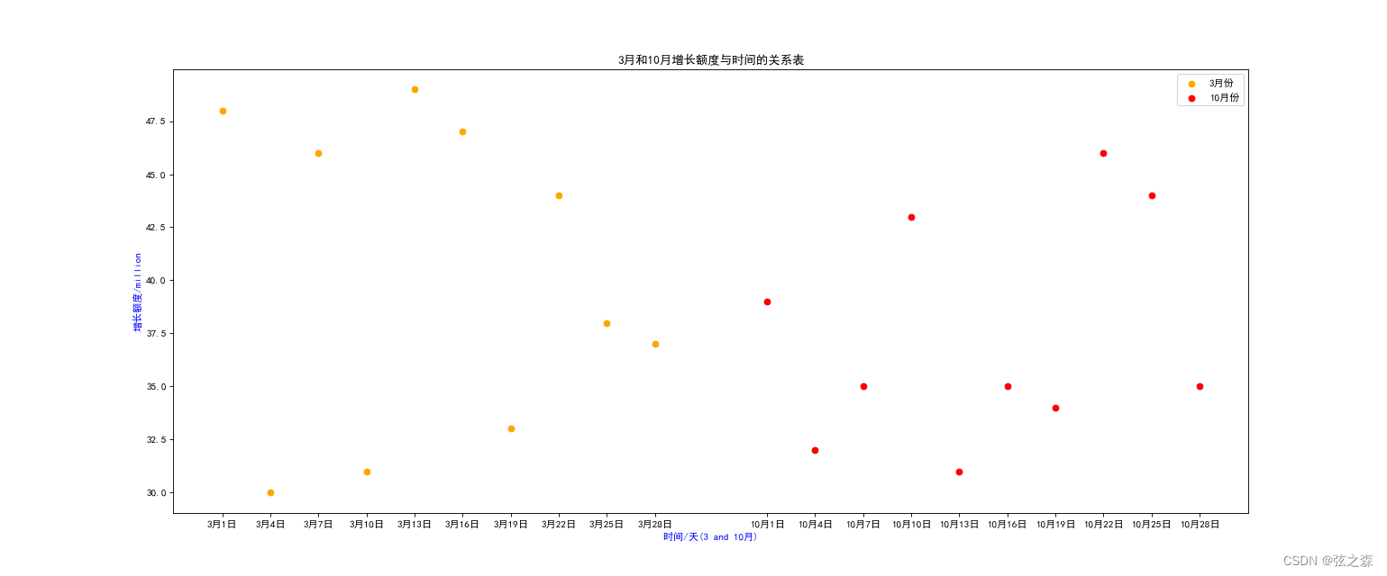
运行结果:


 8191
8191

 被折叠的 条评论
为什么被折叠?
被折叠的 条评论
为什么被折叠?
 到【灌水乐园】发言


