


hallo!这里是yu刚刚接触小程序,练习了一个本地生活案例!
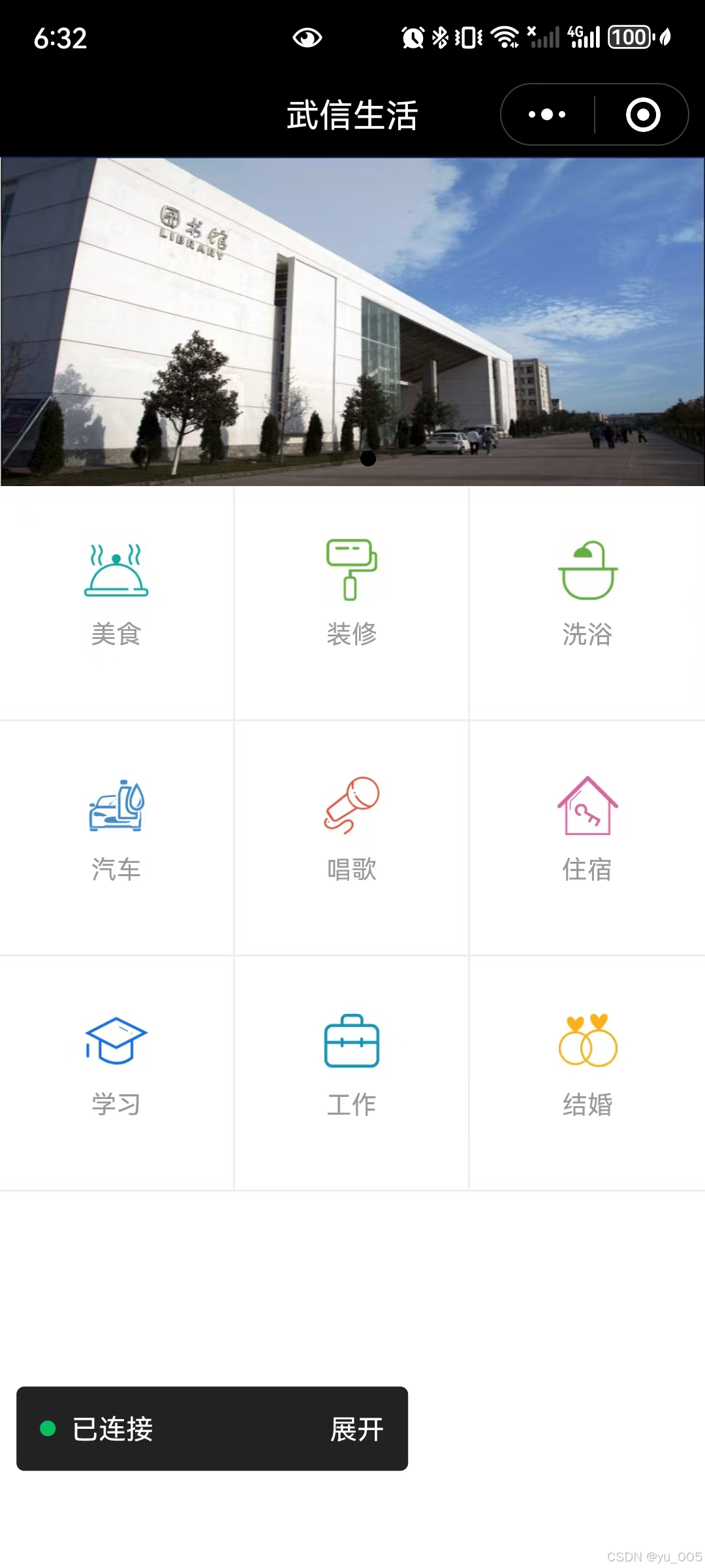
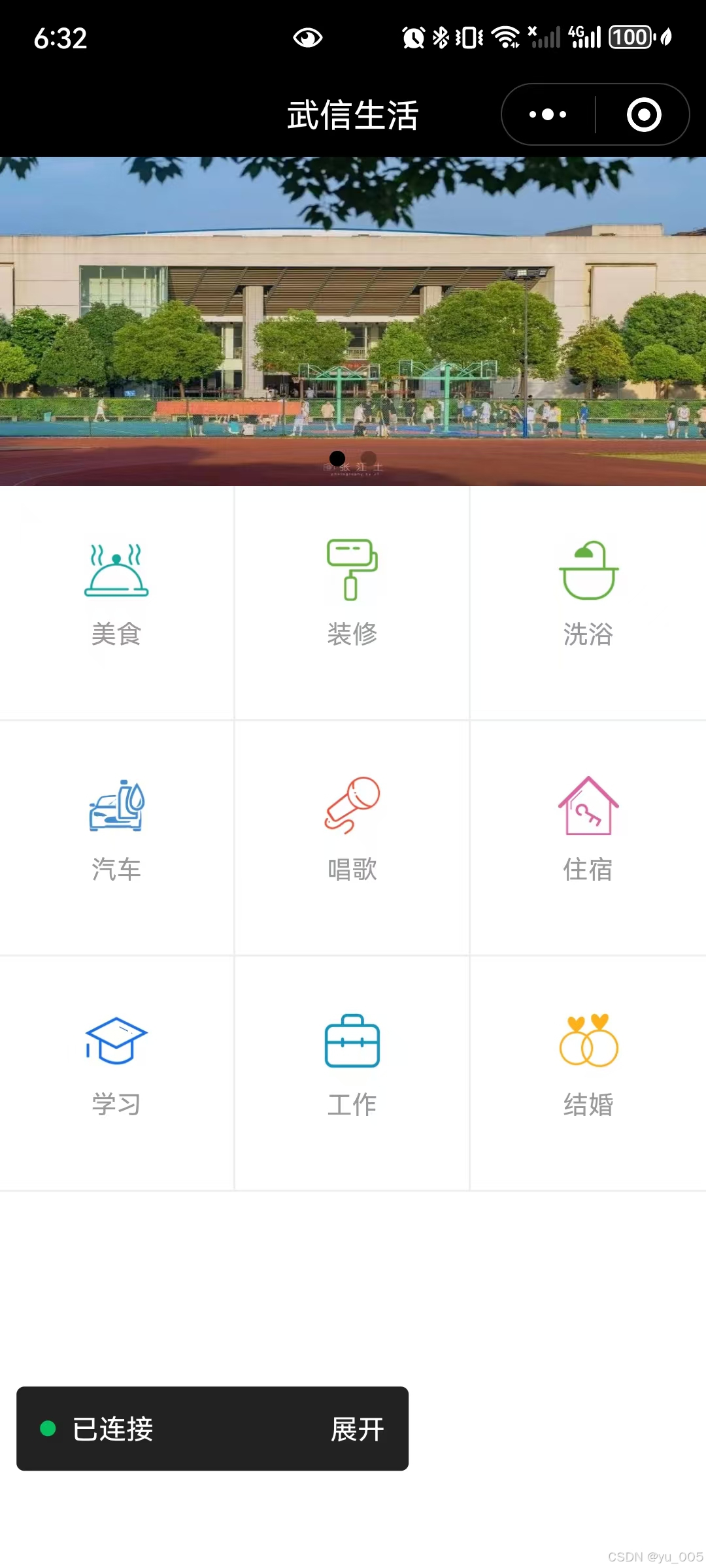
效果如图:
分为轮播图区域和九宫格区域,轮播图使用swiper和swiper-item组件制作,九宫格区使用view组件,text组件和image组件制作。
flex属性是属于其中的难点
flex-wrap属性
flex-wrap属性用于规定是否允许项目换行,能够设置多行排列时换行的方向,它有以下3个常用的可选值。
- nowrap:默认值,表示不换行,如果单行内容过多,项目宽度可能会被压缩。
- wrap:当容器单行容不下所有项目时允许换行排列。
- wrap-reverse:当容器单行容不下所有项目时允许换行排列,换行方向为wrap的反方向。
just-content属性:
just-content属性用于设置项目在主轴方向上的对齐方式,能够分配项目之间及其多余的空间。
- flex-start:默认值,表示项目对其到主轴起点,项目间不留空隙
- flex-end:项目对其到主轴终点,项目间不留空隙
- center:项目在主轴居中排列,项目间不留空隙
- space-between:两端对齐,两端的项目分别靠向容器的两端,其他项目之间的间距相等。
- space-around:每个项目之间的距离相等,第一个项目主轴起点和最后一个项目离终点的距离为中间项目的一般。
源代码
<!--pages/grid/grid.wxml-->
<swiper indicator-dots="true" autoplay="true" interval="3000">
    <swiper-item>
        <image src="/images/01.jpeg" />
    </swiper-item>
    <swiper-item>
        <image src="/images/02.jpeg" />
    </swiper-item>
</swiper>
<view class="grids">
    <view class="item">
    <image src="/images/shi.png" />
    <text>美食</text>
    </view>
    <view class="item">
    <image src="/images/xiu.png" />
    <text>装修</text>
    </view>
    <view class="item">
    <image src="/images/yu.png" />
    <text>洗浴</text>
    </view>
    <view class="item">
    <image src="/images/che.png" />
    <text>汽车</text>
    </view>
    <view class="item">
    <image src="/images/chang.png" />
    <text>唱歌</text>
    </view>
    <view class="item">
    <image src="/images/fang.png"  />
    <text>住宿</text>
    </view>
    <view class="item">
    <image src="/images/xue.png" />
    <text>学习</text>
    </view>
    <view class="item">
    <image src="/images/gong.png" />
    <text>工作</text>
    </view>
    <view class="item">
    <image src="/images/hun.png" />
    <text>结婚</text>
    </view>
</view>
swiper,swiper-item和image组件实现了轮播图区域的页面结构,通过view组件定义了页面中9个不同的分类,每个分类中包含image和text组件,表示分类图片和分类名称
/* pages/grid/grid.wxss */
swiper{
height: 350rpx;
}
swiper image{
width: 100%;
height: 100%;
}
.grids{
display:flex;
flex-wrap:wrap;
}
.grids .item{
width: 250rpx;
height: 250rpx;
border-right:1rpx solid #eee;
border-bottom: 1rpx solid #eee;
box-sizing: border-box;
display: flex;
flex-direction: column;
justify-content: center;
align-items: center;
}
.grids .item:nth-child(3){
border-right:0;
}
.grids .item:nth-child(6){
border-right:0;
}
.grids .item:nth-child(9){
border-right:0;
}
.grids .item image{
width: 70rpx;
height: 70rpx;
}
.grids .item text{
color: #999;
font-size: 28rpx;
margin: 20rpx;
}
flex-wrap设置自动换行,即超出部分项目换行显示。
设置每个格子为border-box,表示元素制定的任何内边距和边框都将在已设定的宽度和高度内进行绘制。
flex-direction将每个格子的主轴方向设为纵向
justify-content和align-item的属性值设置为center,用于将格子中的项目在主轴和交叉轴上的对齐方向设置为居中。


 扫一扫
扫一扫


 被折叠的 条评论
为什么被折叠?
被折叠的 条评论
为什么被折叠?
 到【灌水乐园】发言


